All posts by Oscar V

Filters

Author:
Category:

Photo shoot 2

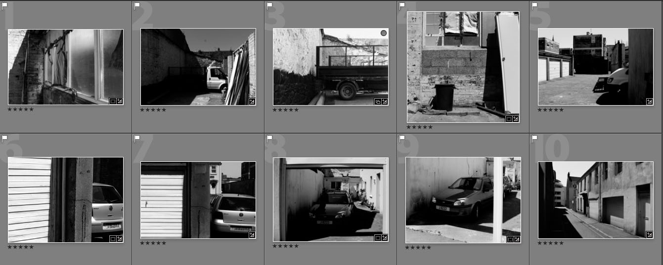
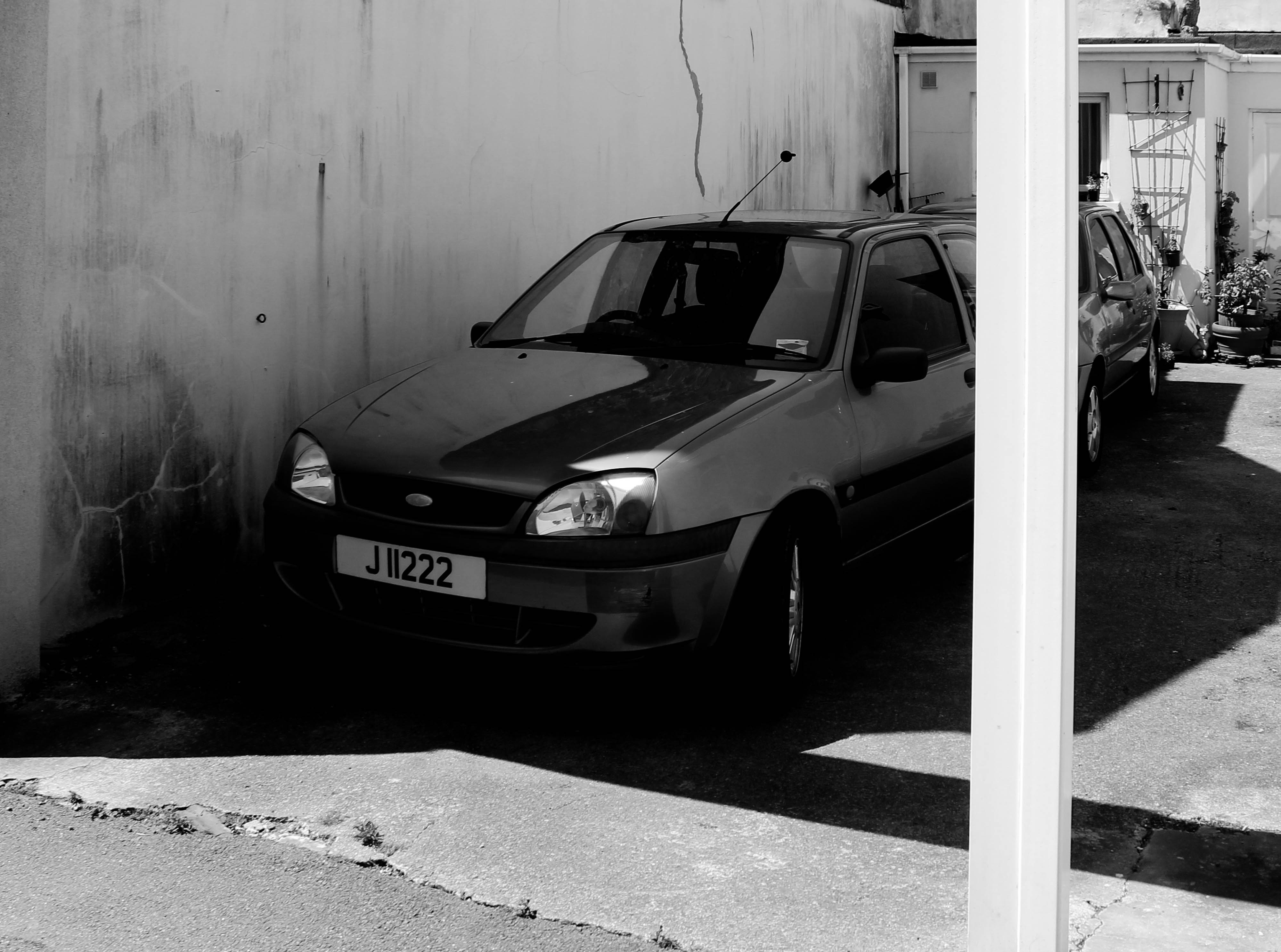
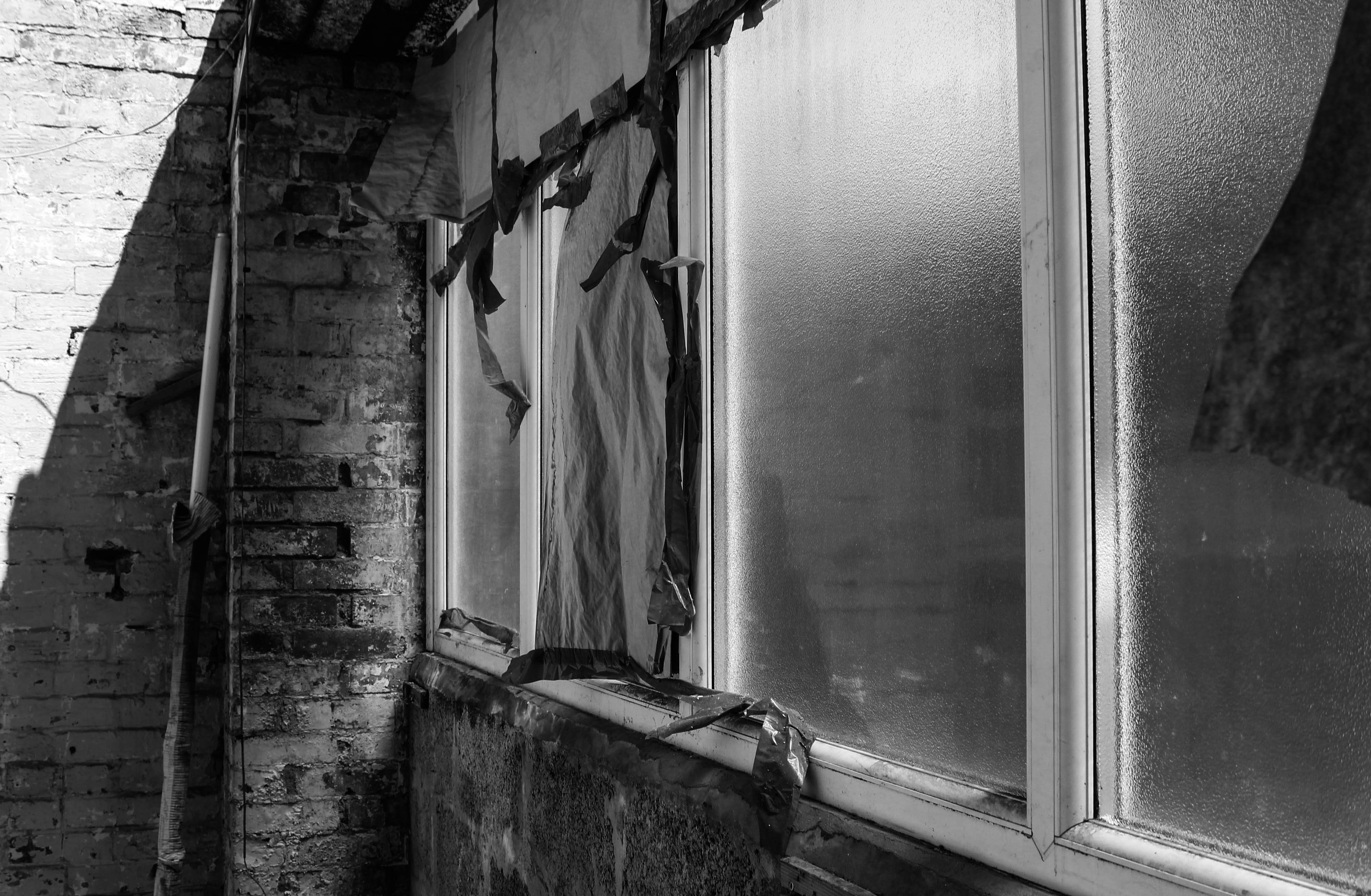
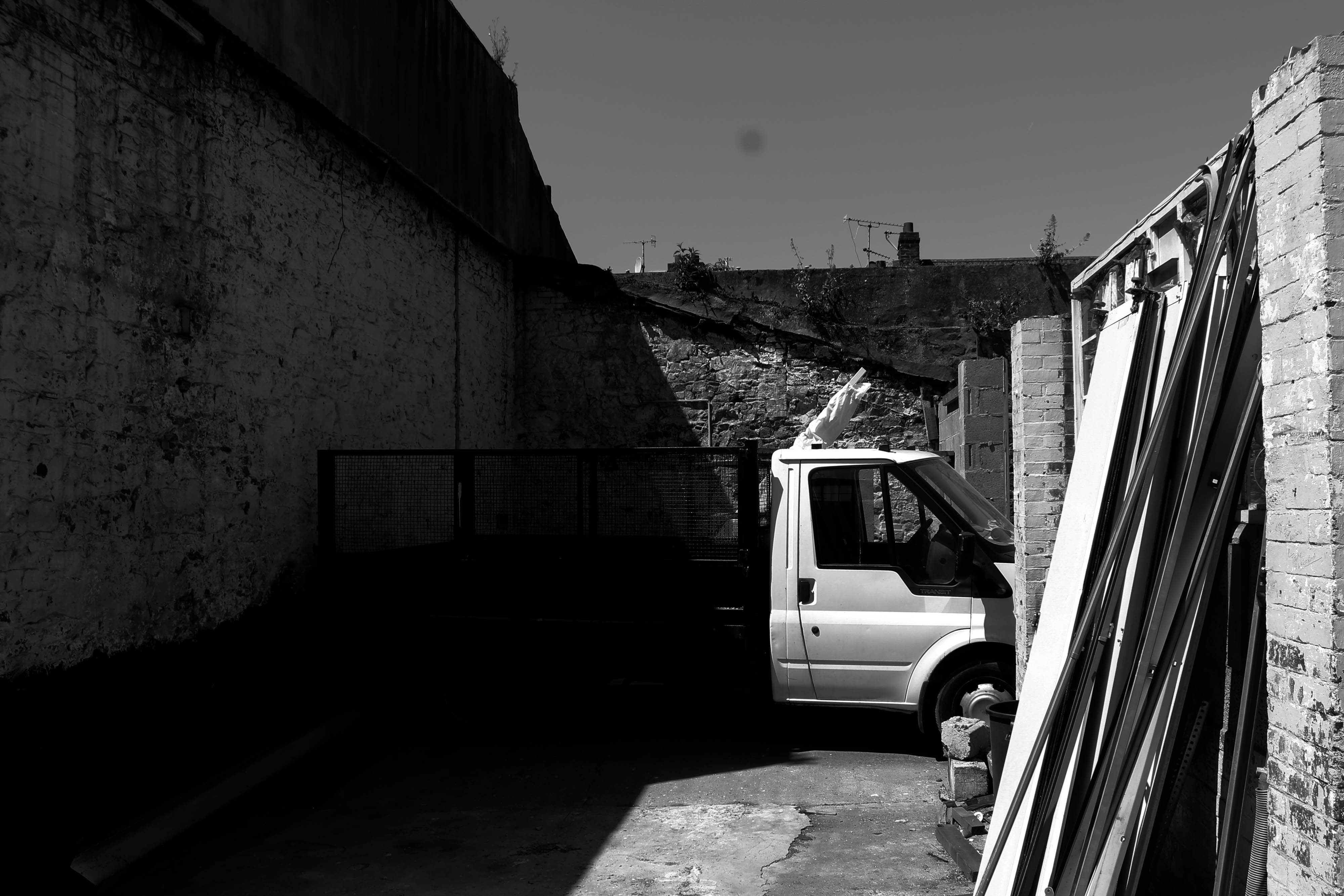
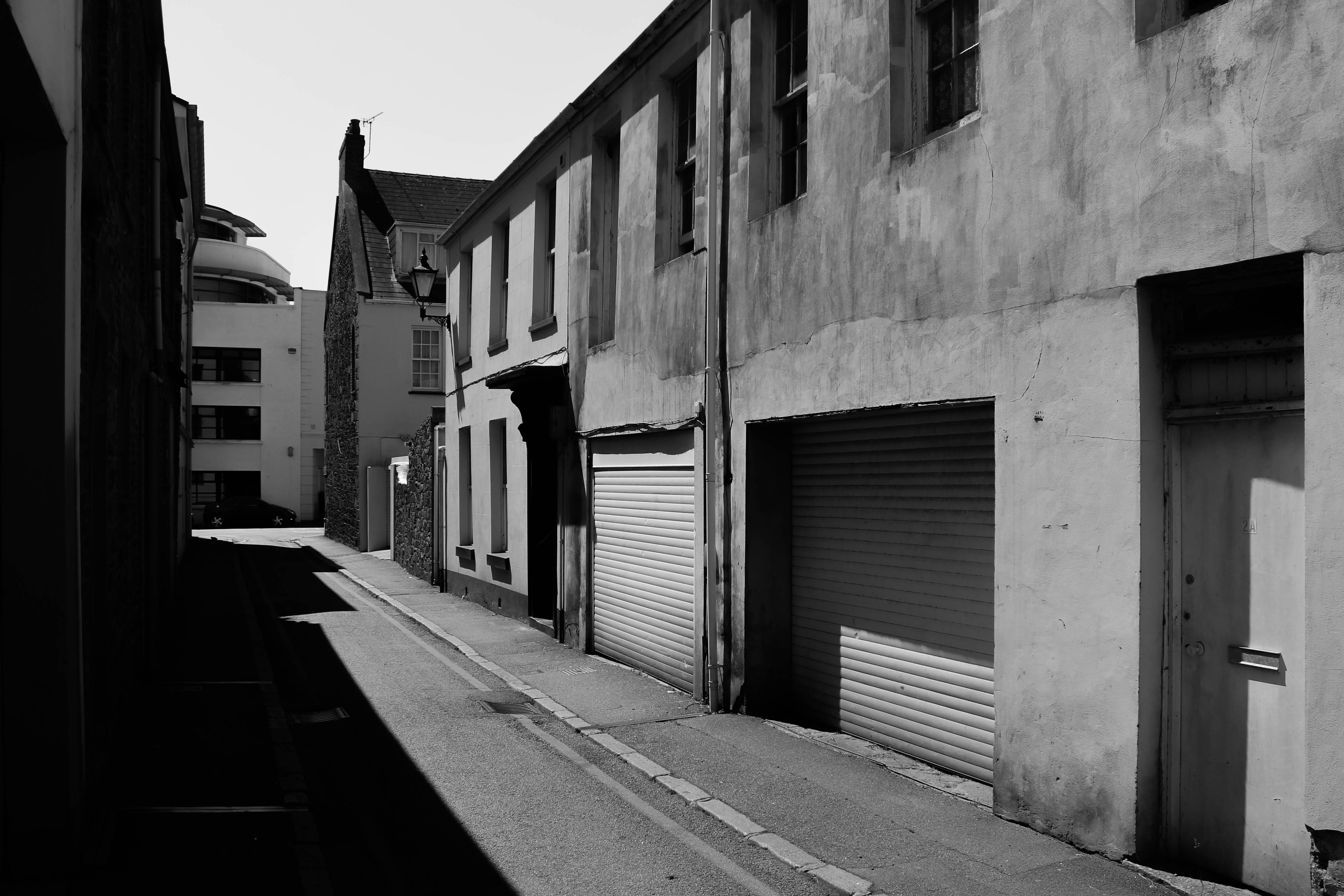
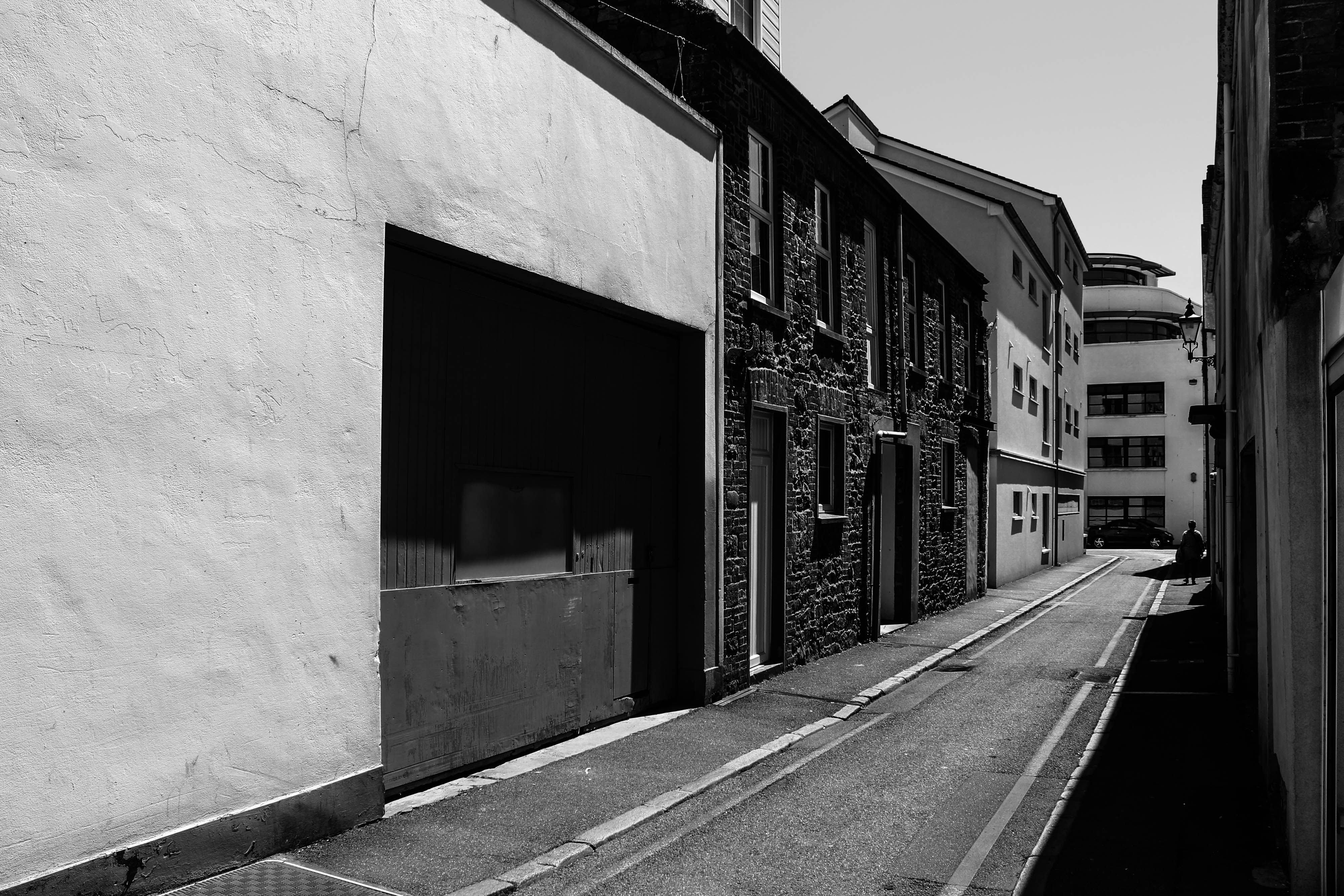
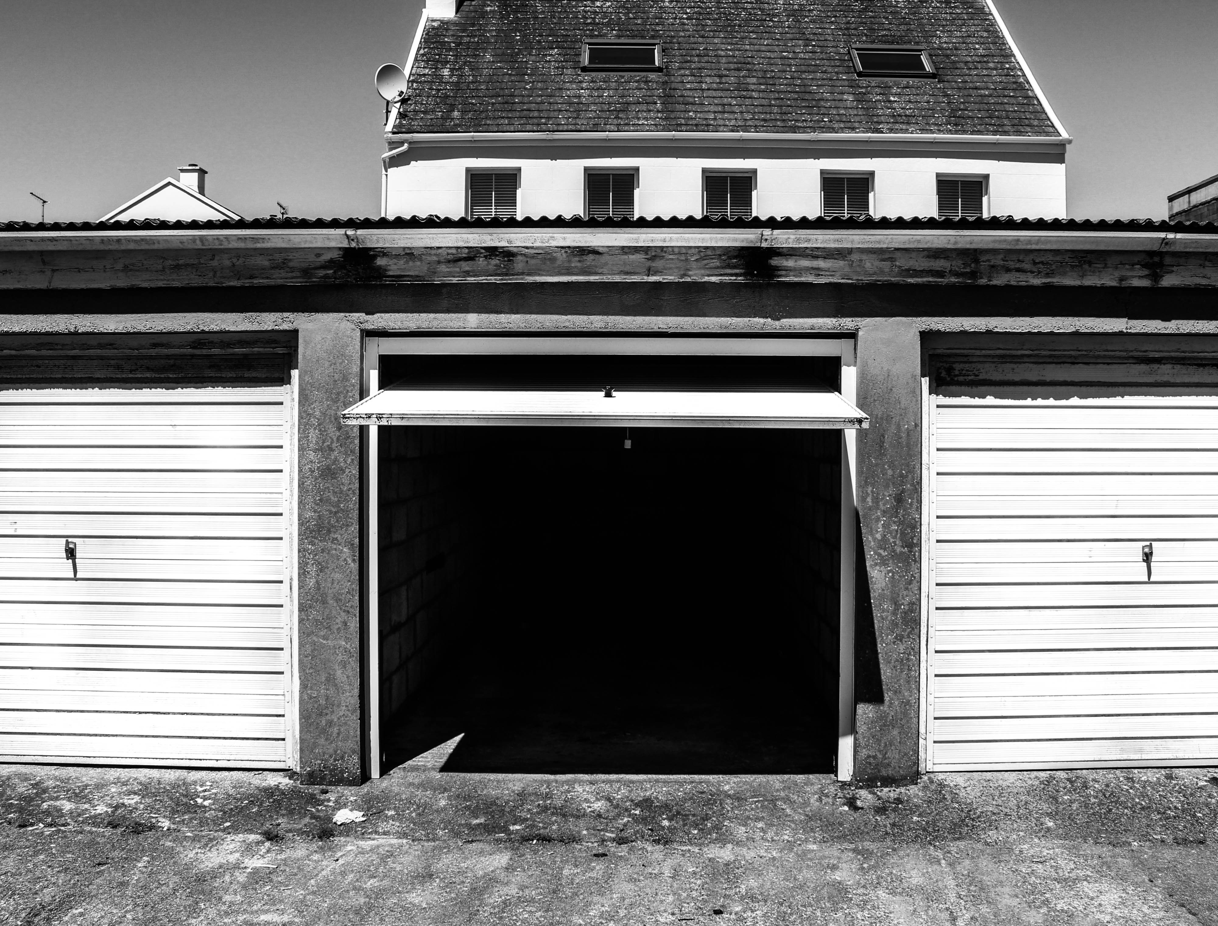
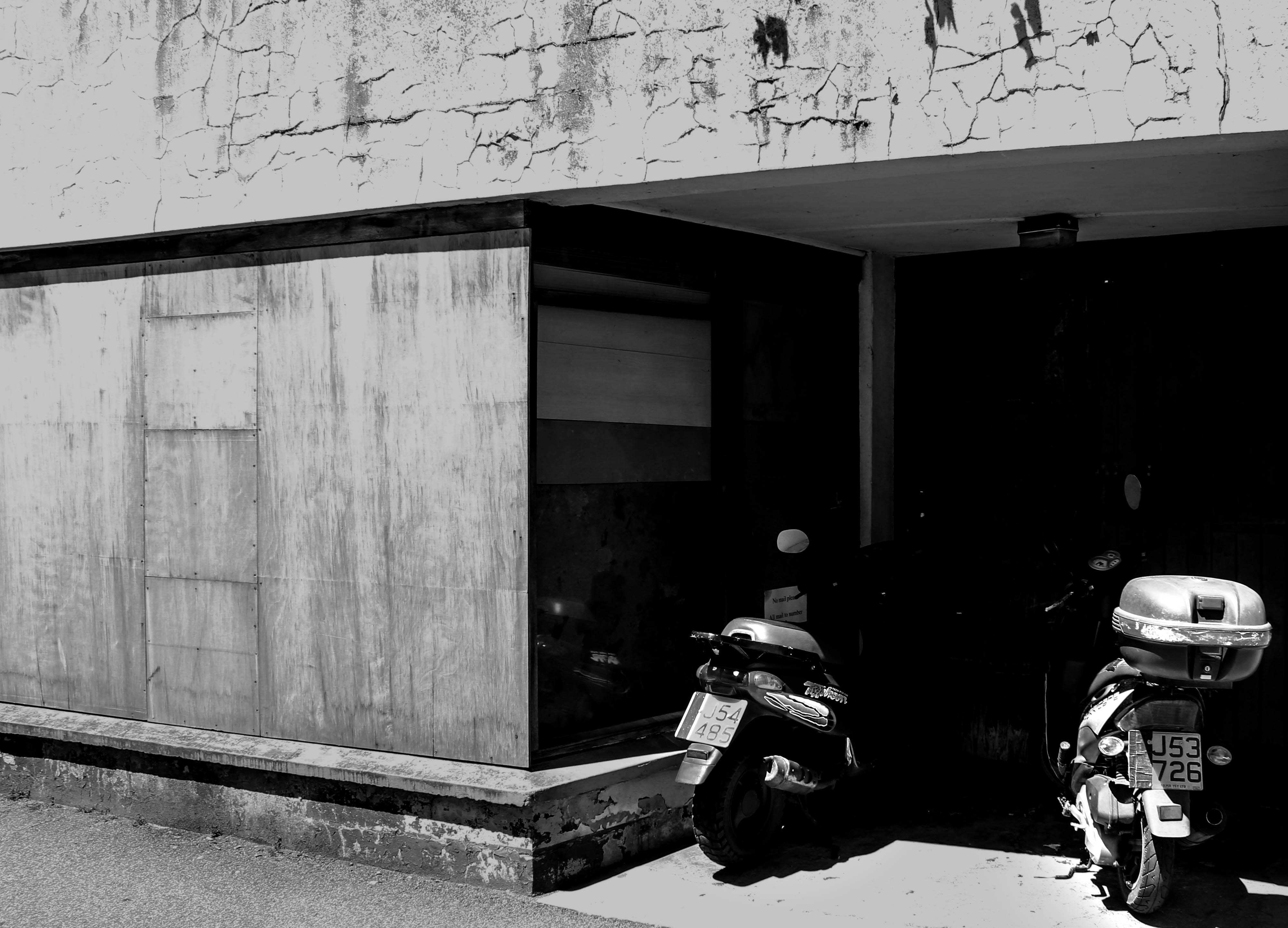
For this photo shoot my intentions were to capture this location in more detail and depth. I did this by shooting derelict buildings which had a sense of usage and were clearly left abandoned. I wanted to show the unnecessary space being used up by these buildings that are wasting space. I also intended on bringing a strong contrast between the old vs new of St Helier which would show the wasted space these buildings are creating.

Further experimented images

I feel this shoot was stronger then the original due to a number of different factors. By planning this shoot I feel that it clearly shows that I have thought about what I wanted to capture and how i’d be able to capture future of St Helier in the strongest way. My images where again in black and white as I thought I would be able to use these images to relate to the archive images that I focused on before the shoot. Furthermore, I think by having them in black and white creates more of a story behind it due to the shadows and different shapes that are created and enhanced. These aspects make the image stronger as I feel these certain images would be boring without the shadows and different shapes that help make up these images. Again these images I have chosen to experiment with further are the ones that I thought where the strongest and feel tell more of story then any other image out of the shoot.

Photoshoot 1

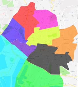
Throughout the shoot I will focus on derelict areas of St Helier and show the back streets in more detail. I want my images to clearly represent the areas that are unseen and are just forgotten about and try to strongly contrast the old and the new parts of St Helier. The area I have been given is the red area. This area has strong locations where I know I can capture the images I want to take where I can strongly capture the future of St Helier.

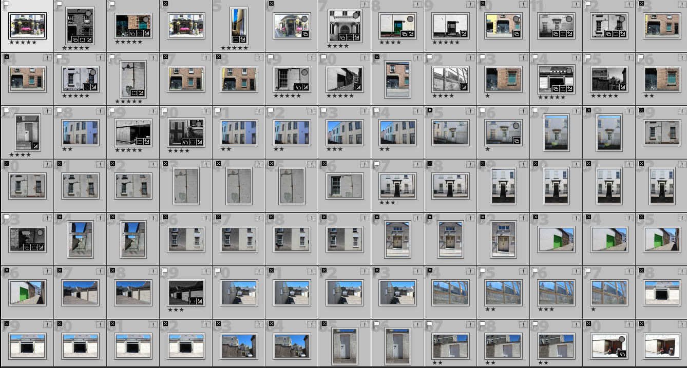
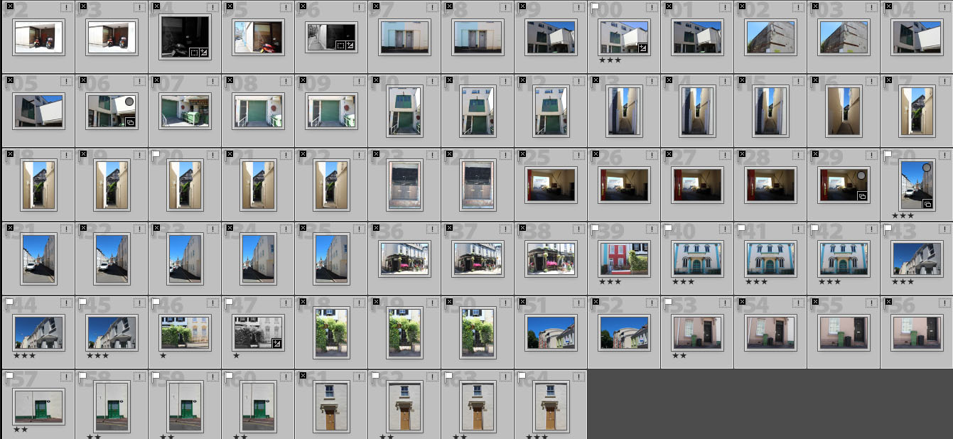
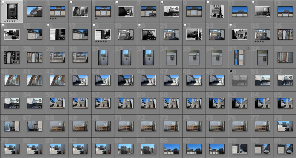
Contact sheet

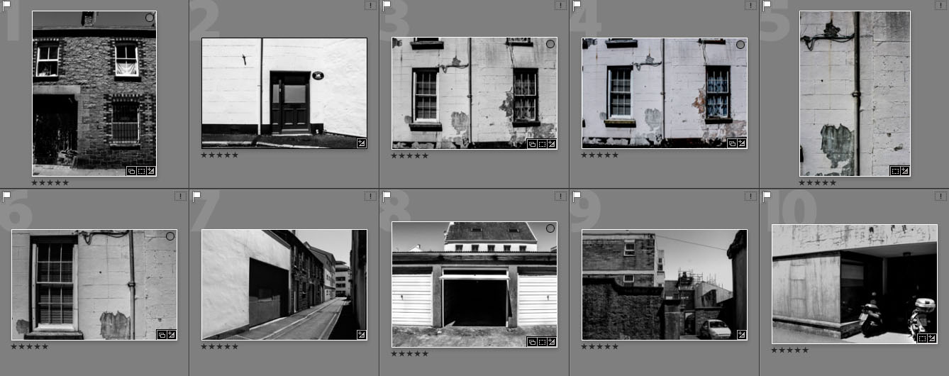
Favorite altered images

This shoot consists of some strong images however, there are also some images that weren’t so strong and didn’t come out how I pictured them too. The images that I found where stronger I have experimented on. The image I thought was the strongest out off the 10 was the last image out of the ones that I edited as I think it clearly shows something that has been forgotten from the abandoned building and the old bikes which is something that I planned to capture. Furthermore, when editing these images I went though different processes of editing.  I firstly wanted to keep them in colour however when further editing them I found they looked stronger in black and white and increased the derelict look of the buildings and enhanced the shadows which I found made them stand out more. The images that I have made large are the three images I found where the strongest out of them all as I feel they were the ones that represented my original ideas the most out of the whole shoot.


My given location – red Area (St Helier)

The area assigned for me to research and photograph is the zone in red. This area consists of the old police station, which is beginning to look run down. This area includes multiple hotels such as the Savoy and the Norfolk lodge hotel which would be interest subjects and locations too shoot as I could capture its history by finding archive images of the hotels and to find out about the hotels history. Furthermore, Rouge Bouillon school is also in the given area and would be a interesting subject to shoot as I could have the opportunity to capture the school in a different way. I would also be able to capture the community around the school and also the area.   The school and the police station creates a strong contrast due to the safety from the school and the criminal action and danger from the police station.

My intentions for the photo shoot is to not only explore and portray the area in the way I percieve it to be but to also capture a sense of what the area once was and could be in the future. I intend to focus on three main elements. This will be the community, the history of the area and the modernization/future of it.

My views, feelings and vision for how I see the Future of St Helier

Image result for st helier

I believe that St Helier is moving forwards with intent to make money within projects like the finance center.  It is likely to benefit Jersey however, these money making investments are orientated towards the finance sector and living complexes which does not positively impact Jersey as a community. Also, the tourism industry is clearly ignored buy the development teams of St Helier with many attractions collapsing and little investment in new leisure facilities.

There are multiple areas around St Helier which have been massively improved however, there are also areas which have been forgotten about and need to be improved for example Fort Regent. This used to be a massive location for tourists and locals which is slowly becoming less and less attractive resulting in it becoming less popular and in desperate need of improvement. However, a location that strongly contrasts this is millennium park and how this area has been improved and made to attract people and resulting in this improvement it has done the job it was set out to do. Unfortunately, iconic locations such as the fort are slowly being forgotten about and left alone creating a waste of space. A location like this shouldn’t be forgotten about as it was an iconic location for many and should be redone and made to full fill the space it is using up.


Photoshoot plan

I plan to show the contrast of the modern vs the old as it will help to show the potential for development and the future of St Helier. I will do this by capturing the dereliction of buildings as well as the construction/modernised buildings. I plan to do two shoots which will all focus on different themes. I plan to produce them in black and white which I feel will create strong contacts between each image showing of the old, run down buildings and the newer modernised buildings.

My first shoot will focus on the locations prompt for development and also how these areas take up unnecessary space that could be used and transformed into things that people in that area could benefit from.

My second photo shoot will involve capturing the back lanes where no one usually visits which are unseen and unused and again taking up valuable space within that location. I will capture how people have left vehicles or belongings in that area and have forgotten about them resulting in the space being used up by unnecessary things. I also intend on bringing a strong contrast between the old vs new of St Helier which would truly show how wasteful the abandoned buildings are.


Brief history of St Helier

18th century – Until the end of the 18th century, the town consisted chiefly of a string of houses, shops and warehouses stretching along the coastal dunes either side of the Church of St Heller.

Image result for 18th century st helier jersey

19th century – Military roads linking coastal defences around the island with St Helier harbour allowed farmers to exploit Jersey’s temperate micro-climate and use new fast sailing ships and then steamships to get their produce to the markets of London and Paris before the competition. This was the start of Jersey’s agricultural prosperity in the 19th century.

Image result for 19th century st helier jersey

20th century – In the 1960s, income from the Jersey States Lottery was used to excavate a two-lane road Tunnel under Fort Regent, enabling traffic from the harbour to the east coast towns to avoid a torturous route around the fort. About the same time, the Fort was converted into a major leisure facility and was linked to the town centre by a gondola cableway – closed and demolished in the 1990s.

Image result for 20th century st helier jersey

21st century – Liberation Square is now a focal point in the town – the former terminus of the Jersey railway housed the Jersey Tourism office until 2007.

Image result for 21th century st helier jersey

Final image analysis and evaluation

The set of images I have chosen, strongly contrast with each other as they are all different but all have specific similarities. This will be effective when presenting them as it will allow each individual photo to stand out.  Furthermore, I have made sure that each image isn’t too similar as I don’t want them all conveying the same story.

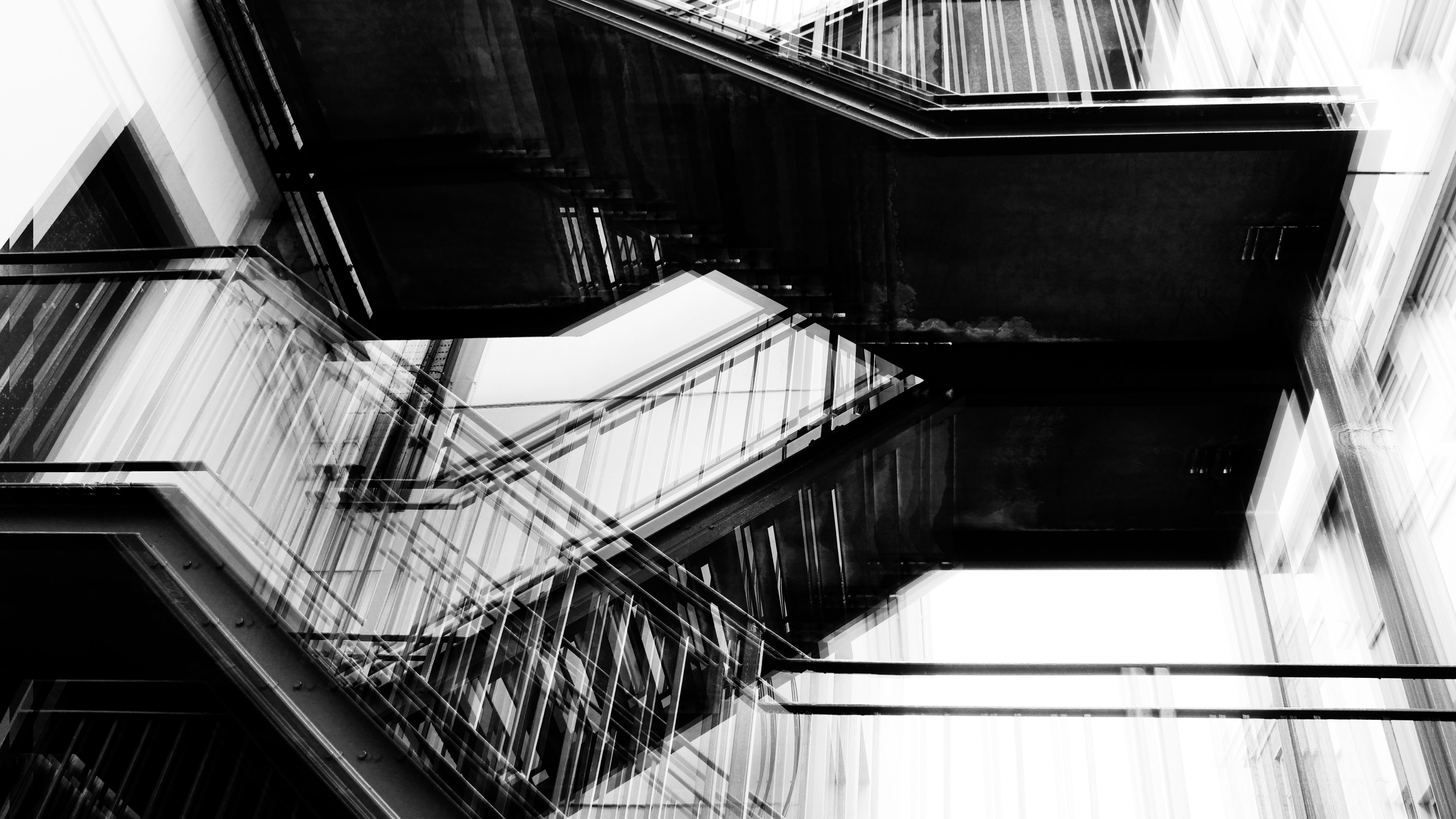
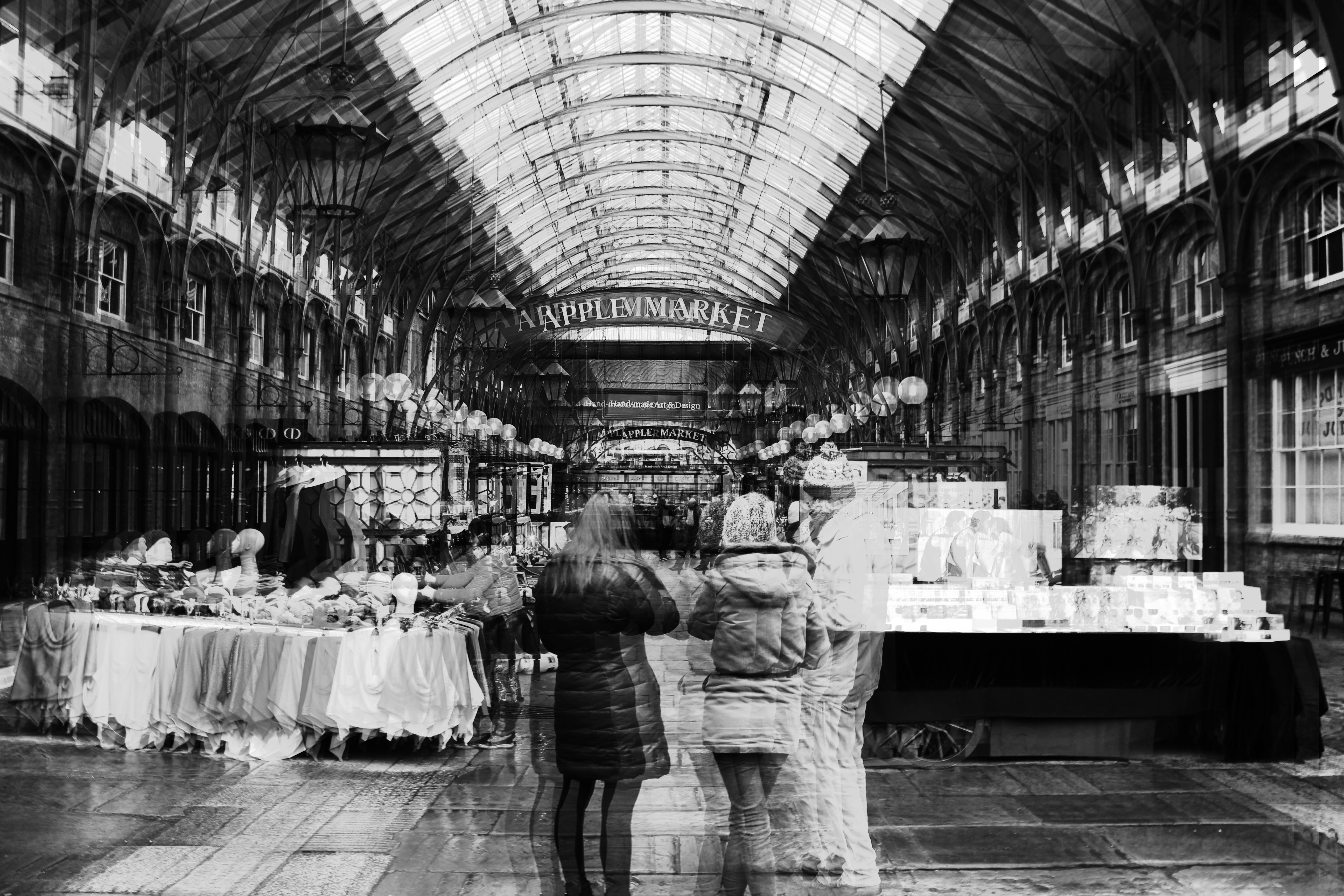
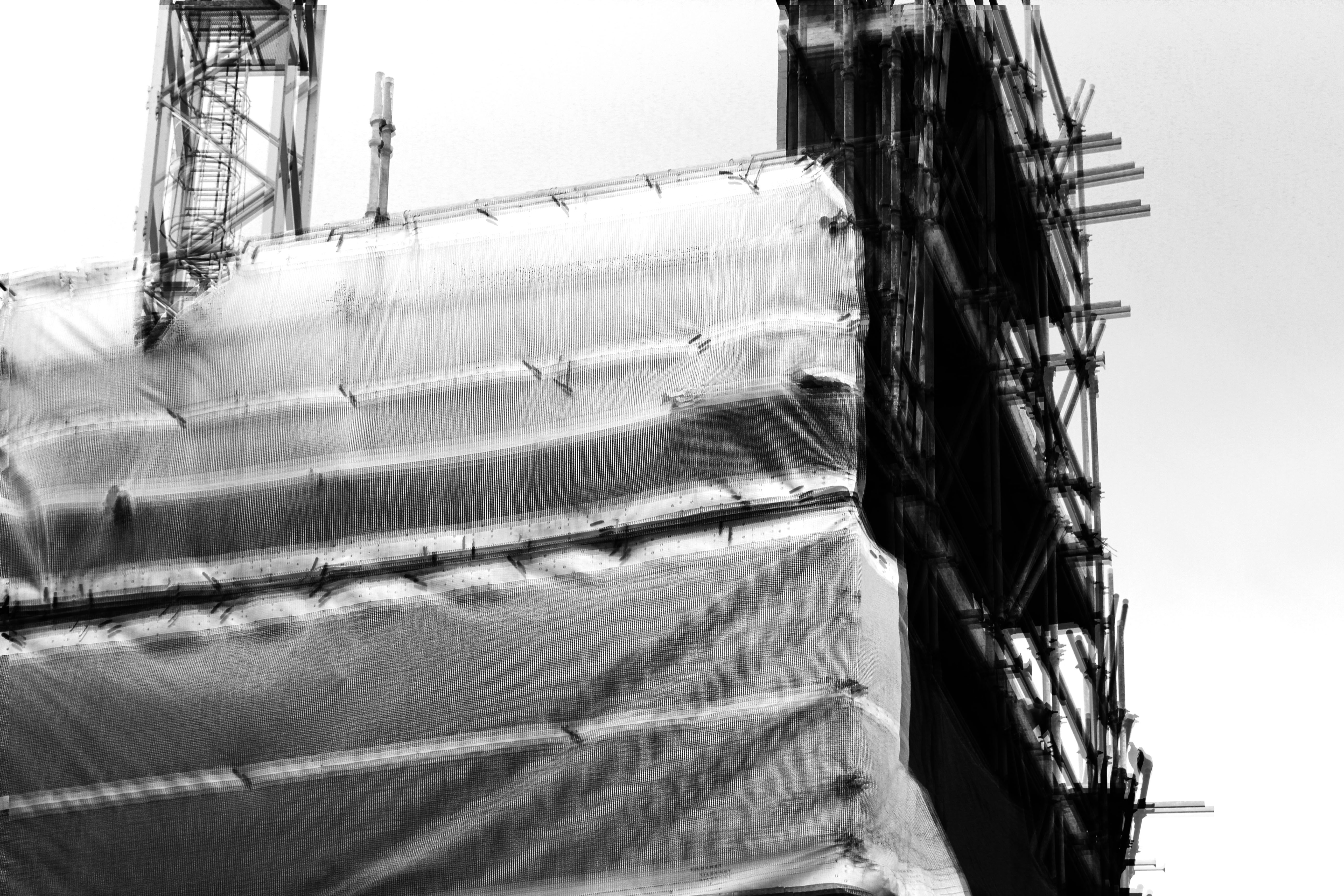
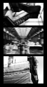
The top and the bottom image are to do with man made structures and contrast each other well but with a clear difference. Furthermore, they both have connotations of secrecy as both images where taken in abandoned areas of London which allows them to have clear links.  The center image was focused more on urban landscape with a sense of secrecy running through it due to  the lack of emotion from the 3 subjects in the front of the image. Therefore, allowing this image to link to the other two images through the conventions of secrecy.

My final piece shows a set of three images of visual evidence of man kinds effect on the landscape and the barriers within which I have been able to shown through layered photography which I have used to create my final piece. This links to one of my artist studies, Lewis Bush. Lewis try to push the boundaries and capture the negative impact they are having.  Lewis uses black and white when taking his photographs which links to my work as I have also taken my final images in black and white therefore, linking our work together. Our work also have clear links through the way we have taken and edited our images which allows a clear comparison to be made between our work.

Secrecy is shown within my final piece due to the derelict and emotionless images which conclude with no reason. However, if looked further into the image, a story is conveyed through the derelict and emotionless images which bring the images to life and allows them to stand out. In addition, the sense of conventions has also been captured through my work due to the editing and manipulation of my final images and how present day photography is presented and made to have a story behind each image.

I think an important feature seen in my final piece is that my images have bee edited in a way that allows them to stand out and are presented in a way that allows them to stand out to the fullest. Furthermore, the balance between black and white creates a strong contrast bringing forth the structures and landscape shown. Through my final pieces I have also been able to show the ever-changing and jarring landscapes that man kind is evolving round and being blocked by these unnecessary boundaries that are effecting  people from accomplishing everyday things.


Presentation methods

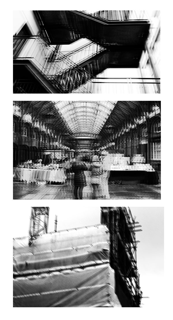
I had a number of different ways I wanted to present my work. I wanted to display my images either horizontally or vertically, like shown below. The reason for this is because I thought it would clearly and neatly display my images in a presentable way that would allow them to stand out. I finally decided on displaying my images vertically as I though that would be the neatest way for this specific set of images to be displayed. As the images where in black and white I then had the decision of displaying them on white or black card. The set of images that I had chosen had a lot of white patches which made me single out the white background as it didn’t really allow them to stand out. However, on black card the images really stood out in comparison. Furthermore, the black background and the images created a strong contrast which contributed to them standing out more. The layout of the images was chosen by the first image which I thought was the strongest image. The image with the people at the front, I thought, was the odd one out in this group of images which is why I placed it in the middle. This decision allowed me to separate the two man made images with some urban landscape. When displaying them I Created  window mounts for the images as I thought this was the strongest way of displaying them and I thought it reflected my final images clearly.

This was my final outcome.


Johnathan Ducruix experimentation

Experimentation

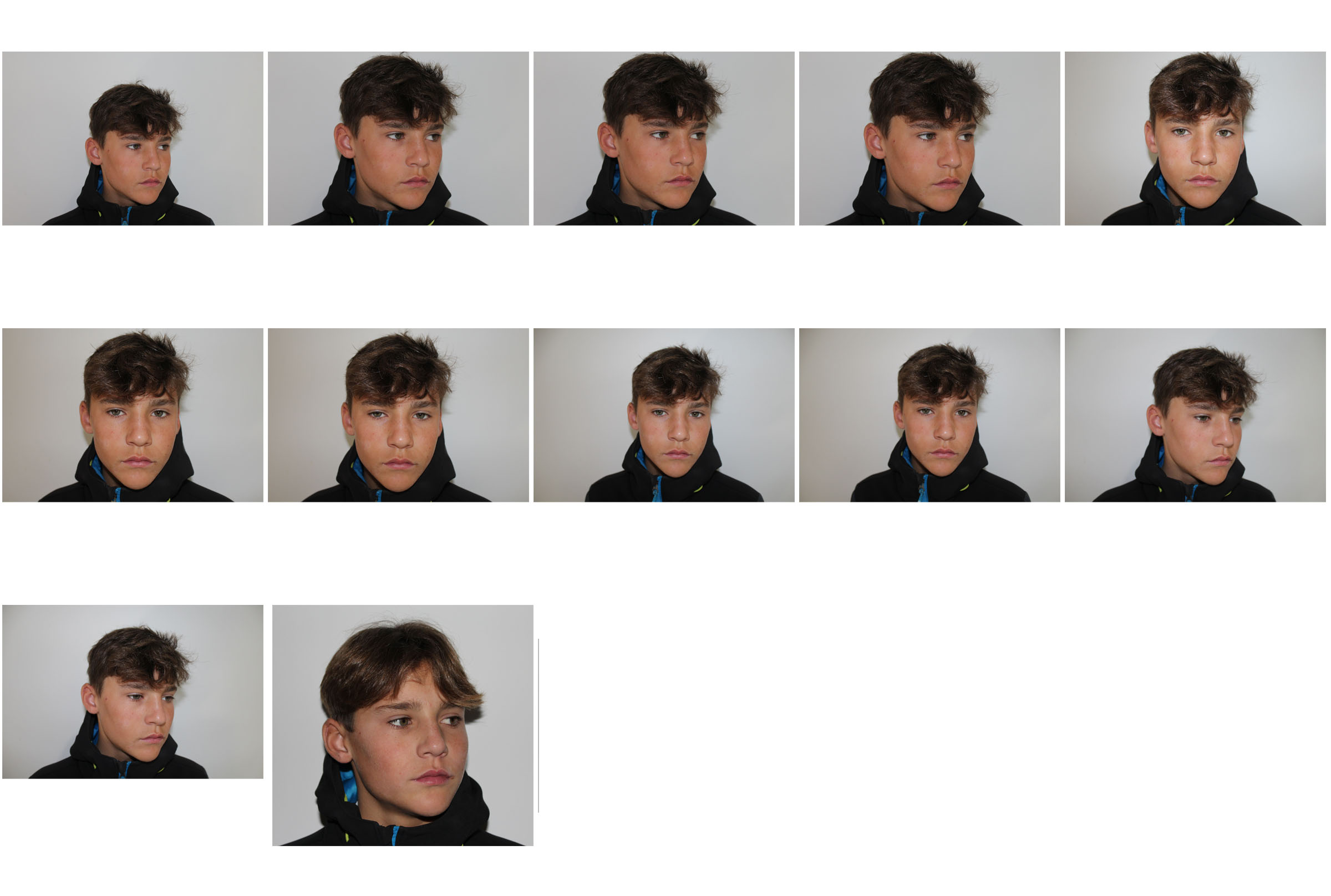
Image I am planning on replicating.

Contact sheet

My interpretations

Further Experimentation / Black and white


Creating an image in the style of Johnathan Ducruix

Original image

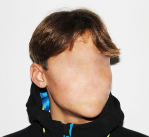
To begin with, I cropped the image as the chosen image had too much unnecessary background space.

Once cropped, I used the healing tool to remove the facial features.

Once I was happy with the image I then moved on to changing the brightness and contrast and then converting it into black and white for further experimentation.

Final image – Colour

Further Experimentation final image – Black and White