How do people react, control and effect the environment by creating man-made structures that cause a sense of isolation?
Mark Power, Magnum Photos, When walls talk
Walls speak, walls silence. For a photographer, walls are barriers; to people, to places, to light. But they also form backdrops. Walls are theatrical. Walls perform, often loudly, even though they are motionless, even though they divide, demark, and contain.
I am focusing on how people react and respond to how man-made subjects in the sense of walls are affecting the environment and how they are creating a feeling of isolation throughout society. I have and will be analysing two different artists; Bruce Davidson and Alex Webb. These two artists have very different approaches, however the idea and concept behind their images are the same. Their ideas behind each photograph perfectly represent the subject that I am studying, and I felt that when responding to their images I was able to use them as a source of inspiration when taking my own images. Furthermore, Alex Webb also challenged the theory throughout his Haiti collection which I thought created a strong juxtaposition between the two artists which I felt had a strong impact on my project.
Street photographyis photography conducted for art which captures encounters at random incidents within public places. Street photography does not require the presence of a street or even the urban environment. Though people usually feature directly, street photography might be absent of people and can be of an object or environment where the image projects a definite human character in an aesthetic way.There are many cross-overs within photography. The clearest distinction between the two forms is that within documentary photography the topic or theme determines the setting, whereas in street photography the setting is more or so the subject. Documentary photography was first introduced around the 1980s/ 1990s and is an extension of realism and often related to photojournalism. Realism is a 19th-century art movement, particularly strong in France that resistedagainst traditional historical and religious subjects and instead depicted scenes from life. Theuseof Realism within photography abled photographs to create images of the everyday world.Pictorialism is an approach to photography that emphasizes beauty of subject matter and composition rather than the documentation of reality.Pictorialist’s images are often heavily romanticized depictions of what the photographer is actually seeing, the result is sometimes what people would consider to have a sense of utopia. Pictorialist’s main priority was making images about feelings which they used multiple techniques they know how to use to alter the images in a way that creates the escapism affect.
Within Bruce Davidsons work, in particular his Subway shoot it is clear that there is one consistent theme throughout, and it is evident what the theme is. His shoot consists of photos in the New York subway of different groups of people commuting via the subway. Bruce Davidson is best known for his subway photographs; his images are of everyday subjects within a very popular form of transport in New York. His images have distinct viewpoints focusing on different people using the underground which makes each image so different whilst still being in the same location. This urban, portrait image in particular is of a family on a dull graffitied tube in New York. The graffitied, dull subway creates different moods within each photograph as even though they are in the same location each photograph is very different in itself. The graffiti within each image allows for different colours to be produced which contributes to the consistency of lighting and colours throughout the whole image. The main view points within each image are highlighted as the light is usually stronger on each subject making it more obvious what Bruce is trying to focus on. The theme throughout his shoot is focusing on the surroundings including the walls and graffiti around them. By focusing on these aspects, it is clear how these man-made products have an effect on people whilst doing everyday things. I feel that Bruce’s photographs in relation to my essay question have clear connotations and have links throughout as he is clearly showing how people are reacting, controlling and effecting the environment from creating certain structures that create a sense of isolation. The dull, man-made lighting within this photograph creates a somewhat eerie atmosphere on the tube as the dull lights on the tube create a green tint to the image.

USA. New York City. 1980. Subway.
The two adults fit into the rule of thirds making them the main view point of the image creating more of story to the characters themselves. This image is underexposed due to the image being very dark which links to the point about the dull lighting as this effect creates an eerie mood to the image. The colours within the image contrasted with the dim lighting allows for the subjects to stand out from the dull, graffitied background. This image looks to be quite grainy suggesting that it could be taken on a film camera rather than a digital camera, as this picture was taken in the 1980s it is more evident that this image could be taken on film. The fact that the subjects within this image are evenly spaced out with the child in the middle allows for three different viewing points when looking at this image. However, the photograph is not even and consist of a slight slant within the image. I feel this doesn’t work so well as when looking closer into the image everything in the picture from the signs in the background to the seat they are sitting on becomes uneasy on the eye as the image is not symmetrical. This photograph has a mysterious feel to it due the normal looking family on the misleading looking tube as this family look like tourists who could be on a tube in the wrong area. Bruce Davidson’s work has a very humanist approach which from looking at many of his images have connotations towards the photographer Henri Cartier Bresson in the sense that they are very heavily focused on human activity and emotions.
Alex Webb’s work consists highly of coloured documentary photography in foreign countries such a Haiti in particular. His shoots consist heavily of people in third world countries documenting their living conditions and life. Each image from his shoot consist of vibrant bright colours with numerus viewpoints throughout. This documentary style photograph in particular is of a group of people who are wondering round their village observing Alex Webb photographing them.
HAITI. Cite Soleil. 1986 – Under a Grudging Sun.
The sharp natural lighting within the image enhances the bright colours on the wall allowing for the wall to stand out and create a strong viewpoint to focus on.The viewer is automatically directed towards the wall due to the bold colours. However, when looking at it closer the image opens up and directs you to a mixture of personalities from the suspicious man on the left to the smiling girl running out the frame. These different personalities create a strong contrast towards each other as well as creating more of a story behind the image. The broken wall symbolizes freedom as they are able to pass through without being stopped by the wall. This naturalistic photograph clearly represents these people’s everyday lives just from capturing where they live in this rundown looking town. Formal elements play a large part in the image due to the repetition of colours and shapes that are seen throughout. This picture is different from real life because not everyone lives like this and the way Alex Webb has captured this image allows us to have more of an insight into the way these people live. Webb has done this to show the viewer what is actually happening and how it can be compared to our lives in such a dramatic way.
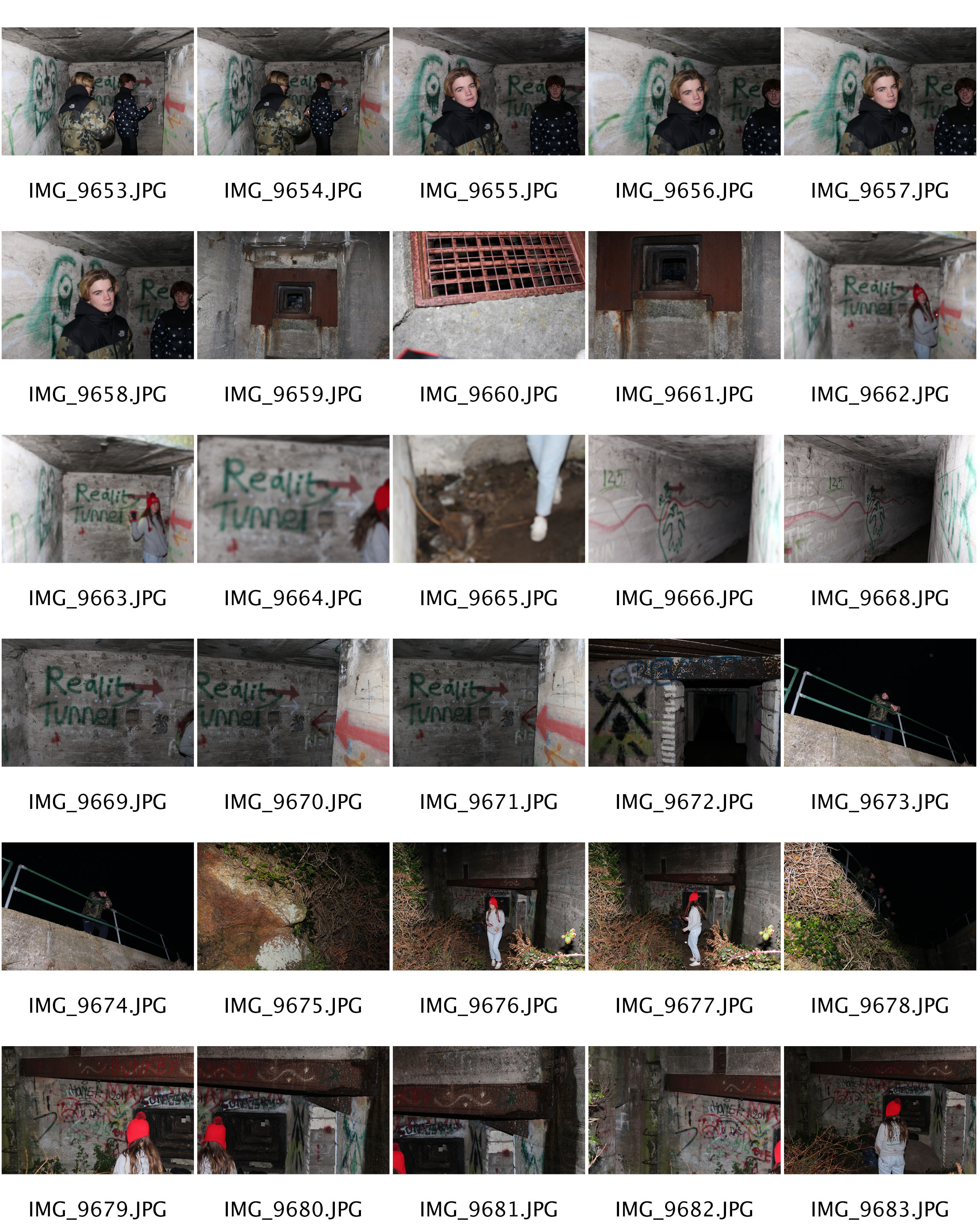
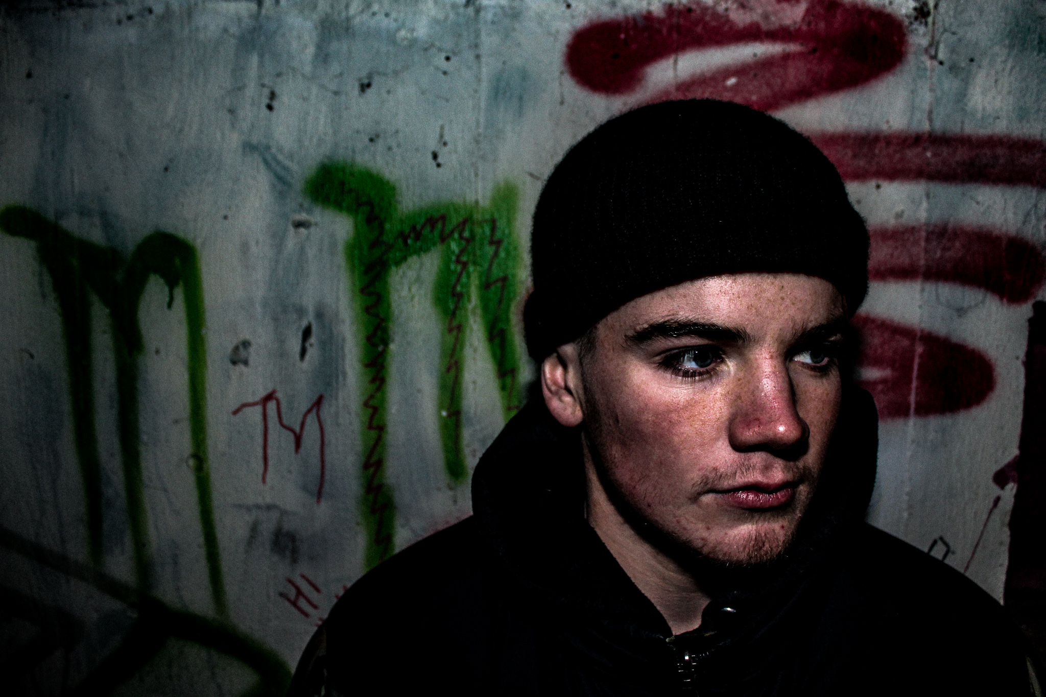
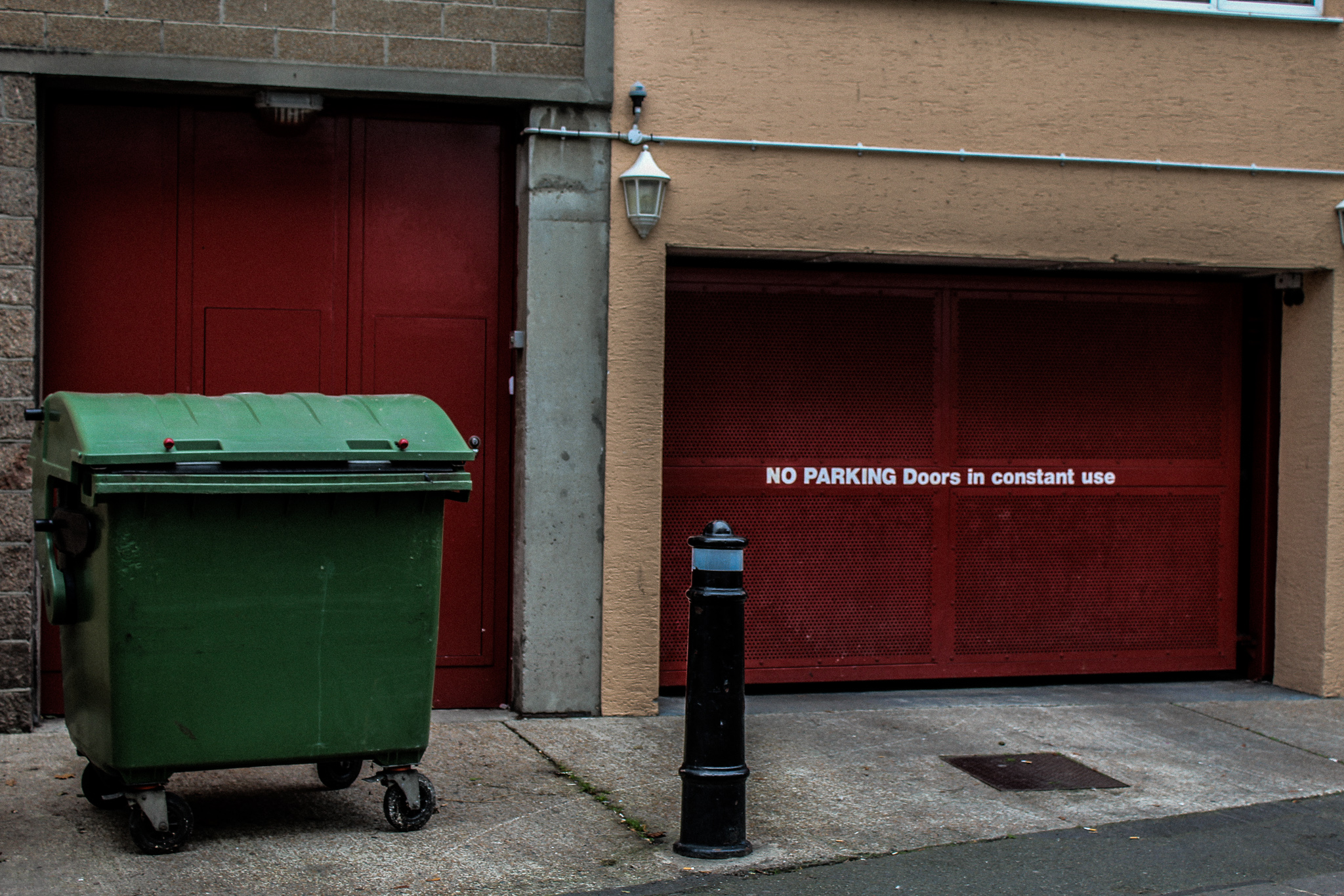
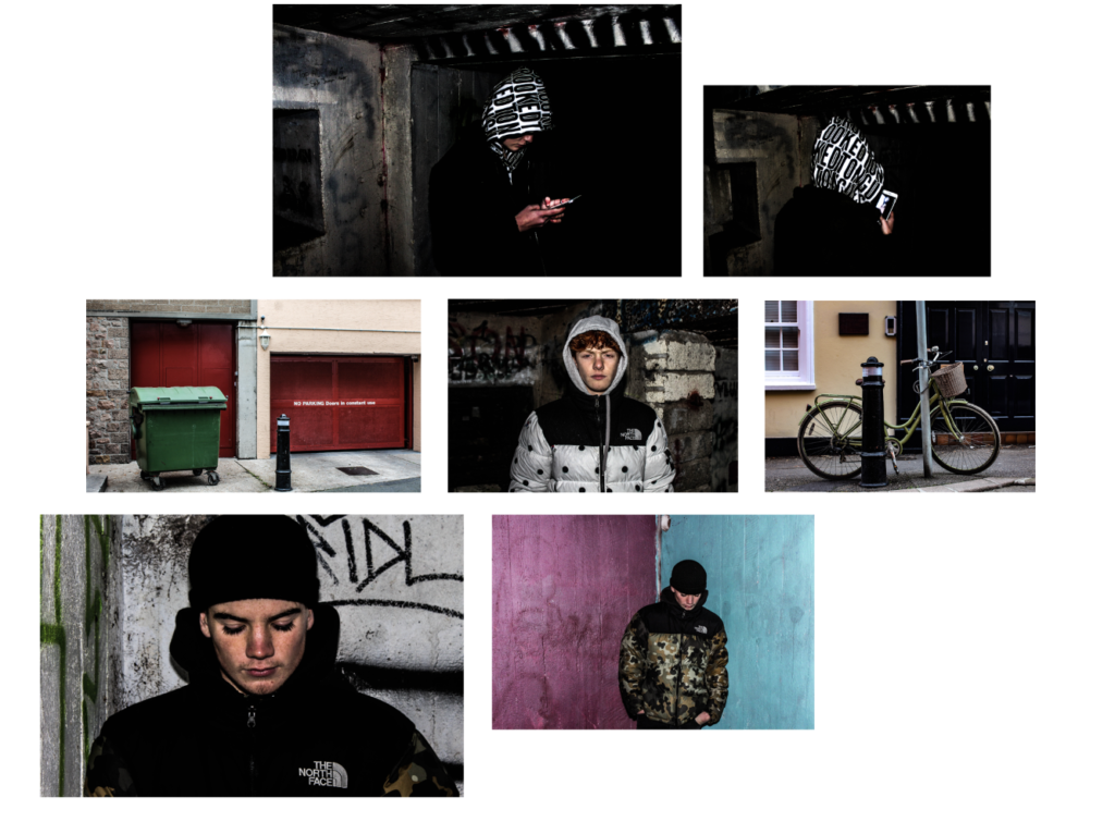
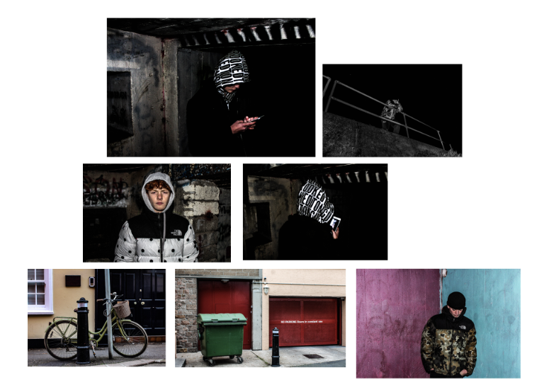
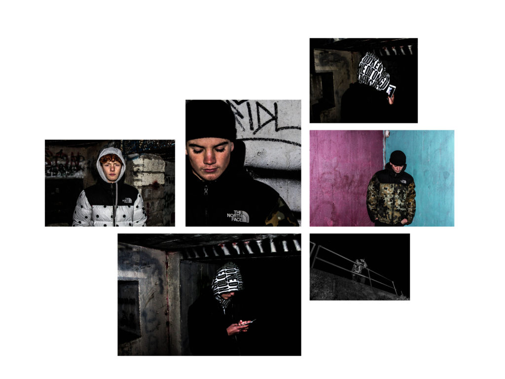
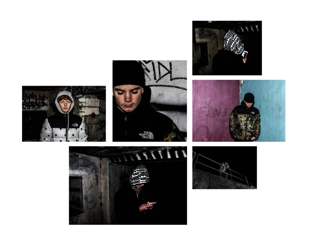
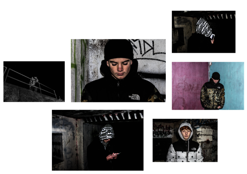
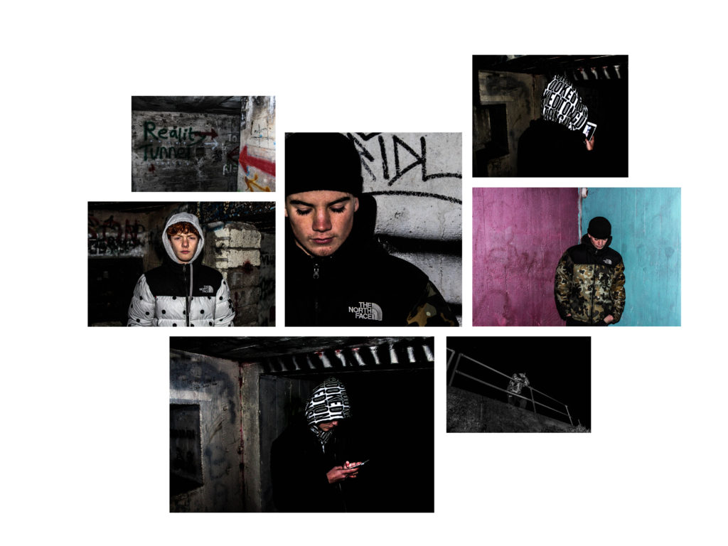
Overall from researching and learning about Alex Webb and Bruce Davidson I have seen the parallels and differences in their work. The point of my project was to discover the effect man made structures had on the people around them and whether it creates a sense of isolation. The areas that I focused on were either built up areas or areas that no one uses other than to produce graffiti art. I visited a bunker in St Ouens bay which was covered in graffiti and very run down which I found had similarities to Bruce Davidsons work in particular his Subway shoot. This bunker was one that was open to the public however nothing had been done to it other than being graffitied. I found this location was a strong place to capture portraiture photographs as id be able to capture the area in a creative way as well capturing the subject in the photo reacting to the location. Furthermore, I also focused on Man-made structures as a whole without focusing on a particular subject as I wanted to fully focus on the area around me that I was focusing on in St Helier. This allowed me to capture structures is a way that enabled me to respond to Alex Webb’s work. I visited run-down, High gated, secured areas that portrayed an idea of isolation which I found had the same connotations as Alex Webb’s, which I found created a strong contrast with my portraiture images and found was very affective when put together. The book will collate a variety of mediums and types of photographs to help build up a story and narrative for the book.The images that I have chosen to include in my book I believe reflect my chosen theme the strongest and in a way that clearly tells an interesting story. Because of this, it enables me to produce a book that opens the viewers mind to how people react to man-made structures around them and how they can control but also how they can be affected by them.
Bibliography:
https://www.magnumphotos.com/theory-and-practice/when-walls-talk/
http://www.streetviewphotography.net/b-spvsdp/


 Emily was born in Jersey in 1974 and was educated at Jersey Collage for Girls and later trained as a sculptor and earned a first in Fine Art. Throughout, the degree she used photograph as a source of material. She has since established an international reputation for her complex and intricate photographic compositions. I recently visited an exhibition which presented some of Emily Alchurch’s work which impressively showed off her master pieces.
 Original image which was used as a source of inspiration – Tower of Babel
W.jpg) Tower of Babel 2.0
Tower of Babel 2.0