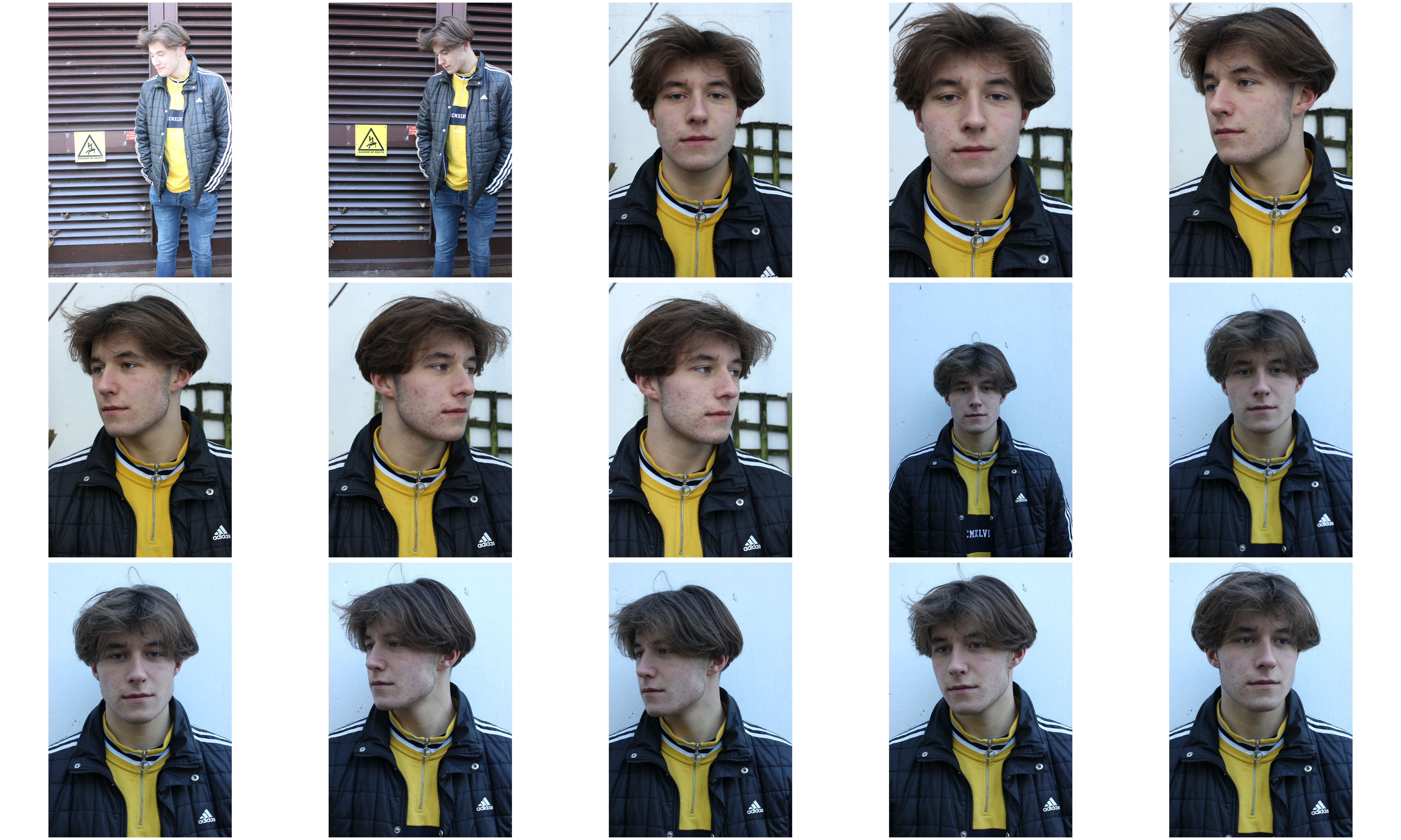
All posts by Nicholas G

Filters

Author:
Category:

My Edits | Constructed Portraits

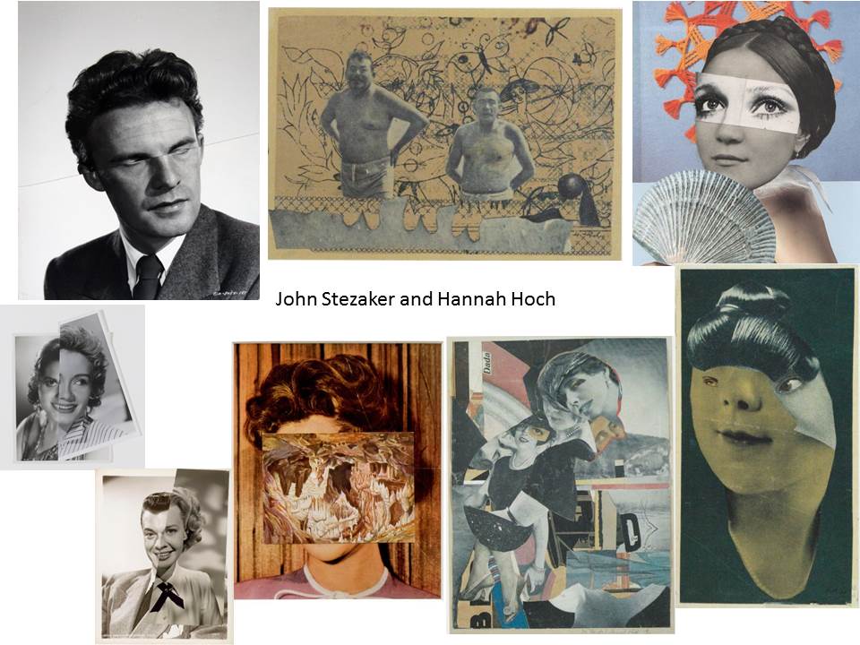
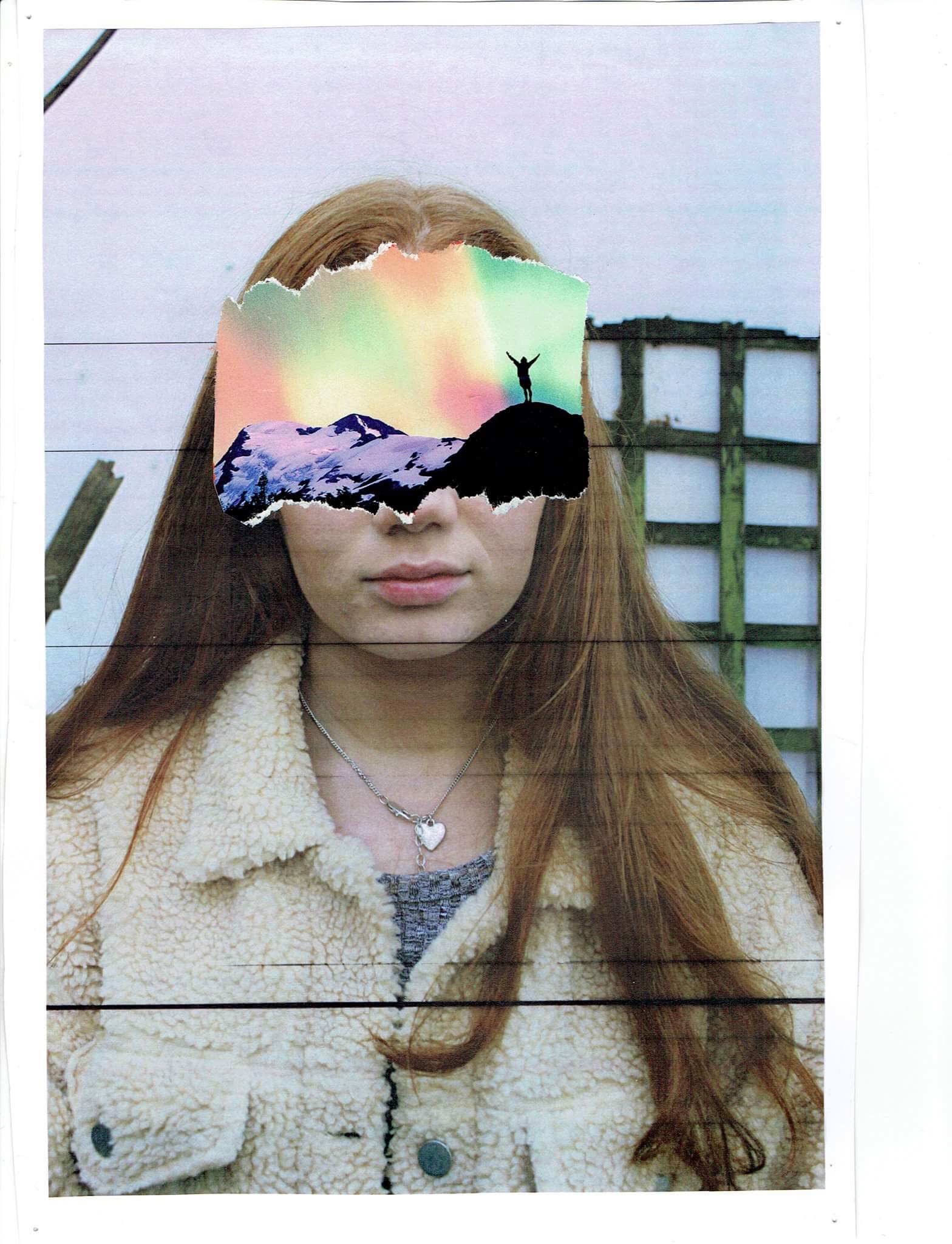
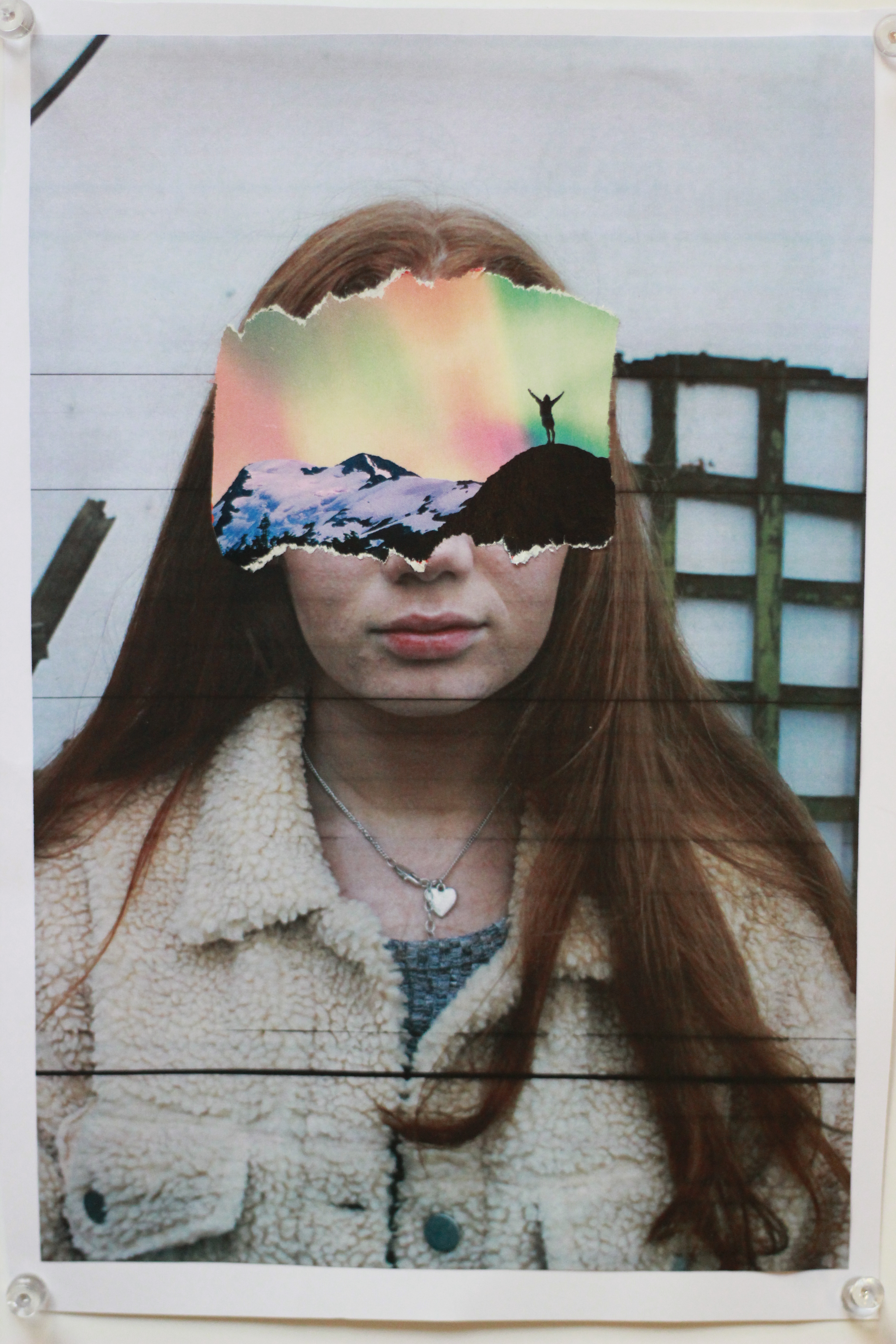
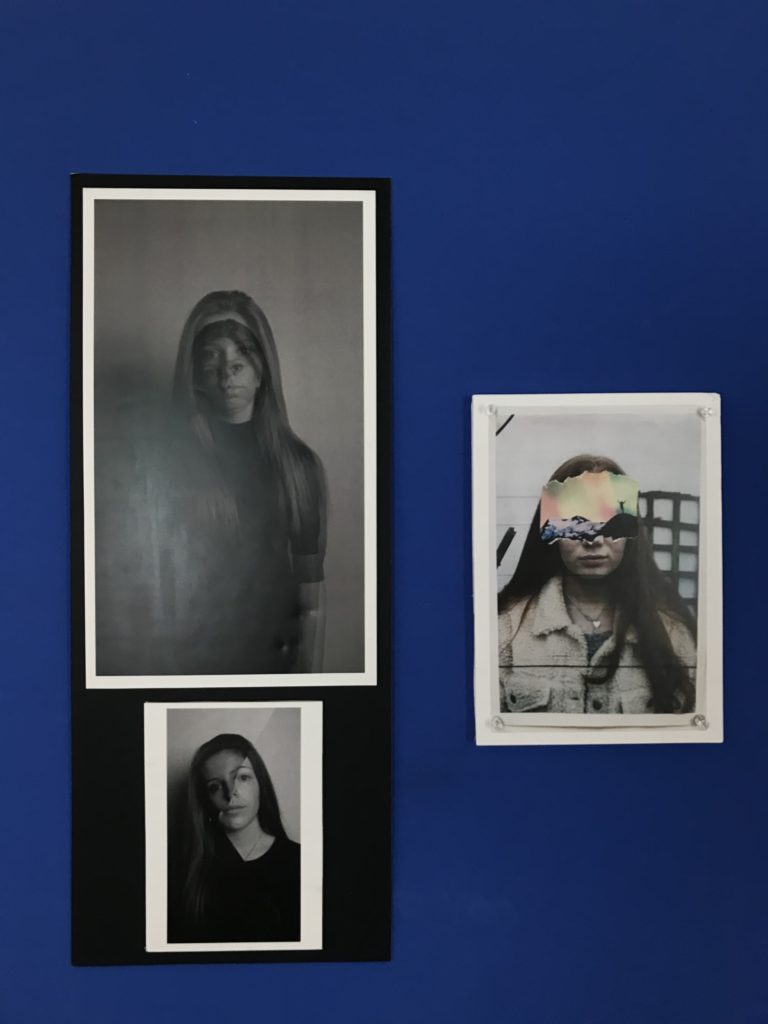
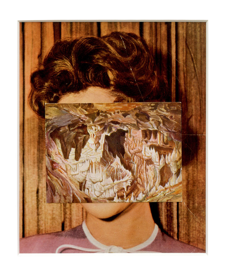
To make this image, I cut out a landscape image from a magazine and covered my subjects face, like John Stezaker’s work.

The pins in the orignal copy (which I took a photo of) added depth so I chose that version of the image over the scanned version. I knew that when presenting this image I could then add actual pins to further the effect.

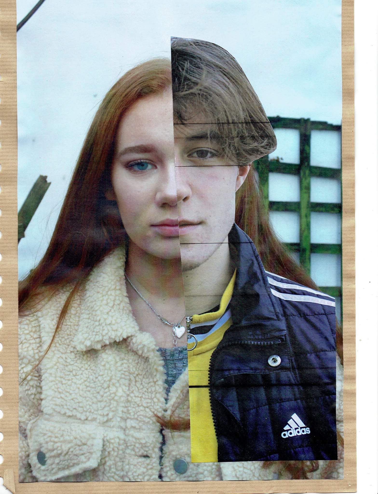
Like Stezaker’s work, I took two of my images and aligned them with eachother to present the differences and similarities in the two facial structures.

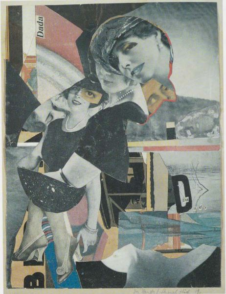
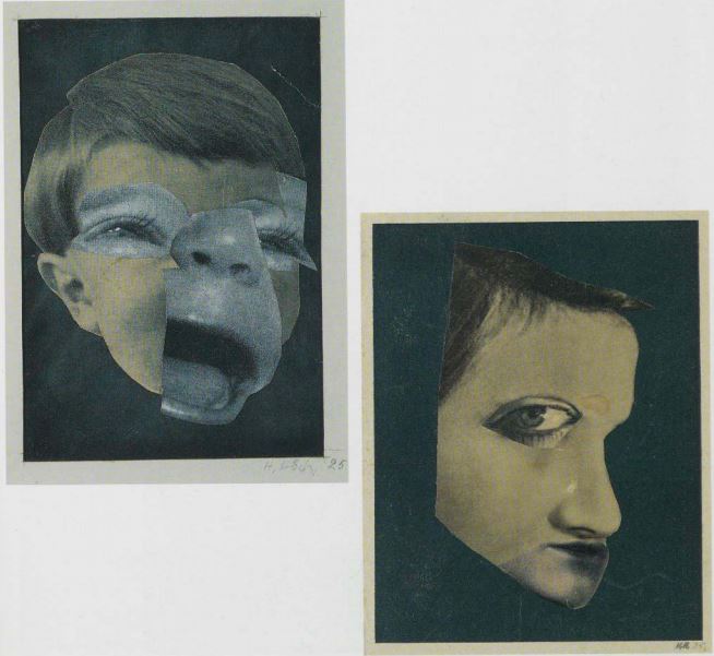
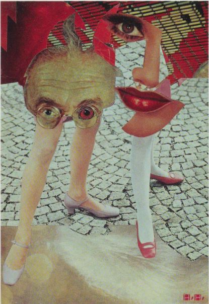
For the above two images, I looked at Hannah Hoch’s photomontage work and took images from online media and magazines of feminine and masculine looking things. I combined these with my own images which I had printed and cut out to collage.
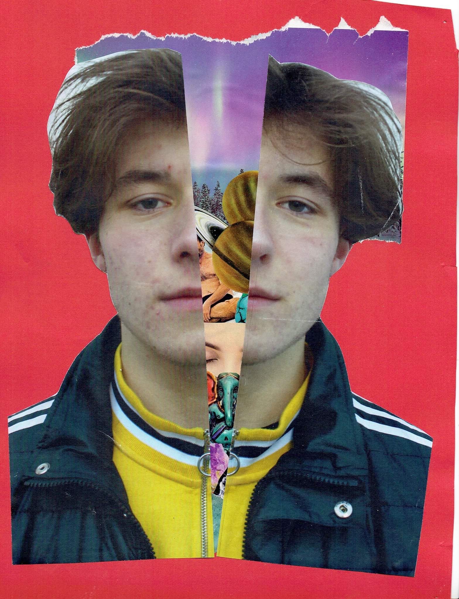
For this image, I used any leftover cut outs that I did not use. I cut out my portrait image and placed the cutouts underneith so as to imply what is going on inside his head.
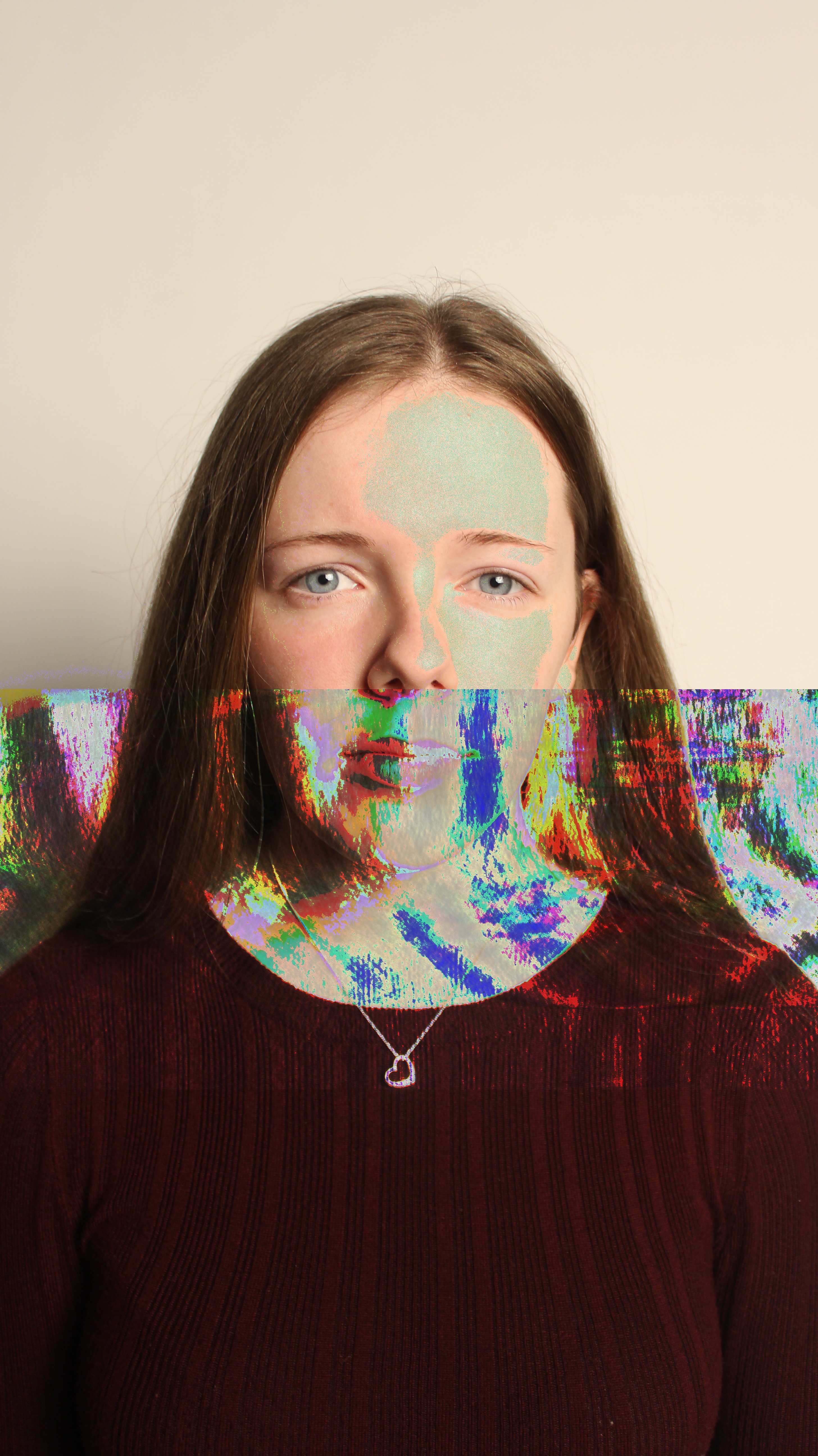
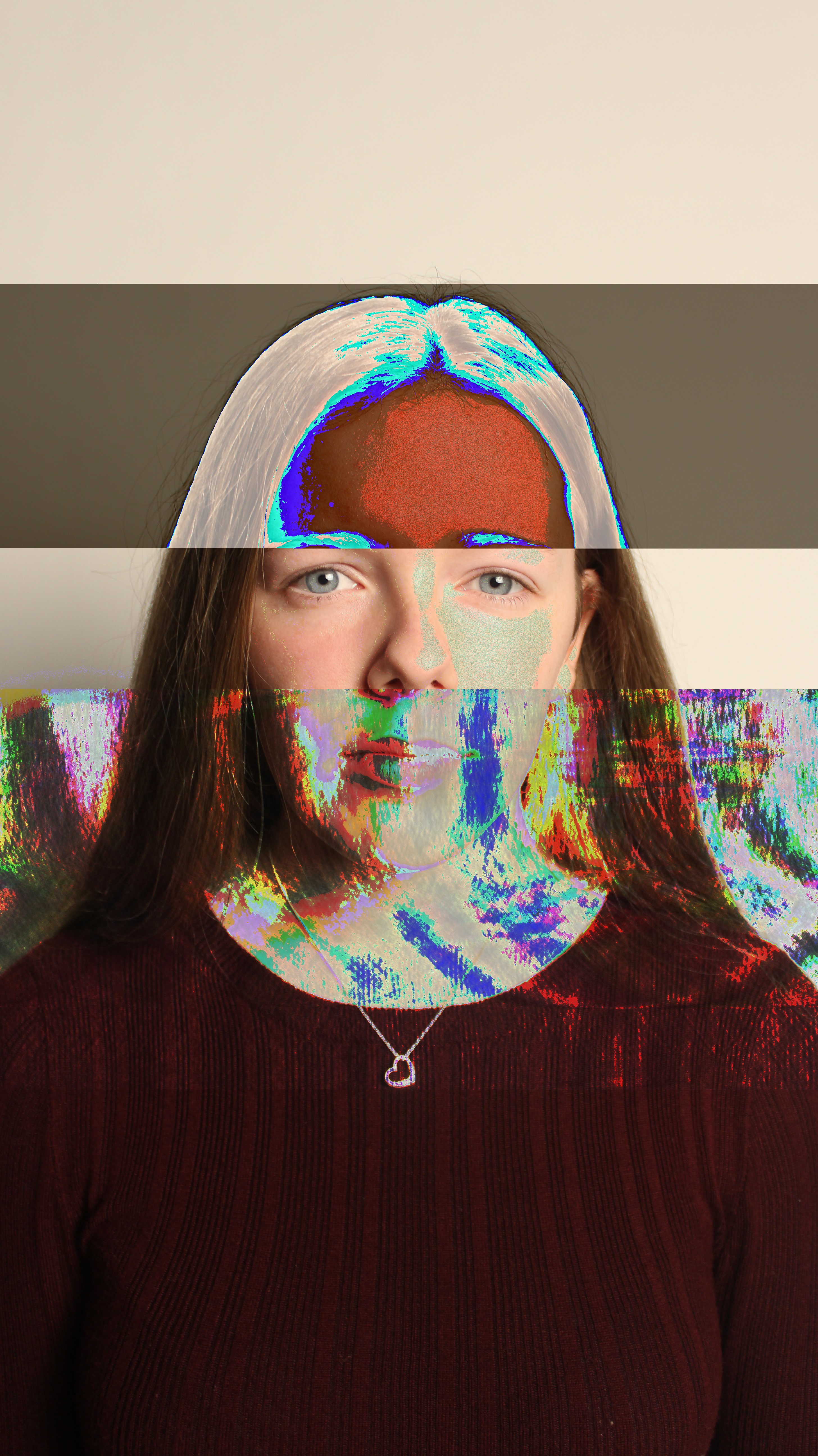
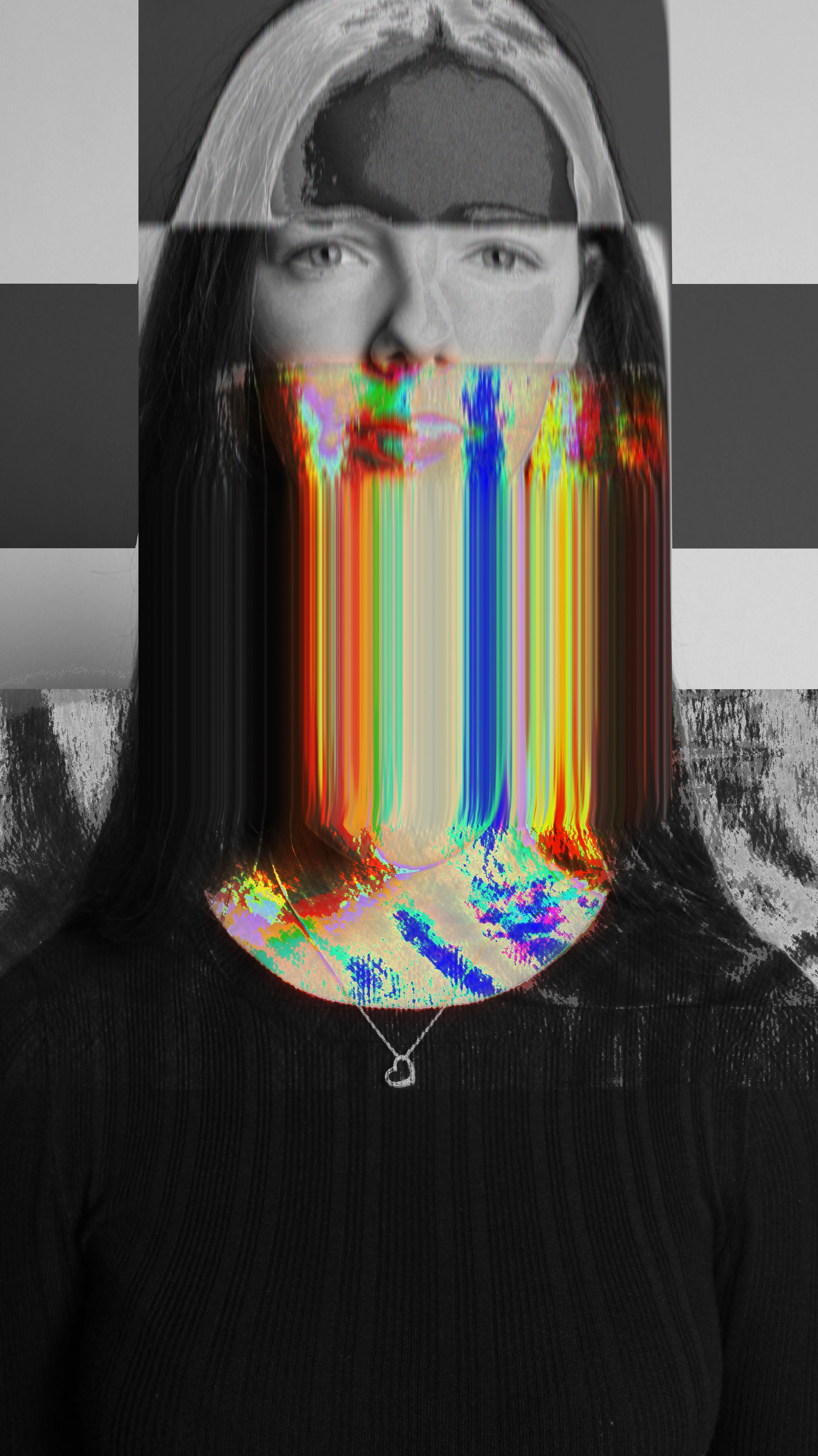
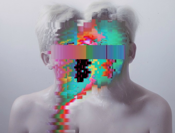
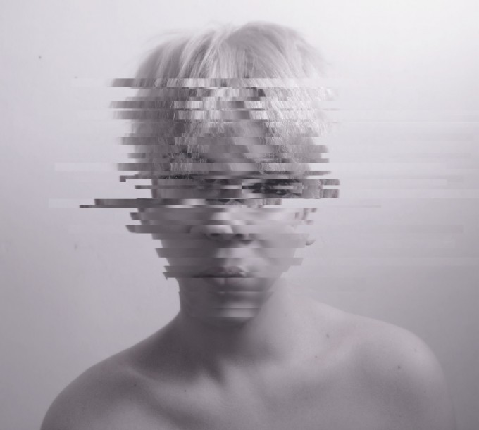
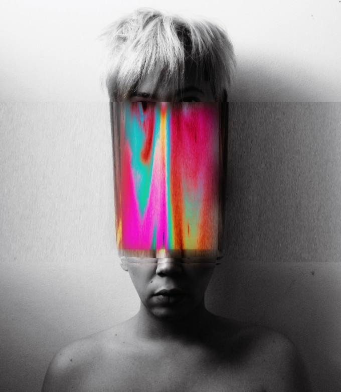
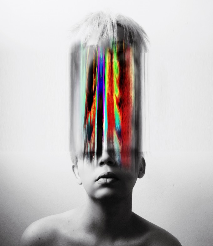
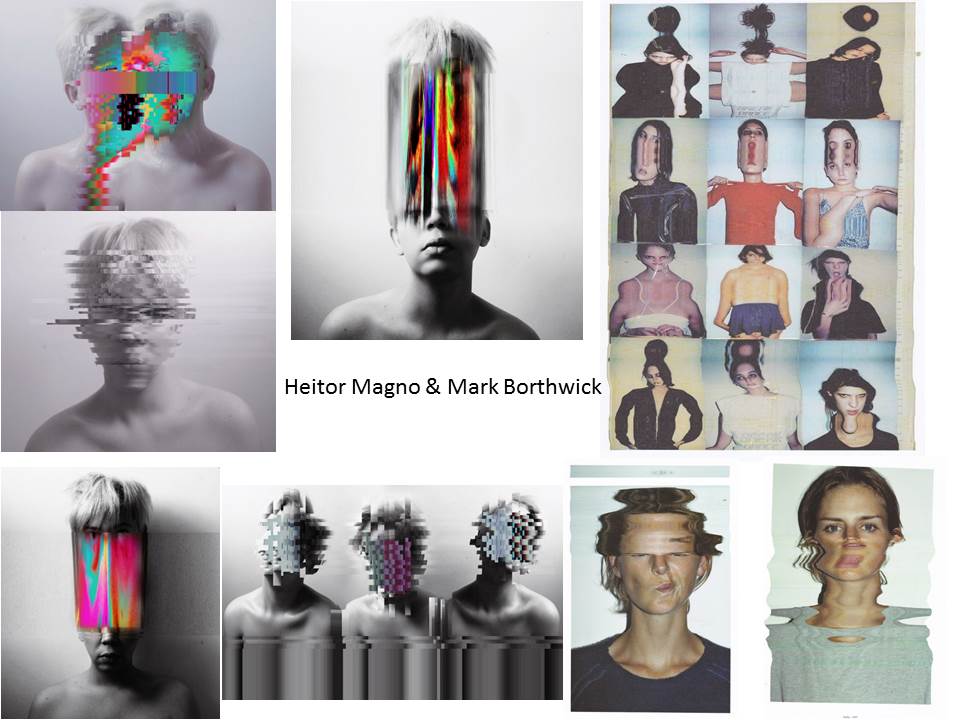
To make my glitch images like Heitor Magno’s, I converted my image files into audio files. Once I had done this, I added effects to the audio file such as amplitude. After doing this, I converted the audio file back to an image and I came out with the outcomes above.

http://datamoshing.com/2016/06/15/how-to-glitch-images-using-audio-editing-software/
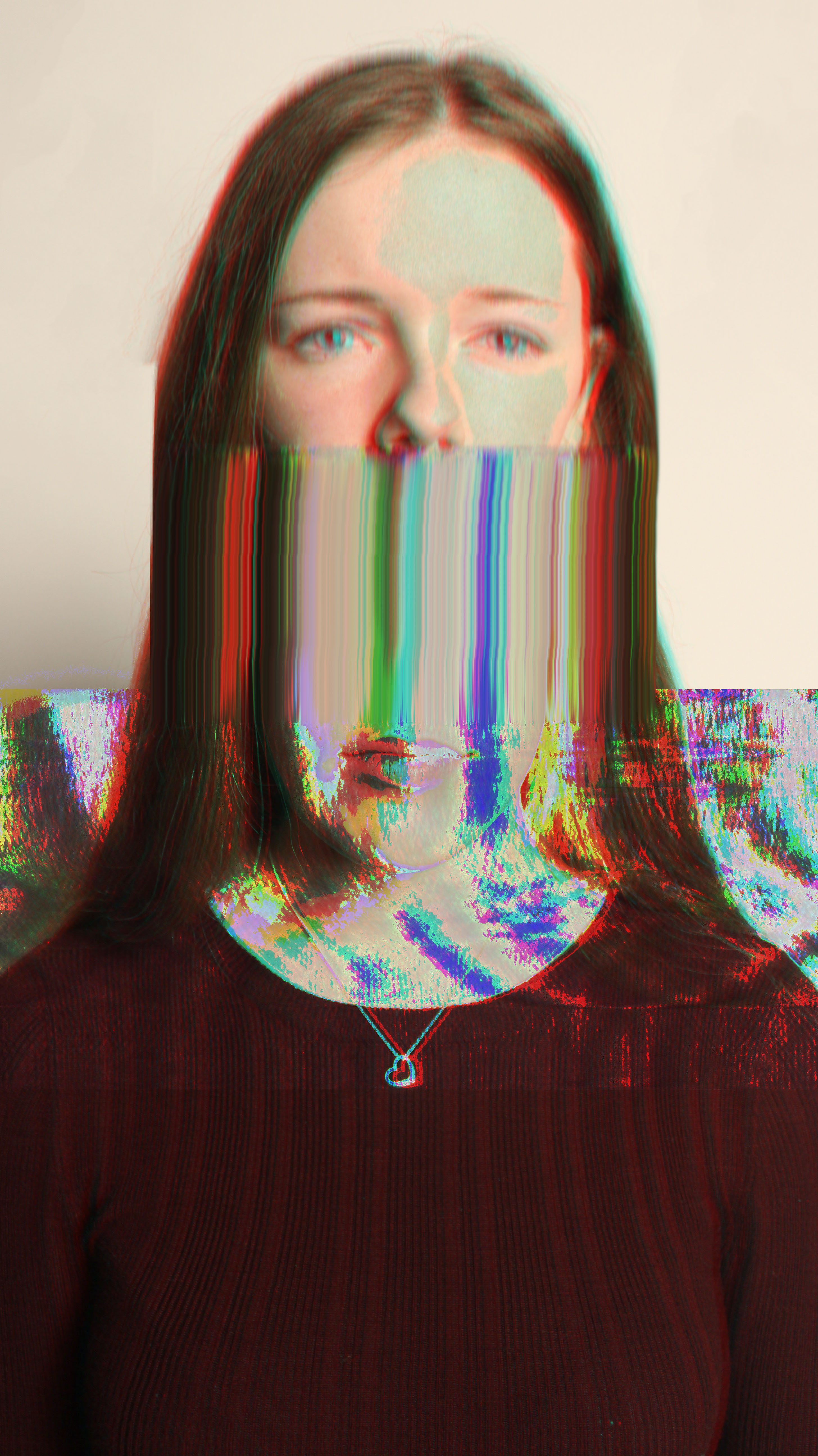
I took my already glitched images, and created another layer of the same image over it. I moved the top layer slightly and changed the channel to red to give the whole image a 3D looking effect. Next, I used the smudge tool over the head to drag out the colours in the glitch.
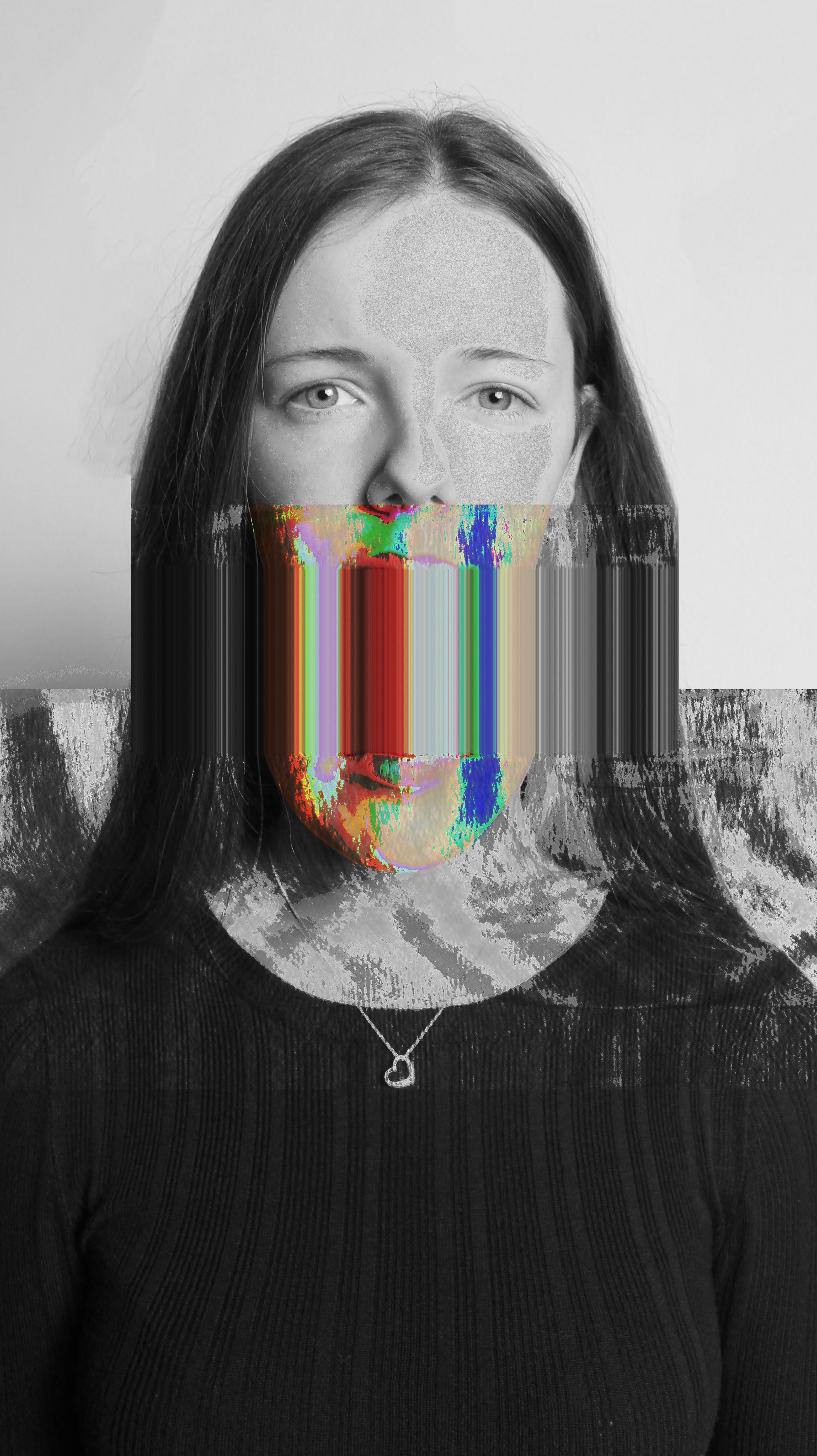
For the above image, I did not add the 3D effect as I thought it made the image hard to look at. However, I did create two layers of the image, where I made the top layer black and white and rubbed out the bits where there was colour. This gave my image an outcome that was more similar to Heitor Magno’s.

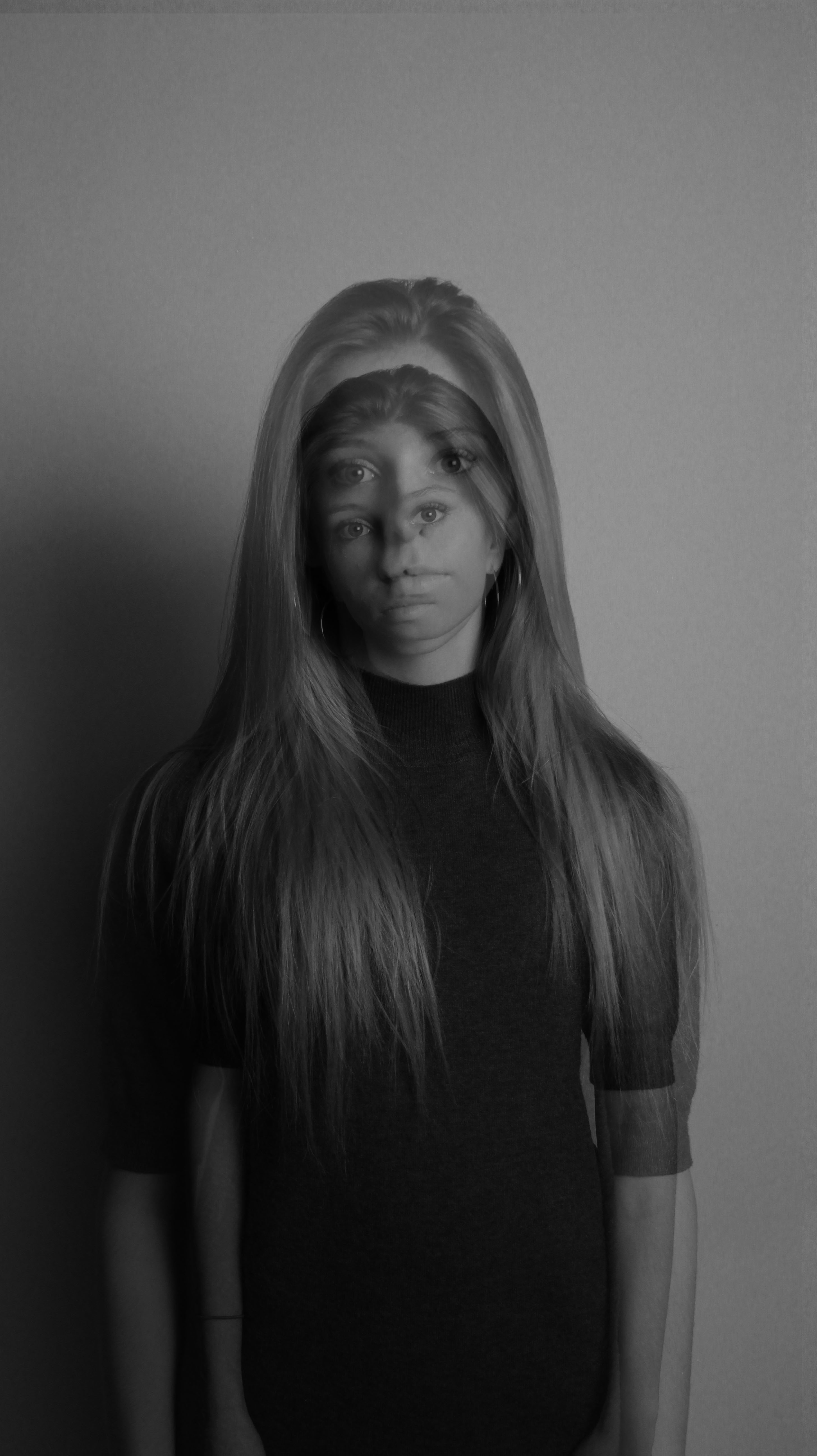
  

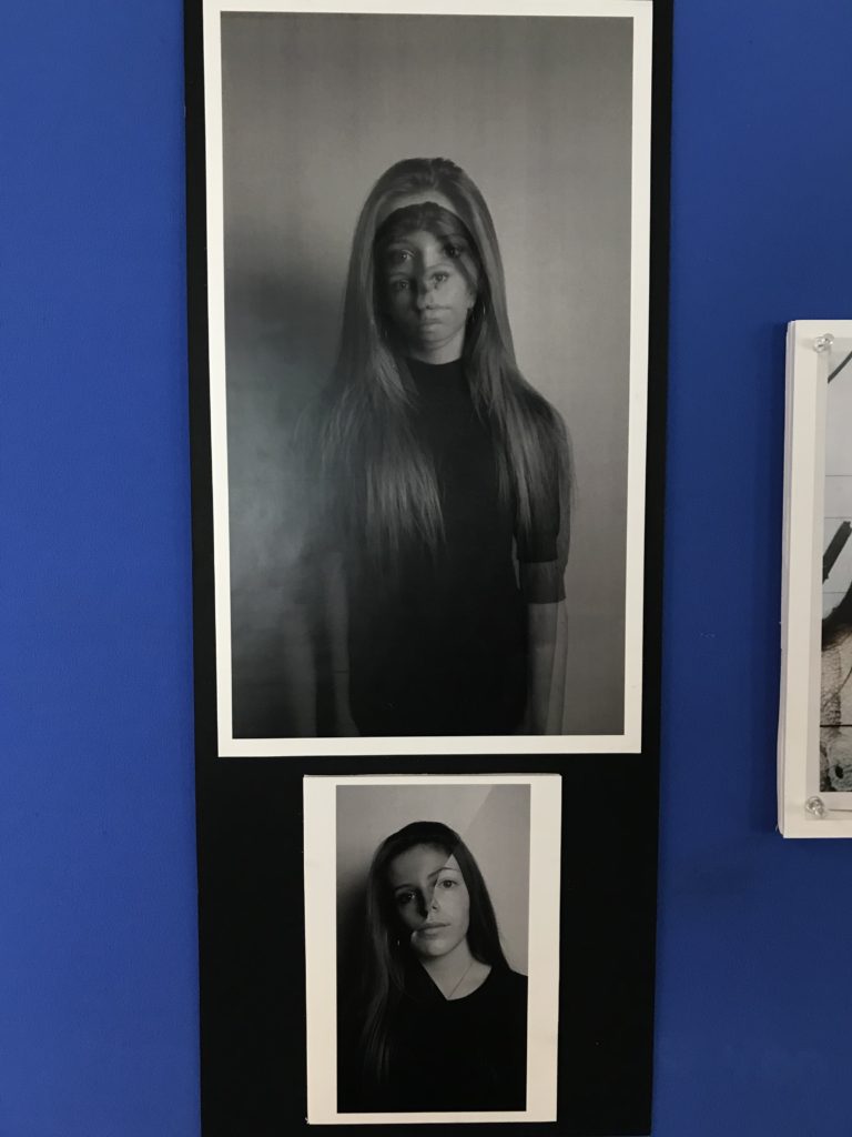
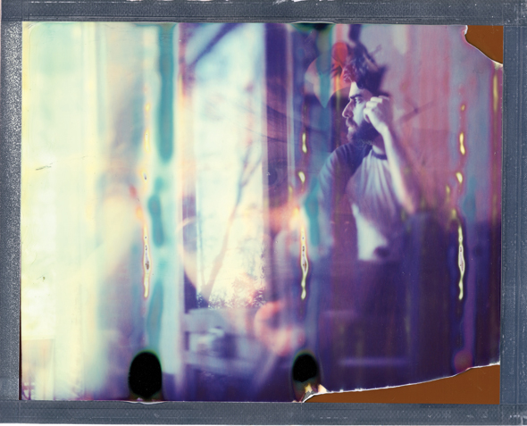
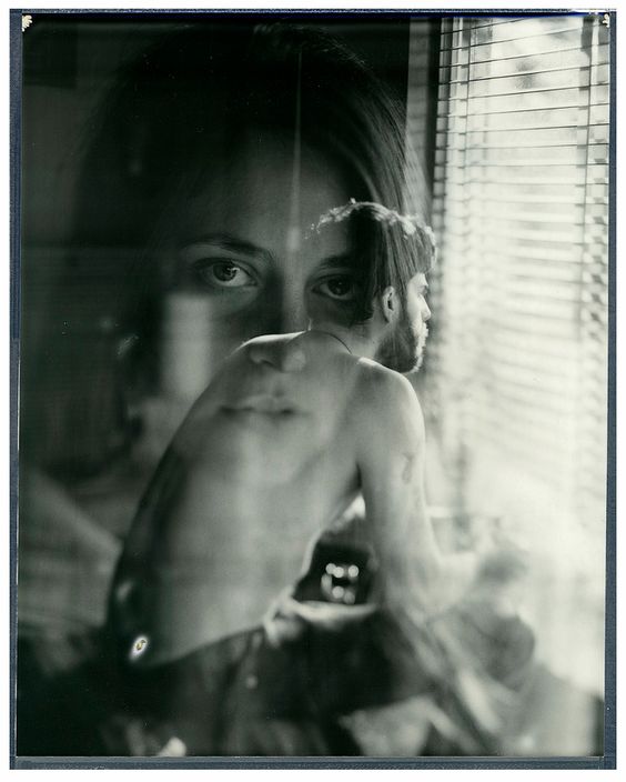
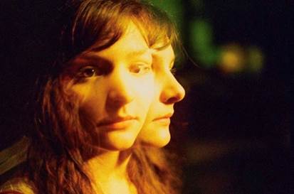
To recreate Adam Goldberg’s work, I took two similar images but with slightly different perspectives and placed one over the other, adjusting the opacity so that I could see both parts of the image. I converted the overall image to black and white and increased contrast to make the double exposure effect more dramatic.
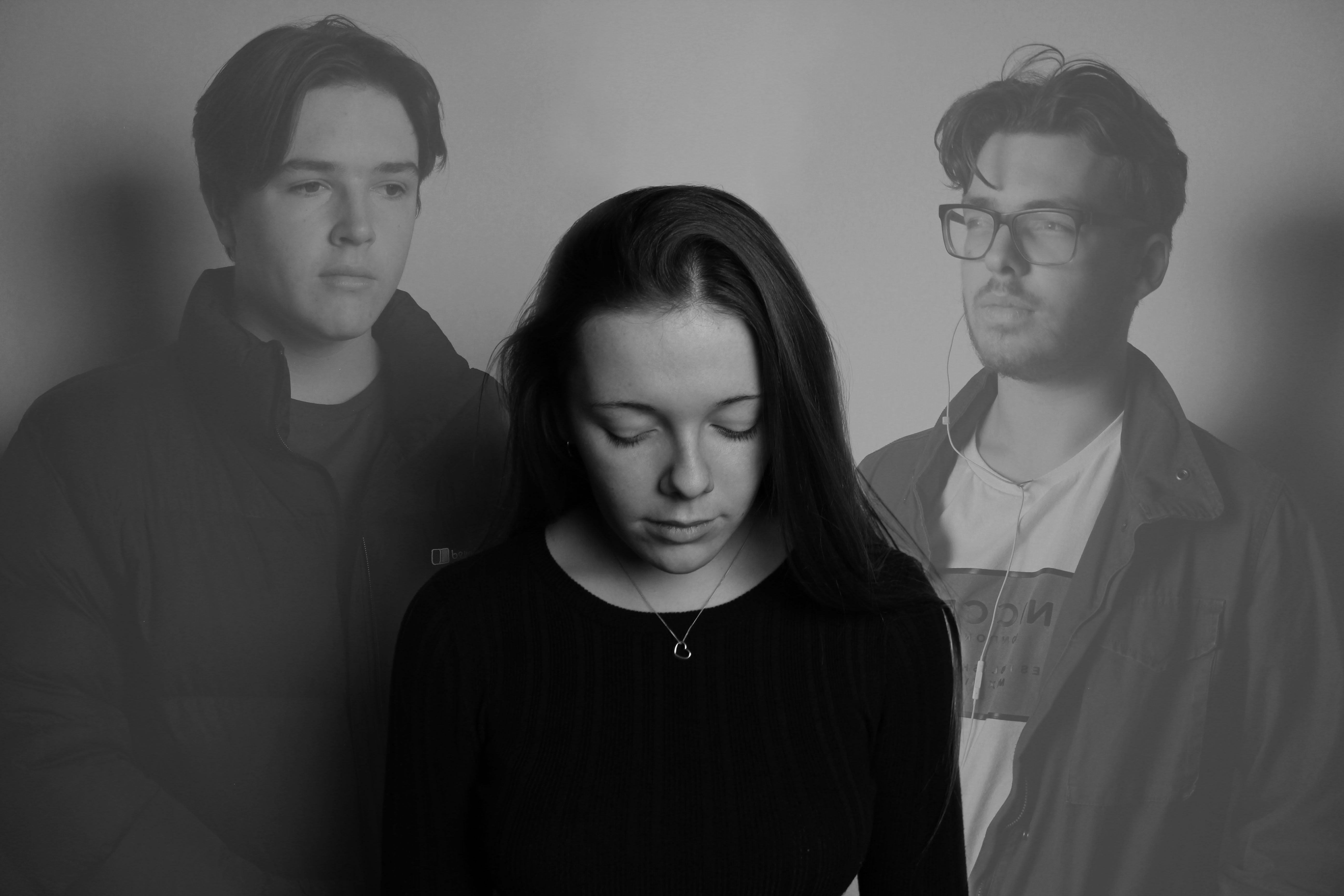
I added multiple photos but adjusted the opacity’s so that the person in the middle was the main focus. I liked this idea as it left it up to the viewer to figure out the story behind the image.
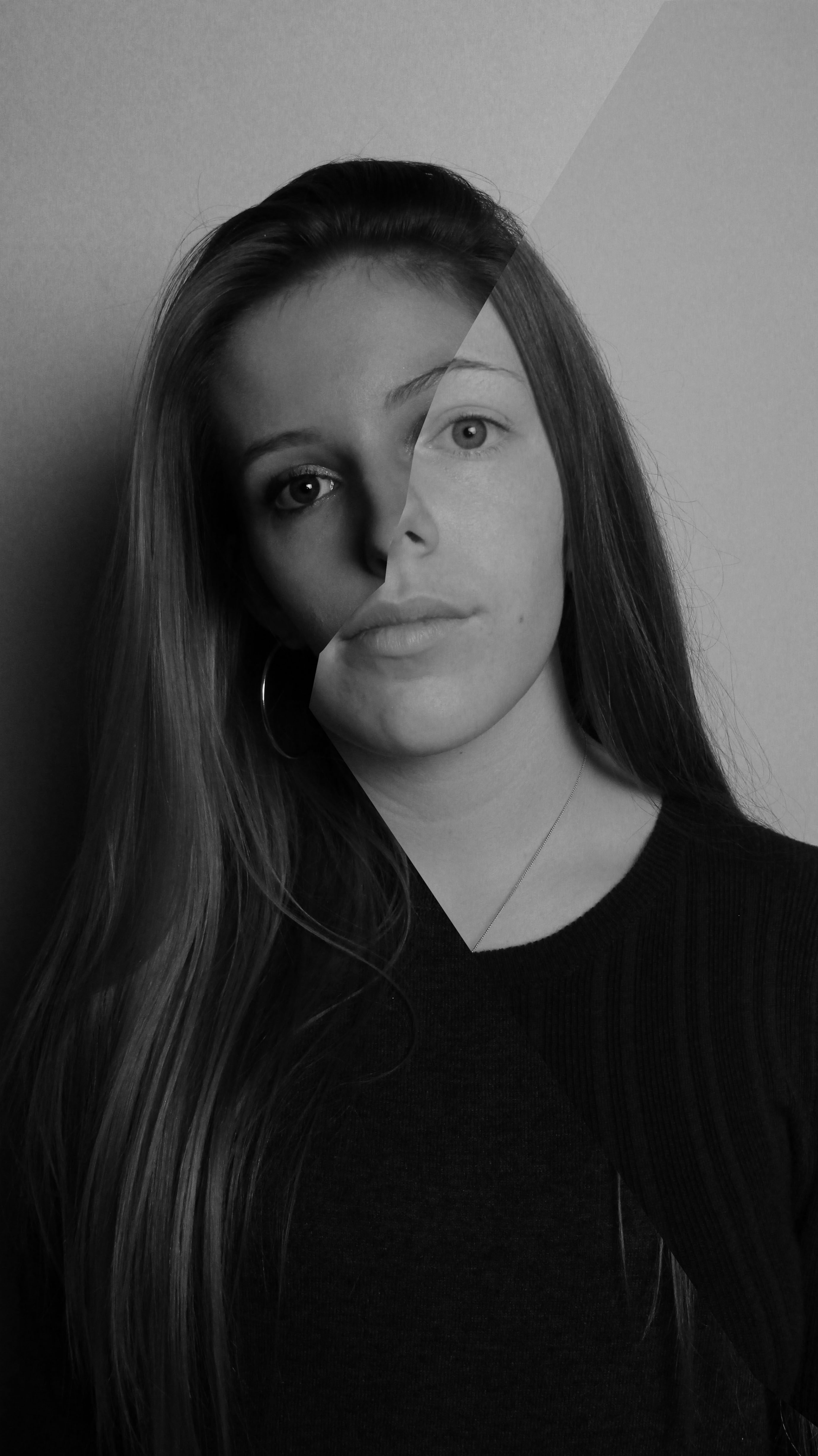
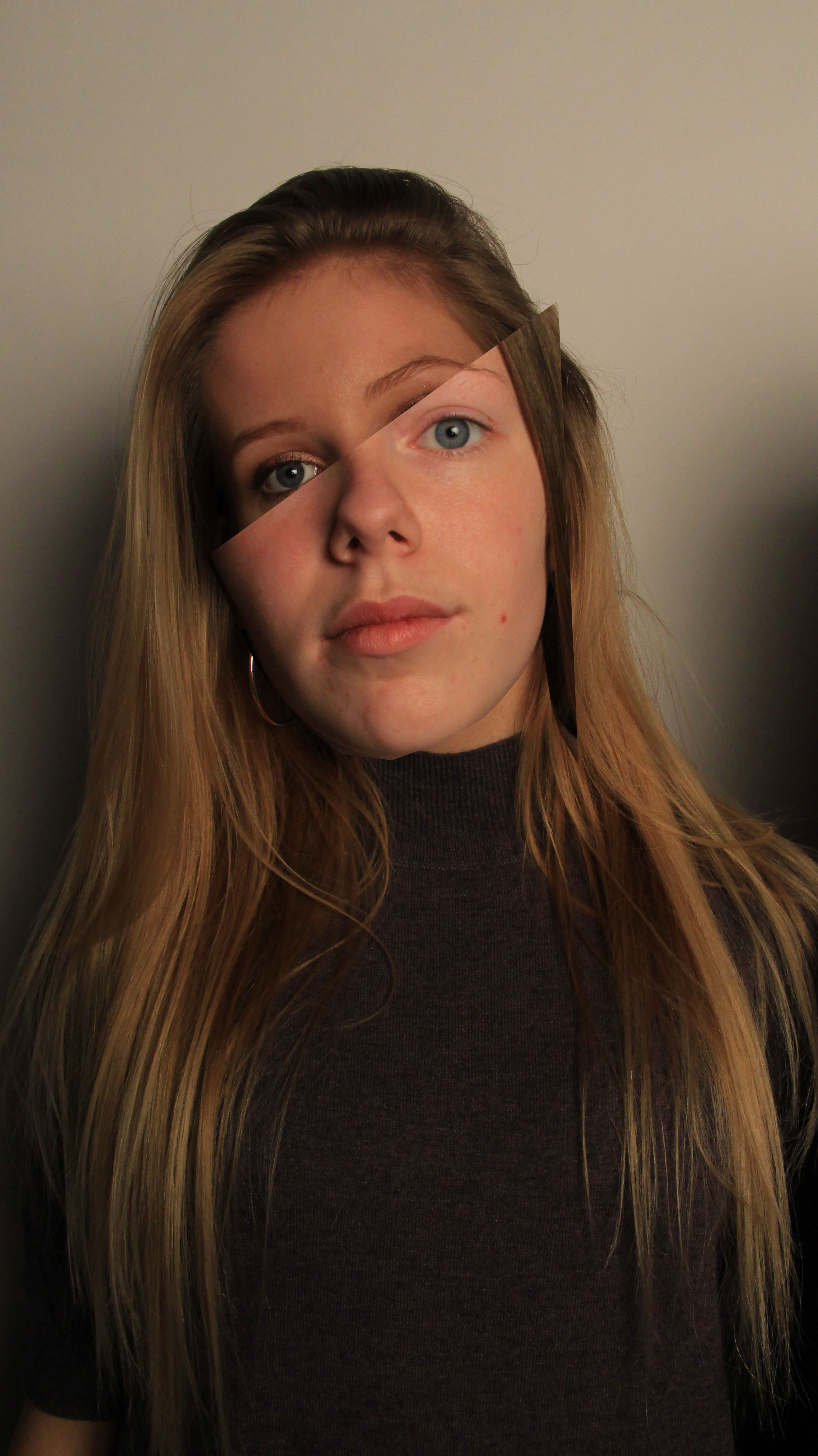
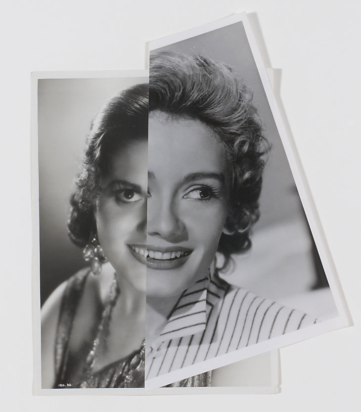
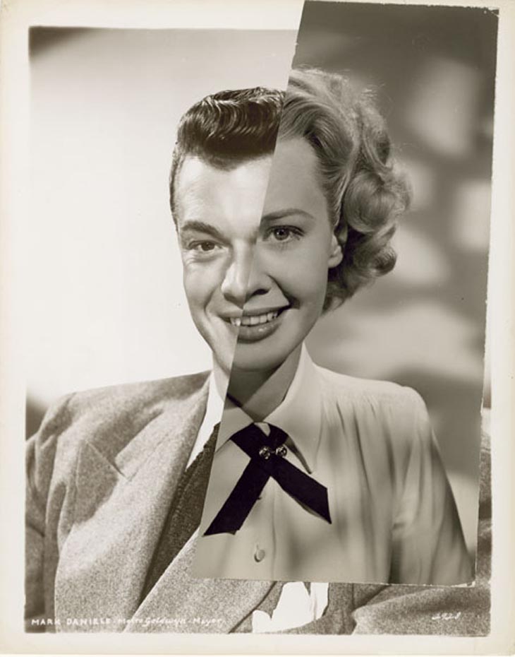
Again like Stezaker’s work, I took two images and cut them up on photoshop where I then positioned them on top of eachother so that the eyebrow, nose and hairline where in line. I converted one image to black and white to give it an older feel like Stezaker’s work

Adam Goldberg | Constructed Portraits


Adam Goldberg

Known primarily as an actor, Adam Goldberg is also a photographer, musician, and a filmmaker.

Although he shoots digitally as well, Adam works primarily with several analog cameras and film stocks ranging from 35mm to 8×10 with an emphasis on instant films.

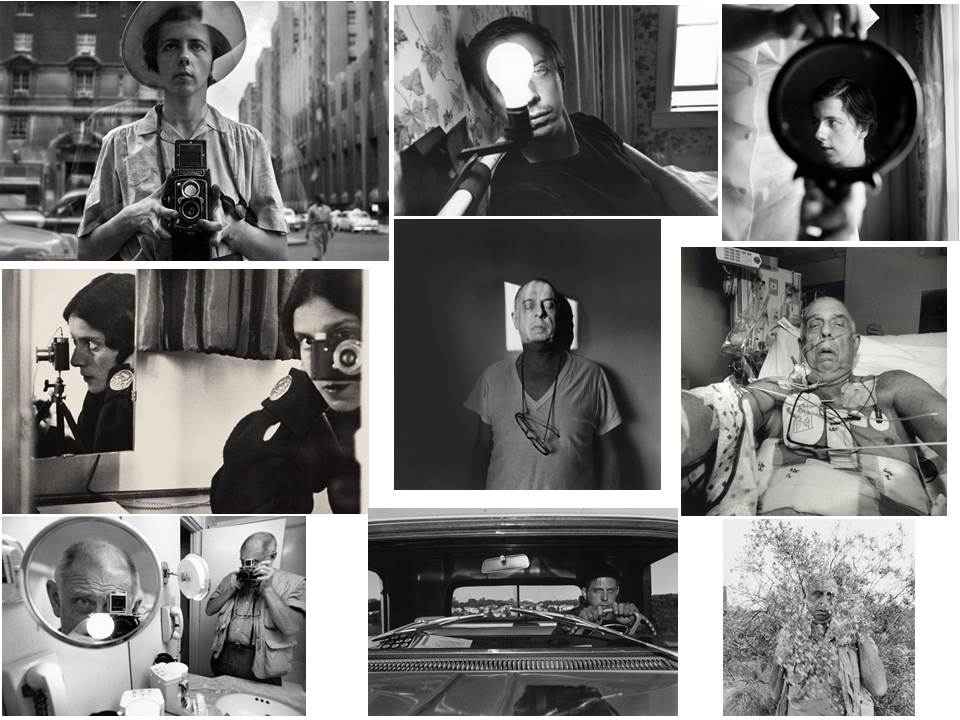
His works use double exposure techniques to layer multiple similar images over one another. This can portray a plot, or the idea of what is going on inside someones head.

After looking at Adam Goldberg’s work, I wanted to also provide an underlying story of what is going on inside the subjects of my photos head.

John Stezaker & Hannah Hoch | Constructed Portraits

John Stezaker

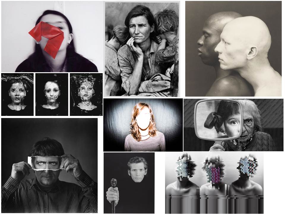
John Stezaker’s work re-examines the various relationships to the photographic image: as a documentation of truth, purveyor of memory, and symbol of modern culture. In his collages, Stezaker appropriates images found in books, magazines, and postcards and uses them as ‘readymades’. Through his elegant juxtapositions, Stezaker adopts the content and contexts of the original images to convey his own witty and poignant meanings.

Using publicity shots of classic film stars, Stezaker splices and overlaps famous faces, creating hybrid ‘icons’ that dissociate the familiar to create sensations of the uncanny. Coupling male and female identity into unified characters, Stezaker points to a disjointed harmony, where the irreconciliation of difference both complements and detracts.

Hannah Hoch

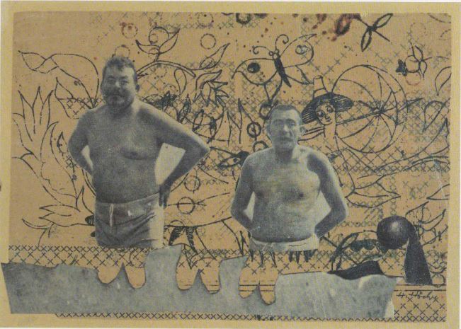
Hannah Höch was a German Dada artist who lived from November 1st, 1889 – May 31st 1978 . She is best known for her work of the Weimar period, when she was one of the originators of photomontage. Photomontage is a type of collage in which the pasted items are actual photographs pulled from other sources of media or photography.

Höch’s work often focused on gender roles where she wanted to show that woman were just as capable and equal as men. Her active interest in challenging the status of women in the social world of her times motivated a long series of works that promoted the idea of the “New Woman” in the era.

Using the same techniques of photomontage, I wanted to create works where I would merge masculine traits with feminine traits. I was inspired to combine my own images with photos of masculine and feminine stereotypes in media.

Heitor Magno & Mark Borthwick | Constructed Portraits
Heitor Magno

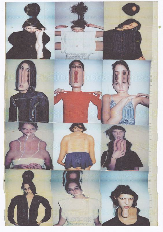
Heitor Magno is a Brazilian visual artist who explores identity through self-portraiture.

He uses double exposure techniques, often placing clones of himself alongside eachother, to create glitch images – layering and obscuring expressions and complex emotions. Interfered Pictures, invisible expressions and pixelated factions are reflections questioning about his identity.

Heitor questions our willingness to expose intimate moments in our lives which can usually be given away by the expression on our faces.

 Mark Borthwick

Mark Borthwick is a British photographer now living in Brooklyn, New York. His photos are often minimal, yet highly saturated in colour. He has contributed to many publications, including Vogue, George, Purple, and Index.

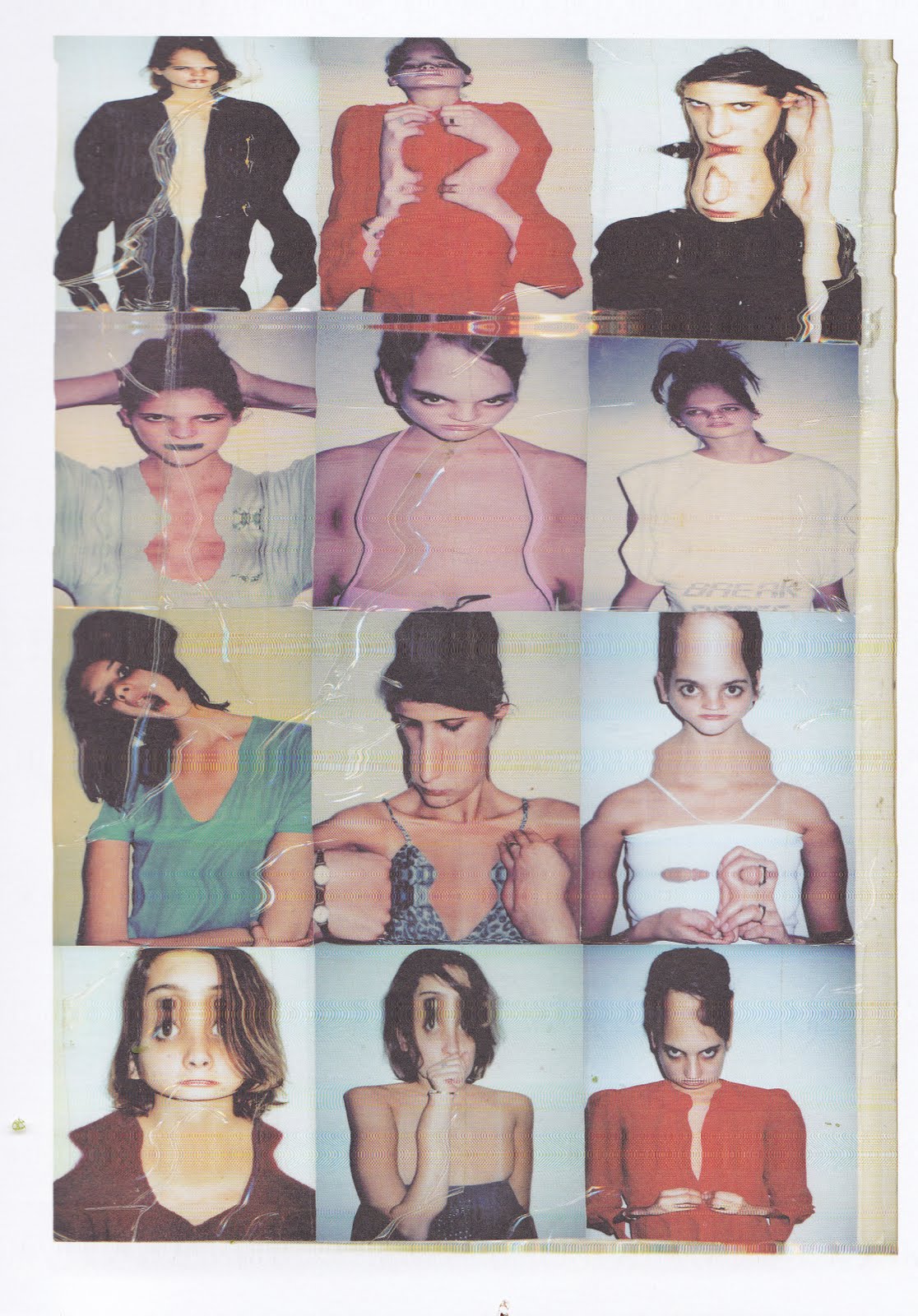
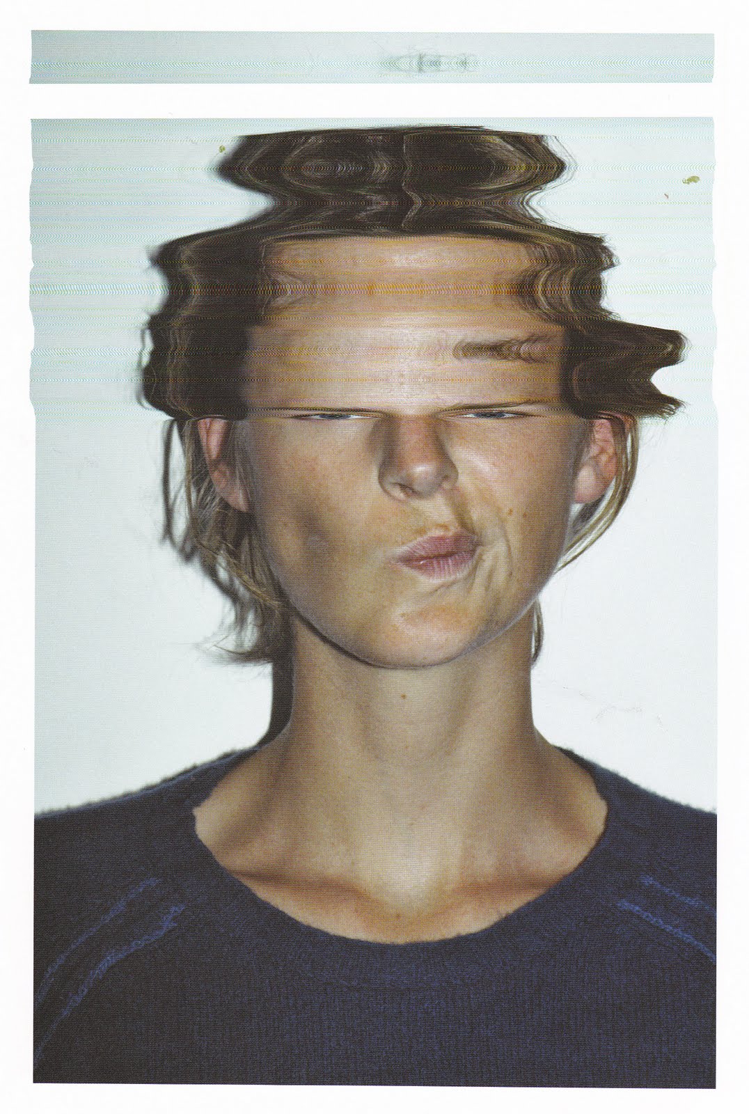
Mark Borthwick uses film in his photography even now due to his interest in the luminosity and transparency that it gives. He likes to have less control of his photography and let it happen spontaneously, as he feels its so controlled like a mechanism. However, he also does find it a surprise everytime as it depends on temperature of the light and the brightness of the light.

He realised that what he loves about photography is capturing people who he has a connection with, as it gives a sense of time and history from capturing them in different moments of time.

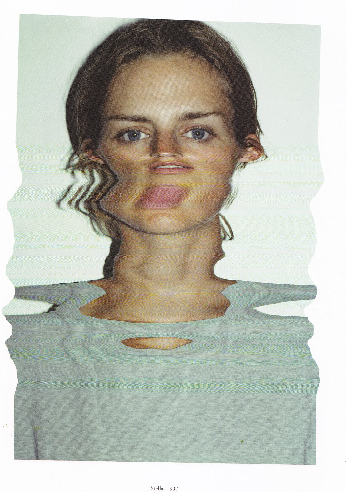
In the Images are Stella Tennant who he has been taking photos of for over 10 years. He became friends with her after their children had formed a friendship.

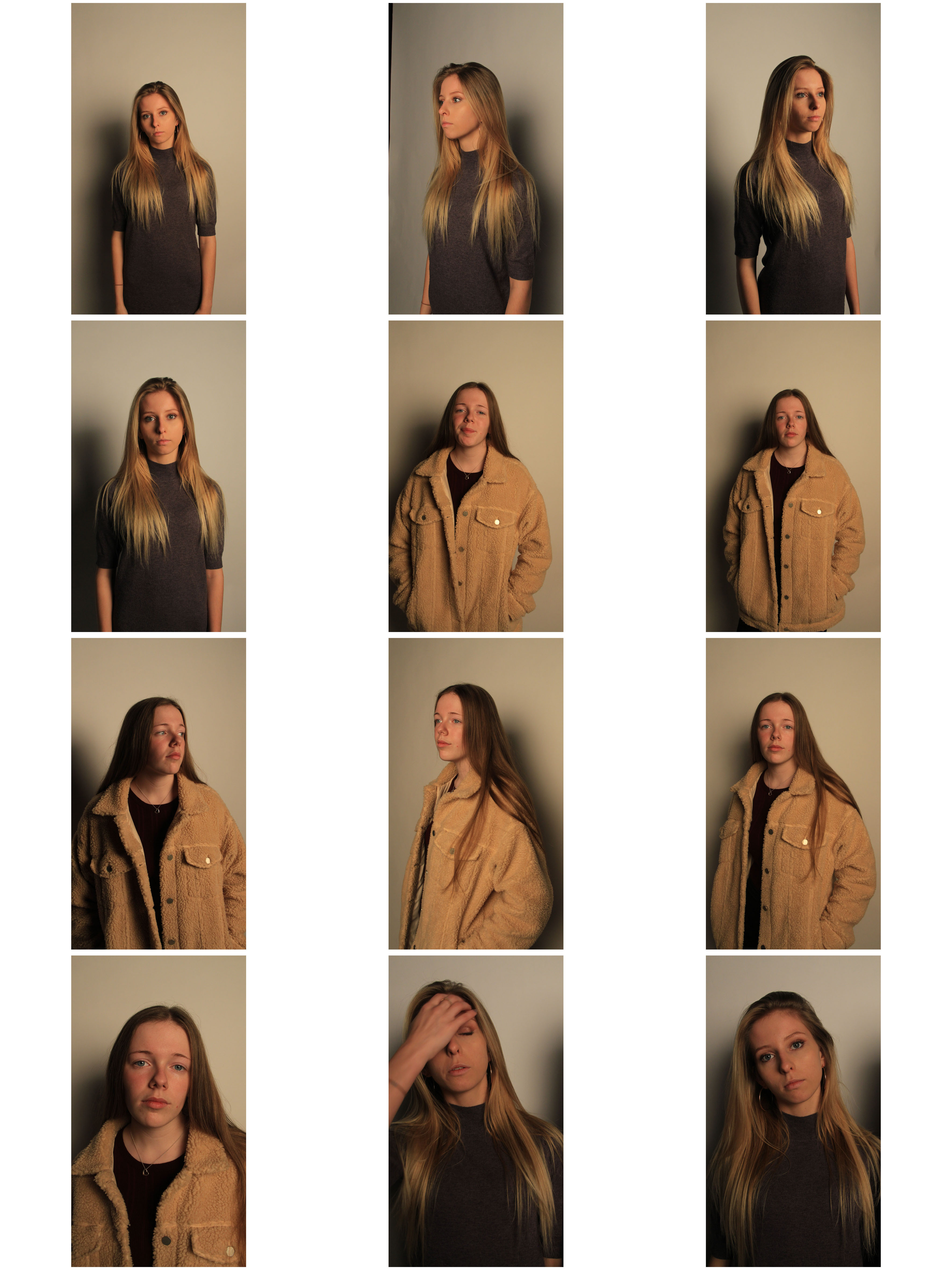
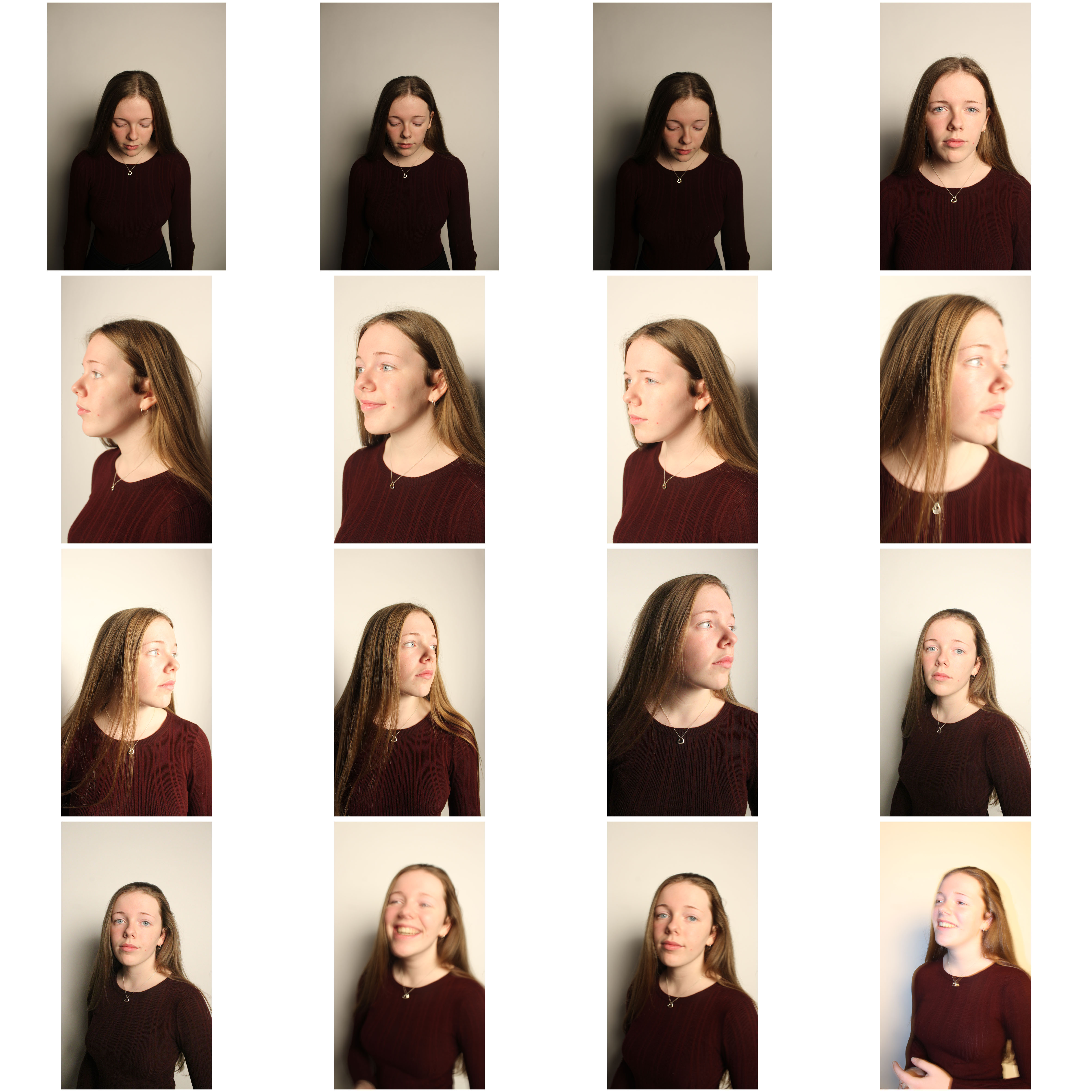
Combining the two photographers ideas, I felt inspired to take photos of people who I had a connection with, my friends. As I know their emotions, I would glitch and distort them to prevent the viewer from seeing this and therefore hiding their identity.

Creative Portrait Definitions

  What is Tableau Photography?

TableauFrench for ‘living picture’, is a style of artistic presentation. It most often describes a group of suitably costumed actors, carefully posed and often theatrically lit.

What is a Self-Portrait?

A self-portrait is a representation of an artist that is drawn, painted, photographed, or sculpted by that artist.

Many Photographers use self portraits as the best way to portray their own emotions and how they feel about a situation.

What is Identity?

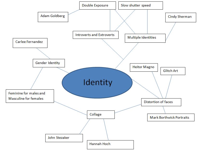
Identity is the fact of being who or what a person or thing is. Photographers choose their subjects based on what area of their identity they want to portray. This could be age, gender, culture, social identity or even a loss of identity.

Studio Lighting | Response

My Studio Portraits

Edits

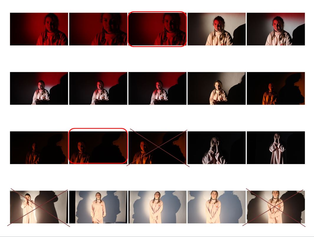
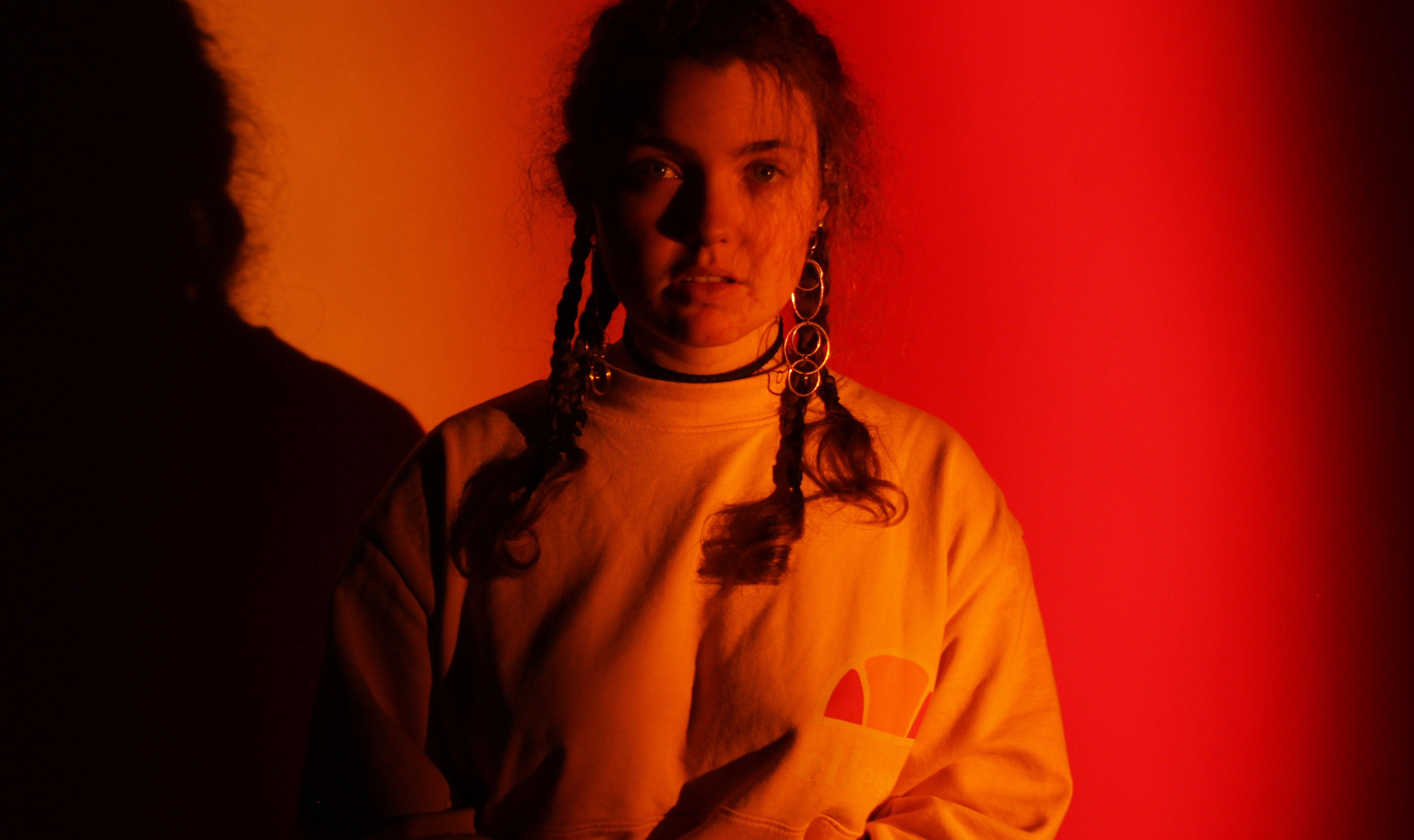
For this image, I got someone to hold the red and orange gels on either side of the light. I did not use the softbox as I did not want the light to be diffused, and felt a harsher spotlight would allow for nice shadows. When editing, I cropped the image a little bit on either side and increased the brightness to 45 on Photoshop to give more vibrance to the colour.

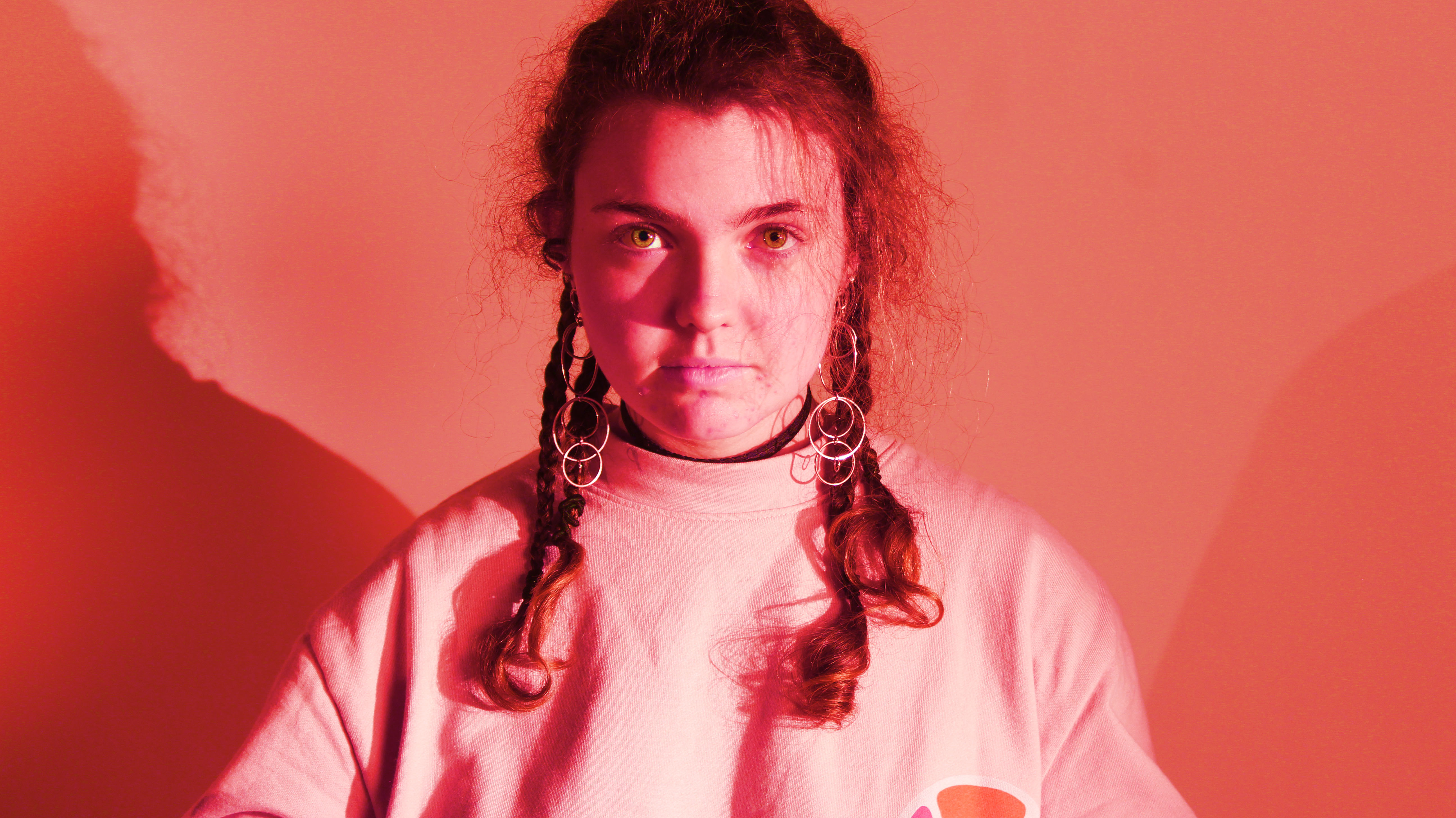
This image I used the softbox so that the light was more even throughout the photo, however I also placed spotlights on both sides of the subject to give some shadow. In Photoshop, I altered the hue to -33, and increased the saturation to 100 to make the colour more powerful.

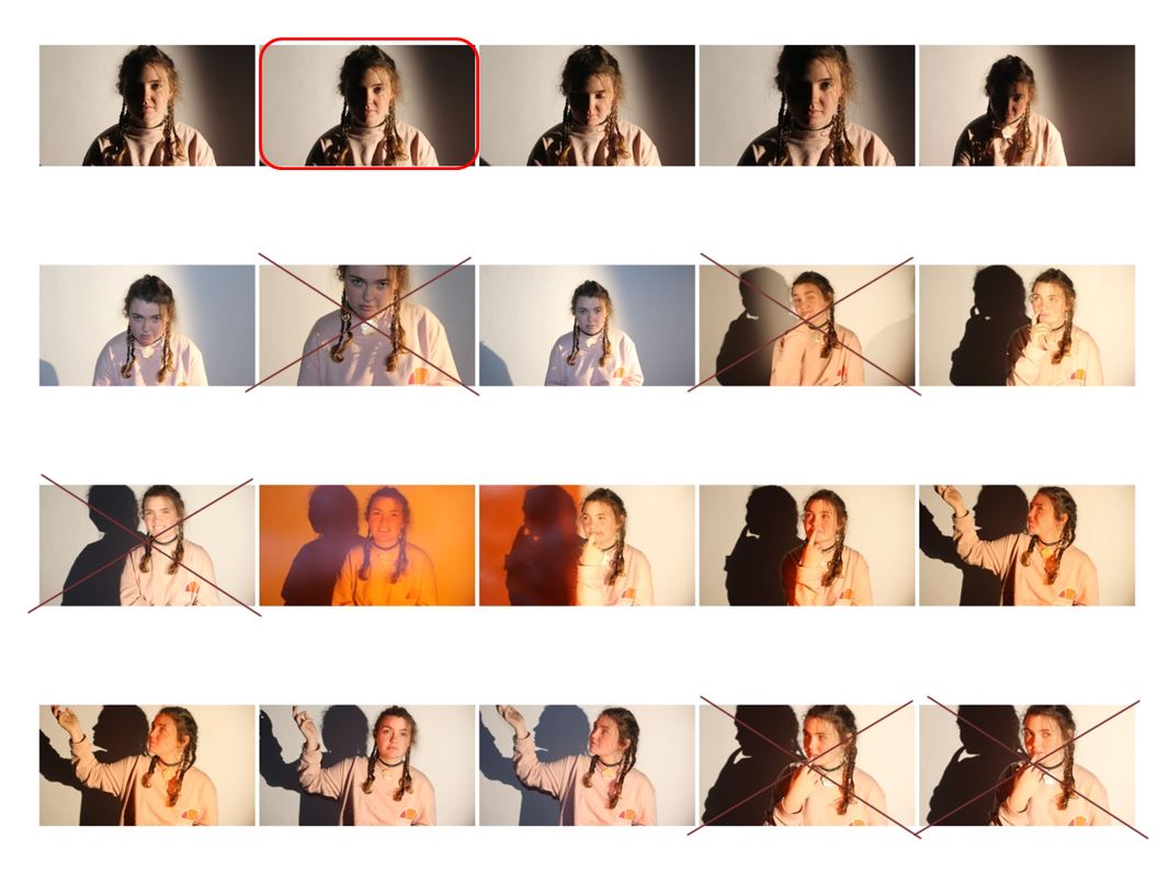
For the above 2 images, I placed only one spotlight on one side of the subject so that half their face was lit up and the other half was not.

I reduced the saturation for both images so that they were black and white, then increased the brightness to 74 in the first image and decreased it to -88 in the second image. I also adjusted the contrast to 44 in the second image.