All posts by Nicholas G

Filters

Author:
Category:

Breaking the Rules of Photography

8 Rules of Photography

#1 The Rules of Objectivity
#2 The Rule of Audience
#3 The Rule of Manipulation
#4 The Rule of Reality
#5 The Rule of Technicality
#6 The Rule of Ownership
#7 The Rule of the Camera
#8 The Rule of Rule Breaking

The rule I chose to break was the rule of manipulation. Manipulating an image can be done digitally using camera settings or photoshop or physically through the use of collage.

An area that I want to look at relating to pollution, would be to manipulate landscapes in order to demonstrate visual pollution caused by industrialisation.

Political Landscapes – Guernsey Photography Festival 2018

Lisa Barnard


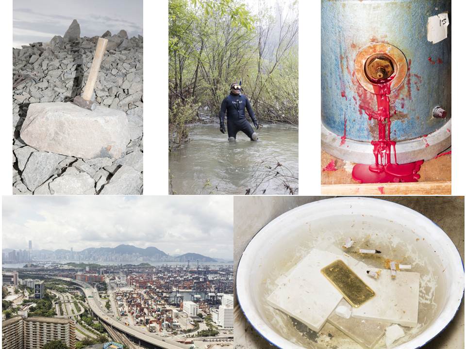
Lisa Barnard is one of the featured artists from this years photography festival. In her series, titled “The Canary and The Hammer”, Barnard details the inherent human reverence of gold and its affair in the ruthless endeavour of progress. A common theme amongst the series is the investigation into man’s abstract but innate desire to occupy territory.

The project was photographed across four years and four continents connecting seemingly disparate issues and aesthetics through a mix of stills, moving images and archival materials.

I am drawn to her work as I can see elements of pollution, where one image demonstrates an industrial landscape and another showcases a dirty river in the form of a portrait.

Jaakko Kahilaniemi


Jaakko Kahilaniemi is another of the featured artists from the 2018 Guernsey Photography Festival.

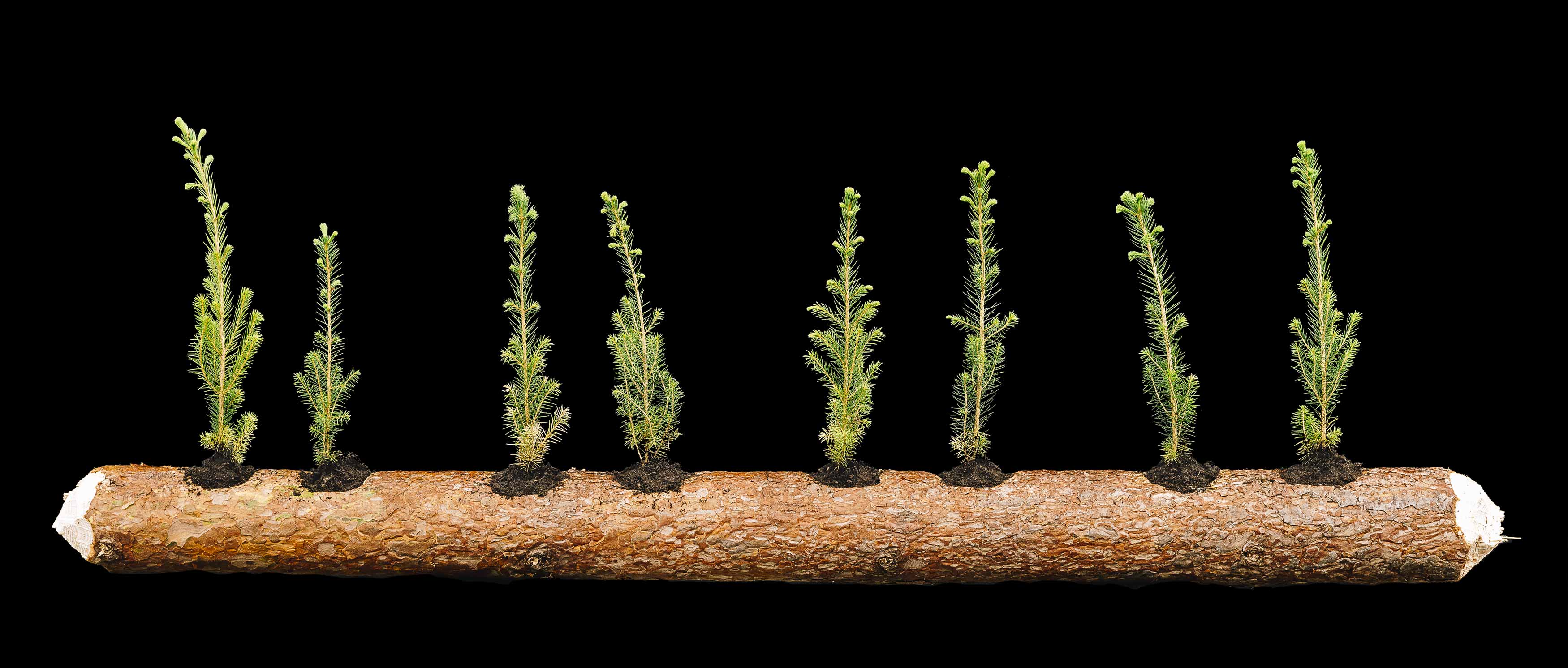
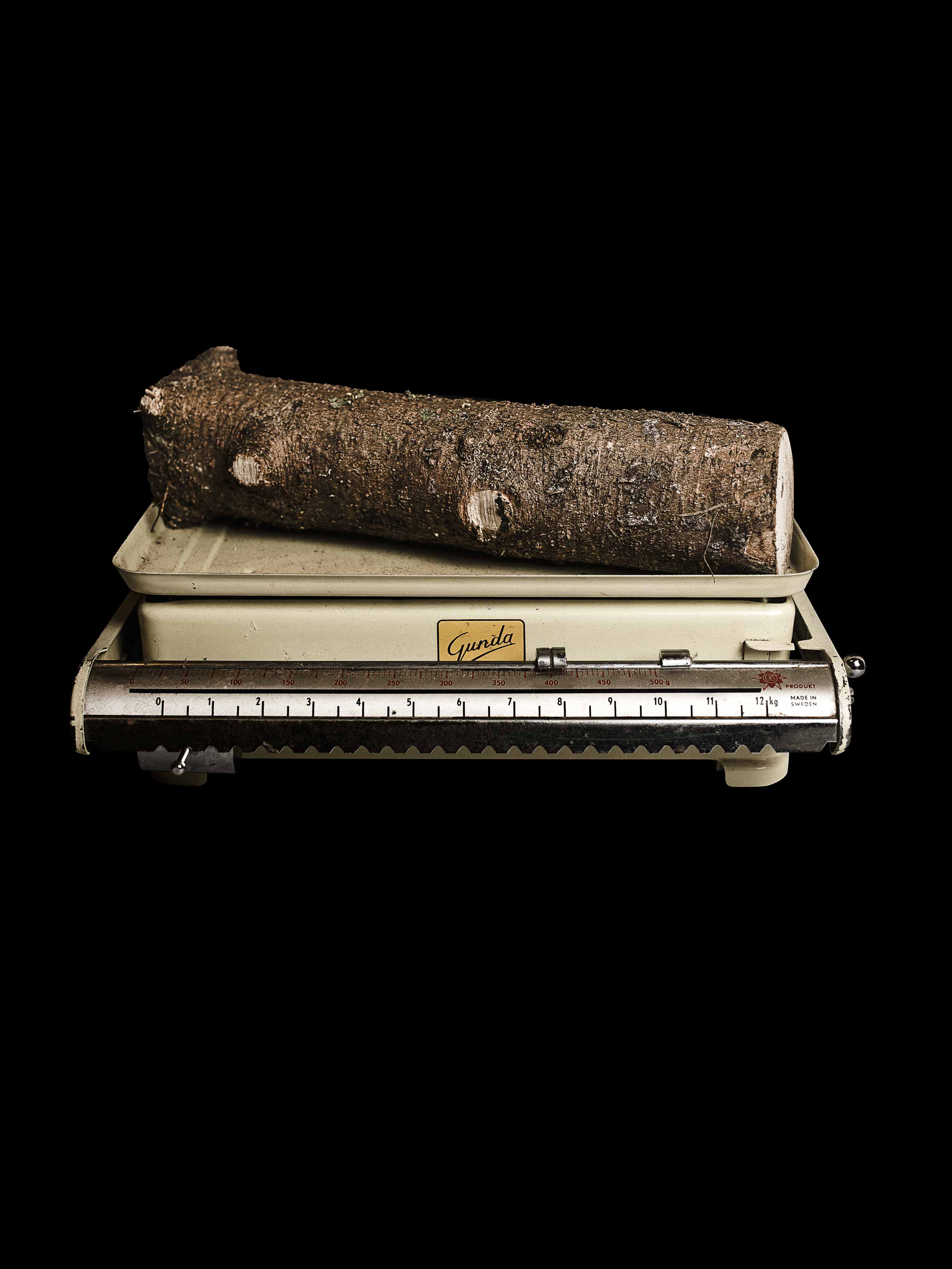
100 Hectares of Understanding is an exploration of an 100 hectare area of forest in Finland, inherited by Jaakko in 1997 when he was only 8 years old. The project includes both tangible and intangible approaches and visualizations of what forest and forestry mean to the photographer and how the unknown becomes familiar.

I was drawn to this series due to its simple aesthetic. The viewer is forced to think about the concept behind objects in the images.

What is Pollution and How does it impact our environment?

Pollution is the introduction of contaminants into the natural environment that cause adverse change.

Pollutants, the components of pollution, can be either foreign substances/energies or naturally occurring contaminants.

In 2015, pollution killed 9 million people in the world.

Major forms of pollution include: Air pollution, light pollution, littering, noise pollution, plastic pollution, soil contamination, radioactive contamination, thermal pollution, visual pollution, water pollution

Political Landscapes – Ideas

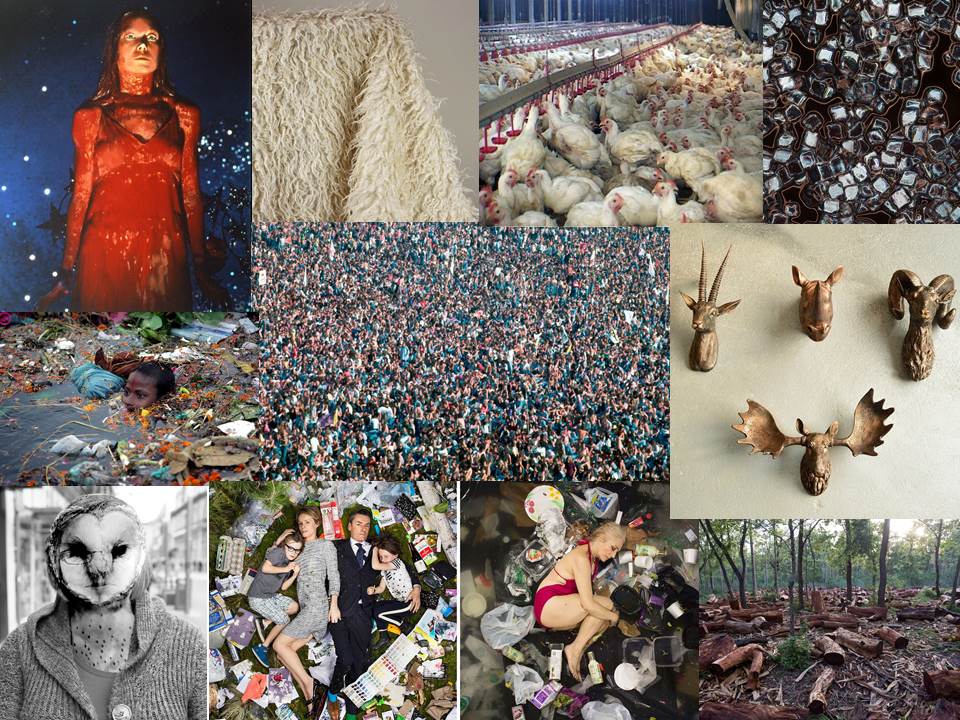
Mind Map


Politics – “the activities associated with the governance of a country or area”.

Landscape – “all the visible features of an area of land, often considered in terms of their aesthetic appeal”.

I decided to look into conservation further by researching the ways in which we impact the environment. This led me to factors such as pollution, overpopulation, animal mono culture, hunting, poaching and deforestation.

I chose to look at pollution as an overall topic as I believe it is a global issue that impacts different areas in different extremes.

Future Of St Helier Prints

The images I chose to print were featured in my zine, based around the theme of ‘living’.

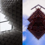
The top 3 images are paired together, connected by colour and location. The images show different perspectives of the same environment. The image on the left is the largest of the three as I wanted the viewer to notice the details in the image, the bird feeder, domesticated cat, mop and ladder all represent the theme of ‘living’.

I chose to present the black and white image on a single board as I believed that it was more powerful by itself. With the slightly hidden figure centre of the image, the viewer is drawn to connect with the person, relating over the daily task of ‘hanging the washing’.

FUTURE OF ST HELIER NEWSPAPER AND INSTALLATION

Hoarding Installation

The unveiling of the Future of St Helier Hoarding at the International Finance Centre on the Esplanade in St Helier took place on Thursday 13 Dec 2018.

First published as a 52 page newspaper supplement in September by the Jersey Evening Post the work produced by A-Level Photography students at Hautlieu School have been transformed into a 34m outdoor installation as part of Masterplan Community Arts and Education Project

We were challenged with responding to specific areas, streets and neighbourhoods divided up along the urban vingtaines of St Helier and to explore through research, archives and photography the built-environment, urban living, diverse communities, town planning, land use and re-generation projects.

We thank all sponsors and collaborators for making this a successful contribution to the island’s cultural records and historic archives Jersey Development Company, Camerons Ltd, MJP ArchitectsArchisleLewis BushPhoto-Archive Societe-Jersiaise, Kevin Pilley, States of Jersey and Connétable of St Helier, Simon Crowcroft
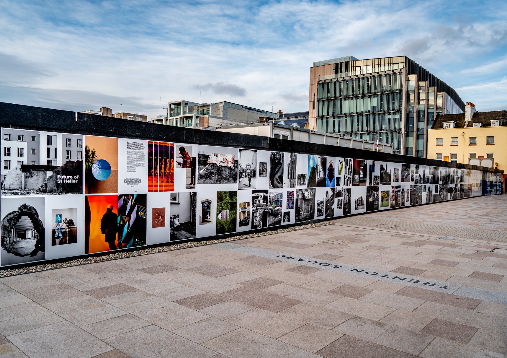
Earlier today we unveiled the Masterplan Future of St Helier hoarding display at the International Finance Centre. Lots of local media interest from Jersey Evening PostITV Channel TV and BBC Jersey who broadcasted live on radio talking to photography students at Hautlieu School, Constable of St Helier, Simon Crowcroft and sponsors Jersey Development Company, Camerons Ltd, MJP Architects about the future of the island and its capital. An excellent example of how a community arts and education project can generate a debate that affects all those who either live, work or visit St Helier.

If you are interested in our views of young people tune into BBC Radio here (listen from 3:18:30 onwards or watch the six o’clock news tonight on ITV.

https://www.bbc.co.uk/sounds/play/p06rlpdw

If you missed the news last night at ITV Channel TV you can catch up here with Hautlieu students talking (15m.12s) about their images on display at the Masterplan Future of St Helier hoarding on the International Finance Centre.

See link here

The outdoor installation on the hoarding around the construction site is a great way to engage the public in art and debates concerning the future of the island’s capital but, what we need in Jersey is a new contemporary art space that will provide a new venue to showcase art produced in the island, but equally also bring international art to Jersey for the public enjoyment of its residents and visitors alike.

The recent Culture, Arts and Heritage Strategic Review, commissioned by the Government of Jersey makes 20 new recommendations that will revitalise the island’s cultural infrastructure and achieve a wide range of social and economic objectives from tourism, to health and well being to external relations, to planning and environmental developments – in the hope that in partnership with Government it will enrich and enhance Jersey’s quality of life.

Let’s hope those in power who can make real changes to St Helier’s build environment will include such a new art space in the revised Masterplan of the Waterfront. All we need is political will and re-prioritising public funding for the arts. States of Jersey

Future of St Helier Newspaper

The outcome of students work was first published on Tuesday 18 September 2018 as a 52 page newspaper supplement, Future of St Helier that was printed in 14,000 copies and inserted into a daily edition of the Jersey Evening Post and distributed island wide.
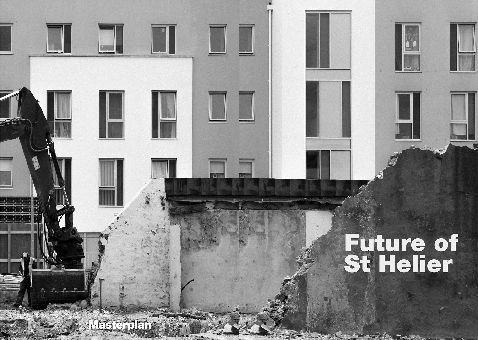
Here is a video browser of our Future of St Helier supplement printed and distributed in today’s edition of the Jersey Evening Post. Hautlieu photography students were challenged with responding to specific areas, streets and neighbourhoods divided up along the urban vingtaines of St Helier and to explore through research, archives and photography the built-environment, urban living, diverse communities, town planning, land use and re-generation projects. Each student designed a page spread which was then split in half producing a fragmented image reflecting on the nature of experience and diversity of St Helier.

Here is a video browser of our Future of St Helier supplement printed and distributed in today’s edition of the Jersey Evening Post. Hautlieu photography students were challenged with responding to specific areas, streets and neighbourhoods divided up along the urban vingtaines of St Helier and to explore through research, archives and photography the built-environment, urban living, diverse communities, town planning, land use and re-generation projects. Each student designed a page spread which was then split in half producing a fragmented image reflecting on the nature of experience and diversity of St Helier. Make sure to get your copy before the shops close!Thanks to everyone involved in the creative process Archisle Lewis Bush, Jamie Cole, Simon Crowcroft, Kevin Pilley – States of Jersey and our sponsors Jersey Development Company and Camerons Limited.
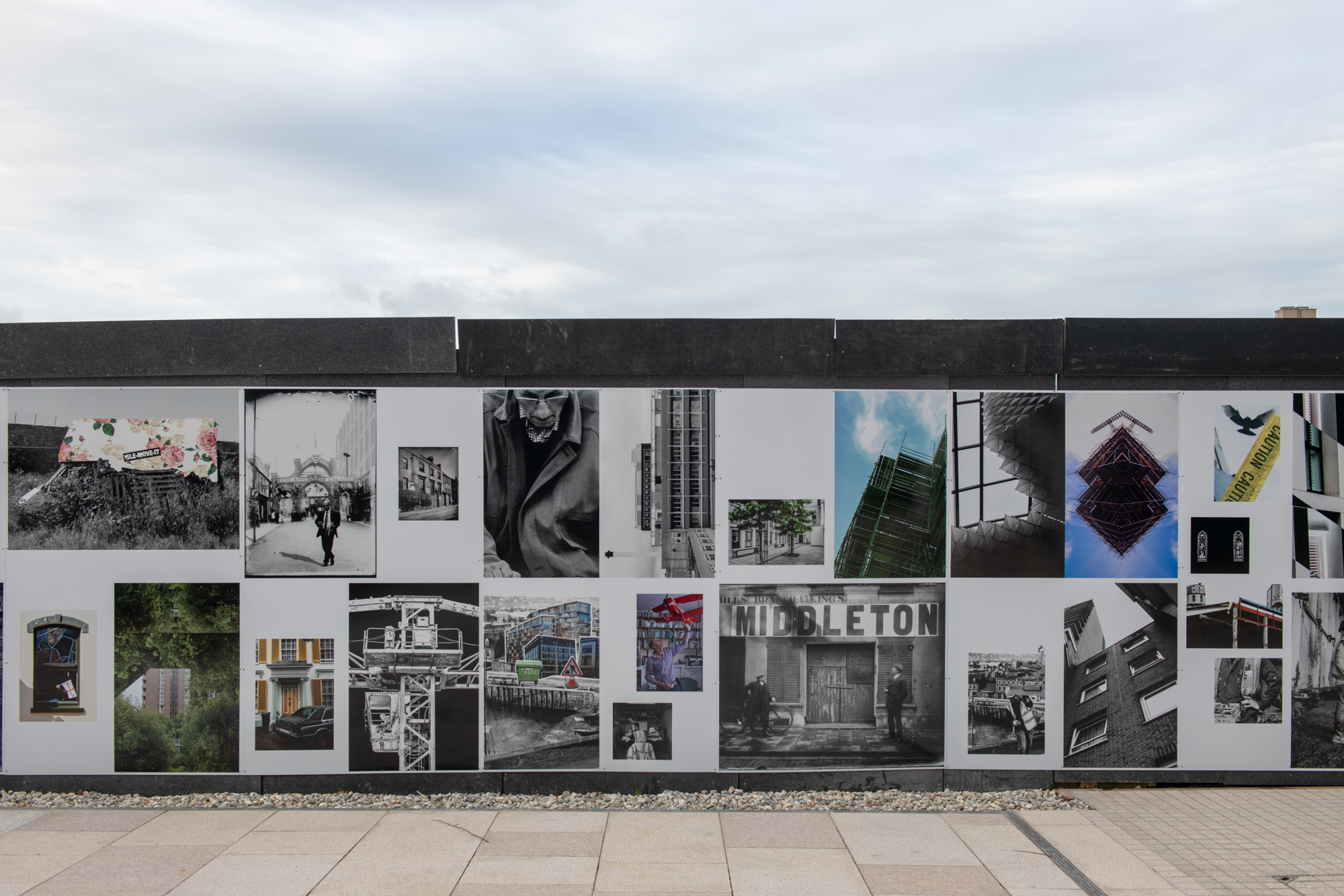
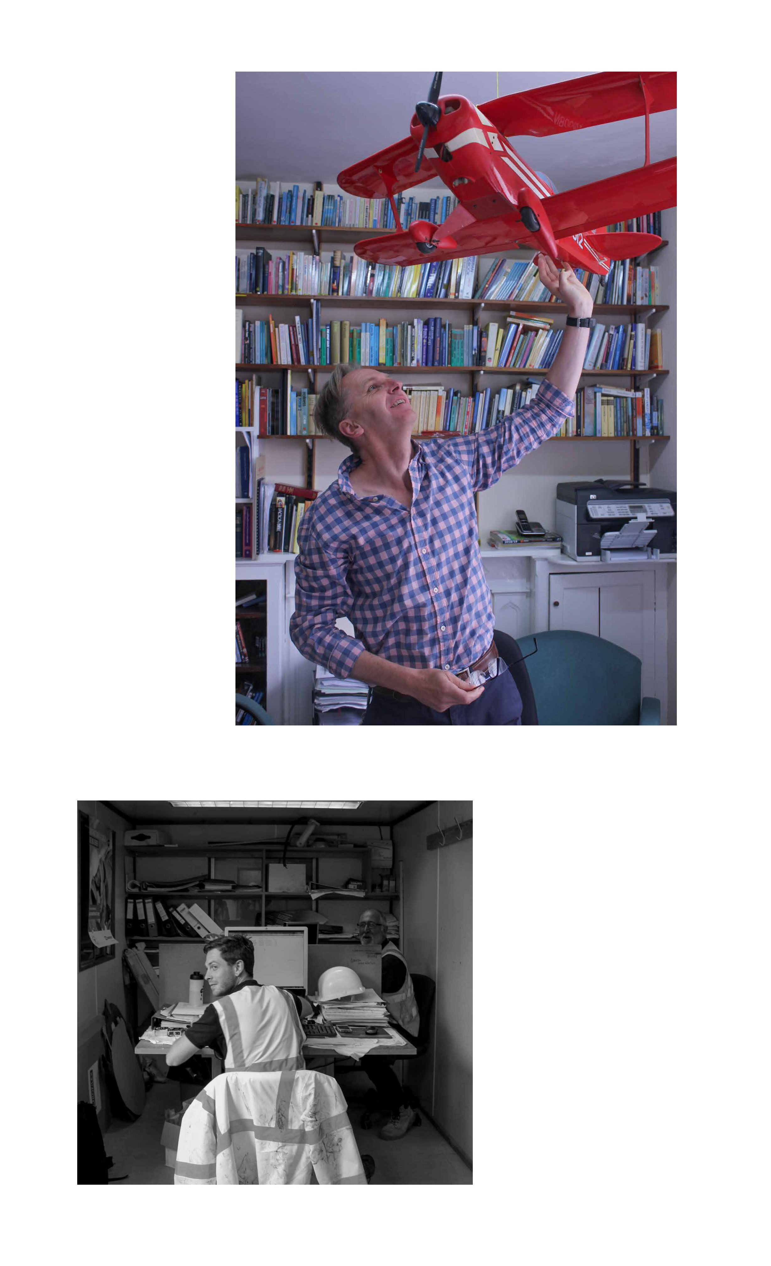
When seeing my work presented in a public and popular location, I felt proud as I knew that it would be seen by the people it represents. Both my images were portraits but the overall context demonstrated the past importance of religion against the modern importance of construction. Suitably, it is placed alongside the newly built finance buildings, reflecting the future importance of finance.

Final Result Of Zine

I chose the cover as I felt it represented my theme as a whole. The presence of the domestic cat, home grown plants and furniture enclosed in this small area creates an interesting environment which I carefully composed to feature as much as possible. The use of flash emphasises these details by intensifying the colours of the image. I used a simple font for the title so as to not distract the viewer from the details of the image.
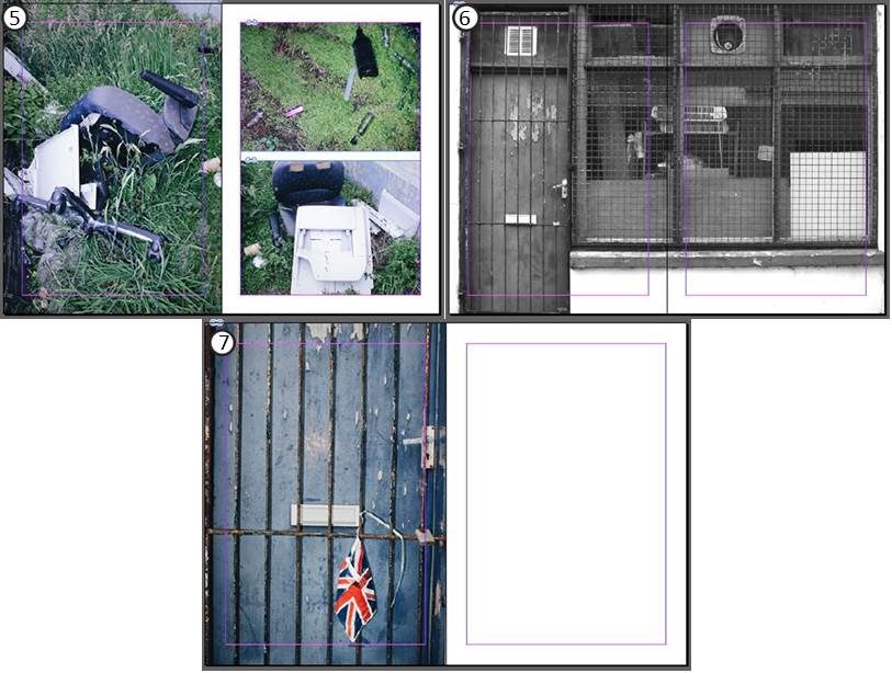
The first two pages show a continuation from the cover of the zine. I placed my images in a reverse order of what I saw in real life as I felt it created a more interesting narrative of looking into someone’s life but not revealing too much about who they are.

In contrast, the next 4 pages showcase daily life in St Helier from an inside perspective. The image of a girl hanging out sheets is composed to make the viewer become part of the situation, aided by the eye contact of the subject in the image. The photo is partnered with a softer toned colour image also featuring a washing line but viewed from an external perspective. I placed the photo of a subject washing dishes alongside an image of a hose as they shared similarities of colour with the use of saturated yellows and greens, as well as the different uses of water in regular life.

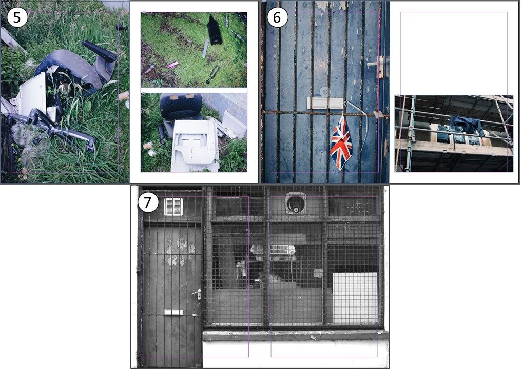
The zine continues on to take a different approach through showcasing darker topics as an underlying meaning. Abandonment and Isolation is shown in images of an empty storage  unit as well as a mattress placed by a bin due to no longer being used. Pollution is seen in images of glass bottles, lighters and broken furniture disposed off in an act of fly tipping in what was once a religious building.

I used the same image that I used for the cover as a back page however in a flipped orientation.

Zine Layout Experimentation

Using the same techniques as James Moreton, I will experiment more simplistically by using 1 or 2 images on each page that express a narrative together.

Experiment 1

Firstly, I took a balanced approach in my layout by using a proportionate amount of large images to small images. This is a safe option as it is more aesthetically pleasing when looking at as a whole.

I decided that I did not like when one image crossed across both pages but was not full size (e.g. page spread 4) as the large abundance of negative space in one corner did not appeal to me visually.

Experiment 2

I removed the empty pages in this version in favour of using more images to tell my narrative. I resized images on page spreads 3 and 5 as their colour scheme shared similarities with images on the opposing page. I also resized images on page spreads 2 and 6 to demonstrate the different perspectives between the images. For example taking a voyeuristic view in comparison to a personal one, or being up close to a subject in comparison to viewing from afar and seeing the subject as a whole.

Combining features from both of these versions, I created a final third version.

Final Version

It was not until the end that I attempted to create my front and back cover. I chose this image as it lead into the first page spread as they were both taken in the same location. I flipped the image in reverse for the back cover as the image was not landscape and I believed the colours would look weird if I was to use a different image.

Additionally, I placed another image from the same location on the first page spread to become apart of the narrative of things we leave behind.

The final version still uses the same simplicity that James Moreton shows in his zines, however I provided my own inspired style on such page spreads as 1 and 5 in order to place more images that shared similarities with what was already there.

Zine Artist Reference

James Moreton


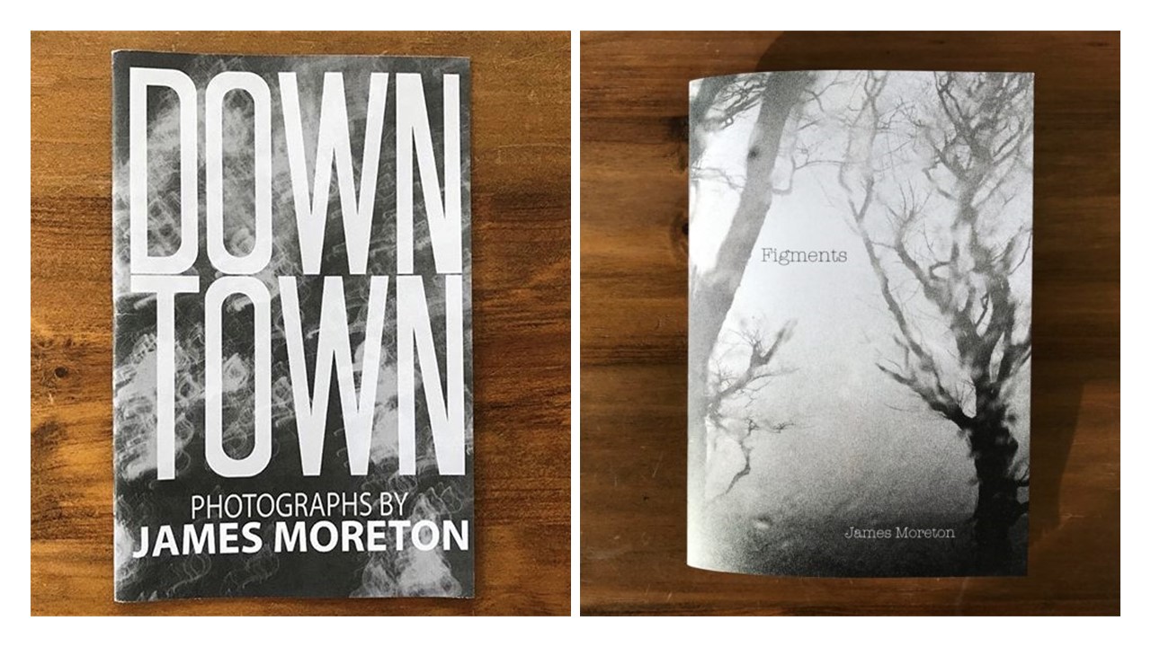
In the eyes of James Moreton, zines are seen to be the most accessible and favourable medium of photography thanks to their ability to create an impact through the use of pairing, juxtaposing and narrative flow to tell a story or instill an emotion, a method “unsurpassed by any other photographic medium”.

“a very interesting and intriguing modern art form.”

~ 3 page spreads from the zine “Down Town”

Moreton has produced his own solo zines as well as collaborating on collective zines, two processes he says are very different. His techniques are used for both experiences but in a smaller portion for group zines where he is only enabled limited space for his images. This inspires him to make more zines to present his projects in.

Analysis


“Figments” is a project that looks deep into the subconscious of James Moreton. Inspired by the poetry of W.B. Yeats, his work represents his thoughts, dreams and nightmares. The above image depicts a dark figure standing before a bright door of light, possibly hinting at something stopping him from reaching a goal. The figure is faceless as he does not know what this factor is.

An eerie atmosphere is created by the use of a vignette that surrounds this central figure, the focus is maintained due to a harsh overexposed portion of artificial light that falls behind them. The tones of darkness are emphasized by converting the image to black and white. A slower shutter speed is used to cause a soft blur of motion by the figure also adding to the nightmarish effect.

Moreton’s placement of images in his zines is very simplistic as he relies more on narrating a story or emotional sequence through the order of images. This is the reason for his choice of single large images on a page or spread.

Providing a big inspiration, W. B. Yeats’ poetry shows his fascination with the occult, made up of symbolism in a traditional form in many of his poems revolving around dreams.

Her Dream

“I dreamed as in my bed I lay,
All night’s fathomless wisdom come,
That I had shorn my locks away
And laid them on Love’s lettered tomb:
But something bore them out of sight
In a great tumult of the air,
And after nailed upon the night
Berenice’s burning hair.”

W.B. Yeats