All posts by Megan Woolsgrove

Filters

Author:
Category:

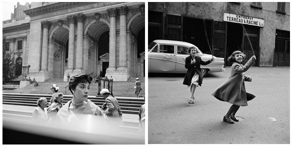
Henri-Cartier Bresson

The Decisive Moment:

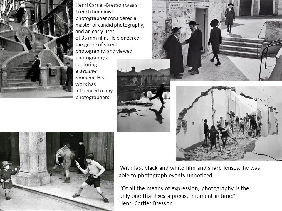
In 1952 Henri Cartier-Bresson, a founder of modern photojournalism, proposed one of the most fascinating and highly debated concepts in the history of photography: “the decisive moment.” This moment occurs when the visual and psychological elements of people in a real life scene spontaneously and briefly come together in perfect resonance to express the essence of that situation. Some people believe that the unique purpose of photography, as compared to other visual arts, is to capture this fleeting, quintessential, and holistic instant in the flow of life.

This website was established by Henri Cartier-Bresson, his wife Martine Franck, and their daughter Mélanie, the Henri Cartier-Bresson Foundation opened its doors in May 2003.  It now preserves Henri Cartier-Bresson and Martine Franck’s archives:

http://www.henricartierbresson.org/en/hcb/

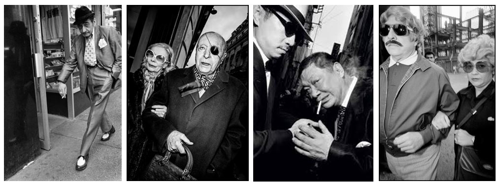
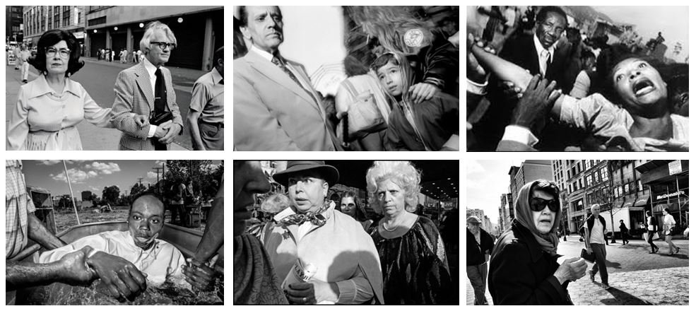
Bruce Gilden

Image result for bruce gilden street photography

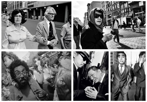
Bruce Gilden is know for his candid close up portraits of people on the streets of New York City and is characterized by his use of flash photography, making him one of the revered street photographers.  He has photographed people on the streets of New York, Japan’s yakuza mobsters, homeless people, prostitutes, and members of bike gangs between 1995 and 2000.  He was fascinated by the duality and double lives of the individuals he photographed.

Gilden’s advice for street photographers is “shoot who we are.” Gilden shoots who he is in a direct, honest, and aggressive type of manner.

An interview with Bruce Gilden:

http://www.gupmagazine.com/articles/in-your-face-an-interview-with-bruce-gilden-part-1

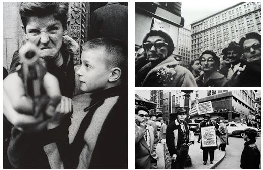
Street Photography

Street photography is a type of photography that features subjects in candid situations within public places. The photographs are mirror images of society, displaying ‘unmanipulated’ scenes, with usually unaware subjects.
 Street photography can focus on people and their behavior in public, thereby also recording people’s history, but does not necessitate the presence of a street or even the urban environment.

Street photography and documentary photography are two very similar genres of photography that often overlap while also having individual qualities. Street photography has the ability to document, while documentary has the definite intention of recording history. Documentary photography can be candid, whereas street photography is defines by its candidness. Photojournalists aim of capturing newsworthy events; any of these photographers’ images may capture people and property visible within or from public places.

Homework 1- Environmental

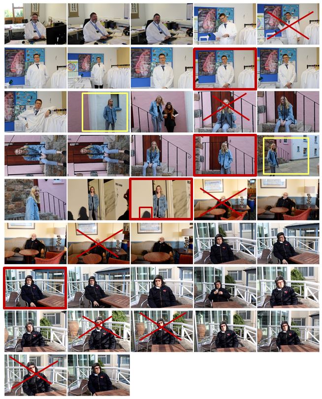
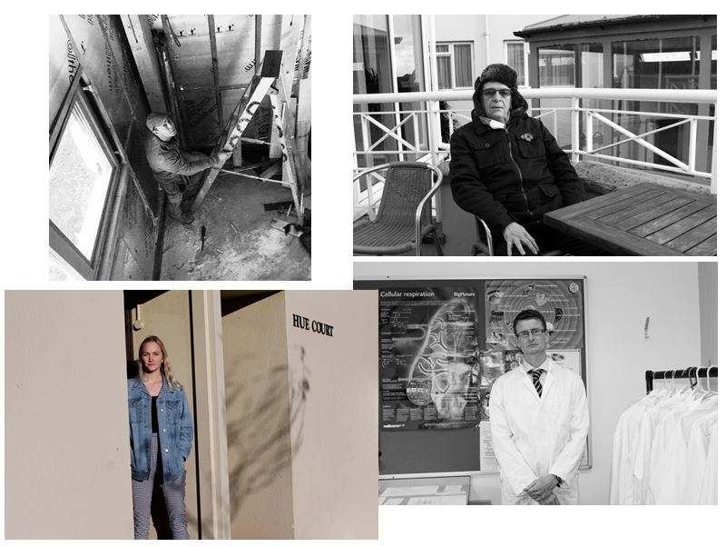
For this homework I photographed 4 different environments and displayed them in a contact sheet where I have identified key features which helped me make selections for the images i want to use and edit.

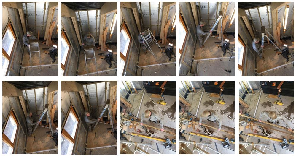
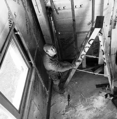
For this photo shoot i visited my dad at his work and photographed him doing what he would normally do. I chose this image as one of my final images as the environment clearly portrays him as a carpenter. The wooden poles, the ladder and the way he is dressed also indicate this. I also like the higher angle I took the photo at as it gives another perspective of the environment. I turned the photo black and white to emphasise the shadows gradually getting darker towards the corner of the room. It shows a varied range of tones, the lightest point being the window and the darkest being the floor and shadows that are created.

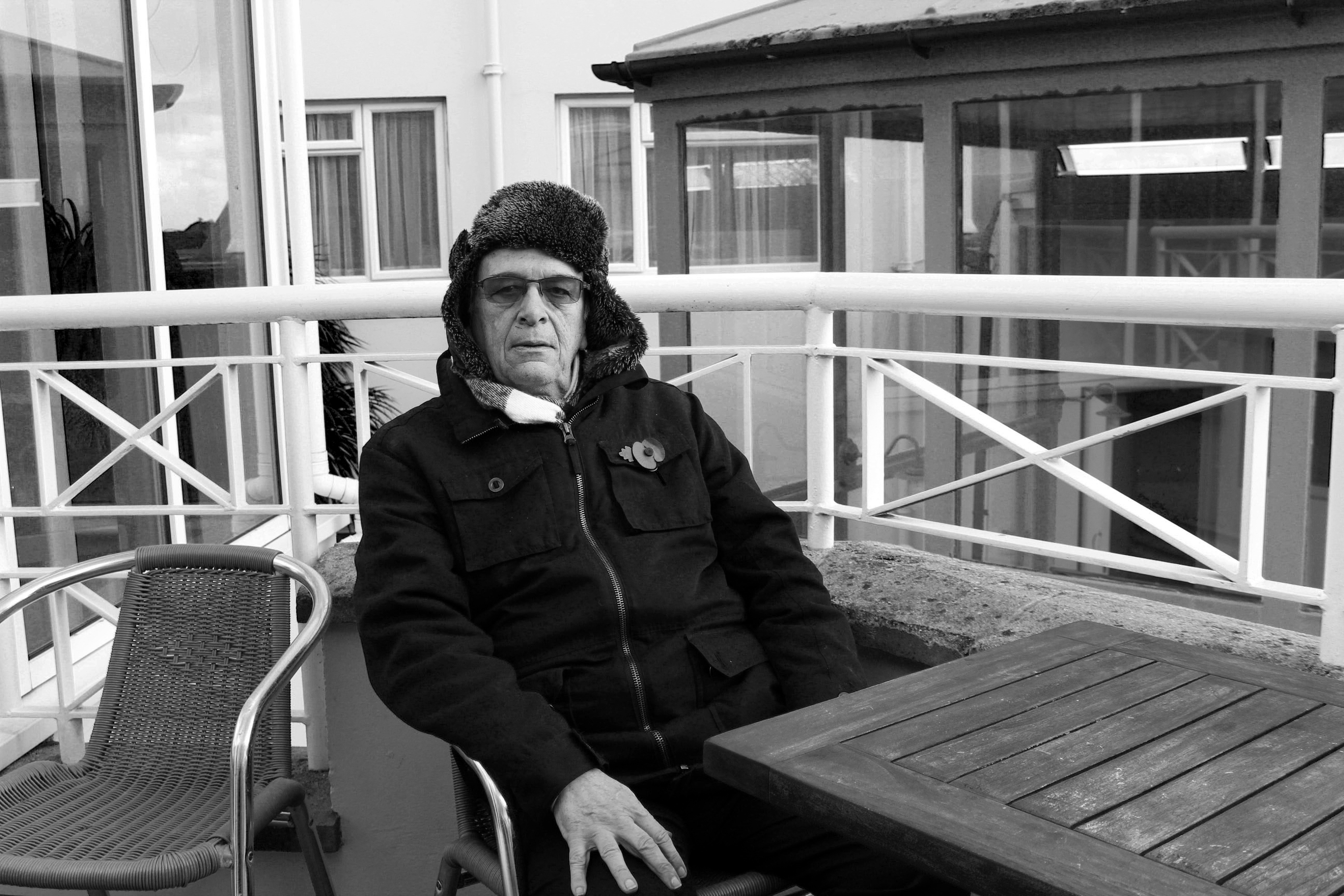
For this photo shoot I chose my Grandad to photograph and selected this image as my final image for that shoot. I think it clearly shows his face using natural light which is better compared to the other photos I took indoors with artificial lighting. Although the environment he is surrounded by does not clearly represent him as a person I like the bold, strong lines which I think represent his character and what it was like being born in 1939, the year in which World War II began and what it was like growing up.

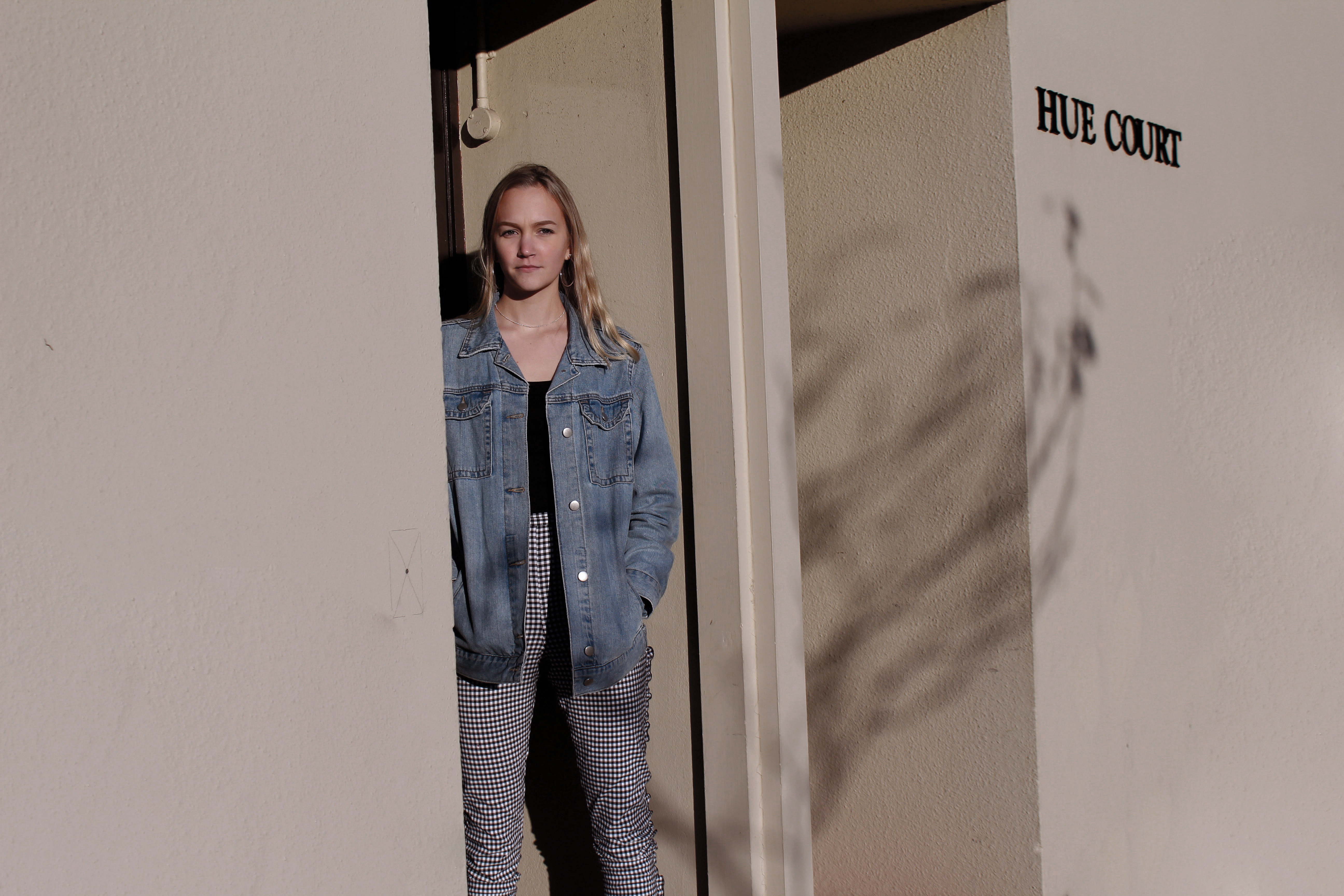
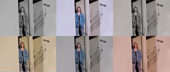
I also chose this photograph as one of my final images as i like the angle and the natural lighting that is used. This photo does not display the environment as effectively as the other photographs as although she is standing outside her house, the surroundings do not indicate much about her character. I experimented with this photo adjusting the colours to try and make the photograph more effective.

I have selected these 4 images to represent this homework as I think they show the varied environments which I photographed as they are all completely different.

Arnold Newman

Arnold Newman is generally acknowledged as the pioneer of the environmental portrait, he is also known for his still life and abstract photography, and he is considered as one of the most influential photographers of the 20th Century.

Newman found his vision in the empathy he felt for artists and their work. Although he photographed many personalities, he maintained that even if the subject is not known, or is already forgotten, the photograph itself must still excite and interest the viewer.
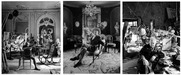
Newman normally captured his subjects in their most familiar surroundings with representative visual elements showing their professions and personalities
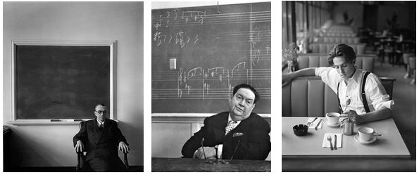
“I didn’t just want to make a photograph with some things in the background, the surroundings had to add to the composition and the understanding of the person. No matter who the subject was, it had to be an interesting photograph. Just to simply do a portrait of a famous person doesn’t mean a thing.”
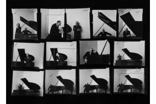
Image result for arnold newman environmental portraits

Related image

Newman’s best-known images were in black and white, although he often photographed in color. This image was photographed in 1946 and is a black and white portrait of Igor Stravinsky seated at a grand piano which became his signature image, even though it was rejected by Harper’s Bazaar, the magazine that gave the assignment to Newman.

Perhaps his most celebrated image is a 1946 portrait of the composer Igor Stravinsky. Stravinsky, his expression deeply serious, is confined to the bottom left corner of the picture, cropped to his head and shoulders, an elbow resting on the piano, his hand supporting his head. The rest of the photograph is taken up by the raised lid of a large grand piano, strategically silhouetted against a blank wall, which is divided off-center into a gray and white rectangle. The lid forms the reversed shape of a leaning, abstract musical note.

Image result for henri cartier bresson photographed by arnold newmanHe was one of the few photographers allowed to make a portrait of the famously camera-shy Henri Cartier-Bresson.

One of the most famous was this sinister picture of the German industrialist Alfried Krupp, taken for Newsweek in 1963. Krupp is smirking, his fingers clasped as he confronts the viewer against the background of a assembly line in the Ruhr. In the color version his face has a greenish cast. The impression it leaves was no accident: Newman knew that Krupp had used slave labor in his factories during the Nazi reign and that he had been imprisoned after World War II for his central role in Hitler’s war machine.
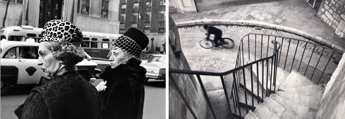
 

Anthony Kurtz

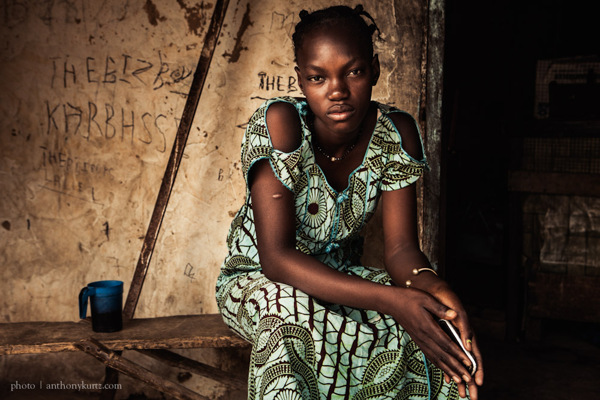
He documents people and places that exist on the edges of society, sometimes physically, mentally or both: excluded by choice or by circumstances. ” I am interested in control and conformity and I strive to represent both of these opposing forces within a photograph. I feel a need to document my generation and question our deeply rooted ideas of democracy, security and progress.”

“I attempt to create a mood and atmosphere, a sort of hyper-reality that contains both a sense of mystery and sadness, hope and beauty.”

His strong work “Africa Street Photography”  photographed in Dakar and Dindefelo, Senegal, is a cinematic art documentary playing with flash and natural light. After this experience he states, “it is sometimes hard to convince people that your are taking these pictures because of your love for people and places with, what I define as, true character.” This is a truly artistic photography with dramatic aspects of life and surroundings.

This is a link to his website:

https://anthonykurtz.com/

https://anthonykurtz.com/pdf

Environmental Portraits

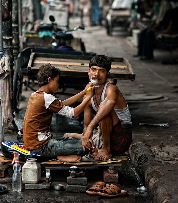
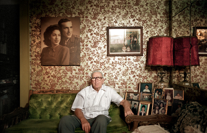
An environmental portrait is a portrait taken of a person or people in a situation that they live in and a place that says something about who they are e.g. workplace, home. They are different from traditional portraits shot in a studio as they give an insight into the daily life of the person being photographed, making for a more personal image.

Morning Tea and Swings - What is Environmental Portrait - Tips & Examples

Shaving - What is Environmental Portrait - Tips & Examples

By photographing a person in their natural surroundings, it is thought that you will be able to better illuminate their character, and therefore portray the essence of their personality, rather than merely a likeness of their physical features

Related image

Related imageThe subject will be more at ease, and so be more conducive to expressing themselves, as opposed to in a studio, which can be a rather intimidating and artificial experience
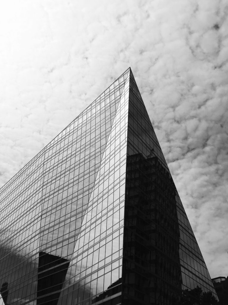
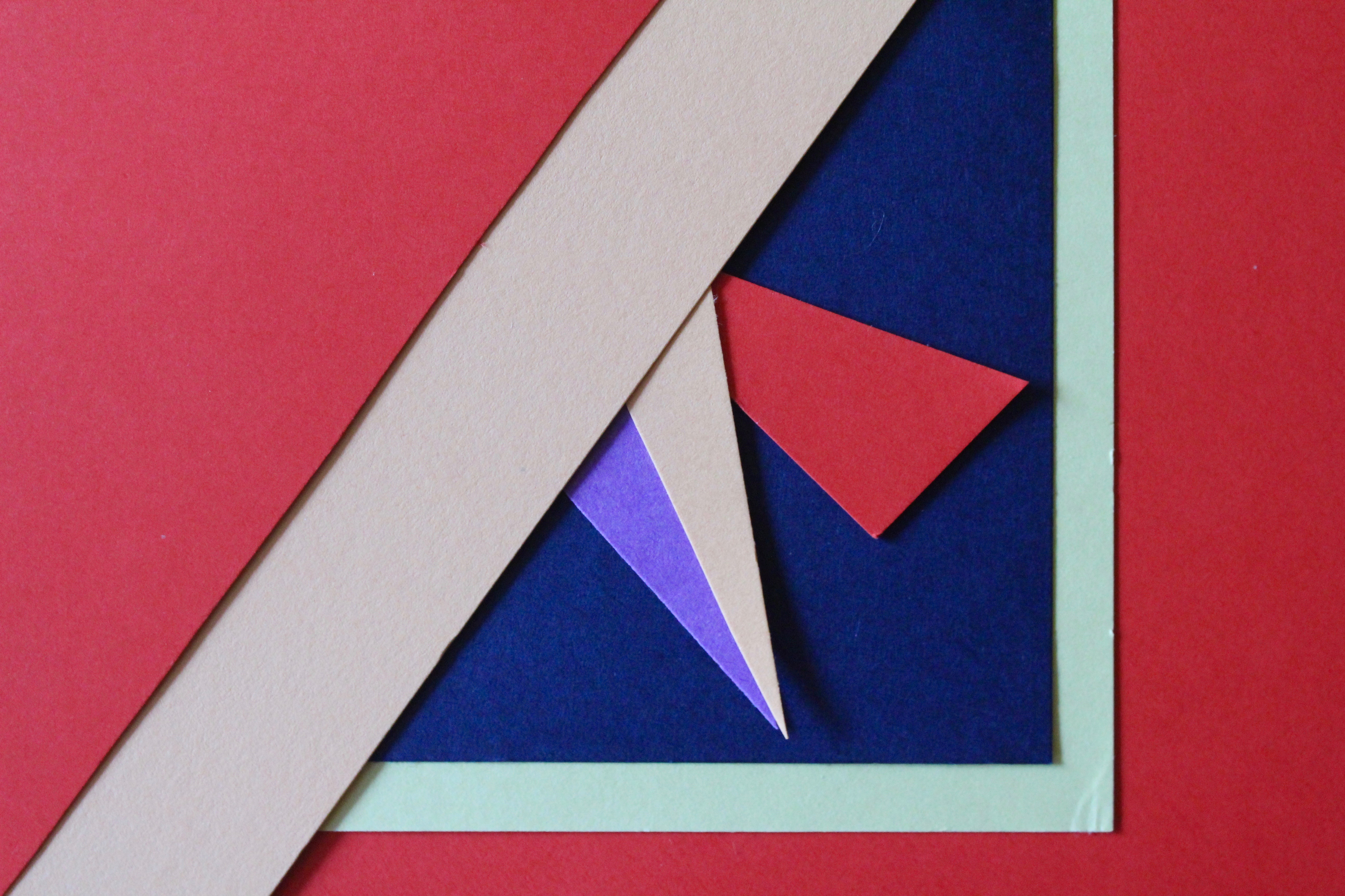
Image result for environmental portraits examples

Here is a website which helps you achieve better environmental portraits:

https://petapixel.com/2016/04/07/8-tips-making-better-environmental-portraits-natural-light/

Final Image

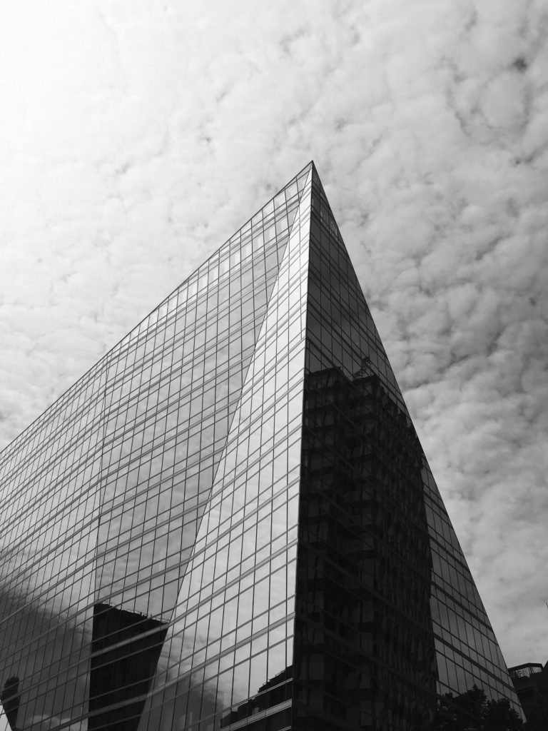
I chose this image as my final piece out of the three as it contains similarities from both the other final images through their geometrical designs and similar triangular shapes that I previously created with the paper. I also chose this photograph as I did not want my project to to turn into an art project and wanted to create variation within my work. This photo was taken with inspiration from Hilla and Bernd Becher’s work in my typologies homework, but I also think it contains elements from other homeworks (such as line, repetition and pattern as well as abstract and texture) which is why i chose it.

This photograph uses Ansel Adams zone system with contrasts from light to dark within the picture creating a photo with varied tones. One reason I like this photo is because of the reflection in which the building has that mirrors the clouds from behind, making the building bright on one side, and dark on the other. This photo also shows repetition through the thin black lines on the building creating a pattern, contrasting with the other side which does not. The building also has a thin black line outlining it, emphasising the structural properties as well as abstract appearance that it has. The fast shutter speed and sharp focus used to take the photo shows the details on the building as well as the clouds behind also showing texture and pattern. The composition of this photograph is aesthetically pleasing through its symetrical appearance.

Overall this project has allowed me to develop my understanding and knowledge of camera skills, and my ability to take better photographs, as well as allowing me to explore artists linking to my work in depth.


Final 3 images

Photo 1

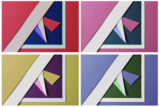
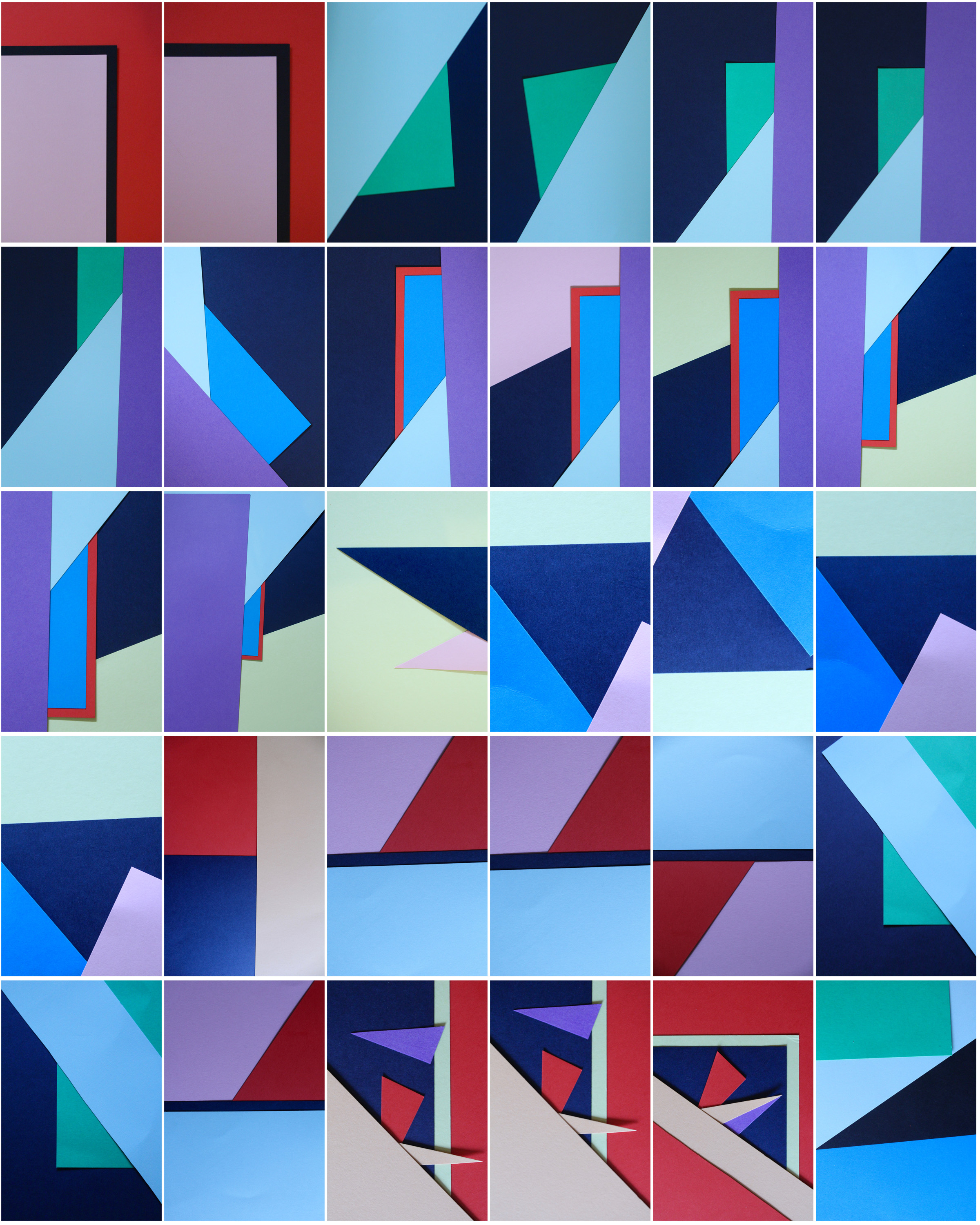
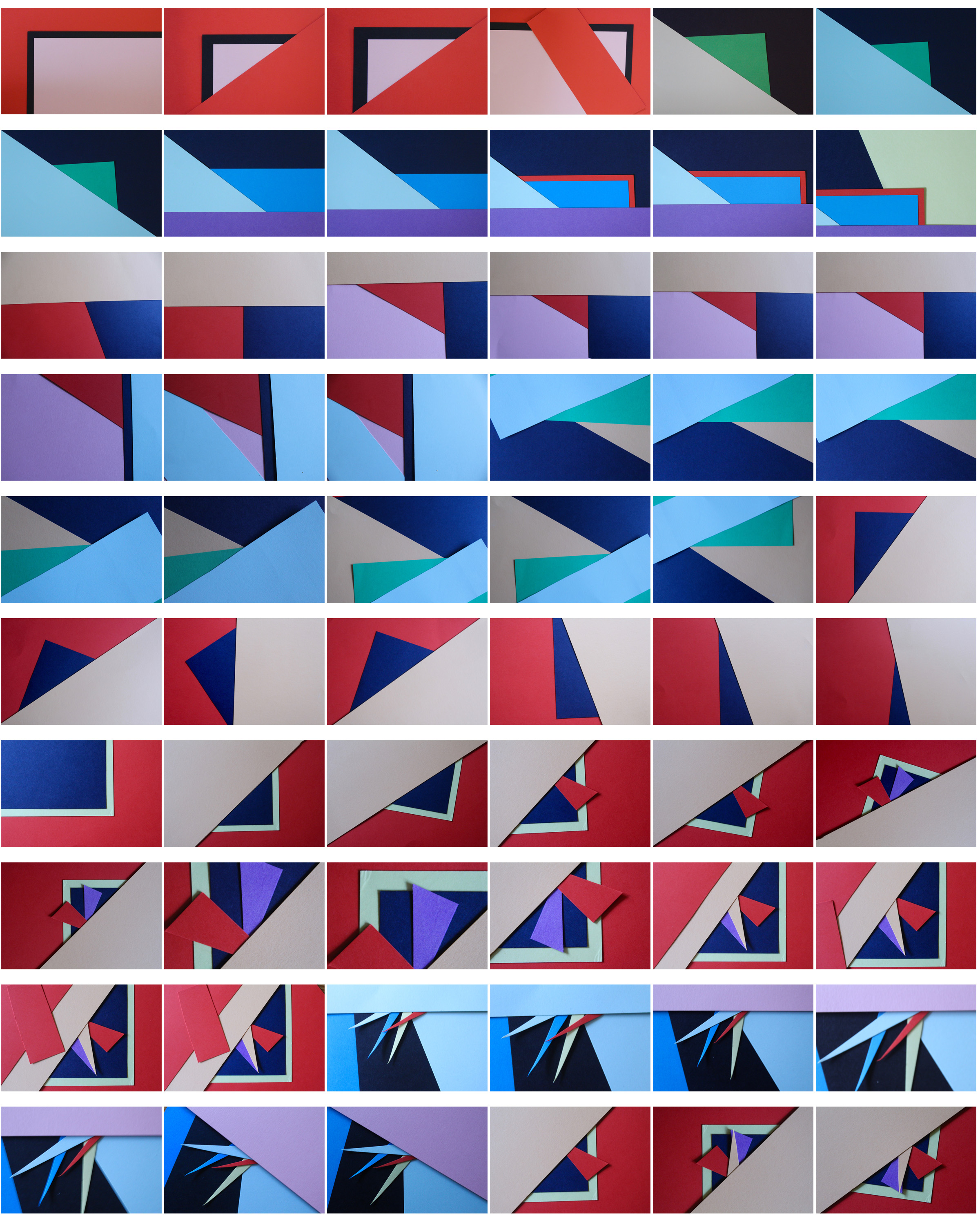
I first experimented with colours and changed the hue of the photos in photoshop and decreased the brightness so the colours weren’t too vibrant. I chose this photo as I think it represents abstract photography well through the solid bold colours and geometrical shapes I created by layering and cutting coloured pieces of paper. I tried to focused on creating contrasts between light and dark pieces of card to emphasise there colour. I personally like the red and pink coloured photos as I think they are the most bold and striking images.

I chose my two favourite photos that I think are the most aesthetically pleasing and experimented by flipping them horizontally and vertically trying to find the best composition and found that I preferred my original composition out of them all.

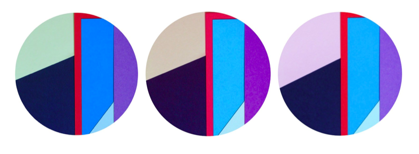
I also experimented by using circular frames which focused more on the middle section of the images, giving them a different appearance

Photo 2

This photo was one of my favourites from my typologies exploration in London, when taking inspiration from Hilla and Bernd Becher. I found that it worked better as a single image, rather than together with others as it contained so much detail. I like the geometrical aspects it has and the repetition and pattern it shows, as well as the tonal variations.

I experimented with the original image, seeing if the photo looked more aesthetically pleasing in colour or in black and white and thought that both worked well as an overall image but decided that black and white was more powerful.

Photo 3

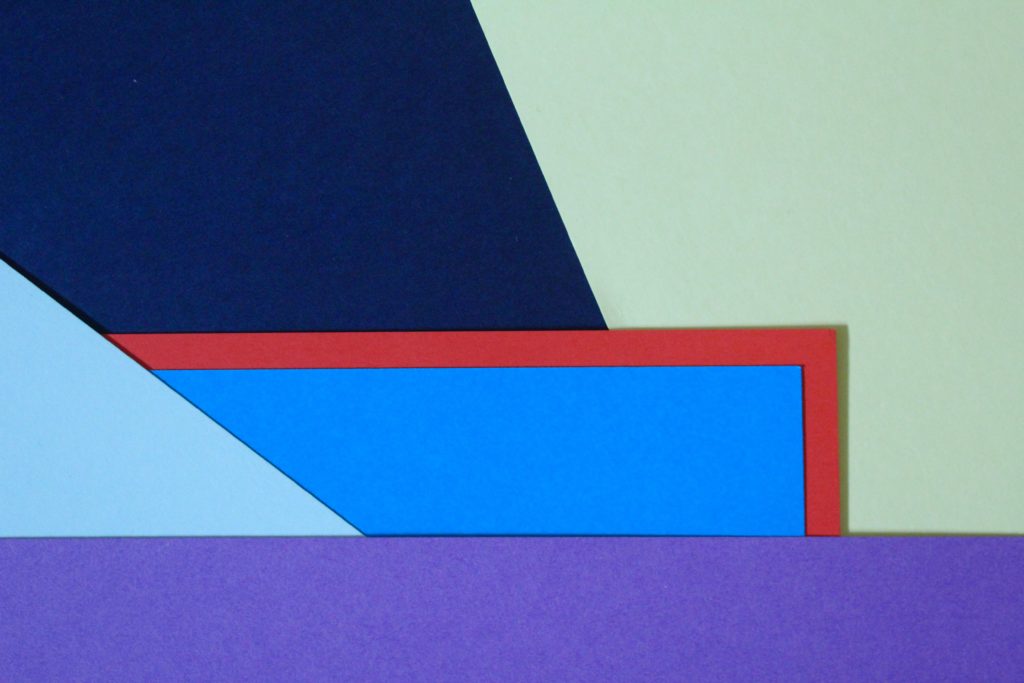
I chose this photo as one of my final images as I think it is a good interpretation of Tamara Lorenz’s work. I like the arrangement of the coloured paper and how I layered them to create distinct shapes with bold colours.

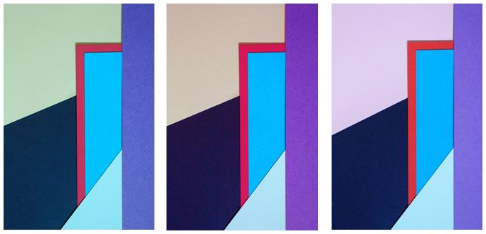
I experimented with the photo, adjusting the hue and I found my 3 favourite edits. The colours I found complemented each other the most were in my original image where the cooler colours (light green, navy and blues) contrasted with the warm colour red, giving a bold outline, which is the point where your eyes are drawn to in the photo.

I experimented with one photo by flipping it to create different layouts and creating symmetrical arrangements. I found that my favourite composition was the photo in landscape:

I like this composition as it contains horizontal lines as well as diagonal lines, with different sized shapes which are emphasised when the picture is landscape.


I also used circular frames to see if the images look more effective and found i preferred my images in a rectangular frame, following the geometrical design of the photo as the contrast of straight edges to circular edges is not aesthetically pleasing.

Colour- Homework 5

Taking inspiration from Tamara Lorenz, I tried to re-create her abstract photography using sheets of coloured paper and arranging them in different ways. I selected colours that complemented each other and cut pieces of paper to create traingles and other shapes to make the photos more interesting.

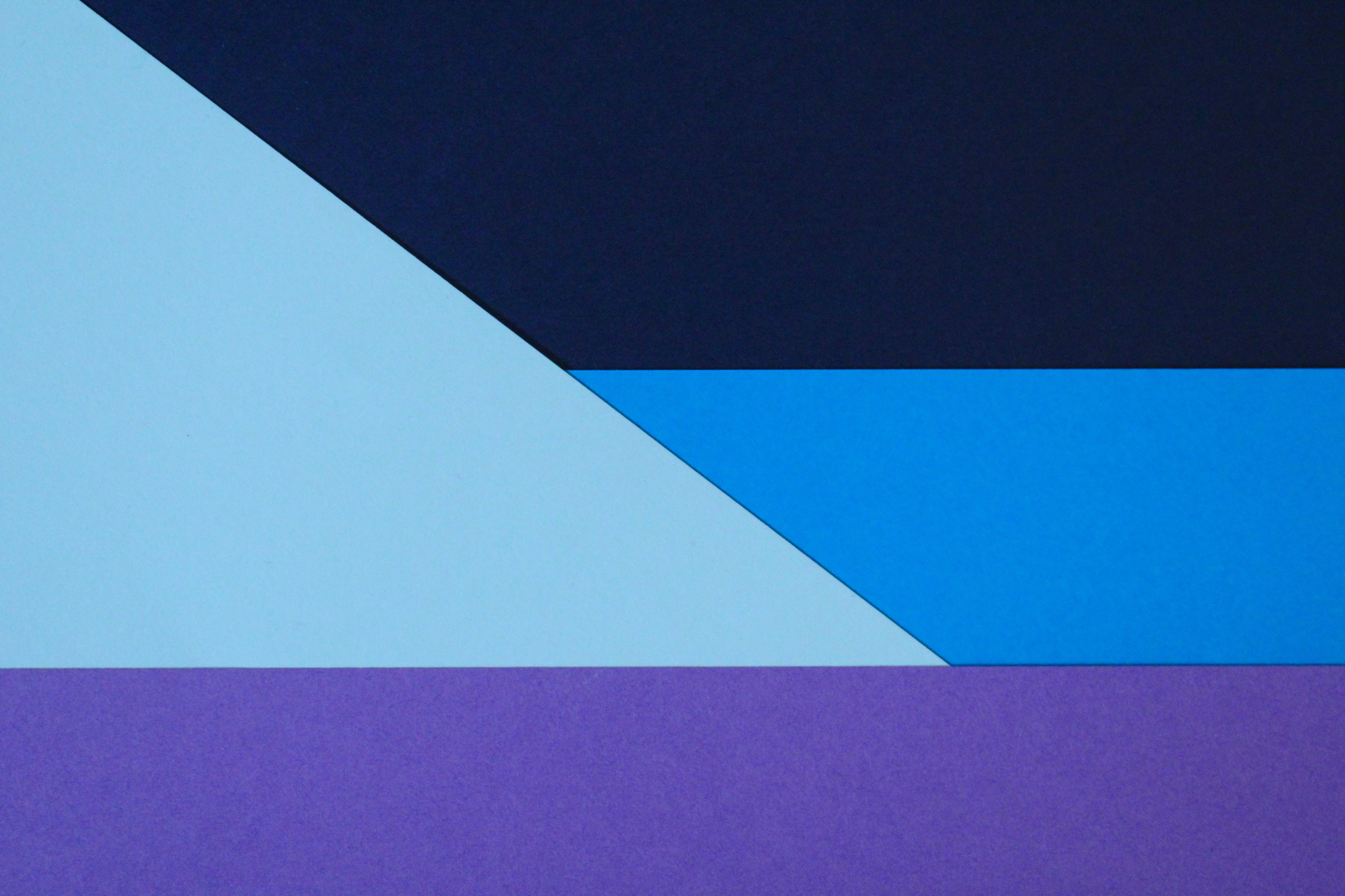
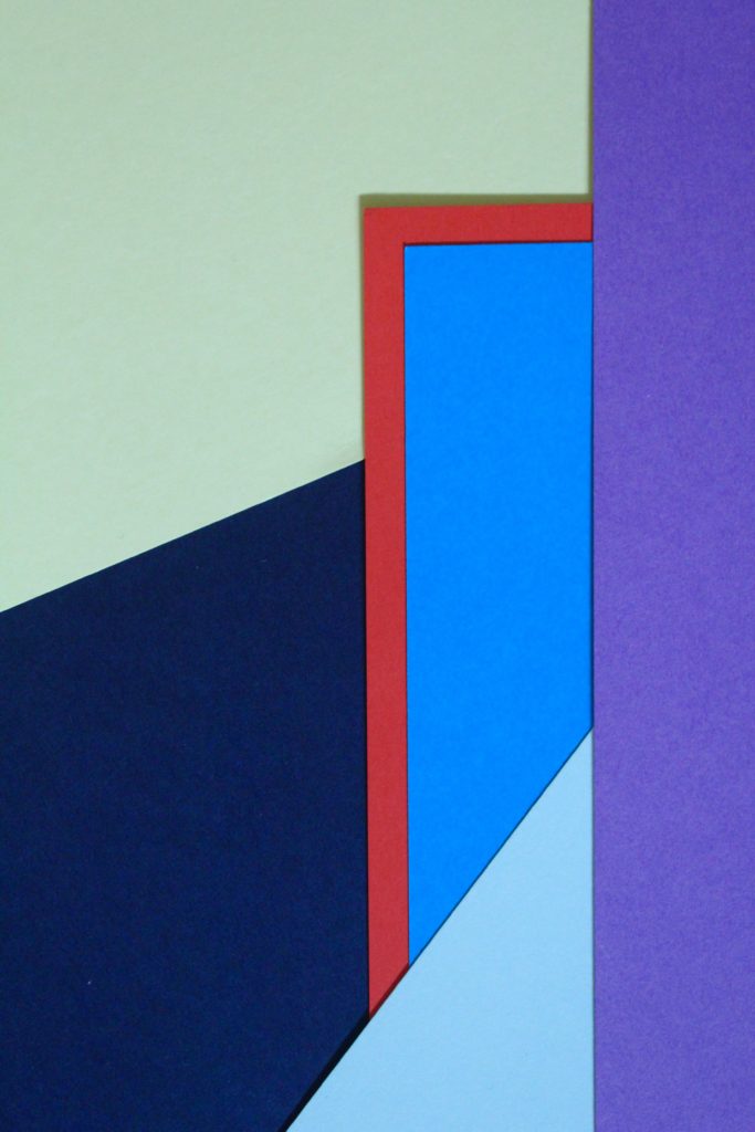
I especially like this photo and the colours I used to create the pattern. The red sheet of paper with the blue layered on top creates a bold outline and is the point where your eyes are drawn to. Like Tamara, the addition of strong planes of colour provide another source of contrast in addition to those of line, shape, tone and texture. The cold colours paired with the warm colour creates a contrast between the sheets. The paper layered behind is arranged to create distinct geometrical shapes, emphasising the straight lines. I experimented with different angles to place the paper and tried to find the most aesthetically pleasing arrangement. I experimented with flash and natural light and decided that natural was better. This work also shows similarities to Franco Fontana’s work using bold, vivid blocks of colour to link into abstract photography.

To further develop these photos I could arrange them in a different shapes, e.g. a circular shape, to frame the photos even more.