All posts by Megan Woolsgrove

Filters

Author:
Category:

Fay Godwin

Fay Godwin is very much a writer’s photographer, in more senses than one. Poets and novelists are drawn to her work, and she worked closely with several. The work comments on both the romanticism of the British Landscape and the harsh man altered reality.
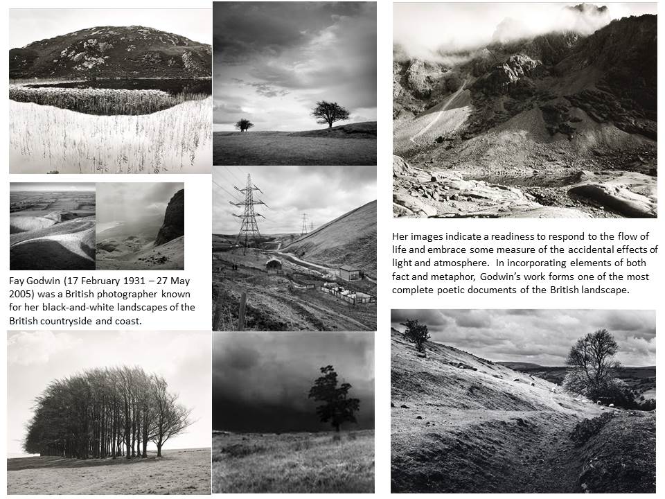
Godwin’s involvement with photography stemmed from the hobby of photographing her children which led in the early 1970s to commissioned portraits of poets and writers. Her interest in landscape was stimulated by her love of walking. She subsequently co-authored many essays, guide-books and poems on the theme of British landscape.

When photographing landscapes she worked in black & white and her genuine concern for the environment made her a unique figure in British photography.  Her images were noted for their clarity, careful composition and expert control over tonal values. She was known for great tenacity and determination when creating an image. When someone once remarked to her that she had been lucky to catch the ideal cloud formations in a particular picture she quickly replied, ‘I didn’t “catch” it. I sat down and waited three days for it.’
Heptonstall

Image Analysis:

  • The image contains horizontal lines which divides the image into three sections demonstrating the rule of thirds.
  • It contains a hill in the foreground and more hills in the background creating sections within the image that join together to make shapes, similar to three triangles.
  • The placement of the horizontal lines makes the image a good composition as each section is a different tone: the foreground starts off the darkest followed by a lighter grey followed by the white in the sky to emphasise the dark clouds.
  • The darker tones allow for the beams of sunlight to be emphasised coming forward creating a misty effect in the middle ground which is also emphasised by the dark bushes and trees.
  • The main cloud in the sky on the left is the same tone as the foreground making it stand out from the white sky and make a complementary picture.
  • Fay Godwin’s image is an example of romanticism in landscape photography as it shows an interest in the natural world and has a powerful and dramatic composition and provides an expression of personal sentiment.


Romanticism

Romanticism is a term in use by the early nineteenth century to describe the movement in art and literature distinguished by a new interest in human psychology, expression of personal feeling and interest in the natural world

At the end of the 18th century and well into the 19th, Romanticism quickly spread throughout Europe and the United States to challenge the rational ideal held so tightly during the Enlightenment. The artists emphasized that sense and emotions – not simply reason and order – were equally important means of understanding and experiencing the world.

Image result for romanticism artRomanticist practitioners found their voices across all genres, including literature, music, art, and architecture. Additionally, in an effort to stem the tide of increasing industrialization, many of the Romanticists emphasized the individual’s connection to nature and an idealized past.

Image result for romanticism photographerPainters began using current events and atrocities to shed light on injustices in dramatic compositions that rivaled the more staid Neoclassical history paintings accepted by national academies. Powerful compositions also erupted during this time, with artists often painting mythical, landscape, or historical scenes focused around a particular message.

In British art, Romanticism was embraced in new responses to nature in the art of John Constable and J.M.W. Turner. Visionary artist William Blake examined man’s place in the cosmos and his relationship to God as well as exploring new ways of looking at human history. Other significant painters of history subjects were Henry Fuseli, James Barry and John Hamilton Mortimer.

The invention of photography very nearly coincided with the Romantic movement.  These included responses to nature, the environment, atmosphere, spirit of place, heightened moments of awareness and reflections on antiquity and ruin,


Final Image

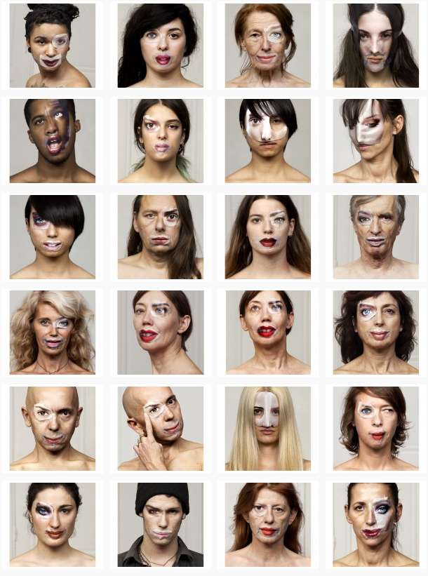
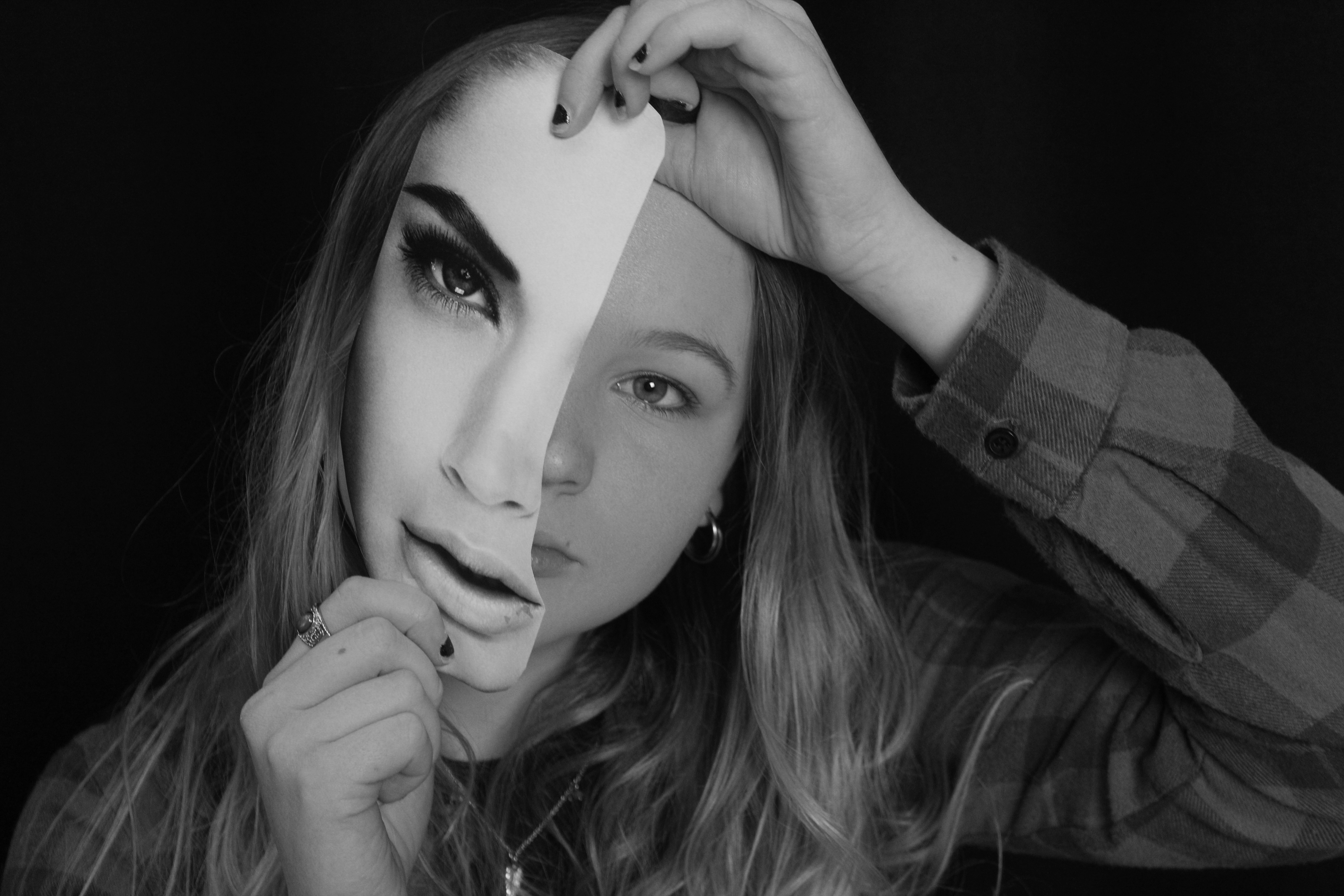
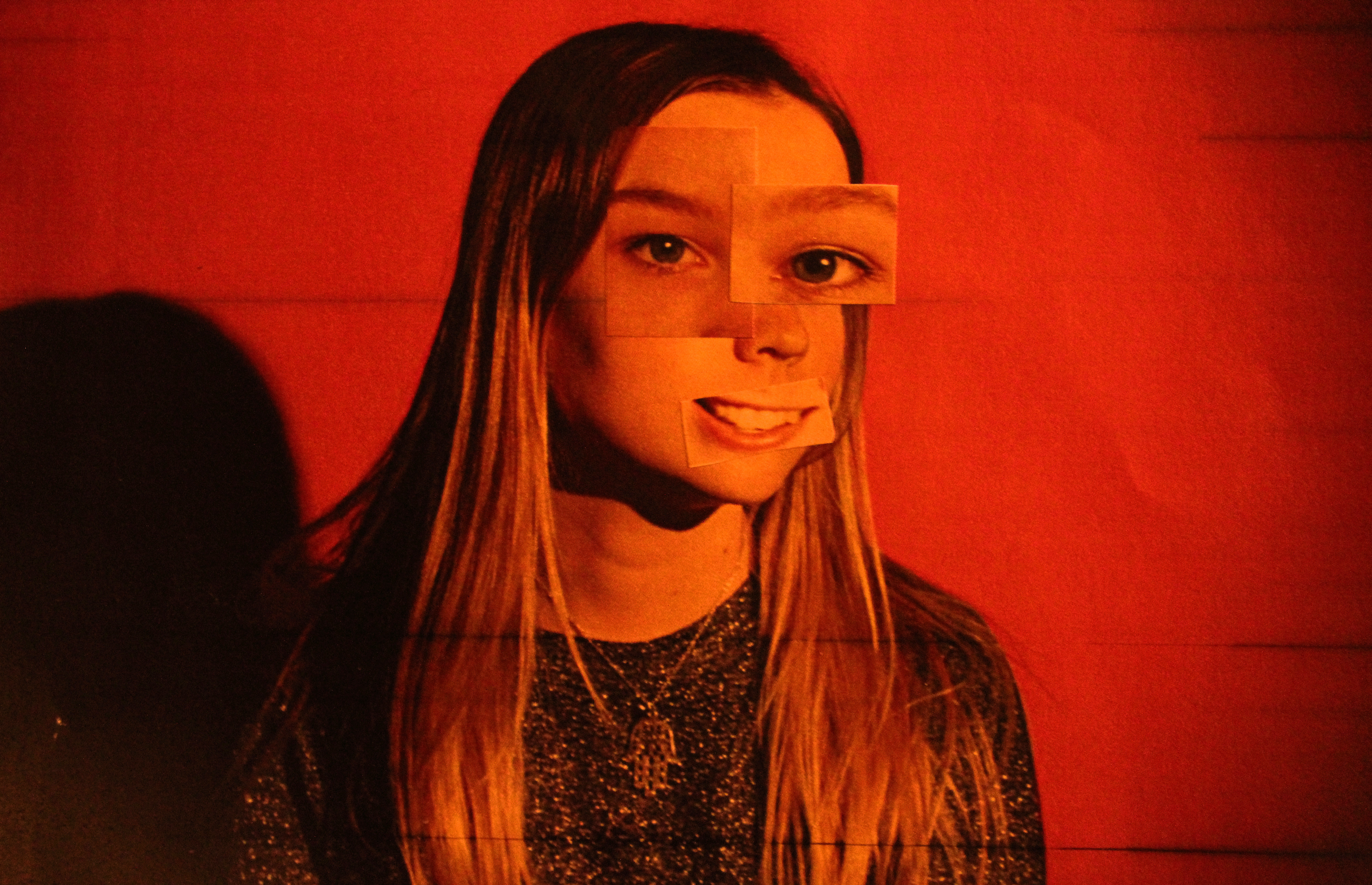
I chose this as my final images as I think it is a good interpretation of Bruno Metra and Laurence Jeanson photos from their series ‘The Identity Project’. In this series  they apply cut outs of facial features from  magazines onto their subjects faces to create a new form of facial expression, like they appear to have cosmetic surgery. This provides a juxtaposition between everyday humans and the images seen in advertisements e.c.t

The image has the contrast between cold and warm colours. The blue tints on the cut out face is balanced out with the blue shirt the model is wearing which is contrasted with the warm colours on face similar to the hair, makes it complementary. The image has a background which is created from taking the photos in a studio. Unlike Bruno Metra and Laurence Jeanson’s photos where they sometimes incorporate a background of a bedroom or something personal, I decided to keep the background black as it keeps the focus and emphasises the model and creates contrast between the bright white cut out and the dark background. In Bruno Metra and Laurence Jeanson’s photos they physically stuck the cut out on to the models face whereas I had the model hold the cut out in front of her face creating mask like effect. The cutout is mostly centered  creating a division between the paper and face down the middle of the image. Although the cutout is not the same size as the models face and does not meet to look like a real face, Bruno Metra and Laurence Jeanson also did this to make it obvious that the cutout are not edited on after the original photo was taken. I made it so the cutout is bigger than the models head to emphasise the seriousness and harshness on the models face (as well as the cold colours) which is contrasted with the warm colours on the models face to show power. The lighting used when taking the photo was harsh to highlight the models features and to brighten the face on the cutout making it stand out more than the actually models face. It is also portrayed harshly to create a harsh division.

The concept of the image I found when exploring Brno Del Zou and John Stezaker photography when they manipulated faces to create a different appearance for them. The concept for Bruno Metra and Laurence Jeanson series is beauty, identity and fashion. The idea came from challenging brainwashing ideas of beauty as it is expressed in culture and especially in the illusion of beauty as represented in fashion magazines.  The series is to picture an individual’s face as a collage of collective images: models, standards, norms of beauty, to question the construct of personal identity. It focuses on Photoshop creations, and the impact that this beauty has on people. Bruno Metra and Laurence Jeanson covered eyes and lips of models from fashion magazines on real humans and the result is a mixture between reality and glamour.

Throughout the project i developed my ideas and overall I think this photo sums up my portrait project and my final ideas well.

Final Outcomes

Image 1

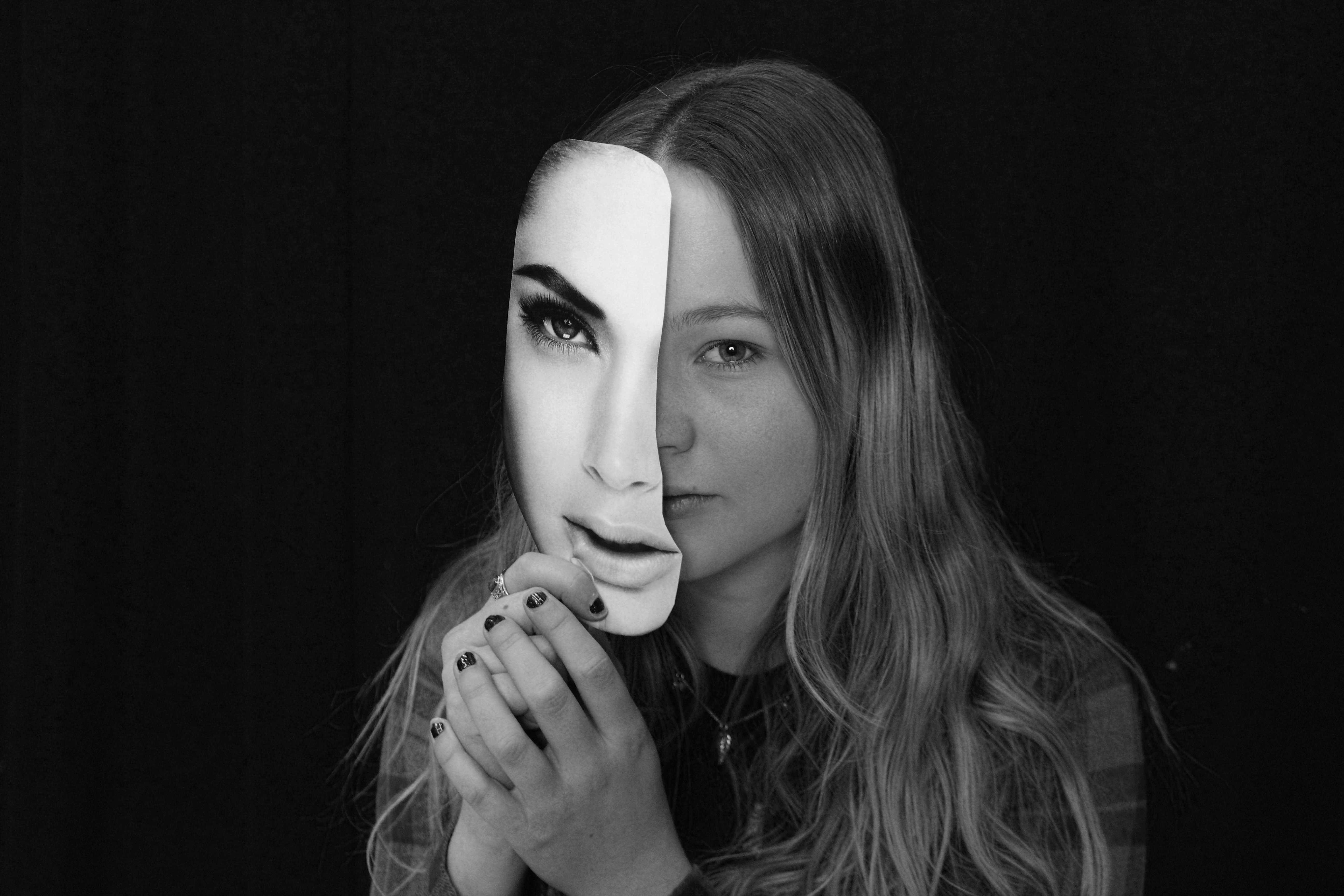
I chose this as one of my final images from my creative portraits homework that interprets Bruno Metra and Laurence Jeanson’s photography where they apply cut outs of facial features from  magazines onto their subjects faces to create a new form of facial expression, like they appear to have cosmetic surgery. This provides a juxtaposition between everyday humans and the images seen in advertisements.

Experimentation

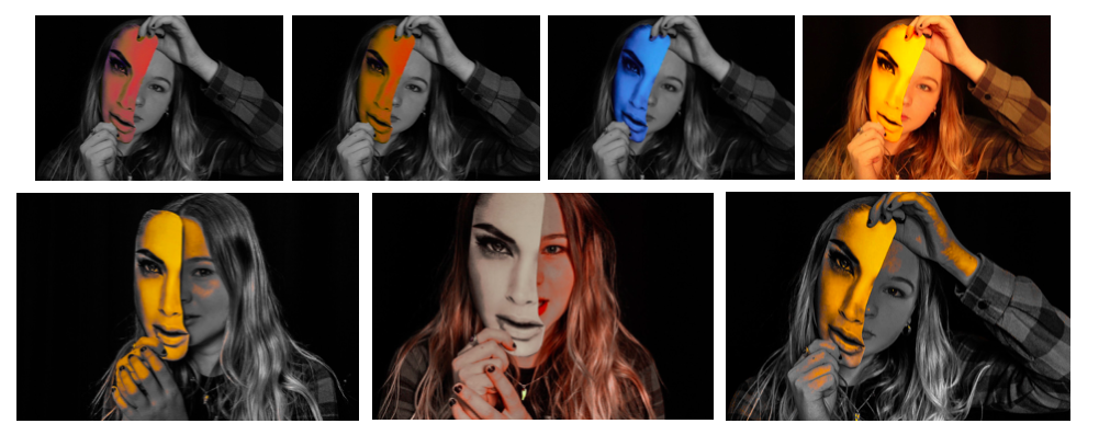
I first experimented by altering the colour of the photo from black and white to colour and adjusted the hues to create contrast wihin the image. I also edited the cut out face different colours from the background to create even more contrast and to emphasise that it is an important part in the image.

I also experimented with the shape of the frame to see if the image was more effective when focused on the middle section of the photo.

I found that i preferred the image when i had a rectangular frame so the audience is not distracted from the image and concept.

Compare and Contrast

When compared to Bruno Metra and Laurence Jeanson’s photography I think that the image portrays the same concept and provokes the same emotions that the audience would get if they saw Bruno Metra and Laurence Jeanson’s work. One main difference between my work and ‘The Identity Project’ series is that where in Bruno Metra and Laurence Jeanson’s work they often physically stick the cut out image to the models face, whereas in my work I had my model hold the image in front of her face creating a mask-like appearance. This makes the image look like the cut out could have been edited in after the photograph was taken but the model was physically holding the cut out so the image did not need too much editing afterwards. Another difference is that the background of my photographs is black focusing all the attention onto the model with no distractions, whereas in a couple of Bruno Metra and Laurence Jeanson’s photographs they included a background of a bedroom or something personal in the photograph making the images more personal which is not achieved in my images. Although most of their images had a white background to emphasise the model rather than whats in the background aswell.

Image 2

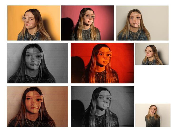
Another one of my final images is this image that was in my creative portraits homework and took inspiration from Brno Del Zou’s work where the body and the faces are revisited and their volumes are highlighted in order to create installations of multiple scales. I tried to recreate his work by editing images in photo shop and also physically cutting out paper and sticking it down and found that when I physically cut out the face it was more effective.

Experimentation

I tried experimenting by changing my image from colour to black and white like Brno Del Zou’s photos and also different colours like pink and red. The one with the best overall appearance is my original as I think the experimentation’s look too over edited and i like the orange/yellow tint that is shown when i took the picture as i used artificial light and altered the ISO.

Compare and Contrast

When compared to Brno Del Zou’s photography you can definitely tell that my images are inspired by and are an interpretation of his work. One main difference between the images are that Brno Del Zou’s photography contains many different images with significantly different angles of the same face. Mine however, although are of the same face, do not contain as many angles as Brno Del Zou’s in the final image and are mostly of the same angle but with different facial expression. This is the effect I wanted to created and wanted to create the image of a full face with altered expressions and arrangements within it. Another difference between mine and Brno Del Zou’s work is that he physically raises the different images within the face to create visible shadows between the different cut outs. Whereas I directly stuck the cut of images onto the original image to make it look more like a real face without shadows and different sections. I think both these arrangements create different effects but have similarities between them. Another difference is that Bruno Del Zou’s work is in black and white whereas mine i kept like the original photo with the orange/yellow tint as it makes the photo look even more individualized and direct. Because you can  see the thin white outline where I cut the paper it creates an unrefined, homemade effect which I think makes the image more personal.

Creative portraits Homework-part 2

The exploration of both Bruno Del Zou and John Stezaker led to me the idea of experimenting with visual perception, linking to the way we see ourselves.  When researching this idea I came across a series of photographs called ‘The Identity Project’ taken by the French photographers Bruno Metra and Laurence Jeanson. They created a series of portraits that deal with the concepts of identity, beauty and otherness. Experimenting with our visual perception, they apply cut outs of facial features from glossy magazines onto their subjects faces to create a new form of facial expression, like they appear to have cosmetic surgery.

http://www.123inspiration.com/plastic-surgery-with-magazines-by-metra-bruno-and-laurence-jeanson/

“Magazines, cinema, television, keep creating and imposing codes that become social references. What one must look like, how to make up, what clothes to wear, how to behave… We are fascinated by the power of media to influence people’s identities.”

The series provides a compelling visual juxtaposition between everyday humans and the images seen in advertisements, taking a hard look at our identity, as each subject in the photograph de-faces and destroys her or his own image.

To explore this I planned to do an experimentation, taking inspiration from Bruno Metra and Laurence Jeanson , incorporating images from  magazines on peoples faces. First, I would try having printed  images and attaching faces from magazines and re-taking the picture and secondly physically attaching the cut out facial features over their eyes, lips, and noses to my subjects face, like Bruno Metra and Laurence Jeanson did in their series.

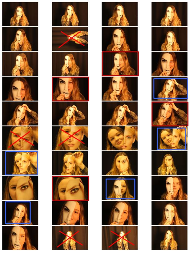
In my photo shoot I used a few different heads cut out of magazines and found that the one I used in the images that I’ve decided to experiment with was the most effective out of them all. This is because the cut of was the closest to the size of the actual model head.I then chose my favourite 6 images and displayed them next to each other so i could compare them. The pictures already had an yellow/orange tint when I took them which is what i wanted but i then decided to edit them to experiment with colours.
Although i do like the images edited with colour I decided my final 3 images for this shoot be in black and white as it gives them a dramatic effect that is not achieved in colour.

To edit these images i turned them black and white and increased the contrast to make the magazine cut out stand out even more compared to the subjects face. Doing this highlights the cutout and emphasises the shadow between the face and the paper creating a mask-like effect (especially on the 3rd image) and creates a clear division between the two. I decided for my final images to be in black and white as i did not want them to look over edited and too unnatural. I think I did a good interpretation of  Bruno Metra and Laurence Jeanson photography linking to the visual juxtaposition between everyday humans and the images seen in advertisements and their exploration of identity.

Creative Portraits Homework-part 1

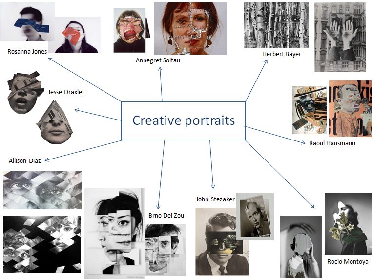
I first created a mind map of photographers that interested me and that I thought related to the concept of identity. The manipulation of paper and the way we perceive the photograph was also important when deciding which photographers I would take inspiration from when doing my photo shoots.

I tried to interpret his style by creating images by layering different sections from different cropped photos.I edited some of the photographs on photo shop and some by cutting the paper and physically sticking on the different angles of the face to experiment which way worked best. I found that the better effect was when i physically stuck on paper on the printed out face as the images edited on photo shop looked too artificial, whereas the stuck on photos looked developed and well experimented.
These are my two final selections that i have chosen to be printed and framed:

Some more examples of John Stezaker’s work:

John Stezaker’s work may, in several respects, be part of the continuity of the collage activities that marked 20th-century art, but they stand out in particular by the way they broach the construction of meaning.
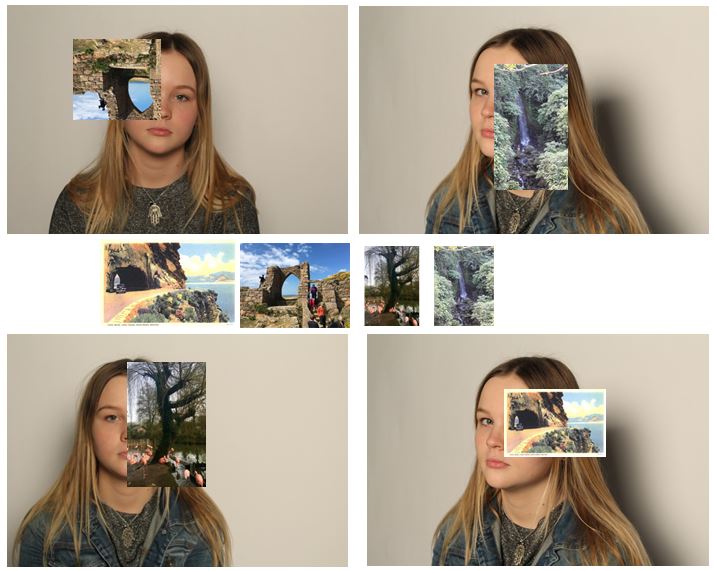
Some experiments:  I tried to interpret John Stezakers work by editing photos onto images of my subject. I tried to select images that would make for an interesting photo and tried to connect lines in the attached photo to lines and sections on the original photos. For three of the images i edited my own photographs onto the image and the forth one i used a picture of an postcard I found online to interpret John Stezaker’s work the best i could as he used postcards in his photos, which i think is the most effective out of the four.

When experimenting with Brno Del Zou and John Stezaker’s work i found that my experiments did not have a clear meaning behind them and decided to explore more to find a different photographer more suited to my point of view.

Tableau, and Identity

Tableau Photography

Tableau is French for ‘living picture’ and is a style of artistic presentation. It most often describes a group of suitably costumed actors, carefully posed and often theatrically lit. By extension, it also applied to works of visual art including painting, photography and sculpture. The characters are arranged for picturesque or dramatic effect and appear absorbed and completely unaware of the existence of the viewer.

Sarah Jones, ‘The Dining Room (Francis Place) I’ 1997

The term was first used in the eighteenth century by French philosopher Denis Diderot to describe paintings with this type of composition. Tableau paintings were natural and true to life, and had the effect of walling off the observer from the drama taking place, transfixing the viewer like never before.

Related image

Sir John Everett Millais, Bt, ‘Christ in the House of His Parents (‘The Carpenter’s Shop’)’ 1849–50

In the 1970s, a group of young artists began to make large format photographs that, like paintings, were designed to hang on a wall. As a result these photographers were compelled to engage with the very same issues revealing the continued relevance of the tableau in contemporary art.

Image result for tableau photography

Identity

Identity is the way we perceive and express ourselves. Factors and conditions that an individual is born with—such as ethnic heritage, sex, or one’s body—often play a role in defining one’s identity. However, many aspects of a person’s identity change throughout his or her life. People’s experiences can alter how they see themselves or are perceived by others. Many artists use their work to express, explore, and question ideas about identity.

Homework 3- Studio

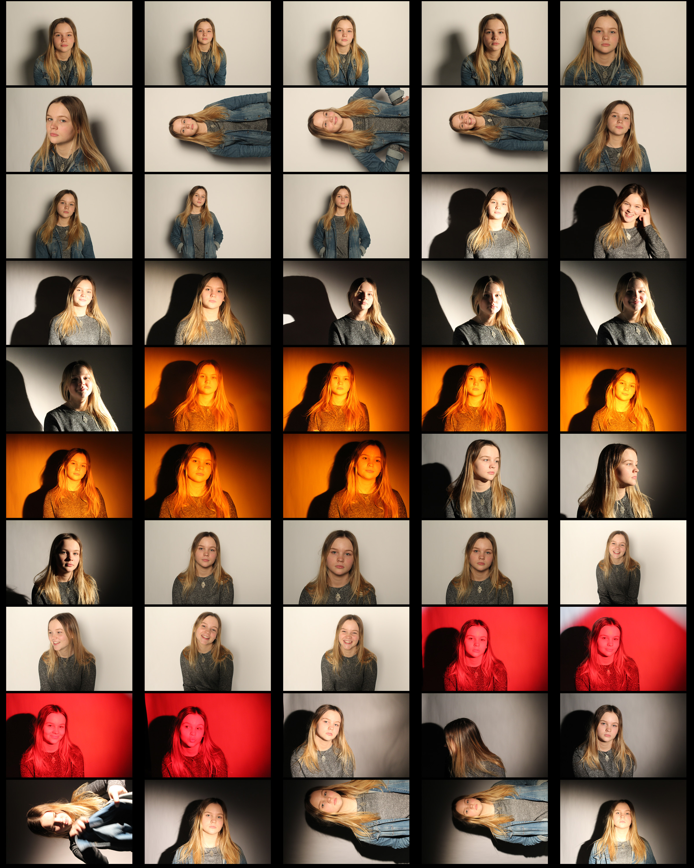
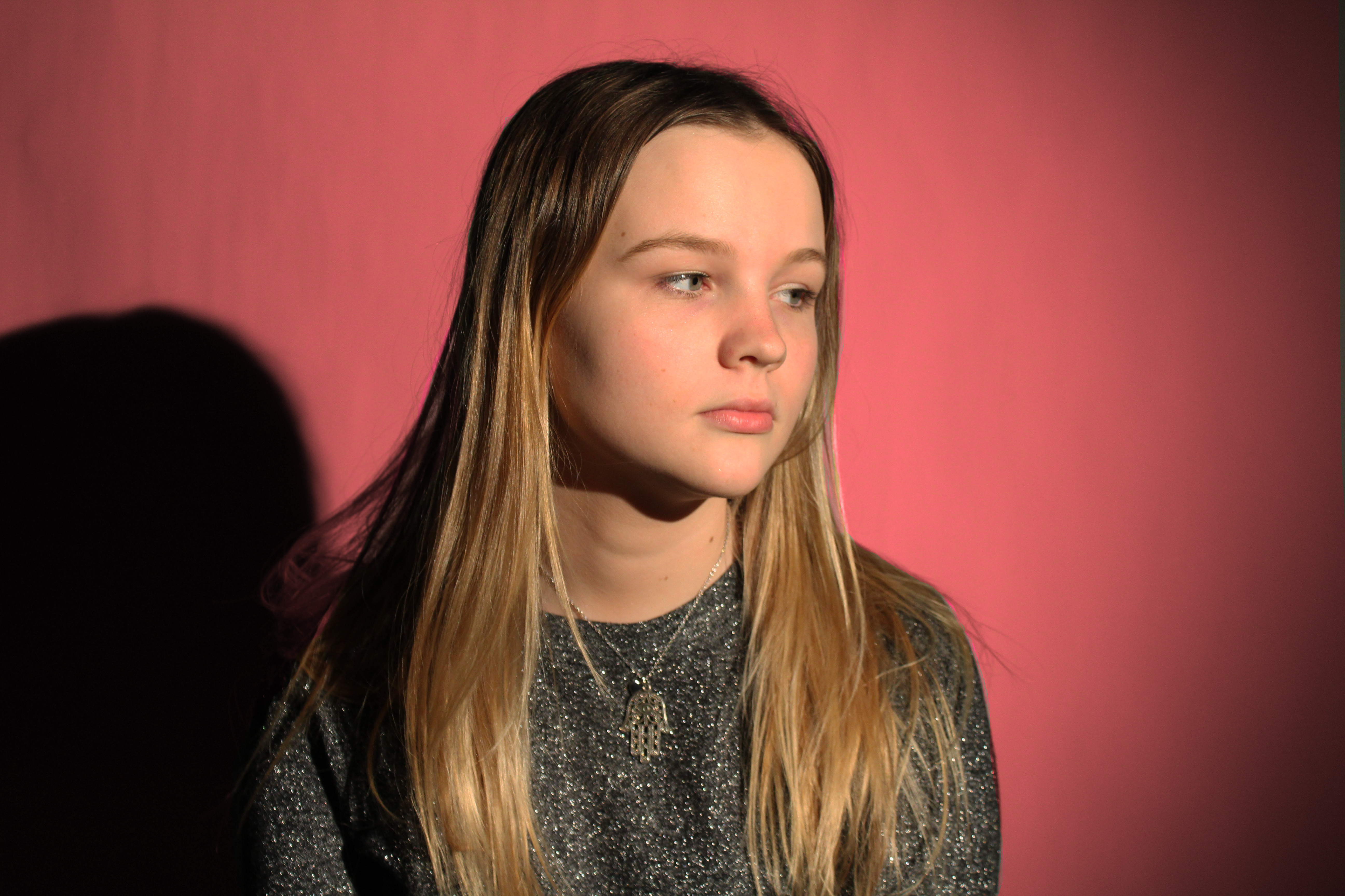
For my photo shoot in the studio I focused on experimenting with different lighting to create an atmosphere and the shadows which are created behind.

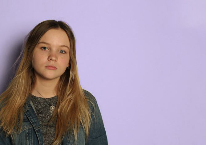
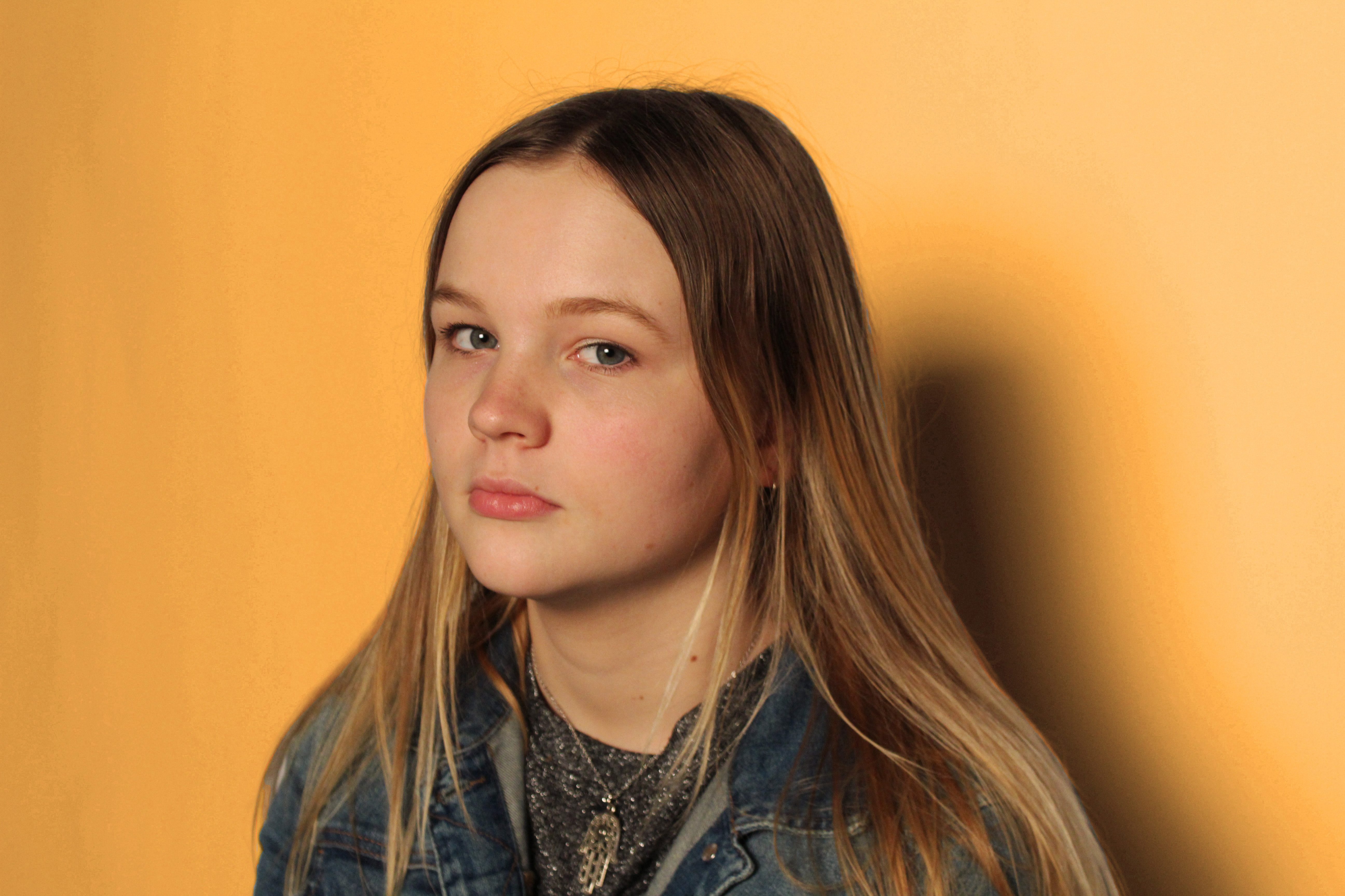
These are my final 4 images:
I edited the background on photoshop as the lighting produced in the studio was not as bright and colourful as i wanted it to be. I used the original image of my subject (with adjusted brightness and contrast) and only edited the background a different colour to make the subject stand out and to create separation from the two parts of the photograph. My subject has a neutral face in my final four images as i think they are most effective like this. I also selected images that were taken at different angles to create variation within the four and so the photos could be displayed individually or together. For example:
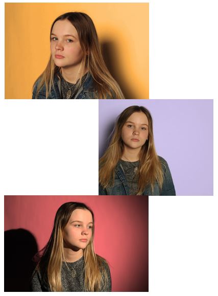
The photos could be shown in a set to show variation and the contrast between the background colours. For my final selection I chose the images where i used a soft box, reducing harsh shadows and where the light is even and soft on the face.

Overall my studio photography but does not have a concept behind it making these images seem less interesting. To develop my work i will explore different ideas and concepts to improve and create variety in my work.

Studio Lighting

Why do we use studio lighting?

We use studio lighting when we want to control illumination, the subject as well as the camera and exposure settings.
Studio lighting  (strobes, reflectors, diffusers etc.)  offers us that control.

Image result for picture of photography studio

Shooting Mode:

Manual mode is often preferred once an initial exposure is established. If you’re shooting your camera in Manual Mode, and your flash in manual mode, you’ll also adjust flash intensities and then apertures. If your images are dark, you increase the intensity of your flash and/or use a smaller (higher) aperture. If your test images are overexposed, you decrease the intensity of your flash and/or use a larger (lower) aperture.

Image result for lighting in photography techniques

One Point Lighting

In many occasions, a single source of light creates a very natural, sometimes dramatic look that will draw people’s attention to the single lighted person or surface- a single source looks two dimensional or flat, and rarely hits people straight on, so it creates shadows.

Two point Lighting

When you want the subtleness of a single light source but want your people to stand out in 3D, two-point lighting can be a great way to add dimensionality without going overboard on your lighting.

Three point Lighting

The goal of three point lighting is to create the illusion of a three-dimensional subject in a two-dimensional image.

  • The Key Light – This is the main light used on your subject. (The purpose of the key light is to put the light on the subject. You can place it anywhere you want, but a common placement is about 45 degrees to either side of the camera, and about 45 degrees up from the subject.)
  • The Fill Light – The purpose of this light is to fill in the shadows created by the key light, preventing them from getting too dark. (The purpose of the fill light is simply to fill in the shadows caused by the key light. One thing to be cautious about — the fill light should not create a second shadow. If you see two shadows, that means the fill light is too powerful and needs to be reduced.)
  • The Back Light – This is used to separate the subject from the background.
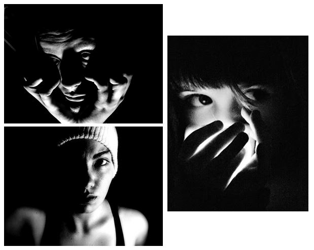
What is Chiarascuro ?

Chiarascuro is an oil painting technique, developed during the Renaissance, that uses strong tonal contrasts between light and dark to model three-dimensional forms, often to dramatic effect (it is a method of painting which imparts a sense of very directional light falling on the subject.) Artists known for developing the technique include Leonardo da Vinci, Caravaggio, and Rembrandt.

Some examples:

Homework 2- Street Photography

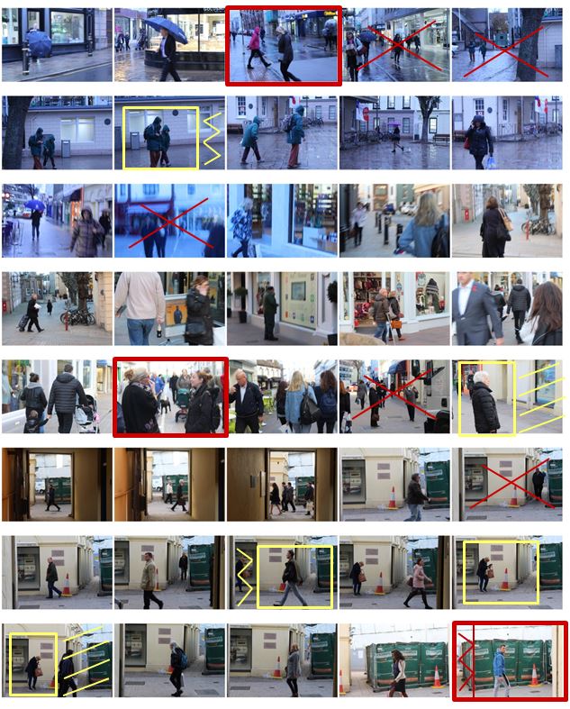
I selected the images from my photo shoot that I thought have a clear subject and a good angle at which the photo was taken and displayed them below. I have highlighted the photos I definitely want to use in red and highlighted them in yellow if they need editing.
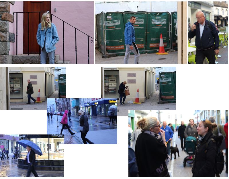
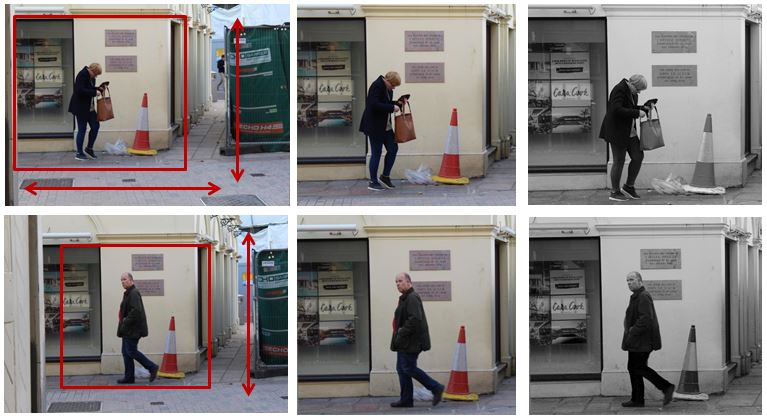
I have chosen these photos and have cropped them to make the overall photo more aesthetically pleasing and so you can see the person more clearly and distinctly. The photograph was candid as i took it at an angle in which the subject did not know they were being photographed, making it more natural. My favourite photo out of the two is the first one as it is more interesting as she is looking for something and is not just walking down the street.

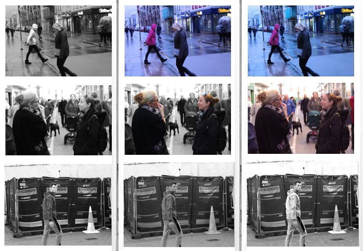
I chose another three images which I liked out of my photo shoot and experimented with the colours and tones. This process allows me to see my photographs next to one another and compare them with each other so i can effectively chose my final images. My favorite image from the first row is the 3rd image as i set the white balance to fluorescent light in order to create a blue tint. This creates the effect that the photo was taken in the evening. I also like the colours in the background as i think it gives the photo more atmosphere.

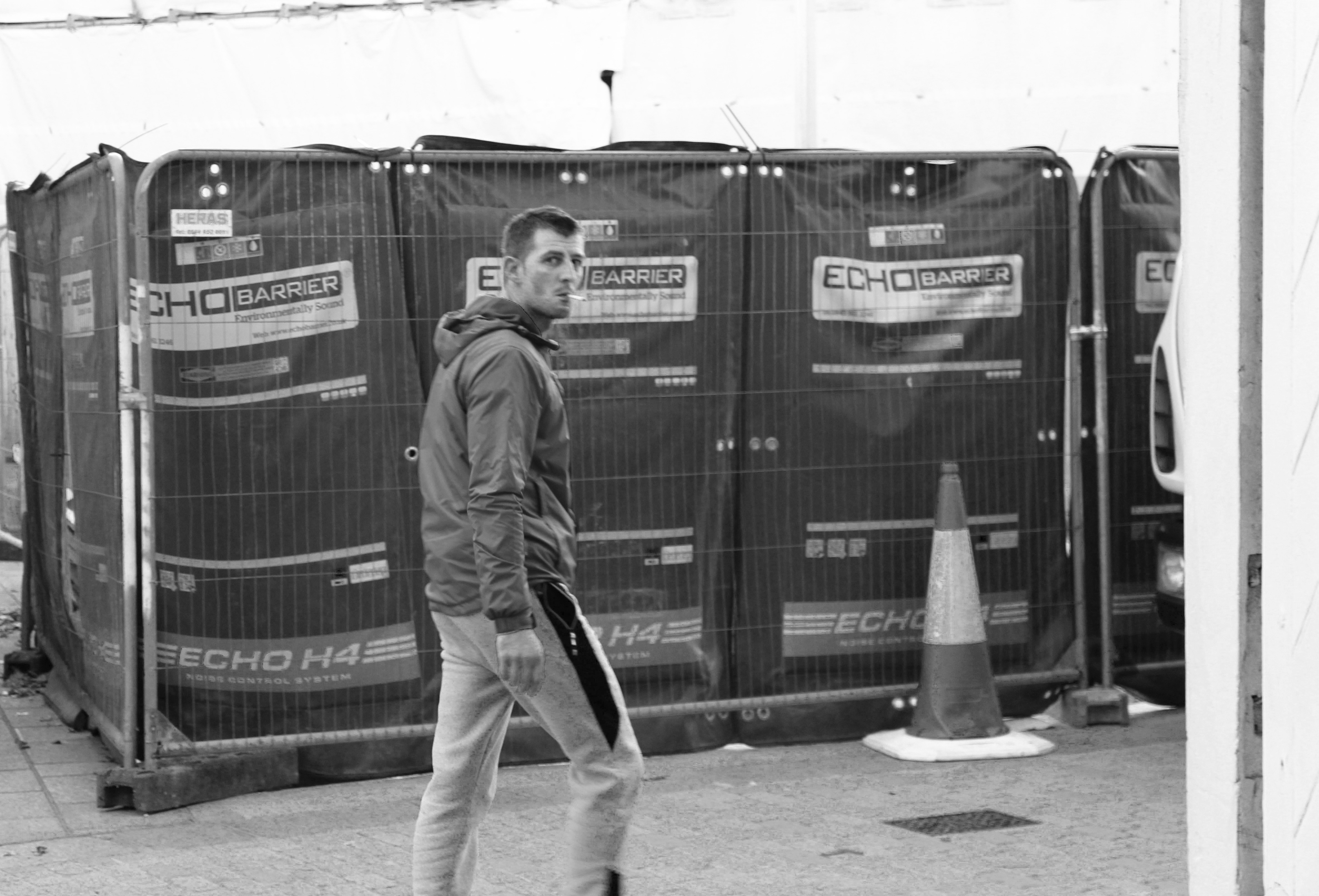
These are my final two images from the photoshoot.

The first image i like as the subject is completely natural which makes the photo candid. I also managed to capture the photo the moment in which he realised he was being photographed which is why his face is confused. I edited the photo in black and white to emphasise the the contrasts in colour and so the subject and the street are in similar tones. I like the background in the photograph and i think it portrays a street well, the fencing and the traffic cone create a sense of the loud atmosphere when the photograph was taken.

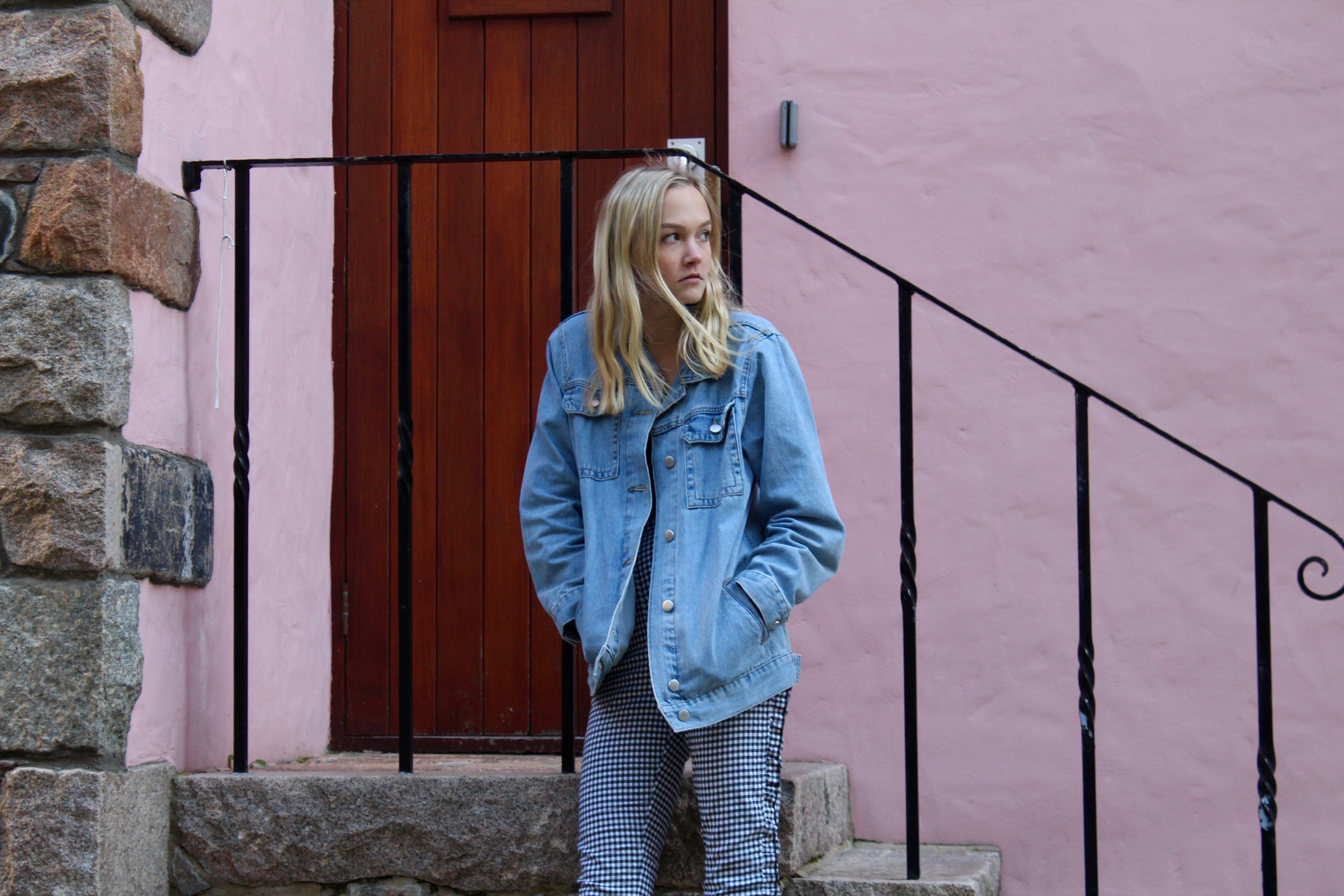
I chose this as my second final image as the atmosphere of the photograph contrasts a lot with the first image. The first being loud and busy, and this photo being more calm and relaxed due to the colours in the background of the photo. I edited the photo to emphasise the pastel light pink wall in the background and the railings behind her. The composition of the photograph is good as it is split up my straight lines showing the rule of thirds. The photo is also candid and natural as the subject is unaware that the photo is being taken making it ideal for street photography.