All posts by Megan Woolsgrove

Filters

Author:
Category:

Beomsik Won

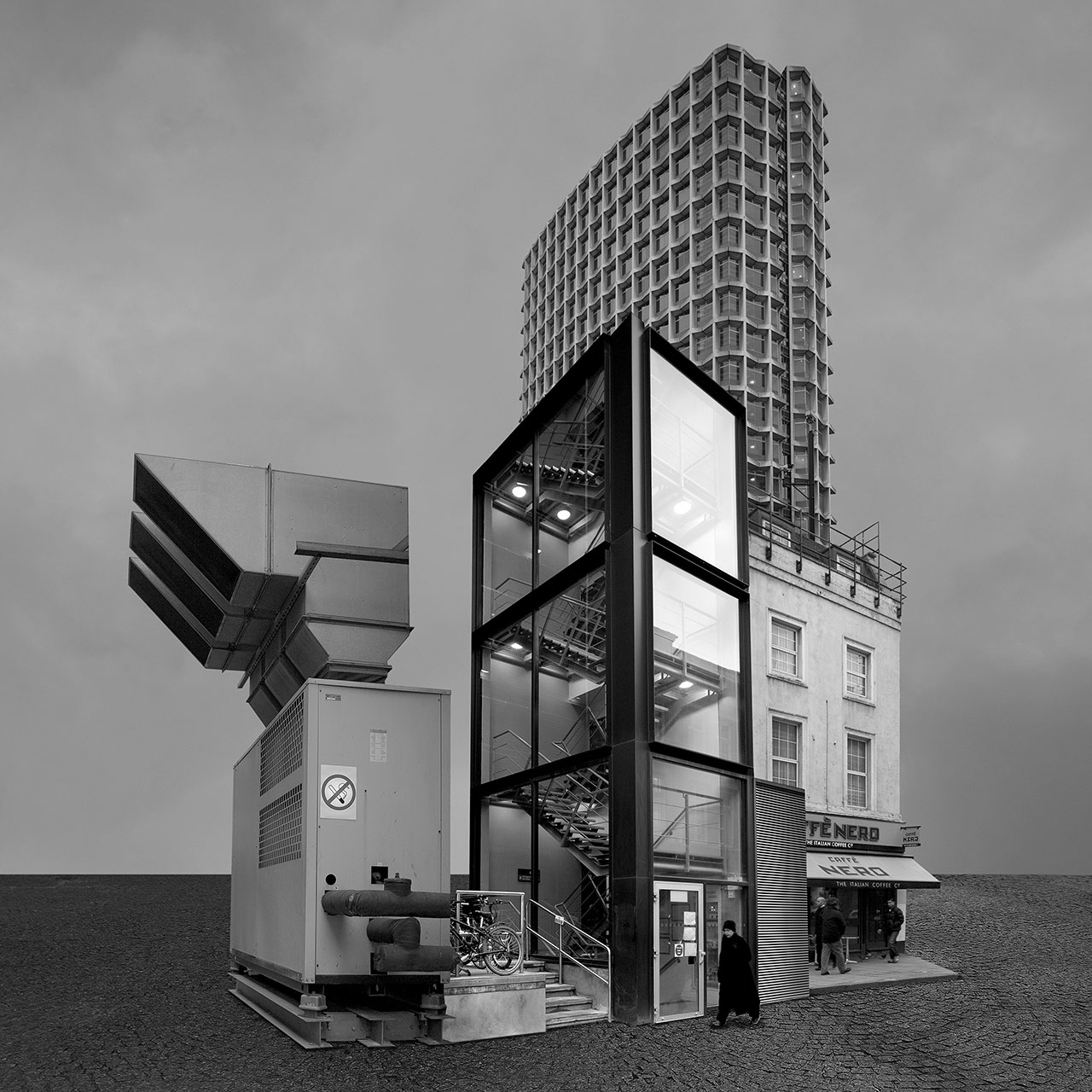
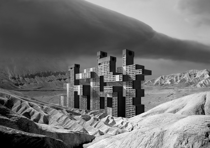
Beomsik WON takes photographs of urban buildings from different times and spaces, breaks them down into segments using digital techniques, and constructs collages to create familiar-looking, yet imaginary buildings. To make these “Archisculptures” as it is called, he carefully combines the segments taking into consideration the architectural size, space, and formative elements; he then places them against simple backgrounds, and lastly adds people or birds for the viewers to guess the size of the building. Although these strange buildings are products of the artist’s imagination, they show various styles of architectures throughout history.

  • In the Archisculpture series, WON collaged the images of politically or socially important buildings in order to present a new interpretation of a city that operates like an enormous organism.
  • He shows not only the history of the city but also the history of its people by revealing the surface of buildings that have been damaged due to natural weathering or historical incidents and then subsequently repaired.
  • The Archisculpture, essentially a collage of history and people, is how the artist collects, classifies, and preserves the collective memory.

His images are digitally manipulated photographs of non-existent, fantastical buildings that appear to be real.

“You have a photography and arts background. Where did your interest in architecture originate from? What inspired you to launch the Archisculpture photo project?

My interest in architecture stems from its gigantic size and pragmatic functions. Whenever I see buildings of grand scale or interesting design I usually take photos, so I’ve got thousands of them. However, I couldn’t use those photos because even though I took them I thought it’s not my work but the architects’. Thus I decided to use them as material for my artworks.”

At first, he only made images in black and white, but then he realised that the real world is not b&w but coloured. So since then he has been making two version at the same time. He believes the black and white version is more surrealistic than colour one.Beomsik Won, Archisculpture 003, 2010. Archival pigment print, 50x50cm.

Image Analysis:

  • Beomsik Won digitally manipulates and constructs buildings, compiling them together to create a completely new building. In this image he has combined an industrial machine, office buildings and  a cafe together.
  • The layout of the image is very aesthetically pleasing, with many straight lines within the windows and walls, as well as the straight horizon behind the buildings.
  • The buildings are placed to emphasise their different architectural sizes, levels and shapes, each level complementing each other.
  • He combines the different types of buildings and structures to show the contrast between them and compiles them together into one structure to make it appear real and to show various styles of architectures throughout history.
  • In the Archisculpture series, Won collaged the images of politically or socially important buildings in order to present a new interpretation of a city that operates like an enormous organism.
  • He emphasises the history of the buildings  by showing the surface of buildings that have been damaged due to natural weathering or historical incidents.
  • He took photos of the buildings from the same angles, or digitally manipulated them, so that they all fit together and face the same angle so they connected easily.
  • He uses a simple background of a cloudy sky and a cobbled pavement to emphasise the building he created  and the present it in a place where a normal building wouldn’t be, not surrounded by anything.
  • He takes the photos at different times of day so the lighting is different in each image. The glass window on the office building is reflecting white light , whereas the other buildings are not, emphasising how it is from the present-day as it is modern.

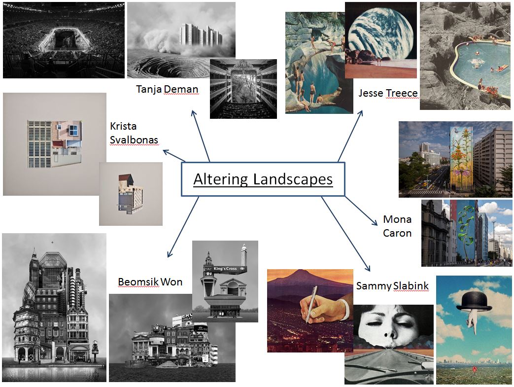
Altered Landscapes

Tanja Deman

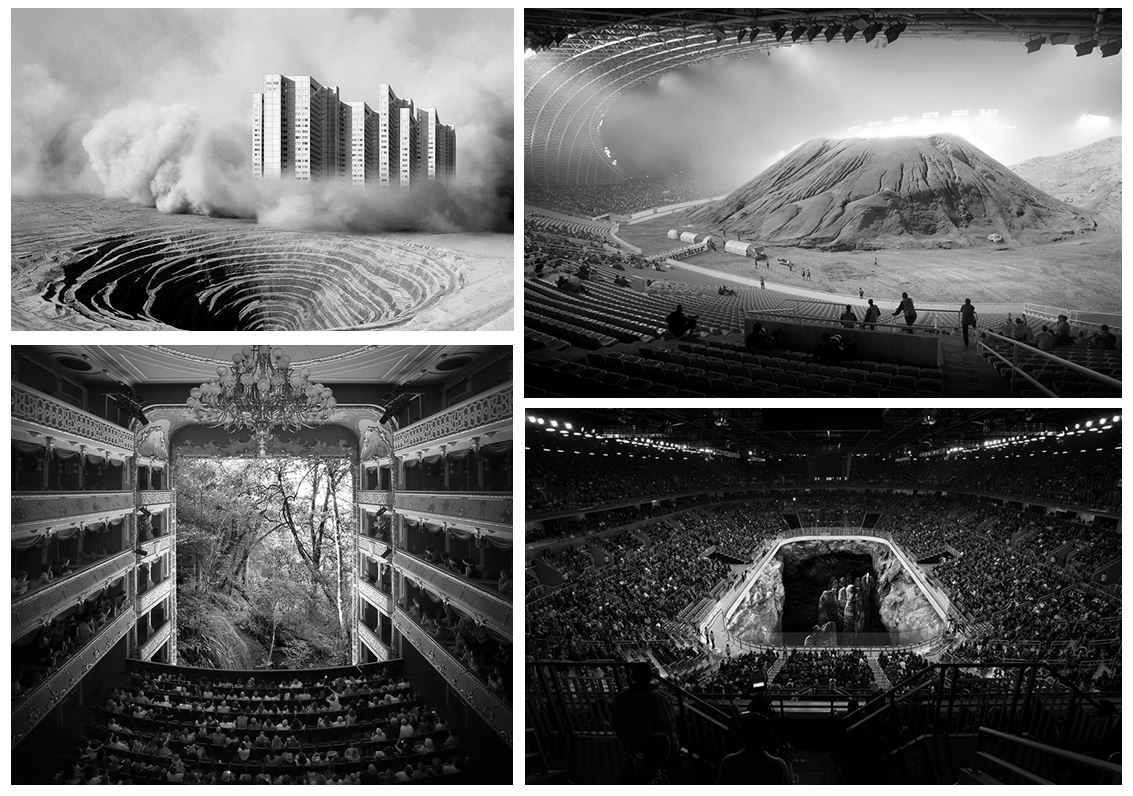
Tanja Deman’s art is inspired by her interest in the perception of space and her relationship to nature.
Tanja’s works, incorporating photography, collage, video and public art, are evocative meditations on urban space and landscape. Observing recently built legacy or natural sites her work investigates the sociology of space and reflects dynamics hidden under the surface of both the built and natural environment.

Her investigation of collective psychology and space focuses on recently built legacy, specifically in spaces for collectives and how they relate to nature. Her images are visual metaphors that step into puzzling sites and situations layered with history. She captures the awkward socio-political dynamics under the surface of both the built and natural environment.

This image is part of her series called ‘Fernweh’ which explores the concept of a modernist city through its extreme relations to the landscape. The images are placed on a blurred line between a past which reminds us of a future and a future which looks like a past. Scenes are referring to the modernist ideas and aspiration of a man conquering the natural wild land and subordinating it to the rational order, and the consequences of those aspirations, which switched into the longing for an escape from urban environments.

Another one of her series called ‘Sight Densification’ is a photo collage series, based on conflict atmospheres of rapid territorial densification of contemporary megalopolis. While creating these images she was interested in the aura of coexistent city infrastructure, skyscrapers, building sights, bridges, dams and other mega structures in urban environments, as well as their dramatic relation to the nature.

She also won the Archisle International Photographer in Residence Award in Jersey 2017. In 2015 she began ‘Salt Water’ a new series exploring the underwater landscapes of the Adriatic Sea and in her Jersey project she develops this body of work further for the exhibition Sunken Gardens.

“In Jersey I have made a photographic exploration of inter-tidal zones, capturing morphological formations of the seabed, reefs and cliffs that penetrate the sea depths; the transmission and refraction of light through the sea water; and above all the lush underwater gardens of seaweeds.”

Jesse Treece

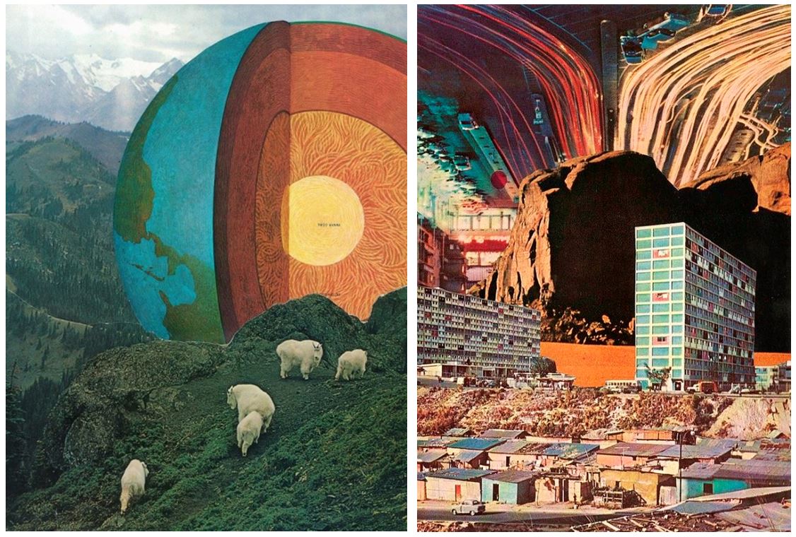
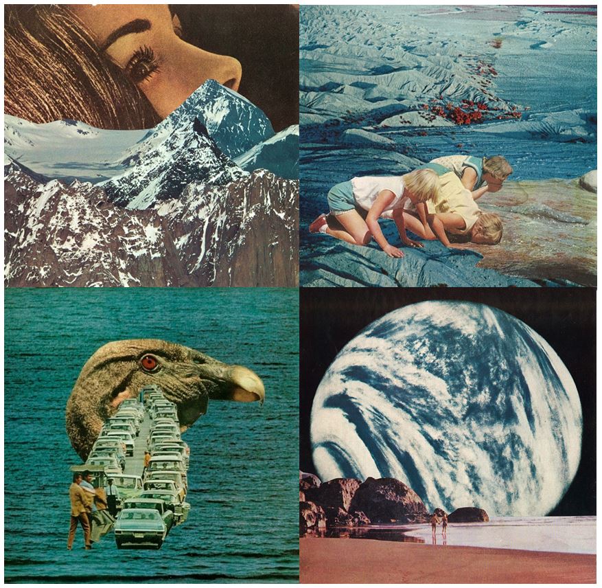
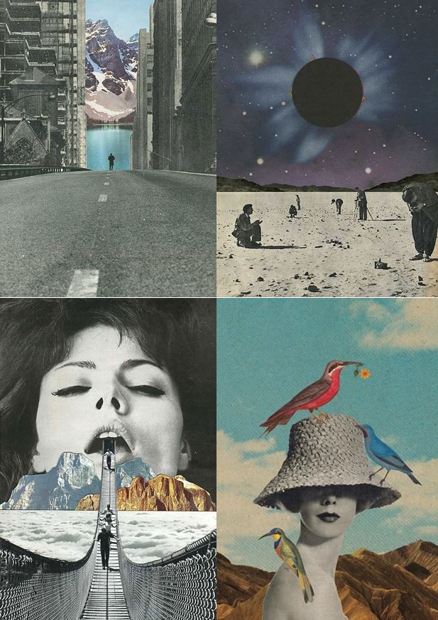
  • His idea is to create artwork that excites and surprises no matter what the current trends or moods are.
  • He’s mainly into old newspaper comic strips, dystopian sci-fi novels, crazy architectural drawings, designs from the 60’s and 70’s and works of artists like Salvador Dalí and Hayao Miyazaki.
  • By this and his preference for the process and the look of handmade collages, he turns his inspiration into something unique and original.
  • Being basically self-taught except for some not very serious art classes, Jesse Treece became a central figure in the underground collage art movement and was even recently included in AnOther Magazine’s list of the top ten collage artists in the world.
  • He somehow manages to mix regular and absurd, beautiful and disturbing, science and nature, large and small and puts together these familiar imageries to create a whole new picture.

Every image tells a different story that you can get lost in for hours. Jesse Treece himself even calls his work slightly disturbing. His imageries somehow made me think of science fiction and horror movies from the 70s.
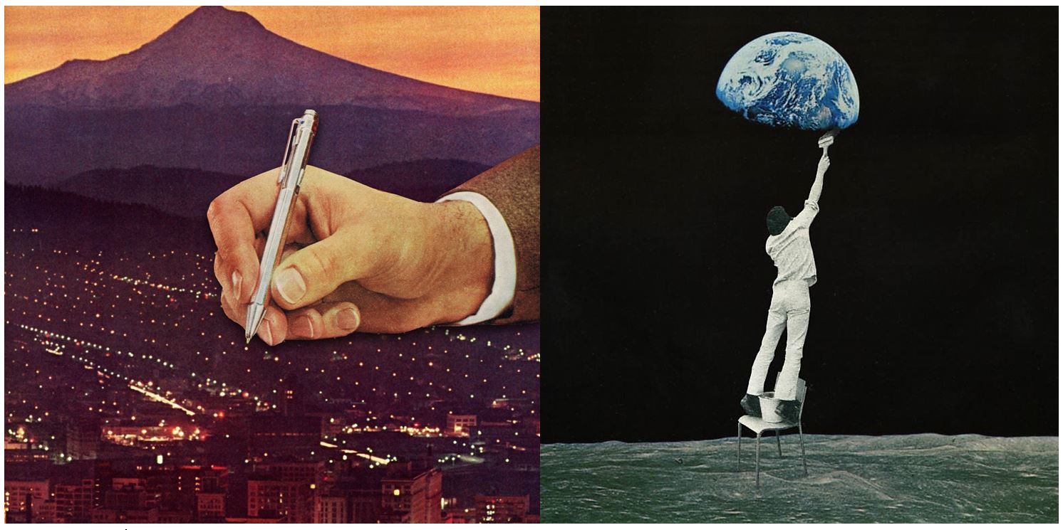
“I came across a box of old magazine clippings one night and found myself wanting to make a visual story out of them. That turned into my first collage and it was the most satisfied I ever felt with something I had created. I guess it kind of snowballed into an obsession from there”

Sammy Slabbinck

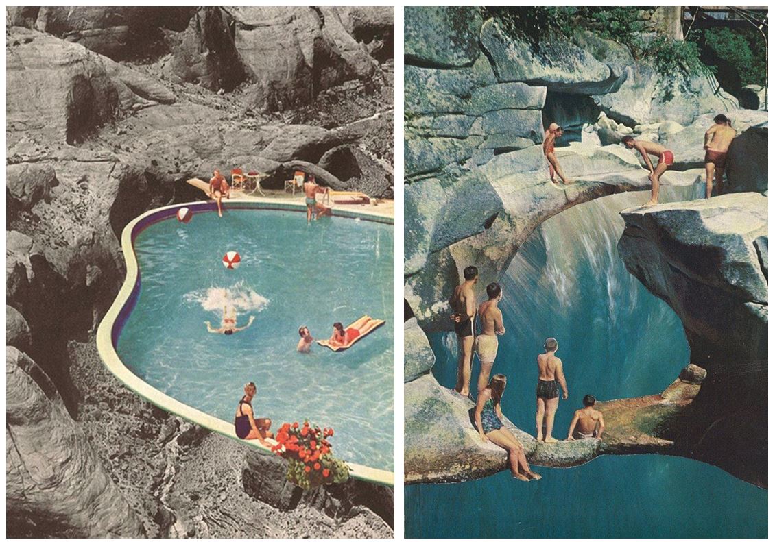
  • Belgian artist Sammy Slabbinck’s work comprises surreal collages and illustrations that somewhat unexpectedly combine vintage with contemporary images.
  • Slabbinck likes to play around with different styles and proportions with the aim of creating powerful yet simple visual works that are permeated by a subtle sense of humour.
  • His carefully composed images create startling juxtapositions and present new meanings through a masterful combination of completely heterogenous elements and a clever use of scale and form.
  • He is an avid collector of magazines and books from the 50’s, 60’s and 70’s and takes full advantage of the muted tones and rich textures that he finds in his source material, namely vintage advertisements, photography and print.

He uses photography from vintage magazines, advertisements and prints as he says “they have a certain look and feel, with very strong lines. You can see it in the architecture, the cars, the furniture. But the photography is also completely different: it has a quality which he finds very innocent. The colours are faded and warm, the images have a soul. It’s nothing like the photographs you can take now with a super digital camera and millions of pixels. I tried making collages with recent magazines but they just don’t  have the same spirit.”

”Mid-century advertisements have a certain look that appeals even up to this day. There is a sense of innocence in them that’s very inviting to work with. Putting these images out of their normal frame and juxtaposing them with modern elements can give an exciting and surprising effect. The characters in these ads can function as actors in the collage, and I, as the director, can give them a second life by putting them in a new surreal landscape.”

He doesn’t consider him self to be a political artist but  he does like to put extra layers in his work.  Sometimes it can go as far as a political satire. He does like to play around with the absurd and put some humor in his work.

Homework 3

Kings Street

King Street forms part of Saint Helier’s main shopping area in Jersey. It is a pedestrianised street which runs from Charing Cross at its west end to Queen Street at its east end.

This map of King Street is believed to date from 1913. It shows clearly how relatively small the properties were on the south side of the street, compared with those on the north, which stretched back over what had previously been wet meadowland.

I first planned out where i was going to go to explore psycho geography on google maps and decided to walk along King Street. I printed out old photographs that were taken of buildings from the past, which also capture the environment of that time.  I planned to compare the old images to present day and take a photo of the comparison.I researched what  King Street looked like in the past and displayed a few to show the comparison between the two time periods.
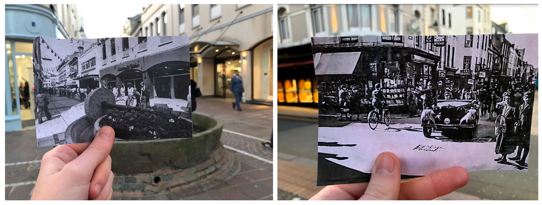
  • I took a few photos of me comparing the present day to old photographs and found that these two worked to best as the buildings line up in both real life and the printed off image.
  • The images also looked better in black and white as it makes them seem more historic.
  • I especially like the one on the right as it shows how different the street was in the past with the car coming from the street which is no longer a road.
  • The one on the left is from King Street in the 1970s. In 1978 the apple crusher was installed at the junction of Rue de Derrière and Ruette Haguais, and La Croix de la Reine at the junction of King Street and Broad Street as part of the pedestrianisation landscaping, a traditional. The left image is from the 1940s showing A German staff car in King Street during the Occupation.

These images also show the change over time on King Street. The first image shows buildings and people in the past and the second image shows what the same buildings look like in the present day. The first image contains quite a few people walking on the pavement dressed in old fashioned clothes, second image contains less people walking in the street and has construction work in the middle of the road.

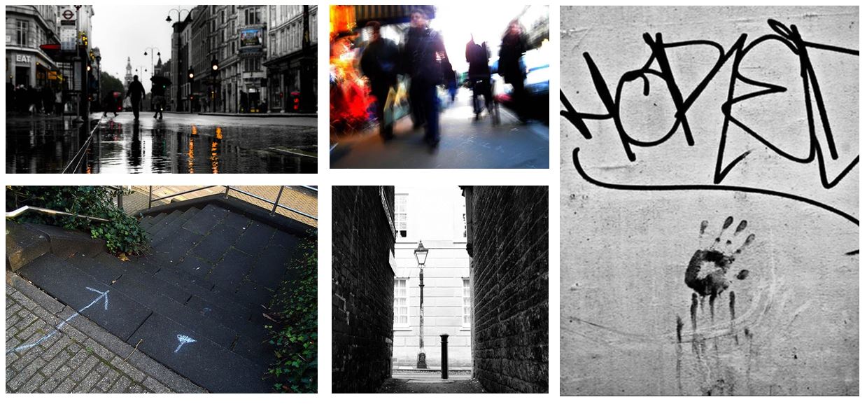
I also took pictures of the urban landscape when comparing the old images and photographed the surrounding environments. When doing this I tried to take the photos taking inspiration from the New Topographic photographers.
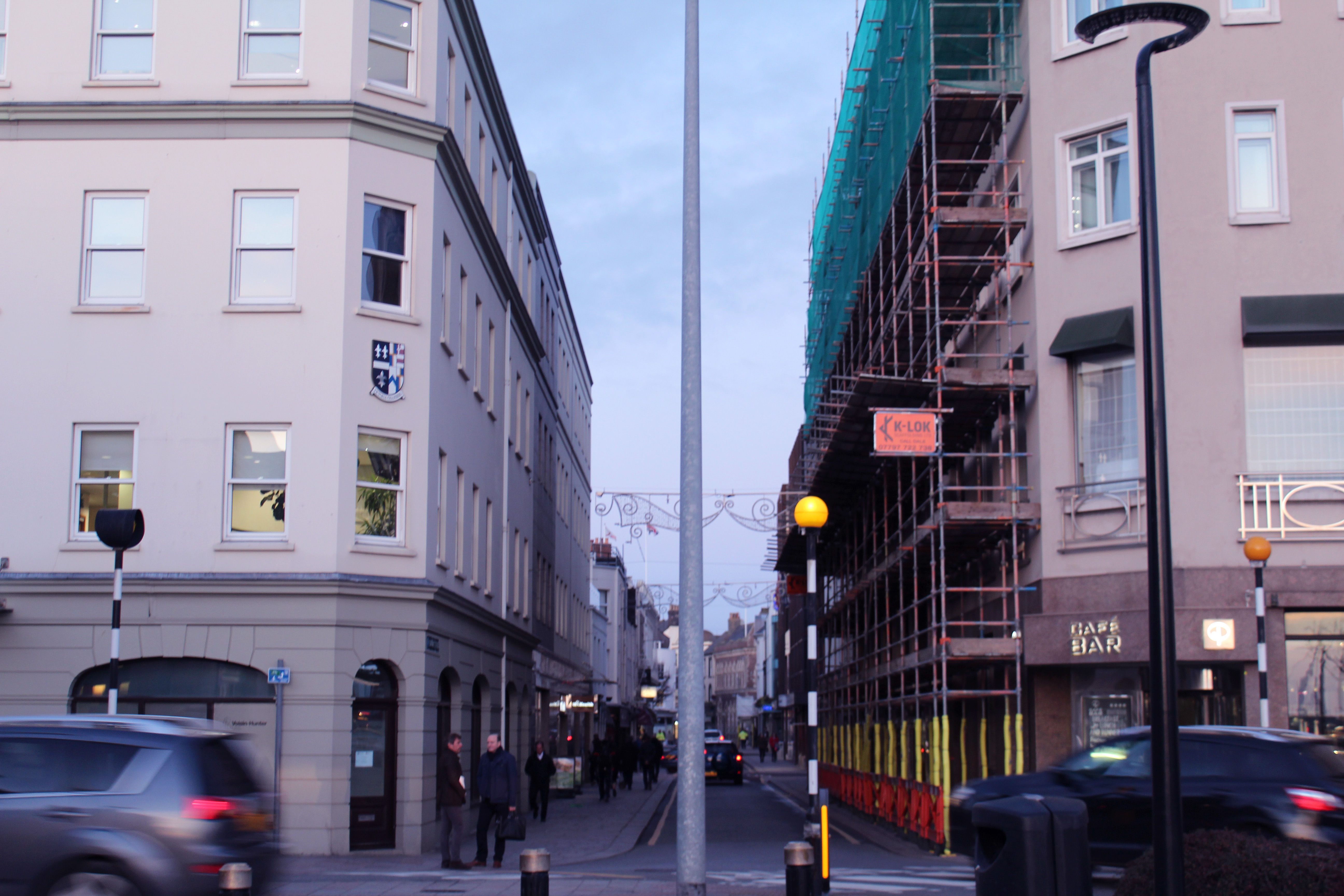
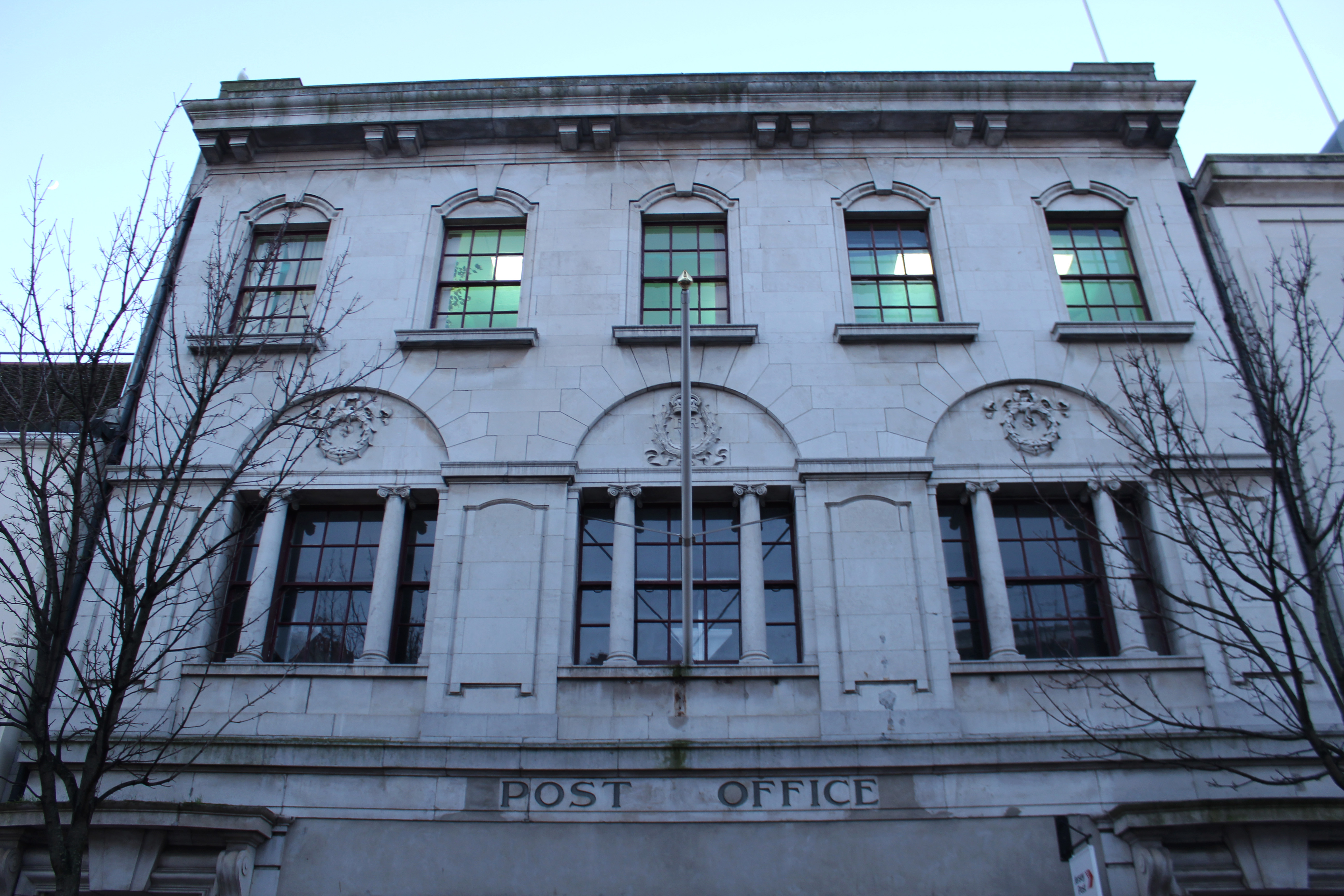
  • When taking this photo I tried to capture the movement of the cars and the symmetrical alignment of the buildings to produce an overall aesthetically pleasing image.
  • The lamp post in the middle divides the image in half, either side having similar layouts with the buildings and cars in similar place.
  • I thought the image was powerful enough by itself and didn’t think it needed too much editing so i only gave the photo a pinkish tint and decreased the exposure slightly to create a softer appearance.
  • I chose to take this photo at this angle to show urban activity continuing down the road with the rushing cars, people and construction along it. The blue sky contrasts with the pinkish buildings

Visual:
  • The angle at which this photo is taken makes the surrounding buildings look like they’re taller and towering over the camera, creating a tunnel like street.
  • The buildings have a shadow cast over them but the bright sky creates a contrast between the two, emphasising the pathway.
  • The layout of the image is nearly symmetrical as the photo was taken standing closer to the left side than the right. This makes the buildings on the left seem taller. I took the photo like this as it emphasises the pathway of the street.
  • The photo is taken from a street view like a person would see when looking down the street as the other image showing the history of Kings Street is from the same angle.
Conceptual:
  • The concept of this image was to compare history to present day thought the buildings on Kings Street.
  • And to capture the atmosphere on King Street now compared to then.
Technical:
  • The lighting in this image was natural and had a natural shadow over the buildings which i emphasised when editing.
  • I used a wide angle lens so i was able to show the whole street
  • I used a fast shutter speed to eliminate motion i the image and low exposure which was why the shadows were emphasised
Contextual:
  • I placed both images beside each other to show the comparison from the historic image and the present day image.
  • It shows how buildings and shops have developed and been re-designed over time

Psycho-Geography

The term psychogeography was invented by the Marxist theorist Guy Debord in 1955 in order to explore this. Inspired by the French nineteenth century poet and writer Charles Baudelaire’s concept of the flâneur – an urban wanderer – Debord suggested playful and inventive ways of navigating the urban environment in order to examine its architecture and spaces.

  • Psychogeographers advocate the act of becoming lost in the city. This is done through the dérive, or “drift”.
  • In a dérive one or more persons during a certain period drop their usual motives for movement and action, their relations, their work and leisure activities, and let themselves be drawn by the attractions of the terrain and the encounters they find there…
  • But the dérive includes both this letting go and its necessary contradiction: the domination of psychogeographical variations by the knowledge and calculation of their possibilities
  • Psychogeography gained popularity in the 1990s when artists, writers and filmmakers such as Iain Sinclair and Patrick Keiller began using the idea to create works based on exploring locations by walking.
  • Psychogeographers idolise the flâneur, a figure conceived in 19th-century France by Charles Baudelaire and popularised in academia by Walter Benjamin in the 20th century. A romantic stroller, the flâneur wandered about the streets, with no clear purpose other than to wander.

  • Because purposeful walking has an agenda, we do not adequately absorb certain aspects of the urban world.
  • This is why the drift is essential to psychogeography; it better connects walkers to the city.

“The study of the specific effects of the geographical environment, consciously organised or not, on the emotions and behaviour of individuals.”

“And in broad terms, psychogeography is, as the name suggests, the point at which psychology and geography collide, a means of exploring the behavioural impact of urban place”.

Harve Des Pas Walk

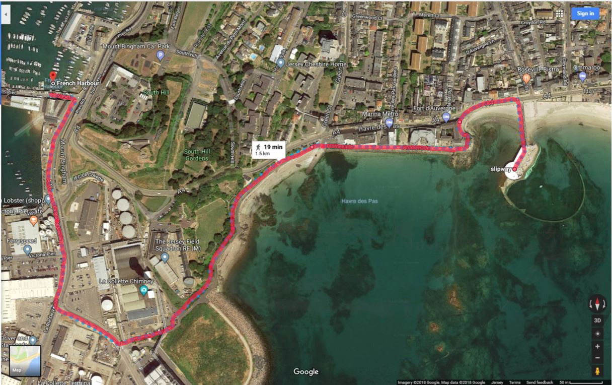
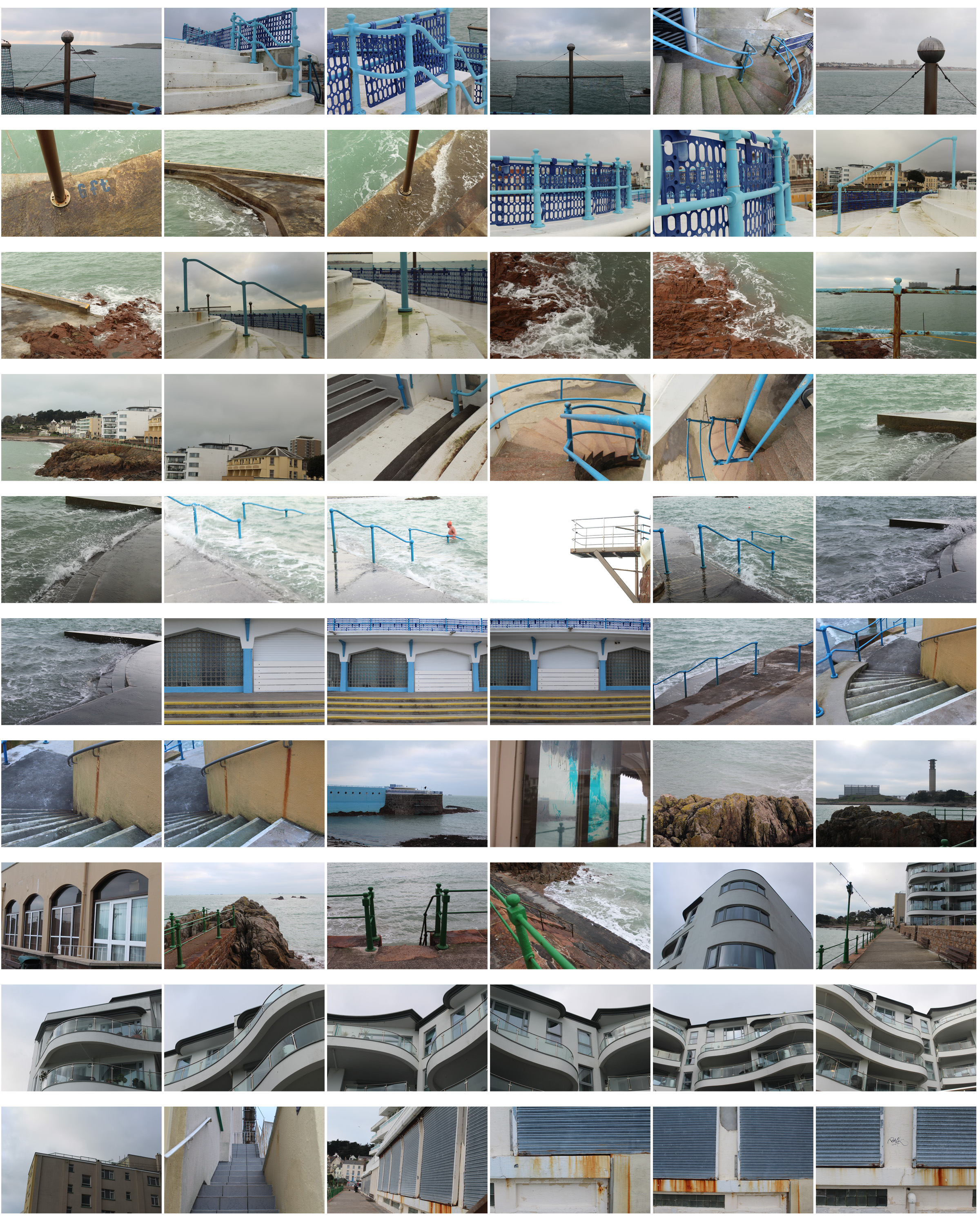
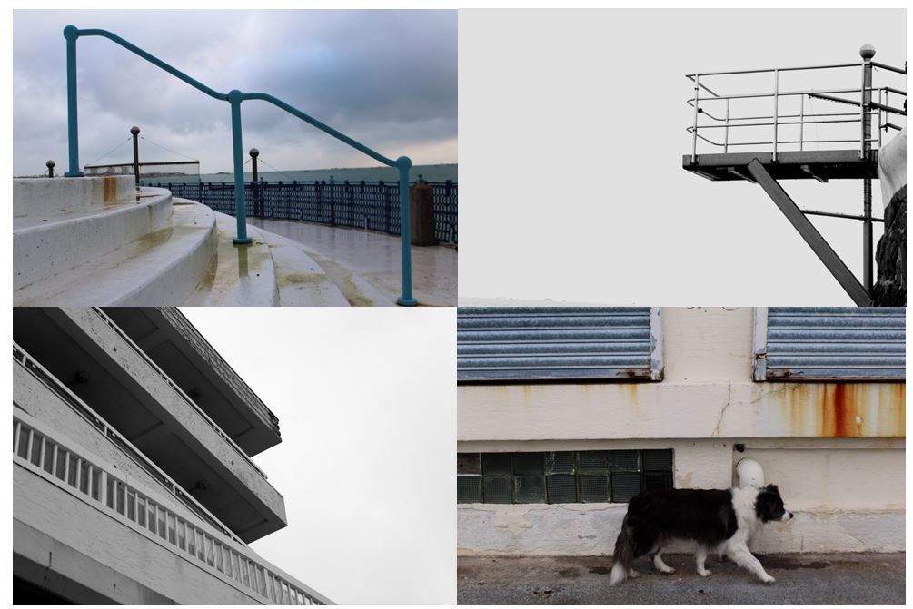
I planned to walk from Harve Des Pas to the Incinerator following the path back to town. This gave me different views and landscapes to photographs showing  my route and journey. I presented my images in a contact sheet and throughout you can see how the route and scenery change from natural to urban.

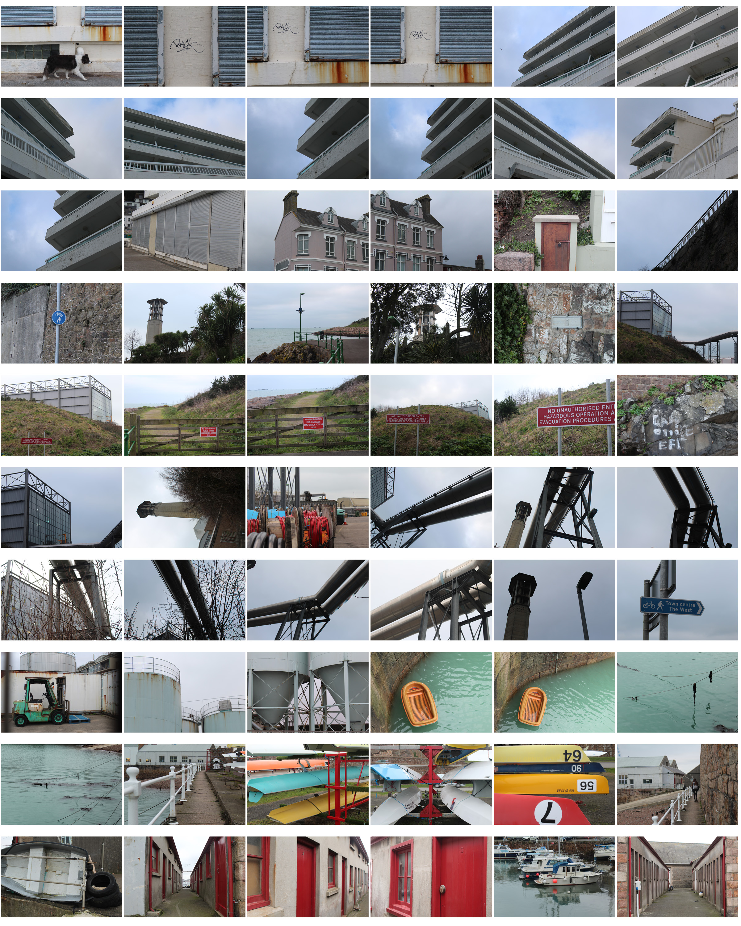
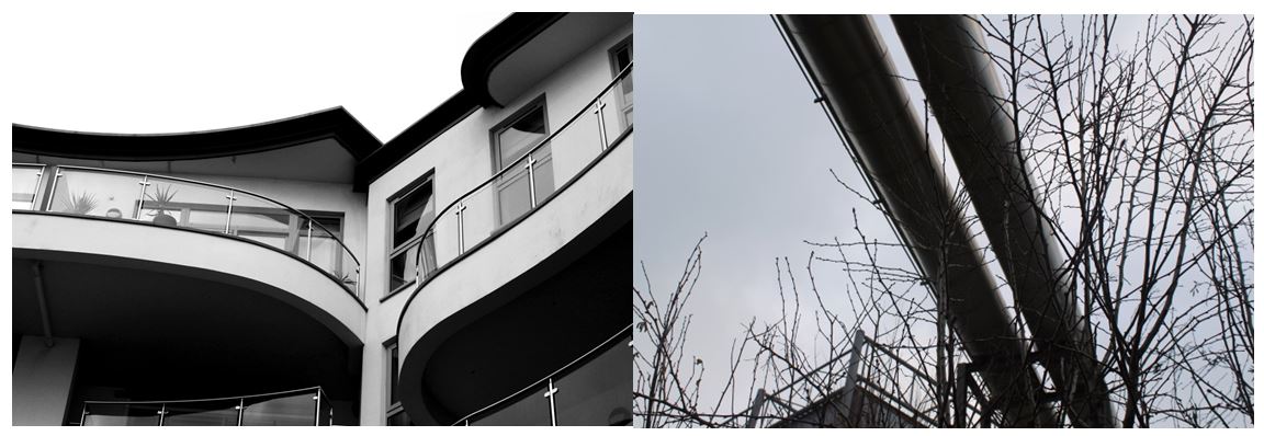
I then chose my favourite photos out of all the images, edited them and displayed them in the contact sheet below so the images can be seen more clearly. I chose these images as each one is completely different and shows the different landscapes I passed and the journey I went on- focusing on structured , man-made objects as well as nature.
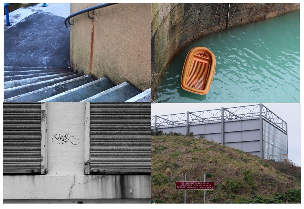
I chose this photo as one of my final images as it clearly shows how urban is taking over nature, similar to concepts The New Topographics focused on. The image shows a very structural industrial building in the background, and a natural hill in the foreground. The contrast between both parts of the image makes it seem like they wouldn’t be in the same place and so close together. It also shows a bright red sign post on the hill which also presents  the new topographics unease about how the natural landscape were being eroded by industrial development. I decided to leave the image in colour with not much editing as I think it emphasises the differences between the two sections of the image.

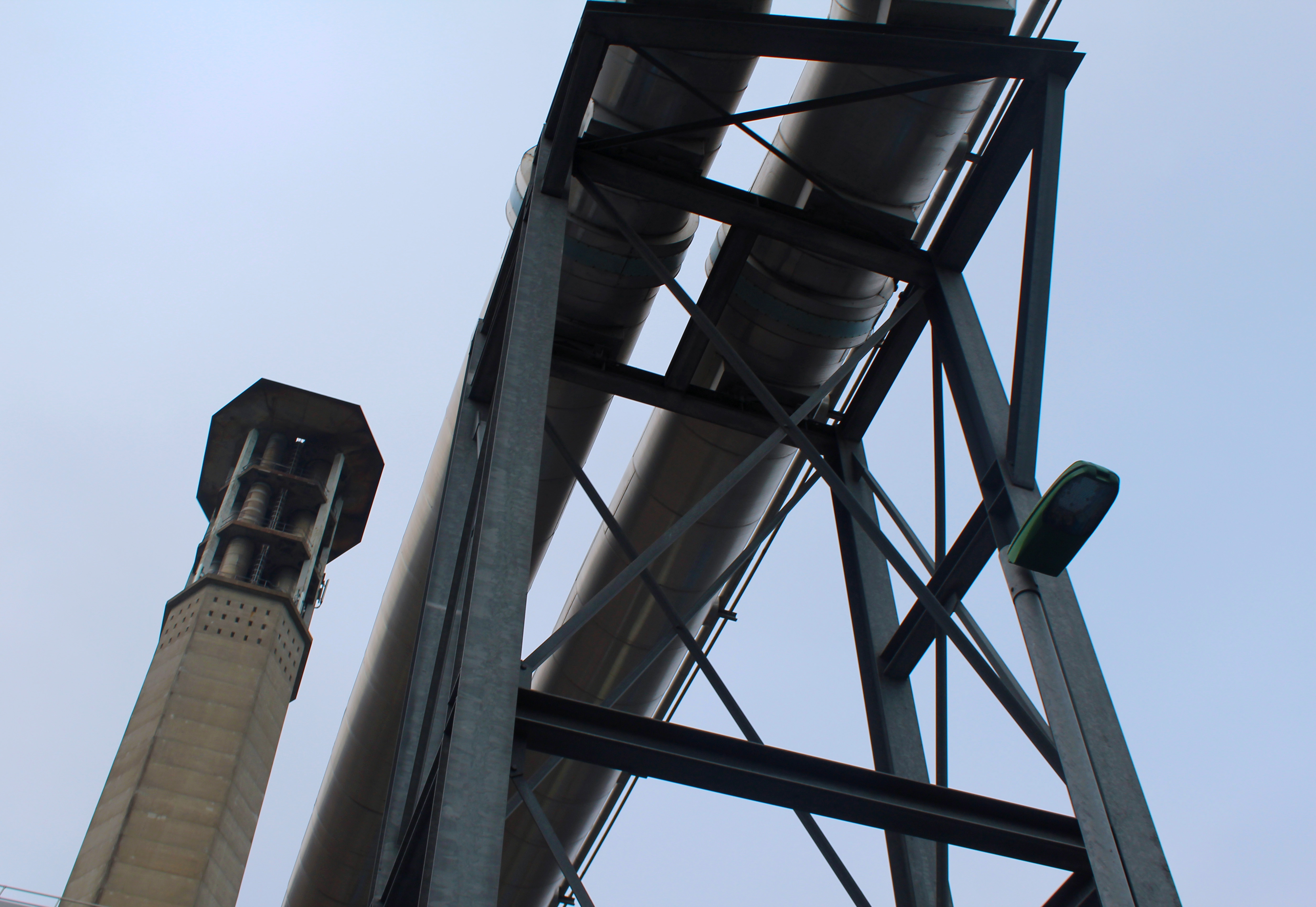
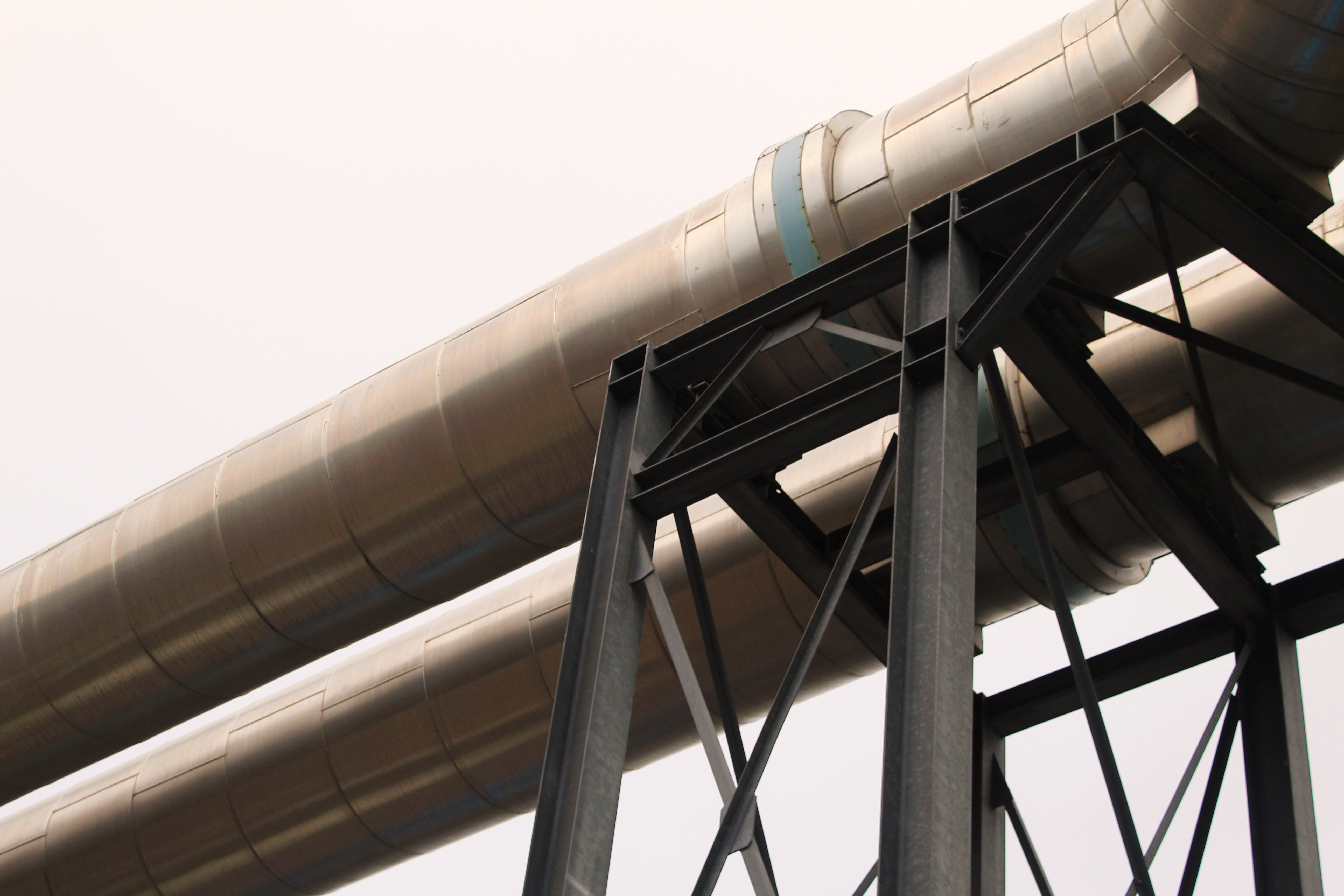
I also chose this photo as one of final images as I focused on industrial buildings and the structures they make. This image takes inspiration from The New Topographics as it focuses on geometrical shapes and symmetry. The image doesn’t contain any natural elements and only shows man-made structures which contrasts with some of the other images I have taken. I left the image in colour as the it only contains browns, greys and blacks that contrast with each other which would not happen as much if the image was in black and white. It also shows the structures and the sky being completely different (natural vs urban).

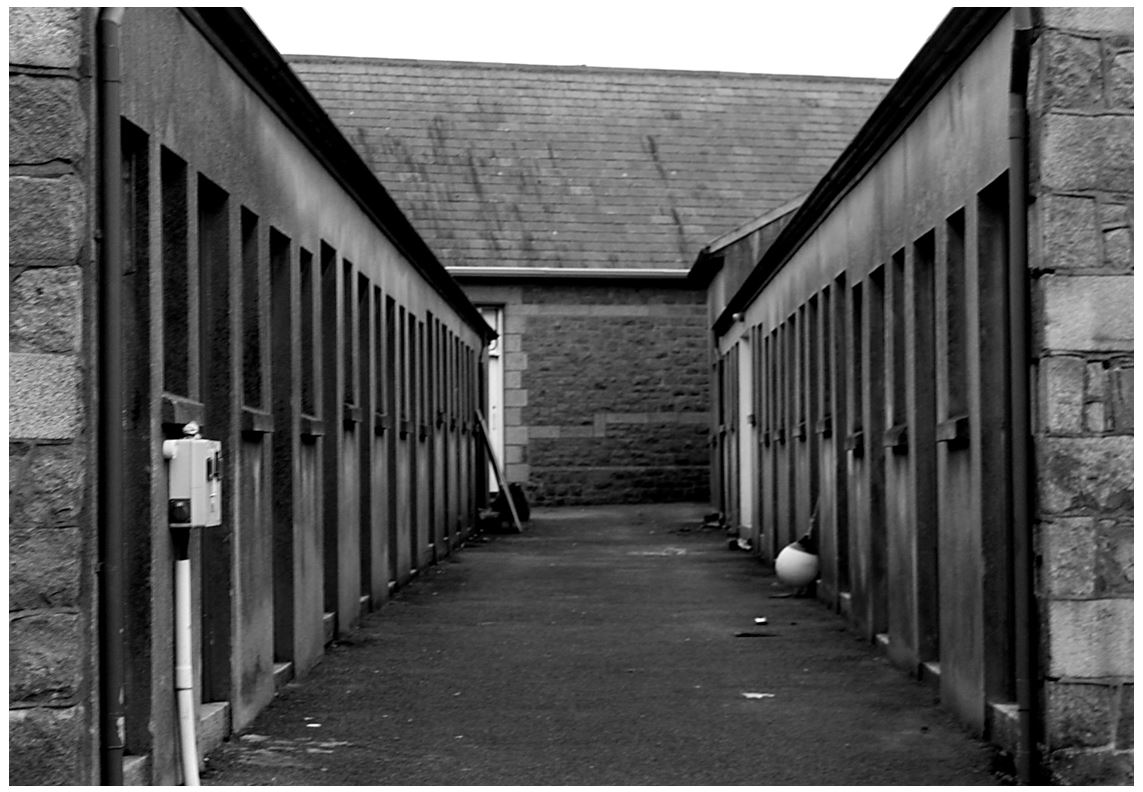
I also chose this image as it shows an alley that I tried to make  symmetrical to show lines and repetition on both sides. I turned the photo to black and white taking inspiration from the new topographic photographers, trying to get the same effect. The industrial photographs I’ve taken have similarities to Albert Renger-Patzsch style in The New Objectivity with clear, black and white pictures of industrial archetypes.
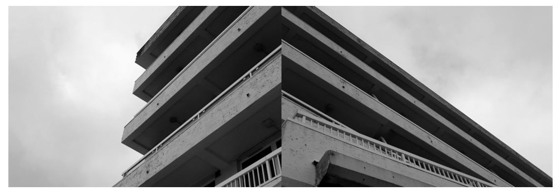
I also tried focusing on industrial buildings, zooming in on specific sections of the same building so I could present them together to show different perspectives. I edited them to black and white as I think it makes the images have more of a contrast between the tones of grey and emphasises the shadows underneath of the balconies and where the light hits the outside of the balcony walls, making the images more powerful. I arranged the images so some of the lines join up between the photos connecting them together to make a new image.

Homework 2- Night Photography

Night Photography

Night photography refers to photographs taken outdoors between dusk and dawn. Night photographers generally have a choice between using artificial light and using a long exposure, exposing the scene for seconds, minutes, and even hours in order to give the film or digital sensor enough time to capture a usable image. With the progress of high-speed films, higher-sensitivity digital image sensors, wide-aperture lenses, and the ever-greater power of urban lights, night photography is increasingly possible using available light.

The following techniques and equipment are generally used in night photography.

  • A tripod is usually necessary due to the long exposure times. Alternatively, the camera may be placed on a steady, flat object e.g. a table or chair, low wall, window sill, etc.
  • A shutter release cable or self timer is almost always used to prevent camera shake when the shutter is released.
  • A camera lens with a wide aperture, preferably one with aspherical elements that can minimize coma

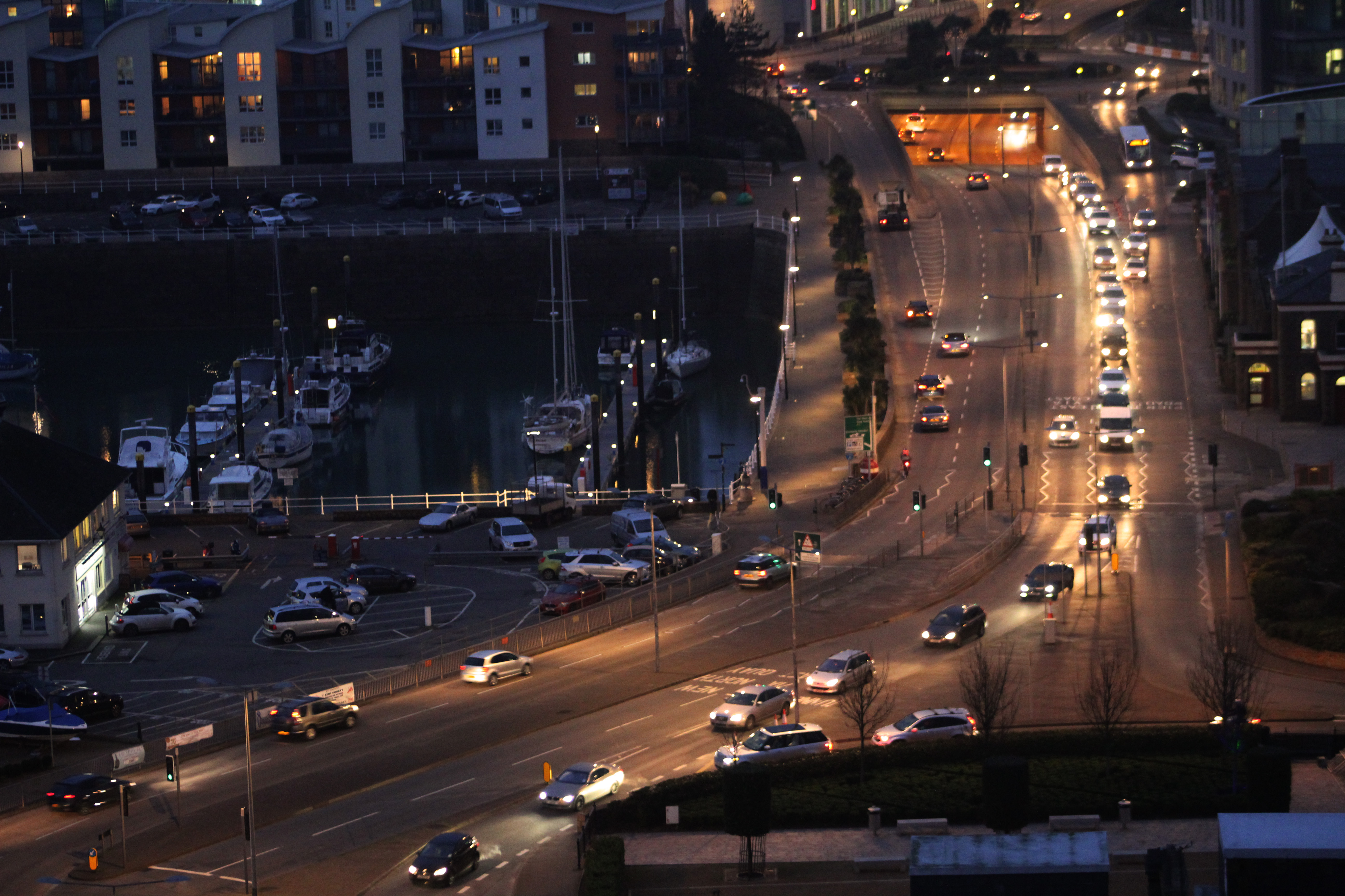
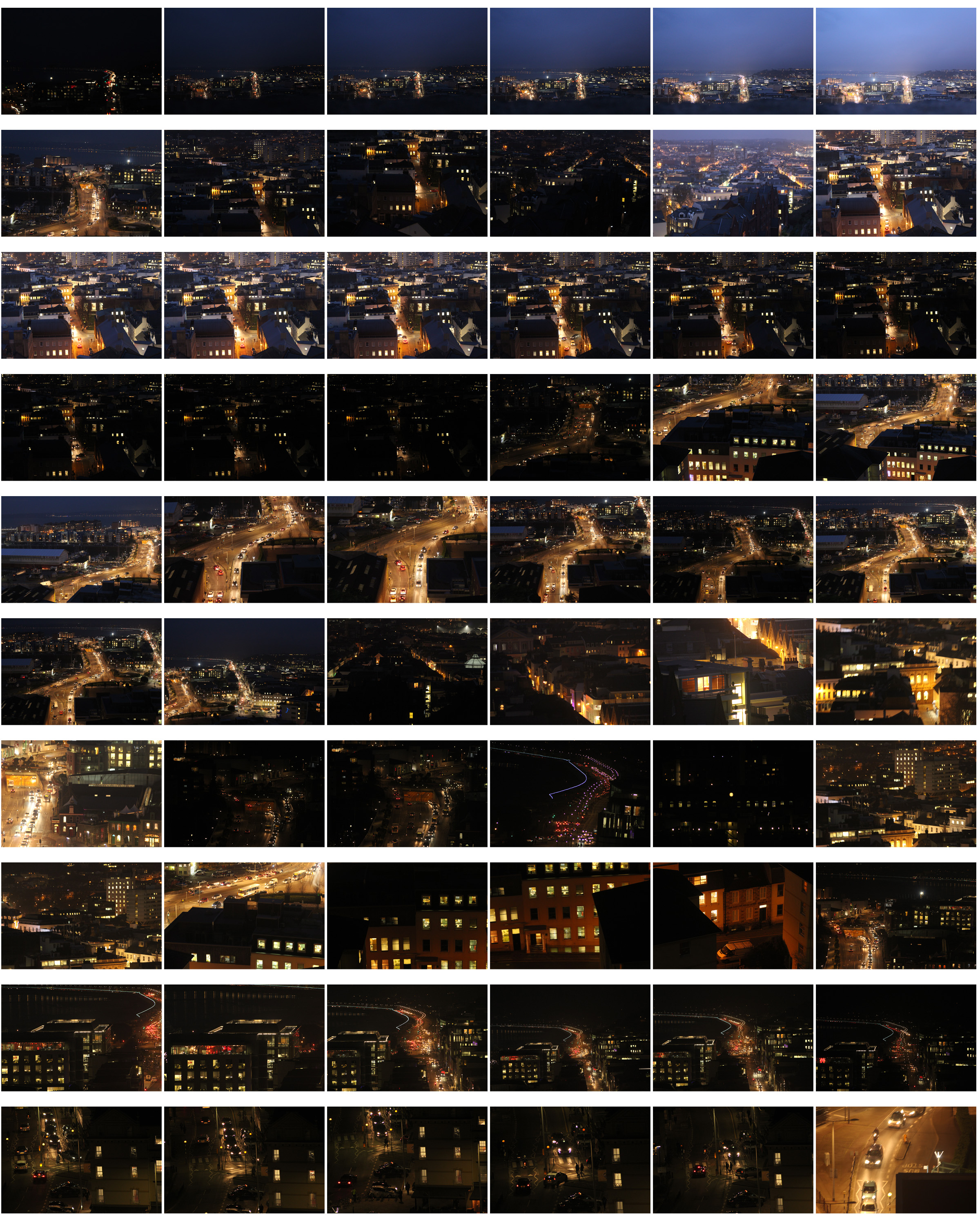
For my urban landscapes homework I decided do my photo shoot from a higher perspective taking inspiration from Nicholas Nixon and photographed buildings, with architectural views. I also took inspiration from Thomas Struth’s photos of industrialised cities and how he incorporated people and movement, presenting images of chaotic urban activity in some images, which is why I captured the movement and business of the cars. I decided to take my images as the sky was turning dark as I thought it would make the lights from the cars and buildings stand out more than if i took them in the day. In my first contact sheet the images have a blue tint where the the sun has not completely gone down, whereas my second contact sheet the sky in completely black by the end, showing the differences the light has on the images. In my second contact sheet the lights from the buildings and cars are much more bright and noticeable as the yellow/orange is contrasted with the black background , making it more clear that it is night time. I think these photos are more effective as the lights from the cars make the whole road light up, making it glow and stand out more.
I first tried editing my first image in black and white which makes the roads seem more dark and atmospheric with the street lights and windows contrasting  from the dark roofs. It shows clearly where the road leads from where the streets lights up  even though you cant see the street.

I compared my photograph in black & white and in colour and decided that i preferred the image in colour because of the how the yellow/orange lights contrast with the black roofs and buildings more than they do than in black and white. Also how the road is emphasised more as it is illuminated from the light which is soft and isn’t too intense.

“Most photographers struggle with one thing in particular. That is how to make their photos stand out from the crowd. You’ll be surprised at how many locations that appear rather mundane during the day can be made to look incredibly dramatic at night. In cities, for example, you will find well-lit facades, bridges, skylines, etc. The city lights add interest and a dramatic effect giving you lots to work with.”

I also chose this image as it shows the business of a road filled with movement, presenting an image of chaotic urban activity, similar to Thomas Struth. The city that Struth presents is unregimented: there is little architectural unity, this is what i tried to interpret. I tried to show energy and speed within the image which I think I achieved from the blurring of the cars and lights by slowing the shutter speed slightly. I increased the exposure when taking the photo so all sections in the image are visible, still keeping the cars and the road the main focus of the image.

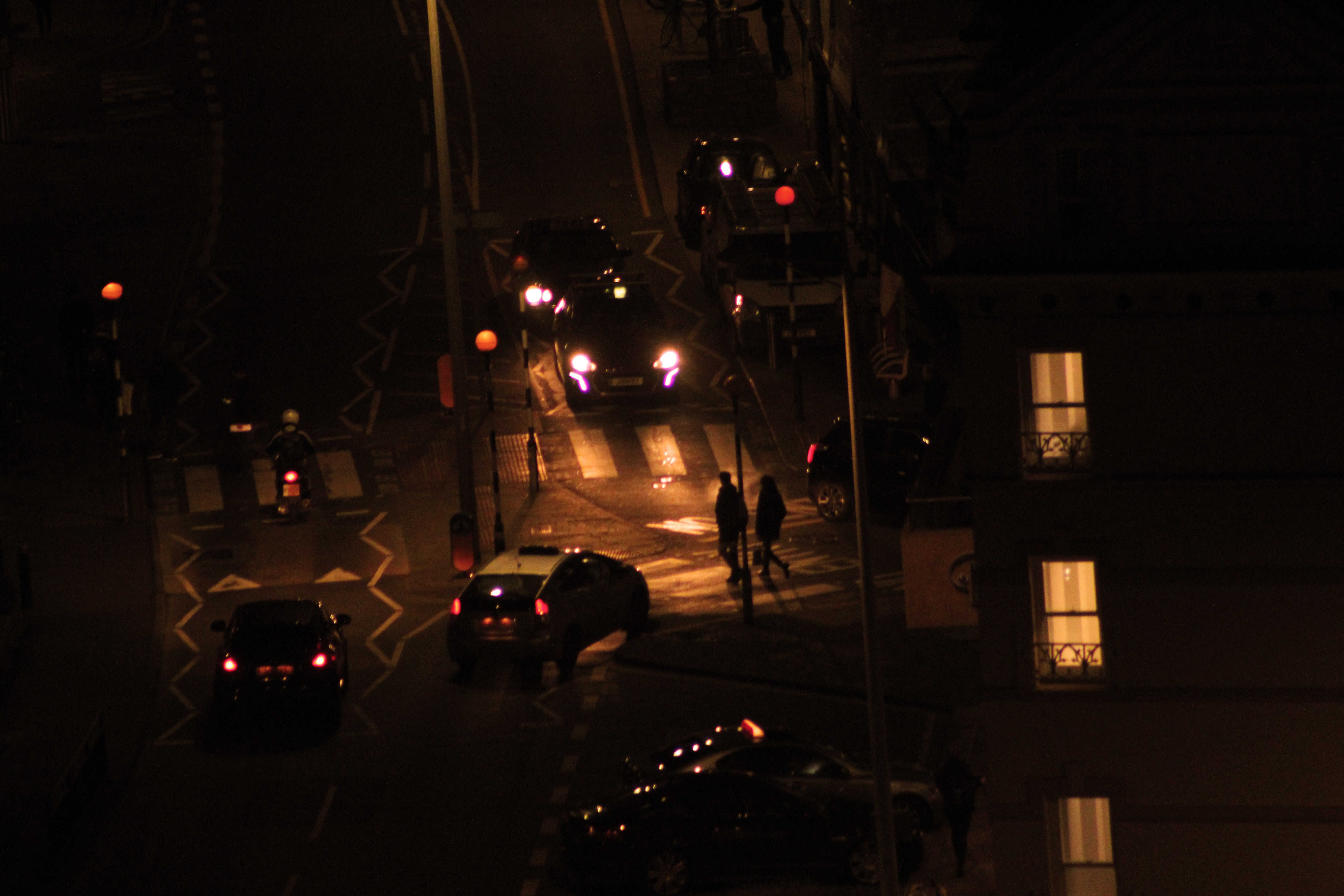
I chose this image as it is different from my other images but still overlooks chaotic urban activity but  scaled down by using a long lens to focus in on a specific street. The headlights of the car highlight the people crossing the road not too intensely so the overall image is softer than it would be in daylight. The corners of the image are black where the buildings are and gradually towards the center of the image is where the main focus of the image is.

Nicholas Nixon

Influenced by the photographs of Edward Weston and Walker Evans, he began working with large-format cameras. Whereas most professional photographers had abandoned these cameras in favor of shooting on 35 mm film with more portable cameras, Nixon preferred the format because it allowed prints to be made directly from the large format negatives, retaining the clarity and integrity of the image.

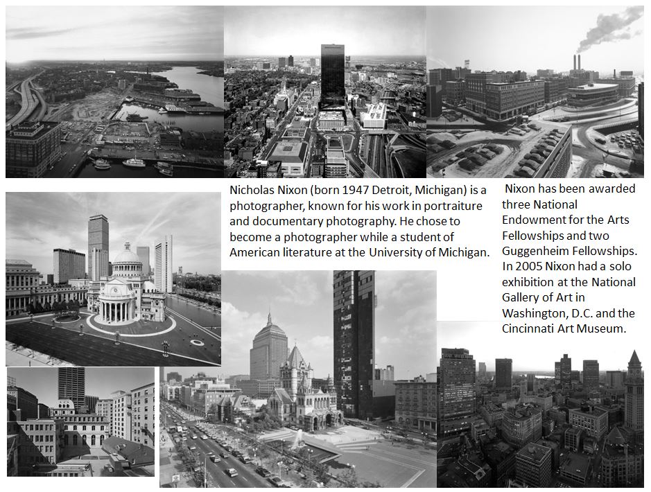
Image result for NICHOLAS NIXON landscape photographyHis very first pictures are mostly architectural views of the city taken from rooftops and part of them were included in the “New Topographics” exhibition in 1975. “My idea at the time was to put my feelings in service to clear description. When I moved to Boston in 1974, I was enthralled with it and was trying to figure it out. Getting on rooftops was a great way to learn…not unlike the way one climbs to the top of a bluff or a mountain: to see more.”  He took photos from above, “like a landscape surveyor,” he said. “You could see where the streets go, you could see where everything lines up.”
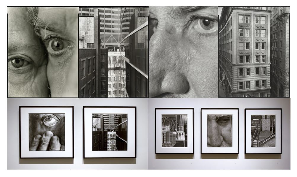
Family Album, through May 2011. In Summer 2013 Nixon’s newest book will be released by Steidl. The body of work entitled Close Far explores the relationship of the self in physical and psychological proximity to the urban landscape. Nixon’s work is included in the collections of the Metropolitan Museum of Art, the Museum of Modern Art, New York, the San Francisco Museum of Modern Art and the Museum of Fine Arts in Boston, among many others.

Thomas Struth

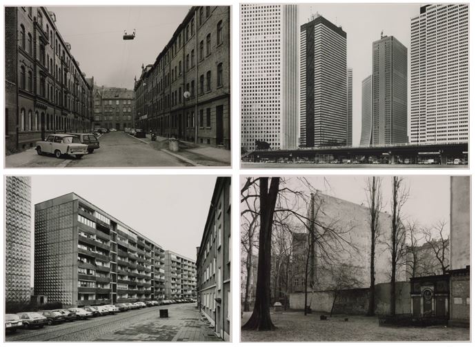
Thomas Struth began taking photographs of industrialised cities when he was studying under Bernd Becher (born 1931) at the Düsseldorf Academy.  He has continued to explore and develop the theme for almost twenty years, focusing his attention on such cities as New York, Tokyo, Berlin and Naples.  Struth’s images of the urban environment concentrate on seemingly unspectacular streets and public spaces. He seeks to record the face of urban space, seeing the architectural environment as a site where a community expresses its history.

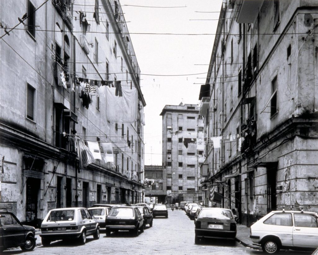
Via Giovanni Tappia, Naples 1989 1989 Thomas Struth

This photo is taken in Via Giovanni Tappia, Naples 1989. Struth focuses his camera on the Neapolitan cityscape where he places the camera in the middle of the street at eye level. This creates a one-point perspective that leads the viewer’s eye down the street. It also results in the road being as much the focus of the scene as the apartment buildings on either side. There are few signs of the lives of the inhabitant, leaving no trace of their presence. Struth presents an image of a slightly scruffy, inner-city residential street which is filled with traces of activity and domestic life. This suggest that his images can be read as exploring differences in national character through the way urban space is inhabited.

In recording the urban environment, Struth deliberately refers to the tradition of black and white documentary photography, adopting a seemingly objective position. The compositions are simple and the photographs are neither staged nor digitally manipulated in post-production.  However, in spite of a link to the reportage tradition, Struth avoids both its snapshot approach and its quest for the capture of a fleeting, spontaneous image. Rather he carefully selects the sites where, using long exposures he makes sharply focused images.

Shinju-ku, (TDK), Tokyo 1986

Struth focuses on a busy intersection in urban Tokyo. He has taken the photograph from the middle of the road, pointing the camera down the street. As a result the spectator’s eye is drawn into the image and invited to inspect the architectural environment. The technique is one which Struth has employed in many of the street scenes since the late 1970s. However, unlike many similarly constructed images, the Tokyo photograph is not deserted. It is rather filled with people and movement, presenting an image of chaotic urban activity. The city that Struth presents is unregimented: there is little architectural unity. Because so much activity is included in the image, Struth is able to evoke the dynamic energy, speed and frenetic temporality characteristic of contemporary Japanese urban culture.

The New Topographics

Many of the photographers associated with new topographics  were inspired by the man-made. Parking lots, suburban housing and warehouses were all depicted with a beautiful stark harshness, almost in the way early photographers documented the natural landscape. These photographers included Robert Adams, Lewis Baltz, Bernd and Hilla Becher, Frank Gohlke, Nicholas Nixon, Joe Deal, Henry Wessel and Stephen Short and have influenced photographic practices regarding landscape around the world

Robert Adamas pointed his camera at eerily empty streets, pristine trailer parks and the steady creep of suburban development in all its regulated uniformity.

All the pictures had a similar banal aesthetic, in that they were formal, mostly black and white prints of the urban landscape

-Lewis Baltz made stark photographs of the walls of office buildings and warehouses on industrial sites in Orange County.

“New Topographics: Photographs of a Man-Altered Landscape” was an exhibition that epitomized a key moment in American landscape photography. The exhibition was at the International Museum of Photography at the George Eastman House, New York, and remained open to the public from October 1975 until February 1976 featuring photographers showing the growing unease about how the natural landscape was being eroded by industrial development.  In one way, they were photographing against the tradition of nature photography that the likes of Ansel Adams and Edward Weston had created.

Each photographer in the New Topographics exhibition was represented by 10 prints. All but Stephen Shore worked in black and white. It seemed to heighten the sense of detachment in Shore’s photographs of anonymous intersections and streets.

-Nixon concentrated on innercity development: skyscrapers that dwarfed period buildings, freeways and gridded streets 

Homework 1- Romanticism in Landscape photography

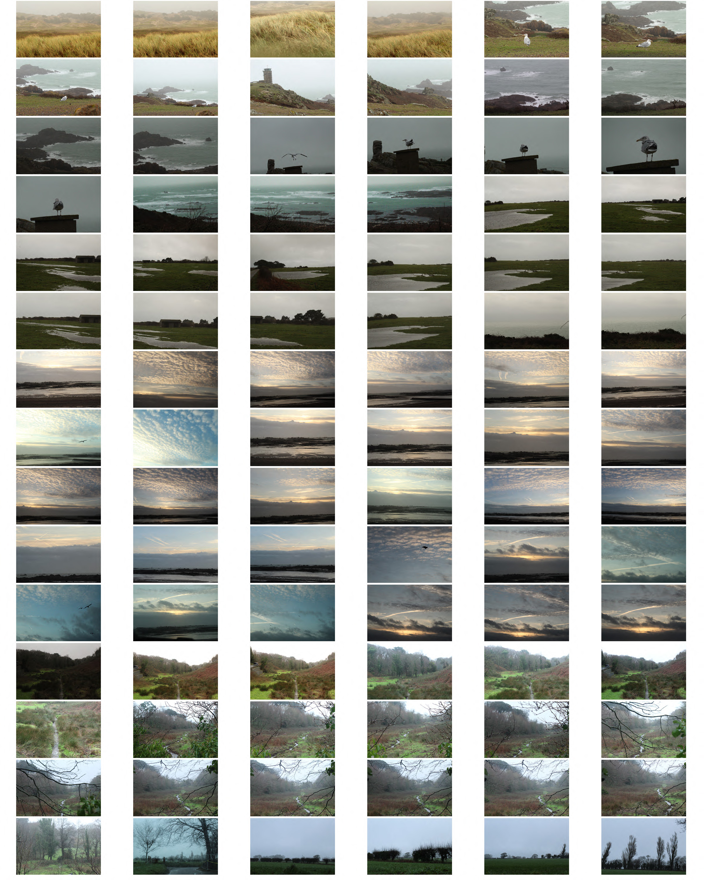
To explore romanticism i planned to visit 3 different places on different days so each image was varied with a different setting and weather. I planned to show an interest in the natural world, taking inspiration from Fay Godwin creating careful compositions and control over tonal values, light and atmosphere.

For this photograph I tried to find a path or stream to be in my image with a natural setting. I focused on the branches in the foreground of the image and left the background more out of focus emphasising the misty environment which creates more atmosphere in the picture. Fay Godwin photos mainly consist of natural environments with trees, fields and beaches which is where I went to take my images.
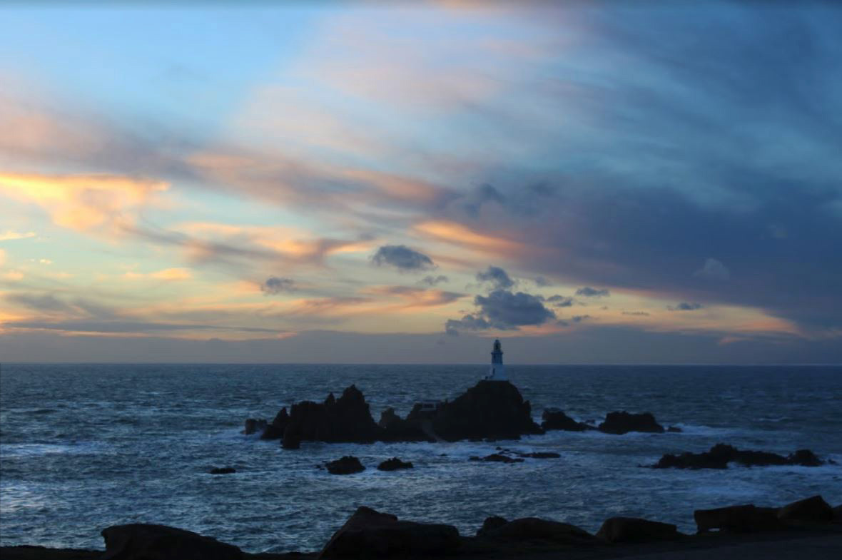
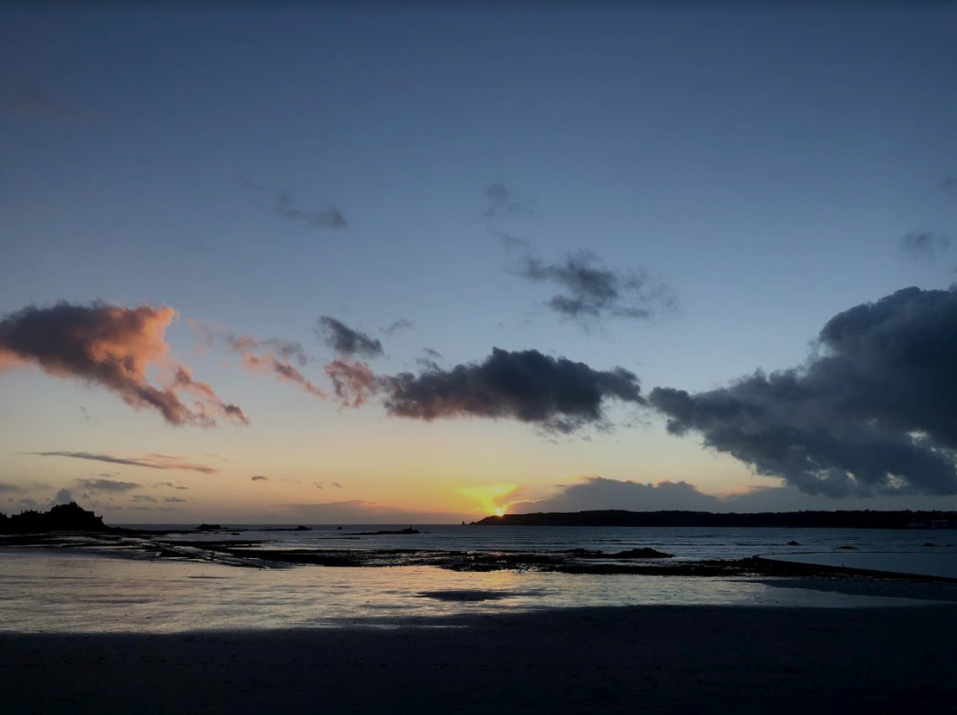
For my second photo shoot I decided to take my images around sunset creating a more romantic setting. Both images have clouds making them more atmospheric and interesting.  In the first photo I decreased the exposure to make the sea darker which emphasises the white and the rocks in the bottom half of the image. In the top half of the image i did not decrease the exposure, but did increase the contrast slightly and adjusted the levels to make the image more effective.

I also tried, when on one of my photoshoots, to take a panoramic on my phone to get a elongated field of view an dot get  wider view of the environment

Panoramic Photography:

Panoramic photography is a technique that stitches multiple images from the same camera together to form a single, wide photograph (vertical or horizontal). The term “panorama” literally means “all sight” in Greek and it first originated from painters that wanted to capture a wide view of a landscape, not just a certain part of it. The first panoramic photographs were made by simply aligning printed versions of film, which did not turn out very well, because it was close to impossible to perfectly align photographs. With the invention of personal computing, advancements in computer software and digital photography, it is now much easier to stitch digital images together using specialized software.