All posts by Megan Woolsgrove

Filters

Author:
Category:

Giorgio Morandi

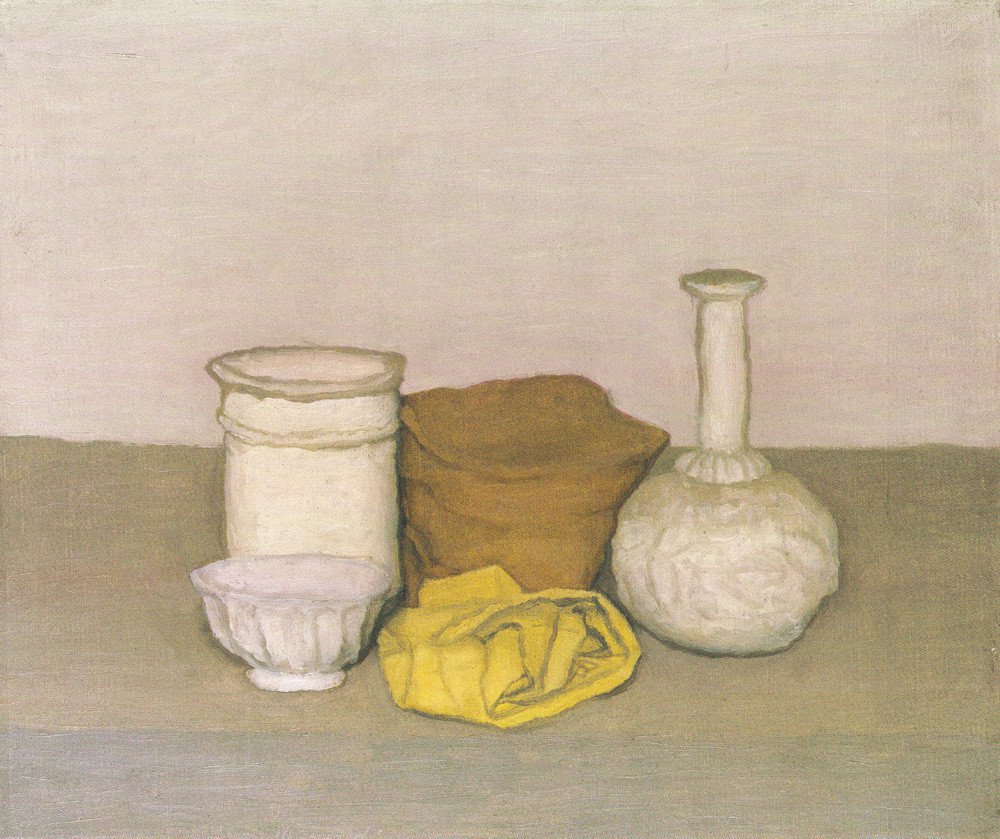
Giorgio Morandi (July 20, 1890 – June 18, 1964) was an Italian painter and printmaker who specialized in still life. His paintings are noted for their tonal subtlety in depicting apparently simple subjects, which were limited mainly to vases, bottles, bowls, flowers and landscapes.

Although he painted generic household objects, critics noted how his representation of these objects conveyed a sense of Morandi’s personality, monastic habits, and Bolognese environment. His tightly unified body of work would be influential for its close study of unremarkable elements of daily life, imbuing them with implications of deeper significance by emphasizing their painterly beauty and simplicity. He represents himself through his paintings and the objects he displayed which links which links to my theme that conventional objects can represent the history of a person.

With his attention to technique and painstaking precision, Morandi extended the legacy of Italian painting into the 20th century, but gave it new relevance with his minimalist style and non-narrative focus. The sparse palette, clean lines, and careful brushstroke of Morandi’s still lifes are unmistakably modern and his attention to technique and the physicality of the painted surface connected later painters with the grand traditions of the still life and landscape genres.
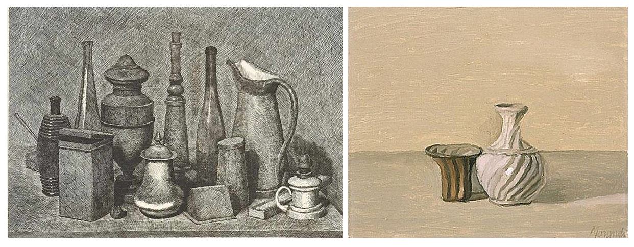
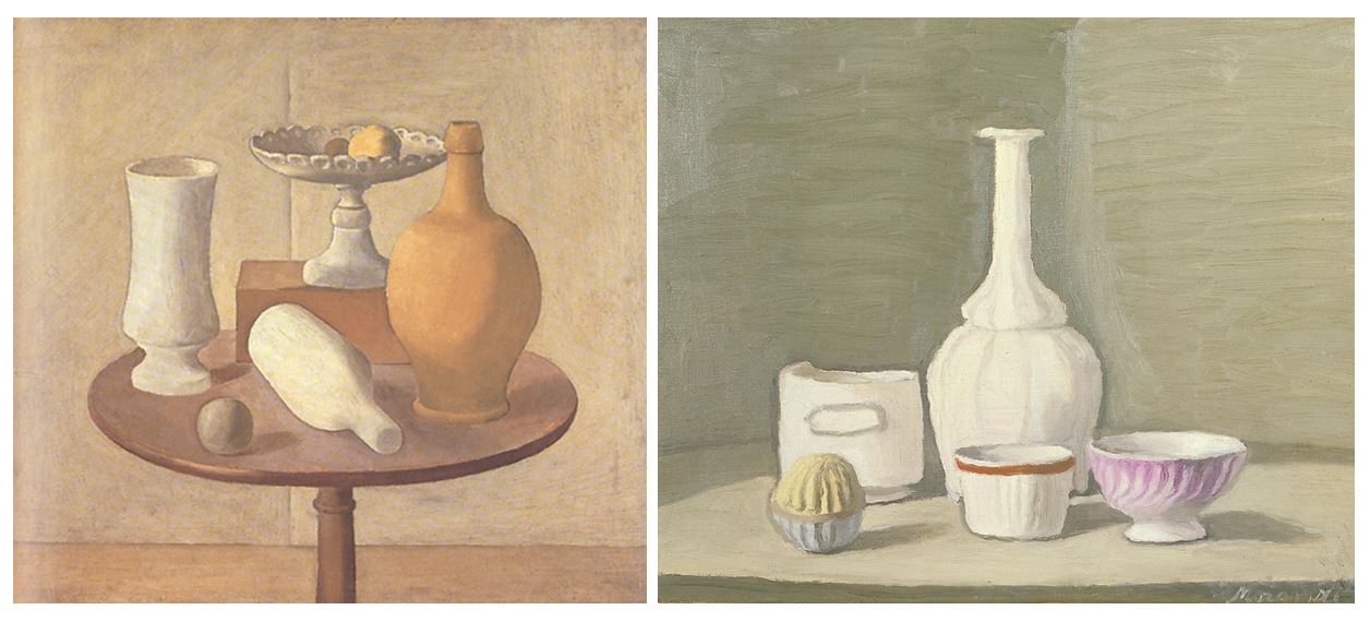
The image on the right  depicts a display of five domestic objects arranged on a flat table surface: a bottle, a jar and three porcelain bowls of various sizes. The objects are arranged in two horizontal rows, with the three smallest objects situated at the front of the composition and the bottle and a taller bowl at the back. In this work, Morandi uses a muted colour palette that ranges from light and medium grey to cream white, beige, pale yellow and mauve. The ball-shaped container in the front row at the lower left corner of the painting has a top section with yellow grooves and a bottom section with white grooves. The cup in the centre of the composition has a red brim and the bowl on the right side has purple grooves. Still Life is inscribed with the artist’s signature at the bottom right of the canvas.

Morandi kept a supply of vases, bottles and jars in his studio, which he used as models for many of his still life paintings in a variety of arrangements. In a letter dated 7 July 1953 the artist wrote that there were ‘several variants of the present work and the same objects also appear in other pictures’
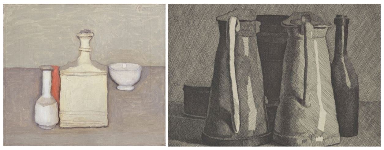
 

The image above is an oil painting. The canvas is divided into two horizontal segments; the upper half painted pale olive green, the lower, lavender-grey. Three objects – a white vase, a short round container and a conical-topped bottle – rest on the surface. They are arranged close together, one in front of the other, and appear to merge. A sense of spatial depth is introduced through a shadow of the objects, represented by dense strokes of darker paint, that appears on the right-hand side of the composition.

Morandi's studio at Via Fondazza

Morandi painted these familiar objects in his bedroom studio at Via Fondazza in Bologna through almost the whole of his career, only shifting to a rural house, at Grizzana, in 1960. Many of the still lifesof the last four years of his life were made there, alongside paintings of the landscape, and achieve an ethereal quality in which formal similarities are found across the two genres.

The Metaphysical painting(Pittura Metafisica) phase in Morandi’s work lasted from 1918 to 1922.

Metaphysical art:  a style of painting developed by the Italian artists Giorgio de Chirico and Carlo Carrà. The movement began in 1911 with de Chirico, whose dreamlike works with sharp contrasts of light and shadow often had a vaguely threatening, mysterious quality

This was to be his last major stylistic shift; thereafter, he focused increasingly on subtle gradations of hue, tone, and objects arranged in a unifying atmospheric haze, establishing the direction his art was to take for the rest of his life.

I decided to chose the artist Giorgio Morandi to take inspiration from when taking still life pictures of objects as his style and arrangements in his paintings are what i want to recreate in my photos with conventional objects. He uses a collection or objects with simple backgrounds and neutral colours to create a simplistic yet detailed paintings.

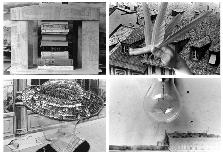
 

Mari Mahr

The work of Mari Mahr is deeply personal and autobiographical, yet addresses universal human concerns regarding where it is that each of us come from, and where it is that we each belong.

Her work has been exhibited worldwide including at the Serpentine, London and is held in numerous important collections including the Victoria and Albert Museum in London

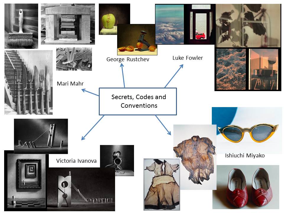
I chose Mari Mahr as a photographer to research as many of her images contain a variety of objects: clocks, birds, fish, books, picture frames, eyes, stars, buildings etc. This could link to the theme of conventions as they seem to be relatively domestic objects suggesting the life of a family or community.

Mari Mahr constructs her photographs from artefacts of her past life and that of her family. She was born in Chile, grew up in Hungary and moved to London in 1972. Her father was an architect but died when she was twenty four. Her mother was a translator; work that brought her into contact with Che Guevara and Pablo Neruda. These diverse origins are represented in her work by an equally diverse selection of objects

This series Between oursleves: ‘My Daughter, My Darling’… and ‘Time for Sorow’ all use the same stage and the same backdrop within their seires; the only variations being in the lighting and in what is displayed. This simplicity is her strength, for she needs little to tell her stories; leaves for the time of year, but also for her memories. Her photographs are therefore both imitations of remembrances and completely artificial. This is clear in her use of old photographs. A story is told as if it were a myth or nursery rhyme combining a landscape and objects that carry a symbolic meaning

NEW PLACES – NEW CODES (2000)

“These are based upon recollections – sometimes vague and sometimes quite specific from that miraculous time when as a child I was trying so hard to make sense of all the people and all the things around me.”” So, existing in a kind of limbo, these images of mine might be seen as reality re-considered – things that I might or should have said at the time.”

SYMBOLS OF OURSELVES (2002)

“All through the ages and in all cultures there have been effigies made to represent us – sometimes for religious reasons, sometimes for commerce and sometimes just for play. My house is full of them.”

“I see these faces around me not as specific representations of particular people, but representing all people. This generic quality has made them especially suited to their being cast as characters with universal significance in some of my previous works.”

“These portraits are a tribute to this international ensemble that surrounds me.”

Here is Mari Mahr’s website and a link to one of her series that links into my interpretation:

Still Life Photography

Genre: Conceptual / Installation Photography

Still life photography is a genre of photography used for the depiction of inanimate subject matter, typically a small group of objects. It is the application of photography to the still life artistic style.

This genre gives the photographer more leeway in the arrangement of design elements within a composition compared to other photographic genres, such as landscape or portrait photography. Lighting and framing are important aspects of still life photography composition.

Still life images can be just about anything that doesn’t move. The definition of a still life is an inanimate object but other subjects are loosely termed as still life as well. These include flowers, food, etc. They are life forms but they don’t move. Because the subjects are smaller, lighting coverage is less and alternatively less power is need.

This goes back to a bit of photography history. In the early days of photography, exposures were pretty long, which made it ideal to take shots of inanimate objects. Of course, as technology improved and time wore on, still life photography is still incredibly popular because of product shots. Whether it’s for magazines, catalogues or websites, product shots and still life anything is very much in-demand.

The still life has always been a key tool for experimentation and development for the artist and photography adopted this tradition as well. Still Life Photography has its roots all the way back to Henry Fox Talbot (member of parliament, scientist, inventor and a pioneer of photography). Many of the early practitioners of still life photography adapted Fox’s examples and mixed them with traditional painting models. Most of this was in trying to get photography accepted as a serious art form. For example, many of the early Roger Fenton works involved typical subjects of fruit, themes of abundance and victorian style lighting.

Examples of Henry Fox Talbot’s Photography:

Still life became distinct genre and professional specialization in Western painting by the late 16th century. Still-life paintings also often are in the interior of ancient Egyptian tombs. It was believed that food objects and other items depicted there would, in the afterlife, become real and available for use by the deceased. Ancient Greek vase paintings also demonstrate great skill in depicting everyday objects and animals.

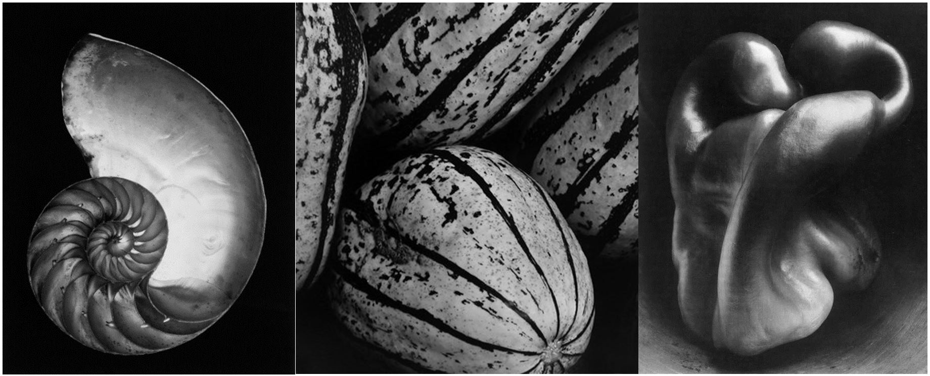
As photography matured into the twentieth century, photographers such as Edward Weston incorporated still life photography in experimentation with organic forms and connections in nature.

Examples of Ed Weston’s work:

Lighting’s always important in photography, but perhaps it’s even more so when still life is concerned. The pros normally rely on either a light box or a soft box to shoot their still lifes because it provides even light on the subject matter. Even lighting makes for better, more attractive images.

In landscape photography, there isn’t much we can learn about how to set up and control light. We generally have to work with what is there and about the only control we have is the time of day. In portrait photography, we have all the lighting options: main light, fill light, background light e.t.c, but we are restricted on the amount of time we can take. If we tweak and adjust too long, our subject will get tired of waiting and leave.

As in the composition arrangement, one of the main benefits of the still life photography lighting setup is that we can take as long as we want. We can tweak and fiddle until it is perfect.

Photoshoot-1

For my first photoshoot I decided to go to the Jersey War Tunnels to look into the history side of photography and to see if any conventional objects where displayed from the past. Many of the displays were settings e.g. dining rooms and kitchens, linking into the theme of conventions and secrets.

In 2001, a permanent exhibit called “Captive Island” was unveiled in the tunnel complex, detailing everyday life for civilians in Jersey before, during and after the occupation of Jersey.

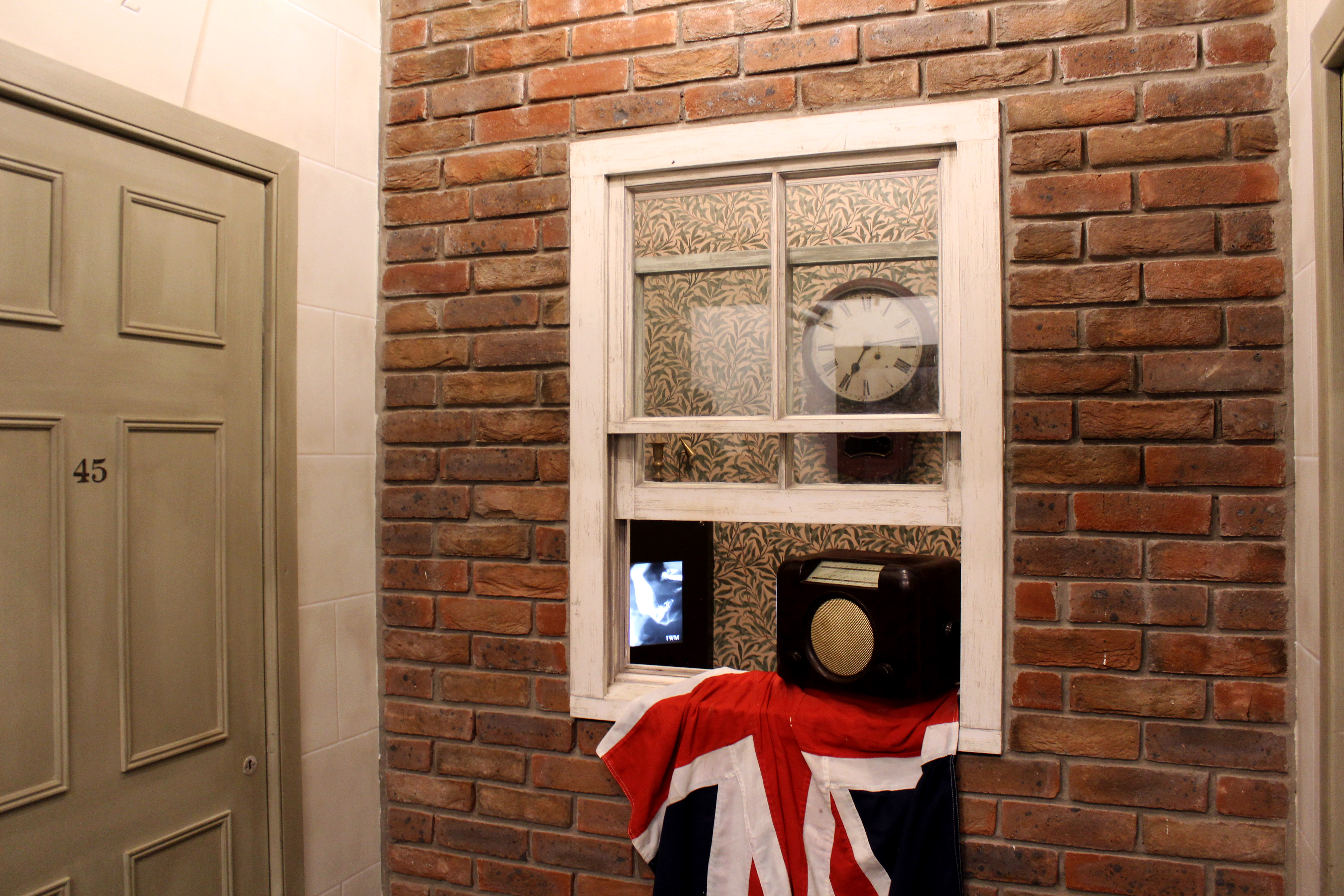
As restrictions and shortages increased, daily life for islanders became more difficult. The image below show the recreation of a Jersey home during the occupation gives an insight into the make do and mend mentality that kept residents going throughout these dark years.

I decided to display these images as a set of three as they present the recreation of a Jersey home from different angles. My favourite image out of the three is the third one as its the most natural looking one and doesn’t look like a artificial set. I also prefer this composition to the others as it has a main focus (the chair) and still represents the atmosphere of the room from a closer perspective. It focuses on the details of the objects in the corner rather than the room as a whole, like the details of the chair and the patterns within the image (the wallpaper etc) showing the historic side. The warm colours of the chair and fireplace contrast with the cold colours in the wallpaper creating an interesting juxtaposition, the blue colours emphasising the main focus of the image which is the furniture. The lighting in this image is artificial and is too harsh on the right side of the wallpaper, to fix this I will edit the image further to creating an aesthetically pleasing image that looks natural. The overall concept of the image is to represent daily life for islanders during the occupation and the idea that history and memories can be represented though conventional objects.

Picture below taken from https://www.jerseywartunnels.com/history-stories/spreading-the-news/

For those who listened to their hidden wireless sets in secret, repeating any thing they had heard was dangerous.  Words could be whispered in open spaces where there was no risk of being overheard, but some people went a step further in their efforts to spread the latest news, putting themselves at great risk of imprisonment and probable deportation.

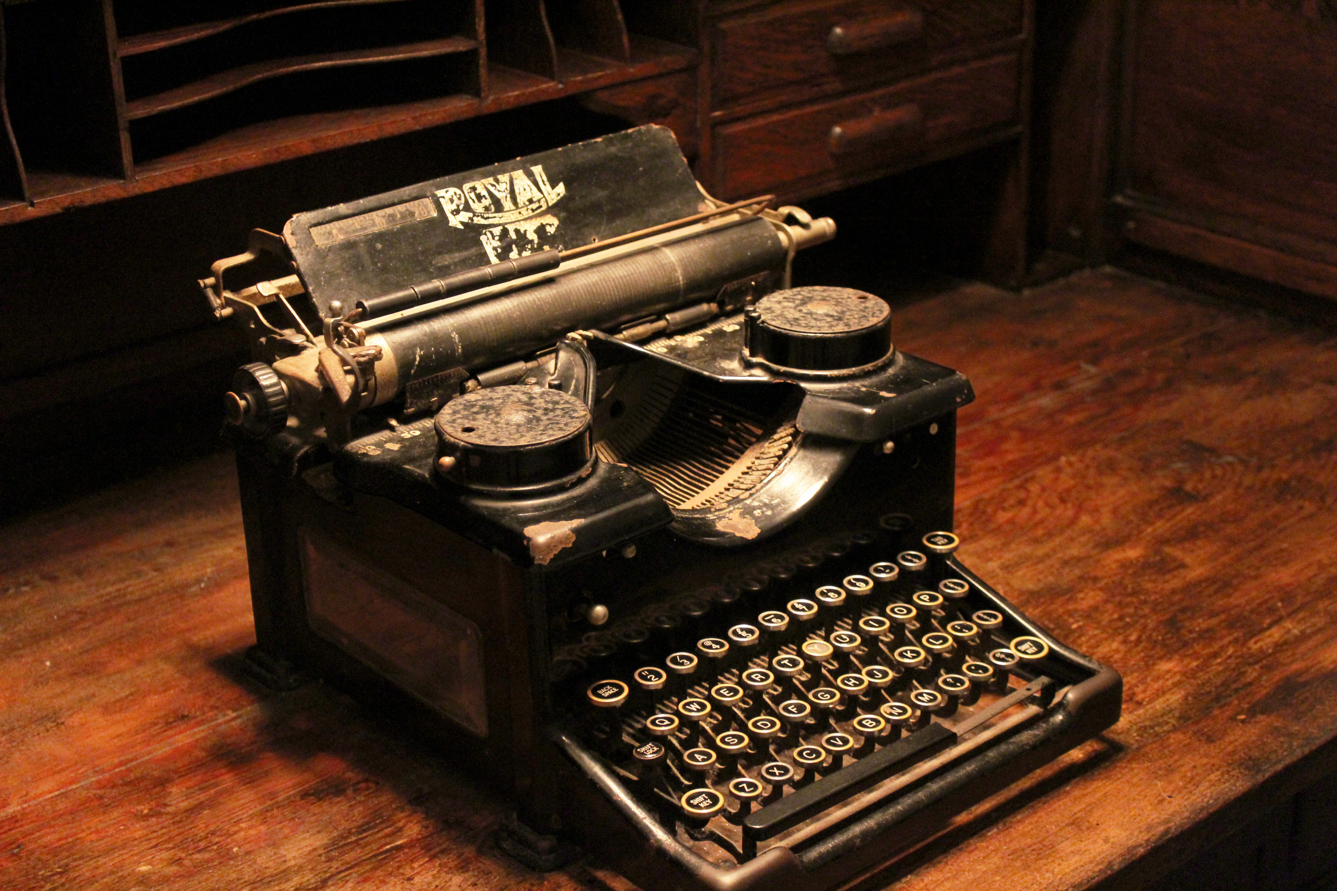
A local schoolmaster was able to note down BBC news bulletins and type out a summary, making copies on an old duplicating machine. If the news concerned Allied positions overseas, he would trace a map from a school atlas and make copies of that too, ready for distribution to a favoured, trusted few.

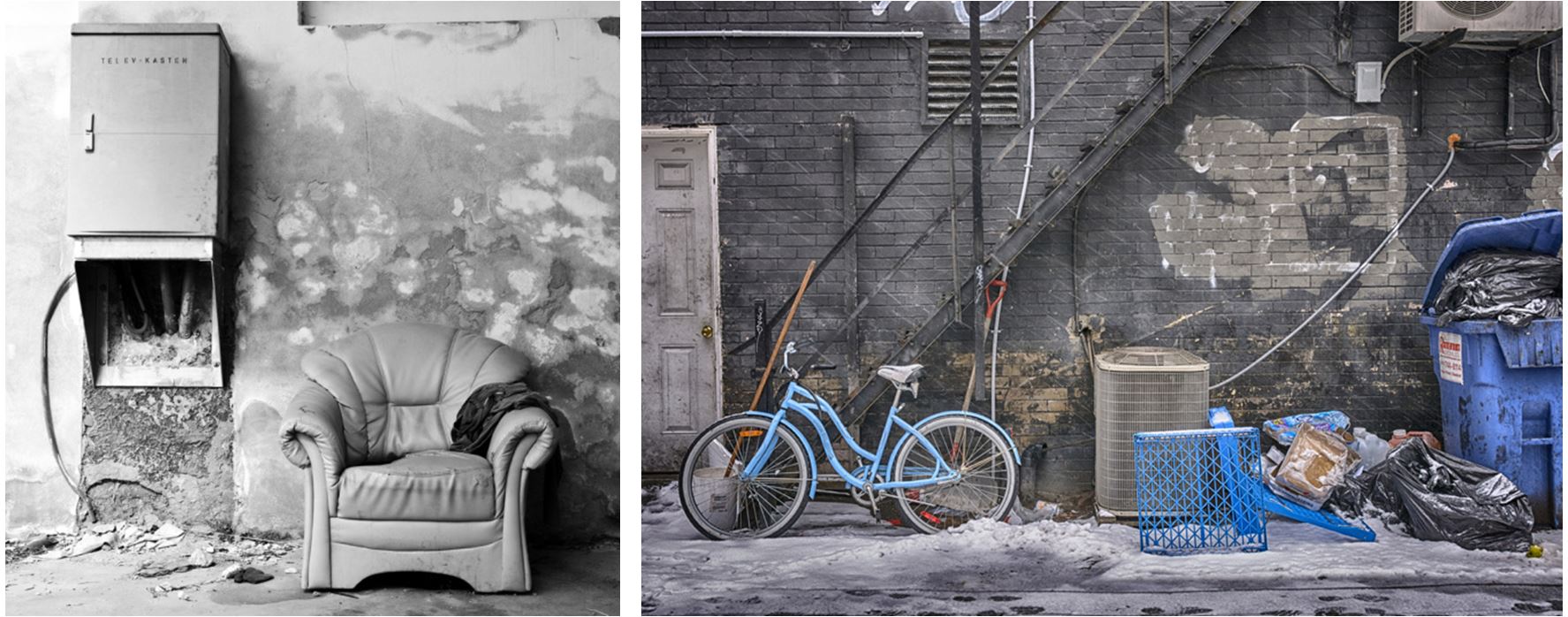
Below I have displayed some conventional objects that would be found around a home in the occupation.

In the final months of Liberation, Islanders became desperate. Food shortages were acute and with no knowledge of when the war would end, the Island entered its darkest times.

A farmer's widow

One day during the Occupation, a farmer’s widow living in the country went to her shed to collect potatoes for a family meal, but was startled by an intruder. A thin, dirty man appeared out of the gloom, and looked at her imploringly, miming the act of eating - for he was starving. One of the many enslaved workers, he was clad in ragged clothes, topped with an old army overcoat.

Feeling slightly nervous, she shouted at him and indicated with hand gestures that he should stay in the shed whilst she went to fetch a piece of bread - all that she could spare. When she returned, he uttered thanks in his own language, whilst stuffing the food hungrily in his mouth.

With compassion she watched him eat, then with words he did not understand, and gestures, made it clear that he should go, fearful the Germans would discover her helping him.

A few days later the man returned and knocked on her door. Again she gave him a little food, and he smiled at her. She was once again afraid - if discovered she would be in serious trouble. She indicated that he should leave, but he stood his ground, carefully removing a needle he had concealed in his coat collar. Grinning, he gave it to her - the only possession he had.

Although these images do not contain people it is easy to imagine families using these conventional objects and living in settings like the recreation of the living room. The fact their is no evidence of people in these photographs adds to the effect of the image like the objects have been abandoned.

9 May 1945. After five years of occupation, British forces arrived to free the Channel Islands. Scenes of happiness and relief characterised this most wonderful of days, which is still marked by a public holiday and celebrations today.

Doing a photoshoot at the War Tunnels has made me realised how the stories of those who lived around that time link a lot more into the themes secrets and conventions than i originally thought. For example, those who listened to secret wireless sets were in danger if they repeated what they heard and could only do so discretely, but some people went a step further in their efforts to spread the latest news, putting themselves at great risk of imprisonment and probable deportation. Linking to the theme of secrets as people were willing to risk their lives to spread information to others that they had discovered in secret. It also links to the theme conventions as I got to see many everyday objects that were used in homes and how  many have history and stories behind them that may not be obvious at first. Also how islanders became desperate as food shortages were acute and with no knowledge of when the war would end and how they were deprived of conventions they were normal to them before.

Jersey War Tunnels

Jersey War Tunnels

Hohlgangsanlage 8 (also known as the German Underground Hospital or the Jersey War Tunnels) was a partially completed underground hospital complex in St. Lawrence, Jersey, built by German occupying forces during the occupation of Jersey during World War II. After Hitler’s October 1941 order to fortify the Channel Islands, work began on a string of fortifications all around Jersey.  Ho8 was intended to be a vast network of underground tunnels that would allow the German occupying infantry to withstand Allied air raids and bombardment. Over 1 km  of tunnels were completed. After the liberation of the Channel Islands, the complex was converted into a museum detailing the occupation and remains a visitor attraction.

One tunnel made 6,000 years ago as part of a Neolithic ritual site, the other made 65 years ago to protect the German war machine from allied bombardment. It took nearly three and a half years to build, with the work being carried out by forced and slave labourers who were brought to the Island from all over Europe. It was originally intended to be a barracks and ammunition store for the occupying forces. Many of the workers were Polish, French, Russian or Republican Spaniards. Conditions were terrible, although Russian and Ukrainians were treated the worst, with cases of malnutrition, death by exhaustion and disease among them becoming common.

In late 1943, with the threat of an Allied invasion of Europe becoming clear, Ho8 was to be converted into a casualty clearing station and emergency hospital. The tunnels were blasted out with gunpowder and handtools, and then covered with concrete. The hospital was dug into a slope, so that it would drain naturally and had 500 beds for patients.

Despite the huge preparations and fortifications made to the Channel Islands, none were ever utilised. The occupying forces in the Channel Islands surrendered on 9 May 1945 (one day after the rest of the German forces surrendered). Ho8 fell into disuse, with British soldiers and souvenir hunters stripping the tunnels of equipment.

The War Tunnels tell the compelling story of life in Jersey under occupation and feature a series of  galleries looking at the diverse experiences of all those who live through it, whether Jersey, British or German

Source of pictures: www.jerseywartunnels.com

In 1940, news of the fall of France to German forces created a sudden crisis for Islanders, should they stay or go. Many men of military age had already left, and most of those whose families were not in Jersey felt the need to return to England. Others also decided it would be advisable to leave. Whole families had to rapidly prepare to walk away from house and home, leaving behind their happy life – and not imagining it would be for five long years.

“Queues for tickets stretched for long distances, and hurried arrangements for leaving were made. Choosing what to take was not easy, as only one suitcase each was allowed. We could only pack essential clothing, so my sister and I were dressed in extra layers of clothing, despite the warm weather. We were each allowed to choose just one book and one toy to take with us.”- Ann Bright (7 years old at the time)

In 1942, the German turned up at this time-crossing site and damaged it by digging an underground bunker, now transformed into a memorial dedicated to the thousands of men, women and children transported to the Channel Islands as forced workers during the second world war.

Memories inscribed on plaques are chilling: “I have never forgotten the sound that came out of the huts. When people are starving, the pitch of their voices rises. The sound was like lots of birds in an aviary.”

Secrets, Codes and Conventions Introduction

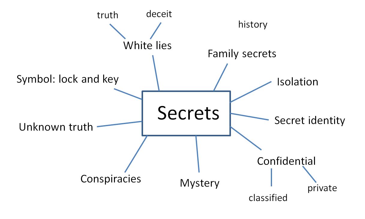
Secrets:

‘Not known or seen or not meant to be known or seen by others.’
synonyms: confidential, strictly confidential, top secretclassifiedrestrictedunrevealedundisclosedunpublisheduntoldunknownuncommunicated,

masks, disguises, camouflage, costumes

Codes:

‘a system of words, letters, figures, or symbols used to represent others, especially for the purposes of secrecy.’
synonyms: cipher, secret language, secret writing, set of symbols, key, hieroglyphics;  coded message, cryptogram

“a message in code”

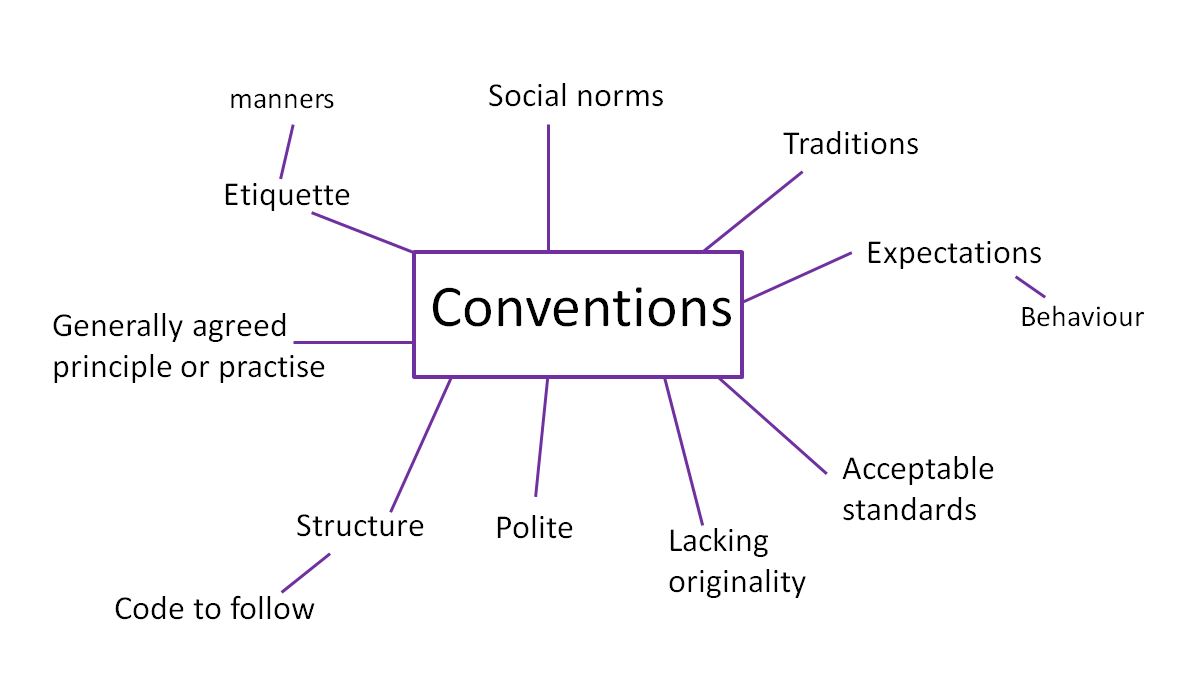
Conventions:

‘a way in which something is usually done’
synonyms: customusagepracticetraditionwayhabitnorm;

rulecodecanonpunctilio;
accepted behaviour, conventionality, proprietyetiquetteprotocolformality,
 or ‘an agreement between states covering particular matters, especially one less formal than a treaty’
synonyms: agreementaccordprotocolcompactpact;

treatyconcordat

• rules, rituals, etiquette, procedures, conformity, oppression


Photographers to research:

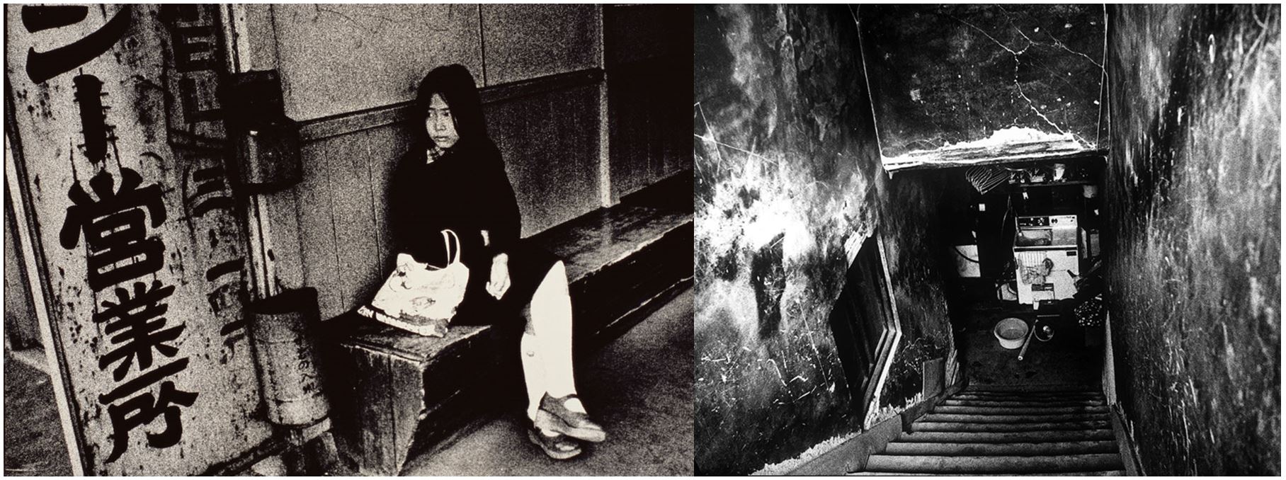
  • Donovan Wylie
  • Ishiuchi Miyako
  • Luke Fowler
  • Jerry Uelsmann
  • Lara Zankoul
  • Mari Mahr-conventions

Final Outcomes

Image 1:

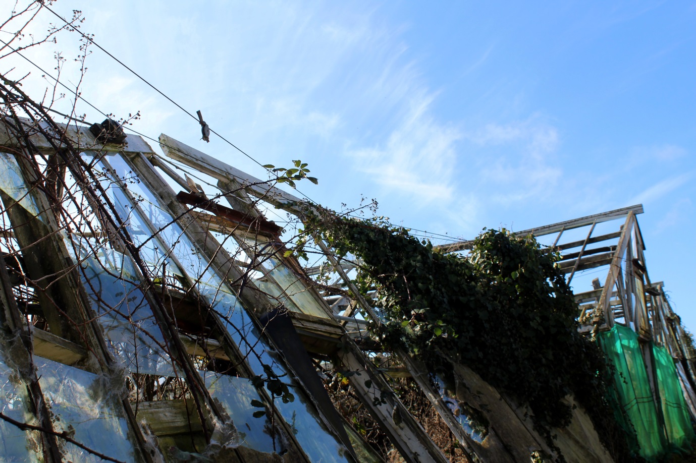
For this photoshoot I wanted to go explore natural places and landscapes but came across some abandoned greenhouses and decided to focus my photoshoot around them. I still consider this a photoshoot exploring natural landscapes as all the images contain some sort of natural aspect but combined with derelict greenhouses, either the plants that have grown around the broken glass and wooden frames or are surrounding the greenhouses by themselves. I chose this image from my photoshoot to be in my final 3 as I like the geometrical shapes and lines created from the broken wooden frames, giving a different effect than if they were not derelict.

Experimentation:

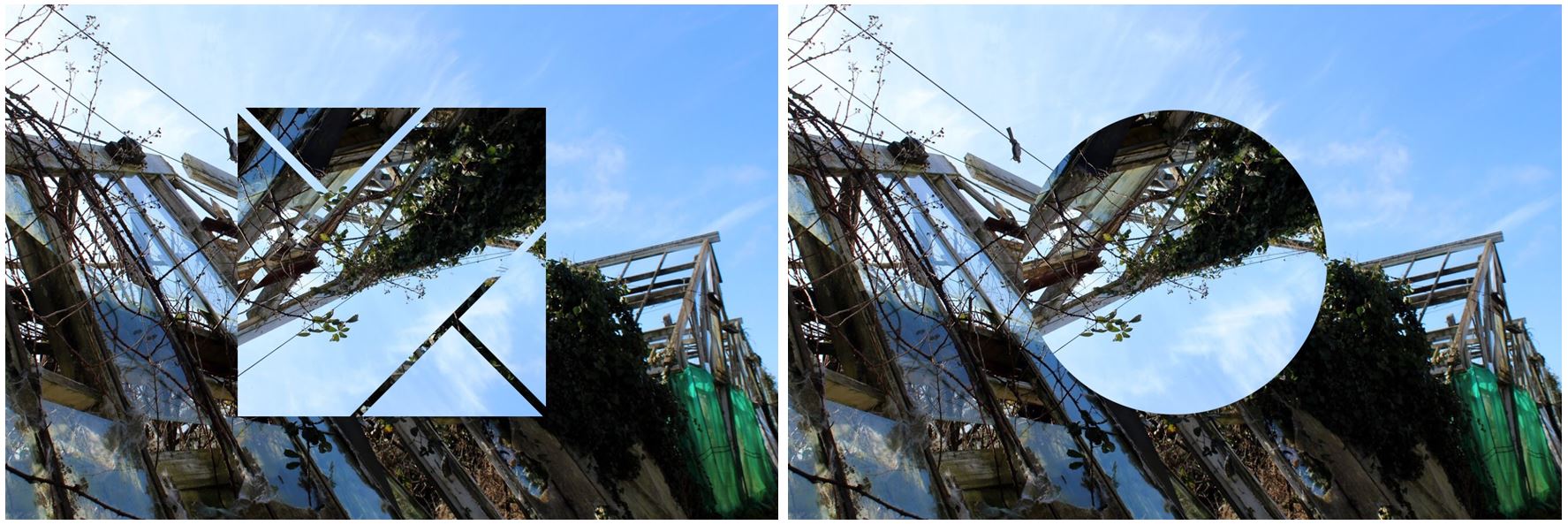
For experimentation I wanted to add another aspect to the image to make it more aesthetically pleasing and interesting. I decided to try and edit shapes into the photo so you could still see the background of the original photo but with a shape in the middle that was transparent so you can still see through it.

I also tried turning the image into a panoramic image by taking the photo and attaching it to the original image but flipped horizontally to create a symmetrical and aesthetically pleasing overall image. I decided to not use this image as i think its too repetitive and decided that when I added in a shape it gives the image a different aspect, rather than the same aspect repeated.

Conclusion:
  • When taking this photoshoot i didn’t have one particular photographer in mind and wanted to do my own images, with a combinations of ideas from all the different photographers I’ve studied.
  • Although i liked the image by itself, without much editing, I decided to add in different shapes to develop my work and to make it look like more of a final outcome.
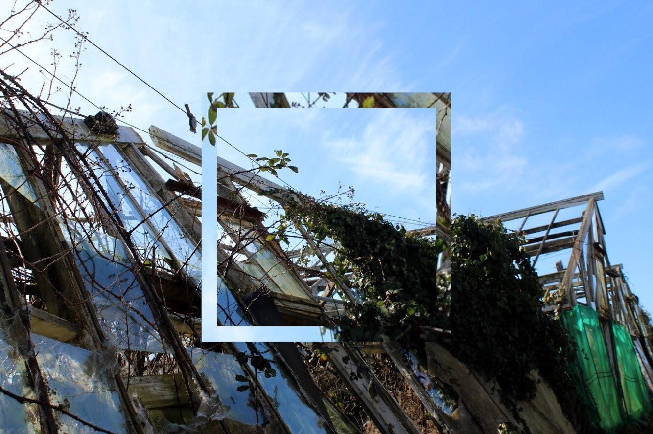
  • The square shape I have edited emphasises the geometrical lines and shapes within the image and adds a different aspect to the photo.
  • The shape also brings the light blue from the sky into the bottom half of the image creating contrast between the two as it contains parts of the image within the square.
  • The colours within the image as a whole are very neutral: the panes of broken glass on the left side of the photo also show the reflection from the sky making them appear blue in the image and  show the reflection of the clouds aswell. This blue then contrasts with the green on the right side on the image on a different greenhouse,

Image 2:

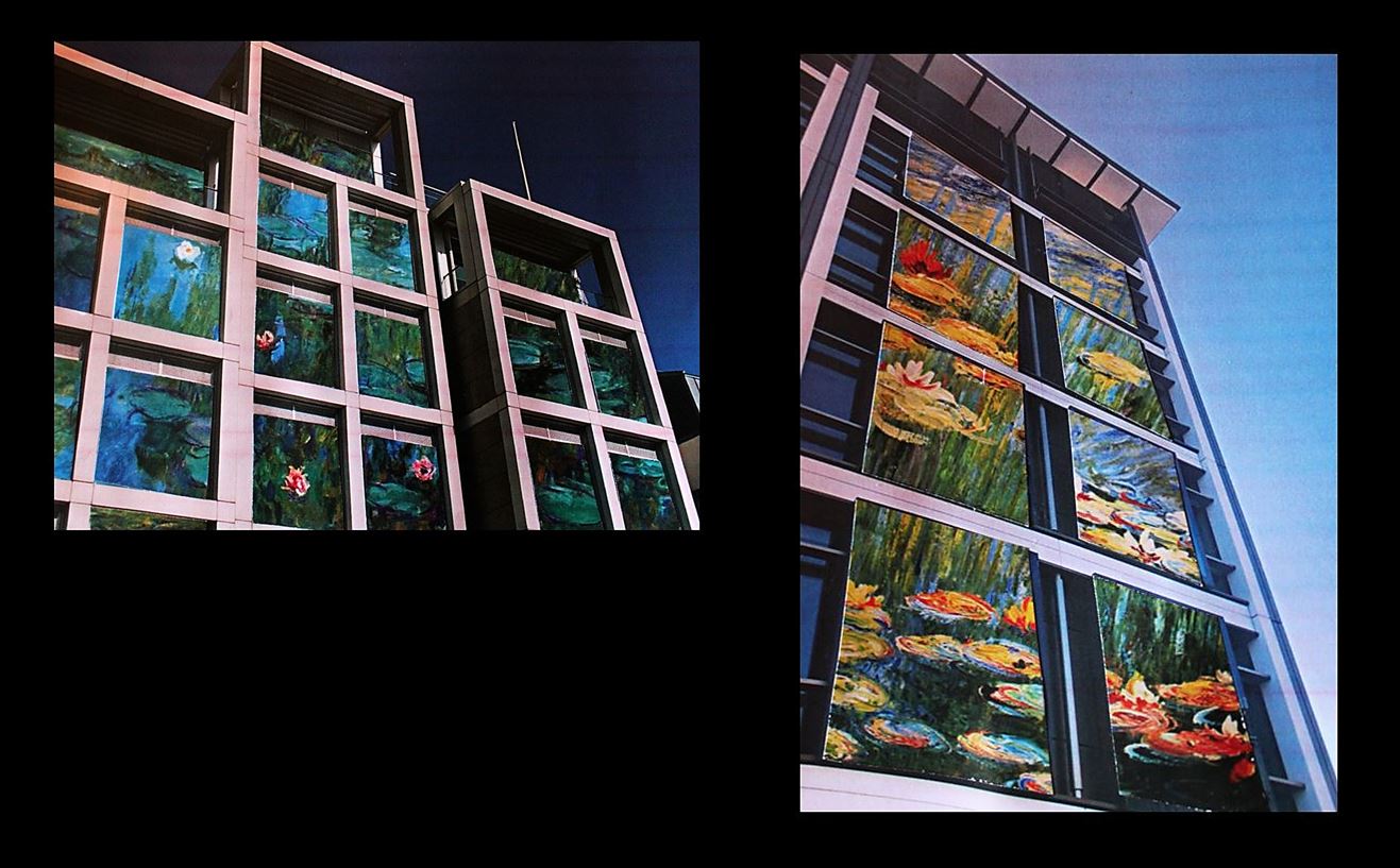
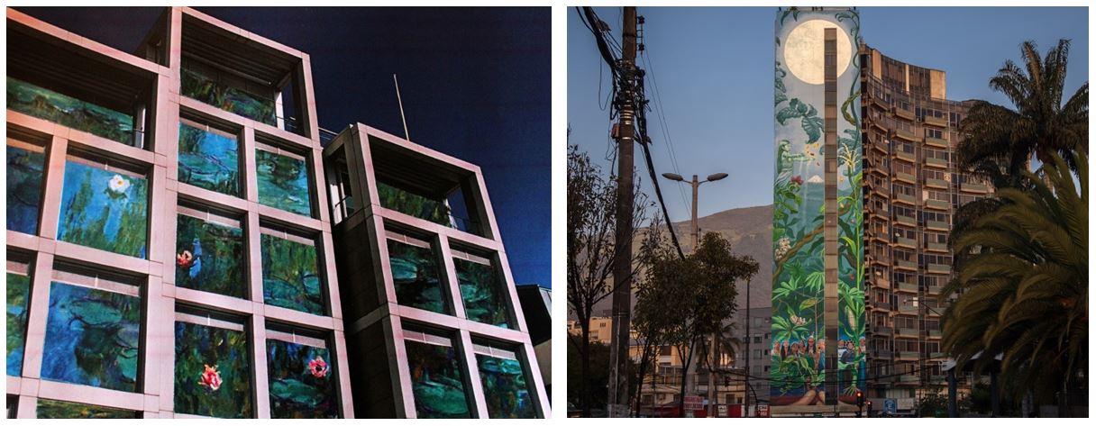
For these images I took inspiration from Mona Caron and the murals & street art she paints in the US, throughout South America and in Europe. For this image I put together two images as i liked them both together and decided to show the range and variation within my work. I added a black background as it frames the images and reflects how i want the images to be shown together rather than two separate images. I think they go together well as although they both have different paintings which i have edited in, the colours complement each other well as they are both from the same artist (Claude Monet). My favourite out of the two images is the one on the right as the painting is more visible and noticeable which makes it more similar to Mona Caron.

Experimentation:

At first I thought I would edit the images onto the side of the buildings as that’s what the artist did but I thought the paintings would look better framed by the window edges which would make my images similar but slightly different to Mona Caron’s.

Compare and Contrast:
  • The one main difference between Mona Caron’s work and mine  is that she physically paints her images onto buildings (normally plants and flowers) to create murals for the public in the city, whereas I gathered images of paintings by Claude Monet (specifically his water lily paintings) and physically stuck them onto my own photos of buildings.  Instead of sticking the printed out paintings onto the walls on the side of the buildings, I edited them in the shape of the windows, so there were different sections of the painting around the image instead of just a whole image on one wall.
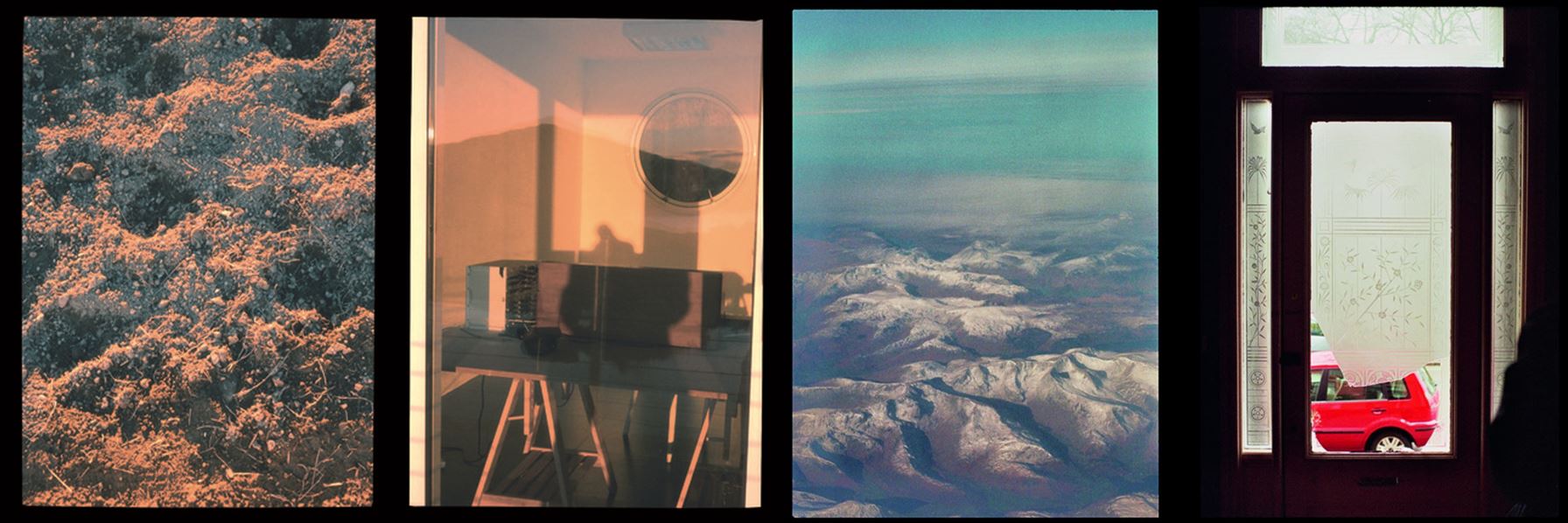
  • One similarity of Mona Caron’s and I’s work is that instead of using images of actual plants and flowers I used images of paintings that an artist has created to be more alike to Mona’s work.
  • In Mona Caron’s photos she has surrounding buildings within the building to create a sense of the city she painted her mural in, showing urban activity like cars and people in the images. She also does this to show the size of her paintings as without the surroundings someone may mistake it for being smaller than it actually is. In my images I only included one building in each of the images as i wanted all the attention to be on one single building, focusing on the paintings edited on as if i included other buildings there would be too much going on in the images when i displayed them both together.

Image 3

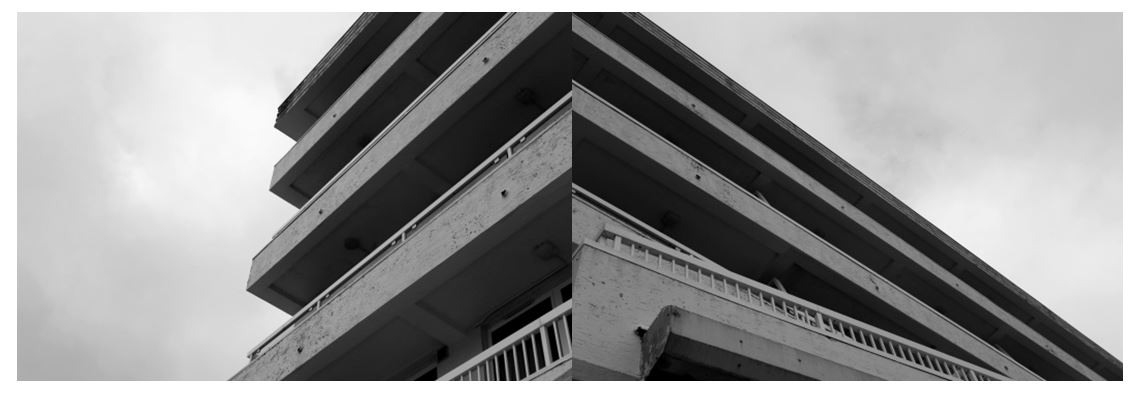
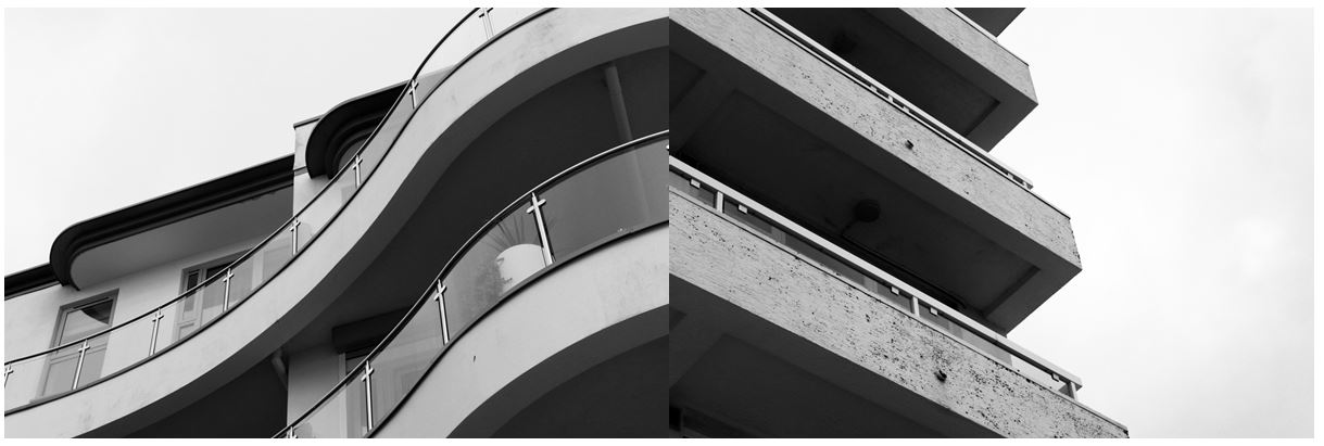
I chose this image from my Harve Des Pas photoshoot as i like the simplicity of it and the strong geometrical lines and shapes. I combined the two images together as i didn’t think the images would be as effective by themselves and be combining them together to create a completely new image and the illusion of a new building. I think this image represents the urban side of photography that I explored in this project, taking inspiration from the New Topographics through the contrasts of the harsh lines to the bright sky.

Experimentation:

To experiment with my images I tried different arrangements of images I took on my Harve Des Pas homework. I used images that i had edited to all have bold lines and shapes and connected lines from each image to the next (especially in the first image) so the images had a connection between them. I like the second image as it shows contrast between the curved and straight lines on different buildings, but they’re edited in a way to make them look similar: in both images the underneath of the balcony is contrasted with the light colour of the balcony and the bright white sky.

Compare and Contrast:

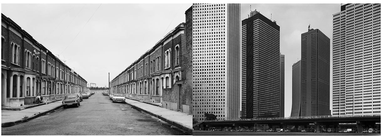
When photographing this image I tried to interpret some on Thomas Struth’s building photographs and some of the concepts he incooporates in his photos. He photographed industrialised cities focusing his attention on such cities as New York, Tokyo, Berlin and Naples.  Struth’s images of the urban environment concentrate on seemingly unspectacular streets and public spaces. This is similar to my photos as I focused in on one particular section of buildings, excluding any surroundings.  He seeks to record the face of urban space, seeing the architectural environment as a site where a community expresses its history and identity.
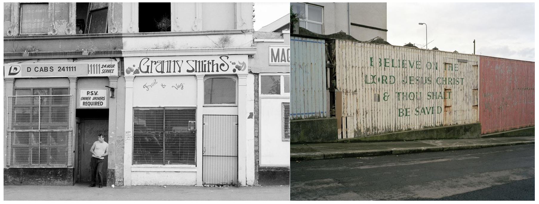
Struth deliberately refers to the tradition of black and white documentary photography, adopting a seemingly objective position. I also edited my images to black and white to create a similar effect to Struth’s. I also took the photo with a ‘seemingly objective position’ by zooming in on the edges and certain parts of the buildings, and with the compositions being simple.  One difference between mine and Struth’s work is that his photographs are neither staged nor digitally manipulated in post-production, whereas I edited my photo after, with emphasising the contrast between the light and dark sections.

Another similarity is that Struth had taken his photographs from the ground, adopting the viewpoint of a spectator looking up at the towering office blocks, which is what I did aswell. One difference between out work is that Struth seemed to focus his photos on a whole street or whole buildings, whereas I only focused on one section of a building, not incorporating any other buildings, giving a more objective viewpoint.

Overall I have enjoyed this landscape unit as i got to develop my knowledge in camera techniques and my understanding of concepts behind landscape photography that i wouldn’t have thought of before. I also now have a deeper knowledge of older and newer landscape photographers and the reasons they do what they do from researching romanticism, altered landscapes, as well as the urban and natural side of landscape photography and have explored each area doing my own interpretations.

Natural landscapes- 2

Location: Abandoned Places

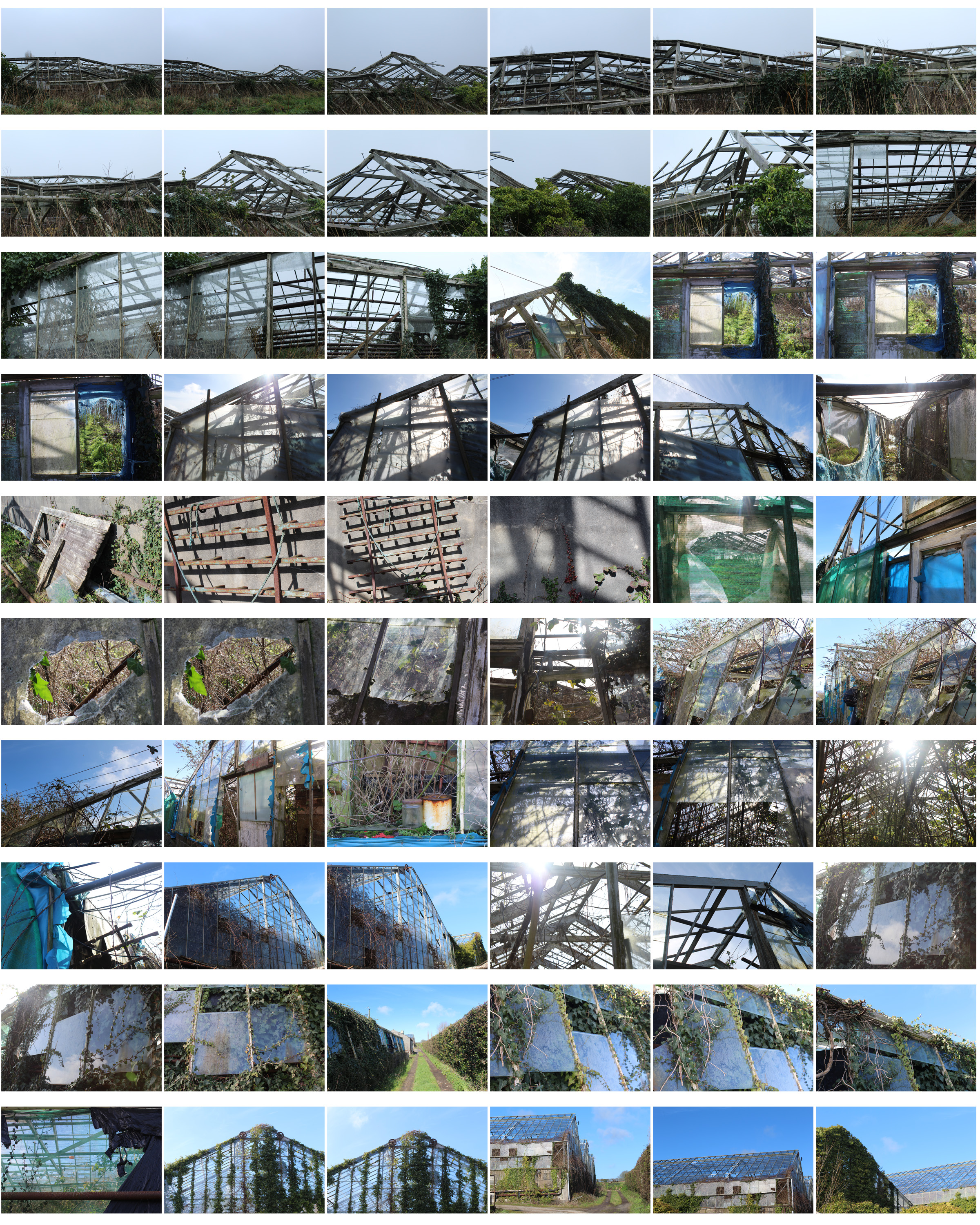
To explore natural landscapes more i decided that i wanted to go to abandoned places that have been neglected to create more interesting subjects for my images. I decided that I would visit derelict greenhouses with overgrown plants showing the natural aspect with the broken greenhouse creating a more thought-provoking image. Although these photos aren’t completely natural, they show how the natural aspects have taken over and grow around the urban spaces.

I went through my contact sheet and selected my favourite images and displayed them above unedited. I chose these photos as they are taken from different angles showing a different point of view in each image, some showing close up detail of areas that caught my attention and some that are from far away giving more of an overview of the scenery and structural shapes.

  • This is one of my final images for this homework as it clearly show the natural aspects i wanted to present and the derelict urban aspect through the broken glass.
  • I focused in on the left side of the image so the right side was gradually more out of focus to show the marks and patterns on the glass more clearly.
  • The glass has a reflection from the blue sky so I edited it slightly so that colour was emphasised to take make the image stand out more. The glass also has marks to show the derelict aspect of the greenhouses.
  • The colour of the plants growing around the glass are also emphasised showing darker and lighter greens. I chose this image as the panes of glass that are there create a pattern as some are missing.

  • I also like this image and decided for it too be printed and framed along with the image below as I think it portrays derelict greenhouses well.
  • The wooden frames with missing glass panes give evidence of destruction and reflects what happens to structural buildings over time.
  • I like the geometrical pattern that is created and the angle of the wooden door and frames also show how the greenhouses have been left alone for a long period of time to eventually be destroyed.
  • The condition of the plastic sheets show weathering and also show how the area has been neglected.

To experiment with my images I decided to edit different shapes with the image to make the photo more intriguing and to give the photo a different aspect, although I like the images by themselves.

  • I like the geometrical shapes and lines created from the broken wooden frames, giving a different effect than if they were not derelict.
  • The shapes I have edited emphasise the geometrical lines and shapes within the image and adds a different aspect to the photo.
  • The most effective image i think is the square as its simple and not distracting too much from the original image and the detail within it as the other shapes remove whole areas from the background image, whereas the square is a thin line.
  • The shape also brings the light blue from the sky into the bottom half of the image creating contrast between the two as it contains parts of the image within the square.
  • The colours within the image as a whole are very neutral: the panes of broken glass on the left side of the photo also show the reflection from the sky making them appear blue in the image and  show the reflection of the clouds aswell.
  • This blue then contrasts with the green on the right side on the image on a different greenhouse,

I also tried to create some panoramic images by taking the same image and flipping it horizontally and attaching to the original image. I did this as i thought it would be harder to attach different images and line them up exactly to create one landscape so i use the same images flipped so the it was easy to connect which I thought would be more aesthetically pleasing. These panoramic images create structural shapes that would not be found in real life making for an interesting image. I did not chose these images to be in my final outcomes as I think the patterns created are too repetitive being the same images repeated again.

Homework 5- Altered Landscapes

Out of Beomsik Won and Mona Caron i decided to take inspiration from Mona Caron. I decided to edit pictures of nature and plants onto buildings to present the concept of urban taking over nature. I planed to physically stick the images onto a printed out building to make a collage and to also digitally edit images onto buildings in photoshop, similar to how I edited my other altered landscape photos.

The images I planned to use to edit onto buildings were not my own photographs but secondary source of art as Mona Caron physically painted murals onto buildings I wanted to keep that aspect but using different artists work of natural landscapes and plants, still keeping my own images of the buildings.

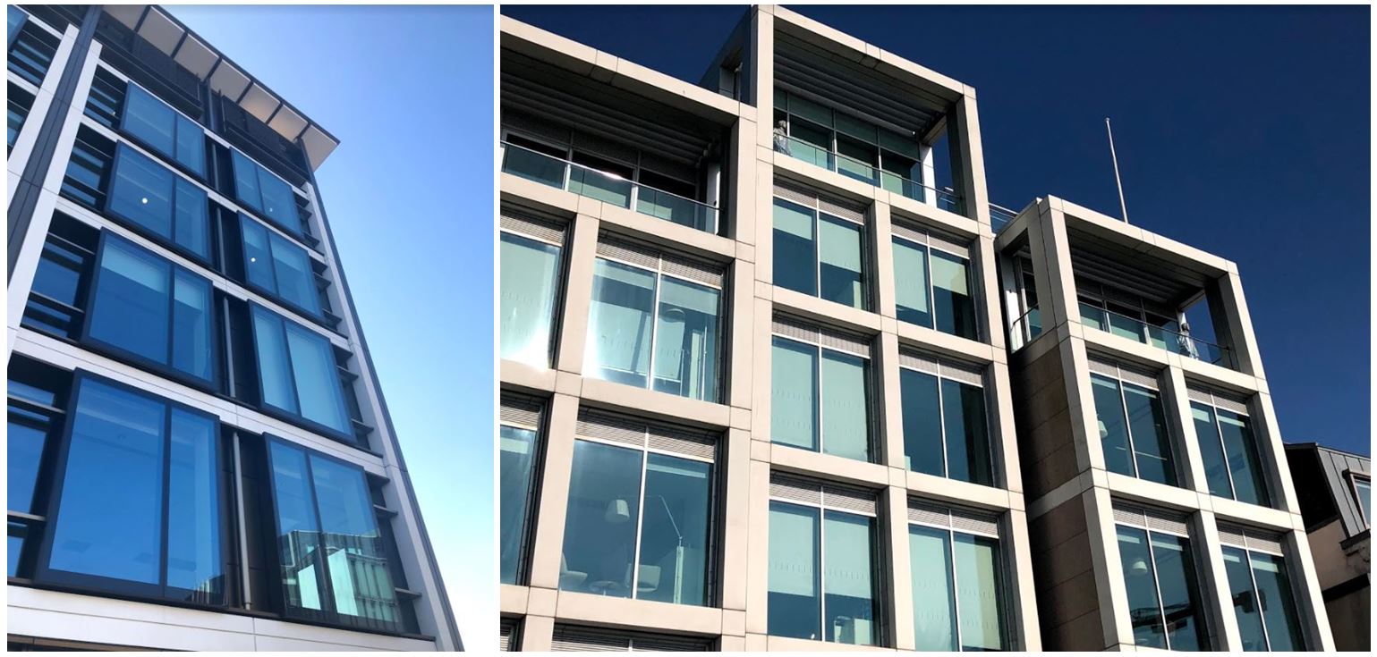
I first went out and took pictures of buildings so i could edit them in different ways.

I then chose two of these images to be my final images to edit. The pictures I wanted to lay on the buildings are from the artist Claude Monet as his paintings are often of nature and plants so the urban and nature will both be included in my image. Also Mona Caron is an artists and physically paints murals onto the side of buildings so i wanted to carry that aspect on to my images.
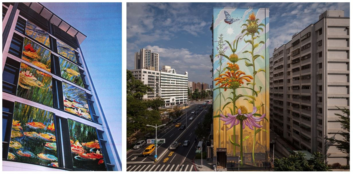
I cut the paintings specifically in the shape of the windows so it looks like the paintings are inside of the buildings. I think this was effective as the paintings are angles to make the image look 3D. These were the final outcomes when I photographed the images stuck on top of each other:

  • I chose to do this as i think the images link into my other blog posts with the theme of urban vs. nature. Claude Monet’s painting of lily pads represents the nature with the structural building representing urban.
  •  I physically printed out the images and collaged and stuck them together to make the images seem less manipulated.
  • To re-take the photo I used artificial lighting to highlight the photo as best i could even though the print out of the building wasn’t the best quality (to improve these images i could get them printed professionally.)
  • I think the edits look effective as it looks as though they were edited digitally when they were physically stuck on.
  • The shadows created from the building (especially in the first photo) make edit look more real as the painting is cut in a certain shape to emphasise that shadow.
  • For my final image I put a black border around the images and combined the tow in the same photo to show the variety of images.

Mona Caron

Mona Caron is a San Francisco-based artist, engaging in muralism & street art, illustration, art-ivism, and photography. Her focus is on community-informed and site-specific public art . She has created murals in the US, throughout South America and in Europe, creates stop-motion mural animations, has freelanced as an illustrator, and engages in artivism with social and environmental movements.

The first image is a mural called ‘Outgrowing’ in Taiwan, Mona painted the plants growing, like weeds do, from an inhospitable ground, a disturbed environment. She utilizes a wall’s large size to emphasize this inversion of scale, a micro-to-macro assertion of the power of small things, the power of the grassroots, human or plant.

Public art

Mona has been focusing primarily on murals in public space since the beginning of the millennium. Her goal is to activate public space by simultaneously creating artwork and interactive street happenings, using the painting’s narratives to spark conversations and critical awareness of the space we share.

Several of these murals contain intricate miniature details, invisible from afar. These typically narrate the local history, chronicle the social life of the mural’s immediate surroundings, and visualize future possibility, and are created in a process that incorporates ideas emerging through spontaneous conversations with the artwork’s hosting communities while painting.

Mona’s first period in muralism was defined by very site-specific and community-immersive narrative murals, reflecting the past, present, and future images of their neighborhoods through a uniquely permeable participatory process, considered part of the artwork. Mona’s community process has been the subject, among other publications, of an Emmy-winning documentary film by Paige Bierma.

In recent years, Mona’s stop-motion animation and botanical mural series titled ”WEEDS”,  a metaphor about resilience, has been growing, just like its namesakes, both in numbers and geographic reach, as well as in the scale of her pieces.

  • Currently, Mona likes to combine the poetic with the narrative aspects of her work, as can be seen in her most recent Collaborative work.
  • Mona has also illustrated books, posters for music or political events, news editorials, and more, using various styles of watercolor, block print techniques and more.Mural by Mona Caron
  • This mural, called ‘Taking Root’, features the first wildflower that made it back to a barren piece of land in Union City, California, after its rehabilitation from industrial pollution, and during the construction of a new affordable housing complex.
  • The topsoil had been completely scraped off to remove pollution, killing all vegetation. As the building construction neared completion, the first wildflower she found became the main feature of the mural, a symbol of resilience.
  • https://www.monacaron.com/murals/taking-root-video-documentary- link to video
  • few more videos https://www.monacaron.com/murals/manifestation-station-painted-utility-box
  • https://www.monacaron.com/murals/brush-tenderloin-short-movie-paige-bierma

Dandelion 1 Masjid Darussalam, San Francisco by Mona Caron

http://youtube vid:  https://monacaron.com/weeds -a stop-motion mural animation

“They may be tiny but they break through concrete. They are everywhere and yet unseen. And the more they get stepped on, the stronger they grow back.”

This is a series of paintings of urban weeds, created as a tribute to the resilience of all those beings who no one made room for, were not part of the plan, and yet keep coming back, pushing through and rising up.

weed-1-new

“I look for weeds in the city streets near a wall I’m about to paint. When I find a particularly heroic one growing through the pavement, I paint it big, at a scale inversely proportional to the attention and regard it gets”