All posts by Megan Woolsgrove

Filters

Author:
Category:

Tamara Lorenz and Franco Fontana

Franco Fontana

Tamara Lorenz


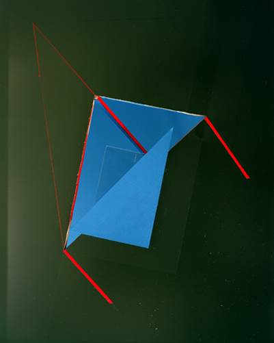
Tamara Lorenz uses geometrical shapes with solid colours to photograph.  She cuts and folds the paper to achieve the shape that she wants.  This photograph mainly consists of triangular shapes to give the impression of a 3D shape when in reality its only pieces of card. The folds within the photograph creates darker tones and shadows. The green background starts lighter in the top left corner and ends much darker in the bottem right, showing that the light is coming from the left. The thin lines of red create more geometrical shapes in the photo and outlines the other shapes. contrasting with the colours. At first glance, it is unclear whether the photograph itself is the artwork, or just a photograph of an exhibition, this directs attention to the tradition of photographic reproduction of artworks and its impact on the development of art and the art history since the nineteenth century.

Texture- Homework 4

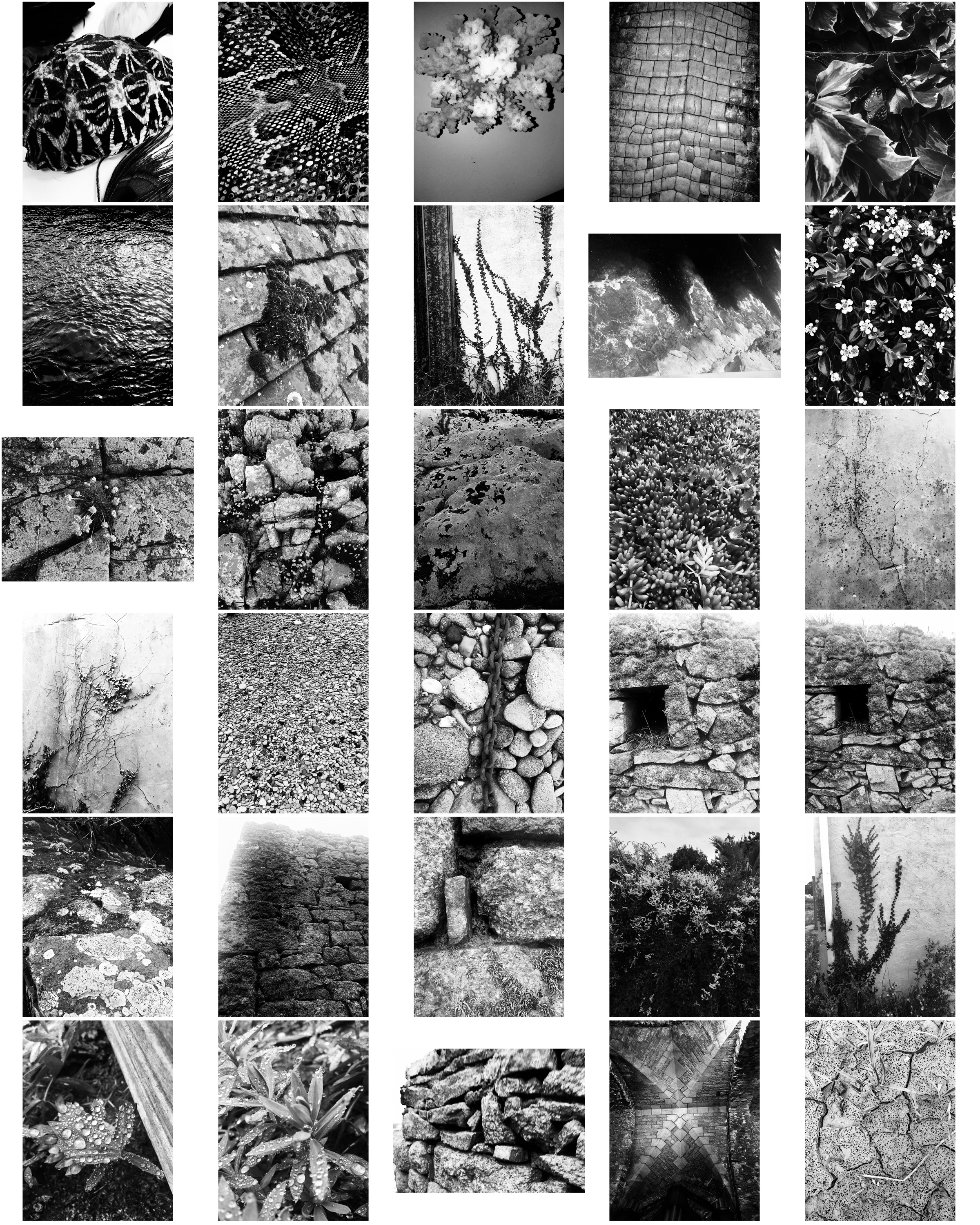
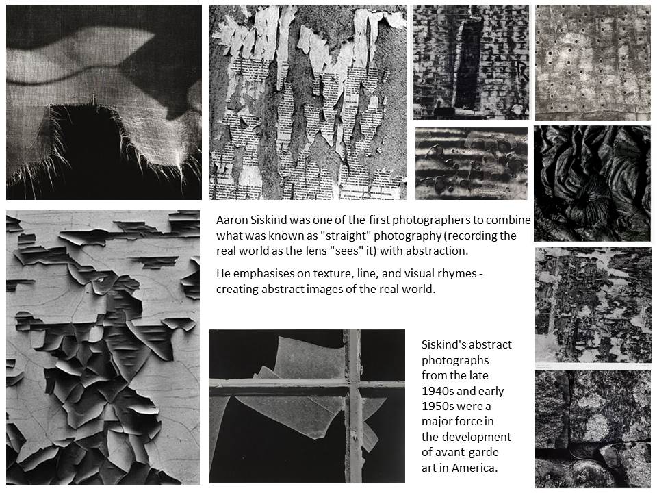
These photos take inspiration from Aaron Siskind focusing on texture, line and visual rhymes.

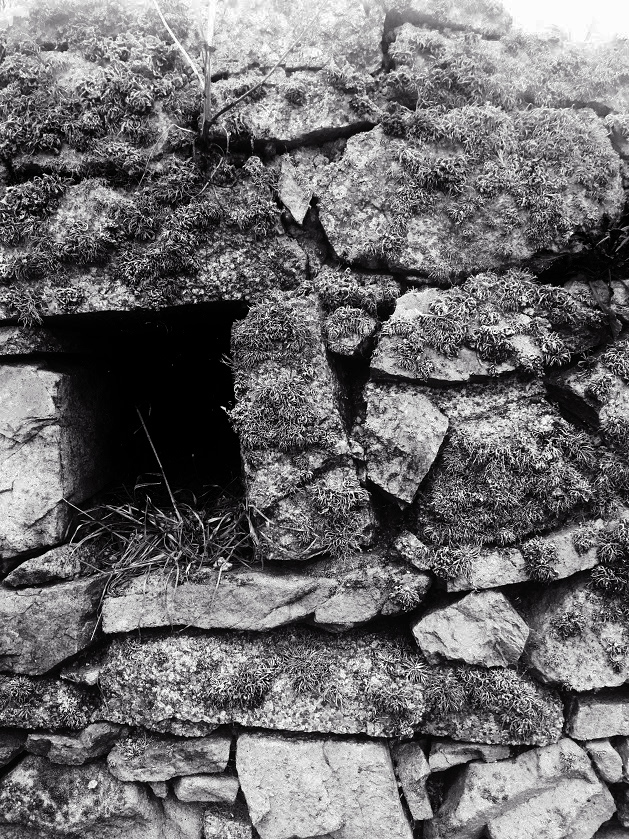
These two photos are my favourite from the shoot as they display texture of the surface, using the Ansel Adams zone system. The stones in these photographs both contain a lot of detail like the moss and weathering, making the photos more interesting. Both images contain contrasts between light and dark, the first image has contrasts from the higher level of rock and the shadows which they create below them, and the second image contains shadows through the gaps in the stones creating varied tones in the photo. Editing the photos in the contact sheet black and white makes them more similar to Aaron Siskind’s style.

These photos show similarities to Aaron Siskind’s ‘Martha’s Vineyard’ photograph:

Martha's Vineyard 131B


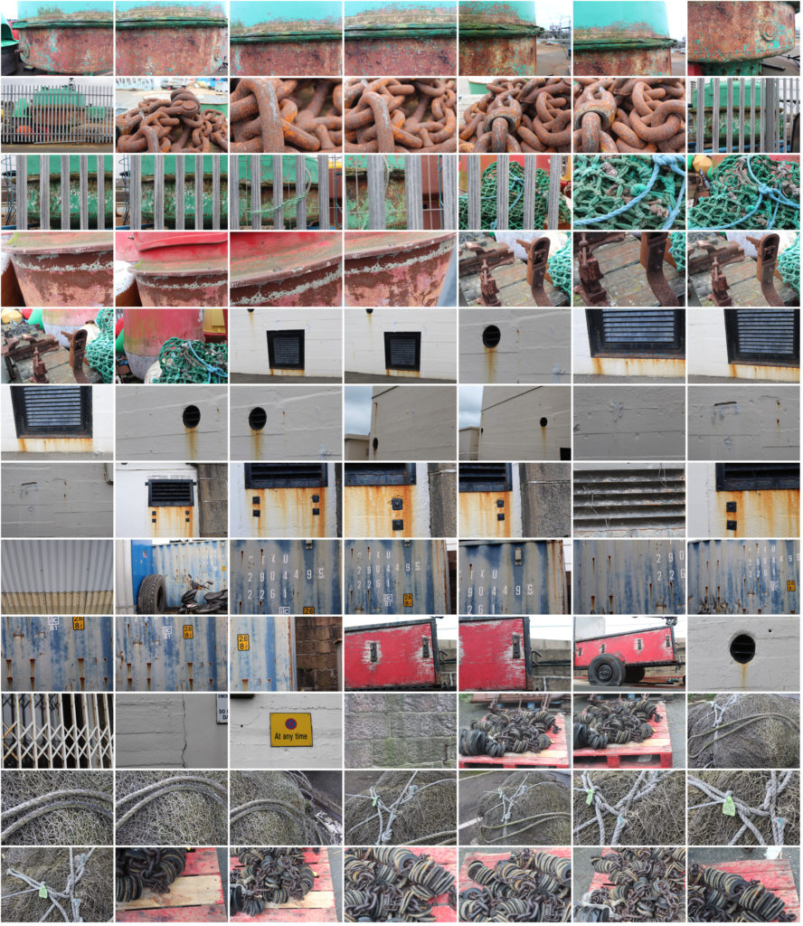
For this photoshoot I looked for objects that had been in the sea or near it so i could focus on the weathering and rusting, like Frank Hallam-Day did in his ship hull photos.

Final 5 Images from Shoot:

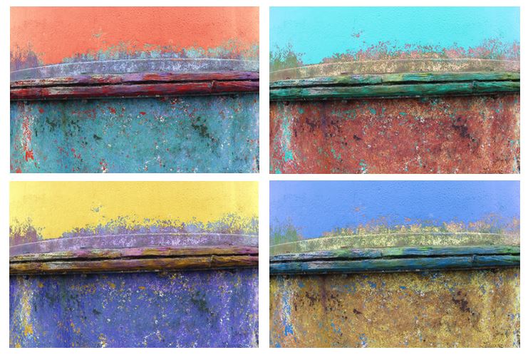
The photo which i think shows the most similarities to Frank Hallam-Days photography is image 5 as it focuses on the weathering and gradual deterioration of a man made object. It has horizontal lines, creating sections with the photo of different texture. To improve this   photo i would have photographed the entire ship hull so it showed more similarities to Frank Hallam-Days work.

I edited the original picture and altered the hue to create different colours of ship hulls and a more varied range of photos. I tried to capture the way Frank portrays the effect of time on works of man, emphasising the rusting and weathering.

Frank Hallam-Day and Aaron Siskind

Aaron Siskind

Frank Hallam-Day

 Image Analysis:

I think this photo expresses Frank Hallam-Day’s theme of passage of time on works of man well. He highlights the bright colour yellow and also the brown to emphasise the weathering of the ship hull. He contrasts the work of man (ship hull) with nature (water) to express the affect nature has. The photo is split into the rule of thirds horizontally and one line vertically, creating a grid shape to show the sections within the photo of different patterns like weathering and rusting. The middle section has different levels of rust from where the sea has been, expressing that the ship hulls where once technological achievements but are now just sitting in the harbour. He contrasts the bottom of the photo with the top half, the bottom half having a lot of marks and patterns, and the top being one bold colour. The marks on the ship hull create interesting reflections on the sea and he has increased saturation to emphasise the rust in the reflection.

Bokeh Effect

The bokeh effect refers to blur or a blurry quality, and in photography it is a very recognizable technique. The word bokeh translates from Japanese as ‘blur’.

Bokeh tends to appear in the areas of an image that remain outside the focal region. Because of this the most common technique used to add it is a shallow depth of field created through a wide open aperture.  It is generally considered pleasing for your eyes and your perception of a photograph, because it can add softness to an otherwise harshly lit photograph.

This website shows the different types of bokeh effects that can be achieved:

What is Bokeh and How It Affects Your Images

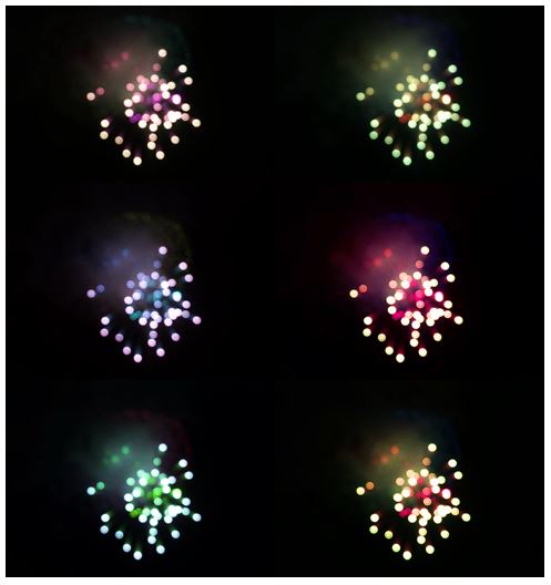
My own examples:

I raised the ISO no higher than 400 and had aperture open wider to allow a shorter shutter time.

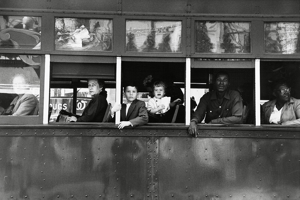
Robert Frank Analysis

Visual

The black and white emphasises the different races and the repetition of the physical bar standing between the people, and the rest of the bus, shows the segregation and categorises them individually. The photograph demonstrates the rule of third as it has vertical and horizontal lines. It also shows signs of Ansel Adams zone system, the brightest point being the white bars.

Conceptual

The idea that America in the 1920s wasn’t a great life for everyone , and racism was a apart of everyday life, revealing the cruel reality of the ‘American Dream’.

Technical

The photo has natural daylight as Robert Frank was a documentary photographer. The photo was taken on the streets so has no artificial lighting. He used a fast shutter speed as the photo is very sharp and not blurred so if the bus was moving at the time he captured all the detail.

Contextual

The 1920’s was a time of racism and prejudice and it was uncommon for photographers to tackle the issue of racism at the time.

Experimenting with Threshold

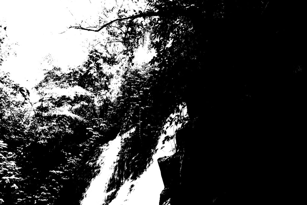
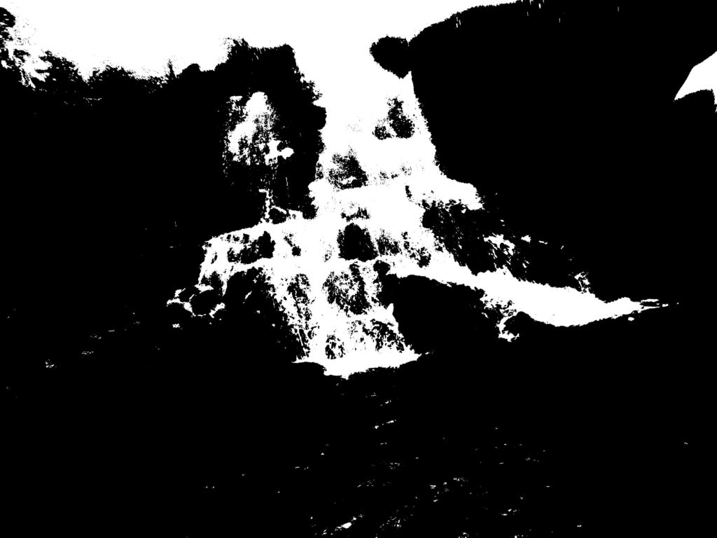
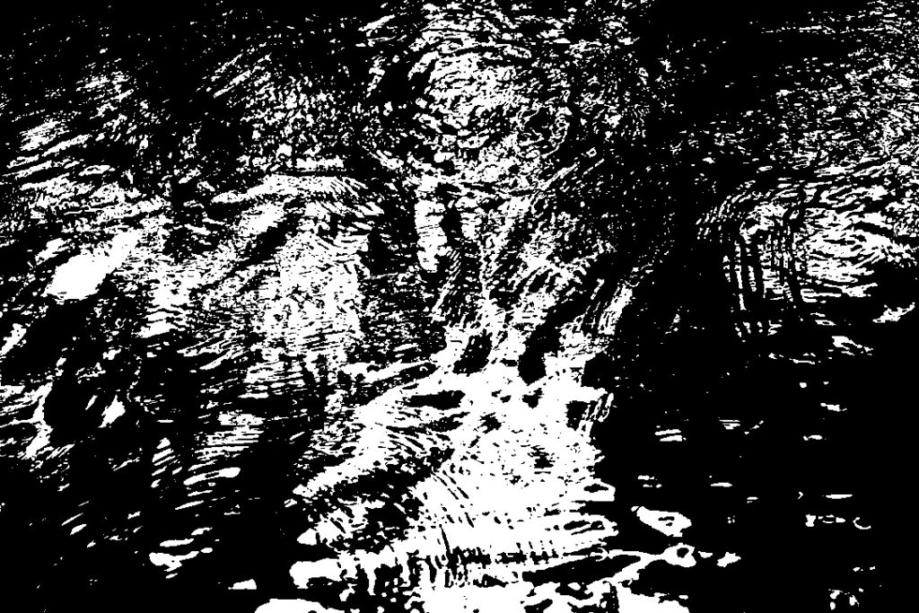
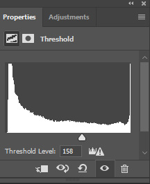
I have taken inspiration from Keld Helmer Peterson and edited my photos in photoshop, using the threshold effect to achieve a similar appearance.

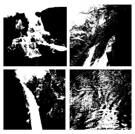
I cropped the photos and altered the threshold levels to get the effect I wanted. I put the edited photos in a square shape to show my work as whole.

I think these photos work well in a grid format as the threshold effect shows the different textures of water. Having the images together emphasises the contrast from white to black and because the photos only have two colours it makes them more powerful.

Keld Helmer-Peterson

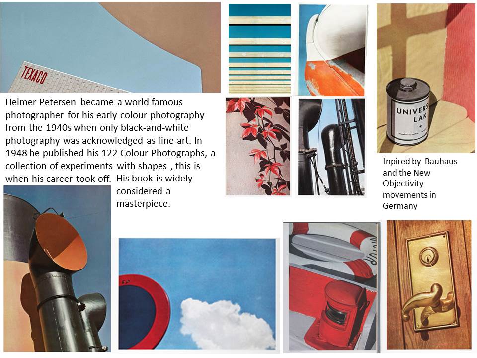
Keld Helmer-Peterson Research

Related image


Image Analysis:

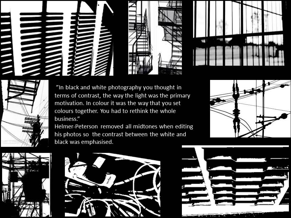
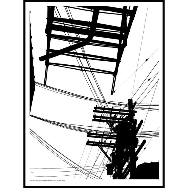
This photo is from Keld Helmer-Peterson’s black and white photography where he looks at threshold. The photo at first glance does not look like a photo of telephone wires and could be mistaken as a drawing because of the bold solid colours displayed. He removed all mid tones so the contrast from white to black emphasises the thin lines as well as the bolder ones and also the different  shapes in the photo. Because the photo only contains two colours, with no varied tones, it create a bold and striking appearance that couldn’t be achieved with mid tones.

Abstract- Homework 3

Abstract photography concentrates on shape, form, colour, pattern and texture. The viewer is often unable to see the whole object. The subject of the photo is often only a small part of the idea of the image. Viewers may only know the essence of the image subject or understand it by what is implied. However, it could be argued that all art, including photography, is essentially abstract. I first set out to look for straight bold lines and found that the bright yellow works well.
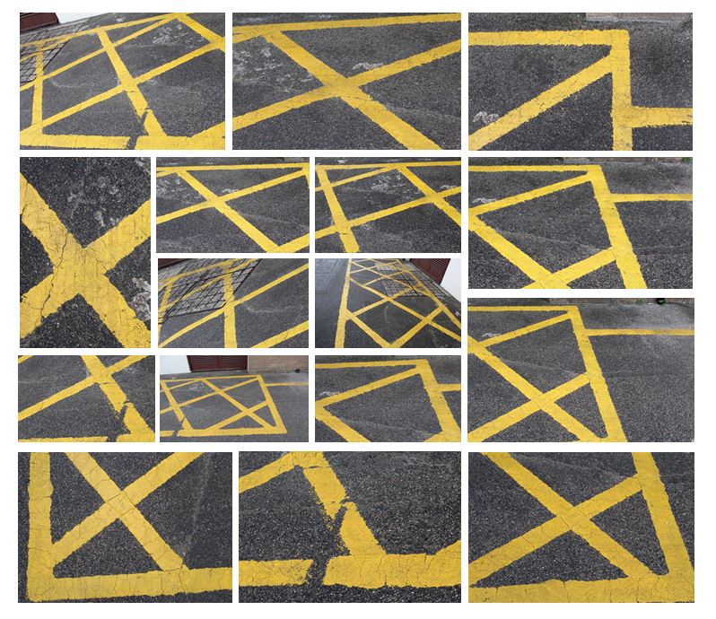
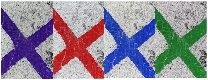
I edited these photos in photoshop by adjusting the hue and increasing the contrast to create different coloured lines to achieve more interesting, abstract photographs. I also experiemented with different layouts, creating patterns and geometrical shapes by flipping the photos vertically and horizontally.
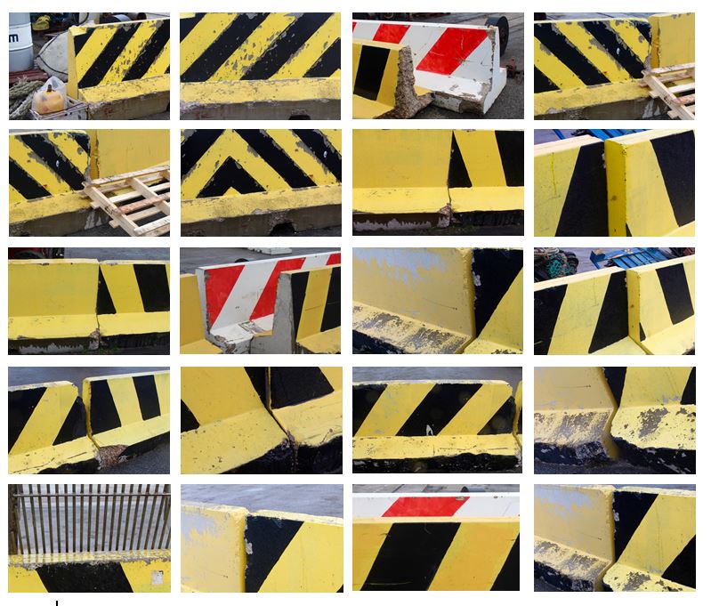
I tried to explore the contrast of colour between the yellow and black and the texture they presented. Using natural light and photographed different angles of the wall to create variety within the collection. To improve this photo shoot I would edit the photos to make them more abstract so the viewer would not be able to see that it was a wall and would emphasise the pattern and texture.
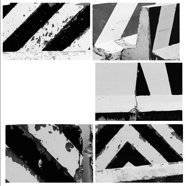
I edited these photos in photoshop to develop them further by turning them black and white and making the lines more bold. I like how the black and white emphasises the texture within the wall and the weathering that has occurred over time. I think it is now less clearer to the viewer that the photograph is of a wall and is now more abstract.
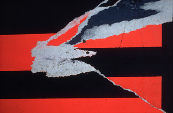
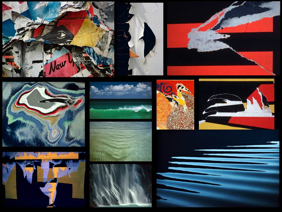
I think the photos I have taken are similar to this photo (Torn Poster II—Redbird) Ernst Haas photographed in 1960.  Both photos contain bold, straight lines and texture within that. The black lines frame the picture and are the points where the eyes are drawn to. Similarly, both contain horizontal, vertical and diagonal lines.

Aperture

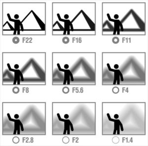
Aperture is a hole within a lens, through which light travels into and is expressed in f-numbers. These f-numbers that are known as “f-stops” are a way of describing the size of the aperture, or how open or closed the aperture is. A smaller f-stop means a larger aperture, while a larger f-stop means a smaller aperture.

It has a direct impact on the depth of field which is the area of the image that appears sharp (depth of field is defined as “the zone of acceptable sharpness in front of and behind the subject on which the lens is focused.”)

For portraits we separate our subject from the surroundings by using “selective focus.” Choosing a large aperture (lower f number) which creates a shallow depth of field with only the subject in focus. This helps direct the viewer’s attention to the subject.

In a landscape or scenic photograph you usually want to see as much detail as possible from foreground to background, wanting to achieve maximum depth of field by choosing a small aperture (higher f number).