All posts by Lily-Mae Fry

Filters

Author:
Category:

YOKO ONO

Yoko Ono in her short film ‘Cut Piece’

One of Yoko Ono’s early performance work was ‘Cut Piece’, a recorded film where Ono sat on stage in one of her best suits in front of an audience and invited them one by one to approach her and cut a piece of her clothing and take it with them, until eventually she was left with almost nothing on her body. This simple act carried a great message behind it even though Yoko never communicated anything to her audience other than their instructions and instead sat motionless and expressionless. This aspect of this piece was to promote peace even when cutting her clothes off carried a brutal and horrifying message about the way women are looked at and used by men and women. Yoko explained

Yoko Ono – Cut Piece

‘So of course I was saying, hey, you’re doing this to women, you know? We’re all in it. But also, at the time, it’s much better to just go with it. And that thought of letting women know that, you know, we’re all going through this, but don’t fight, let it happen. By not fighting, we show them that there’s a whole world, which could exist by being peaceful.’ – Yoko Ono. Cut Piece. 1964 | MoMa

The whole video was shot in black and white which comes with the use of an old film camera, with lighting coming from three directions; the front and either side of Ono which can be seen with the cast of two shadows on both sides of her on her shoulders. The video was shot in one take which adds to the simplicity of the piece. The focus of the art within the video is not the technical aspect of the camera but the simple acts of cutting away at Yoko’s clothes, providing more attention on the issue of the objectification of females in society, media and art, inflicted by both men and women.

The objectification of women has been an ongoing issue within all areas of the world because this notion is constantly reinforced in many ways. This ranges from what people take in through the media that people in developed countries are constantly surrounded by.  To simply learning from a young age the false roles and traits of men and women through watching parents and peers. Women have always had a fixed role in society, the reinforced idea of being submissive to men and being seen as a pretty object rather than a being that are just as capable as men.

Throughout art history, when female artists have been discussed their art has always been regarded as biologically determined, that all associations of femininity are linked to their style of painting and the subjects they choose to paint. Female artists were seen as the minority. This was stemmed from the common ideologies of gender norms within society that restricted their subject matters in their paintings – only painting objects that reflected their femininity like flowers or portraits of miniatures, using mediums like pastels and watercolour. Moreover, women who were subjects within paintings were often objectified by the male artist simply for the pleasure of the receiver.  Typically within paintings of the nude, women were often stripped of their sexual power so the spectator – typically a man- could monopolize their own sexual power and feel dominance of the submissive subject within a painting. Women within art have always been overlooked and restrained of their creativity because of male dominance within society. Even at present day, female artists struggle to create pieces of work that don’t have a hegemonic hold and connotations or histories of traditional ideas of femininity. This can be perceived as boundaries, so therefore female artists usually find other ways of creating art like installations and producing pictures, or in Yoko Ono’s case: video art. These are contemporary ways of producing art and therefore don’t refer to a particular or dominant gender.

By Yoka demonstrating these ideas in a video, it brings this issue attention and provokes thought that could help change the collective mindset of society.

EXPERIMENTATION

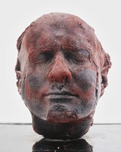
Marc Quinn ‘Self’ – 1991

These pictures are experiments of my own existing material from previous projects. Each piece of material that I have taken from my photographic archive were taken with different incentives yet i have merged them together and created images with different meanings within their context. I’ve done this to further explore my idea of how western culture identifies with meat, in the hope of developing an alternative response that incorporates emotion and a story within my images. This inspiration has stemmed from the artist Marc Quinn and his ongoing series of self-portrait sculptures ‘Self’, sculptured entirely from his own blood, capturing his aging throughout the years. Quinn’s sculptures are innocently morbid, encapsulating the idea that we are all just made of meat.  He’s used mediums from his own body without harming himself. Throughout history, there has always been the repeated idea that the body is sacred and should be left untouched after death. When exposed, the internal body has always been associated with death, perhaps connected with the fragility of life and the fragility of the body, yet the exposure of our insides is often forbidden through the eyes of religion. Western Religion has always taught people to respect the body before and especially after death. This also aligns with our laws and standards; it is commonly known that any mutilation of the body is forbidden. Although we carry out respect for our own bodies, the consummation of meat is often overlooked. The whole process of producing meat violates and mutilates an animals body before and after death. Surely all life in every shape and form should be protected, yet we break this rule by reassuring ourselves that animals are less than us and therefore, it is okay to enforce ill treatment upon them just to satisfy an acquired taste that everyone picks up from an early age. These photos that I have created is a reflection of ourselves and our diets. I have placed another animals internal layers above the external layers of these portraits, just for the sake of spite; we can’t mutilate one another but can mutilate beings ‘lesser’ than us – I have surfaced how this reflects on us – almost like the infamous Lady Macbeth from Shakespeare’s ‘Macbeth’, relating to the scene when she hallucinates blood on her hands. The meat connotes death within a picture of a life.

PAOLA PAREDES

PAOLA PAREDES MELANCHOLIA OF VIRGINS

This image is from Paola Paredes body of work ‘Melancholia of Virgins’, a selection of experimental pieces raising awareness of the humiliation of misdiagnosed women in Salpêtrière Hospital Paris for ‘Hysteria’ during the 19th century – a time when medicine subjected women to abhorrent treatment. The term ‘Hysteria’ is now recognized as a diagnosis stemming from pseudo-science, intrinsically linked to misogyny and man’s dominance. These ‘Hysteric’ women were put on display for audiences consisting of medical contemporaries, students and members of the public. One front-runner in Hysteria science was Jean-Martin Charcot he was charged with Hysteria treatment at the Salpêtrière Hospital in Paris, where he would use his camera as a tool for recording patient’s attack symptoms for later analysis.  These pictures were then published and used as ‘evidence’. Paola Paredes then took these images and redeveloped them with the use of modern technology, stitching and handmade collages to produce animations and to magnify the humility and penalization that the institution forced on these women.

Conventionally speaking, the quality of the picture is poor due to the age of the photograph, with no depth in contrast, or wide spectrum of shades and

Image from Paola Paredes’ body of work ‘Melancholia of Virgins’

the noise that the camera has picked up in the darker tones of the image. However if you look at the image conceptually the poor quality of the image carries connotations of poor quality of life, respect and empathy for these women, which gives more depth to the context of the image. The rework of the image  encourages viewers to  to look at the image in a different way and interpret feelings and emotions throughout the whole of the frame, as the subjects face is completely covered making it impossible to read her emotions, so therefore applying an interpreted context to the image. The rework and manipulation of the image grasps the viewers attention on the feeling of being watched and recorded, being subjected to humiliation and being stripped of dignity.
This image is one of her still images which contrasts the effect of one of Paredes’ moving images where there is a sense of input of intensified emotion. However each of her still images convey the feeling of a forced or submissive silence. The use of the string covering the face and hiding the identity of this woman reinforces the idea of that these women were dehumanized, silenced and belittled. This simple technique unveils more about the context of this picture than if it was left untouched or the subject’s face was left on show. However, my interpretation of the reason why Paredes decided to cover her face is the possible referencing of the automatic invalidation of their opinions and dismissal of their freedom of choice and speech because of a ‘higher’ or ‘stronger’ force – in this pictures case the flash of the camera is the force acting against these imprisoned women, which could be interpreted as the misogynistic men that took advantage of them.

Photo Shoot – I want to experiment with Paola  Paredes experimental approach to redevelop old images and give them new meanings and context to provide a thought provoking piece that encourages an audience to interpret an image with my political message. I want to take the idea from Paola Paredes of reworking, experimenting and manipulating existing images, carrying on the theme of my political landscape topic; the agriculture industry and its effect on climate change, being responisble for destruction of land and the mass usage of limited resources that don’t have enough value to raise concern like water and again, land.

BREAKING THE RULES – RULE OF MANIPULATION

Image by Paola Paredes

Alice Wielinga – North Korea: A Life Between Propaganda And Reality, 2013-2014

EIGHT 'RULES' OF PHOTOGRAPHY THAT ARE WORTH BREAKING
A photographers work is often manipulated by a set of rules that have been drilled into the mind when learning how to use a camera. These rules are often followed through in photojournalism when it comes to documenting scenes, places and events. The rule forbids a photographer to manipulate an image digitally as it is often believed that a good photographer can take the perfect photo in the moment. However, manipulation can be looked at in different ways. When looking at a photograph which has been produced to record a series of events or a culture for example, it is a usual standard for the audience taking in the image to trust that the photographer has not staged or changed the scene in any way. However there is always an underlying pressure for a photographer to create an image that looks perfect or in a sense aesthetically pleasing for an audience to like and accept it. If the underlying statement for a set images has a political message, producing an image to have an impact and to be thought provoking towards an audience is almost impossible without having some control over the image you produce other than the chance of coming across a scene at the right place and time. 
Manipulating an image can be done during the process of taking the picture and editing or even by changing the caption. This can give the opposite connotations of what the original image had and can move the audiences viewpoint or focus on a photograph. For example, a news story will usually be accompanied by an image. If the editor was to change the headline of the image it can either change the image to be positive or negative; changing how someone can perceive a photograph.

PAOLA PAREDES Paola Paredes created a body of work through redeveloping the visual representation of a set of images from Jean-Martin Charcot's 'evidence' of 'hysteric' women through digital technology, handmade collages and stitching, turning his imagery into animations. 'Transforming this once static archive into one now dynamic and contemporary'. 'These experimental pieces seek to increase awareness of a time when the field of medicine subjected women to abhorrent treatment'.

POLITICAL LANDSCAPES

'political' definition: Relating to the government or public affairs of a country.
origin: (from Greek: πολιτικά, (Politiká), meaning "affairs of the cities") is the process of making decisions that apply to members of a group.

'landscape' definition: All the visible features of an area of land, often considered in terms of their aesthetic appeal.
origin: Late 16th century (denoting a picture of scenery): from Middle Dutch lantscap, from land ‘land’ + scap (equivalent of -ship).

'Political landscapes' can be explored in many ways through photography, it could be argued that every photograph that we take has an underlying political statement even if there was no intention for it - a photograph can either conform to ideologies and standards of a culture/society or it could break them. 
Your Photography Is Political

Effectively the product produced by the fusion of politics and landscape photography is documentary photography, which essentially highlights and tackles current issues, daily life, events or traditions that have been developed through political influences, then reinforced through the media and dominant ideologies in societies. 

Landscape photography can present issues like global warming and the impact of human activity or capitalism in modern cities or societies and its effects on the lower classes, or natural landscapes and the impact of infrastructure and urban development; focusing on the sublime in nature or perhaps what has replaced the feeling of sublimity with the changing landscape; escapism.
As well as landscape photography conveying issues through the land and scenery of an area it can become something more abstract like the human body or inanimate objects. This can relate to social issues like equality within race, gender, disabilities, mental health and breaking stereotypes and breaking ideologies.

ZINE

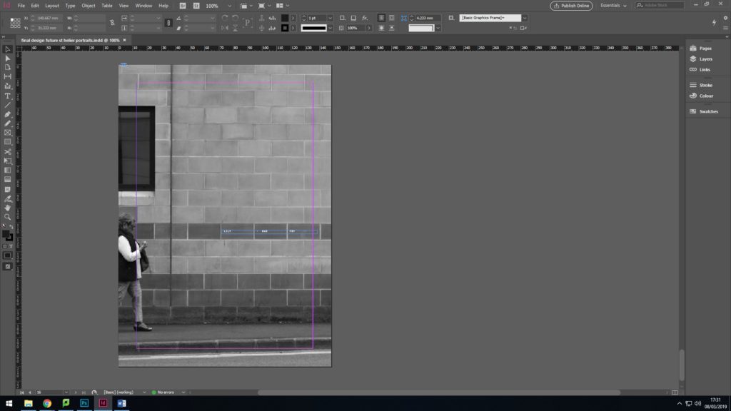
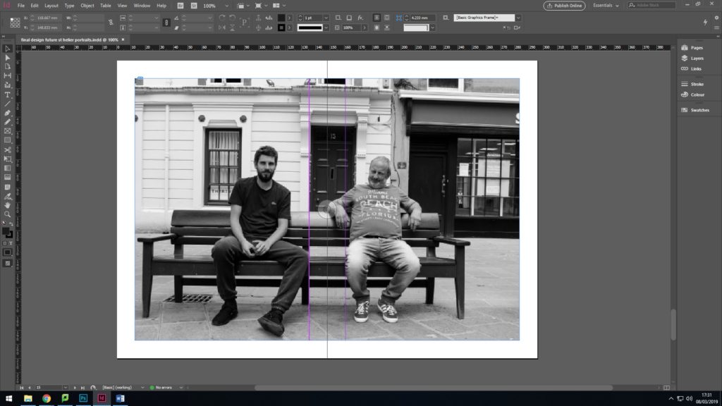
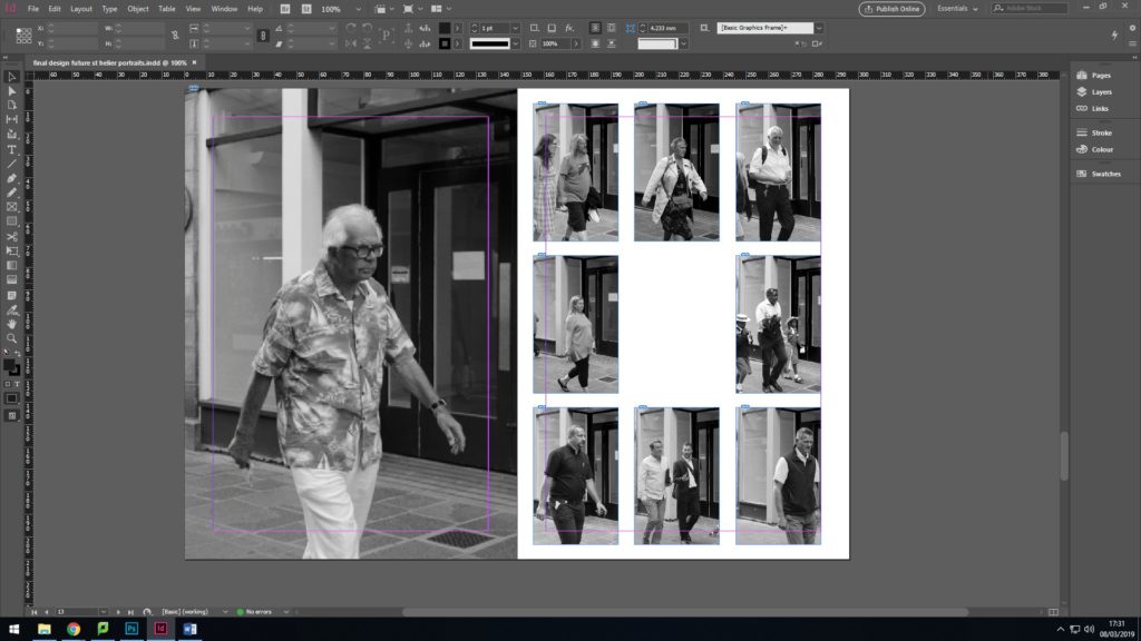
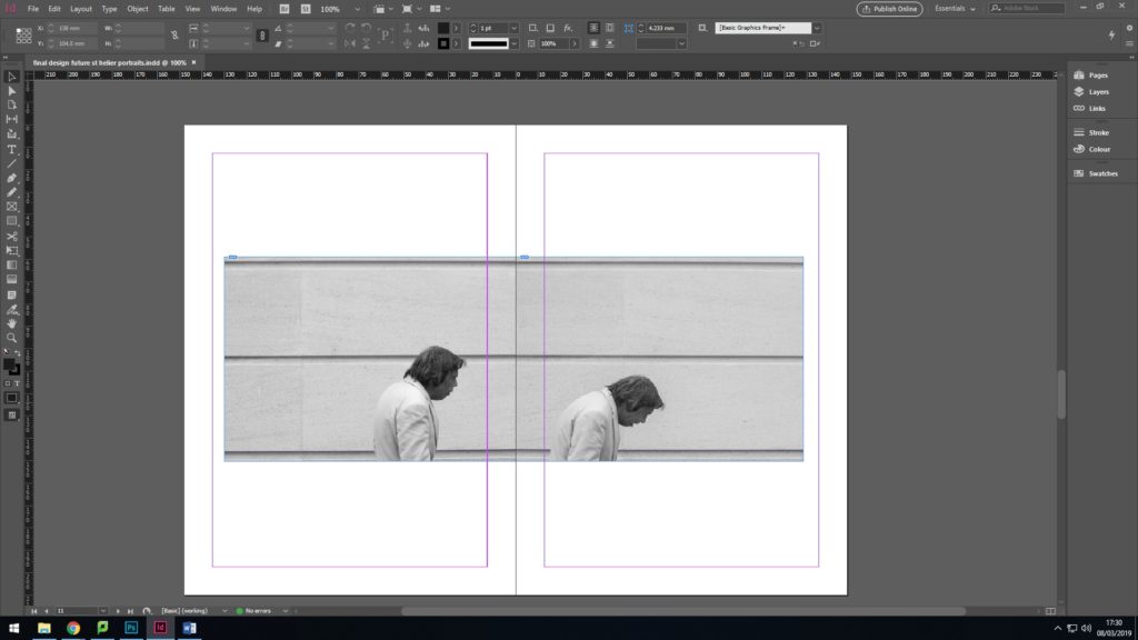
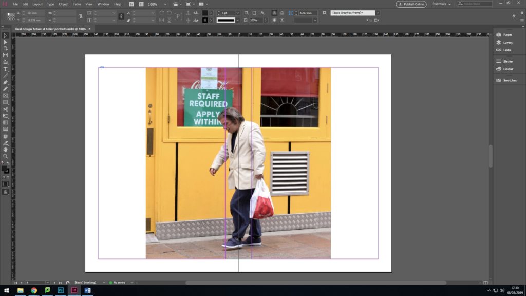
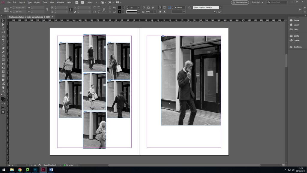
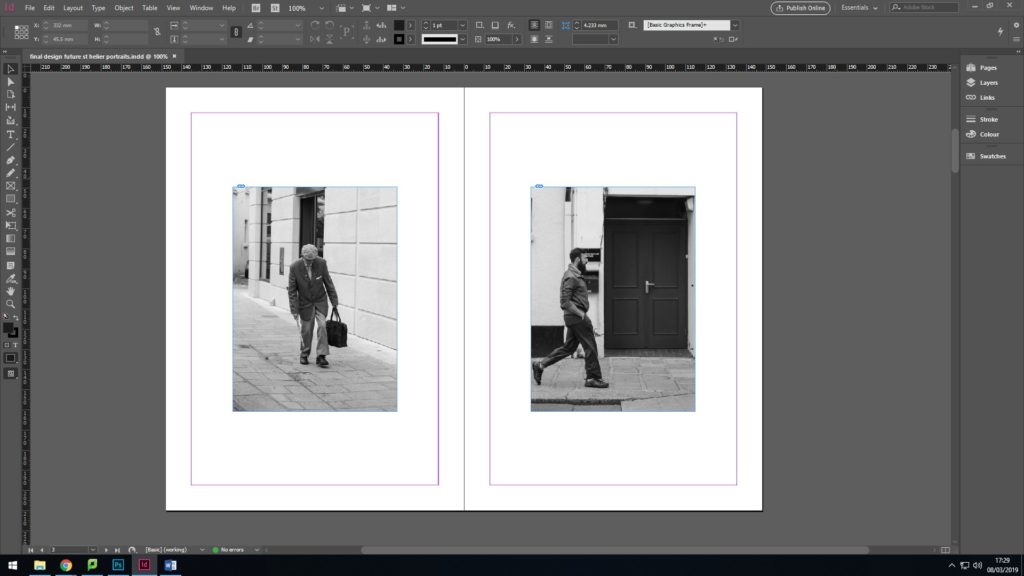
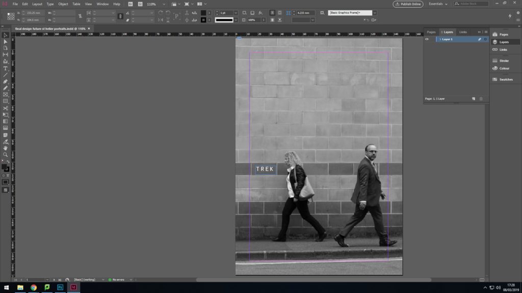
Below is my final Zine layout for the Future of St. Helier project. My first attempt of my zine had no structure, flow or theme and was a meesy outburst of colour that was too much to take in. Most of my didn’t link to any of my inspirations from the project so I had to re-think about artists that I had taken inspiration from. To relate to my initial ideas of photographing the people that make up St. Helier, I went back to artist Walker Evans and adopted his overall house style of editing. I then selected my strongest images from each of my photoshoots and edited them all black and white to correlate to Evans and also to simply display each photograph. I then explored layout and referenced contact sheets in some of the pages by arranging rows of images into the same format as contact sheets and shapes. I kept one photo in colour to; my strongest picture to break up the theme and let it stand out from the other pages.

PHOTO SHOOT 3

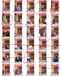
I managed to capture a lot of material for my project and successfully managed to keep the same frame for each subject. It was hard to find an area in town that had a nice frame for people to walk into, while also being a busy spot that provided me with enough subjects to walk past my camera. I stood in the middle of the street and waiting for people to willingly walk past me. A lot of people clocked that I was taking pictures and walk past me with unspoken consent to take a picture. Surprisingly there were only a few people that avoided me.

WALKER EVANS

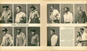
Walker Evans’ ‘Labor Anonymous’

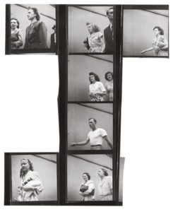
These photos are from Walker Evans body of work titled ‘Labor Anonymous’. The way in which Evans has presented his photographs are similar to the genre of photography, typology. Typically, typology focuses on objects or buildings that can be placed into one category or represent similar shapes, rather than people. Evan’s has managed to achieve the aesthetic of typology by cropping each image to contain similar backgrounds and angling his camera from the same point; his waist.

Evans had a night time job so he had freedom within the day to take photographs, using the natural light for most of pictures. Evans concealed his camera in his coat so he could take candid pictures of each person that past him, which managed to capture a particular essence from each individual. This was a technique that he used for many of his works as he said describing his Subway Portraits,  “The guard is down and the mask is off … even more than when in lone bedrooms (where there are mirrors). People’s faces are in naked repose down in the subway.” The same idea is used for ‘Labor Anonymous’.

This body of work reflects what I hope to achieve in my project for ‘The Future of St. Helier’. Evans has managed to capture an idea of what workers and people were like during his time by taking candid pictures of people simply walking to and from work. St. Helier holds many places of work and constantly has people walking to and from work and up and down it’s main street. In my last photo shoot I noticed that if I stayed in one place and took pictures of everyone that walked passed me, I wouldn’t have to go and find subjects to take pictures of. They simply walk past me, knowingly that I have a camera and I am actively shooting pictures. I’d like to dedicate a whole photo shoot to using this technique and hopefully capturing images of people in a moment of repose.


Walker Evans ‘Labor Anonymous’ contact sheet

EXPLORING EXTREME EDITING

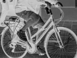
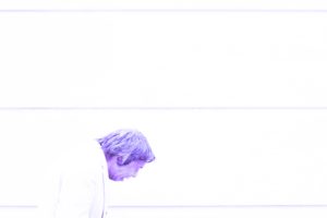
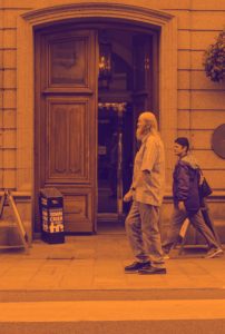
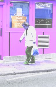
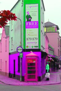
After my first shoot I have began to explore extreme editing in Lightroom and Photoshop to help establish a theme and way of enhancing images. I’ve edited each image to an extreme to understand how far I can manipulate an image, but also to understand how editing can cater to meaning behind an image and add personality. I’ve explored inverting images, changing the hue to enhance colours, over exposing images, layering bright colours over images and cropping. For example, I’ve cropped the head off the individual in the first image to shift the focal point in the image to the bike rather than the person riding it.

I think the overall mise-en-scene for this group of images creates an over-riding sickly effect that doesn’t justify my incentive or reason behind my images. However if each image is taken in individually, the editing entertains the underlying emotion and feeling for each individual in each image. These experiments have also helped me understand Photoshop and Lightroom more than previously.

These are few of my experiments;

Further editing:

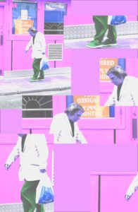
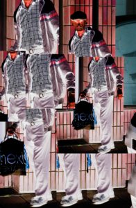
I further developed some of my images by cropping, layering and repeating parts of each image to create an overall insight into each individual. These images were inspired by Lewis Bush’s editing style in ‘Metropole’ where he used double exposure to create abstract images that almost replicated a kaleidoscope. Instead, for my images I have chosen and cropped certain aspects of each individual that give away more information of what they were doing, how they choose to personalise themselves, facial expressions, body language and their surroundings.

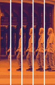
In the second image I decided to approach the editing style in a different way. I chose to crop the image into long and equal segments to mirror the height of the individual. I then moved and lined up the images together to create the simulation of a casual stroll. This was to replicate the impression I had when I decided to take this image.