All posts by Lily-Mae Fry
Filters
EVALUATION
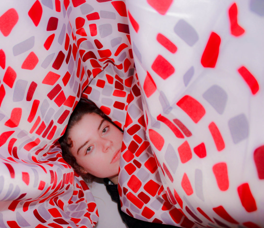
For Political Landscapes I struggled to reach a final idea for final pieces and a project. My initial ideas were leaning towards the meat industry and its effects on the landscape and the climate, but I had limited resources to produce photographs, so I started to explore other ideas. I then moved onto studying feminism and the role women have played in art throughout history as artists and subjects. This lead me to explore influential female artists that emerged around the beginning of new technology and consequently new art – video art. I then explored Yoko Ono and Marina Abramovic, radical female artists. However, their intentions weren’t always in favour for the feminist movement but more for the sake of art. I then started to look at more contemporary artists like Izumi Miyazaki and Iiu Susiraja. I realised that the use of art for political messages was more common today than it was in past, with almost every current female artists creating art for themselves as women and for other inspiring other females around the world. This lead me to think of the idea of creating art for individual females and making my concepts behind my photographs more personal rather than for a larger cause or movement. I think the simplicity of producing photos that reflect an individual is powerful, as the population on our planet rises and the need for individuality increases. -I think I succeeded in my intentions as my essay explains the context behind my book, and the book itself creates a visual display of two strangers, communicating to the audience who they are without the use if words and all through photos.
BOOK DESIGN


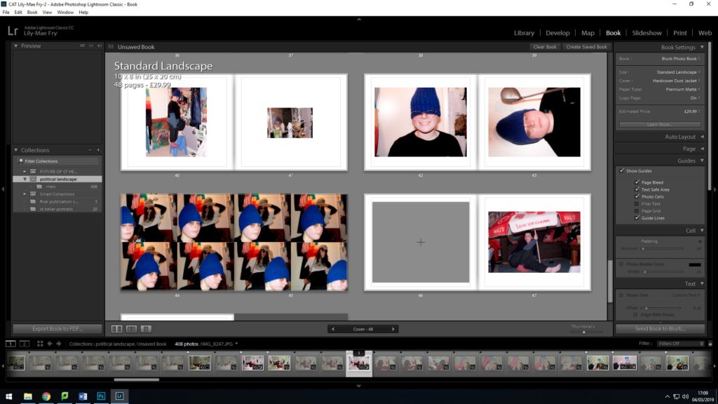
The initial layout of my book didn’t have a sense of a continuous theme throughout my design and layout. I wanted to imitate the content of my pictures through my design but the overall outlook of my design was too messy, untidy and had an overriding intense feeling. To improve the presentation of my book I used the templates instead of making my own to create a continuous flow. Below is my final design, improved from my initial design.


MY BOOK SPECIFICATION
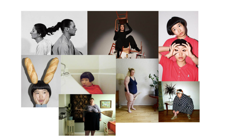
My photo book will focus on the ongoing political movement of feminism and claiming back power through portraits and tableaux’s of domestic scenes that comment on traditional characteristics and stereotypes of the female using humor, with inspiration taken from working artists and photographers, Liu Susiraja, Juno Calypso and Izumi Miyazaki.

Izumi Miyazaki created ‘Me and Me’ photo book consisting of surreal self portraits that question reality and female stereotypes in art. Miyazaki is a Japanese artist, her work is considered in her homeland to be nontraditional for a female artist which helps to break down barriers for other female artists within and out of her homeland.
I like the format of Miyazaki’s ‘Me and Me’, the inspiration I take from her book is the individual formats on each page for each photograph. Every layout on each page caters for one image, keeping each image separate with individual frames that work best for the overall mise-en-scene and treating each portrait as a separate piece of art. This is simply done with each image on a blank background with different crops and frames, size and placement giving each image a different area of negative space.
 I want my book to feel as authentic as my subjects and to disregard any connotations of mainstream beauty magazines, adverts or icons in western society. Females are usually represented to be refined and perfect with a sense of materialistic features and symbols which I think take away from the authentic female. I don’t want to replicate this in my photo book, I think glossy paper connotes this negative outlook as it’s often used in magazines that are sold to a consumerist audience, making them buy into unrealistic lifestyles and beauty standards that are toxic to the mind. I want my book to have a fresh authentic feel, using matte paper is more raw and real, not fake.
From the moment someone looks at the cover of my book I don’t want any prejudice opinions of the content just by looking at a photo or colour. Colour and photographs hold a range of meanings that could lead to presumptions about the content of my book. The word Feminism already has so many negative connotations and I don’t want to add any more negative outlooks on my book.
EDITING


For my editing process I chose to enhance the colours in each photo which I think lifts each image’s content and my subjects within them. I wanted to preserve the idea of femininity by keeping the images soft, contrasting the vibrance in colours while toning down the initial intake of visual representation.


PHOTOSHOOT
Marina Abramovic and Izumi Miyazaki influenced my photoshoot a lot. From Abramovic I took the idea of performance and directed many scenarios in my project that displayed the characters and traits of my subjects. I shot my whole project in one room, my subjects personal space which I interpret as her landscape, decorated in an organised mess that represents many characteristics of the individual in each object that lies around her room and the interactions she has with them. My concept behind the series is influenced behind the history of women in art and Miyazaki. Miyazaki has control over the representation of her sex because she is taking them herself. Miyazaki purposely produces pictures that move away from the classifications of female stereotypes. As a female, I thought it was important that the representation of my subjects displayed them as individuals and not as objects, therefore keeping them in their personal environments and disregarding any ideas of perfection or social ideologies of how women should look and what women do. Women taking pictures of other women allows complete control over representation. I wanted the effect of getting to know the subjects when the series is viewed rather than seeing someone who looks ‘aesthetically’ pleasing in terms of beauty standards within the western world, with no character behind the individual. The series is a personal look into a stranger’s life, using the notion of scopophilia but with consent and without the expectation of female stereotypes.


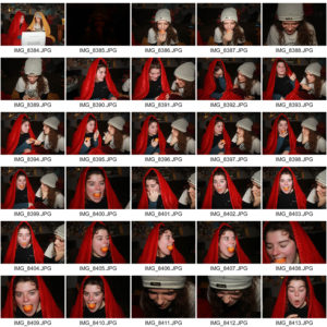


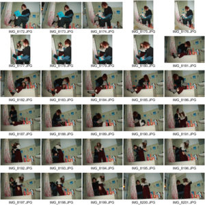
PHOTO SHOOT PLAN
Following the recent artists I have taken influence to, I want to re-create pictures that stimulate the same agenda as contemporary female artists. Marina Abramovic incorporates performance into her work which is something I would also like to integrate, through directing my subjects in scenarios that summarize their identities through displaying their characteristics and traits in forms of performance. I will shoot my subjects in one location which I have decided to be in a personal space which therefore adds to their identity – these will fundamentally be environmental portraits. I want to capture my subjects interaction within their room though objects and the space itself as I believe every object someone collects has a personal meaning and connection with the person – a reference to artist Iiu susiraja. I also interpret someone’s bedroom as a personal landscape that embodies someones personality. My concept is influenced behind women in art and the struggle to gain a creative outlet that has no dominance in masculinity, like traditional paintings. Instead this photo shoot is significant to me because I am a female producing pictures of other females and therefore representing them without hegemonic hold of masculinity, also presenting them as individuals rather than objects. This is something I have noticed within Izumi Miyazaki’s self-portraits, a movement away from the classifications of female stereotypes of beauty and ‘femininity’. My goal is to create a series of images that are an insight into a strangers life without the use of words.
IMAGE ANALYSIS – essay

This photograph is very simply constructed, with a simple background, lighting and colour palette that connote clinical and clean environments, representing certain aspects of the beauty industry. From an audiences perspective, by Miyaziki looking directly at the viewer, it seems like an intrusion of privacy and gives the unwanted impression of scopophilia while also, Miyazaki has caught the audience out on the act of peering in on her. The direction of light also adds to the the illusion of intrusion. The light hits the subjects front on and from the same direction of the viewer.
This self portrait was taken by Japanese working artist Izumi Miyazaki which simply depicts her turning to look at the camera while peeling an apple with a pink razor blade. This simple and abstract action carries different connotations of a ‘traditional’ female role; the razor blade and the apple, blending two sides of a suppressed and idealized female; beauty and domestic life. The razor blade is a tool used by many women to remove their natural hair on their own bodies, simply because of beauty standards that have been created all around the world in different societies that are constantly reinforced by advertising and the media. The apple could indicate the suppressed domestic female role, an idealized role depicted throughout history, particularly post WW2 in western society. Women had experienced working in dominated male industries due to the lack of workers because of the war, yet when the war was over many women were pushed out of work and subliminally forced to stay in their traditional domestic roles through advertisements commissioned by the Government. These advertisements conveyed women satisfied, content and happy from everyday domestic appliances that seemed to make their domestic lives easier, for example a dishwasher. These advertisements were aimed at women, reinforcing pre war mindsets and attitudes towards women and setting ideologies of their roles in society. As a female from a western society, these are the sort of connotations I receive from Miyakzaki’s picture, a blend of two dominant ideologies based around women thrown together with a bi-product of humor – commenting on the ridiculousness of these standards. Attitudes towards women and feminism has changed radically since the beginnings of its movement, the fight for equality between the two sexes are not seen as urgent as they used to. The word feminism is constantly disregarded by everyone due to the change of meaning the word now carries. Although its definition hasn’t changed, the word has been misused and it now carries a bad reputation. I don’t think Miyazaki has purposely created this image with a feminist message, most contemporary photographers will comment of blatantly obvious issues in the world. Attaching the word feminist to any piece of art usually disrupts the incentive of the image as the meaning of the word has been disrupted itself.
ESSAY INTRODUCTION
Is feminism [the equality of the sexes] still relevant today and how have artists throughout each wave of feminism reflected their agenda in their art??
Throughout art history, when female artists have been discussed their art has always been regarded as biologically determined, that all associations of femininity are linked to their style of painting and the subjects they choose to paint. Female artists were seen as the minority. This was stemmed from common ideologies and gender norms within society that restricted their subject matters in their paintings – only painting objects that reflected their femininity like flowers or portraits of miniatures, using mediums like pastels and watercolour. Moreover, women who were subjects within paintings were often objectified by the male artist simply for the pleasure of the receiver. Typically, within paintings of the nude women were often stripped of their sexual power so the spectator – typically a man – could monopolise their own sexual power and feel dominance of the submissive subject within a painting. Women within art have always been overlooked and restrained of their creativity because of male dominance within the patriarchal society. Even at present day, female artists struggle to create pieces of work that don’t have a hegemonic hold and connotations or histories of traditional ideas of femininity. This can be perceived as boundaries, so therefore female artists usually find other ways of creating art like installations and producing pictures. These are contemporary ways of producing art and therefore don’t refer to a particular or dominant gender.
ANDY WARHOL

‘Eat’ is a 45-minute underground film created by Andy Warhol which features painter Robert Indiana, filmed in 1964 in Indiana’s studio.
‘Eat’ is filmed in black and white, with no soundtrack and depicts pop artist Indiana engaged in the process of eating a mushroom throughout the whole of the static film, with a final appearance of a cat at the end. The video is an intimate piece of art that is rather more of an experience for the viewer which allows a connection to be made with the subject of the film. The close up shots particularly, like in the frame above, emphasizes the feeling of intimacy. The simplicity of video art creates the idea that what the viewer is watching is not so far detached from reality and replicates real life. Particularly with ‘Eat’, the plot that doesn’t necessarily exist is very mundane, as eating is a part of life that everyone experiences on a daily basis.
Video art emerged during the late 1960s as new consumer video technology. Video tape recorders became available outside corporate broadcasting. One of the key differences between video art and theatrical cinema is that video art does not necessarily rely on many of the conventions that define theatrical cinema. Video art may not employ the use of actors, contain no dialogue, have no discernible narrative or plot, or adhere to any of the other conventions that generally define motion pictures as entertainment. Video art is often experimental, radical or unorthodox with respect to art, culture or society. It may also offer critique of the relationship between producer and consumer.

