All posts by Julia L

Filters

Author:
Category:

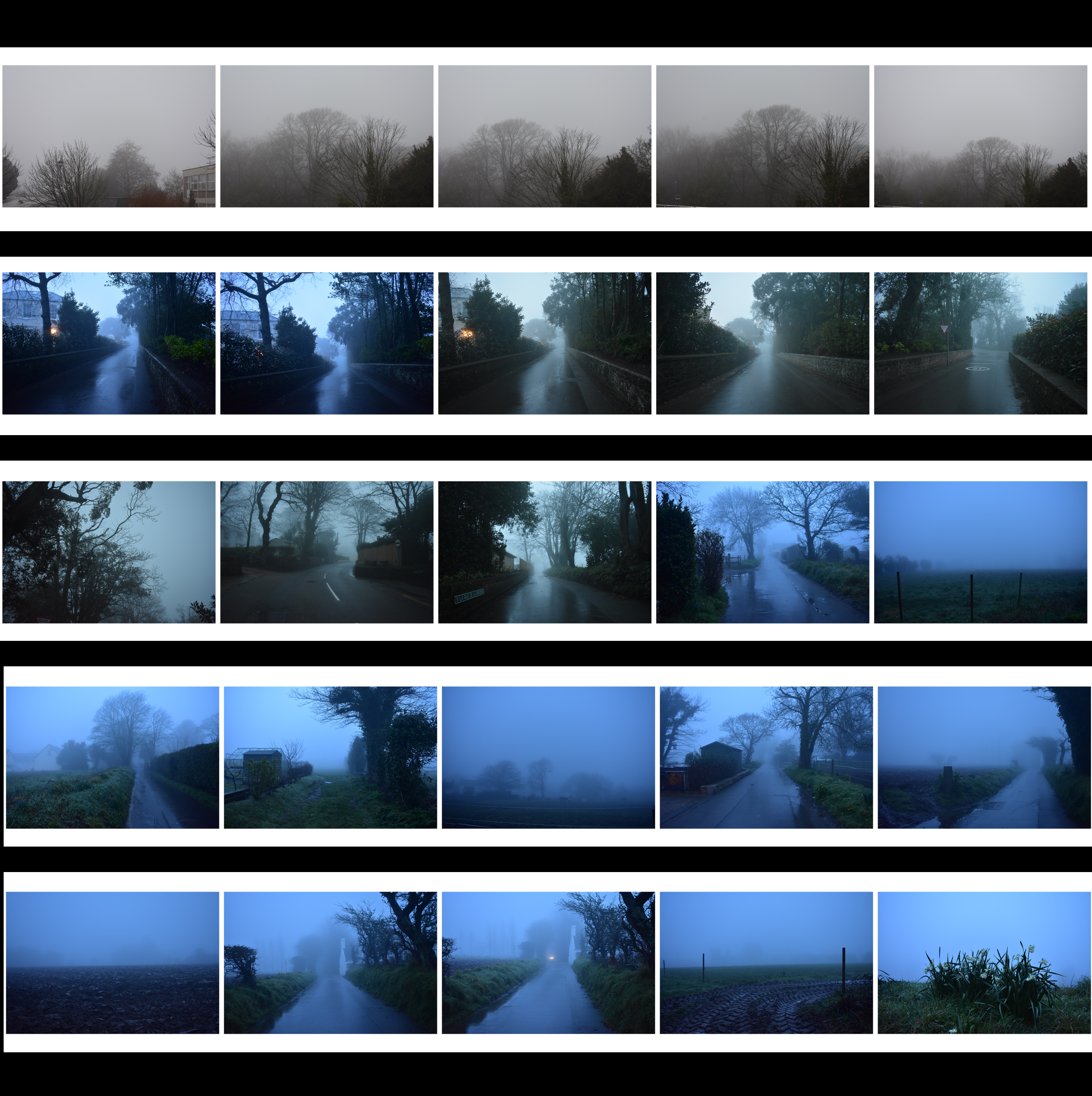
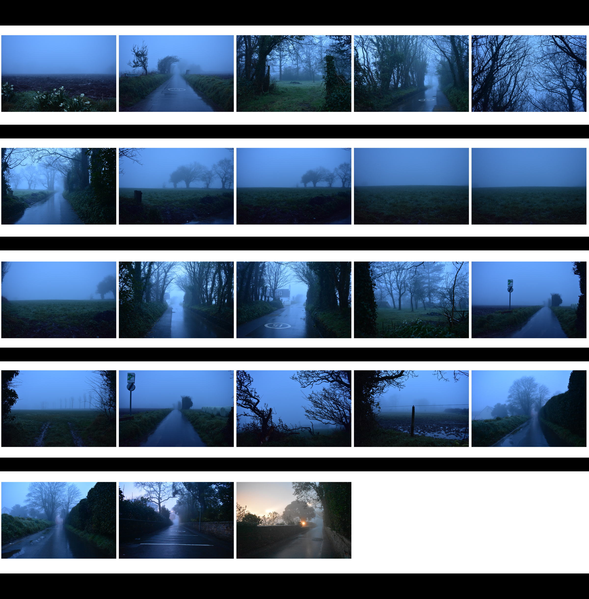
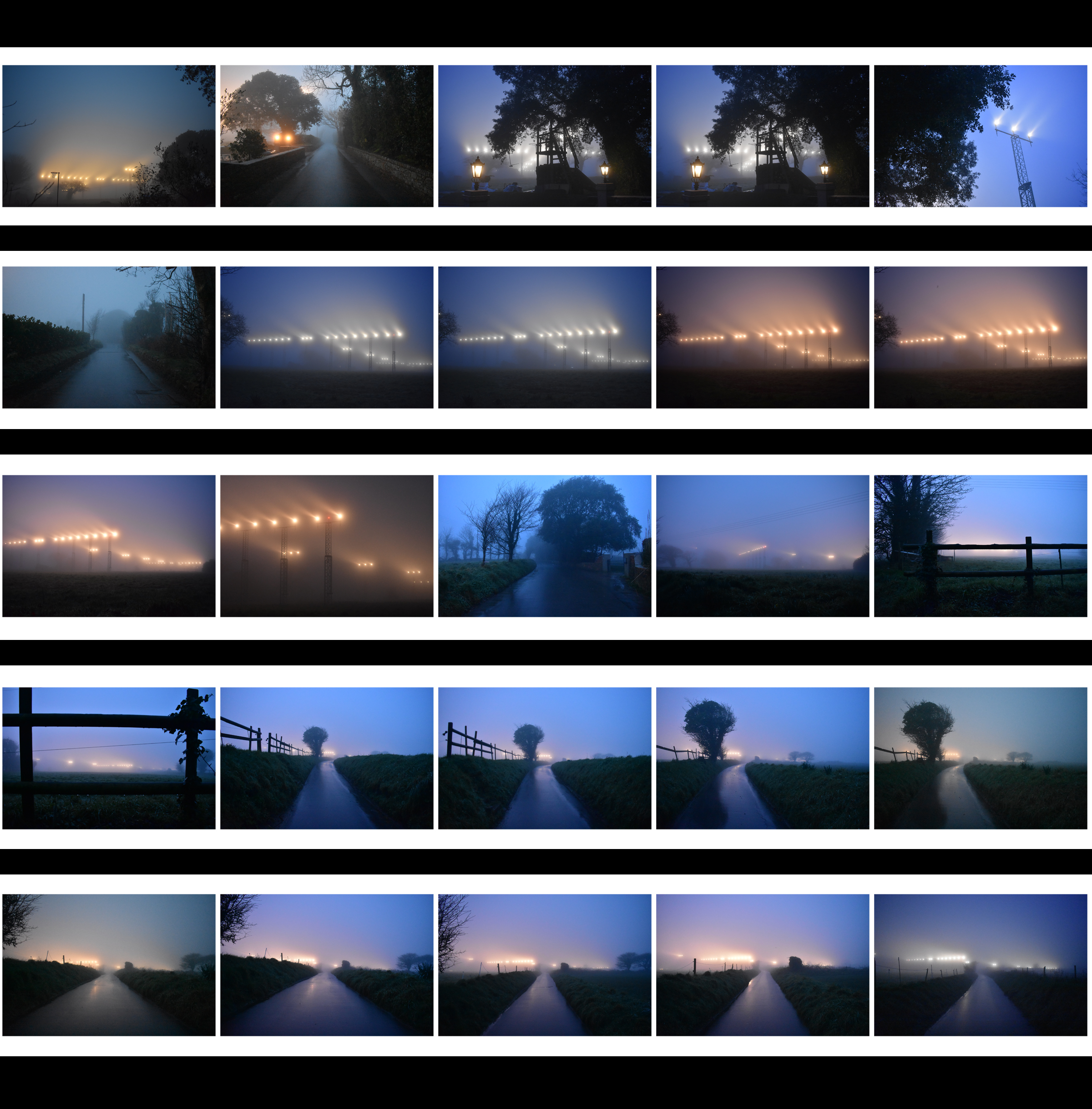
Nature Photoshoot – Fog

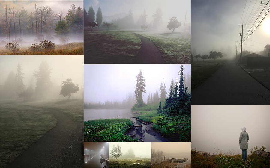
Moodboard

In its simplest form, fog is a cloud that sits on the ground. In more scientific terms, it is condensing atmospheric water vapor created by a temperature drop when relative humidity is fairly high.

Artist Research – Fogaholics

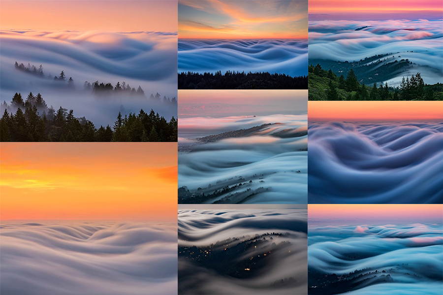
Landscape and cityscape photographers have a love/hate relationship with the fog in the San Francisco Bay area. It can make for some spectacular and moody photos, but it can also leave the area un-shootable – that is unless you seek higher ground. Nick Steinberg and other photographers in the Bay Area have formed a group that they call the “Fogaholics”.

The group consists of around 20 photographers that watch forecasts religiously and seek out the best foggy shooting conditions possible. When the fog rolls in, they make their way to Mt. Tamalpais, which sits at 2,572ft above sea level. This unique vantage point gives them the opportunity to photograph some amazingly beautiful conditions. With the help of an ND filter and exposure times sometimes exceeding two minutes, Nick is able to capture the fog waves as they make their way inland.

Contact Sheets

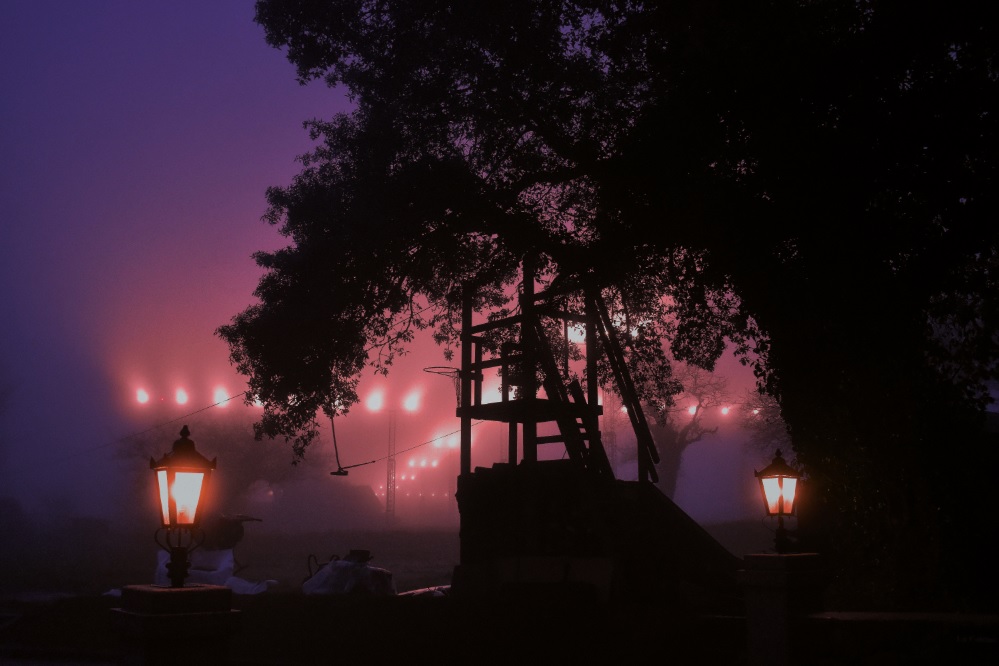
Edited Photograph


New Topographics Research

What Was It?

“What I remember most clearly was that nobody liked it”Frank Gohlke, one of the participating photographers told the LA Times when the exhibition was re staged last year.

‘New Topographics: Photographs of a Man-Altered Landscape’ was an exhibition that showcased a key moment in American Landscape photography. Parking lots, suburban housing and warehouses were all depicted in the same way that early photographers would document the natural landscape- this caused many people to turn their heads on this exhibition. The show consisted of 168 rigorously formal, black-and-white prints and when taken collectively, they seemed to posit an aesthetic of the banal.

source

Robert Adams – Artist Research

Born on the 8th May 1937, Robert Adams is a photographer from America specializing in the landscapes of West America. Adams’s documentation of contemporary western landscapes reveals the environmental damage caused by the suburbanization of such cities as Denver, Portland, Seattle, and Salt Lake City, as well as by the proliferation of nuclear weapons technology in those areas. 

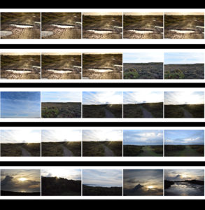
Contact Sheets

j

Analysis Of Photograph

Technical

This is my favourite photograph by Robert Adams, the image portrays a fairground ride illuminated by bright lights. The photo was taken during the evening as the sky was getting darker. Since all of the image is in focus I can assume that Robert Adams used a high aperture of F/22+,  he most likely increased the  exposure to achieve the soft glow from the lights. Due to the black & white feature of the photograph I cannot comment on the white balance or colour composition of the image but due to the vast range of grays it can be implied that the colours created chaos and in that sense, the black and white aspect was able to create a calm and serene atmosphere.

Visual

Referring to Ansel Adam’s tonal system, the image has the brightest white (#ffffff) but lacks the darkest black, despite this, it still  contains a wide range of grays. The composition of the photograph is very successful, the ferris wheel isn’t in the direct center of the image, in fact, the top half of the image is incredibly plain and predominately one colour. This, however, doesn’t in any way serve as a disadvantage to the photograph. Naturally, the eye is drawn to the center of the ferris wheel; then to the bright lights and finally to the looming clouds.

Contexual

The name of the image is ‘Longmont, Colorado’ taken from the series ‘Summer Nights’. The image was taken roughly around 1982 (but printed in 1989).

For about five years, beginning in 1974, Adams embarked on an experiment, he made a series of photographs at night, the opposite of the high-altitude daylight used in most of his previous photographs. The project brought an element of risk he had not experienced before. In this photograph, Adams isolates the ferris wheel lights against a threatening sky to create a scene both delightful and ominous.


Exploring Exposure Techniques

Exposure Bracketing

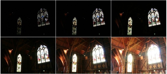
Bracketing in general is a term used to describe a sequence of images taken by a camera with slight differences in the settings.

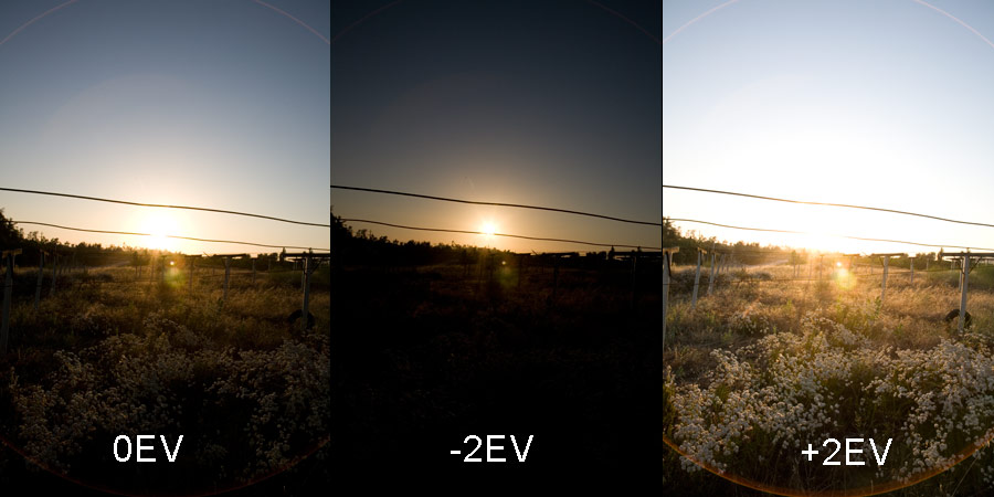
following on that, Exposure Bracketing involves taking a sequence of pictures of the same scene at a range of exposure settings. The reason you do this is because the camera might have been ‘deceived’ by the light  available(too much or too little) and your main subject may be over or under exposed. By taking multiple shots you are making sure that whatever is the case, then you would have properly compensated for it.

Source And Further Reading 

HDR Imagery

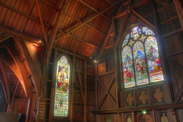
HDR is short for High Dynamic Range. It is a post-processing task of taking either one image or a series of images, combining them, and adjusting the contrast ratios to do things that are virtually impossible with a single aperture and shutter speed.

Cameras are limited to the amount of image detail they can record when the sensor is exposed to light. Whether you’re using the auto settings or are taking pics using skillfully tuned manual settings, your goal is trying to take advantage of the available light to maximize the detail in the result image. The problem is, when you’re shooting heavy shadows and bright lights, you are forced into losing detail in one range or the other.

As you can see in the image above, the camera has taken several images at the same time with different exposure levels, the final image is created by layering and combining them in order to get this look.

The basic idea of creating a combination image with multiple exposures is not new to photography. As long as cameras have had the limitation of standard ranges, clever photographers have been hacking ways to create the best possible image. Brilliant photographer Ansel Adams used dodging and burning techniques to selectively expose his prints and create amazing rich detail in images.

Source And Further Reading 

Case Study – Romanticism

Photographer Research – Hiroshi Sugimoto

Sugimoto Hiroshi, born on February 23, 1948, is a Japanese photographer and architect. He leads the Tokyo-based architectural firm New Material Research Laboratory.

He came to be known for his strictly black-and-white, highly stylized photography series. These series show views of the sea, extremely long exposed theatres, photos of scientific display cabinets, wax figures or Buddhist sculptures. Hiroshi Sugimoto sometimes works for several years on these work series. In recent years he has occupied himself increasingly with architecture, furniture design, objects and fashion.

“It was my goal to visualize the ancient layer of human memory with the means of photography”

“It is about returning to the past and remembering where we come from and how we came into existence.”
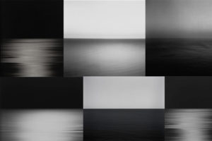
source

Photo Analysis

Technical

Although this photo may look plain and simple at first glance; there are many technical elements embedded in the image. Firstly, the smooth ripples in the water mean long exposure was used, Hiroshi Sugimoto most likely paired that with a slower shutter speed and bigger exposure to achieve this smooth and serene effect. Since the sky is rather dark, it’s natural to assume that the photo was taken at night – due to this, Sugimoto didn’t have to worry about overexposing the image as it would have been too dark to begin with. If the photo was taken in the dark, there would be no natural light for Sugimoto to work with meaning he had to rely on his camera and settings. Referring to Ansel Adam’s tonal range; the image seems to be missing the darkest black and brightest white but captures most of the tones in between.

Visual

Visually, I find this photo very pleasing and soothing. The lack of colour doesn’t feel like a disadvantage in this image; in fact, the lack of colour contributes to the simplicity and straightforward nature of Hiroshi Sugimoto’s photographs. By looking at the other photos in this set, it is safe to assume that Sugimoto used a black and white effect on this photo like all others. The photo has two parts to it: the sky and the sea, divided only by the line of the horizon that creates a soft contrast between the dark grey sky and lighter waves. Sugimoto purposely arranged the position of the sea like this in countless photographs to play and experiment with the concept of minimalism.

Contextual

The photograph was taken in 1997, during a time where most people had access to coloured photographs- Sugimoto purposely chose to not include colour in this image. Hiroshi Sugimoto studied art in Los Angeles in 1971, at the time of Minimalism and Conceptual Art – this is clearly evident in his work.

Conceptual

To me, the concept behind the image is to challenge the audience’s perspective and views on what makes a successful photograph. The image, at first glance, lacks the most conventional aspects of a successful photograph.  The image is incredibly plain due to the lack of subjects but still able to capture the attention of the viewer and provoke an emotional response. The whole set has a similar calm and harmonious atmosphere it radiates, allowing the viewer to feel safe and at peace – which may not be a feeling we expierence much in our chaotic everyday life.

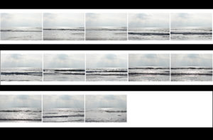
Contact Sheets
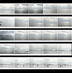
Final Edited Image In The Style Of Hiroshi Sugimoto
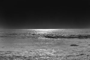

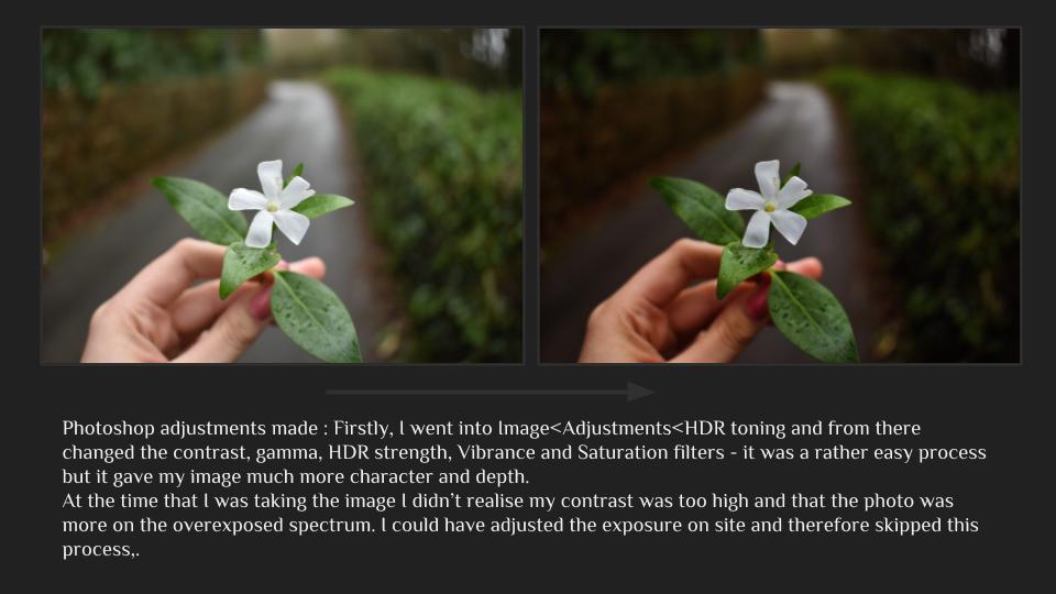
For this image, I first used the lasso tool to separate the sky and the ocean into two different layers and then I simply used the ‘burn’ tool to darken both the sky and the ocean until I was satisfied with the results.  It was an easy process but it allowed me to quickly obtain the results I wanted.
Romanticism

What Is Romanticism?

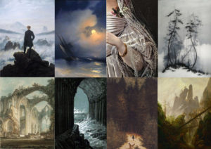
Romanticism was an artistic and intellectual movement which took place in Europe between the late eighteenth and mid-nineteenth centuries. It was a break from the guiding principles of the ‘Enlightenment’ (which established reason as the foundation of all knowledge) the Romantic Movement emphasised the importance of emotional sensitivity and individual subjectivity. For the Romantics, imagination, rather than reason, was the most important creative faculty.

below are some examples of the first paintings in the theme of ‘romanticism’ which set the basis for modern-day romanticism.

Source And Further Reading

Pioneers Of Landscape Photography

Carleton Watkins

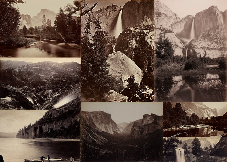
He was perhaps America’s greatest 19th century landscape photographer yet today he’s largely unknown. His breathtaking landscapes of the Yosemite Valley were instrumental in preserving the valley for future generations and paving the way for both the National Parks system and the environmental movement.

Among the people who had Watkins’ prints was a U.S. Senator from California, John Conness. He showed them to his fellow lawmakers as part of his effort to save Yosemite from the development and tourism that was already encroaching on the valley. When President Abraham Lincoln saw them, it helped convince him to sign a bill in 1864 declaring Yosemite Valley “inviolable.”

It was the beginning of America’s environmental movement and the National Parks system. And if not for Watkins, there might not have been a pristine Yosemite Valley for photographers like Ansel Adams to photograph.

Source

Ansel Adams

Though 50 years of work preceded him, Ansel Adams is the spiritual father of American landscape photography. Not only is he perhaps the most recognizable name in all of photography, but his work transcended art and science to make him an icon of popular culture as well.

“It’s rare to find a landscape photographer,” says Carr Clifton, “or any photographer who hasn’t been touched by Ansel Adams’ black-and-white work of the exquisite landscapes of the American West.”

Like Carton Watkins (above) before him, Adams made many famous photographs of Yosemite National Park. What set him apart was his work’s timeless quality. Technologically innovative and advanced enough to surpass much of the printing done today, Adams’ photography was simple enough to maintain a direct connection to the earliest pioneers of the medium.

Source


Creative Portraiture Case Study – John French

Visual Influence – Projector Portraits

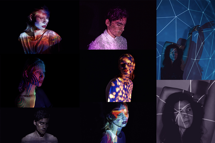
Below are some images that I found interesting and wish to work in the style of.

Projection photography has become increasingly more popular over the years as photographers and artists have discovered this fantastically adaptable resource to produce art and photography.

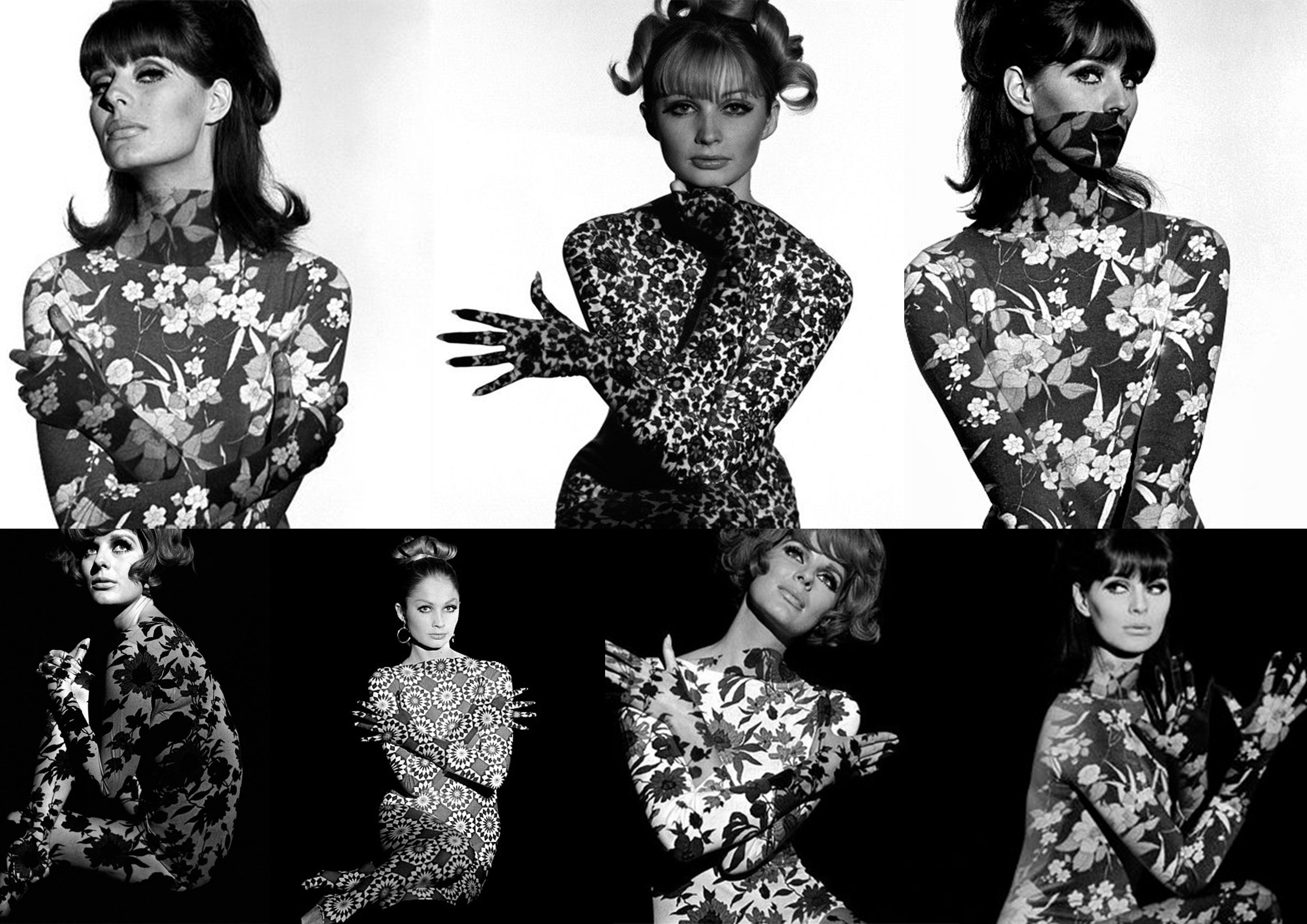
Most famously, photographer John French used projection art photography in the 1960s – he photographed models with floral patterns projected onto their bodies instead of clothes.

John French

Born in Edmonton (London) John French originally trained and worked as a commercial artist, becoming a photographic director in an advertising studio just before World War II.

He worked for many editorial magazines and newspapers(like the Daily Express). He worked on a new form of fashion photography (which included bouncing light from reflector boards to create aesthetically pleasing, low-contract images that would reproduce well on newsprint).French is known for his clear, stylish, uncluttered black and white photographs taken against clean backgrounds.  He preferred to work closely with his models, devoting much attention to their posing and his sets.

Source

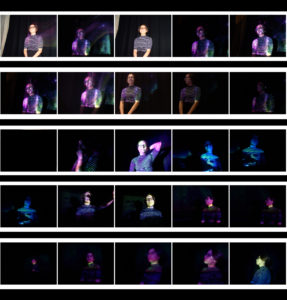
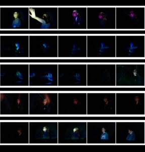
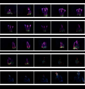
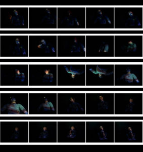
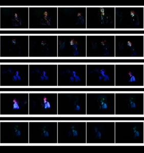
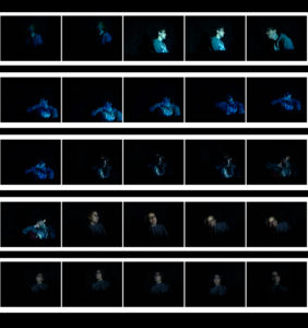
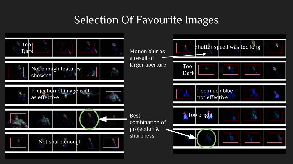
Contact Sheets

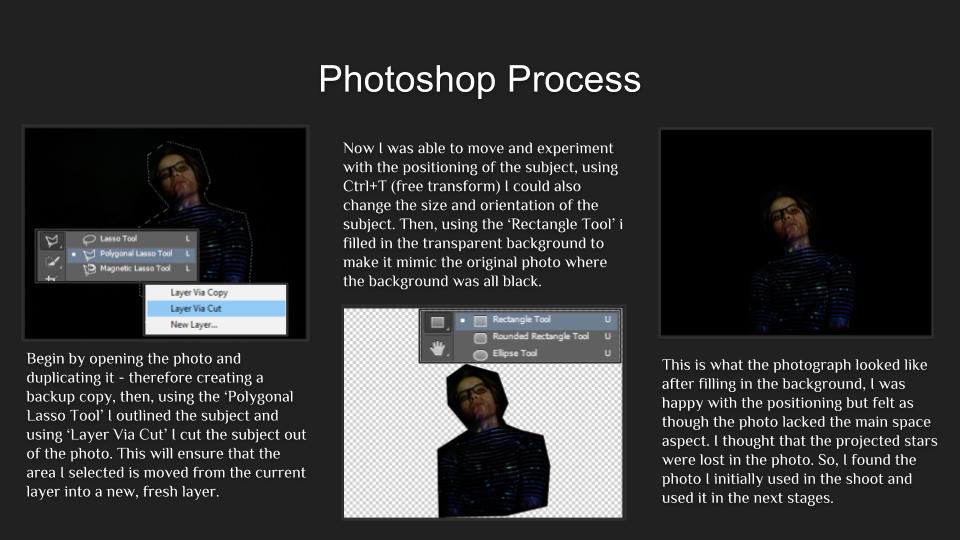
Editing

Evaluation

 This was my first and, by far, favourite image. I like the immense focus and the chilling stare of the subject. Adobe Photoshop helped me position the model in the center of the image with a large amount of black filling the frame. I aimed for this effect with all of my images, I wanted the dark to almost swallow my models – I think that this gave my images a more sinister feel and created a more mysterious atmosphere that surrounded my images. Due to this, the photographs also have a more minimalistic feel about them, thanks to the projection aspect the photographs are much more complex and interesting to look at. If I were to do this whole photo shoot again I think I’d try to take some photos with multiple models- with each of them having different projections and experiment with the different effects. I would also try to mix some images together via overlay and such.
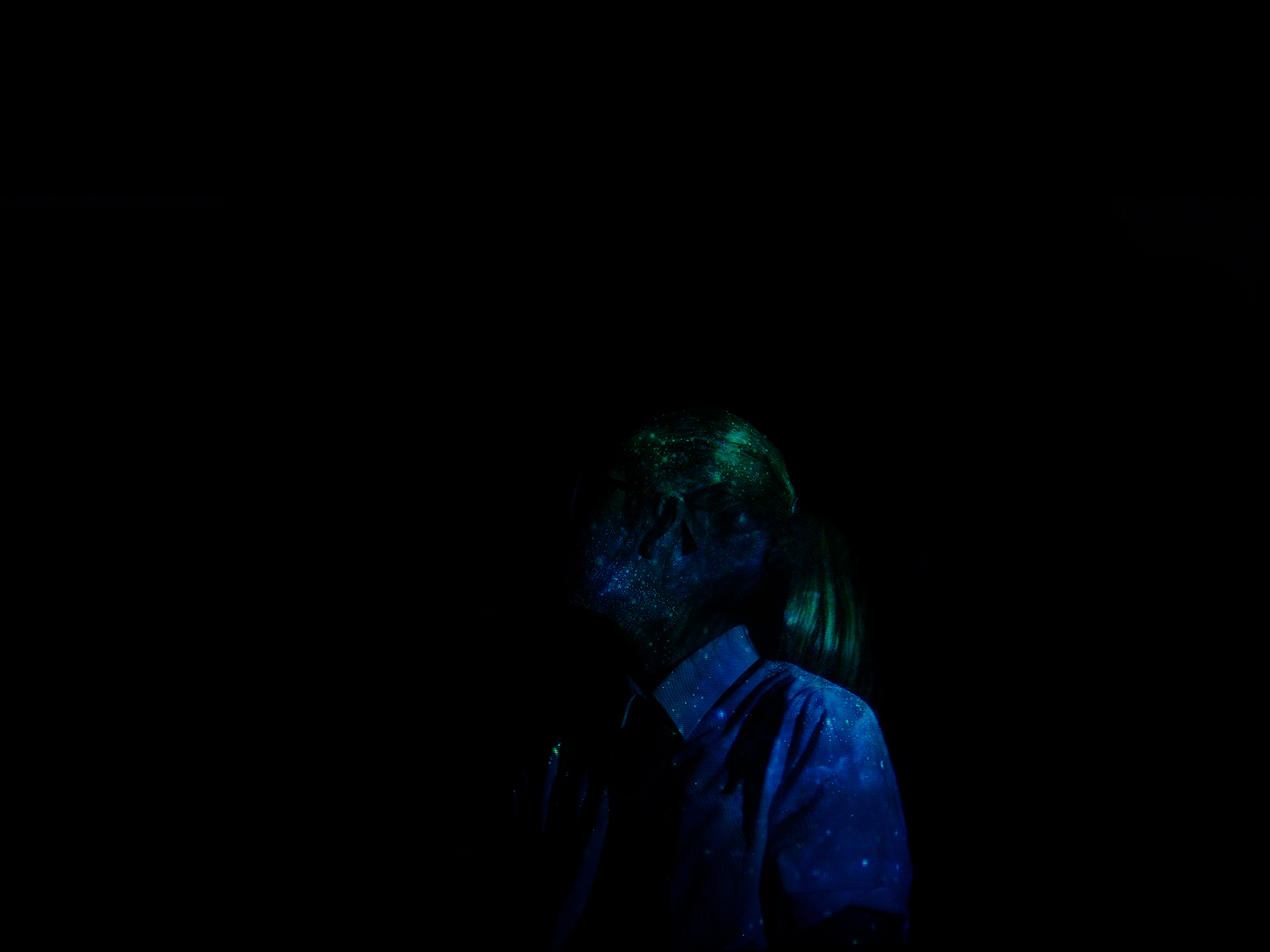
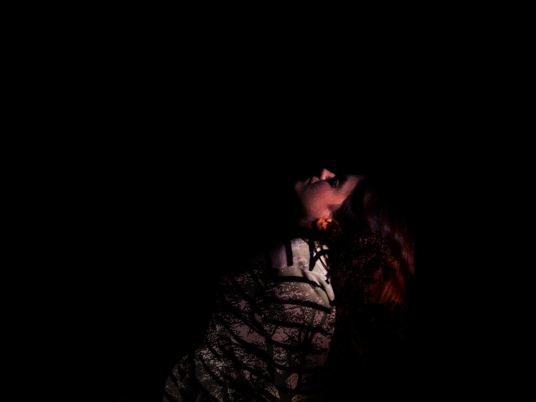
This is my second final image for this subunit, unlike in the other two photographs, this image fully obscures the model’s face and features, This is because she’s looking away from the light source and into the shadow. It follows the general theme and what I was going for, the projection of the stars is very sharp and crisp in this image which makes it more pleasing to look at. This is the last image, for this image I chose to use an image of a tree with stars behind it. This way I was able to achieve different colours and play around with the placement of the trees in regards to the subject’s posture and such.