All posts by Juliette Cullinane
Filters
Editing and Selecting images


With all of my images I made a selection of my strongest images, I narrowed down my selection by comparing lighting, composition etc. With this image image I decided to go with the one on the left as there was a few composition and lighting things that i preferred about it, for example I compared to the image on the right the flag that is being waved is more clear on the left photo whereas you cannot clearly see that it is a flag on the left photo, also I prefer the lighting of the man on the left photo, even though in the right you can more clearly see the man the left photo creates more mystery with the man being barely visible in a dark pub seemingly watching the football.
Page spread designs
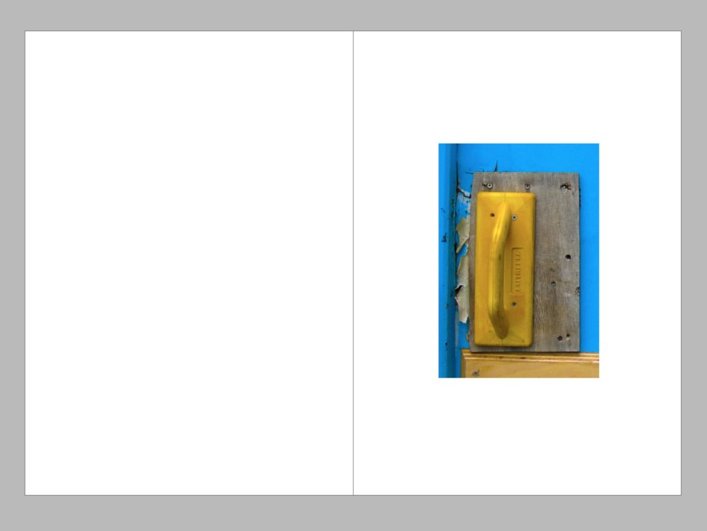
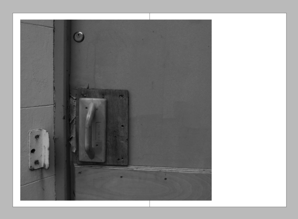
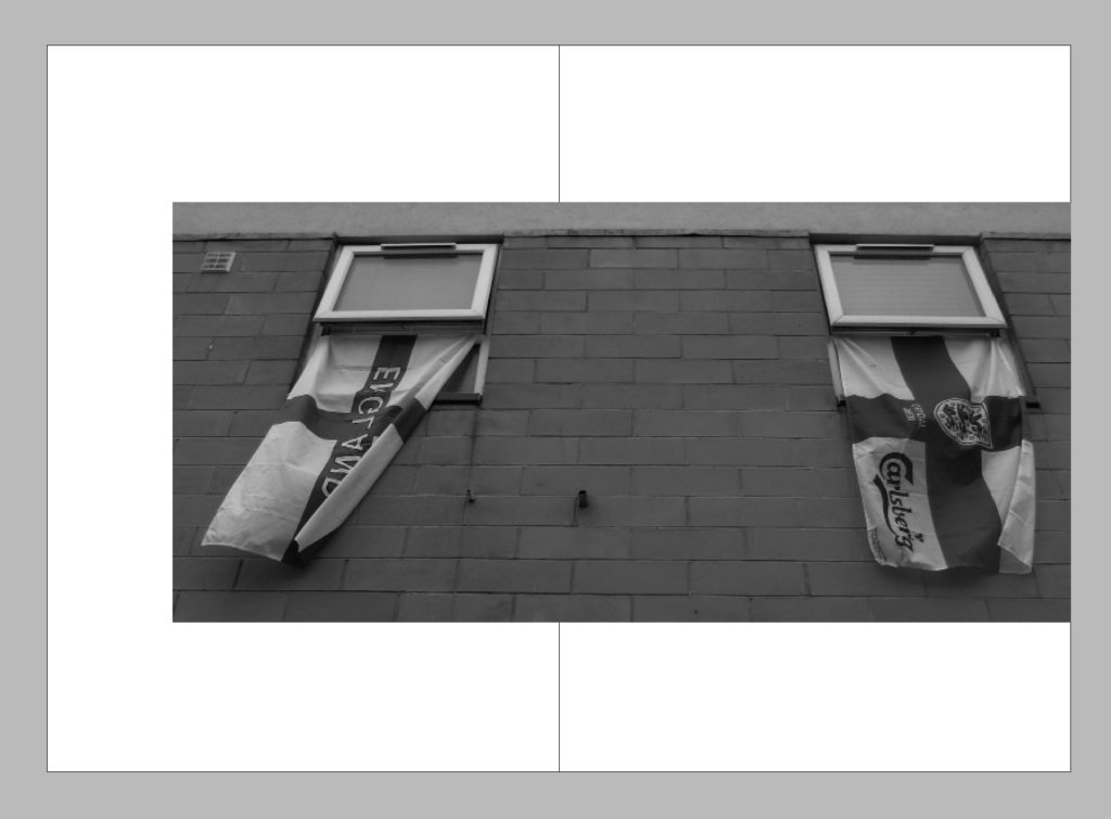
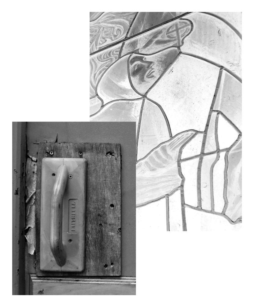
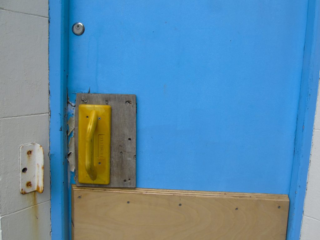
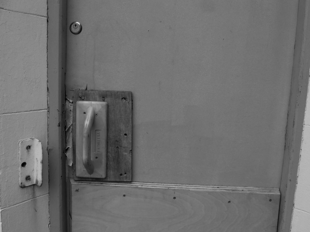
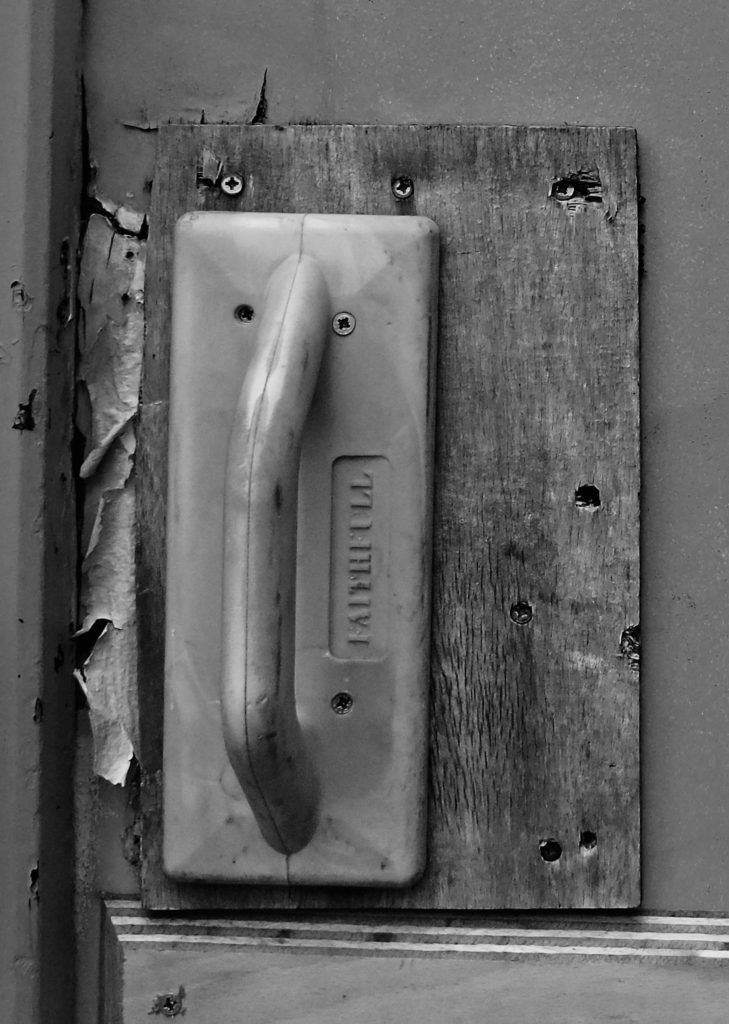
I used InDesign to create a variation of draft page spreads, my intention was to experiment with some different placement and layout ideas and also to experiment with having either all colour photos in my layout or all black and white. In the end I decided that although I did like the colour concept i found that having all the images in black and white helps the layout to link together better and creates a better narrative. Although I decided to go with the black and white layouts I still like the placement of the images on the other coloured pages, I felt that having a variety of page layouts is what would look best for my images as some images looked better by themselves or full bleed on the page or some smaller, I also experimented with having the single photos spread onto a second page slightly to create a break from symmetry, for example I decided to place the bottom right picture on the left of the page because the door handle is on the left of the door, but I still wanted to have something on the right page as when you are looking through a book you tend to look at the right page first so I placed the image slightly off from the left so that it would go over onto the right page.
Shoot 2 – area revisit
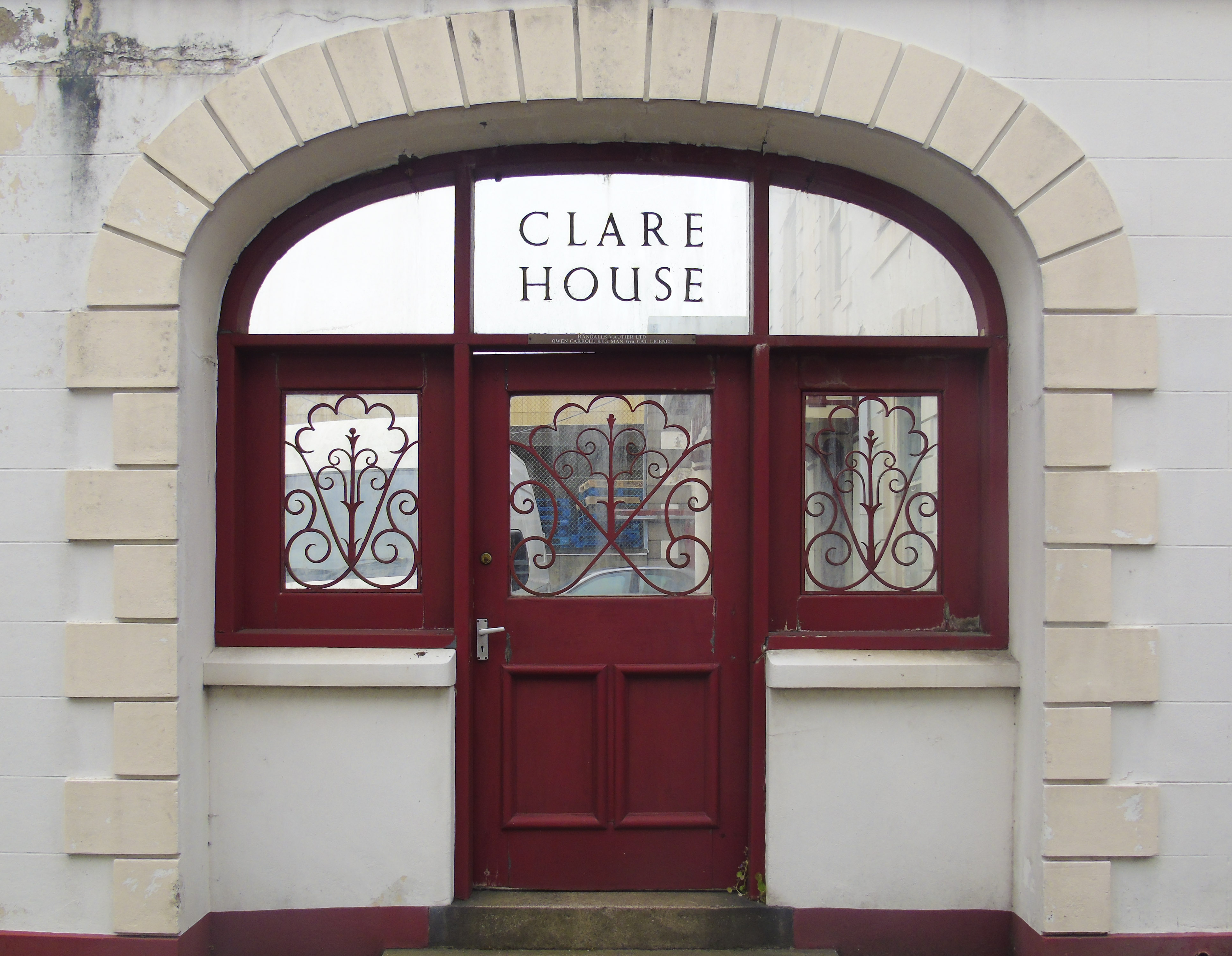
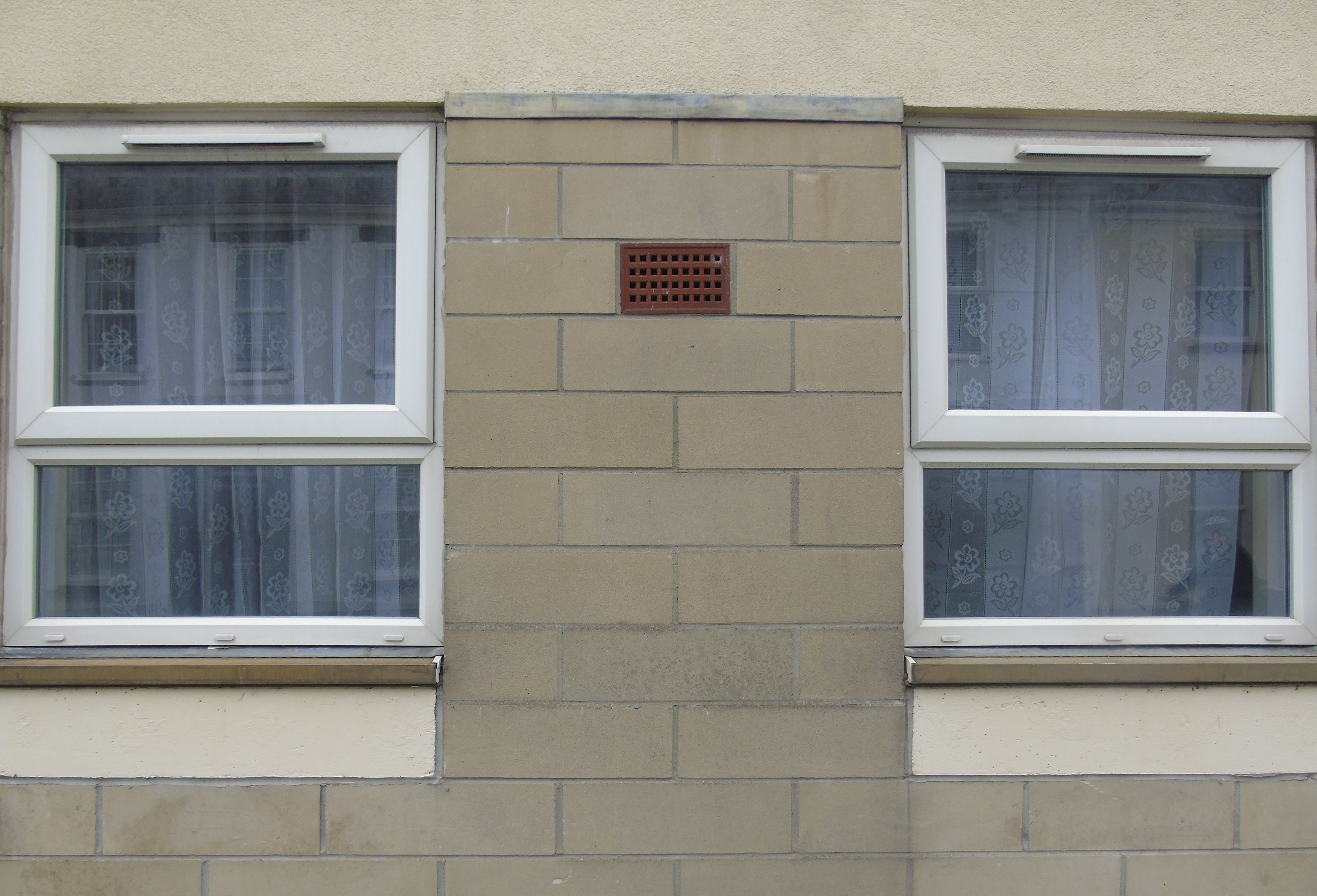
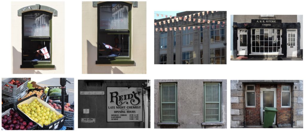
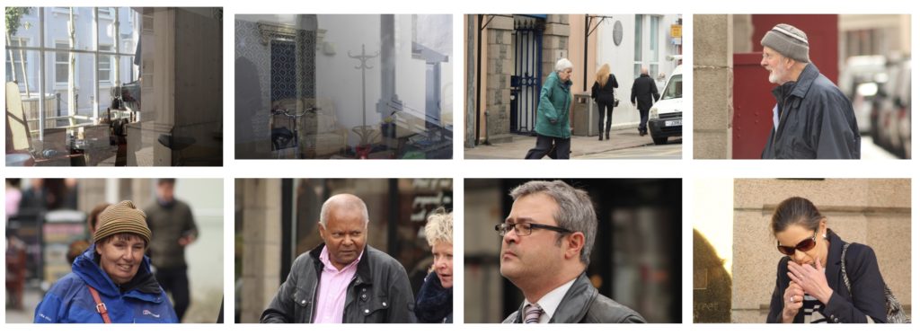
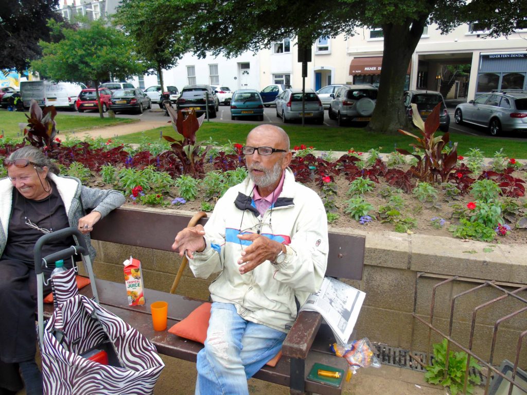
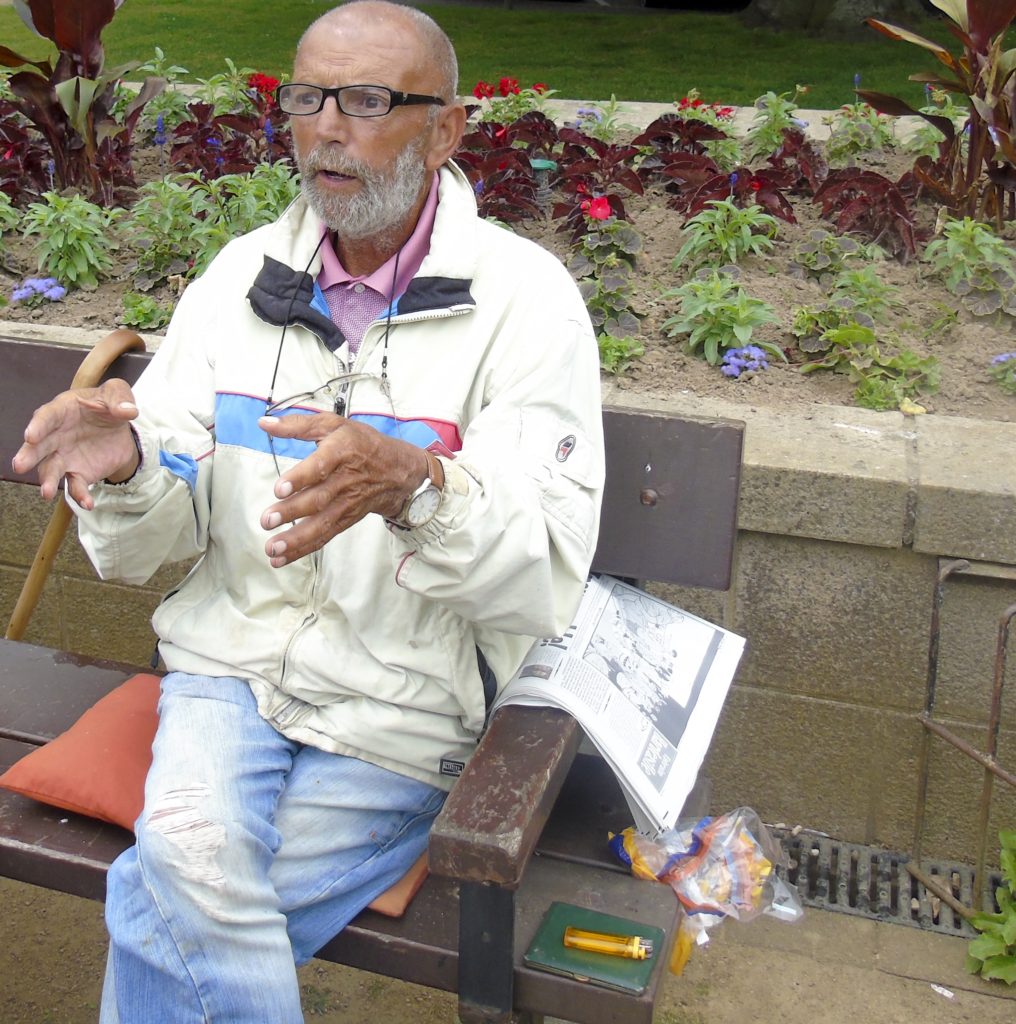
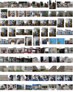
For my second shoot I revisited the area and explored some new places to get some more photographs, I tried to get a mixture of images of people and buildings so that I would have a good selection to pick from. These are a few of my favourite images from the shoot.
Montages
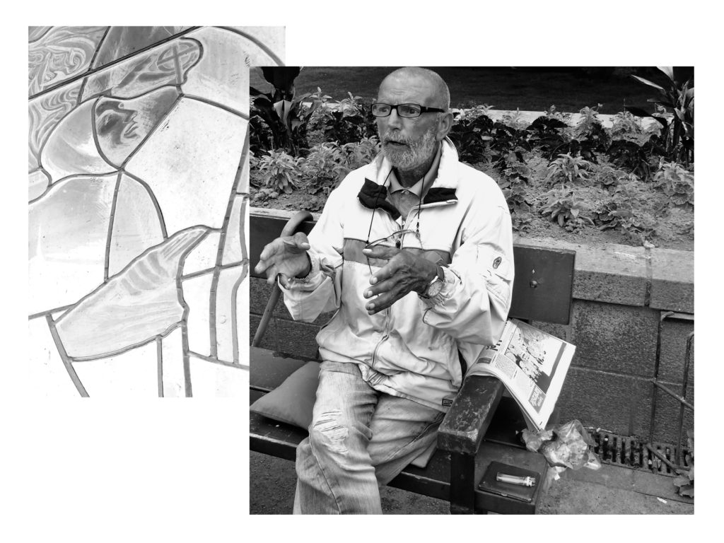
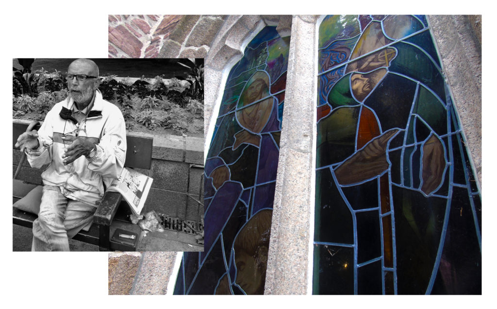
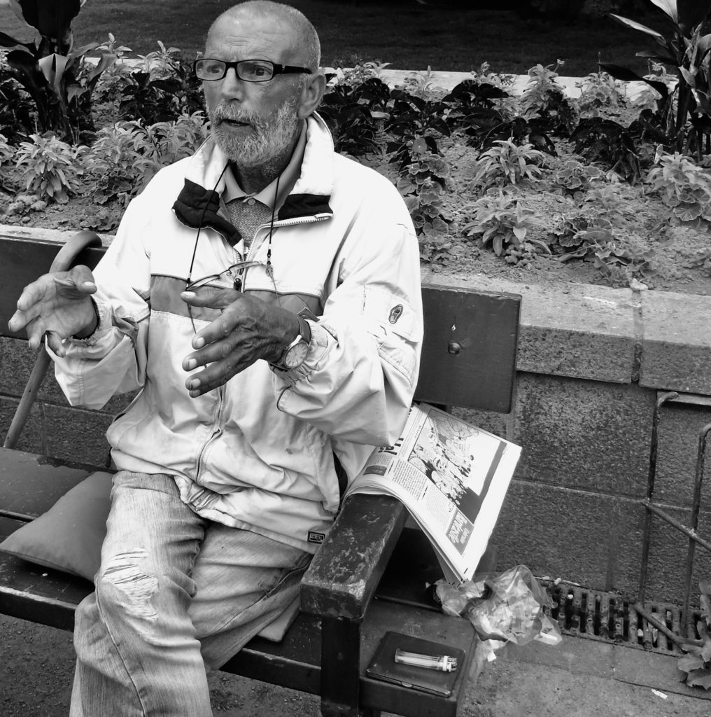
For these montages I decided to experiment with a variation of black and white and colour, I experimented with a variation of compositions and pairings of photographs to create different narratives.
Colour Edits
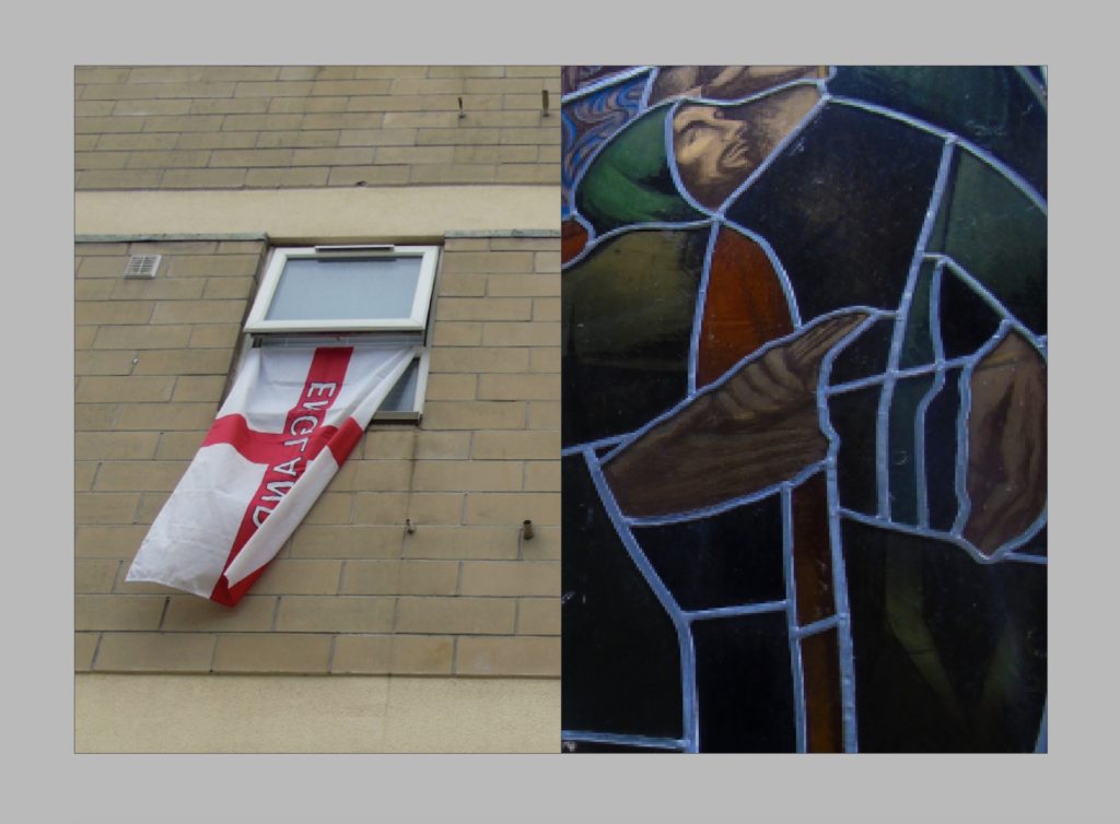
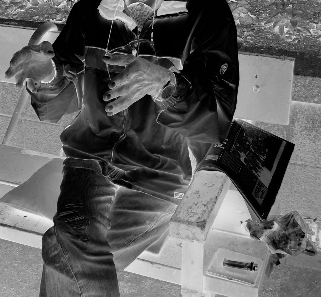
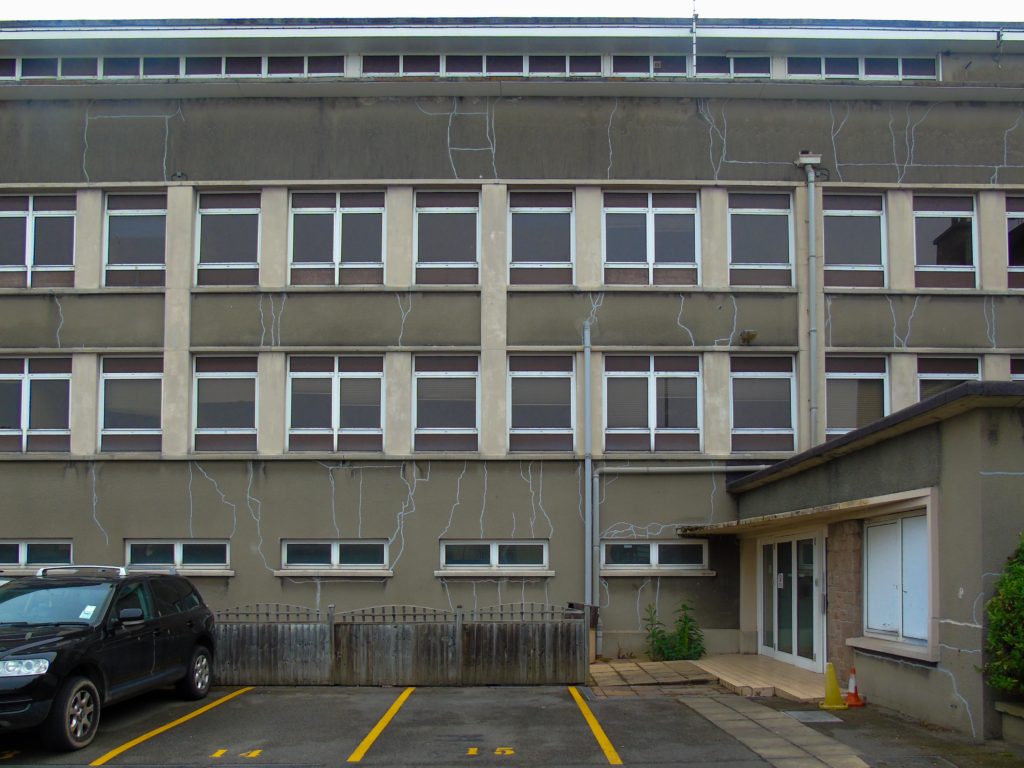
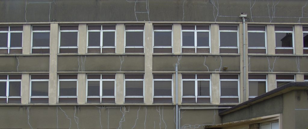
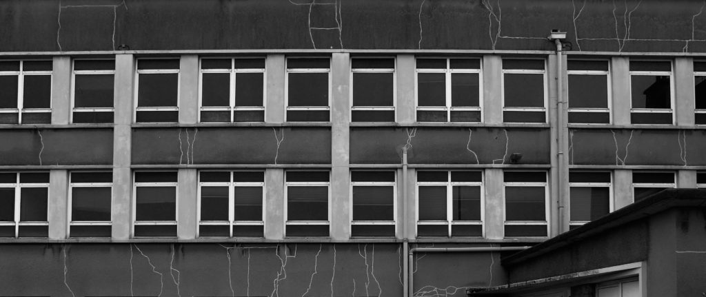
I decided to experiment with some of the photos from my first shoot, I took inspiration from the artists I researches, Nick Miners and Garry Winogrand, I experimented with things such as cropping and colour adjustments to manipulate the context of the images.
Image 1
Image 2
Image 3
shoot 1
Artist Research
Nick Miners
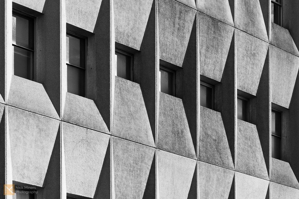
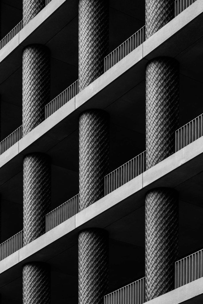
Nick Miners is an architecture and interiors photographer based between Bath and London. He is inspired about architecture and interior design and has a particular interest for brutalism and the work of Le Corbusier, Denys Lasdun and Ernő Goldfinger. He loves to to explore interesting buildings in his photography whether they are still being dusted off or have been standing for centuries. He has photographed buildings as old as the 16th Century Packwood House in Warwickshire, and as recent as 30 St Mary Axe, more commonly known as The Gherkin in London. Miners manages to capture the essence of a building in a seemingly abstract way, turning concrete monsters into beautifully abstract shapes, patterns and textures.
Artist research
Garry Winogrand
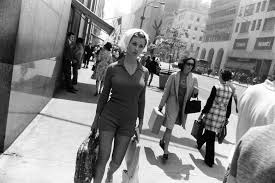
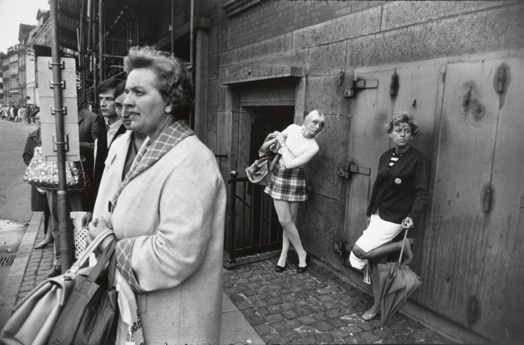
Garry Winogrand was born in 1928, he grew up in a Jewish, working-class neighbourhood of the Bronx in New York City. His parents immigrated to the United States from Hungary and Poland in the hopes of having a better life in the United States, but then the Great Depression hit the country a year after Winogrand was born. In 1949, he took a photography class at the New School, where his teacher, Alexey Brodovitch, who was the celebrated art director at Harper’s Bazaar at the time, taught him to rely on his instinct rather than classical photographic techniques when taking photos. The lessons Brodovitch gave Winogrand, such as trusting his gut rather than established conventions would greatly influence him, defining not only his photographic style, but also his attitude towards the medium. Ultimately, Winogrand’s working class immigrant background influenced his shooting style as well as his choice of subjects. This viewpoint ultimately set him apart from his colleagues, as well as the tremendous influence of photographers such as Brodovitch and Henri Cartier-Bresson. His unflinching view of American society places his lineage more in line with the photographers Walker Evans and Robert Frank. Like most photographers of his generation, Winogrand was inspired by the black and white photography of Henri Cartier-Bresson, Robert Frank, and Walker Evans. It was after seeing Evans’s book American Photographs that he really became driven in regards to his own work. Everyday he would shoot relentlessly, and with the dynamic energy of the city as his subject and inspiration, Winogrand began to create an unwavering body of work that was rich in its diversity. He took photos of women passing by, animals, parades, crowded street corners, airports, business men, political conventions, anti-war protests- any scene he found interesting, but always containing people. Rather than allowing the scenes he photographed to happen as he maintained a passive stance, as traditional street photographers had done, he intruded into his subject’s physical space. This allowed him to startle and provoke his subjects as he shot them and thus to capture their startled and strange glances. His photographs often appear haphazard, tilted, and poorly composed – what came to be called the ‘snapshot aesthetic’. However, this unique aesthetic helped emphasize his subject matter, allowing the viewer to engage with his subjects in new and unusual ways. In so doing, Winogrand influenced an entire generation of photographers and artists to push the boundaries of what photography as a medium could be and what it could expose.
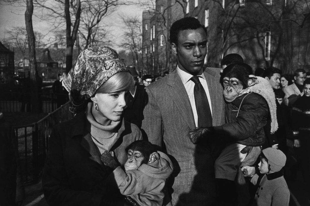
Central Park Zoo, a young interracial couple each holds a chimpanzee dressed in children’s clothes. Winogrand captures himself in this scene as well – his shadow falls over the man’s torso, reminding the viewers of just how close Winogrand got to his subjects. Taken during the height of the Civil Rights Movement, their mere public presence is very much a political statement. Interracial couples were taunted with the idea that their children would be monkey-like, casting a more serious political statement to the seeming levity of the dressed up chimpanzees. Certainly aware of this, Winogrand presents them in a moment of passing by him, and their implacable facial expressions give this image an ambiguous tone: there is no easy or singular political statement offered here. In this work, Winogrand removes the context, showing just enough of the moment that the viewer can only describe what they are seeing in the image. The racial tensions inherent in this image are in the background, and in so doing, Winogrand normalises what would have been a rare sight: an interracial couple in public, in addition to their well-dressed chimpanzees. For Winogrand, photography was about transforming the real world into a distinct image, disconnecting it from its narrative. Because he believed photography’s purpose wasn’t to tell a story, it was simply to exist, or perhaps, in this image, the right to exist.
Future of st helier
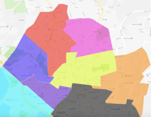
The red section is the section that I have been given, to me, this divides into two main areas; This being the old police station that has now been left empty with some interesting architecture, and the Savoy jersey which could be considered the most upscale part of this particular area and then up towards St Thomas church. The area throughout is focused mostly on old buildings and more urban and deteriorating areas typically ignored by government property developers as they do not hold a public interest within the main section of town or the finance sector, and therefor the area has been left to slowly deteriorate and slowly being abandoned by example the police station which has now moved to a more central and up to date part of town. I do believe there are many small communities within these areas to which I could take images of the people as a representative of the area itself. I also intend to explore the the architecture of the area, such as the churches and deteriorating buildings that form this area, there are also quite a few independent shops and areas of flats in this area that I intend to photograph to create a full perspective of the area with my images.
