All posts by Conor H

Filters

Author:
Category:

My Plan of My Response to My Manifesto

In my shoot responding to my manifesto I will be focusing on rules number 3,4 and 7.

  • Rule #3 – I will take inspiration from Henrik Malmstrom’s ‘A Minor Wrongdoing’ by taking photographs that do not fit within the conventions of photography.
  • Rule #4 – I will question whether the technicalities and conventions of society, photography and day-to-day life are necessary.
  • Rule #7 – I will take inspiration from Lewis Bush’s work on ‘Metropole’ in the sense of use of double exposure.

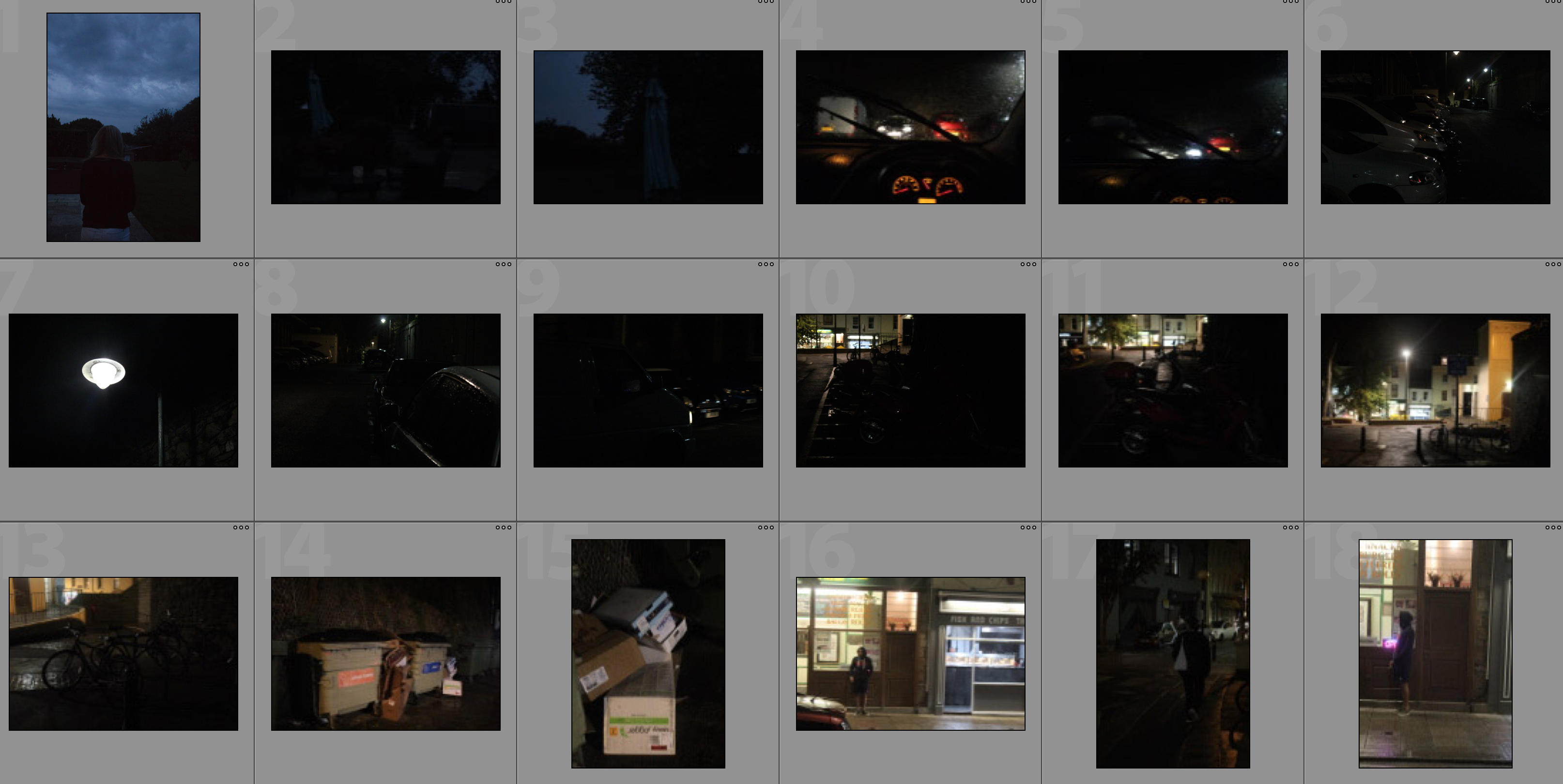
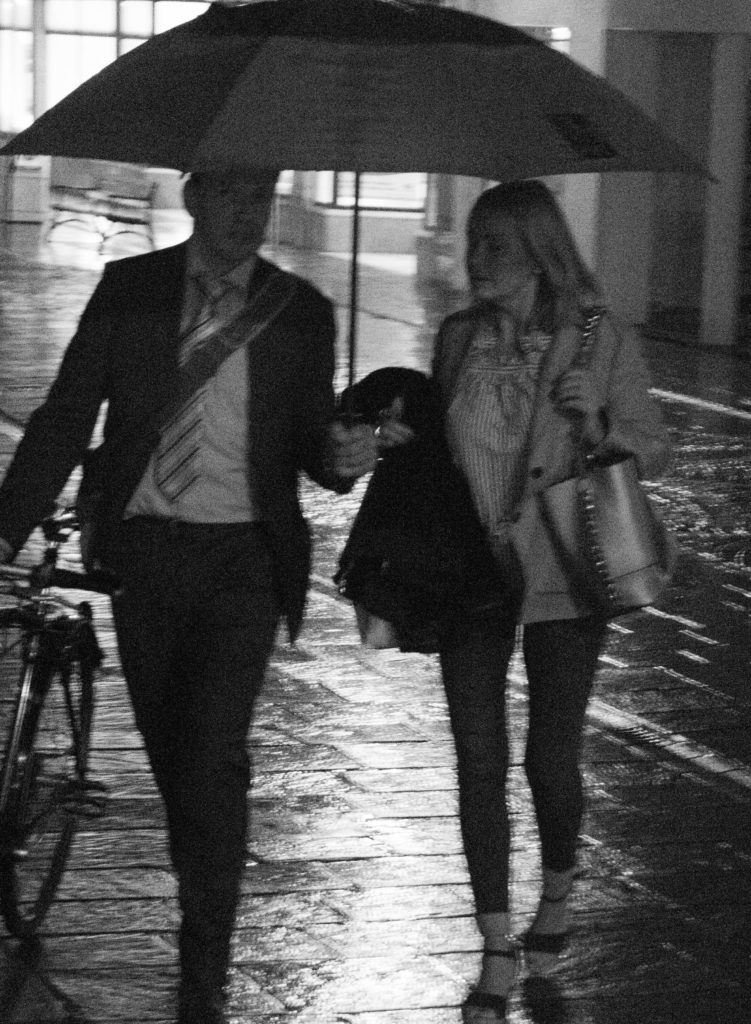
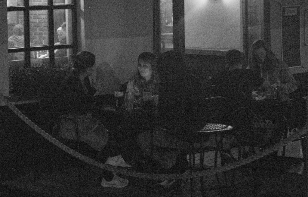
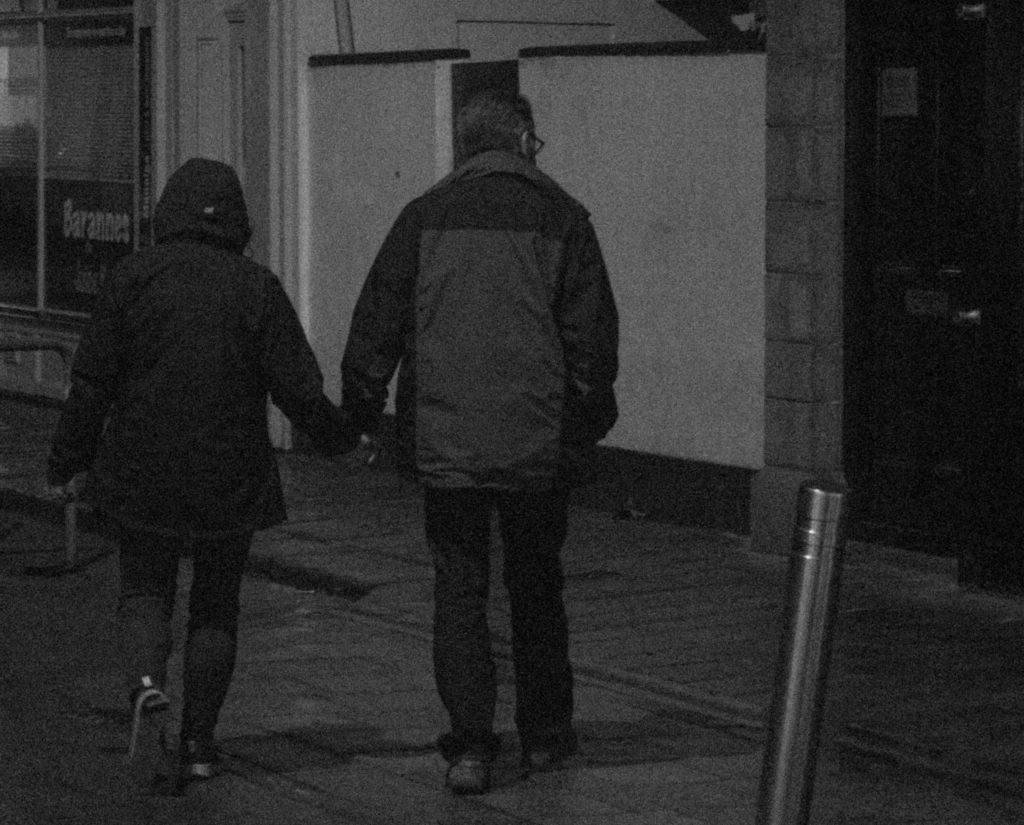
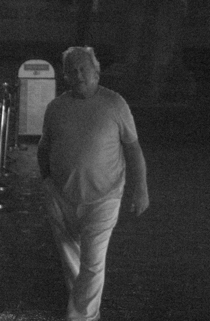
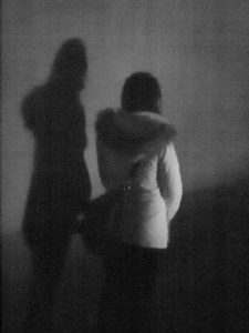
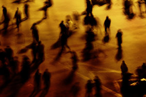
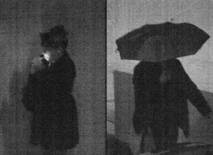
I am focusing on these rules as they allow me to further explore the work I have done on Lewis Bush and Henrik Malmstrom through the use of techniques and styles of photography that both photographers have used in their shoots.  I plan on taking inspiration from Henrik Malmstrom by further developing on my shoot in which I took high-ISO grainy photographs which questioned the technicality rule of photography.  I plan on merging this inspiration with inspiration from Lewis Bush by editing the photographs to create the effect of double exposure that Bush used in his project ‘Metropole’The combination of these two inspirations will allow be to follow rule four and question whether the technicalities and conventions of society and photography are necessary as well as incorporating political landscape further.  As seen in this post, I will be creating double exposure photographs using grainy photographs of individuals minding their own business in order to show and convey the idea that the Islanders are feeling disorientated and lost –  both because of the fast development in their island and because they are getting lost in their own business to the point where they do not realise people are observing and watching them

My Manifesto

  1. I will photograph representations of society within Jersey through individual subjects.
  2. I will show the population of St. Helier and Jersey in the light that they portray themselves in when it appears that nobody is looking.
  3. I will take inspiration from Henrik Malmstrom’s ‘A Minor Wrongdoing’ by taking photographs that do not fit within the conventions of photography.
  4. I will question whether the technicalities and conventions of society, photography and day-to-day life are necessary.
  5. I will demonstrate how residents of Jersey react to changing developments within the island.
  6. I will show how there is always someone watching from afar.
  7. I will take inspiration from Lewis Bush’s work on ‘Metropole’ in the sense of use of double exposure.
  8. I will demonstrate political landscape through showing the vast differences between the individuals in Jersey.
  9. I will bring forward the feelings within the subject I photograph – through disorientation and reactions to everyday factors on the streets.

Analysis of Futurism Artwork

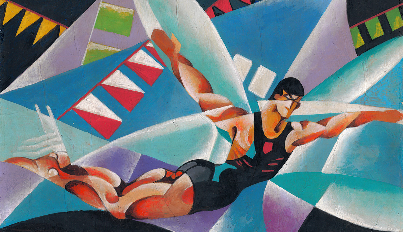
Below are two photographs that have been made in response to the manifesto of Futurism – ‘Dynanism of a Car‘ by Luigi Russolo and ‘Dynanism of a Soccer Player’ by Umberto Boccioni.

Dynanism of a Car

Luigi Russolo, ‘Dynamism of a Car’

The colours within this work are very intense – the yellow colours make the viewer think of the headlights of a car as well as the red. This use of hot colours throughout the work adds to the feeling that the car in the painting is going at a very fast speed – which could reflect how Futurists feel about how the world should be. The use of the hard hot colours creates a contrast with the black of the de-constructed car which creates a more sleek and eye-catching design. The use of the yellows and reds have connotations to fire and the way the colour fades out in places can be seen as patterns that would be seen in a physical flame. There is no 3D effect within this photograph but there is an intense feeling of direction within it. The shape of the aero-dynamic modelled car can be seen even though it has been deconstructed and re-arranged. Russolo added to the affect of the aero-dynamic shape by horizontally stacking red arrows pointing in the direction of the car’s motion in order to give a sense of direction and movement within the photograph. ‘Dynanism of a Car‘ takes a car and de-constructs it into new entities that are then re-arranged into a new interpretation of the same car – this shows Cubist influences which was another artistic movement that de-constructs the subjects.

This piece of art by Luigi Russolo, titled ‘Dynanism of a Car‘ is a great example of the type of work produced during the movement of futurism in Italy.  Futurism is a rejection of the past and a celebration of speed, machinery, violence, youth and industry.  Futurists insist that literature will not be overtaken by progress, rather, it will absorb progress in its evolution.  This art was produced in 1912 and produces an image reminiscent of chronophotography by introducing the time dimension of speed in painting.

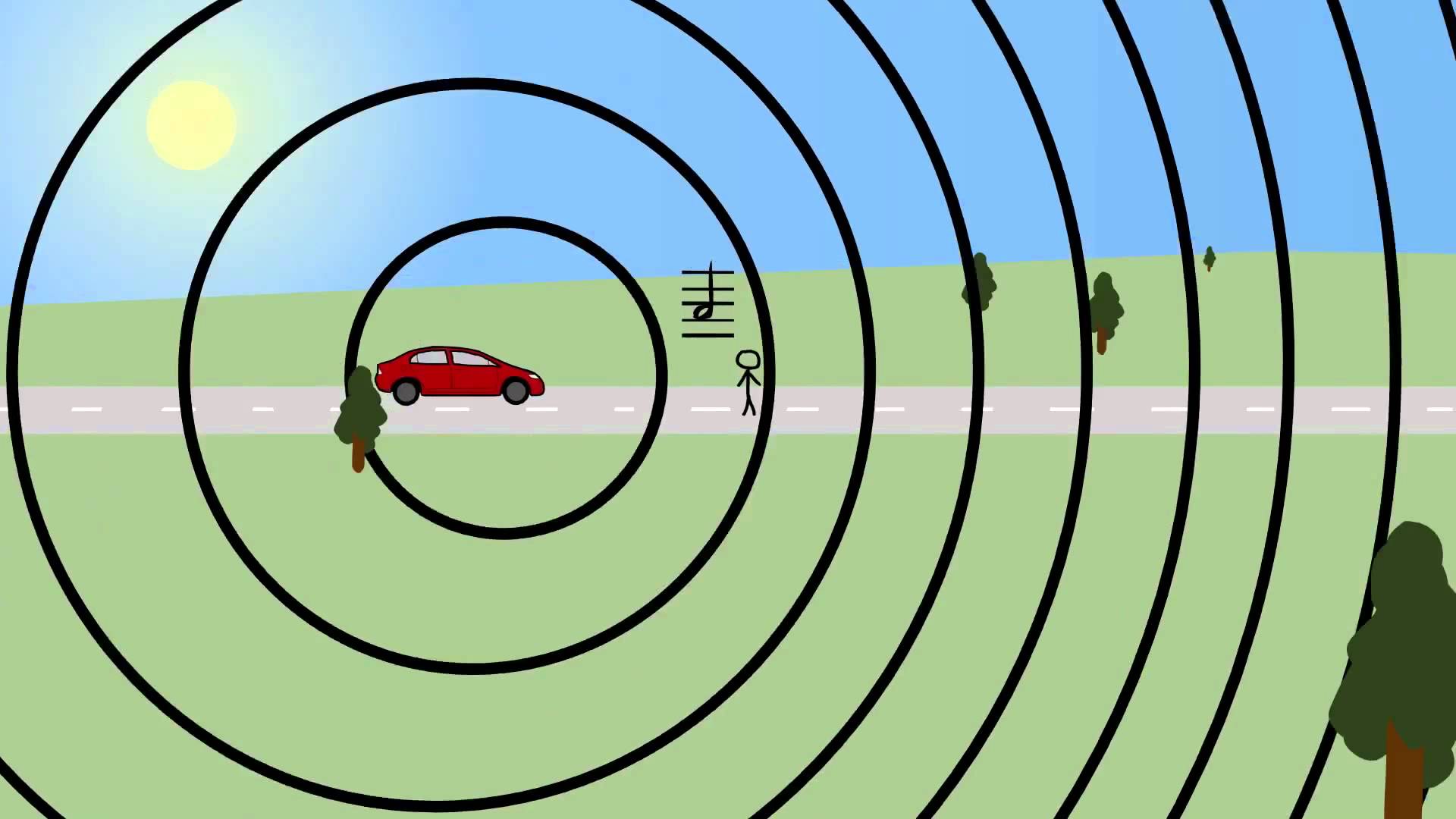
The painting was produced in 1912 but the image seems to display a modern bat-mobile type supercar which shows the forward-thinking attitude within Futurism.  Russolo is trying to convey the idea of motion by creating the impression of soundwaves in the front of the car. Russolo would often focus on the technological innovation and the visual manifestation of motion which can clearly be seen within ‘Dynanism of a Car‘.  The picture is also  similar to physics textbook pictures illustrating the Doppler effect which supports the idea that Russolo was intending to show the compression of soundwaves through this photograph.

An illustration of the Doppler Effect

Dynanism of a Soccer Player

Boccioni uses highly contrasting colours in ‘Dynanism of a Soccer Player‘ along with extremely vibrant hues divided into sections that are reflective of rays of light – possibly coming from around the football stadium. Boccioni is focused on representing these vibrant colours and a sense of dynamics of movement within the painting rather than depicting the player. The dynamic movement feeling spread throughout the painting is done through abstract shapes of different opacity overlapping eachother – which has Cubist influences, similarly to ‘Dynanism of a Car‘.  The work is intended to show a soccer players dynamic movement through an abstract series of shapes and kaleidoscopic colours. The soccer player is dematerialized into a luminous array of colours which could be seen as the colours and lights seen in a typical football stadium in which there are seas of fans in different coloured football kits supporting the soccer players.  The only part of the soccer player that can be made out is the calf at the centre

Dynanism of a Soccer Player‘ was produced in 1913 by Futurist artist Umberto Boccioni who was a member of the Italian Futurists – a group of artists active around World War 1, which is a rejection of the past and a celebration of speed, machinery, violence, youth and industry.  Futurists are firm believers of moving technology and life forward at a fast pace, which can often be seen through their art.  . This piece demonstrates a quote from Boccioni from 1910, he said “To paint a human figure you must not paint it; you must render the whole of its surrounding atmosphere…movement and light destroy the materiality of bodies”.

Through abstraction and sense of dynamic movement Umberto Boccioni has challenged the conventional stillness of paint on canvas in order to create something exciting and different to the viewer. The viewer is forced by Boccioni to rethink aesthetic sensations and their original perception of surrounding objects due to the chaos of abstract shapes within the painting.

Manifesto Research

A manifesto is a published verbal declaration of the intentions, motives, or views of the issuer, be it an individual, group, political party, government or an artistic movement.  The word manifesto is derived from the Italian word ‘manifesto’, which is derived from the Latin ‘manifestum’, meaning clear or conspicuous. A political manifesto  A manifesto usually accepts a previously published opinion or promotes a new idea with intentions for carrying out changes the author believes should be made.  In particular, political and artistic manifestos can be interesting.

Political Manifesto

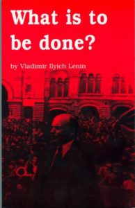
A famous political manifesto is ‘What Is To Be Done?’ by Vladimir Lenin, published in 1901. It is a political pamphlet written by Lenin, who is a Russian revolutionary who said that the article represented “a skeleton plan to be developed in greater detail in a pamphlet now in preparation for print”. The title ‘What Is To Be Done?’ by the novel of the same name by a 19th century Russian revolutionist  Nikolai Chernyshevsky. In this political manifesto, Lenin argues that the working class will not become political simply by fighting economic battles with employers over situations such as wages and working hours. In order to convert the working class to Marxism (the political and economic theories of Karl Marx and Friedrich Engels which were later developed by their followers to form the basis of communism), Lenin insists that Marxists should form a political party of dedicated revolutionaries to spread the ideas among the workers. The main points in the political manifesto are:

  • Lenin confronts the Economist trend in Russian Social Democracy
  • Lenin states that workers will not spontaneously become Marxists just by fighting battles over wages, rather they need to form a political party to publicise their ideas – he says that to understand politics you must understand all of society, which the workers need to learn to do.
  • Lenin speaks about the wave of strikes in late 19th Century Russia and says “the history of all countries shows that the working class, exclusively by its own efforts, is able to develop only trade-union consciousness”.

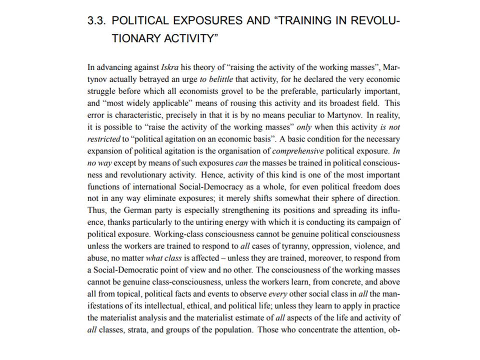
Below, I have included an extract of the political pamphlet in order to show an insight to the language used, the vision and metaphors.

Artistic Manifesto

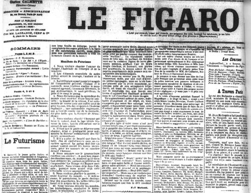
A very good example of an artistic manifesto is the Futurism manifesto which was written by the Italian poet Filippo Tommaso Marinetti and published in the French Newspaper ‘Le Figaro’ in 1909. In the Futurism manifesto, Marinette expresses Futurism as a rejection of the past and a celebration of speed, machinery, violence, youth and industry. The Futurism movement places action over sentiment.  Futurists insist that literature will not be overtaken by progress, rather, it will absorb progress in its evolution. Man is reacting against the potentially overwhelming strength of progress. Below, I have written out the founding manifesto of Futurism for both research and comparison purposes:

  1. We intend to sing the love of danger, the habit of energy and fearlessness.
  2. Courage, audacity, and revolt will be essential elements of our poetry.
  3. Up to now literature has exalted a pensive immobility, ecstasy, and sleep. We intend to exalt aggressive action, a feverish insomnia, the racer’s stride, the mortal leap, the punch and the slap.
  4. We affirm that the world’s magnificence has been enriched by a new beauty: the beauty of speed. A racing car whose hood is adorned with great pipes, like serpents of explosive breath—a roaring car that seems to ride on grapeshot is more beautiful than the Victory of Samothrace.
  5. We want to hymn the man at the wheel, who hurls the lance of his spirit across the Earth, along the circle of its orbit.
  6. The poet must spend himself with ardor, splendor, and generosity, to swell the enthusiastic fervor of the primordial elements.
  7. Except in struggle, there is no more beauty. No work without an aggressive character can be a masterpiece. Poetry must be conceived as a violent attack on unknown forces, to reduce and prostrate them before man.
  8. We stand on the last promontory of the centuries!… Why should we look back, when what we want is to break down the mysterious doors of the Impossible? Time and Space died yesterday. We already live in the absolute, because we have created eternal, omnipresent speed.
  9. We will glorify war—the world’s only hygiene—militarism, patriotism, the destructive gesture of freedom-bringers, beautiful ideas worth dying for, and scorn for woman.
  10. We will destroy the museums, libraries, academies of every kind, will fight moralism, feminism, every opportunistic or utilitarian cowardice.
  11. We will sing of great crowds excited by work, by pleasure, and by riot; we will sing of the multicolored, polyphonic tides of revolution in the modern capitals; we will sing of the vibrant nightly fervor of arsenals and shipyards blazing with violent electric moons; greedy railway stations that devour smoke-plumed serpents; factories hung on clouds by the crooked lines of their smoke; bridges that stride the rivers like giant gymnasts, flashing in the sun with a glitter of knives; adventurous steamers that sniff the horizon; deep-chested locomotives whose wheels paw the tracks like the hooves of enormous steel horses bridled by tubing; and the sleek flight of planes whose propellers chatter in the wind like banners and seem to cheer like an enthusiastic crowd.

Similarities and Differences

Some of the similarities between the political manifesto, ‘What Is To Be Done?’, and the artistic manifesto of Futurism are:

  • They both aim to make it heard what they believe in
  • They both state what it is that they are going to be doing.
  • They both have key points and beliefs from the author
  • They both give a deep insight to the mind of the author/show how they feel about society or their situation.

Some of the differences between the political manifesto, ‘What Is To Be Done?’, and the artistic manifesto of Futurism are:

  • Political manifesto’s aim to persuade the reader of their views, whereas artistic manifestos state their views as they are for them and not for those that disagree.
  • Political manifesto’s point out points of injustice in society and attempt to give the reader something to believe in through claiming to change this injustice, whereas artistic manifestos focuses on the individual and what they want to be/who they could become through the manifesto.

The Rule of Technicality – My Response

In this shoot I will be responding to the rule of technicality and taking inspiration from the works of Henrik Malmstrom – particularly his work on ‘A Minor Wrongdoing‘ in which he would photograph people that he saw from the window of his living room using a cheap digital camera. The idea of this book was to create grainy surveillance-type photographs that are unconventional and unique. He would do this through using dark environments along with high ISO’s which I will be replicating in my shoot to show the different people within St. Helier and what they get up to when it appears that nobody is watching them. I will be using an ISO of 6400 on all of my photographs in this shoot to achieve a grainy effect and a shutter speed of 1/30-1/80. I will attempt to create a fusion of documentary and street photography within this photoshoot.

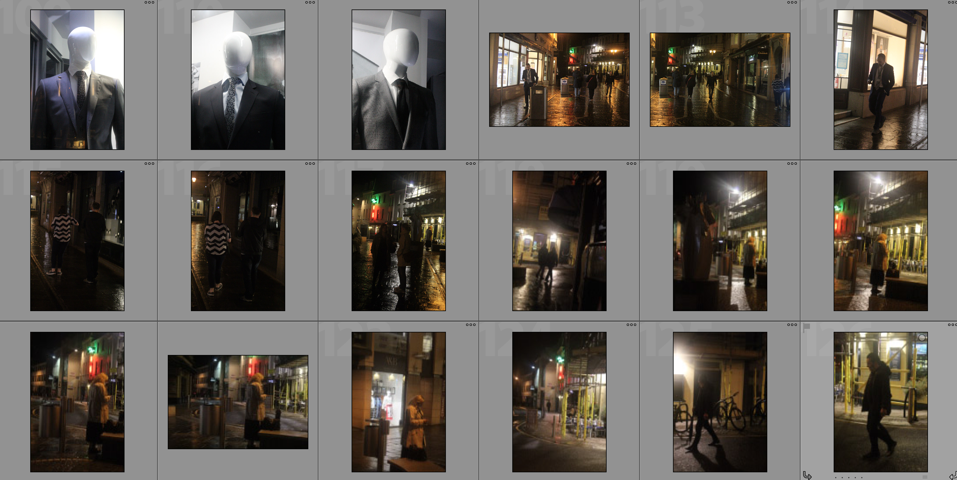
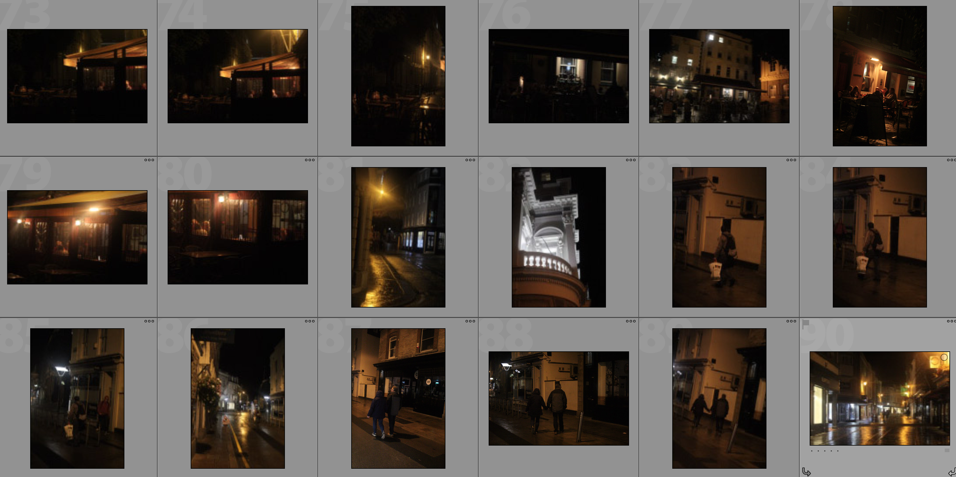
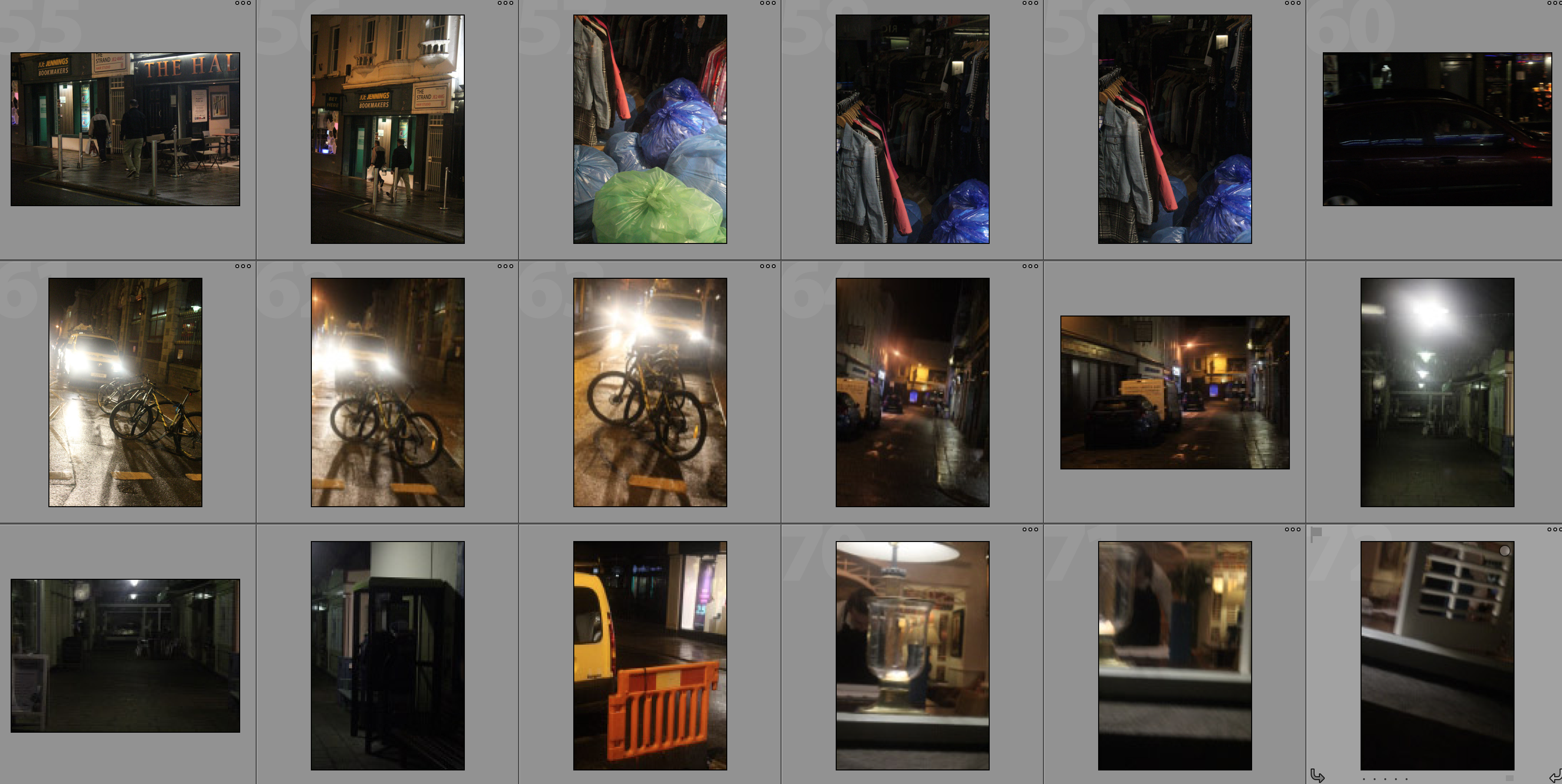
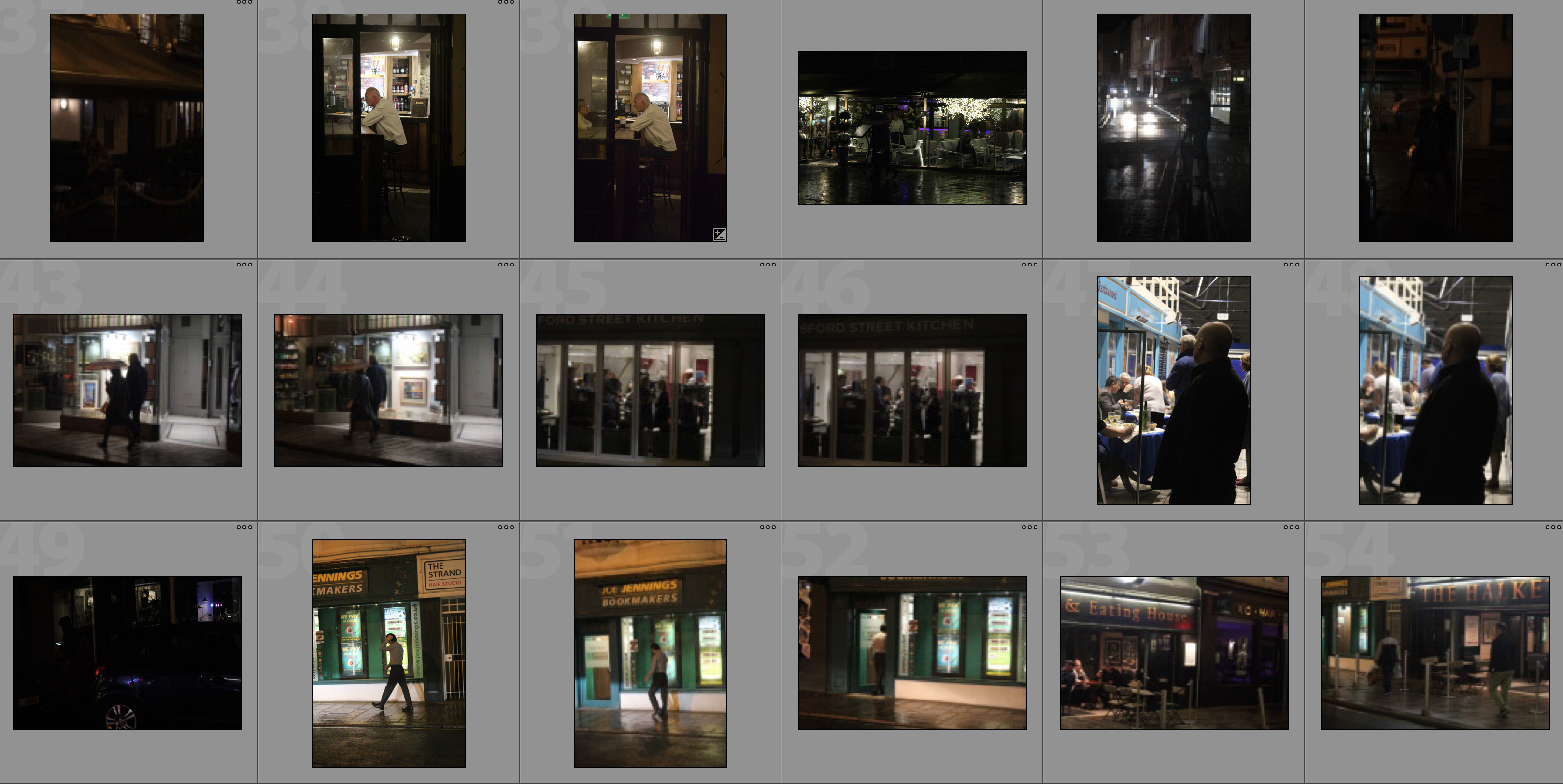
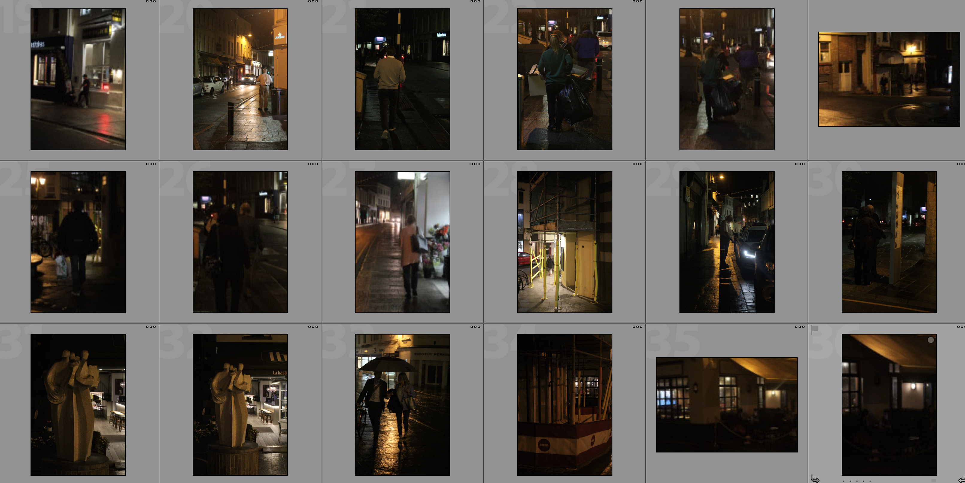
Contact Sheets

Edits

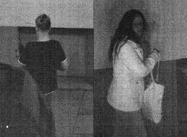
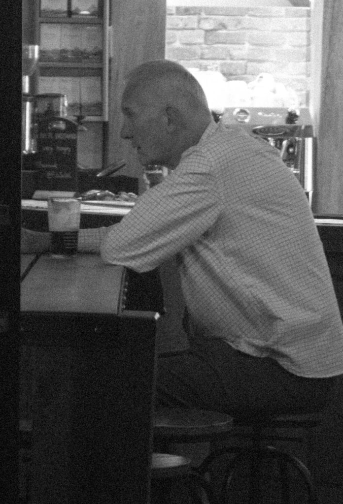
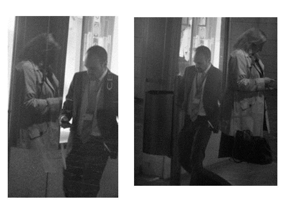
In the below edits I have taken photographs of people within St. Helier with a high zoom and ISO in order to create surveillance style photographs. I have then used lightroom to crop these photographs to close in on the subjects and further improve the effect of surveillance. I also added a black and white filter to these photographs and reduced contrast to create conventionally grey images that contrast with ordinary dramatic contrasting black and white photographs.

Analysis

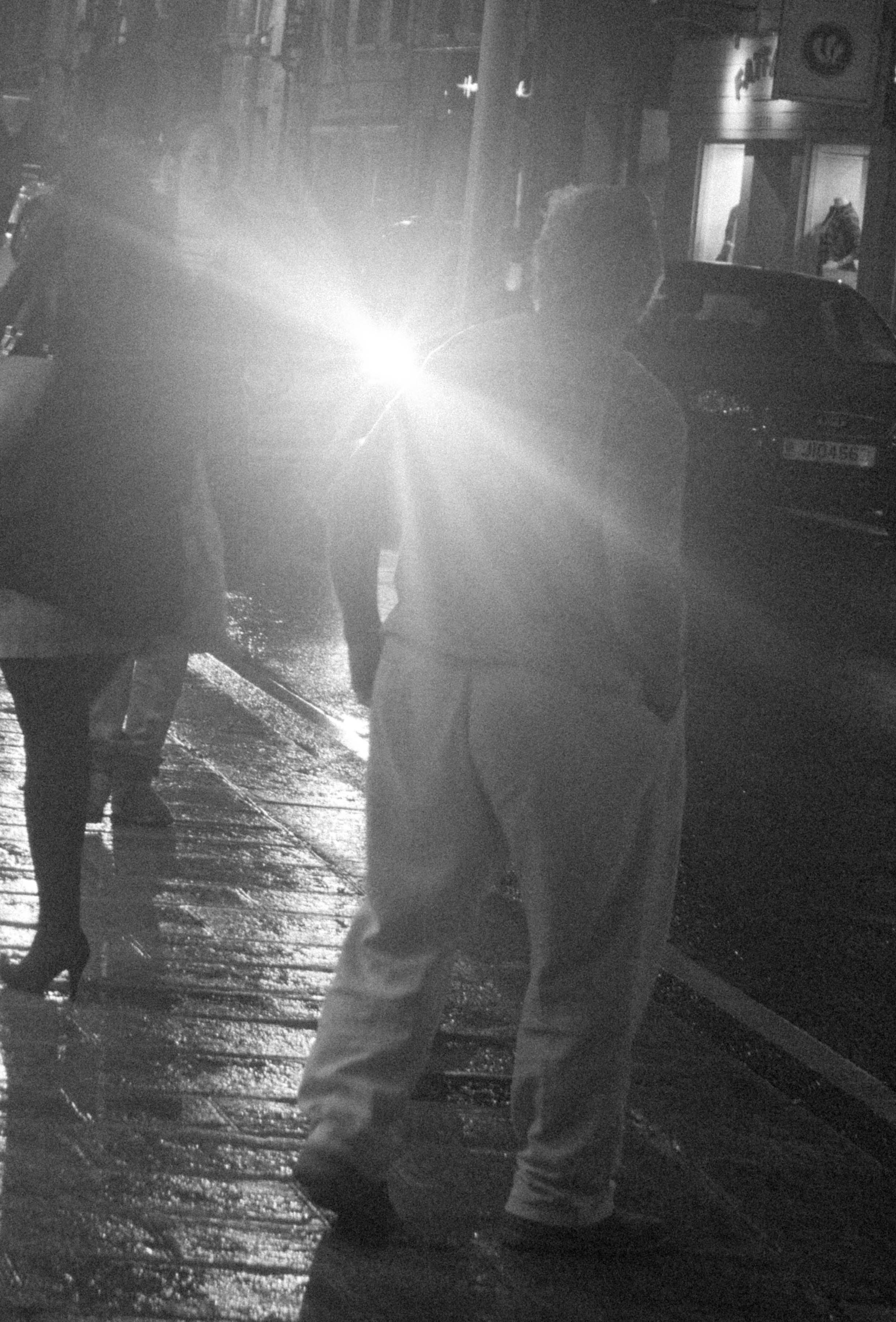
In this photograph I have used the artificial light from town at night to create a dimly lit photograph with little contrast in it.  The lack of light within the setting allowed for a contrasting bright light from a car to illuminate parts of the photograph and create a glare in the camera which creates a mysterious and intriguing subject at which the man in the photograph is looking.  If it was not for the glaring bright light, there would not be a very wide tonal range within the photograph as there would be no major source of light so the photograph is dark grey tones throughout except for this one spark of white.  I think that this white tone within the dark tones of grey add to the photograph by providing another viewpoint and provides a sense of confusion and distortion.  I used a deep depth of field in this photograph to ensure that the entirety of the photograph was in focus but this cannot be seen due to the glare of the car light distracting the viewing eye.  To capture this photograph with a grainy surveillance effect I used a shutter speed of 1/30-1/60 in order to allow some light to enter the lens from the dark environment.  I also used a very high ISO of 6400 to create the grain and conventionally bad quality of the photograph to create a unique composition.

There is no colour in this photograph due to the black and white filter that I have used. I have removed all colour from this photograph in order to convey the theme of surveillance and discretion within the photographs. The use of a high ISO mixed with the black and white effect allows for quite grey and documentary style tones which adds more mystery to the photograph as it is not very clear what the light is or what is going on in the composition. The grainy texture makes the photograph seem as if it was taken poorly, which is the aim of this shoot. The grainy texture creates character and feeling of a dark and disorientating environment to fit in with the surveillance theme. There is a slight 3D effect to the photograph due to the glare of the light separating the man in the foreground from the car in the background – this beam of light surrounding the man further creates a disorientating effect for the viewer, resulting in a slightly abstract composition.  Although I am breaking rules of technicality within this photograph, the man is placed along a vertical line of the rule of thirds but the main viewpoint, being the glaring light, is slightly offset from the centre which adds to the disorientating composition.

This photograph takes lots of inspiration from the work of Henrik Malmstrom’s ‘A Minor Wrongdoing‘ in which he photographs people in the streets using a very high ISO along with a cheap camera to create grainy surveillance-type photographs that are different to the conventional standards of a good photograph.  The photographs that would result from this are similar to mine in the sense that they are dark, grainy and have a sense of mystery and secrecy around them.  Lewis Bush once said that that “the camera technology of today means the real skill and the real statement sometimes lies in taking a wilfully ‘bad’ image”, which is exactly what I am attempting to do with this photograph – create a photograph which is interesting and unique but does not sit within the conventions of photography technicalities.

As with what I think that Malmstrom is trying to convey throughhis photographs, I am questioning whether the technicalities and conventions of society, photography and day-to-day life are necessary and whether people stick to them when it appears that no one is watching them. In this photograph I have photographed a man without revealing his identity, suggesting that he represents society and everyones ongoing ordinary lives.  The photograph observes how society moves and composes itself whilst getting from A to B and also how society presents itself and reacts to certain situations – such as the man staring into the glaring headlights.  This photograph is my attempt of showing people in their own world minding their own business but being watched and recorded without knowing – which can also link to controversy about how closely society is being watched by organisations such as the government.

The Rule of Technicality – Henrik Malmstrom

Henrik Malmstrom is a Finnish photographer currently living and working in Buenos Aires, Argentina.  Malmstrom self-published his first book in 2010, titled On Borrowed Time‘.  He is the co-founder and curator of the Müllkellergalerie which is a premium art gallery located in a garbage room in Hamburg, Germany.  Malmstrom has won over 15 awards since 2008 as well as being shortlisted for the best photobook of the year in 2016.
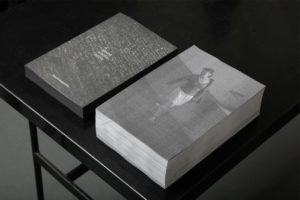
I think that Malmstrom has a very interesting approach in his book ‘A Minor Wrongdoing‘ in which he photographs subjects at night with a very high ISO to create grainy and underexposed photographs.  In this book Malmstrom would photograph people that he saw from the window of his living room using a cheap digital camera. He would create the effect of a surveillance camera by setting the ISO abnormally high.  The book that came from this replicates a messy police report archive with the grainy monochromatic photographs creating a sense of abstraction due to their unconventional appearances. The photographs in this book were taken between 2011-2014, Malmstrom’s synopsis of ‘A Minor Wrongdoing’ says that the project records “the last remains 
of street life in an urban area that is currently undergoing
fierce gentrification after recent official law enforcement
against street-based prostitution”.
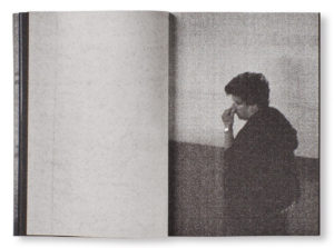
I think that Malmstrom’s defiance of the rule of technicality is very interesting and unique as it creates a composition that most photographers would not even attempt to make.  Whilst having an abstract and unconventional aesthetic in this project, Malmstrom has managed to make this work still look good whilst breaking the rules of technicality. I plan on taking inspiration from Malmstrom’s work when exploring breaking the rule of technicality as I think I can successfully combine documentary/street photography along with this style to create something that I would not usually attempt.

Analysis

In this photograph, Malmstrom has used natural lighting, or the lack of it, in order to create a very grainy and grey photograph which replicates the effect of a surveillance camera. Within this photograph there is not a wide tonal range due to the grey and surveillance nature of the photograph which creates an almost old-fashioned effect within the photograph. The photograph is not a very high contrast either due to the dark setting that Malmstrom is going for, but the low contrast works for the style of photograph. Malmstrom will have used a shutter speed of around 1/50 – 1/100 with a very high ISO of 1600 or 3200 as the idea of this project was to capture grainy photographs of people in the dark. Technical quality was not a key aim of this photograph, which can be seen, as Malmstrom aimed to create these technically incorrect photographs. The high ISO allows for the grainy texture to be created which adds a lot of character to the photographs and adds to the dark and mysterious setting.

There is no colour in this photograph – only black and white. This black and white theme further conveys the theme of surveillance and discretion within the photographs. The mixture of the high ISO grainy photograph with the black and white effect means that the tones are also very dark and mysterious – these dark tones make the setting have a sinister and secretive vibe meaning there could be more to what meets the eye with this subject. The grainy texture makes the photograph seem as if it was printed poorly – which again breaks the technical rules of photography, but this grainy texture fits in to further push the idea that this is a mysterious photograph. The eye is immediately drawn to the cigarette being lit in the subjects mouth as it sparks to be the whitest part of the photograph, contrasting from the regular grey tones without. This white spark illuminates the side of the subjects face to give a slight sense of the subjects identity without giving too much away, leaving more mystery in the photograph. The subject is also placed along one of the vertical lines of the rule of thirds – this may be intentional but also may not be, either way it makes the photograph more aesthetically pleasing for the viewer. There is not much of a 3D setting to the photograph due to the dark and grey tones with little shadowing.

This photograph was taken from Malmstrom’s book ‘A Minor Wrongdoing‘ in which he photographs subjects at night with a very high ISO to create grainy and underexposed photographs.  All of the subjects within the book were photographs from Malmstrom’s living room window which adds to the sense of mysteriousness and surveillance.  On the final outcome of the book in which this photograph was placed, it replicated a messy police report archive which shows that the surveillance theme conveyed throughout the photographs is intentional.

I think that through this photograph and the other photograph from his book  ‘A Minor Wrongdoing‘, Malmstrom is trying to question whether the technicalities and conventions of photography and society that we are supposed to conform to really matter in the grand scheme of things.  I think this because Malmstrom is photographing unaware subjects whilst they are in their own world, not worrying about conforming to society’s standards or trying to impress people.  Through doing this Malmstrom is showing what people are really like when they are not around and so how we should be all the time.  Malmstrom further presses this idea by not sticking to the normal conventions of photography through grainy, low contrast photographs caught with an abnormally high ISO.
 

The Rule of Technicality

A Minor Wrongdoing, 2015. Henrik Malmström.

The word ‘rule’ is defined as one of a set of explicit or understood regulations or principles governing conduct or procedure within a particular area of activity. This shows that the word rule is linked to control and standards – rules govern what we should and shouldn’t do.  When looking at photography, the rules can often be what is acceptable to photograph and what is not, where a subject should be placed, and which camera settings should be used to capture the technically correct photograph.  Below is the origin for the word ‘rule’. It originated from the latin word ‘regula’ for ‘straight stick’ and progressed through French in order to come around in the Middle English language.

The word ‘technicality’ is defined as ‘a point of law or a small detail of a set of rules, as contrasted with the intent or purpose of the rules.’  This shows that technicality links into rules as they are small details which should be set a certain way in order to stay in line with the rules governing. In terms of photography, this is the settings of the camera; the ISO, the shutter speed, the aperture and the exposure.  The technicalities and rules of camera settings suggest that photographs should be exposed correctly, be in focus and be aesthetically pleasing but technicalities can be changed in order to challenge these rules.

By El-Tantawy, from the Egyptian revolution

In Lewis Bush’s article ‘Rule Breakers‘, he explores eight rules within photography that are worth breaking. One of these rules is the rule of technicality.  Bush says that “the camera technology of today means the real skill and the real statement sometimes lies in taking a wilfully ‘bad’ image”.  By saying this, Bush is trying to convey the idea that it is alright to go outside the conventions of ordinary camera settings in order to create experimental photographs that would not normally be deemed aesthetically pleasing, but by using unique technicalities, photographers and artists such as Laura El-Tantawy and Henrik Malmstrom have used these technicalities to show creative expression.  For example, El-Tantawy renders photographs of the Egyptian revolution with long exposures to express a personal vision of the event. El-Tantawy says “It was about responding spontaneously to the events around me” when speaking about the photographs as they showed what she felt and what she saw in the moment.

Ideas For Exploration

Whilst exploring the rule of technicality I will be looking at altering camera settings to create unconventional photographs that are both interesting and unique.  I can take inspiration from both El-Tantawy and Henrik Malmstrom for this investigation as they both create unique and unconventional photographs. I think that Malmstrom has a very interesting approach in his book ‘A Minor Wrongdoing‘ in which he photographs subjects at night with a very high ISO to create grainy and underexposed photographs so I will continue to study Malmstrom. I will be able to explore street photography/documentary photography through this whilst also exploring the people within Jersey. Whilst doing this I can also look at creating out of proportion photographs or ones which do not consist of a conventional composition to further explore the idea of breaking the rule of technicality.

Whilst focusing on taking inspiration from Malmstrom, I may also look at changing technicalities which Malmstrom did not, such as shutter speed and aperture in order to make my photographs more unique and interesting. I hope through exploring this that I will be able to show my understanding of the rule of technicality and my understanding of the camera technicalities and conventions.


My Response To Lewis Bush

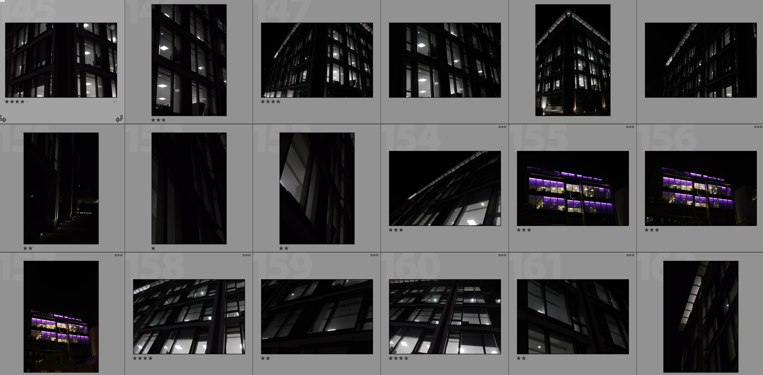
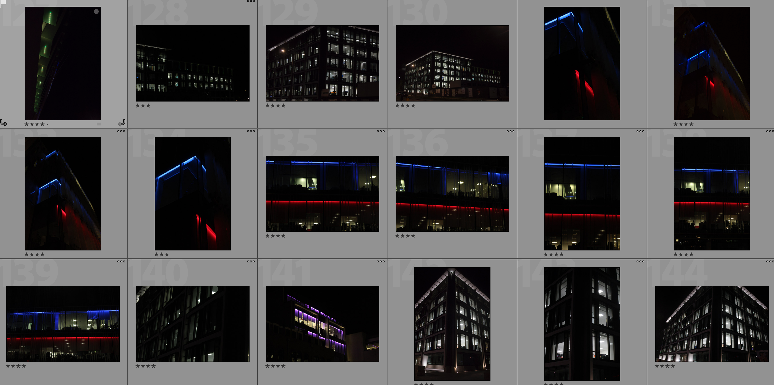
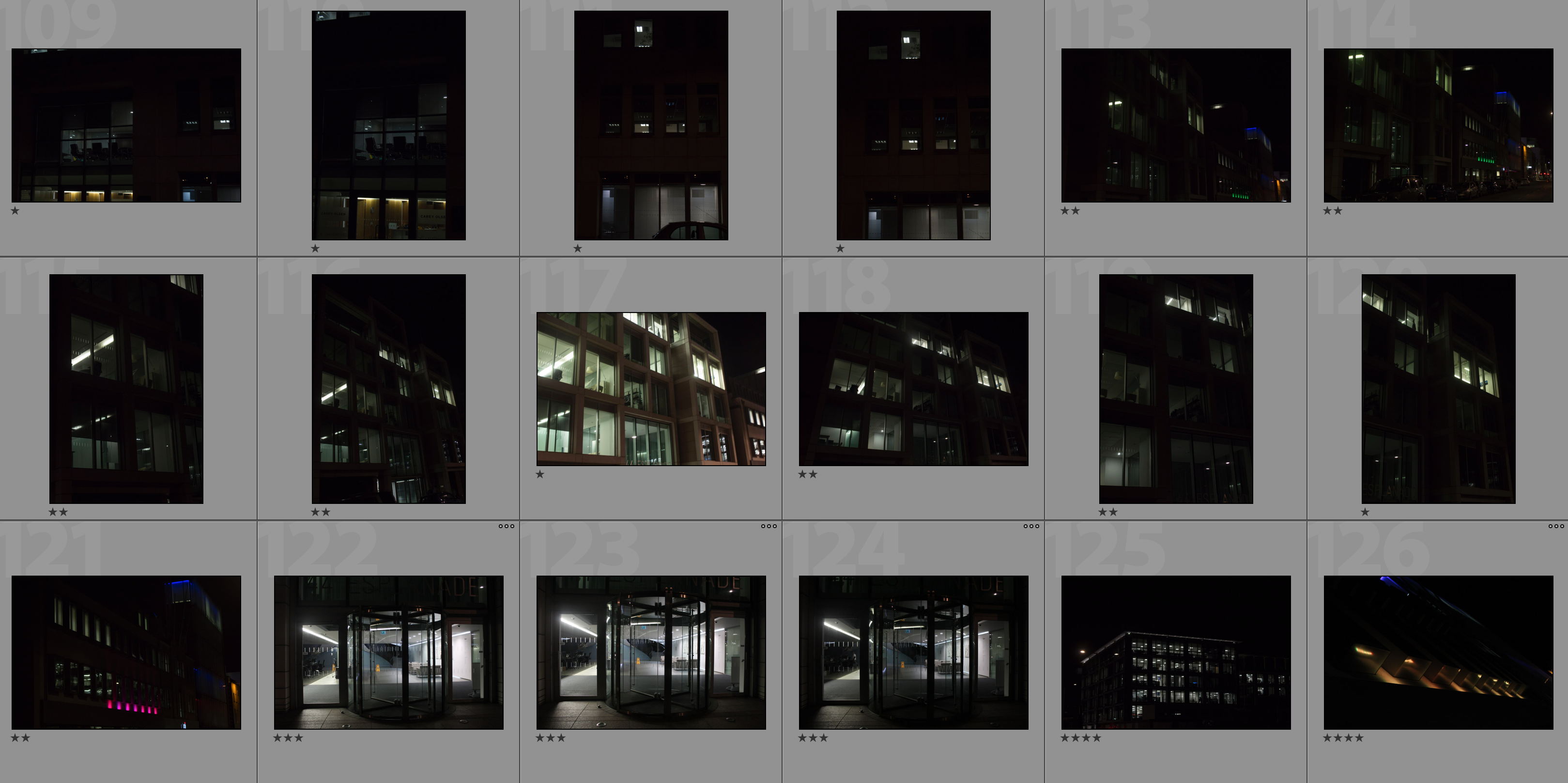
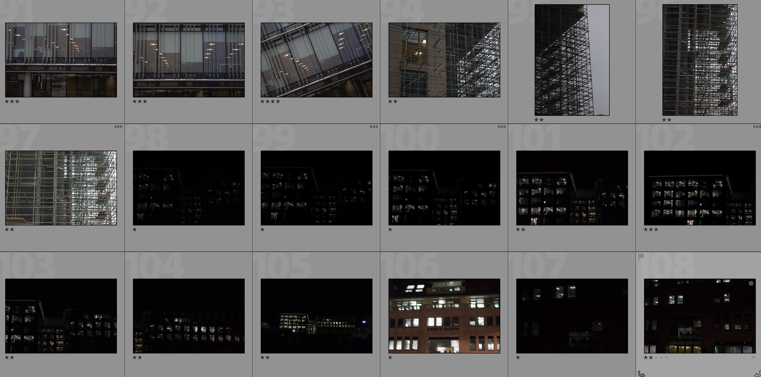
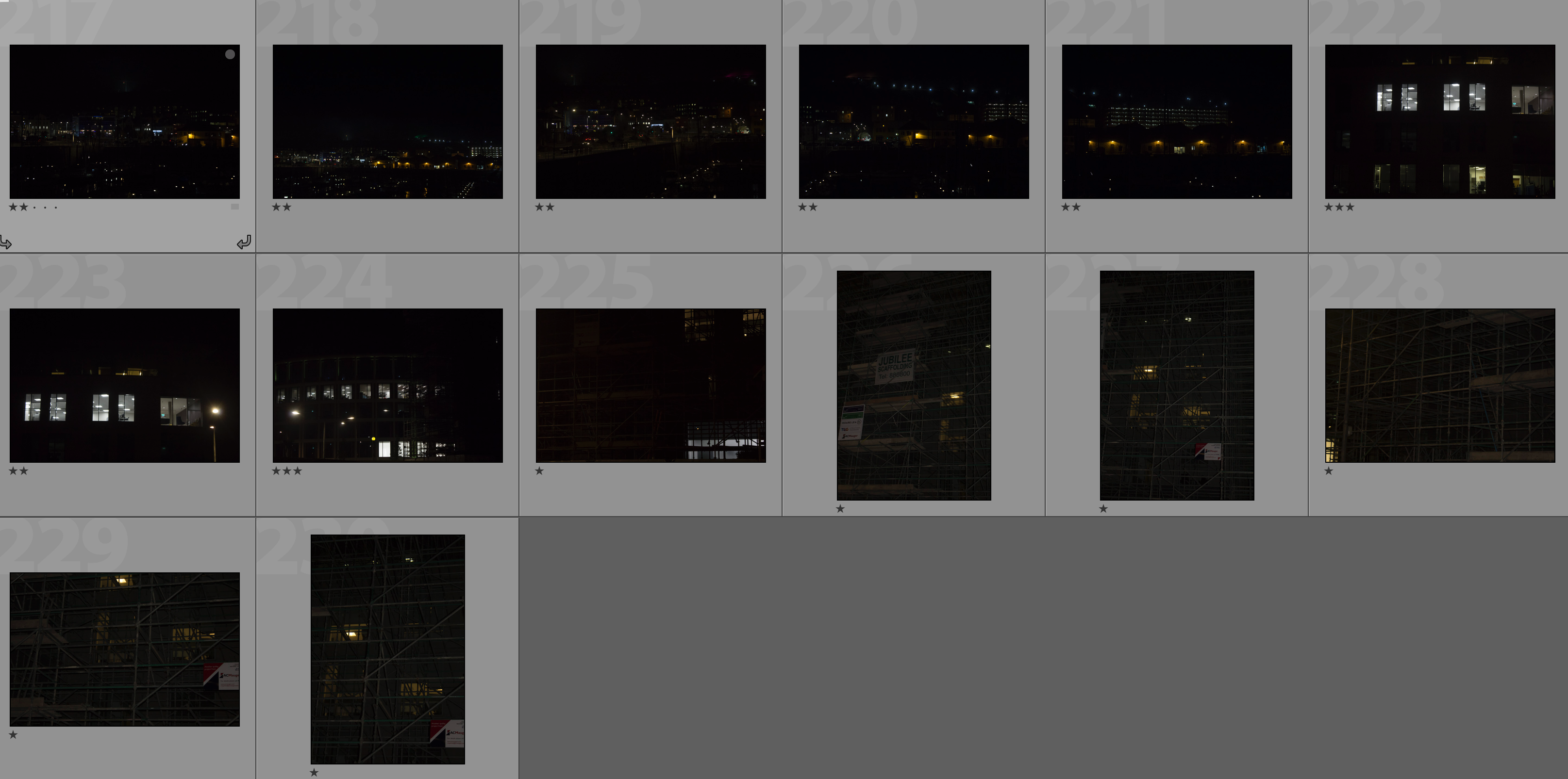
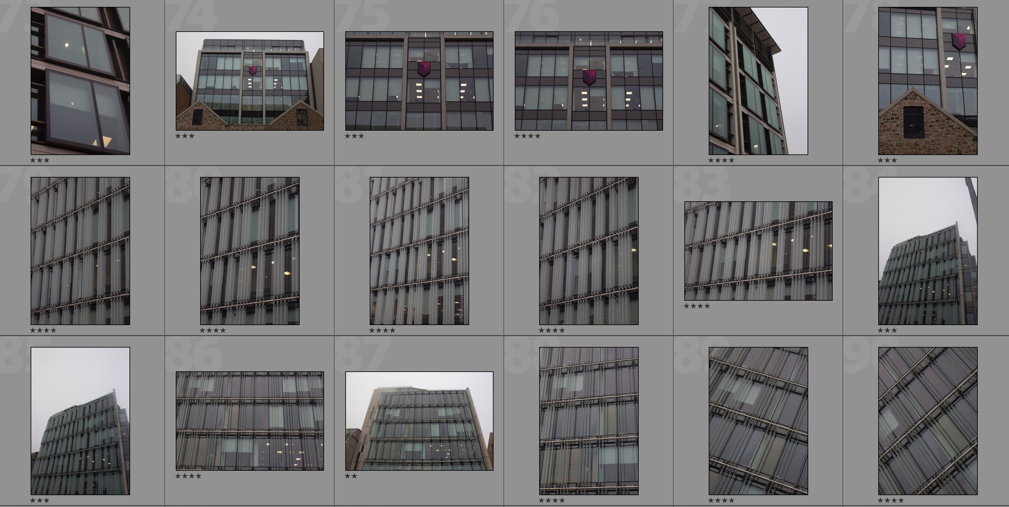
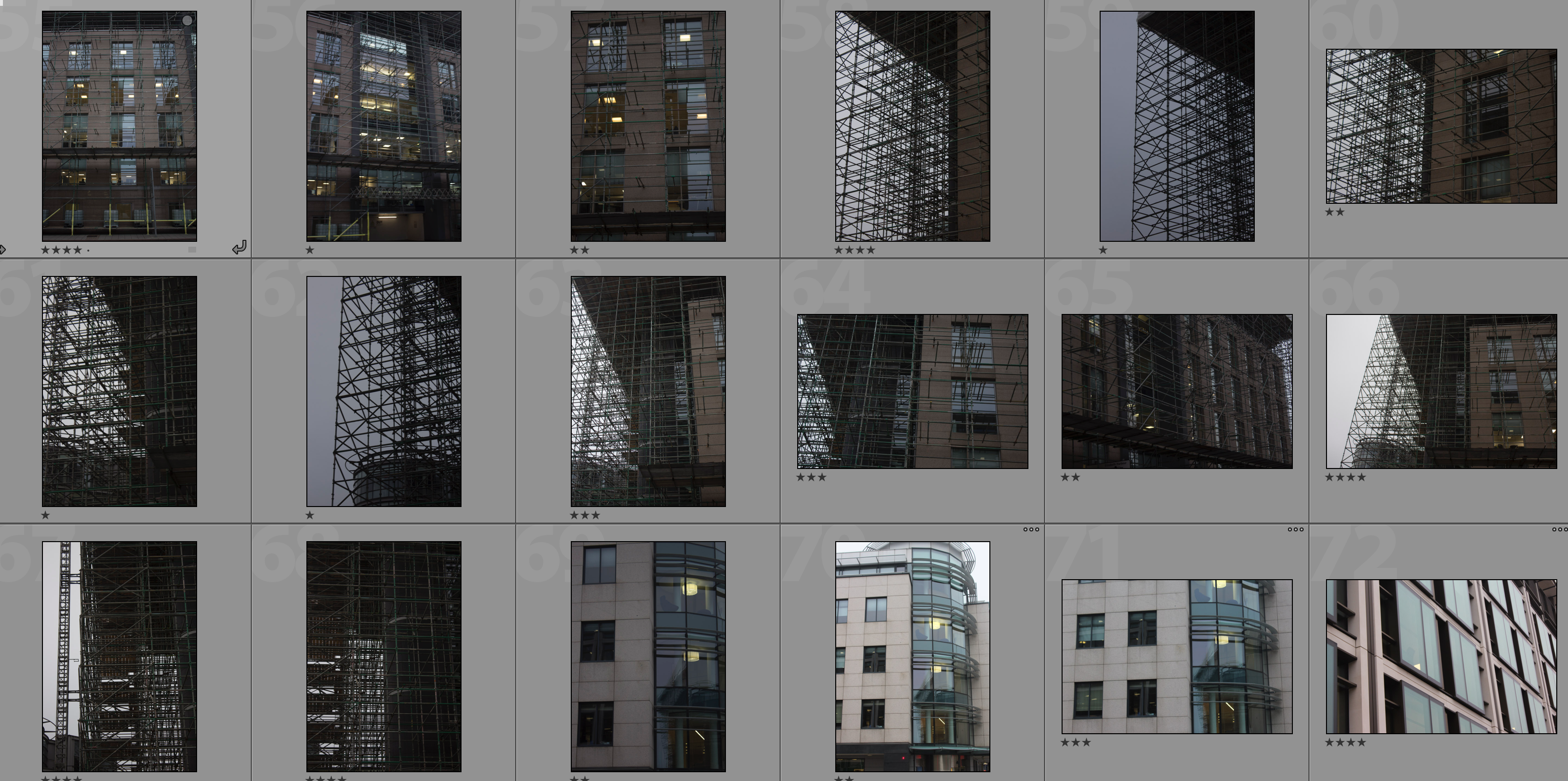
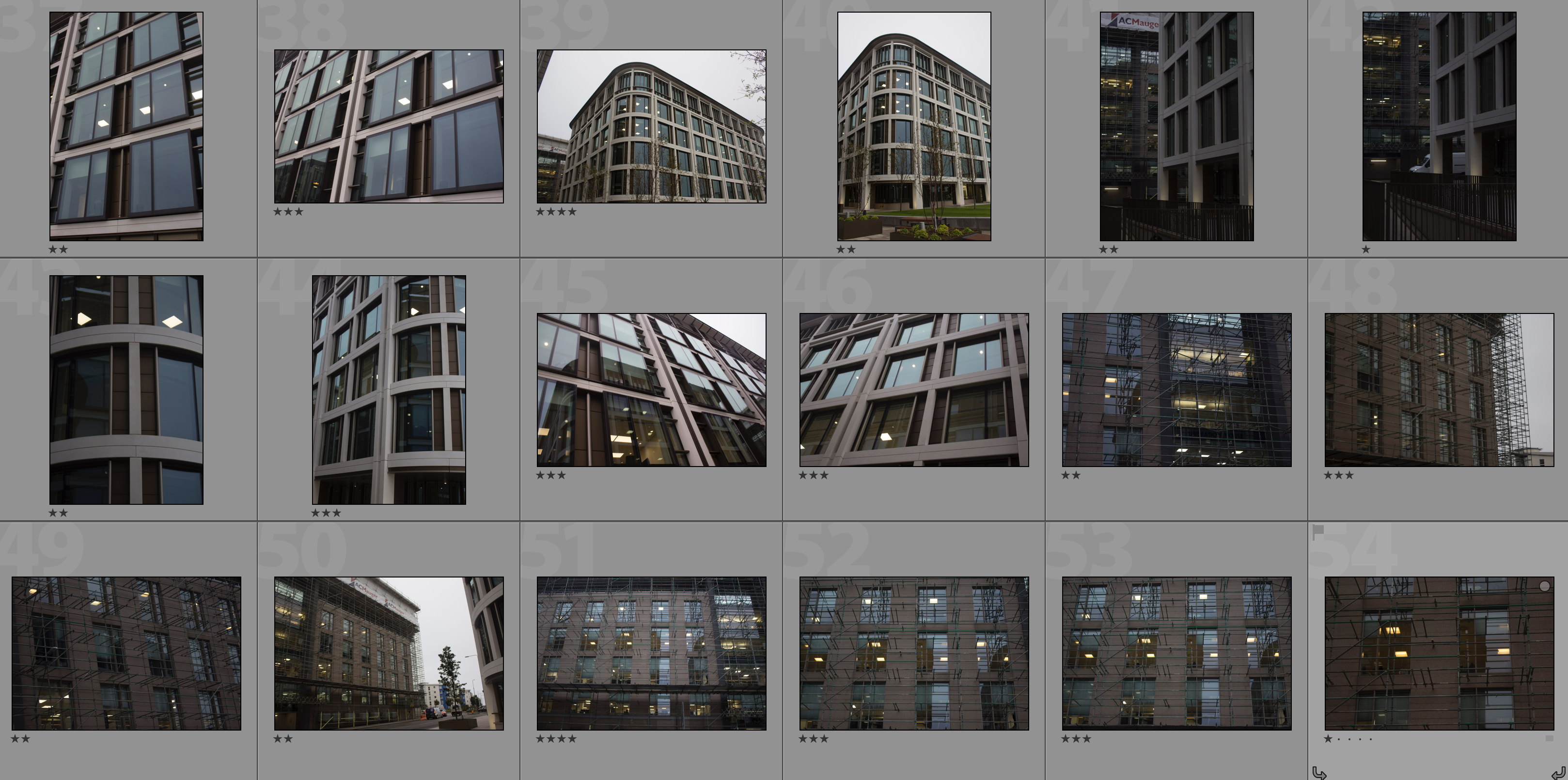
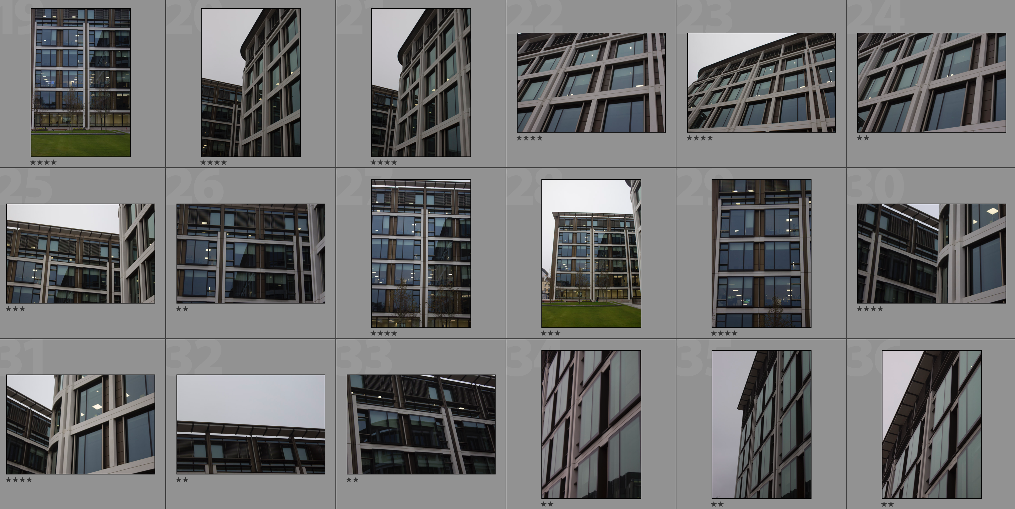
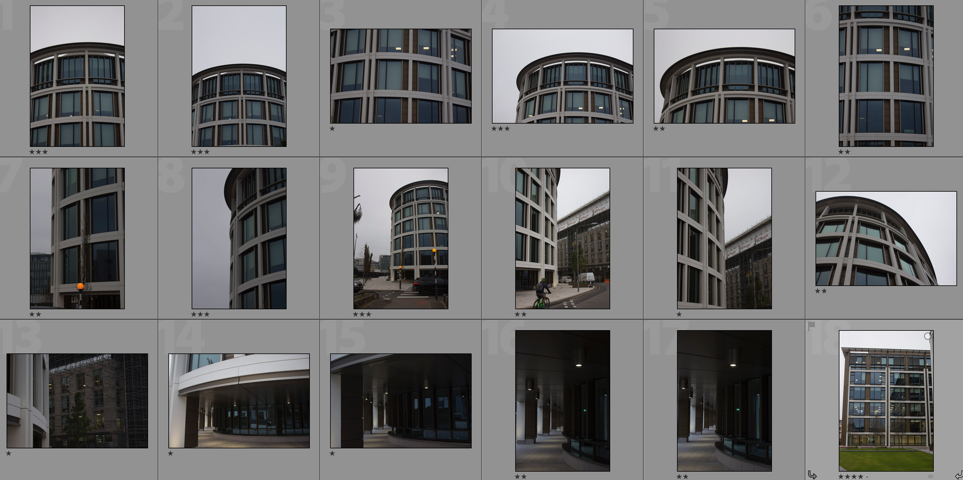
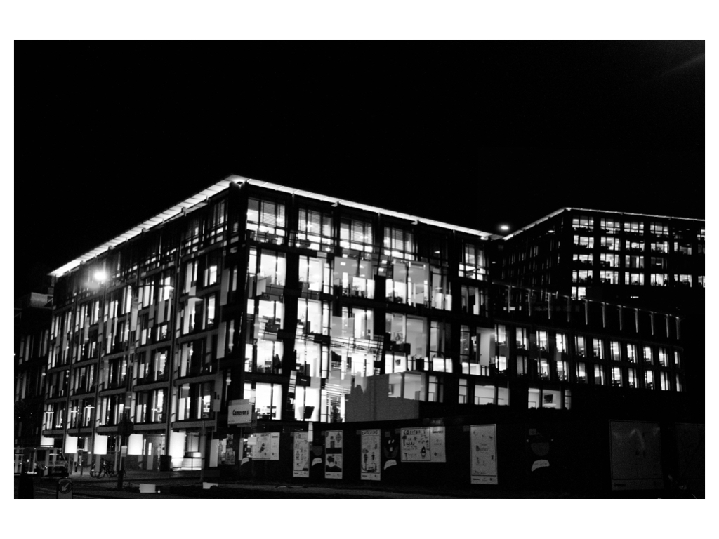
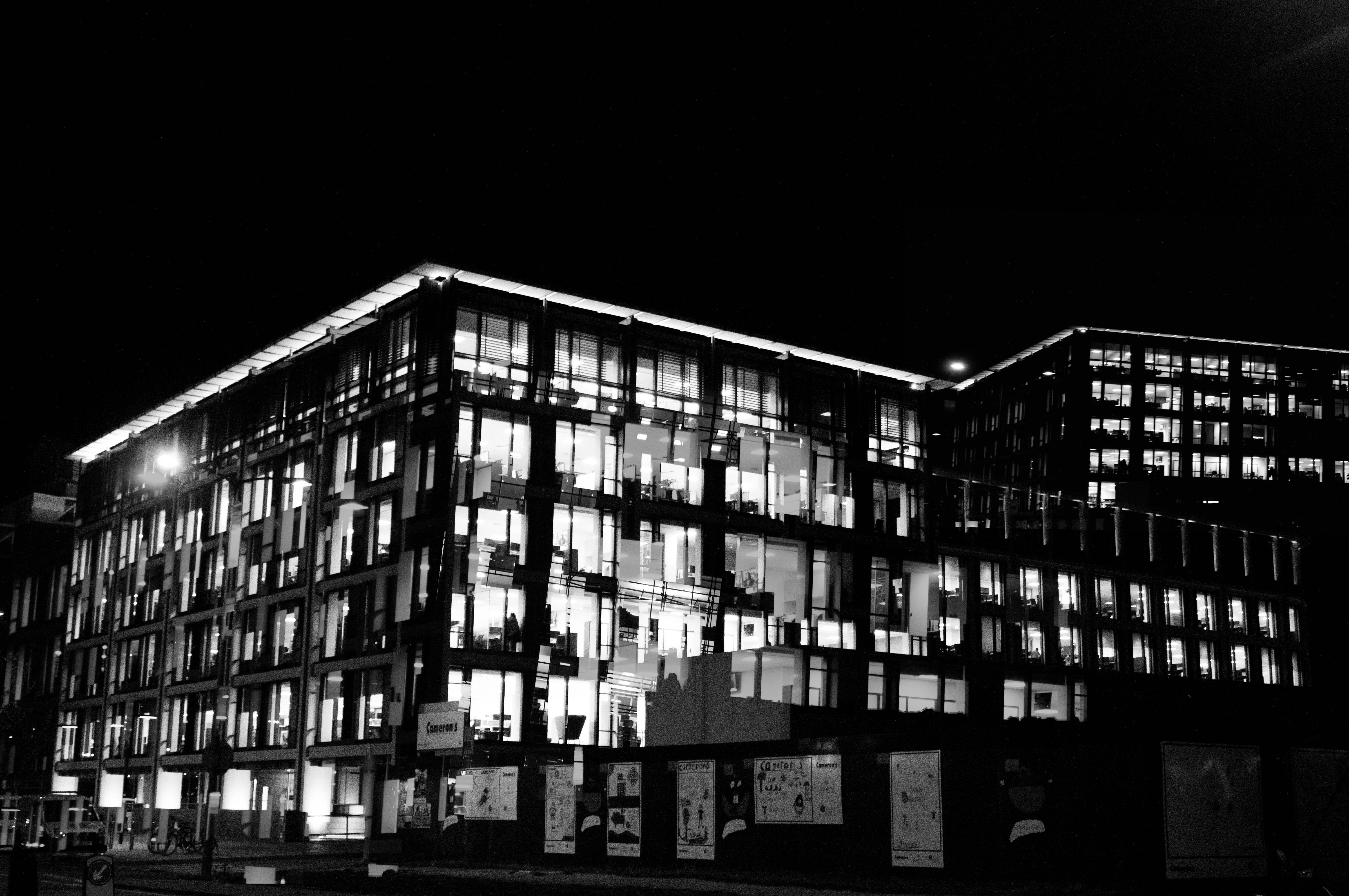
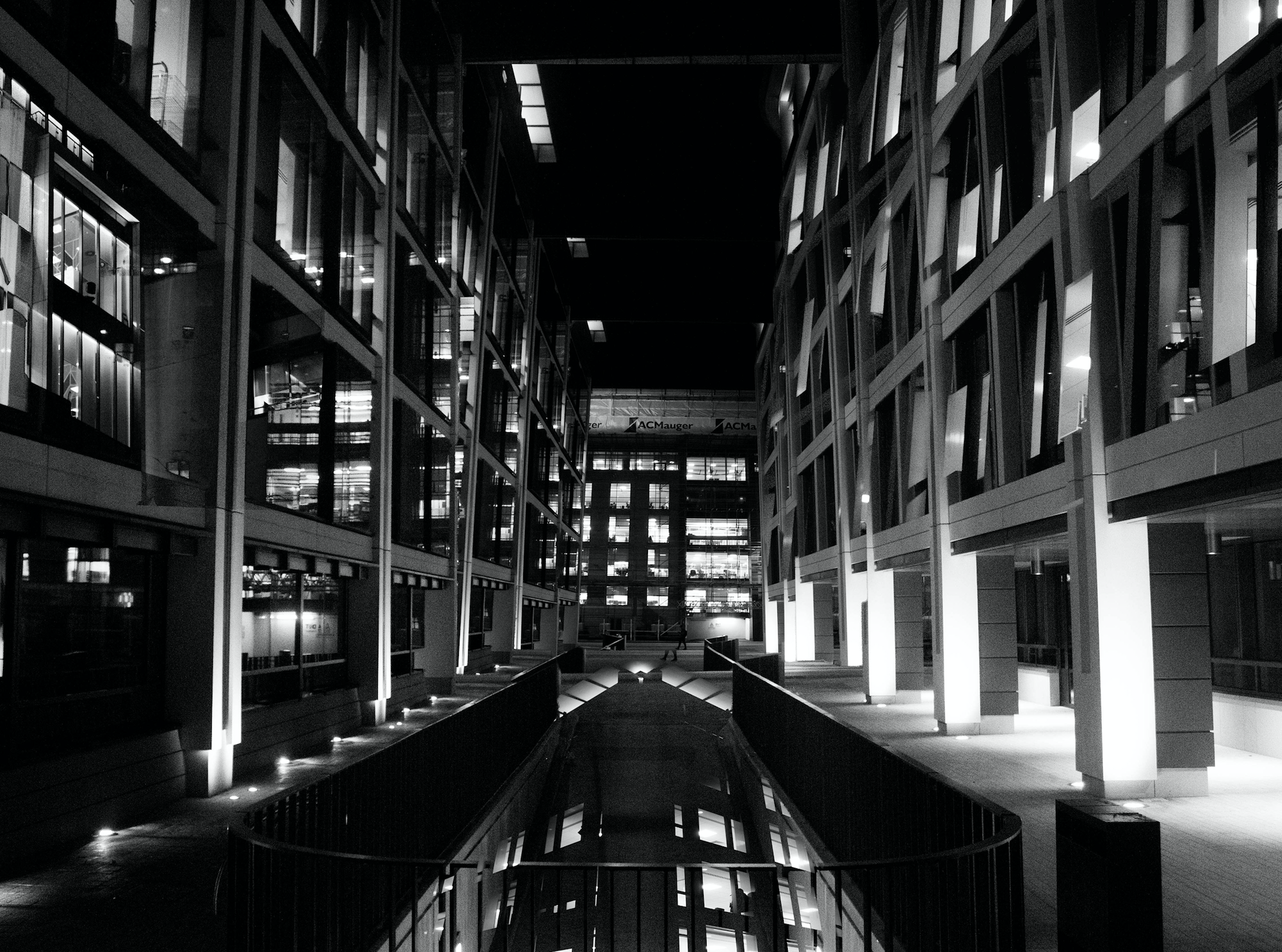
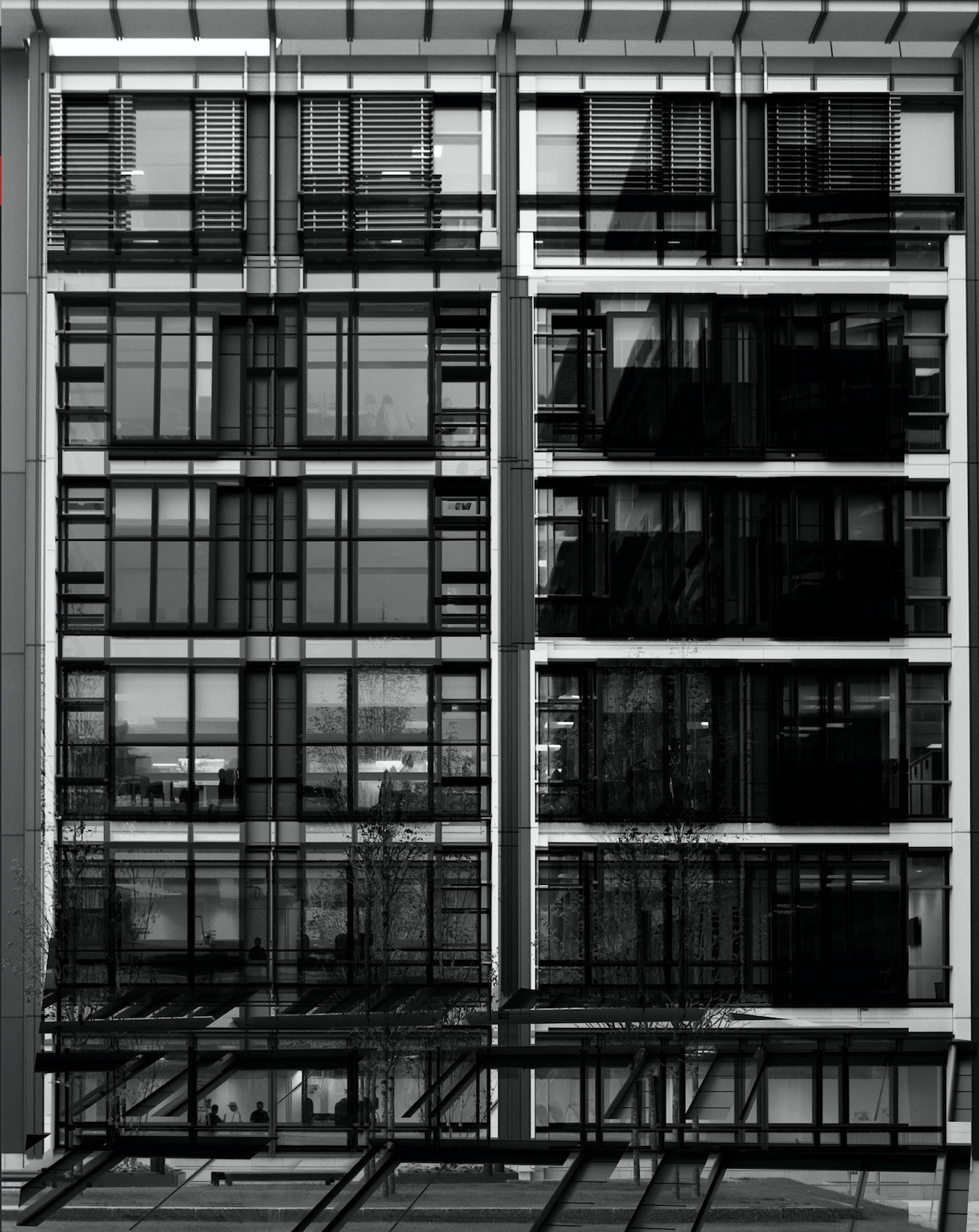
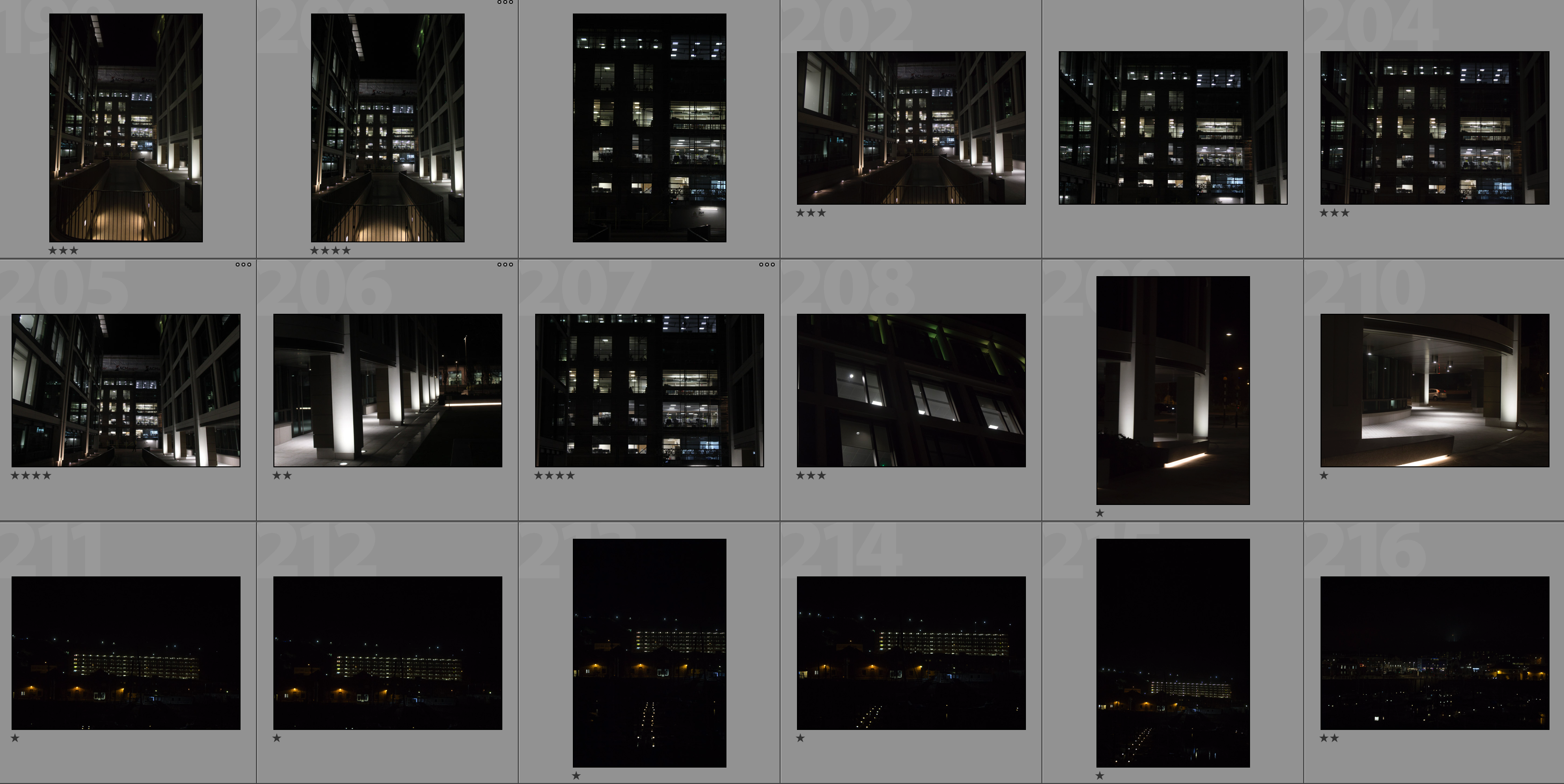
In my response to Lewis Bush I am going to be photographing the financial sector within St. Helier in both day and night and then creating a double exposure effect with these photographs in photoshop. The inspiration for photographing the financial sector comes from Bush’s ‘Trading Zones‘ and the use of double exposure comes from his project ‘Metropole‘ in which he used this technique throughout. I will be carrying out two photoshoots for this response – one in the daytime and one at nighttime. This will allow me to be able to work with a wide variety of photographs in order to create different effects and settings within the edits.
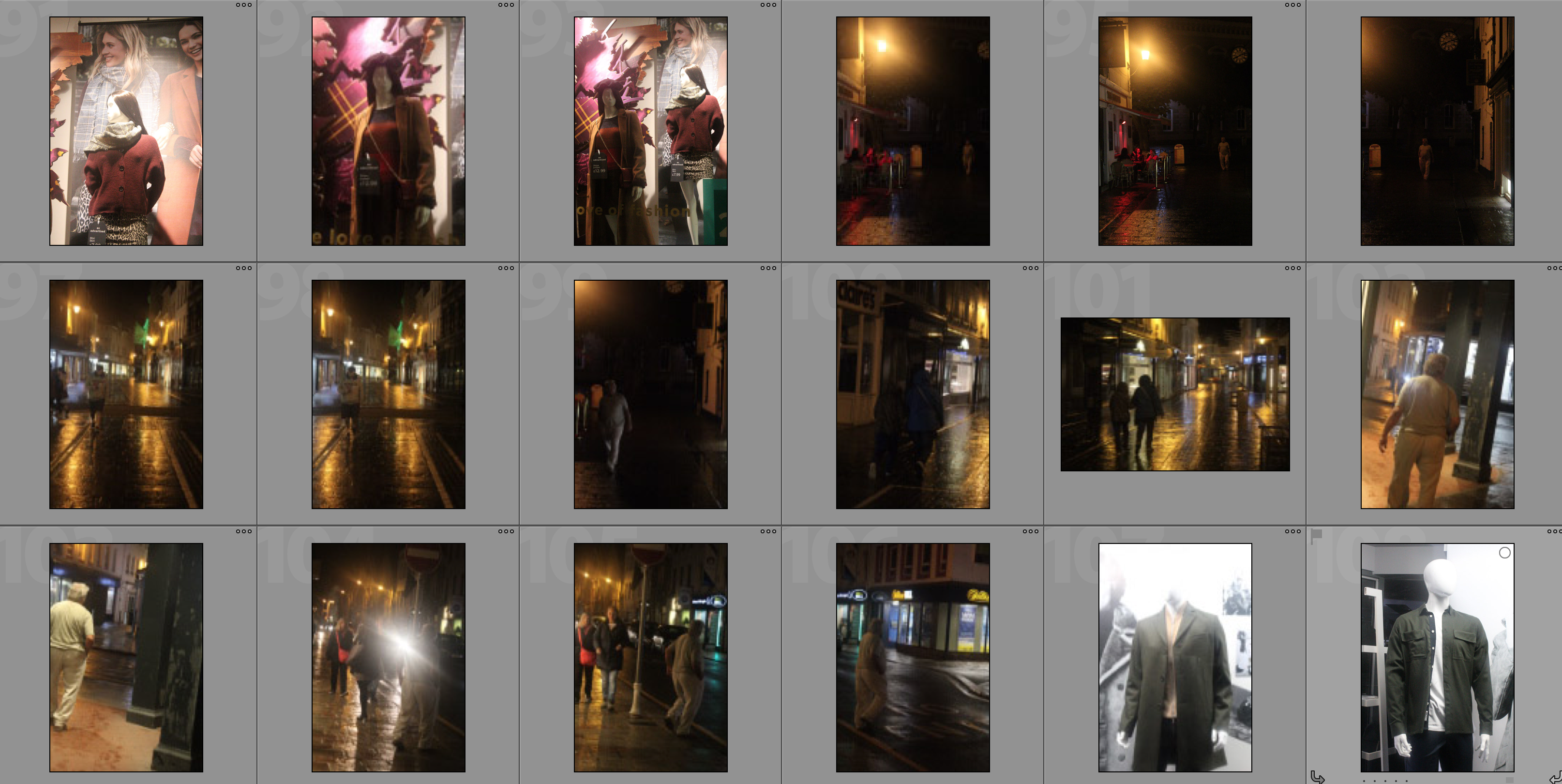
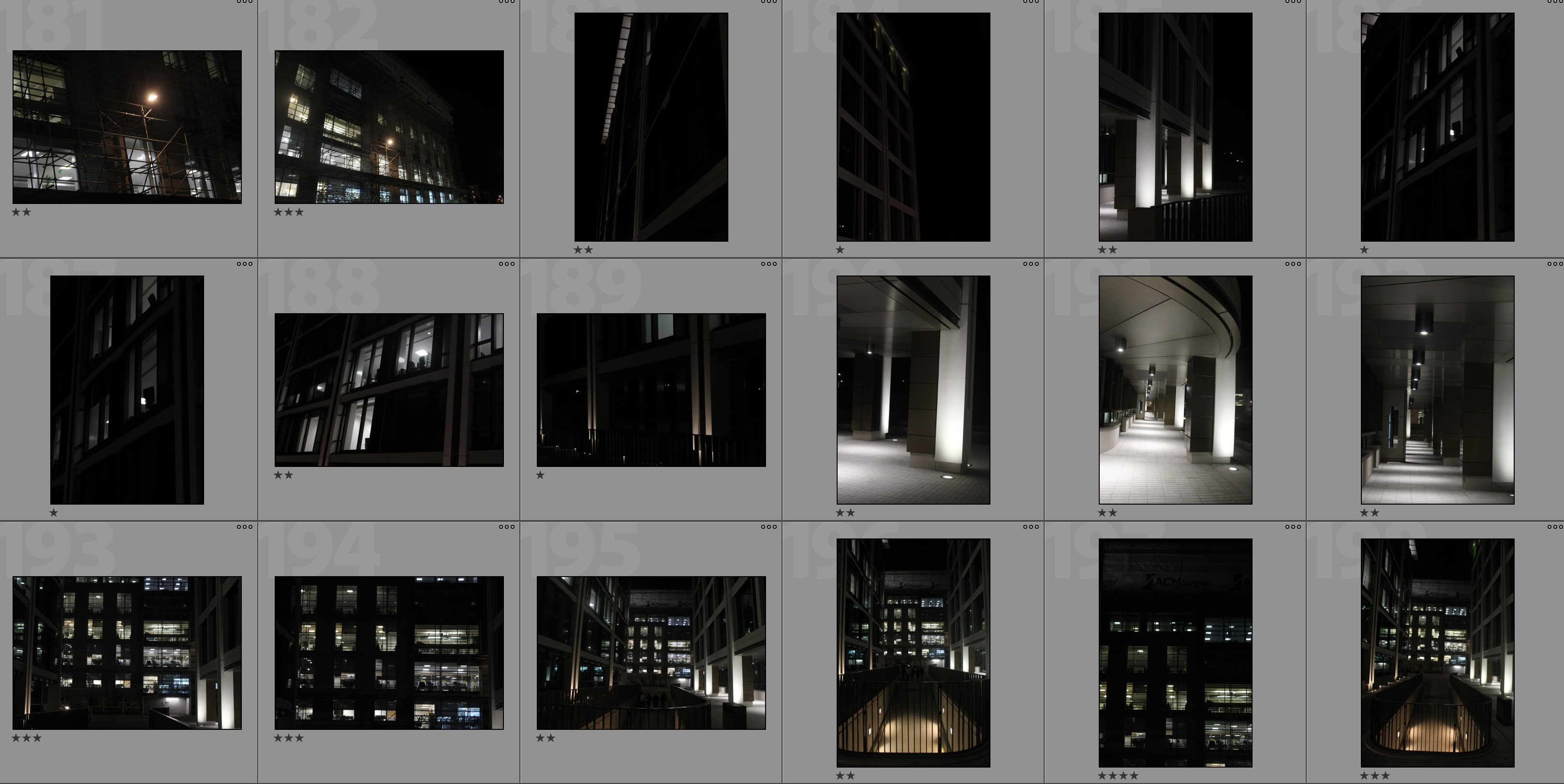
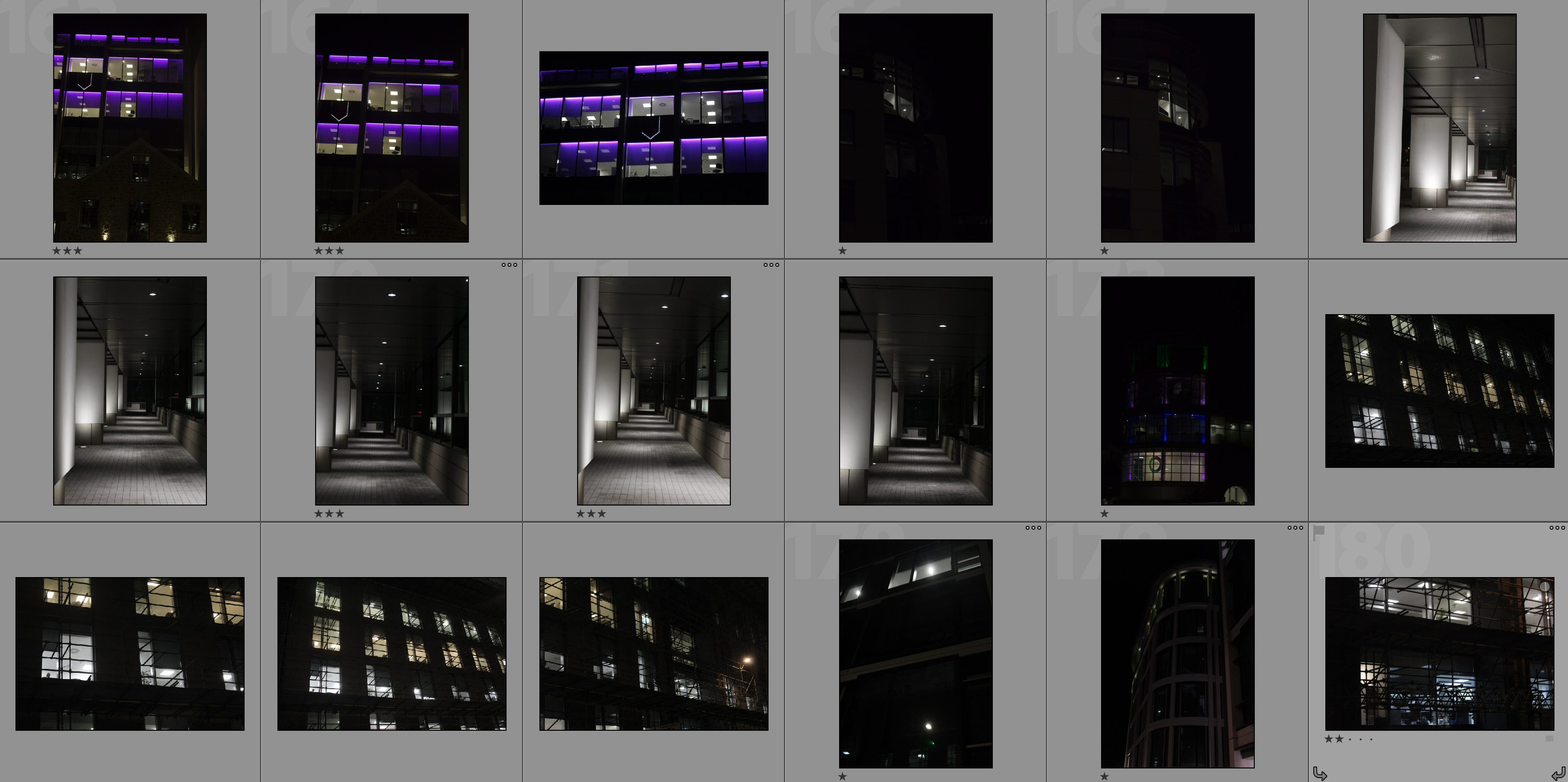
Contact Sheets

Editing Process

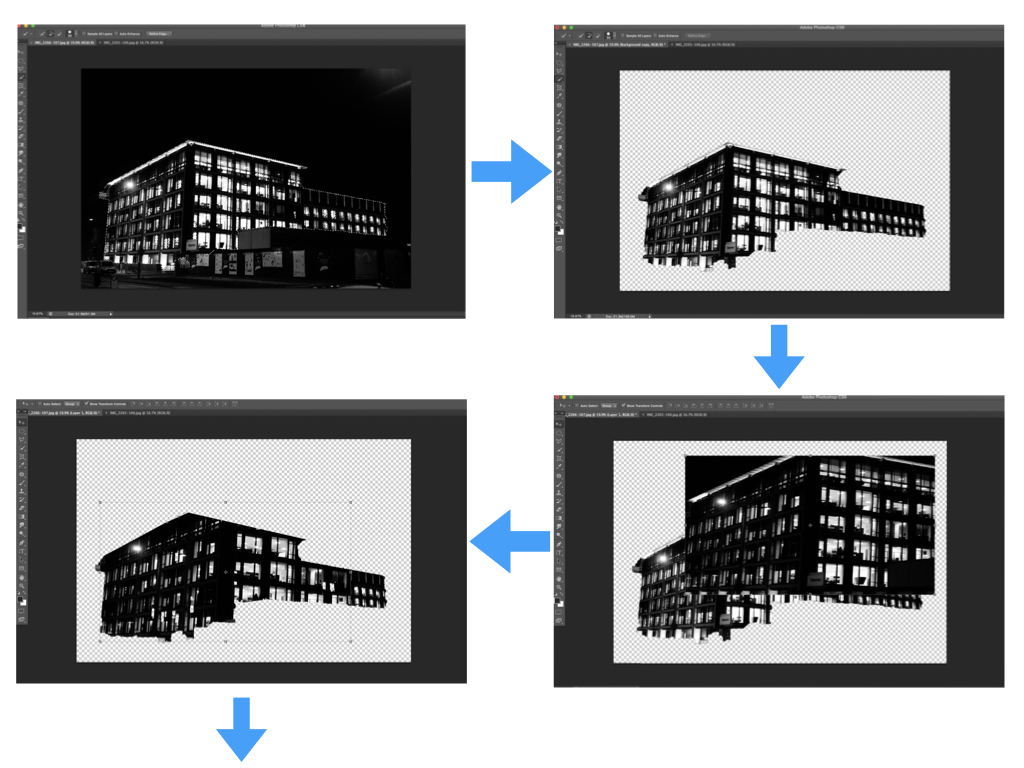
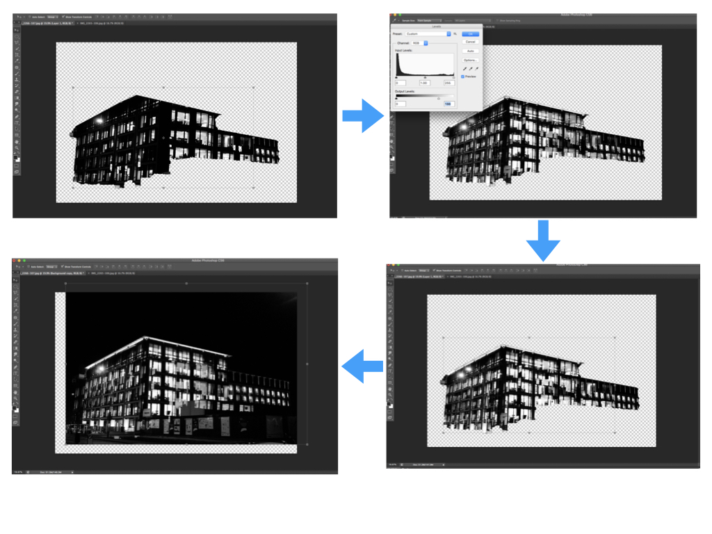
I carried out the double exposure editing on photoshop. I started by using the quick selection tool to separate the building from the rest of the photograph and clicked the ‘refine edge’ button to create a blank background. I then placed the second photograph over the base photograph and added a layer mask in order to shape the second photograph in line with the base photograph. After this I used command-L in order to edit the levels of the second photograph and so changing the black/white/grey properties. Next I selected the blending option as ‘lighten’ to allow the two photographs to merge. I repositioned the second photograph over the base photograph to create a double exposure effect then brought the background forward to reintroduce it to the composition. Finally I repeated this with multiple photographs to create a disorientating composition.

My Edits


Analysis

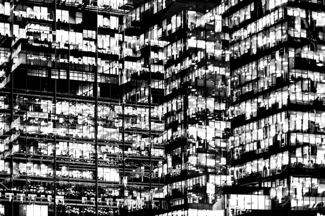
In this photograph I have used natural lighting in order to capture the natural shadows and contrast of the new finance centre in St. Helier.  This natural lighting allowed for reflections in all of the windows which creates a variety of tones throughout the composition. This variety of tones creates contrast between the dark black frames and the grey tones of the windows.  I used a deep depth of field to capture this photograph to ensure that every detail was in focus including the reflections in the windows.  By layering multiple photographs over the top of the original I have been able to create dark frames and dark shadows to contrast with the lighter tones – I think that this create a much more dramatic and slightly abstract photograph. I used a shutter speed of 1/60 to capture the original photograph along with a fairly low ISO of 200 in order to ensure that the photograph is exposed enough but is as high quality as possible. This high quality photograph allowed for the similar photographs overlayed on top to blend in well to provide more contrast and structure to the photograph.

There is no colour in this photograph as I thought that the black and white filter really allowed the black dark tones to come out to provide more contrast and shadows within the photograph. The lack of colour also allows the viewer to focus on the dark lines and paths running throughout the composition and so emphasising the disorientating intent of the photograph. The tones throughout this photograph are mostly gray with streaks of black running throughout it – there are not many bright tones in this photograph which I think works well as the grey and black tones allow the original photograph and the photographs on top to blend well together to create a photograph that is familiar to someone from Jersey but unfamiliar at the same time. From the way that I have cropped this photograph using perspective crop it is a very 2D and flat photograph except for the photograph overlayed in the bottom third of the photograph. This bottom third of the photograph appears to come towards the viewer which sends the rest of the photograph to the back, ultimately creating a sense of confusion within the viewer. The windows and lines throughout the photograph are very aesthetically pleasing as they create a pattern of squares and lines, making the photograph more intriguing. There is no immediate viewpoint that they eye is led to due to the abstractness and pattern throughout the photograph. The line straight down the middle of the photograph creates a sense of division within the composition as well as a sense of satisfaction due to the organisation of the placement.

I took inspiration for this photograph from Lewis Bush’s project ‘Metropole‘ in which he looked at the collapse of the British Empire and how in its place globalised capitalism grew as London has been rebranded as “a city of demolition, cranes, and glittering new high rises”.  ‘Metropole’ aims to record the effect of this on London through the form of documentary photography and I aim to show the effect of how Jersey has changed with the construction of the new financial centre and all the new flats and other offices within the area. St. Helier has changed drastically over the past couple decades and it may seem as if it is moving too fast for some of the residents that have lived through these stages. This photograph was taken as part of a shoot of the new financial centre, I took the original photograph and layered multiple photographs of the same centre over the top to create a disorientating effect.

I have attempted to recreate the double exposure that Bush used in his ‘Metropole‘ project in order to convey the idea that as the financial centre grows and as construction within the area goes on at the rate it is, the people of St. Helier are becoming more lost and disorientated as this is no longer the St. Helier that they’ve lived in for all of these years.  Bush used this effect in order to create the “sense of loss that many Londoners feel” in the big city. This theme of a feeling of loss within the city links to the genre of ‘political landscape’ as it looks at both the present and past in St. Helier showing how it has changed and how the residents of St. Helier are feeling about it all.  I think that the government of Jersey is focusing too much on construction and not what would really benefit and satisfy the people of Jersey.