All posts by Conor H

Filters

Author:
Category:

Tableau/Creative Portrait – Homework Assignment

Planning

Task – Take 100-200 photos that show your exploration of either tableau or other creative approaches to portraits.

Models/Props – For my model I will use 1-3 people in the lens at a time to create more intense photographs. My only prop will be paint on the models’ face which I will edit to create a more intense colour afterwards.

Camera Settings – I will use a fairly low shutter speed of 1/10 to 1/60 to allow more light to enter the lens from the dark environment when using a black background. I will use a higher shutter speed of 1/60 when using a white background. I will use a low ISO of 100 or 200 to keep the image high quality. I will use a shallow depth of field to create a soft blur in the background.

Lighting – I will be using red head lights, spotlights, natural light and flash to capture a wide range of images. I will be using red head light for soft light, white backdrop for some lighter images, a black backdrop for darker images,  a spotlight for harder light, a reflector to reflect light into the model’s face and gel filters to change the colour of the light

Location – I will do my shoot in the school studio.

Context – I will be using the school studio to capture a range of images in different styles and different lighting to create different amounts of contrast and shadows in the photographs.

Concept – To capture studio portraits looking at both identity and lack of identity.

Johnathan Ducruix

Image result for jonathan ducruixImage result for jonathan ducruix

Ducruix is a  Lyon-based digital artist who goes by the pseudonym Me&Edward. He has a diploma in 2D and 3D computer graphics. He says that he has always been attracted to the world of fashion and design which is obvious in his work. Ducruix says that he has a more impulsive style of work – when he has a specific idea in mind he will work on it right away. His spontaneous projects are often the ones that satisfy him the most. The pseudonym ‘Me&Edward’ comes from the fact that he wanted to dissociate the I – as a photographer from the I – as a human being. I hope to take inspiration from Ducruix’s style of editing and photography in my response – especially the removal of facial features.

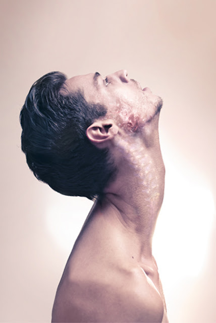
Johnathan Ducruix Favourite Photo

Image result for jonathan ducruix

In this photograph, it appears that studio lighting was used to create shadows and highlights in the exact places that Ducruix wanted it to create contrast and to emphasise the shapes within the photograph. It is unclear whether a shallow or deep depth of field was used as it cannot be seen if the background is in focus or not due to it being an infinity screen. It appears that a quick/slow shutter speed (about 1/10)  was used due to the image not being too dark and it being completely in focus and sharp. A low ISO will have been used as it is a photo in a studio, Ducruix will have used a low ISO to balance the overexposure from the shutter speed to keep the image very high quality. It appears that a neutral/warm colour cast has been used on this photograph.

A neutral skin-colour range was used for the colour pallete for this image. This natural colour contrasts with the unnatural subject of the photograph. There is a variety of light and dark in this photograph ranging from the highlight of the forehead to the shadow under the colour bone. This creates contrast in the photograph. They is a smooth texture throughout the photograph except for the face of the subject which has a rough, decaying texture; this adds more drama to the photograph. The shadows and position of the model in relation to the background creates a 3D effect to bring the unrealistic subject to life. The subject appears to be placed in the middle of the photograph to create an uneasy atmosphere in the photograph.

This photograph is from Ducroix’s collection of image from 2012 titled “Metamorphosis”. On Ducroix’s site, he says that Metamorphosis is “a concept about the unlimited transformations of the human body. Just like a chameleon, it’s fitting, just like a virus, it’s mutating, just like a personality, it’s changing. Something new is about to birth, a metamorphosis, an organic complexity.”

The concept of Ducroix’s “Metamorphosis” collection is to show the human body in different forms that are deemed unnatural. Ducroix’s message in this collection is that the human body is capable of many many things and goes through lots of transformations in a lifetime.

Jesse Draxler

Image result for jesse draxlerImage result for jesse draxler

Jesse Draxler, born 1983, is a Wisconsin born photographer/artist who has featured in publications such as ‘Dazed and Popular’ and photographs for the New York Times. Draxler says he struggles to call his art his job, he says “I always hated having a job, now I don’t have one…One of my biggest fears in life is thinking I may have to get a job again some day if this art stuff doesn’t pan out,” Draxler has had her work exhibited all over the world.

Draxler’s work consists of collage-like pictures which merge with surrealism. Draxler will often paint over the photographs he takes or will rearrange it to create something visually confusing but intriguing. I like Draxler’s work because of how dramatic it is and how the he moulds multimedia together to create something that works which shouldn’t.

Jesse Draxler Favourite Photo

Image result for jesse draxler

It appears that artificial lighting was used in this photograph to create the tonal range and contrast that the photographer wanted. A deep depth of field appears to have been used due to the fact that it is all in focus – the corners are not blurred.  A shutter speed of 1/20 to 1/60 was most likely used to allow plenty of light to enter the lens whilst the ISO was also kept low to keep the image quality very high. This helped to create a dramatic image.

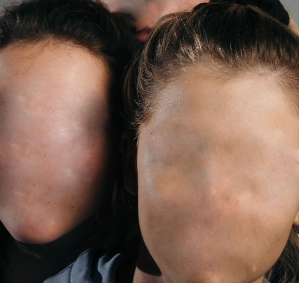
There is no colour in this photograph as it is in black and white – this adds to the mystery of the photograph that is initially created by the collage effect. There is wide tonal range in the image but the tones have been placed in unusual places due to the cut and stick style of this photograph. This creates even more drama and contrast in the photograph. The texture of the skin can clearly be seen in the photograph which makes it clear that it is a person but the identity has been scrambled.  There is no clear layout or arrangement in this photograph which links to the idea of mess and confusion in the photograph. There is no clear point that the eye is lead to which further confuses the viewer.

This photograph is from Draxler’s collection of abstract portraiture, it is titled “I wanna be serrated”. It is a collection of photograph like this one in which Draxler takes portrait photographs and then cuts up parts of them then places them in unusual positions to confuse the viewer.

To me, in this collection of photographs, Draxler is challenging the idea of identity and is trying to show how some people feel that they have a lack of it, or struggle to find their identities sometimes and end up stuck in a place without identity.

My Response

My Edits
My Favourite Photos

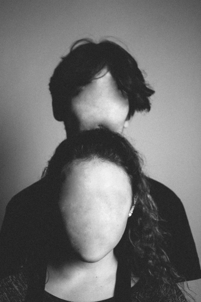
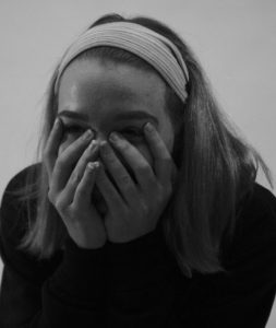
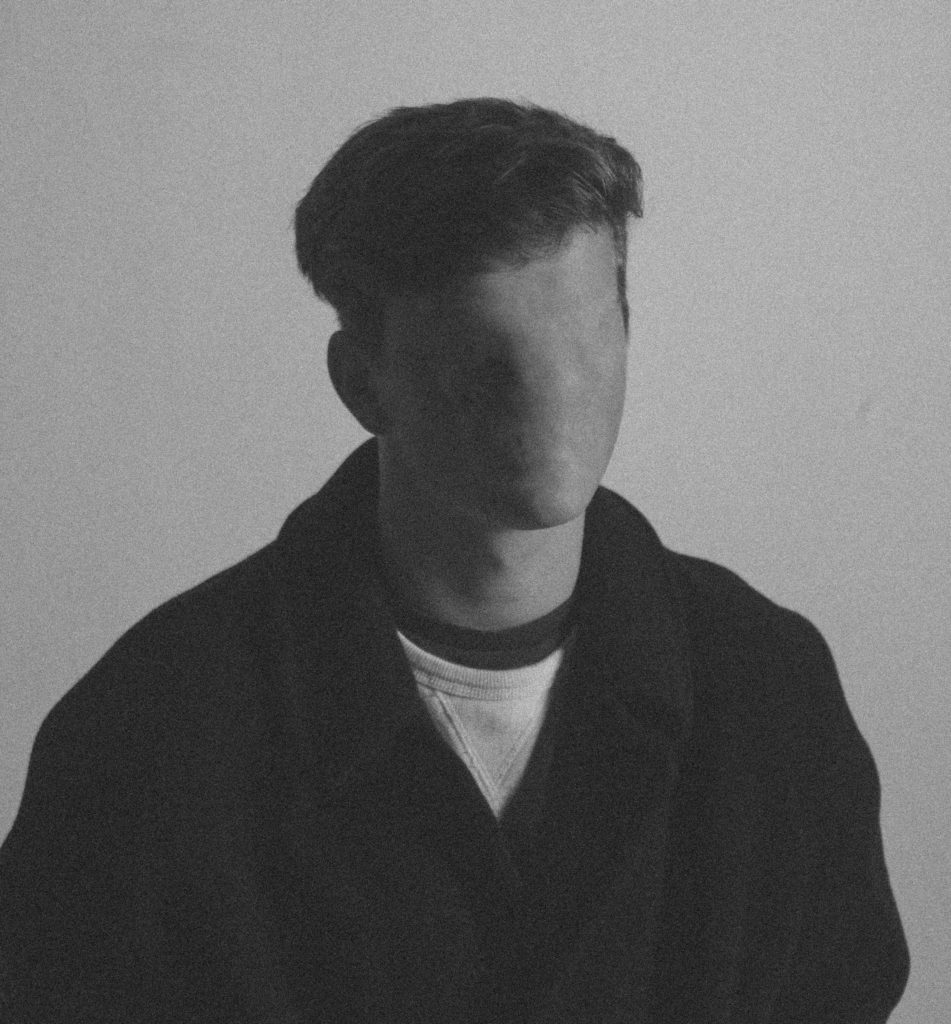
This image was created using artificial light. I used a redhead light to provide some soft light across the models’ faces and I used a spotlight to create a slight chiaroscuro effect to create a more dramatic image with more contrast and shadows. I used a shallow depth  of field (4.0) to create focus on the front model and to mildly blur out the background. I used a slow/medium shutter speed (1/20) to allow more light to enter the lens from the dark environment, I used this along with a low shutter speed of 200 to keep the quality of the image as best as possible.

I used a black and white filter over this photograph to create more contrast and I increased the amount of noise to create an old-fashioned portrait photograph effect.  There is a wide range of tones in this photograph ranging from the darkness of the shadows to the highlight of the face. There is a 3D effect to this image due to the positioning of the models and the slight blurring of the back model, this brings the photograph to life and gives it a more intriguing appearance.  I have placed the models in the centre of the image to create an uneasy effect in the image.

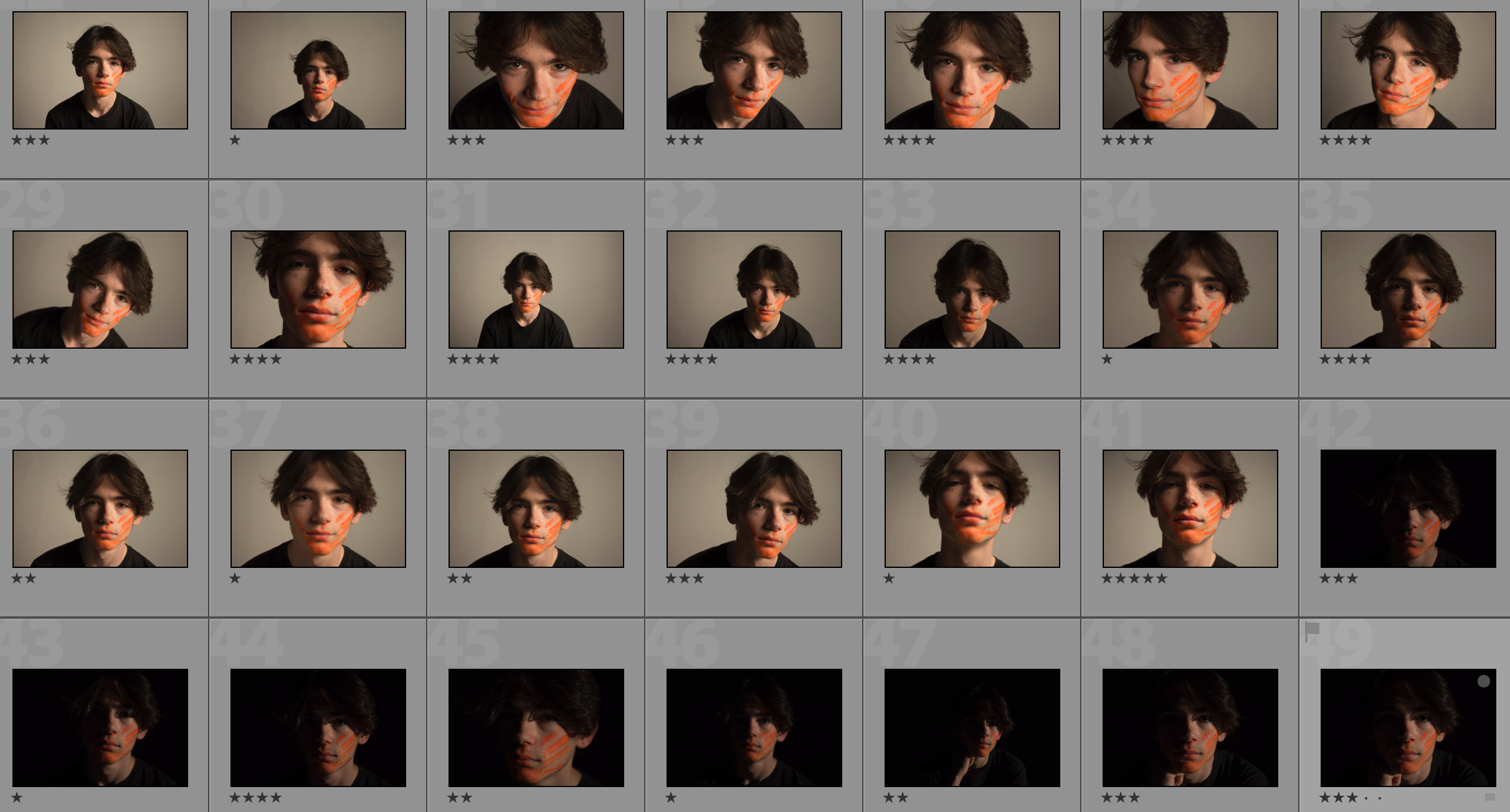
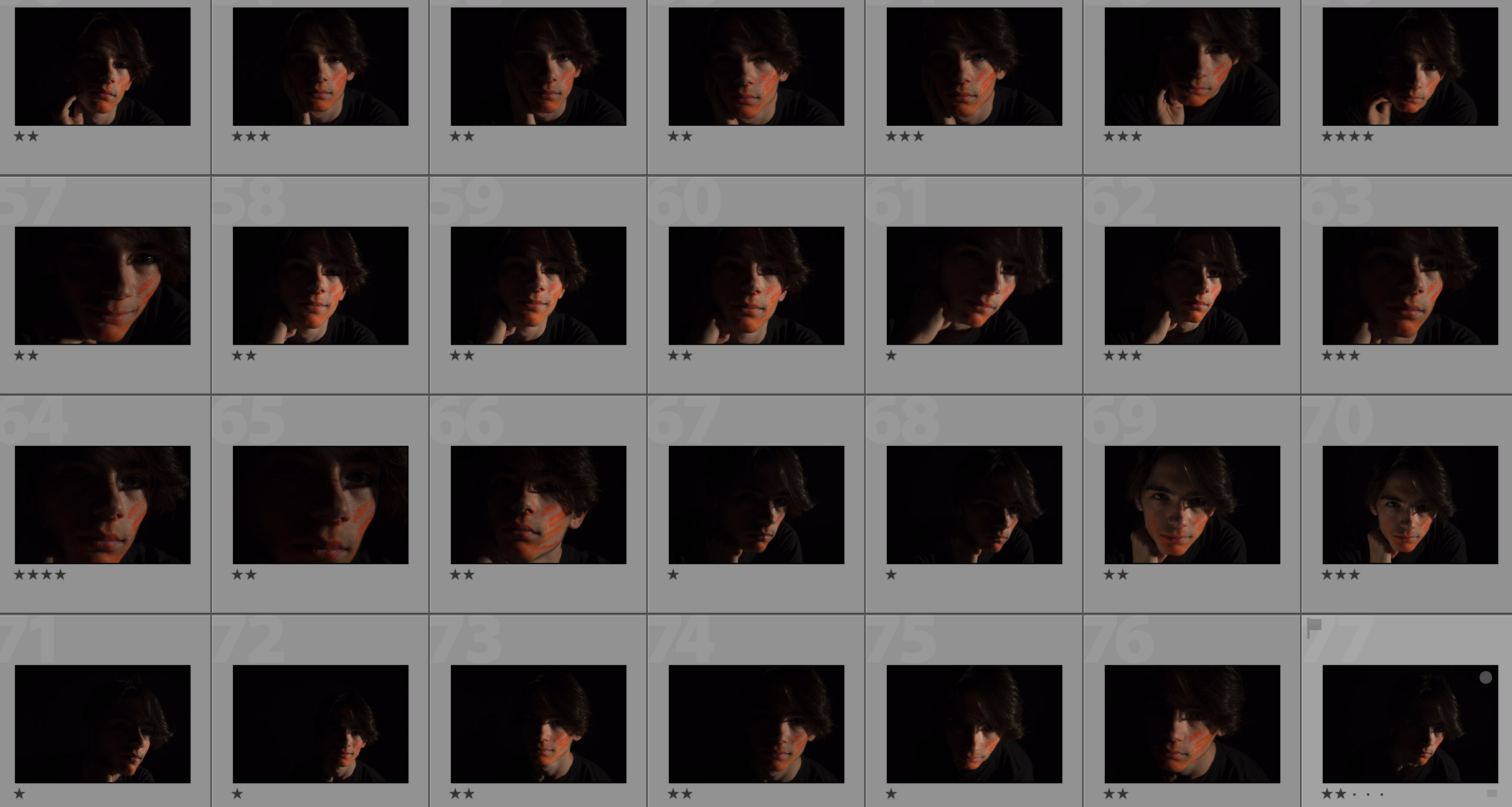
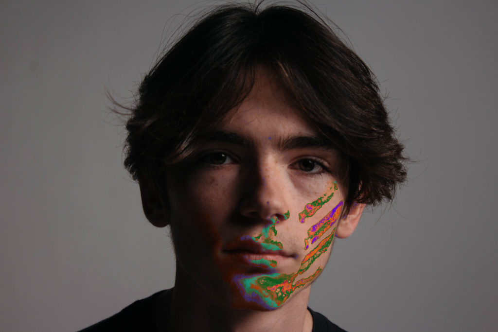
This photograph was taken in the studio with the work of Ducruix in mind. I took the photo then edited it in lightroom to create an old-fashioned effect by using a filter, changing the white balance and increasing the noise. I then used photoshop to remove the features of the face by using the spot repair tool. The aim of this photograph is to show something unnatural and make the viewer uncomfortable.

I took this photograph with the plan of using it for the topic of lack of identity. It shows that there is not much distinguishing each of us other than characteristics and features.  It shows how bland and boring the world would be if we did not have our individual identities as everyone would have the same aspirations and personality traits.


Studio Lighting Final Outcomes

Portrait With Natural Lighting

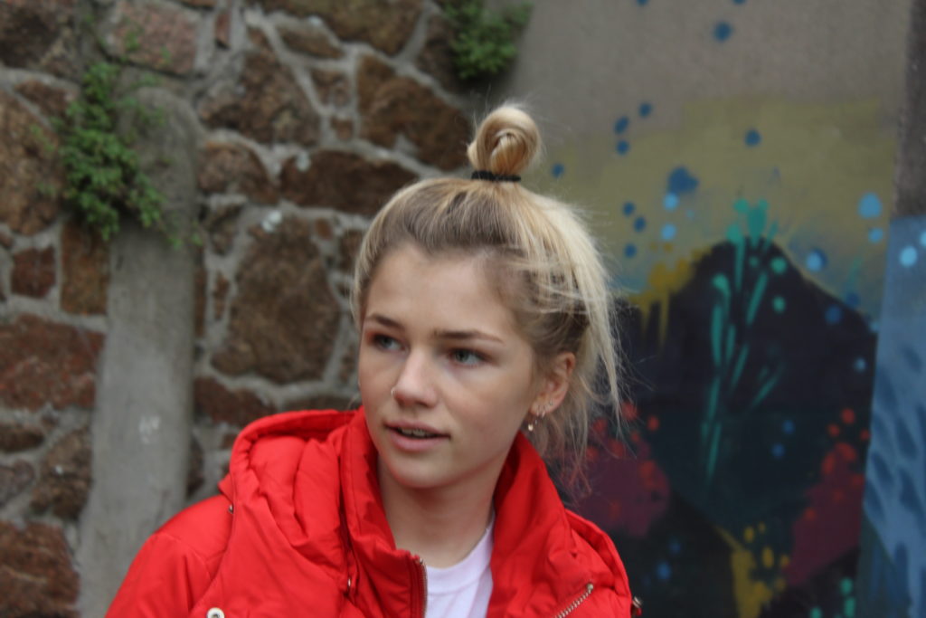
In this photograph I used natural lighting. This allowed me to position the model so that the light was directly in her face and so that the shadows on her face are minimised. I used a shallow depth of field in this photograph so that the background was blurred out whilst the model was in focus. I used a shutter speed of 1/100 to capture a clear image of the model. I used a low/medium ISO of 400 to capture a light image whilst keeping noise minimalised.

The colours in this image are quite saturated and they bring the portrait to life – especially the contrast between the colourful wall and the stone wall. There is not a massive tonal range in this image as there is no pure black or pure white. There is a slight 3D effect to the image as the background has been blurred with a shallow depth of field. I placed the subject in the centre of the image to divide the colourful wall and the plain wall to make the image appear more appealing.

This photo was taken next to a mural in town, it was taken during my street photography homework assignment and takes inspiration from Vivian Maier in the sense that the photo is fairly close up and the model is conscious that the photo is being taken.

I used this photo to separate the colourful and the bland. This photo shows very well the mixture of environments and styles in town – in this photo it shows the mixture of the two, broken into two only by the model.

Portrait With Artificial Lighting

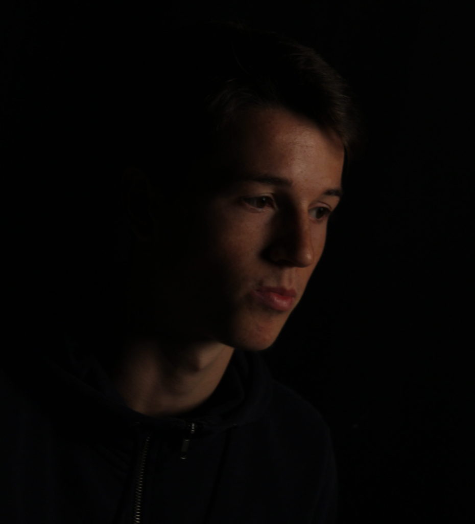
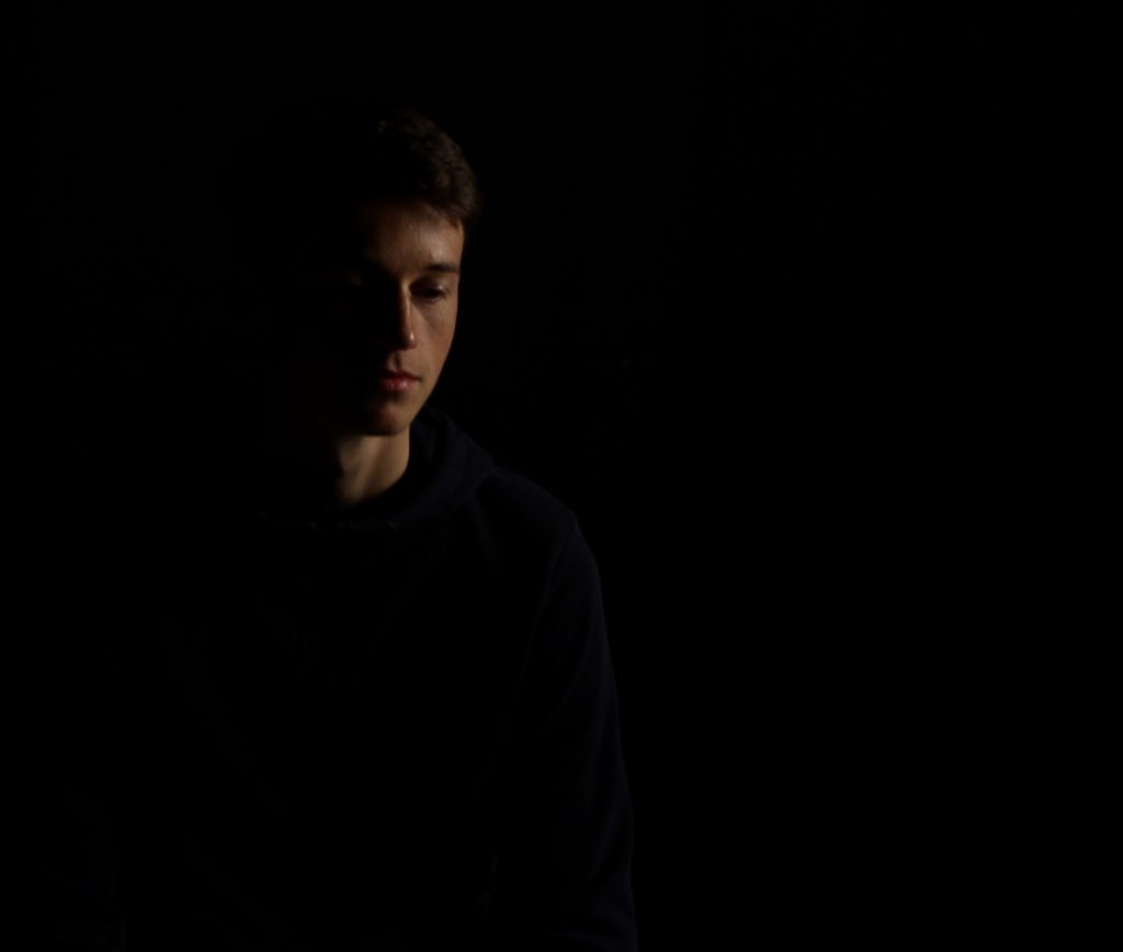
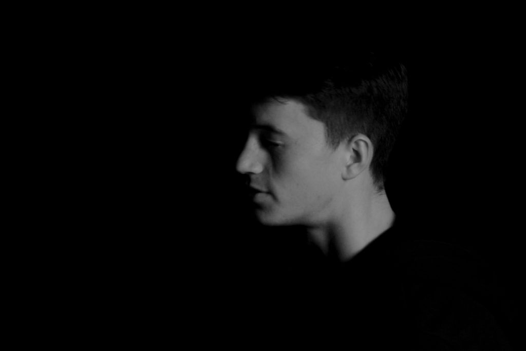
In this photograph, artificial lighting was used to create it in a dark and dramatic manner. I set up the environment to use chiaroscuro in the photograph, I did this by drawing a black curtain over the backdrop and then using one spotlight to put light on one side of the models face to cast shadows across the other side. I used a deep depth of field to keep all of the photograph in focus. I used a relatively slow shutter speed (1/10) to allow more light to enter the lens from the dark environment along with a low ISO to create a photograph with minimal noise.

I increased the saturation of the image to give it a warm undertone that will blend in with the black background. There is not a wide tonal range in this photograph as the majority of the image is dark. It has a 3D effect as the model appears to emerge from the background. The eye is straight away lead to the models face due to the contrast with the background, especially the brightest part on the forehead.

This photograph incorporates chiaroscuro which is a an oil painting technique (more modernly a photography technique) that developed during the Renaissance period. It uses strong tonal contrasts between light and dark for a dramatic effect. Some artists best known for developing the technique are Leonardo Da Vinci and Caravaggio.

My aim whilst creating this photograph was to capture an image in the style of Rankin’s chiaroscuro photographs whilst creating a more gradual fade of the model to the background. I took multiple photos using this technique to capture one where the light falls just right on the face with a more gradual fade and a highlighted spot on the face.

Portrait With Flash

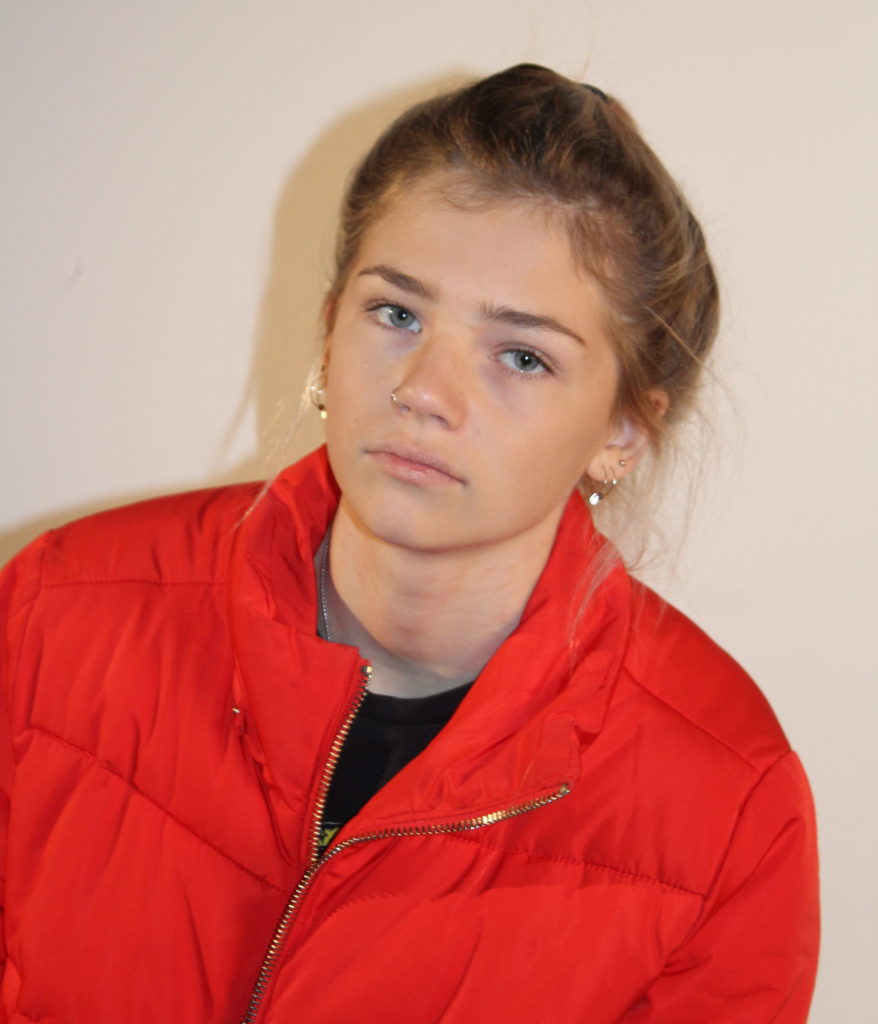
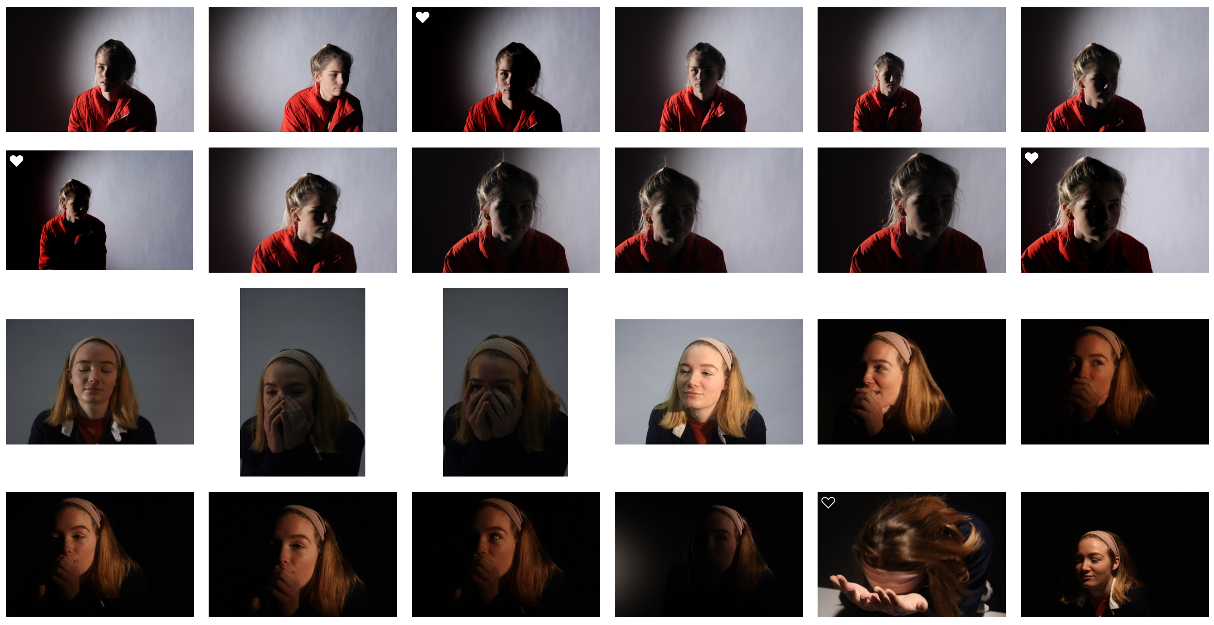
In this photograph I used flash light from the top of my camera to distribute light evenly across the subjects face. This reduced the shadows on the subjects face and exposed her features such as her eyes to the camera more. I set up a red head light on the side to create a soft light across the subject and to illuminate the environment better. It also created a sharp shadow in the background for dramatic effect. I used a deep depth of field to keep the whole image sharp and in focus. I also used a quick shutter speed of 1/60 to ensure that the image was sharp and none of it was blurred. I used an ISO of 400 in this image to allow enough the image to be bright enough whilst keeping the noise minimised. I also had someone holding a reflector with a golden foil over it to create a warm undertone to the image.

There is a warm undertone to the image along with the saturated colour of the jacket with the whiteness of the background. There is not a massive tonal range in this photograph – it is mostly light apart from the black top. There is a slight 3D effect in the photograph because of the shadow behind the model casted by the flash. I placed the subject slightly off the centre of the image so that the shadow would be in the centre of the image.

This photograph was taken in the studio whilst I was trying out a range of techniques with light. I experimented with the flash light, the red head light, the spot light, the rig light and different gel filters and backgrounds. This allowed me to find how to capture the ideal image with flash on.

I took inspiration for this image from Annie Leibovits work, who focuses on contemporary studio photography and street photography. I took inspiration from her more plain photoshoots in which it is simply the subject with no props, I will be looking into creating more creative portraits next week.

Rankin

Rankin

John Rankin Waddell (born 1966), who works under the name Rankin, is a British portrait and fashion photographer. Rankin founded the monthly magazine called ‘Dazed and Confused’ in 1992. It provided a platform for innovation for emerging stylists, designers, photographers and writers.  Rankin’s body of work features some of the biggest brands and celebrities, he has shot covers for Elle, Vogue and Rolling Stone along with many others. Rankin’s work has always questioned social norms and ideas of beauty.

Image result for rankinImage result for rankin

My Response

I have taken inspiration from the above photo to include chiaroscuro into my response to Rankin’s photography. I have used the strong shadows and contrast that Rankin has used in his photography. In the bottom image, I tried to replicate Rankin’s style by getting close up to the subject and using black and white.


Techniques in the Studio

Why Do We Use Studio Lighting?

Studio lighting is used to create a controlled environment to capture the exact photograph that you want. It allows you to completely control how hard/soft the light is, the intensity of it and the direction of which it is coming from.

Image result for studio lighting

What is the Difference Between 1-2-3 Point Lighting?

Three point lighting is a method used in studio photography. It uses three separate positions so that the photographer can illuminate the subject in the exact way that he/she wants to. The first light is a key light, which is usually the strongest light and sets the lighting of the scene. The second light is a fill light which helps to fill the shadows that the key light casts. The last light is called a back light and is used to create contour and separation.

3-point-lighting

What is Fill Lighting?

Fill lighting is a light used in the 1-2-3 point lighting technique.  It fills the shadows that the main light cast.  Below is an example of the effects of fill lighting.

A photograph using the main light only
A photograph showing the effects of combined fill and main light

What is Spill Lighting?

Spill lighting is where light falls where it was not intended to fall, an example is light on a bedroom wall from across the street. It can be used in photography  to create different light effects and it can be controlled by re-positioning the lights.

Image result for what is spill lighting

What is Chiaroscuro? 

Chiaroscuro is a lighting technique that uses strong tonal contrasts between light and dark to model 3D forms with a dramatic effect.  It creates lots of drama and mystery in the photograph. Below is an example of my own work.

Studio Lighting – Homework Assignment

Planning

Task – Produce 100-200 images showing your understanding and control of studio lighting.

Models/props – For my model I will use somebody from my class.

Camera settings – I will use a fairly low shutter speed of 1/10 to 1/60 to allow more light to enter the lens from the dark environment when using a black background. I will use a higher shutter speed of 1/60 when using a white background. I will use a low ISO of 100 or 200 to keep the image high quality. I will use a shallow depth of field to create a soft blur in the background.

Lighting – I will be using red head lights, spotlights, natural light and flash to capture a wide range of images. I will be using red head light for soft light, white backdrop for some lighter images, a black backdrop for darker images,  a spotlight for harder light, a reflector to reflect light into the model’s face and gel filters to change the colour of the light

Location – School studio

Context – I will be using the school studio to capture a range of images in different styles and different lighting.

Concept – To capture studio photographs in the style of David Bailey and Irving Penn whilst incorporating chiaroscuro.

David Bailey

Image result for bailey photographerImage result for bailey photographer

David Bailey (born 1938) is an English fashion and portrait photographer. Bailey is considered one of the pioneers of contemporary photographer. He is credited with producing some of the most interesting images of recent times. He has captured images of some very iconic people such as The Rolling Stones and Kate Moss.

I like Bailey’s photographs because of the strong contrast in the images. As you can see in the images above, the subject is contrasted against the plain white background and this helps the viewer focus on the small details in the subject.

David Bailey Favourite Photo

Image result for bailey photographer

It appears that flash was used in this photograph as the faces of the subjects are over-exposed. This creates contrast in the image between the white faces and the black details, almost in the style of Andy Warhol’s pop art. It also increases the tonal range in the photograph. A deep depth of field appears to have been used also because all of the photograph is in focus. A quick shutter speed will have also been used because the image is focused and sharp. It appears that a medium/high ISO has been used as the image is quite light but there is some noise in it. The grey background creates a slightly cold undertone to the image.

There is no colour in this image as it has a black and white filter over it. This increases the emphasis on the contrast and boldness of the image. There is a wide tonal range in this image but the tones quickly range from dark black to bright white, there is not too many tones in between. There is a slight 3D effect on this image as one of the subjects are placed behind the other, this makes the photograph more interesting to look at. Both subjects have been placed along the horizontal lines of the rule of thirds, this makes the photograph more appealing to look at.

This image was taken in 1965. It shows Reggie Kray and Ronnie Kray, two London gangsters. It is a widely recognised image and is of historical interest in terms of representing Bailey’s style of artwork and also the Kray twins, who were iconic and infamous.

From doing this shoot with the Kray twins, I think that Bailey is trying to show that he does not only work with high-profile celebrities with good reputations – but he will also work with the gangsters that have bad reputations. This shows the diversity in Bailey’s photography and what he is capable of.

Irving Penn

Image result for irving pennImage result for irving penn

Irving Penn (1917-2009) was an American photographer best known for fashion photography and portraits.  Penn’s work included work at Vogue magazine and independent work for clients including clinique.  Penn was among one of the first photographers to pose subjects against a plain white or grey backdrop. Penn experimented with many printing techniques including prints made on aluminium sheets coated with platinum emulsion rendering the image with a warmth that untoned silver prints lacked. His black and white portraits stood out due to the high contrast he used in them.

I like Penn’s photographs because of the angles and poses of the subjects. This creates an interesting photograph that captures the eye of the viewer because most photographs aren’t taken from so close up and at these creative angles.

Irving Penn Favourite Photo

Related image

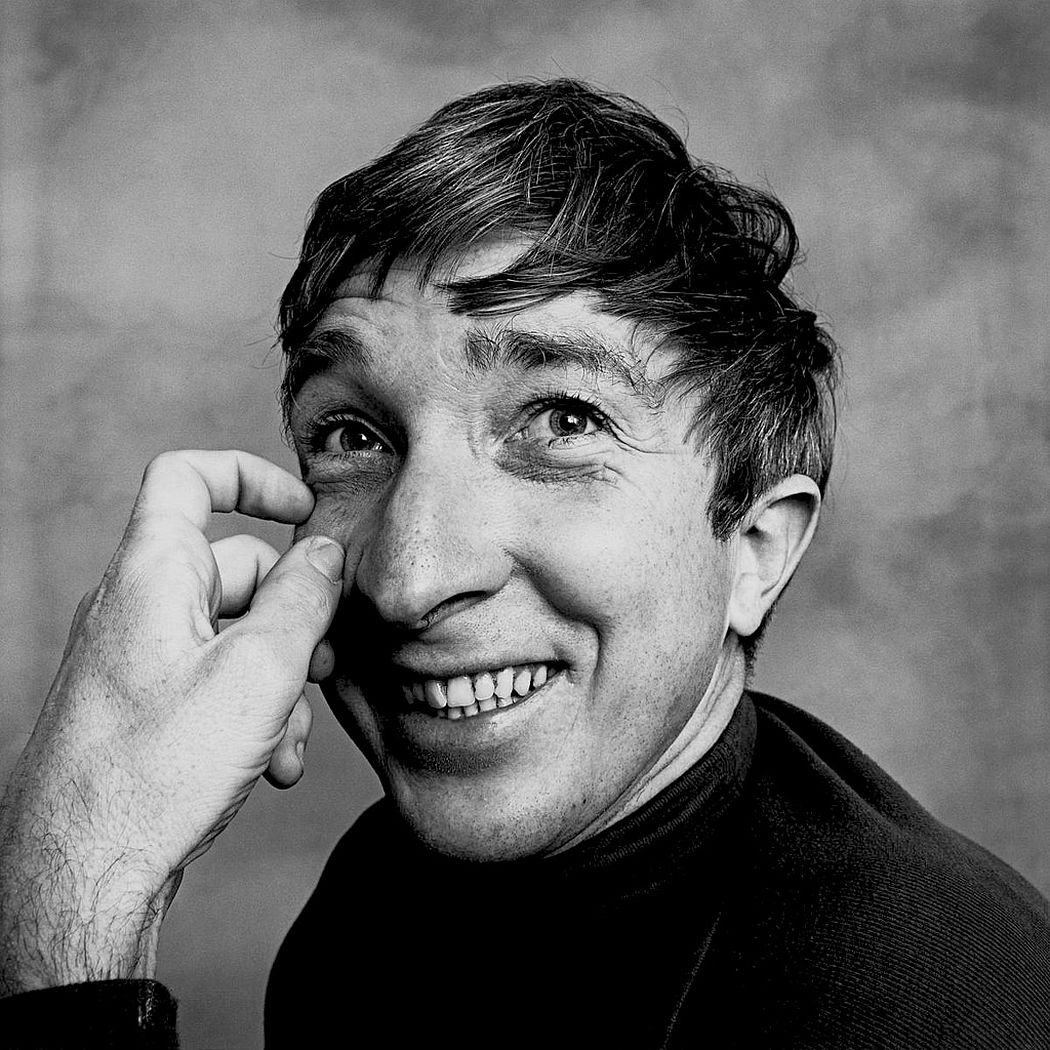
In this image, studio lighting was used coming from the right side of the image. This has created a wide tonal range in the image as it has created shadows and contrast. It appears that a deep depth of field has been used as the whole image is in focus, not just the subject. A quick shutter speed of possibly 1/60 – 1/200 will have been used as the image is sharp and in focus. It appears that a low/medium ISO has been used as it is a slightly dark image with low noise levels. The image has an underlying warm tone to it.
There is no colour in this image as a black and white filter has been applied to this, this has allowed more contrast and shadows to be introduced into the image to create a more eye-catching photograph. There is a wide tonal range in the photograph ranging from the white of his sleeve cuff to the black of his suit. There is a slight 3D effect to this image as the lens is so close to the subject so the hands and glasses are obviously closer in the image. The subjects face is at one of the points on the rule of thirds grid, creating a more visually appealing image. The eye is drawn to the subject’s facial expression straight away as it is unusual and eye-catching.

This photograph is of Truman Capote and was printed on a platinum palladium print in 1976. This would have been from a photoshoot that Penn did with Capote as Penn would often photograph celebrities in his studio as he was a very well known photographer.

In this photograph, Penn has gotten Truman to take an unusual pose and an unusual facial expression. This is a common recurrence in Penn’s photographs as Penn tries to catch the viewers eye with his abnormal style of portrait photography – it is what makes him stand out so he tends to play to this strength.


My Response

My Edits

My Favourite Photo

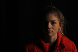
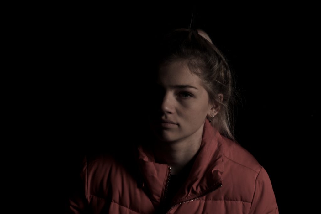
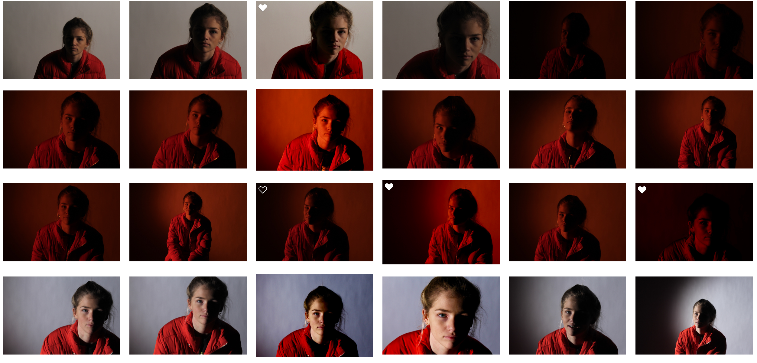
In this photograph, I used the soft light from red head light against a black background so that I could incorporate chiaroscuro into the photograph. I used a deep field of depth so that all of the image was in focus. I used a slow shutter speed (1/20) to allow more light to enter the lens from the dark environment. I also used a low ISO of 200 to keep the quality of the image as best as possible. I decreased the saturation in the image to create a slightly faded and colder effect.

The main colour in this photograph comes from the red coat which fades into the background, I reduced saturation in the image to help it fade into the black more. There are not many light tones in this image as it is mostly dark, this creates a mysterious setting in the photograph. It is quite a 2D photo as the only think that you can see is part of the model – there is nothing else in the image to compare her position to. I have placed the model along the right vertical line of the rule of thirds to create a more appealing image.

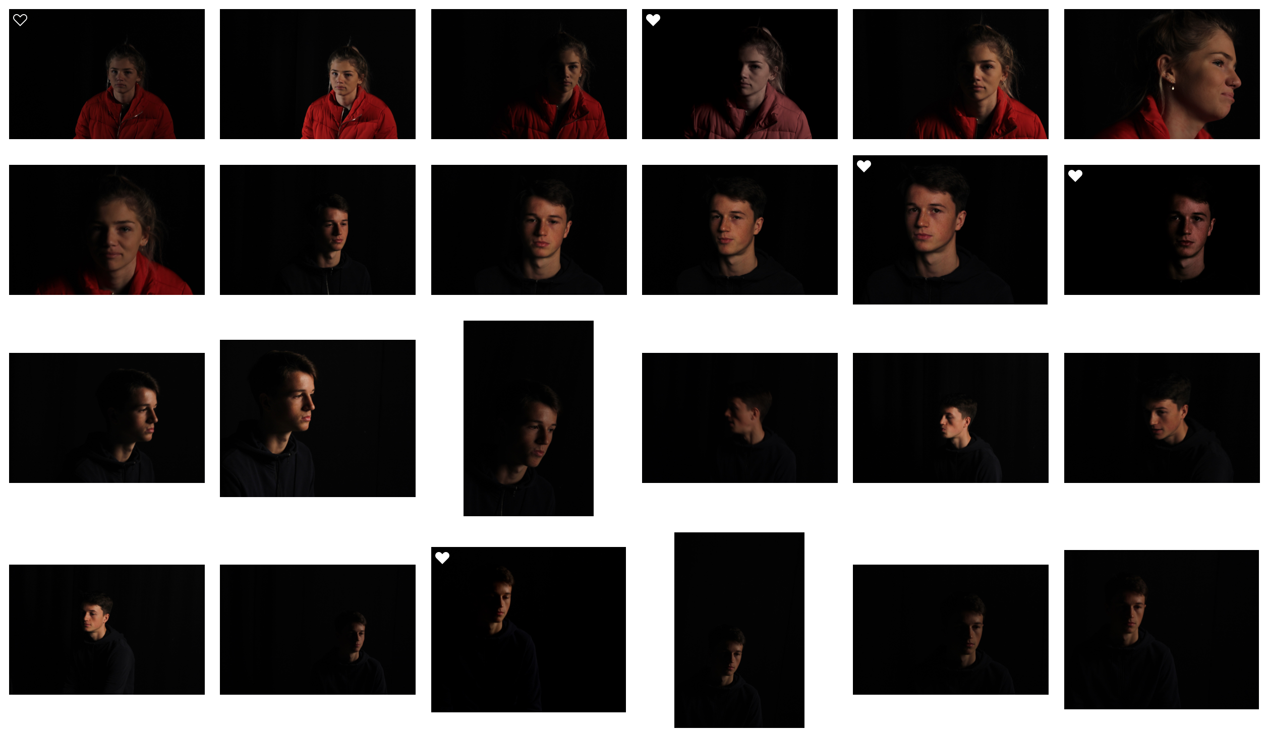
I set up this photograph in the studio, to get this photograph I had experimented with spotlights, red head lights, reflectors and gel filters. I took multiple photographs in this style but this one stands out to me because of the more gradual fade into darkness and the softness of the light.

I took this photo with the intention of experimenting with chiaroscuro and to me it was successful. I took inspiration for the dark tone from Irving Penn’s work. I chose a black background as I thought it would create a more dramatic image.


Representation, Standards and Ethics in Photojournalism

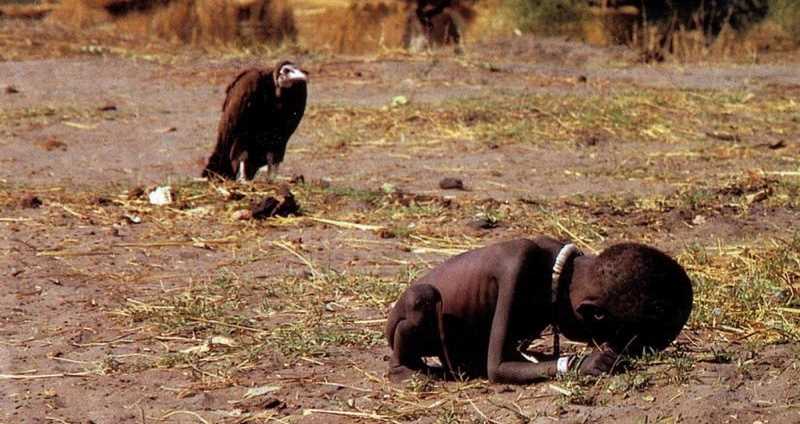
The job of photojournalists is to show the world what is happening in a visual form. This can often be controversial subjects such as war or famine. The photojournalist is ethically bound to not change the story as they should show the real picture that the world deserves to see.  It can be hard for photojournalists to keep these ethics – especially whilst trying to capture the shot that everybody needs to see.

These photojournalists can often come under fire for their controversial photographs. An example of this is Kevin Carter. Carter took this photograph and it was posted in the New York Times in 1993. There was a lot of reaction from readers but it was not positive. People were saying that Carter was inhumane for taking this photograph and that he should’ve dropped the camera and tried to help the little girl. A year after this was published, Carter killed himself due to the backlash. It later turned out that the supposedly girl was in fact a boy and was being taken care of by the UN food aid station. This shows that cropping and lack of context in an image can completely change what the image is showing, and it can be a powerful tool.

Image result for kevin carter

Photo Stories and Stories in a Single Shot

Photo Stories

A visual story is often called a ‘photo essay’ or ‘photo story’. Photo stories allow photographers to narrate a story with a series of photographs. Images are ordered in a specific way with the aim of the viewer seeing them as a story rather than a series of images. Captions are often used with photo essays but it is the images themselves that should be telling the story – the caption is only there to provide some context.

Image result for picture story photography
A photo story found on the internet

Stories in a Single Shot

It doesn’t have to be a series of photographs that tells a story; stories can be told in one photograph. For example the one below. This photograph was captured in 1968 by Eddie Adams in Vietnam. Adams thought that he was watching the interrogation of a prisoner but to his surprise, as he looked through his viewfinder he saw a pistol being raised to the prisoner’s head. This photograph caught the emotion and action of everyone involved and showed the world what life is like in different places from just one photograph.

Photojournalism

What Is Photojournalism?

Photojournalism is a form of journalism that uses images rather than words in order to tell a story or report some significant news. It is now usually used to refer to still images but in some cases it also refers to the use of videos in broadcast journalism. Photojournalism is distinguished from other close genres of photography such as street photography by using a strict ethical framework which demands that the work is honest and impartial whilst telling the story in strict journalistic terms. Photojournalists must be well informed and knowledgeable about events happening in the world. They deliver news in a creative and entertaining format.

Photojournalists have been around as long as cameras and show the world what they want to and what they should be seeing. An example of this is this photograph by Don McCullin. It shows a shell-shocked soldier in Vietnam in 1968. Due to propaganda everyone back in the US thought that everything was fine for the soldiers and they were enjoying fighting for their country but this picture exploited the fact that soldiers were severely damaged by the things they saw. This is just one case of many in which photojournalists have captured a photograph which cannot be explained with words that’ll give the photo justice.