All posts by Conor H

Filters

Author:
Category:

Preparation For Mock Exam

Mood Board

Image result for romanticism photographyImage result for romanticism photographyImage result for romanticism photographyImage result for romanticism photographyImage result for romanticism photographyImage result for romanticism photography

Brainstorming

For my final photographs I want to produce pictures of natural landscapes with a moody, dramatic feeling to them.

  • Sunset
  • Cloudy
  • Storm
  • Beach
    • Devils Hole
    • St Ouens
    • Greve De Lecq
    • Gorey
  • Rocks
  • Trees
  • Cliffs
  • Hills
  • High contrast
  • Dark image

Ansel Adams

Ansel Adams (1902 – 1984) was an American photographer and environmentalist. His photos of the American West are often seen on calendars, photos and books.  Adams founded the photography group ‘Group f/64’. He was part of the romanticism movement and produced lots of striking landscape photographs in black and white, often involving a pathway of some sort and interesting weather.

Image result for ansel adams

Image result for ansel adams

My Favourite Photograph

Image result for ansel adams

This photograph was taken using natural daylight with the clouds blocking the harsh sun from the camera, resulting in dramatic contrast between the mountains and the river being brought into the photograph. It appears that a wide angle lens was used to take this photograph as this is what was typically used by the romantics to capture landscape photographs. It looks like a deep depth of field was used as the whole of the photograph is sharp and in focus. A shutter speed of 1/60 – 1/150 was possibly used for this photograph due to no motion blurs being in the photograph. A low/medium ISO appears to have been used as the photograph is not grainy and is quite dark, which will have been intended. There is lots of texture in the photograph, from the grassy bank to the flowing river. It seems to be quite a cold and isolated photograph as there are no signs of civilization around.

There is no colour in this photograph, which allows the viewer to focus on the range of tones, textures and shapes in the photograph rather than the colour. There is a wide tonal range in the photograph ranging from the dark silhouettes of the mountains to the white reflection of the river. It is quite a 3D photograph due to the trees in the foreground and the river running throughout the photograph, leading the viewers eyes from the trees in the foreground all the way to the mountains in the background. There is no rule of thirds used in this photograph, to me this is because Adams is trying to show that it is natural and nothing is set up.

Adams was a big part of the romantic movement in the late 1700’s, typically the romantics would photograph striking black and white landscapes with the idea that there is a deeper meaning than what appears behind everything. Romanticism was a rejection of the Enlightenment movement which took emotion out of writing and art, Romanticism wanted to challenge this by depicting emotions such as horror and untamed nature.

I think that in this photograph, Adams was trying to emphasise the natural beauty of the environment and to show that no editing was needed on the image, it is as it appears. He is trying to challenge the Enlightenment movement by doing this.

My Photographs
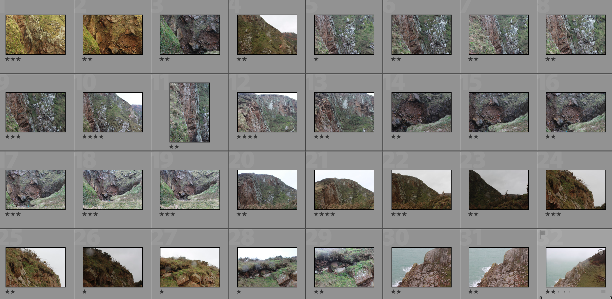
Top 5/Edits
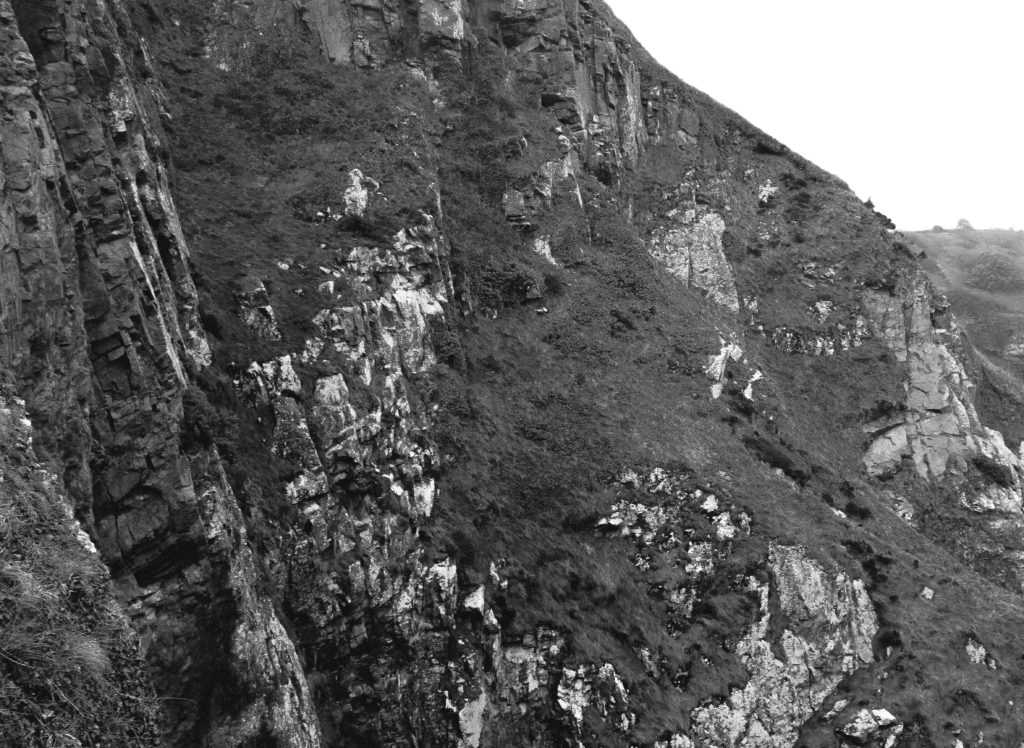
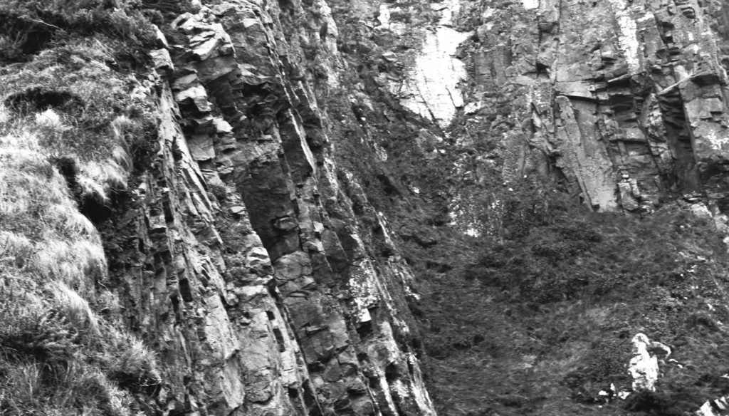
My Favourite Photograph
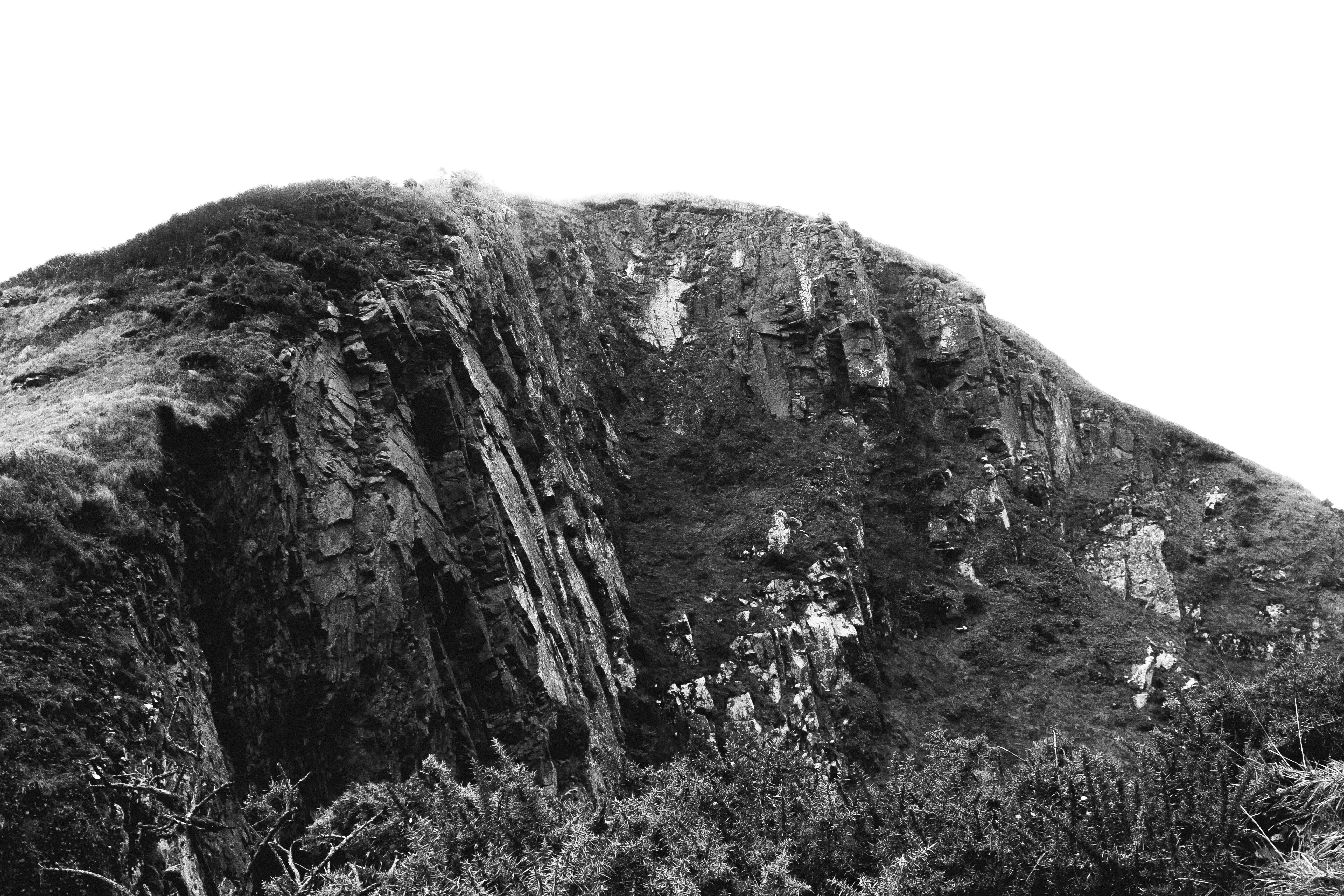
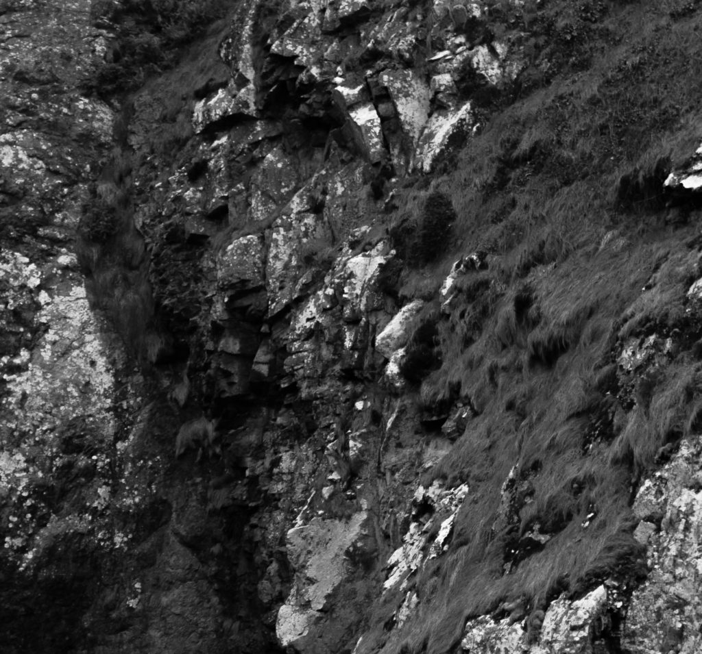
In this photograph I used natural lighting which allowed contrast between the correctly exposed cliff face and the over-exposed sky. This created a very wide tonal range in the photograph. An aperture of 18 was used which allowed the whole of the photograph to be in focus. I used a shutter speed of 1/40 with an ISO of 100 to create a photograph with the highest quality possible. There is a slightly cold undertone in the photograph due to the white balance.

There is no colour in this photograph as it is in the style of the romantics – the lack of colour helps to bring our more contrast and a wider tonal range in the photograph. The texture of the cliff face can be clearly seen which creates a more interesting photograph. There is a slight 3D effect in the photograph due t the shapes and depth within the cliff face.

I took this photograph at Devils Hole. I chose this as the location as it has a rich history and has lots of interest cliff faces surrounding it. I tried to create and edit this photograph in the style of the Romantics in the sense that it is black and white, has dramatic contrast in it and shows only nature. This photograph is similar to the work of Ansel Adams in the sense that it shows the untouched nature in a black and white photograph with lots of shapes and edges within it. My photographs do not have as much contrast and definition in them as Adams’ does but there is clear inspiration from him in my photographs.

David Hockney’s Landscape Joiner Photography

David Hockney

David Hockney (born 1937) is an English painter, print maker and photographer. He was an important contributor to the pop art movement of the 1960’s and is considered one of the most influential British artists of the 20th century.  Hockney has made prints, portraits of friends, and stage designs for the Royal Court Theatre and the Metropolitan Opera in New York City. Hockney was born with synaesthesia, he sees synesthetic colours in response to musical stimuli. In the early 1980’s, Hockney began to produce photo collages that he called ‘joiners’, in these Hockney took multiple photographs and arrange a patchwork to create a composition.

Image result for david hockney landscape joiners

Image result for david hockney landscape joiners

My Favourite Photograph

Image result for david hockney landscape joiners

In this joiner photograph it appears that Hockney used natural daylight to capture it. This is because the colours are very vibrant and there is a natural level of contrast within the photograph. In the photographs that make up this collage, I think that a deep depth of field will have been used to ensure that the whole of the photograph is in focus. A shutter speed of 1/40 – 1/100 will have been used along with an ISO of 100 or 200 for this as the photographs making up the collage are sharp and have the correct amount of exposure.

There are lots of vibrant colours in this collage which catches the viewers eye, this creates a wider tonal range and more contrast between colours in the photograph. The majority of the collage is light, the only dark tones are in the trees and shadows. There is a texture in the ground in the collage which allows the viewer to see the photograph as more realistic and relate to it more. It is quite a 3D image as there are obviously subjects in the foreground and subjects in the background which get darker as they get further back.

This photograph is one of Hockey’s joiner photographs in which he would use polaroid prints and 35 mm commercially processed colour prints of a single subject to create a collage. The result of this joiner work has an affinity with Cubism, which is one of Hockney’s major aims – discussing the way human vision works.

Abstraction and Formalism Landscape Homework

Planning

Task: Take 150-250 photographs that explore Abstraction and Formalism

Camera Settings: I will be used an ISO of 200 along with a shutter speed of 1/40 to allow the image to be as high quality as possible.

Lighting: I will be using natural daylight for my photographs.

Location: La Collette

Context: I will be taking photographs with the work of photographers such as Albert Renger-Patzch in mind.

My Response

My Top 5/Edits

My Favourite Photograph

In this photograph I used natural daylight in order to create a good amount of contrast between the structure and the sky. I used a deep depth of field in order to ensure that all of the photograph was in focus and sharp. I used a shutter speed of 1/40 to allow the image to be sharp, with an ISO of 200 it allowed the image to be slightly dark which increases the contrast and drama in the photograph.

There is no colour in the photograph as I used black and white. I took inspiration for this from Renger-Patzch who did his work in black and white. This creates more drama and shadows within the photograph. There is a wide tonal range in the photograph and the wires and metal structure is very dark whereas the podium they sit on is highlighted with white. There is a 3D effect in this photograph due to the shadows and edges with the photograph.

This photograph is of a crane-type structure used for moving large items, down at la collette. The industrial part of the island that I took photographs of is a great example of altered landscapes because there is almost no nature left there due to the amount of business that goes on there.


Hannah Hoch and the early pioneers of photo collage/montage

Hannah Hoch (1889 – 1978) was a German Dada artist. She is best known for her work of the Weimar period, in which she was one of the originators of photo-montage (a type of collage in which the pasted items are actual photographs, or photographic reproductions pulled from the press and other widely produced media).  Key themes in Hoch’s work include androgyny, political discourse, and shifting gender roles. These themes all interacted to create a feminist discourse surrounding Hoch’s work. Hoch constantly promoted the idea of women working creatively more generally in society.

Image result for hannah hoch

Image result for hannah hoch

Paul Strand

Paul Strand (1890 – 1976) was an American photographer and filmmaker who helped establish photography as an art form in the 20th century. His work covers numerous genres and subjects throughout America, Europe and Africa. Strand was an early icon of the “straight photography school”. In contrast to Pictorialism, “straight photography” was a move to “pure photography” which was loosely defined as having stylistic traits that were not manipulated heavy to mimic other art forms such as painting.

Image result for paul strand photography

Image result for paul strand photography

My Favourite Photograph

Image result for paul strand photography

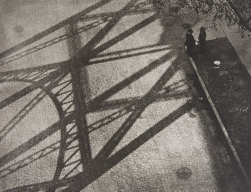
In this photograph it appears that Strand has used and manipulated natural light in order to capture this photographed. He has used the structure of man-made structures against the daylight to create contrast and shapes within the photograph. It appears that a deep depth of field was used as the whole of the photograph is sharp and in focus. A shutter speed of 1/20-1/80 will have been used for this photograph along with an ISO of 100/200/400 to allow enough light to enter the lens whilst keeping the photograph as high-quality as possible. There is a slightly warm and old-fashioned undertone to this photograph.

There is not colour in this photograph – only a warm black and white undertone. This gives an old-fashioned, industrial feeling to the photograph and makes it feel more dramatic. There is lots of contrast between the shadows and the ground which creates a wide range of tones, this adds more drama to the photograph. There is a dirty/dusty texture in this photograph which adds to the industrial feeling of it. It is a flat 2D image mostly due to the focus being the 2D shadows. The shadows create lots of patterns and shapes in the photograph making it more interesting to look at.

Mishka Henner, Edward Burtynsky, The Boyle Family and Psycho-Geographies

Mishka Henner

Mishka Henner (born 1976) is a Belgian artist working and living in Manchester. His work has featured in several surveys of contemporary artists working with photographers in the internet age. Henner uses technologies such as Google Earth, Google Street View, and YouTube in his work.

Image result for mishka henner

Image result for mishka henner

Edward Burtynsky

Edward Burtynsky (born 1955) is a Canadian photographer and artist known for his large format photographs of industrial landscapes. His work is kept in more than 50 museums including the Guggenheim Museum. Nature transformed through industry is a constant theme in his work.  He uses subjects that are rich in detail and scale but they are open in their meaning. The images produced are meant as metaphors to the dilemma of our existence; they search for a dialogue between attraction and repulsion, seduction and fear.

The Boyle Family

The Boyle family is a group of collaborative artists based in London. It consists of the couple Joan Hills and their children. The Boyle family work across a wide range of media (painting, photography, sculpture, film and more) but they are most known for their Earth studies. They recreate randomly chosen areas of the Earth’s surface using resin and fibreglass.

Typology Homework Assignment

Planning

Task: Take 100+ photos that explore the concept of typologies

Camera settings: I will be using an ISO of 100 with a shutter speed of 1/20 mainly in order to allow the image to be as high quality as possible but this may have to be adapted slightly for darker environments.

Lighting: I will be using daylight for the majority of my photographs but photographs taken inside the car park may be captured with flash or with the car park lights.

Location: Waterfront underground car park and Jacksons car centre.

Context: I will be taking photographs with the work of Typologists in mind.

My Photographs

My Edits

My Favourite Photograph

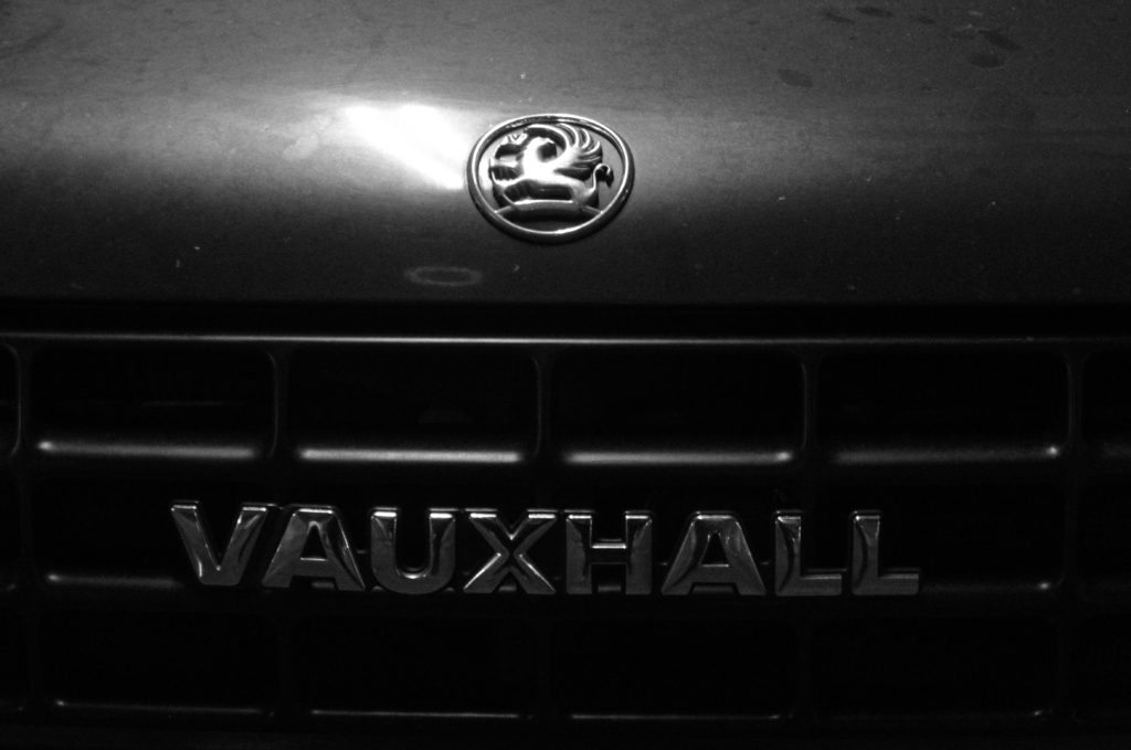
In this photograph I used the artificial lighting the waterfront underground car park. This lighting allowed the photograph to be contrasted with the correct amount of exposure. An aperture of f18 was used for this photograph to ensure that the whole of the photograph was in focus with a deep depth of field. I used a shutter speed of 1/20 along with an ISO of 200 to allow enough light to enter the lens whilst keeping the quality of the photograph as best as possible.

There is no colour in this photograph – only black and white. This creates a rustic/old-fashioned styled photograph. There is not a massively wide tonal range in the photograph but the contrasting tones are right next to eachother so it gives a more dramatic effect. It is quite a 2D photograph as it only has one close-up subject with no foreground or background.

This photograph is part of a collection of typology photographs that I took which include the fronts of cars up close in order to show the differences between similar structures on the Earth. I took inspiration for the style of photograph (rustic) from the Bechers’ but instead of photographing the same subjects as them I decided to choose my own typology whilst taking inspiration from their style.

Typology – Jeff Brouws

Jeff Brouws (born 1955) is a self-taught artist and photographer. He took lots of typology photographs of America’s rural, urban and suburban landscapes. He used typology photographs to document the characteristics of the nation. He takes influence from the New Topographic movement and the writings of cultural geographers. He is the author of seven books and his photographs can be found in major private and public collections including the Whitney Museum of Art.

Image result for jeff brouws

Image result for jeff brouws

My Favourite Photograph

Image result for jeff brouws

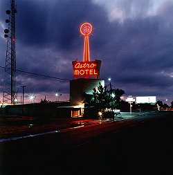
In this photograph Brouws used the fluorescent lighting from the motel to illuminate his photograph. This created contrast between the bright motel sign and the dark and dramatic background. It appears that a deep depth of field was used as the whole of the photograph is in focus. The photograph is generally quite dark so a low ISO of 100 or 200 will have been used along with a slower shutter speed of around 1/25 to let enough light into the lens.

There is lots of use of colour in this photograph – the bright red in the motel sign catches the attention of the viewer and it contrasts with the dark blue of the clouds. There is a wide tonal range in this image which makes it even more dramatic and interesting to look at. The photograph has lots of texture in the clouds which makes the photograph more realistic along with the 3D effect that the motel sign in front of the clouds brings. The central position of the motel makes it clear that it is the main focus of the photograph and it gives somewhere for the eye to be led to.

This photograph is one example of Brouws typology work. He worked to show the differences in the same style objects. He showed the diversity of structures all over America and the different cultures that could be seen. This helped to open the viewer’s eyes to each others differences and respect each other more.

Typology – Bernd and Hilla Becher

Bernd Becher (1931-2007) and Hilla Becher (1934 – 2015) were German conceptual artists and photographers that worked as a collaborative duo. They are best known for their typologies of industrial buildings and structures. They are the founders of the ‘Becher School’ and influenced generations of documentary photographers and artists. They have been awarded the Erasmus Prize and the Hasselblad Award.

Image result for bernd and hilla becher

My Favourite Photograph


Image result for bernd and hilla becher

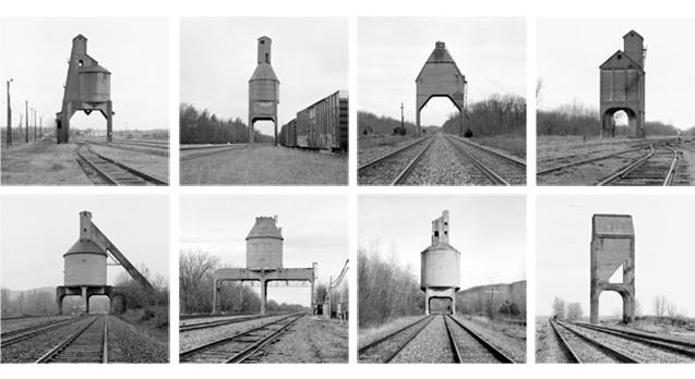
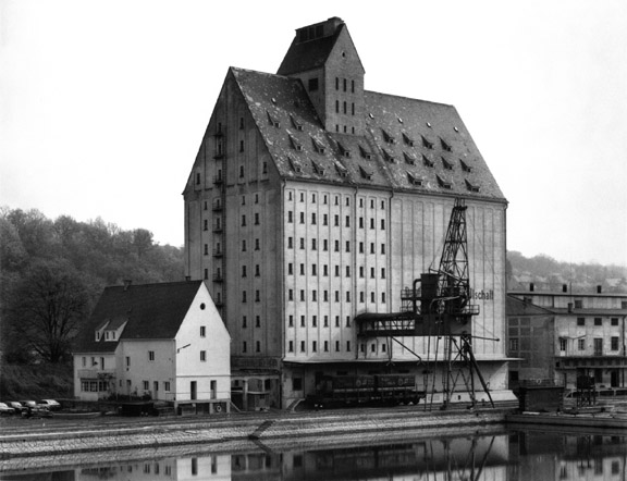
In this photograph natural daylight will have been used to capture it. You can tell because of the soft tones and natural contrast within the photograph. The photograph is slightly over-exposed as can be clearly seen in the background so a slightly higher ISO such as 400 or 800 may have been used along with a potential shutter speed of 1/20-1/80. A deep depth of field has been used at the whole of the photograph is in focus.

There is no colour in the image as it is a black and white photograph. This shows that the viewer should be looking at the details of the subject instead of colours. There is a wide tonal range, ranging from the contrasting shadows of the structure to the over-exposed background. There is clear texture in the structures which makes the photograph more realistic to the viewer and gives it a slight 3D effect.  There is pattern and repetition in the beams of the structures which makes the photograph more aesthetically pleasing for the viewer.

Bernd and Hilla Becher would document architectural structures all over Germany. They took photos of similar typologies and would make compositions of them all together. This is just one example of the work that they would do. They captured the pleasing aesthetics in the buildings deemed ugly and showed the country that there is more to it if they look closely. The Becher couple documented all sorts of structures and worked to open the countries eyes to what was right in front of them.

Psycho-geographies

Psycho-geography

Psycho-geography is defined as the study of the specific effects of the geographical environment, consciously organised or not, on the emotions and behaviour of individuals. The creator of the psycho-geography group, Guy Debord, said that the definition has “pleasing vagueness” meaning that the term can be applied to a wide range of situations.

Snow Hill Psycho-Geography

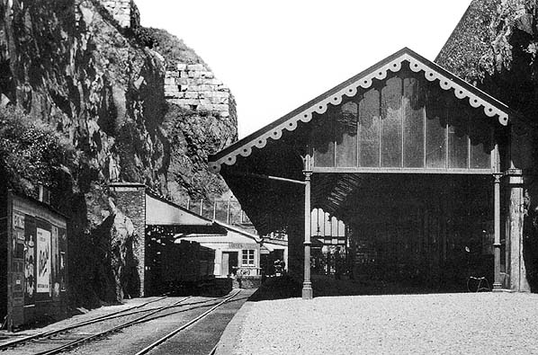
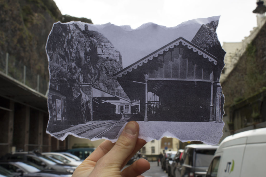
I will be looking at snow hill for my area of interest. Snow hill has some history behind it; in the 17th century it was the eastern limit of St. Helier and was called La Pompe De Haut because of the public pump found there. In the 19th century a theatre was on the site. Between 1873 and 1929 it was the terminus of the Jersey Eastern Railway which ran trains from St Helier to Gorey. The building of the Harbours in the middle of the 19th century used huge quantities of rock for infilling between the outer walls of the harbour and much of this rock was taken from the area now known as Snow Hill car park.

Image result for snow hill car park jersey old

Image result for St helier jersey 20th century

My Archival Image Response

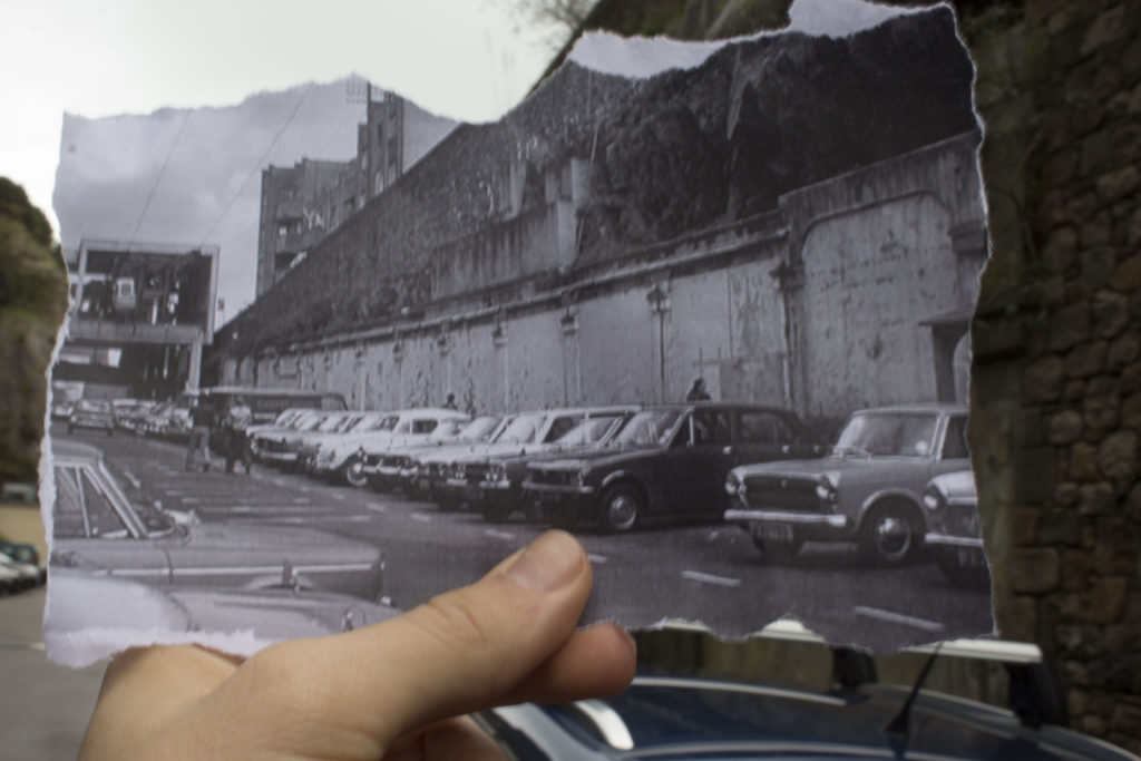
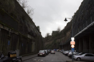
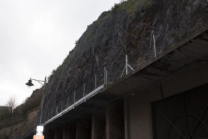
We visited Snow Hill on the 18th January and took archival photographs of the area. There is lots of history behind the area as it has been for used for multiple things such as a railway station and a cable cart station so it was an interesting place to use for comparisons between the new and old. This showed us how much the area has changed and how the past often gets forgotten.

General Photos of the Area

We took some photographs of the area just to show what Snow Hill is like now compared to what it used to be. It is obviously a lot more plain and run-down now as seen in the photographs below.