2ND PHOTO-SHOOT
Here are the contact sheets from my second photo-shoot. Which follow the same photo-shoot plan and annotations…
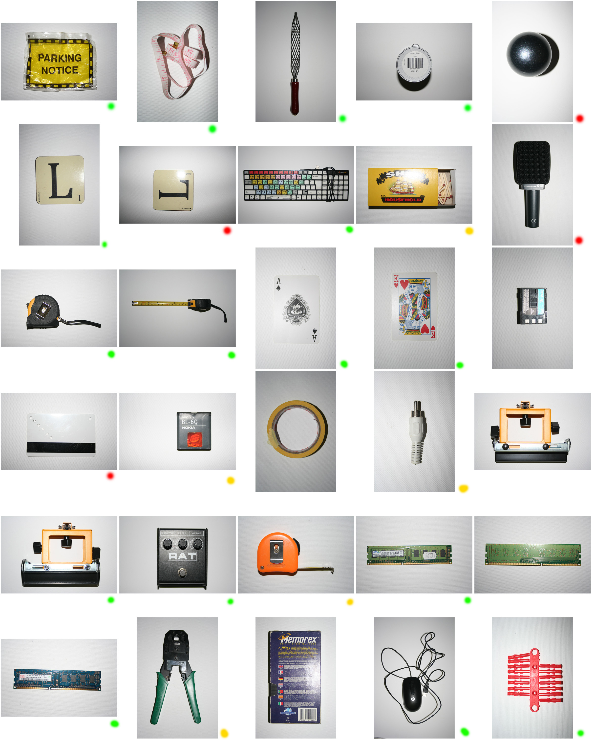
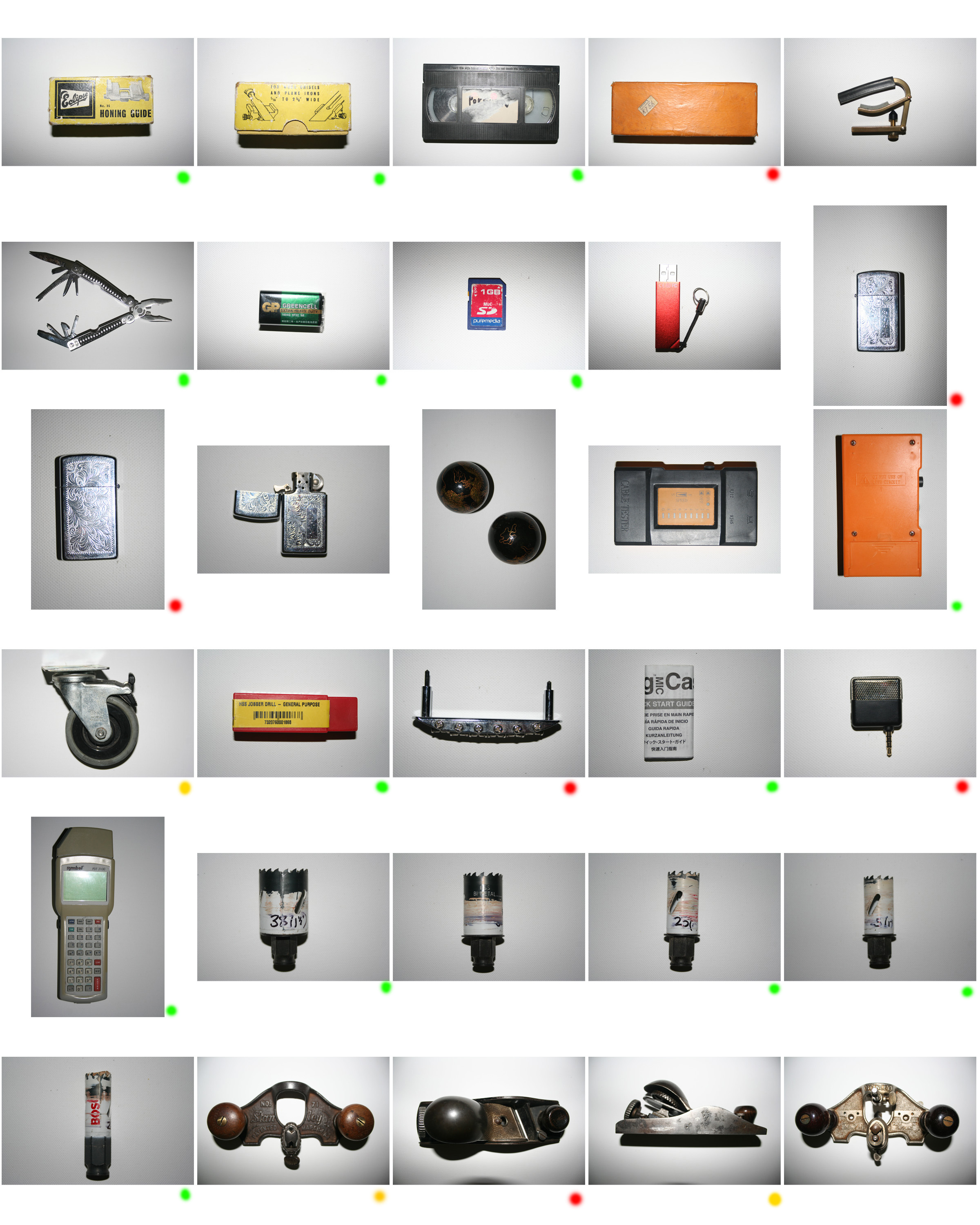

Here are the contact sheets from my second photo-shoot. Which follow the same photo-shoot plan and annotations…


Here are the contact sheets for my first photo-shoot…
Annotations = Successful Okay Unsuccessful
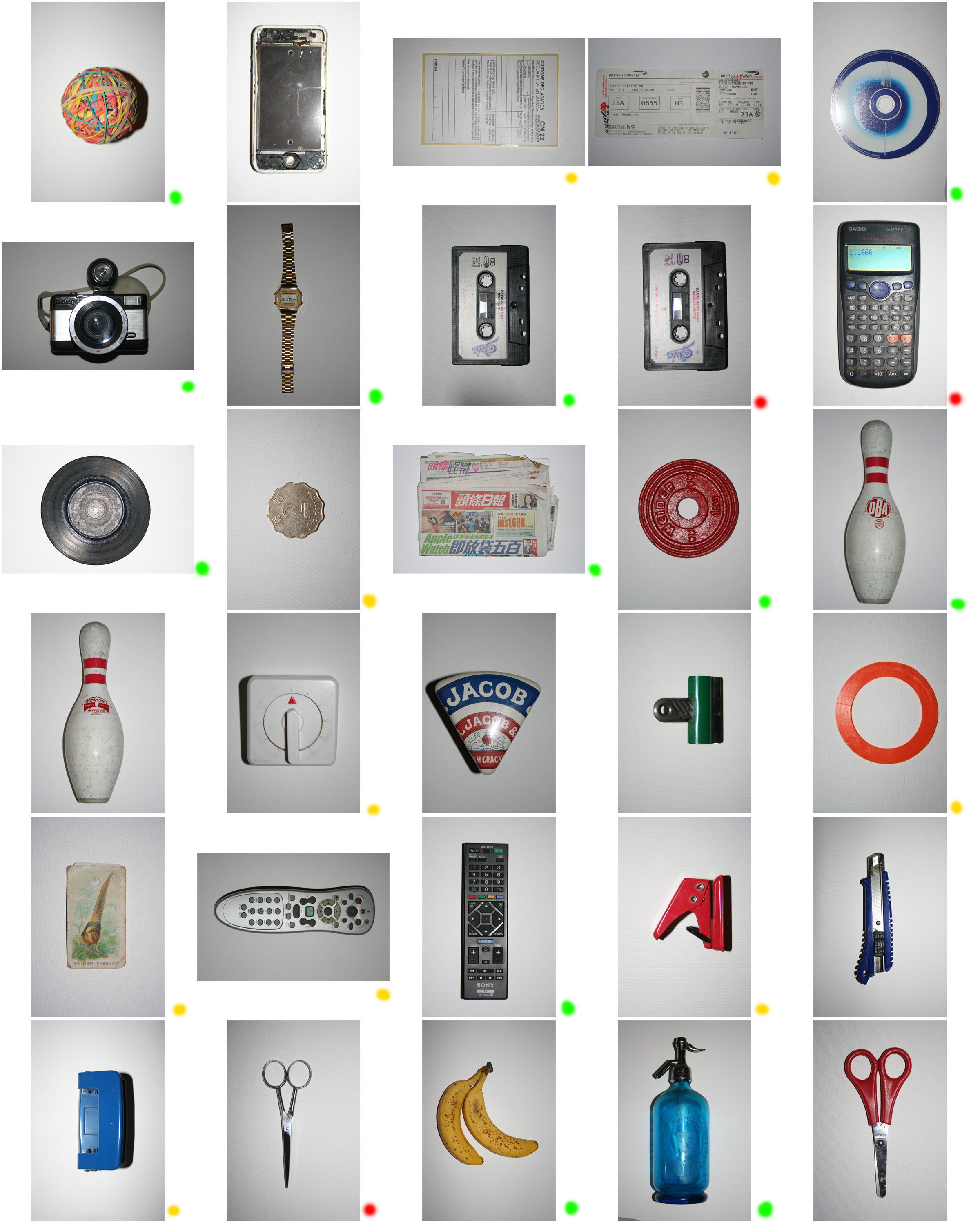
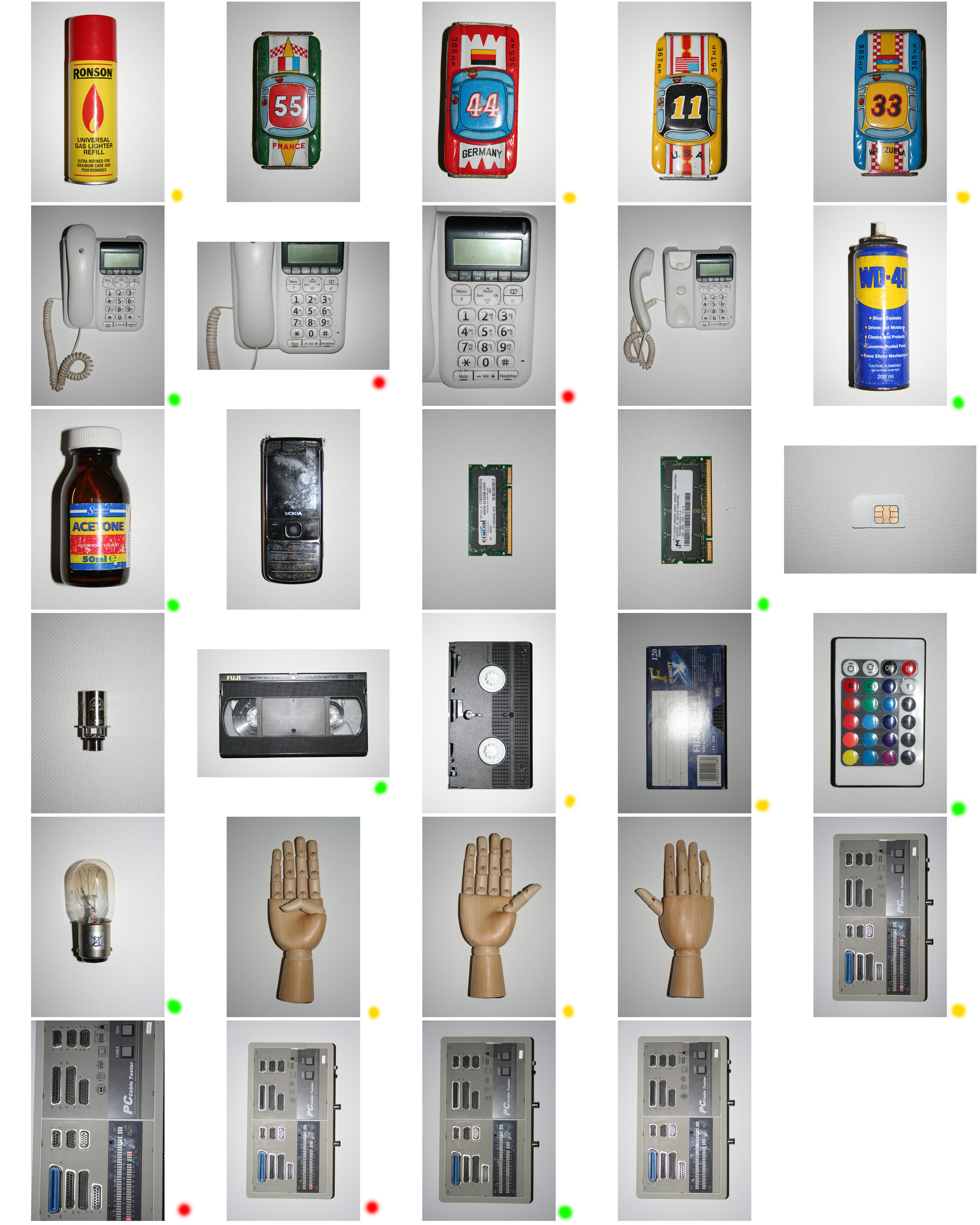
Based on my initial ideas (2 posts previous) for this project, I have made a plan for an initial photo-shoot that will get me started on composing my desired images.

Below is a mood-board which I have composed as initial ideas and inspiration for this project…

The work of Maha Malluh that I previously looked into sparked an idea as it reminded me of the x-ray luggage scans that take place in airport security. Here are some of those scans that I am referring to.


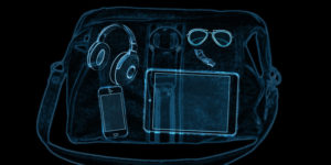 This has given me the idea to photograph individual objects and then use Photoshop to compile and overlay them in order to create images with a similar aesthetic to a mix of the X-rays and of Malluh’s work. However this will require me to find alternative objects which aren’t obvious in order to give the pieces individuality and visual interest within each piece itself. This will be a response to development in technology and the everyday objects that are found around us, and how this development is causing a loss of security and privacy (which will be symbolised by the security X-ray aesthetic as it something that breaks the line of privacy.)
Maha Malluh is an experimental artist from Jeddah, Saudi Arabia. In her work she explores the issues and challenges that come with the modern world in which we live, some particularly relevant to her personal/regional culture.

Amongst Malluh’s large portfolio of work there is the experimentation and exploration into photograms. A photogram is ”an early turn of the century photographic technique invented by Fox Talbot, which captures a photographic image without the use of a camera, by exposing photo-sensitive paper directly to a light source. The arrangement of objects interrupting the passage of light determines the photogram’s appearance.”
In her series of works using the photogram technique, Malluh explores ”how objects define us” and humans and also to ”tell the story of the little things in life which are priceless and give us joy.” Aside of this Malluh’s photogram works also present the changes that have occurred within her culture over recent decades and how traditional things are becoming modernised. A quote from Malluh herself in which she refers to this topic is that ”When an object can no longer operate as was originally intended, a new function through adaptice re-use can be the only way to preserve the heritage of its significance”
Here are some examples of the photogram work which Malluh has executed…


Visually I believe that within this collection of work the strong contrast between the white subjects and the black backgrounds gives the images a haunting feeling but really vividly shows the message and idea that Malluh wishes to present.
Also here is a link to a YouTube video in which Malluh’s development and life as an artist is explored…
https://www.youtube.com/watch?v=KkrmtoRuqoQ
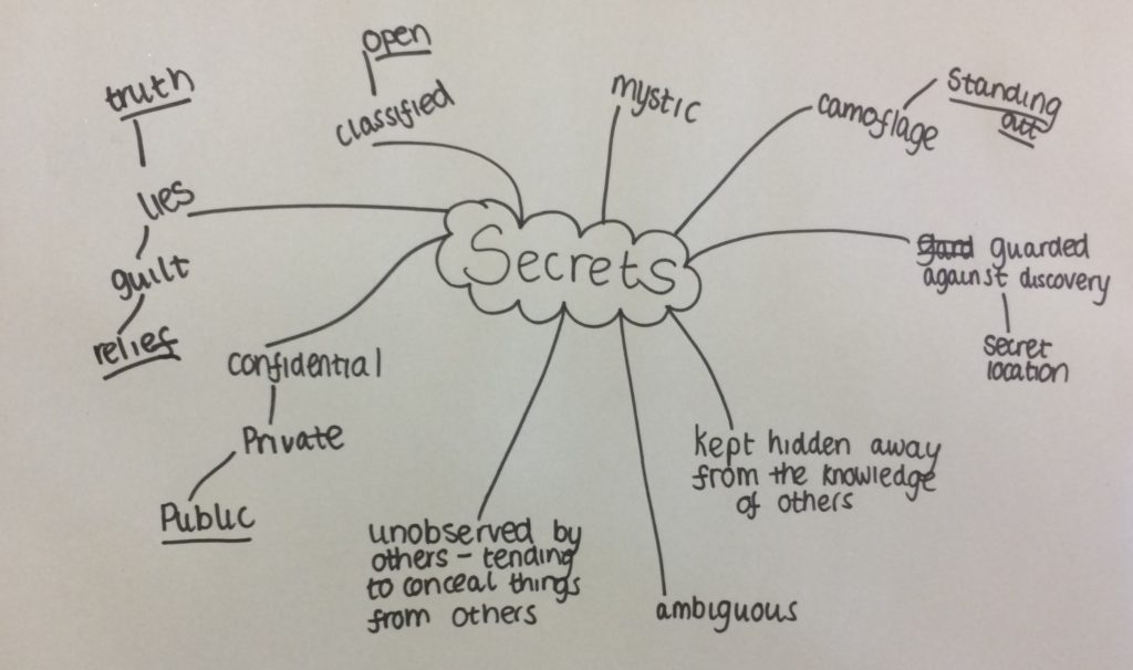
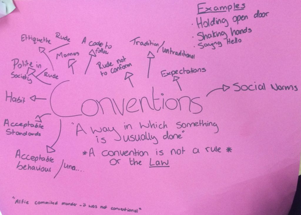
Our class was split into 3 groups and each made to put down our first thoughts on the 3 words Secrets, Codes and Conventions. These first ideas were put down on brainstorms. Here are the class brainstorms and the actual definitions of the words.
Secret – Not known or seen or not meant to be known or seen by others.
Code – A system of words, letters, figures, or symbols used to represent others, especially for the purposes of secrecy.

Convention – A way in which something is usually done.
CORSEWORK CHANGE TO EXTERNALLY SET ASSIGNMENT
This post covers my final outcomes from the whole landscape project. Some of these were photographs that i had printed and some are purposed for the blog.
The first of my final outcomes is this composition of 2 photographs of mountainous landscape in Madeira. I chose to put these two photographs together as one of my final pieces simply because i believe the photos show my raw camera skills and show the true beauty of the landscape as opposed to my previous projects in which my final outcomes were fairly edited and although the raw camera skills of those pieces were good the editing could be seen to ‘take over’ the raw skill. I believe that the exposure of all the photos that I have chosen for my final outcomes are well suited to the condition in which the photos were taken. These 2 photographs have taken inspiration from and are a response to the romanticism landscape photographer Ansel Adams.
Outcome 1

For my second final outcome I have chosen this 3 piece composition of black and white photographs of rocks and water. I believe that these photos represent the harmony of land and ocean as the water covered rocks show how the ocean adds to the aesthetics of the land. the monochrome of the images helps to focus on the detailed textures and shadows of the images by enhancing the light and dark within each.
Outcome 2

For my third final outcome I have chosen this 3 piece composition of photographs of minimal, colourful and bold architecture which show a really interesting combination of shape, pattern, shadow and colour. Also the combination of the 3 primary colours is something that I believe is rather aesthetically pleasing. These 3 images are a inspired by the abstract photographer Yener Torun.
Outcome 3

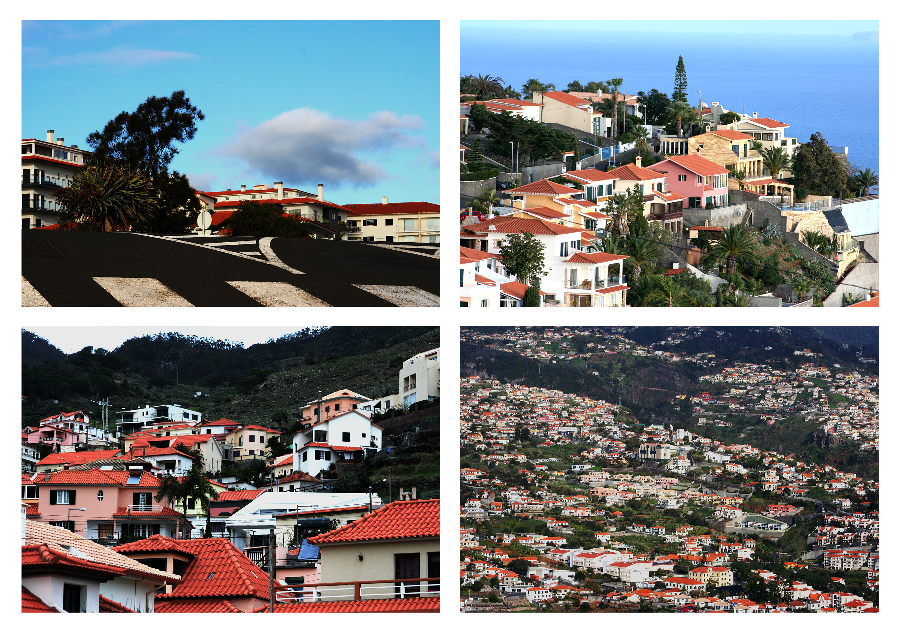
For my fourth final outcome I have chosen this 4 piece composition of photographs of houses positioned in and on top of natural landscapes to show how industrialization/property building effects the natural landscape (but not always in a bad way), which is the idea I was aiming to present from the start of the project. Also I believe that the 4 photographs are all very well matched as the colours and exposures are very balanced.
Outcome 4
For my last final outcome I have chosen this photograph of a shoreline with the sunset and two horses. Similar to my first outcome I feel like this piece presents the pure beauty of the landscape and displays my raw camera skills so therefore deserves to be one of my final outcomes. I feel that the dusk exposure of the image is very effective as it enhances all the different textures within the image such as the smooth clouds and the rough, jagged sea. The silhouette-like dark figures of the horses are the main focus of the image as the sunlight draws the viewers eye right towards them.
Outcome 5
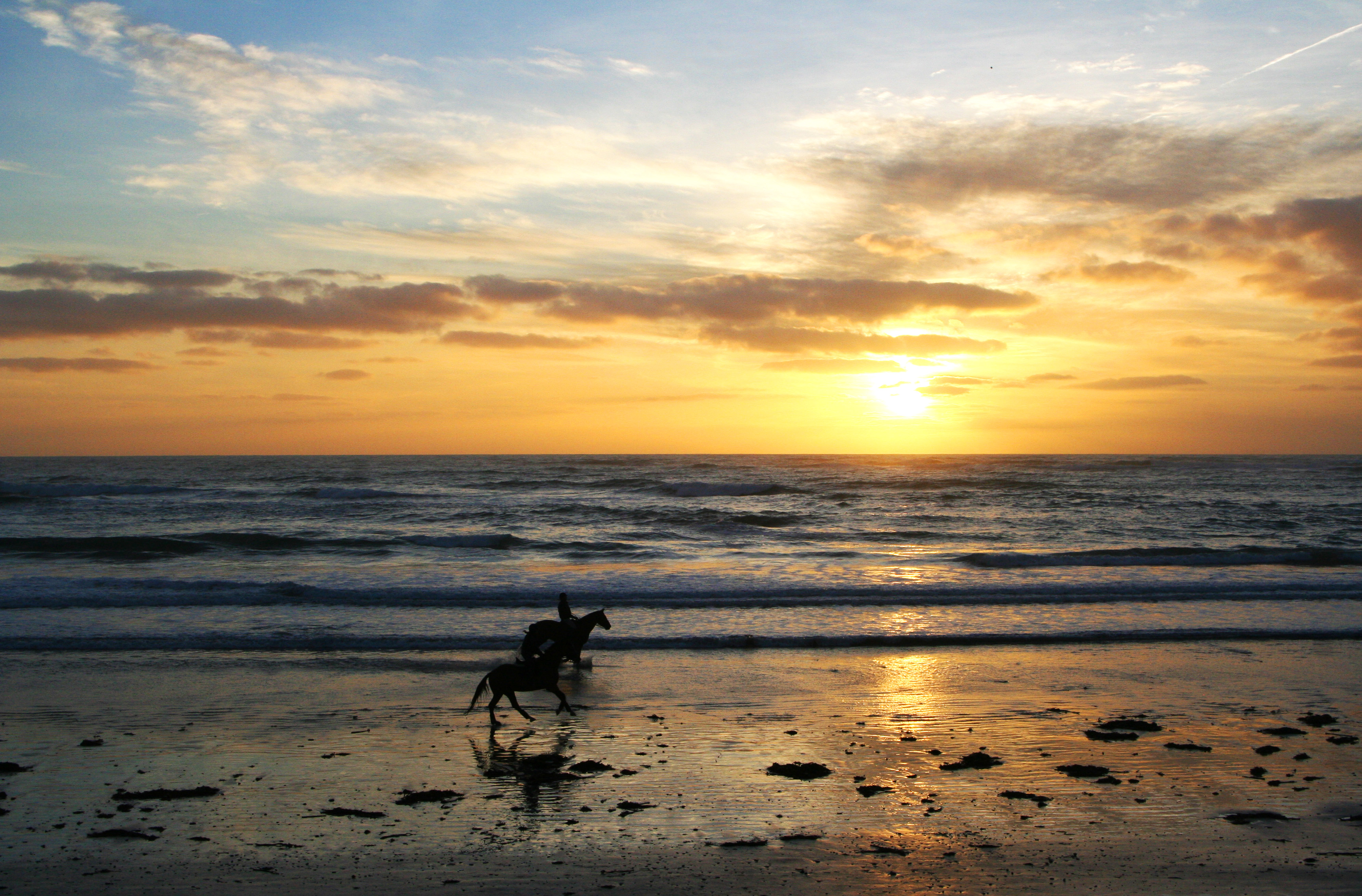
Overall I feel that my 5 outcomes achieve what I wanted to present by the end of the landscape project as they show the harmony between Urban and Natural landscapes. Whilst taking inspiration from the photographers that I have looked at over the project. Also with this project I have been able to produce aesthetically pleasing outcomes whilst purely showing my raw camera skills without any over-creativity which I have been more inclined to explore in my previous projects.
For my final Prints I have chosen the following images.
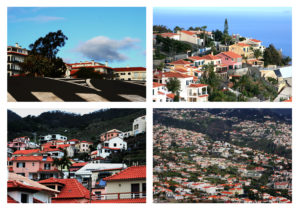


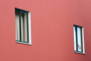
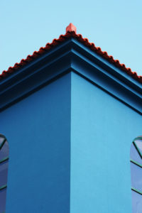
I have chosen these images to print out as I believe that all together they have a good balance of natural and urban landscape. This covers my idea from the start of the project of showing how industrialised development is taking over natural areas. And they also show influence and response to the photographers that i have researched during the landscape project (Ansel Adams, Michael Boniwell, The New Topographics and Yener Torun).
Here is how I plan to mount and compose my prints…

With the A3 print of 4 photographs of houses situated in/on natural landscapes, I plan to trim down the 4 images and place each on a slight frame of black mounting board. Then place all 4 pieces onto 1 piece of foam-board. This will hopefully give the images a slight elevation from the board putting them closer to the viewer. With the raw minimally edited approach to this landscape project, giving the image presentations a sense of depth will mean that there is an extra element added to the piece rather that just mounting the images straight onto mounting board.

With this composition I am using my two A5 prints and one of my A4 prints. The idea of this composition is to present colour and shape within landscape which i think is effectively executed with the use of primary colours. I will put each image on its own piece of foam board with a 1cm boarder (grey in picture) and then mount all three in the order above onto one long thin piece of foam board. The idea of this is to give the piece a considerable amount of depth so that hopefully a shadow is cast on the white foam board as shadow is an element explored within the photographs.

For this A4 photograph print I wanted to keep it simple as it subtly reflects various elements such as shape, line, shadow and pattern. Therefore I will give the image a thin black boarder and place this onto a larger piece of foam board to give the piece a sense of scale and draw your eye into the image without over complicating its presentation.
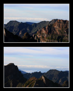
For this final print composition I plan to mount these images of mountains in black mounting board. I wanted to do this as the images are quite detailed in areas and there is a large sense of depth within the photographs, so i didn’t want the presentation of the image to have significant depth its self. I also feel that the black surrounding the photographs will help to bring out the light in the image and draw the viewer’s eye towards the photographs.