All posts by Charlie Craig

Filters

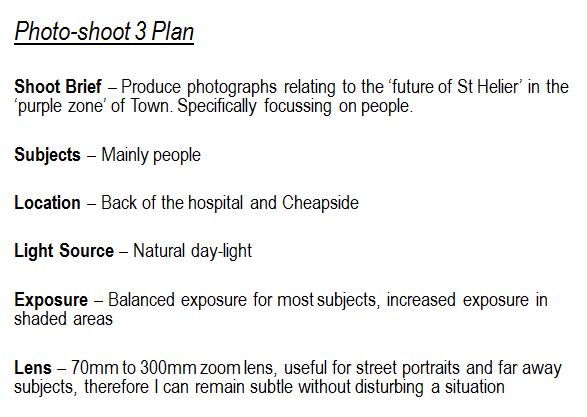
Author:
Category:

Future Of St Helier Newspaper And Installation

Future of St Helier

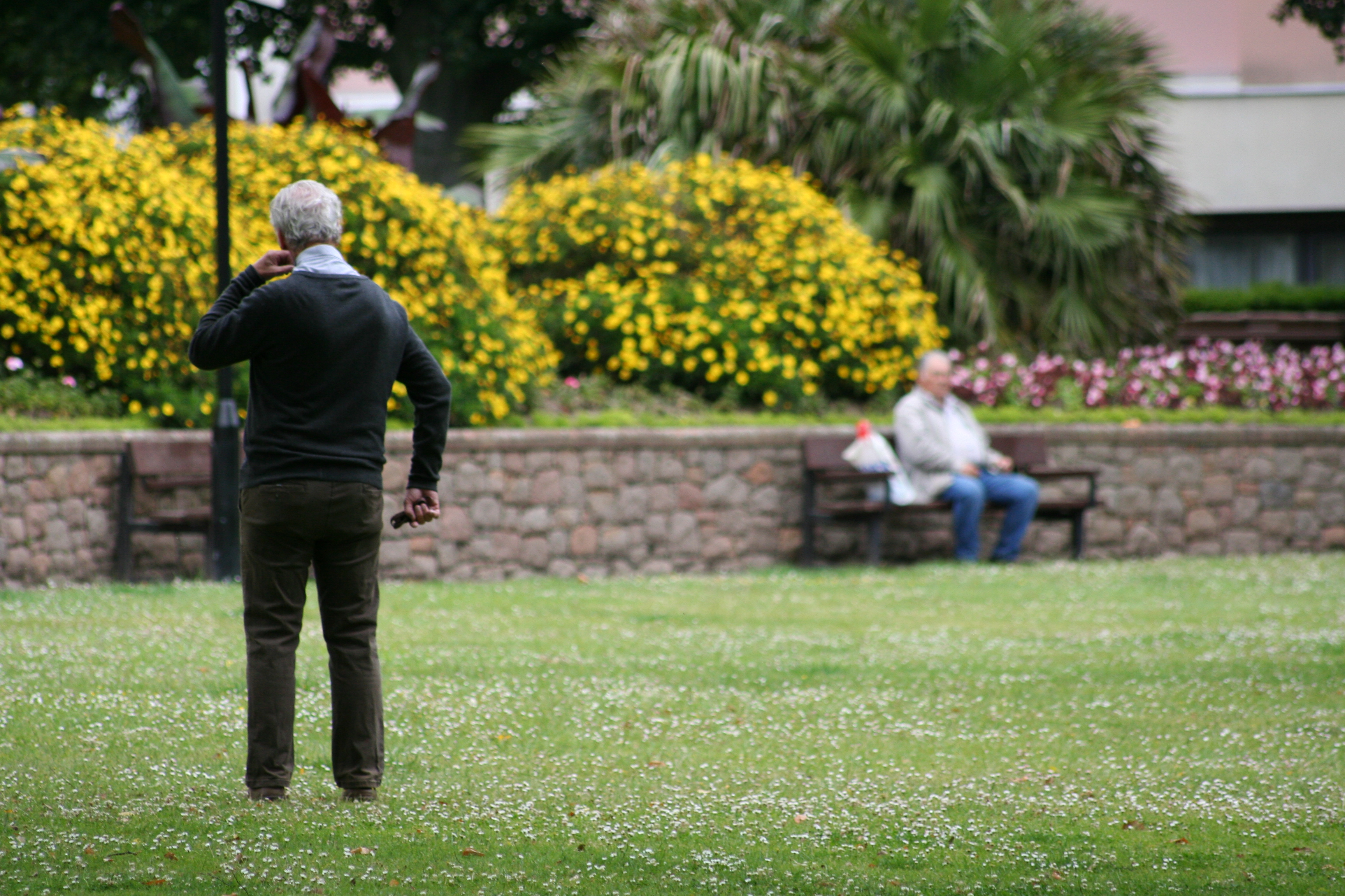
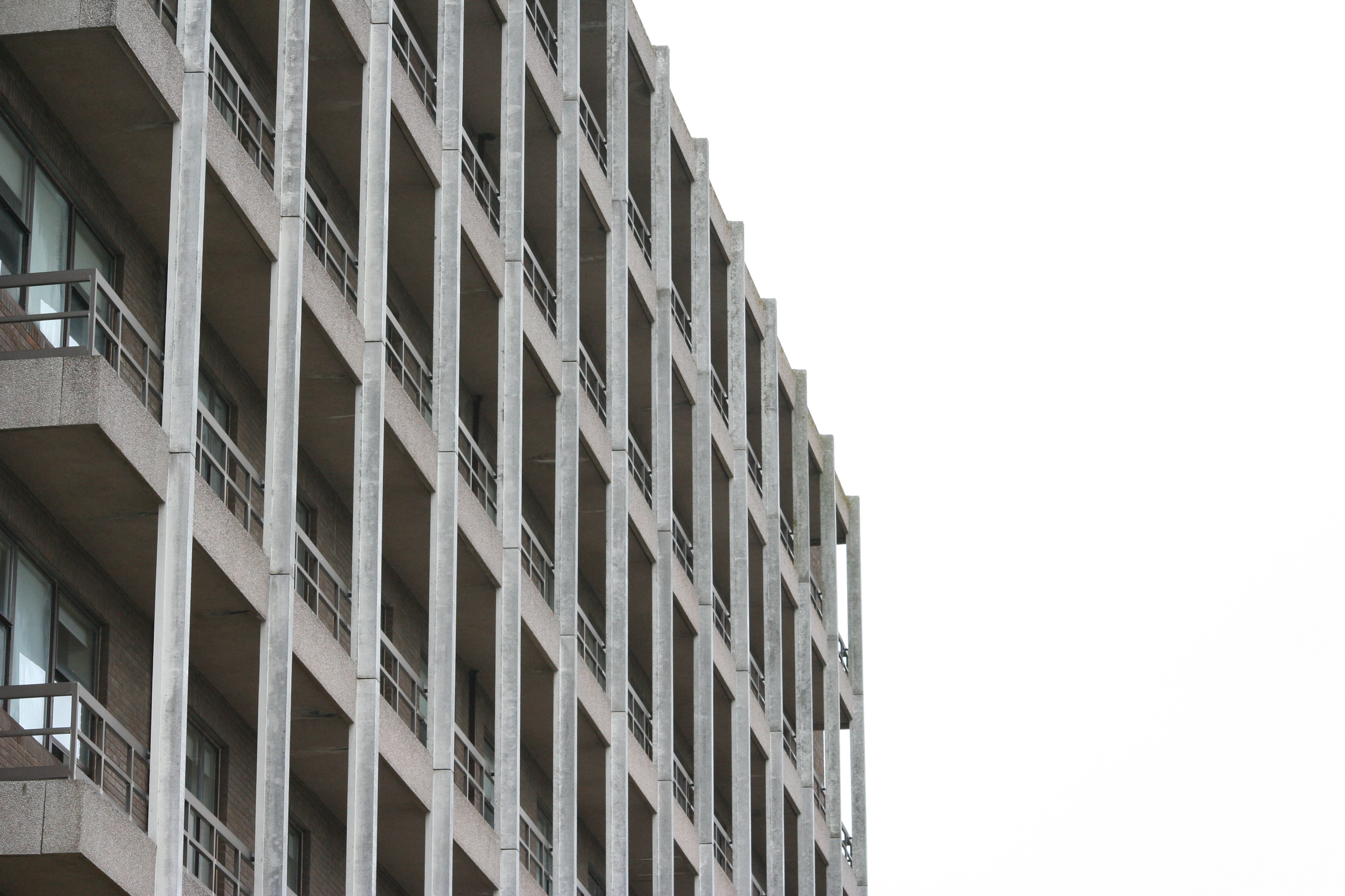
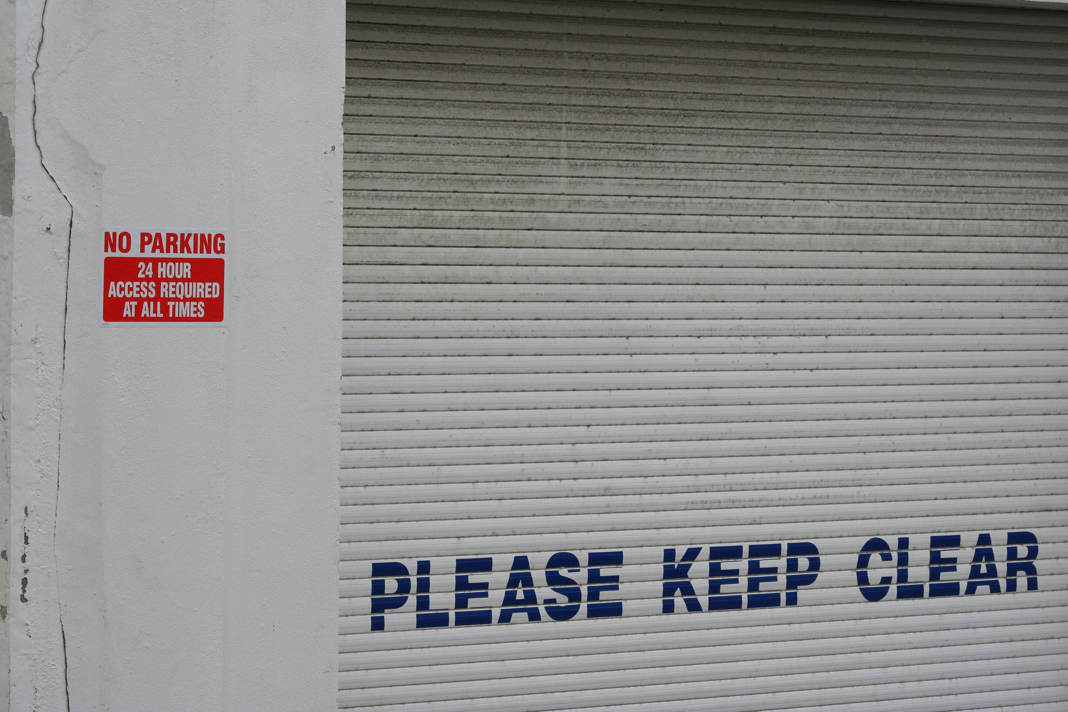
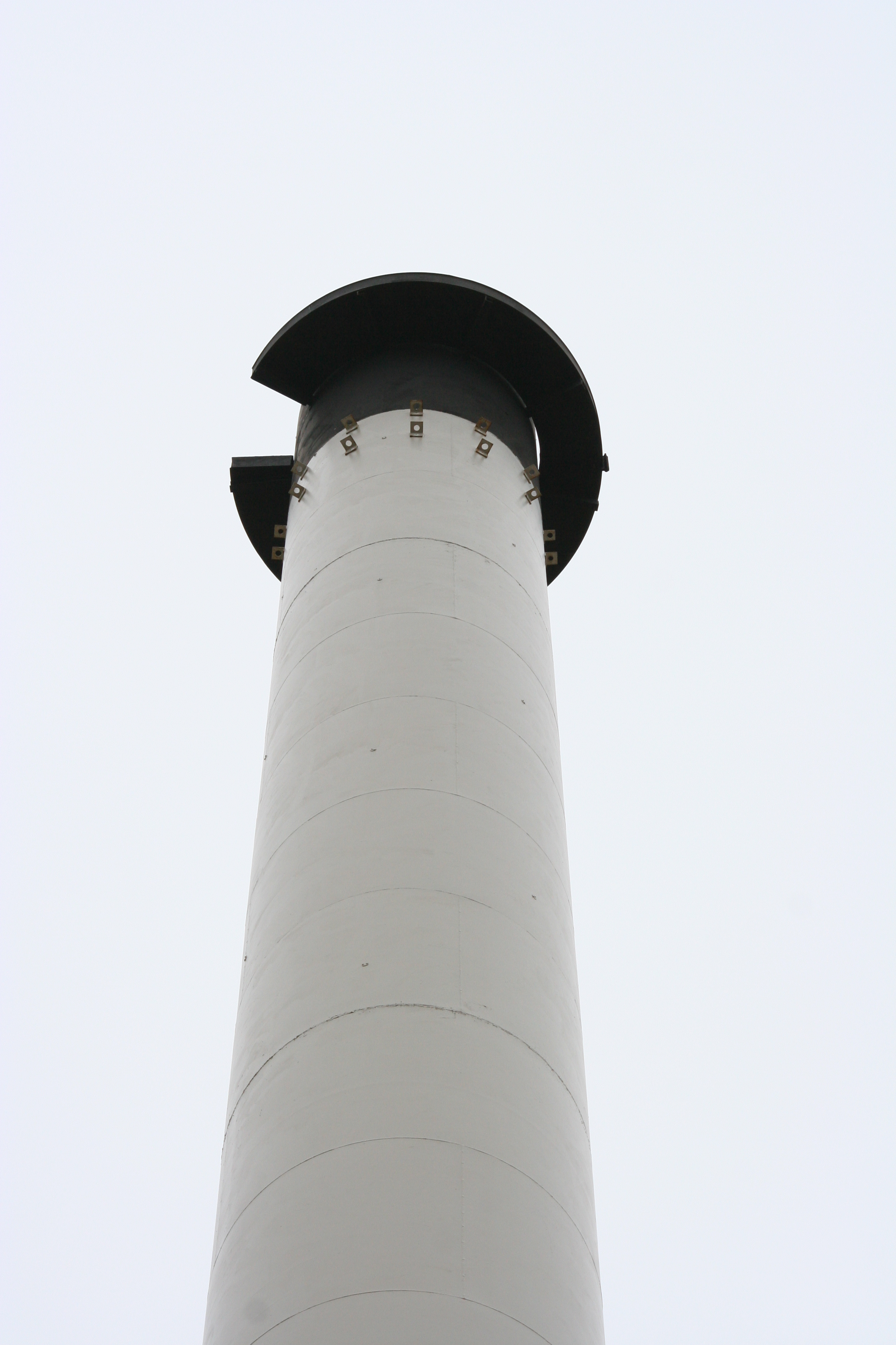
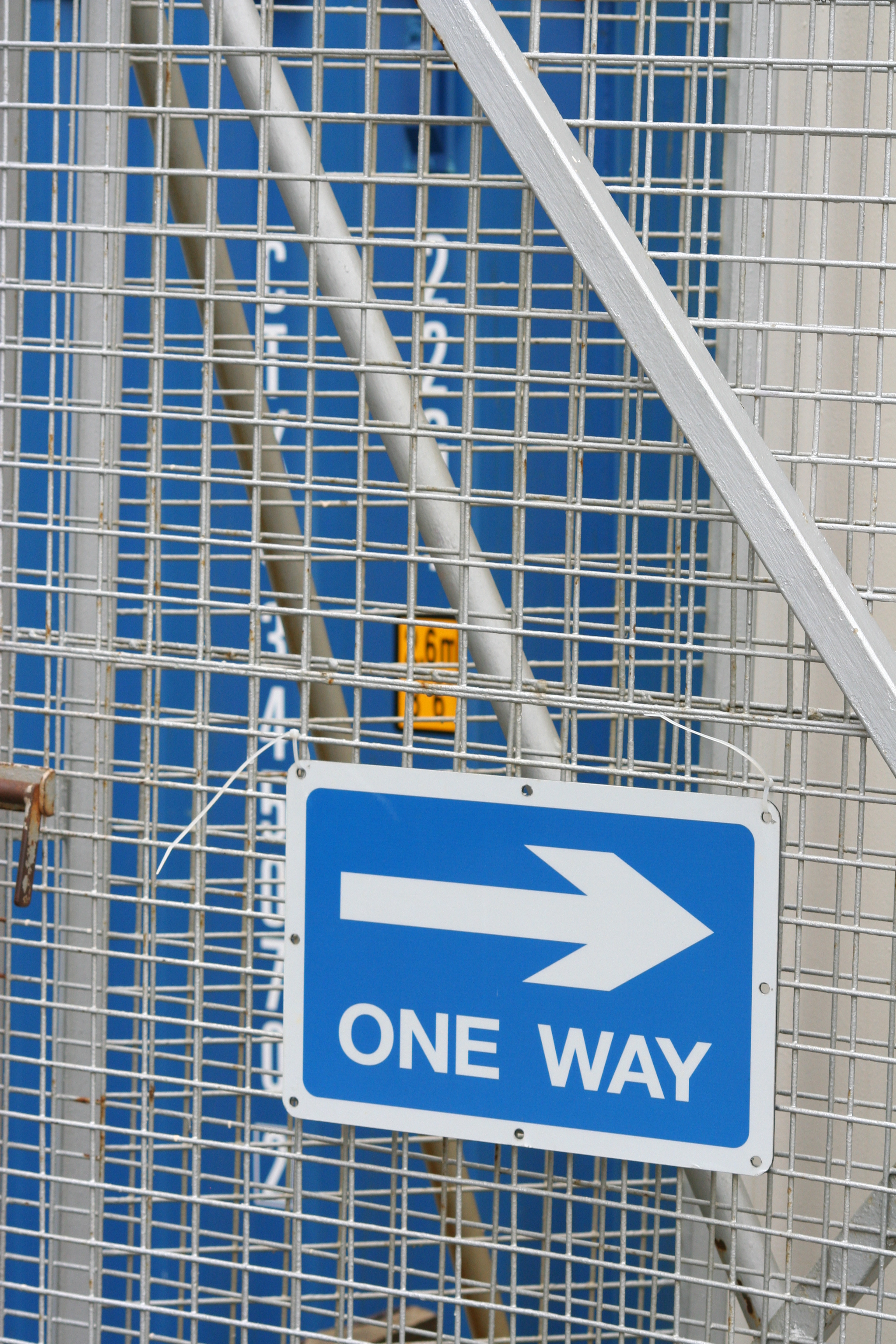
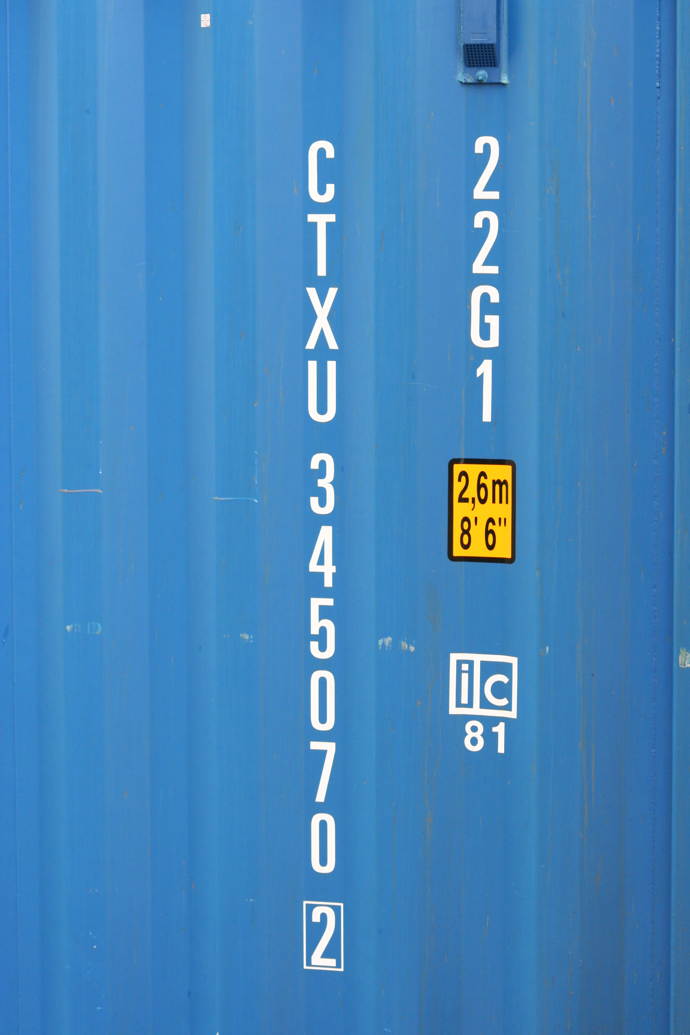
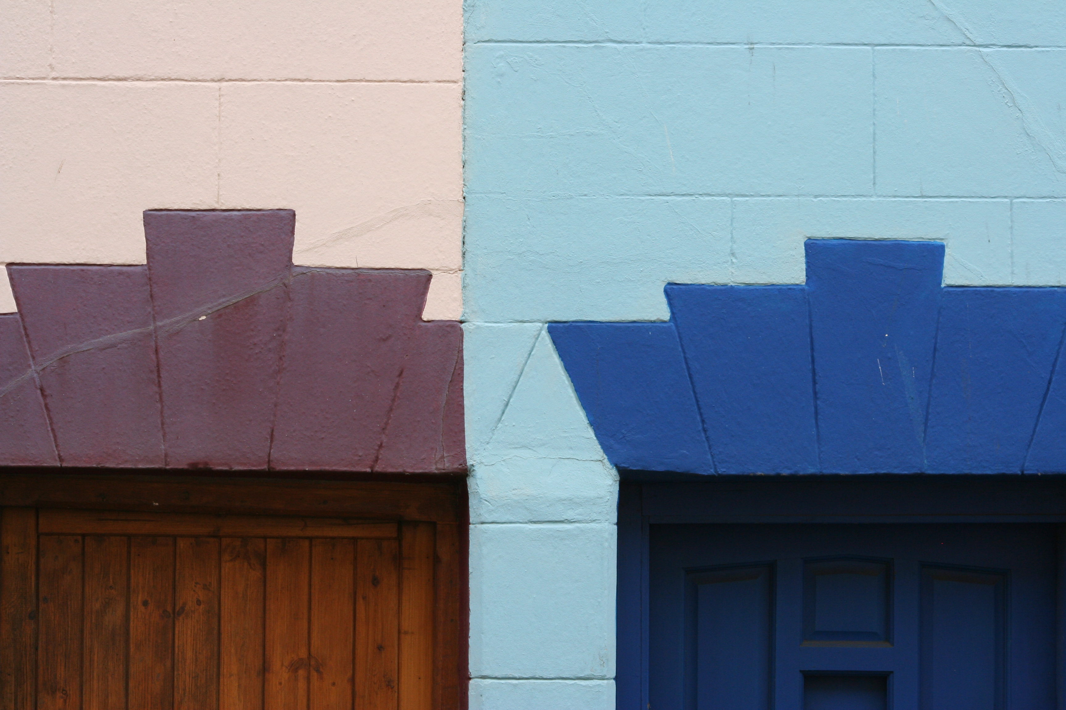
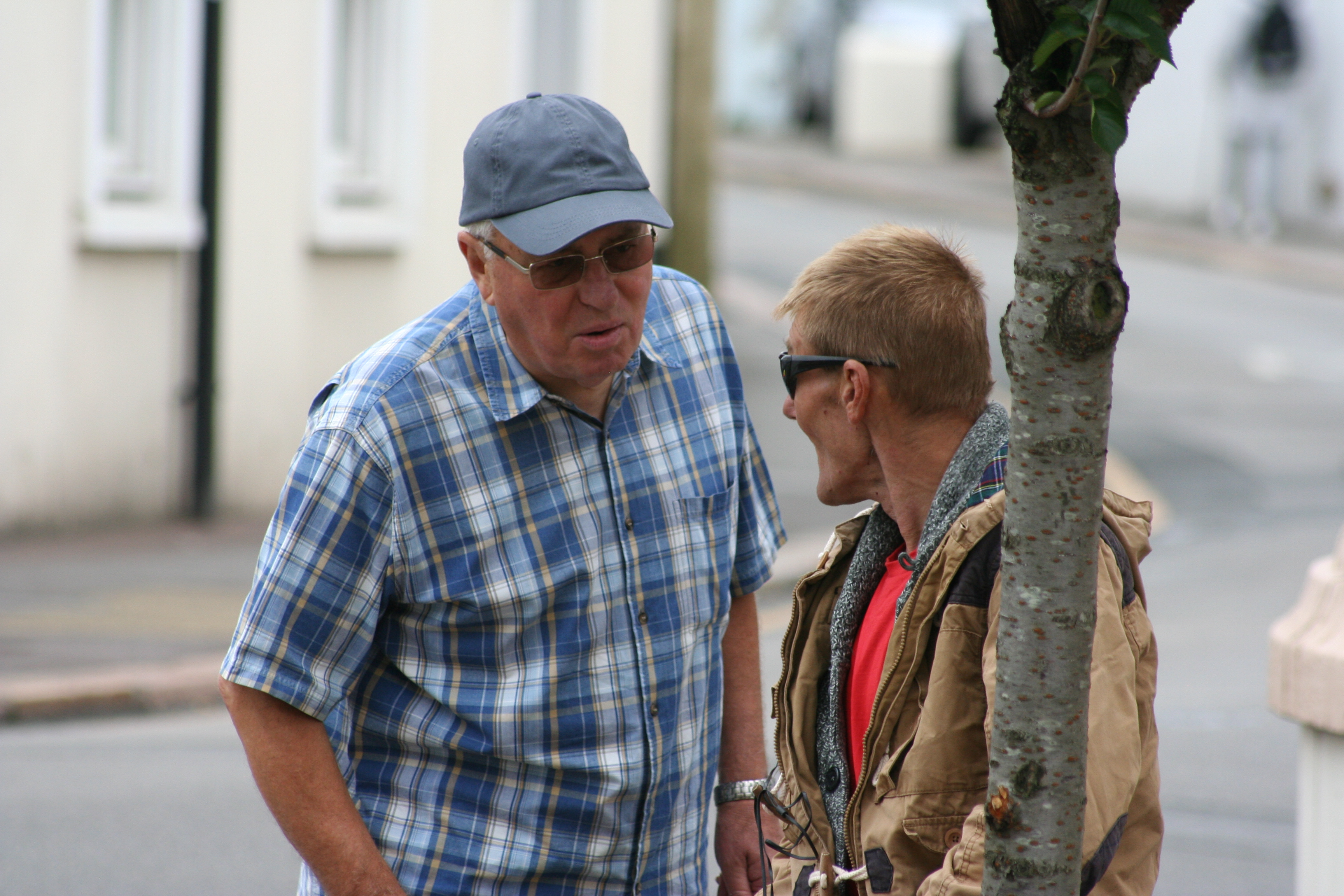
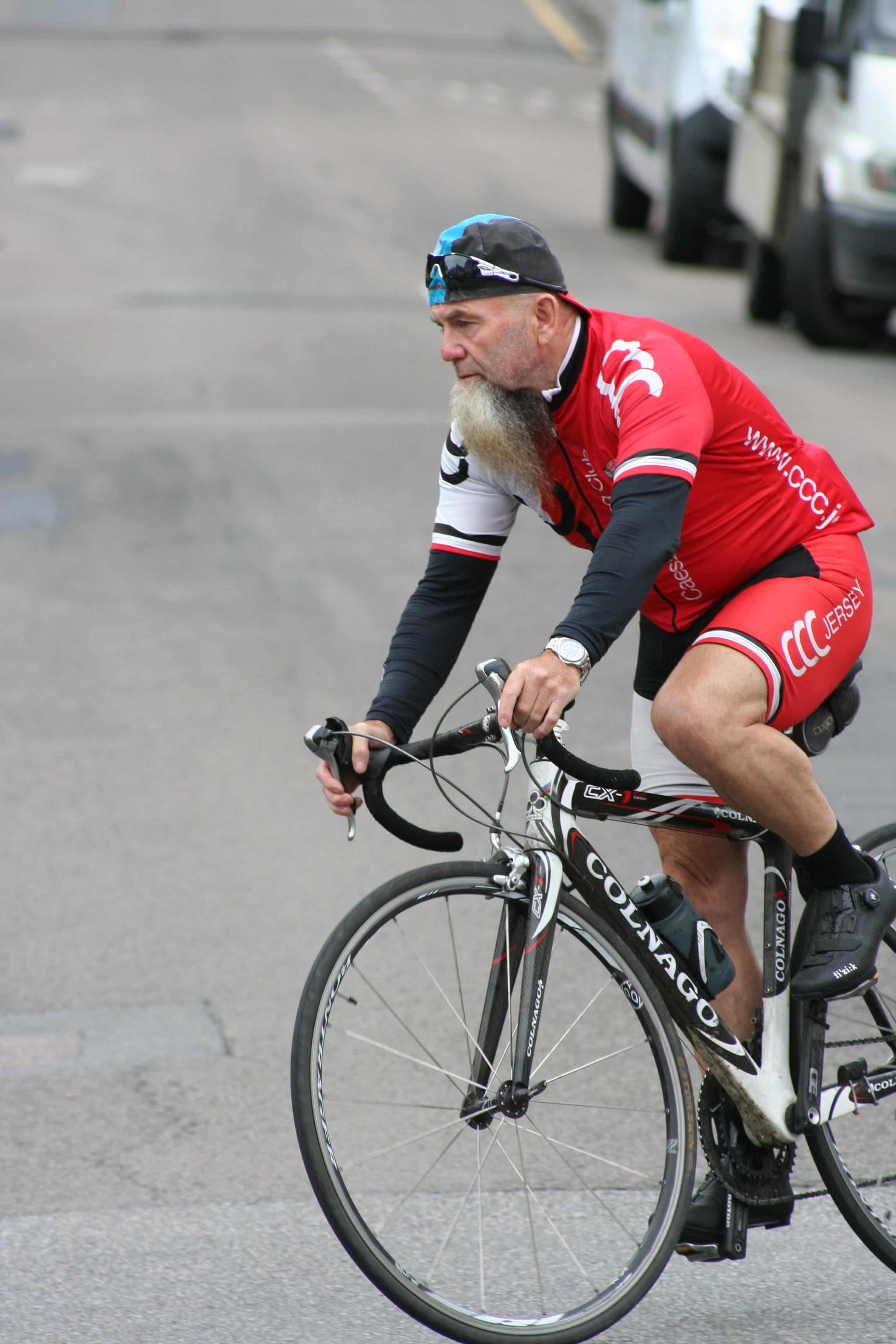
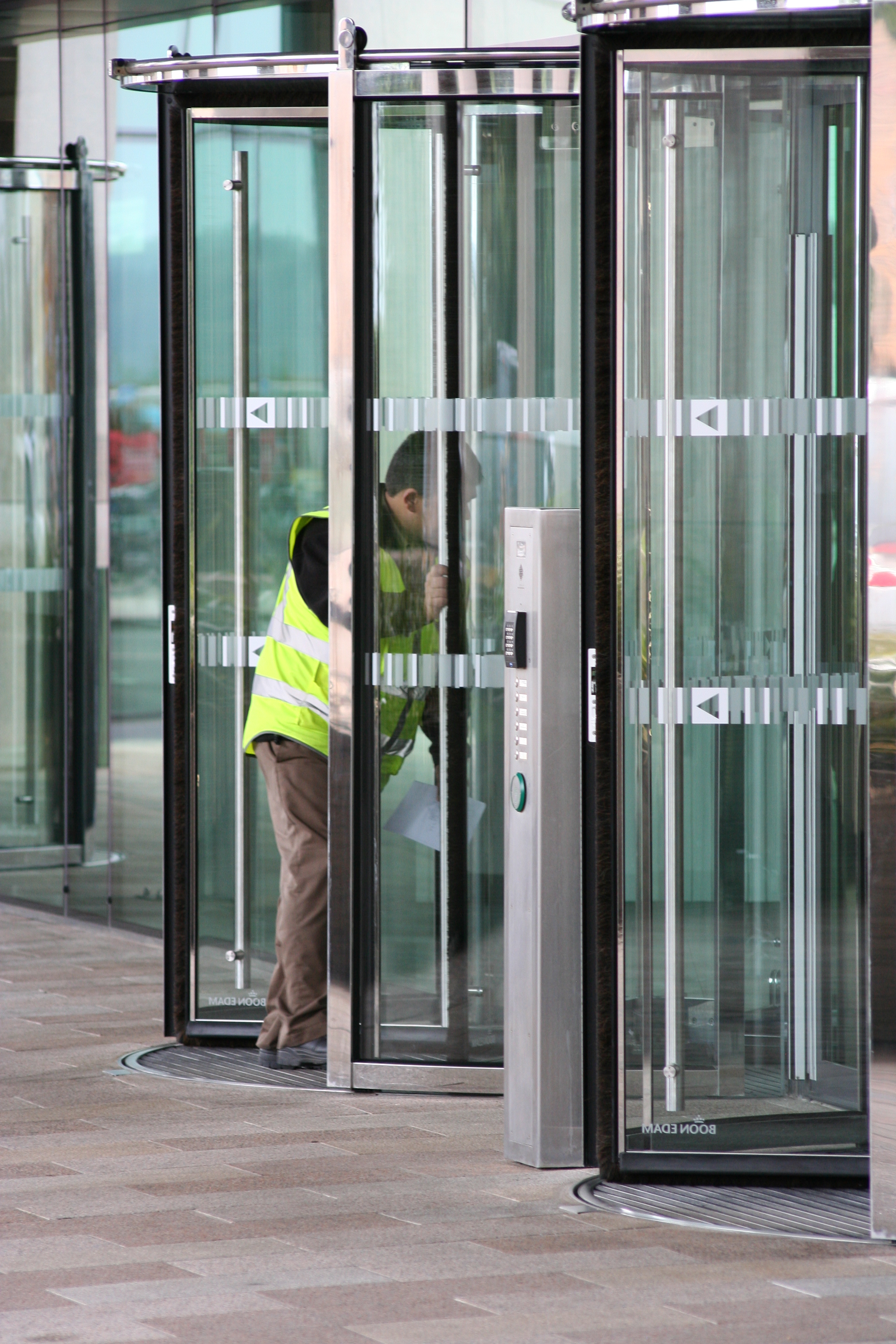
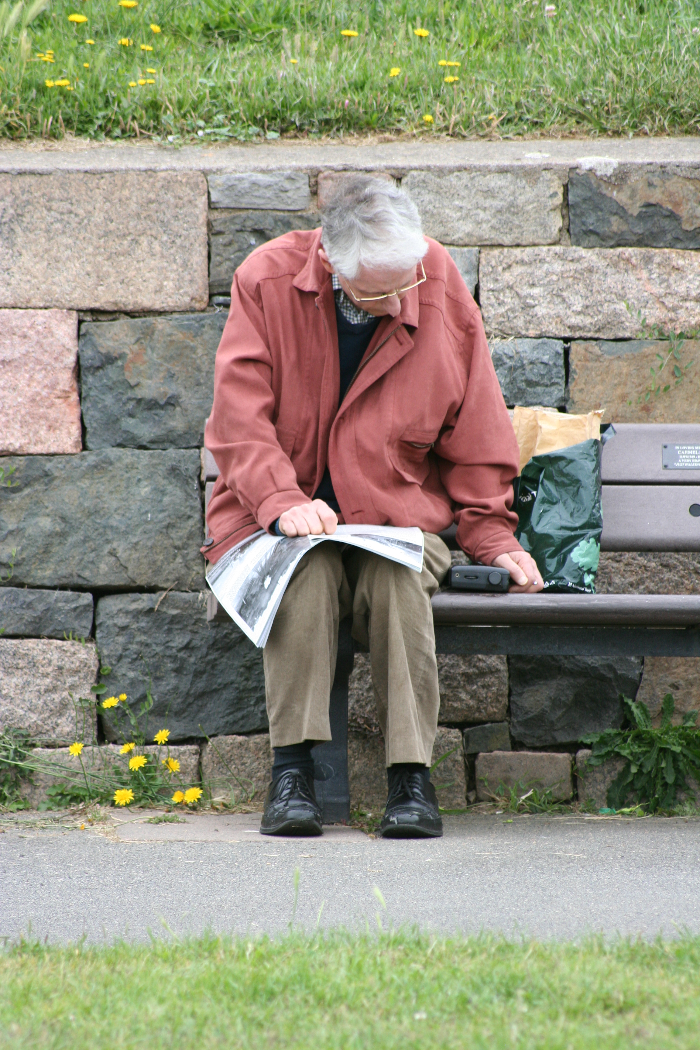
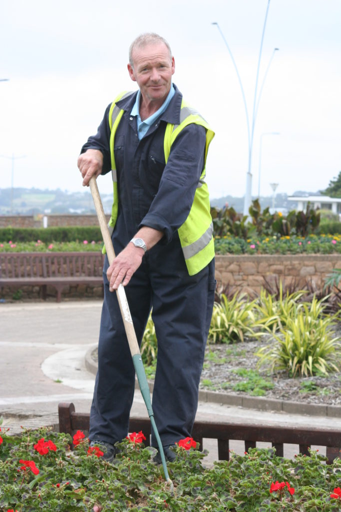
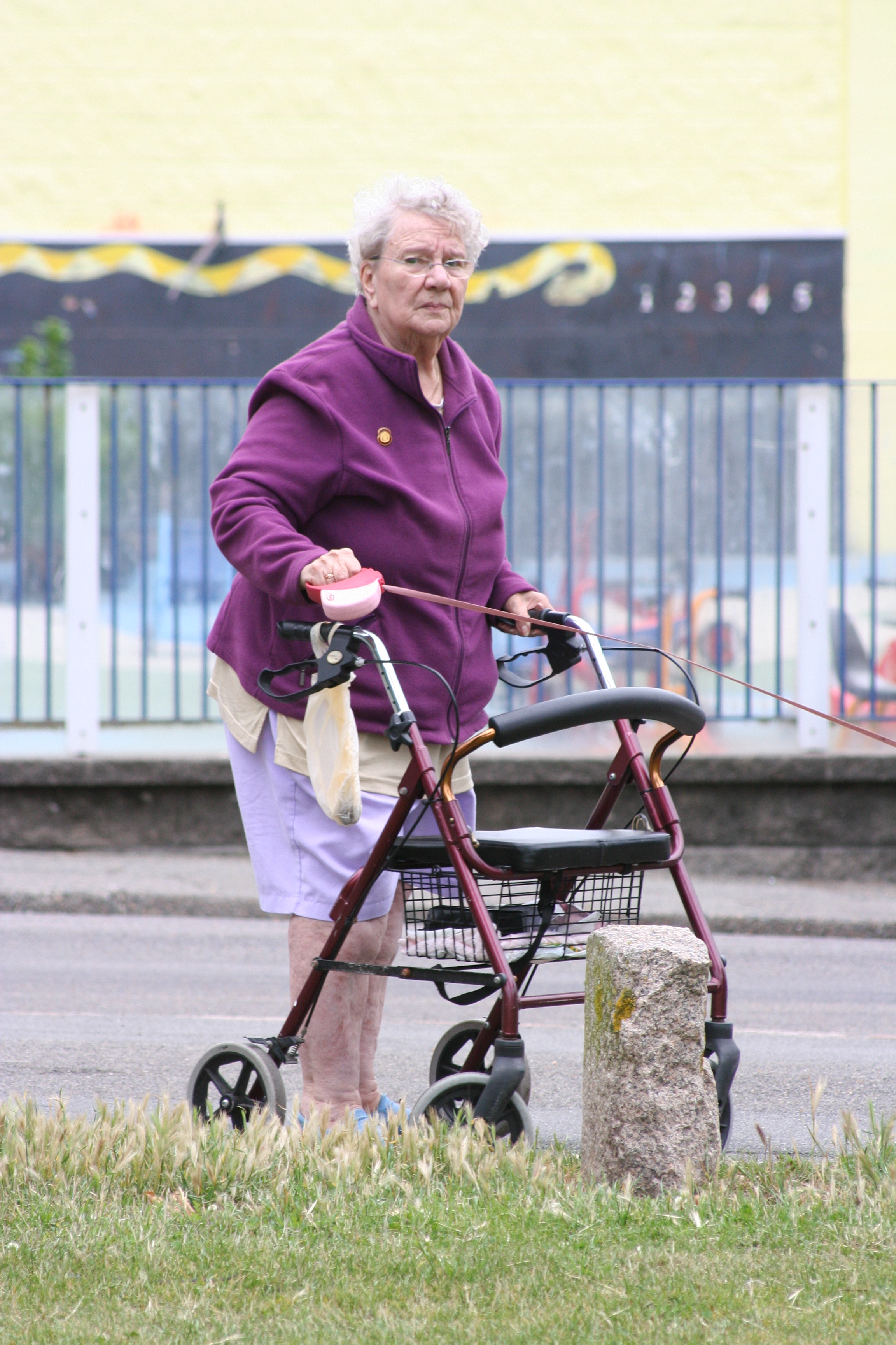
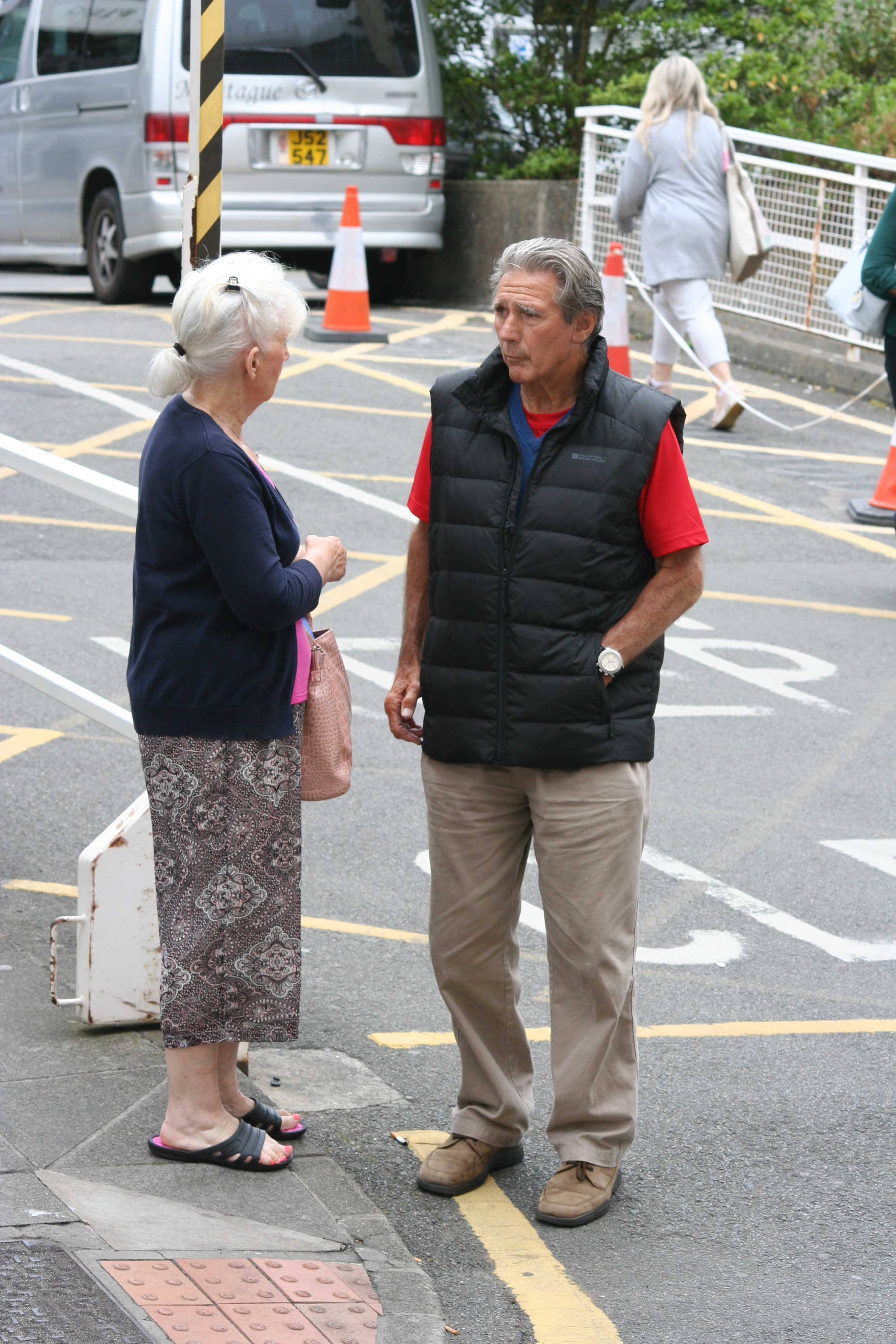
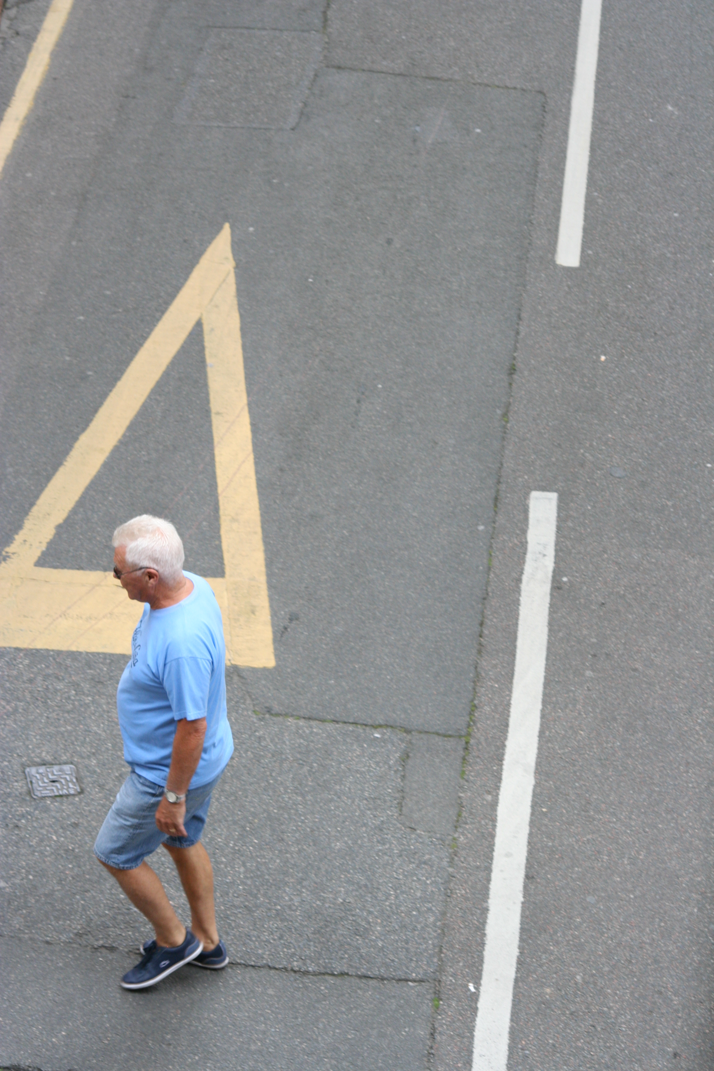
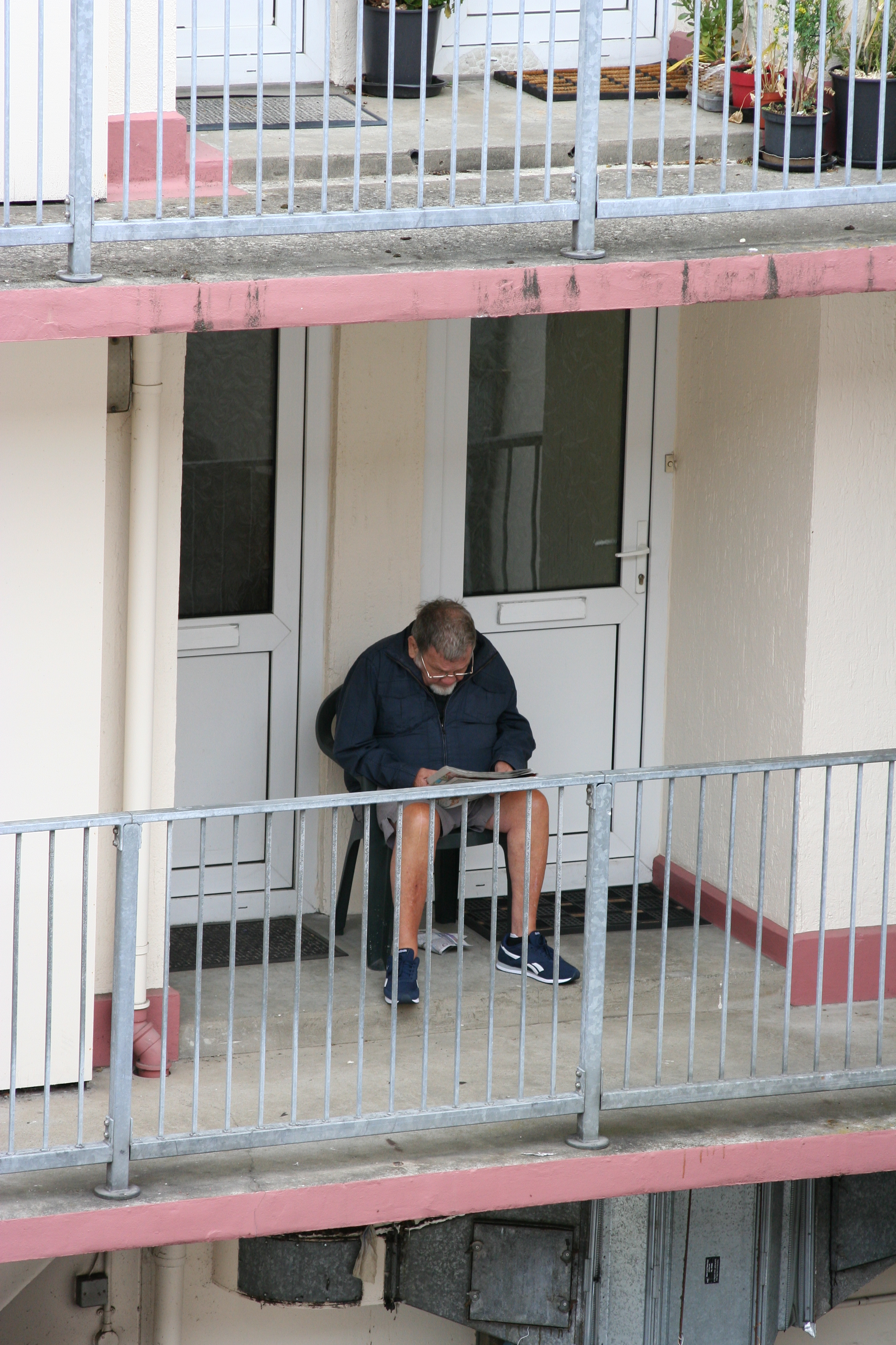
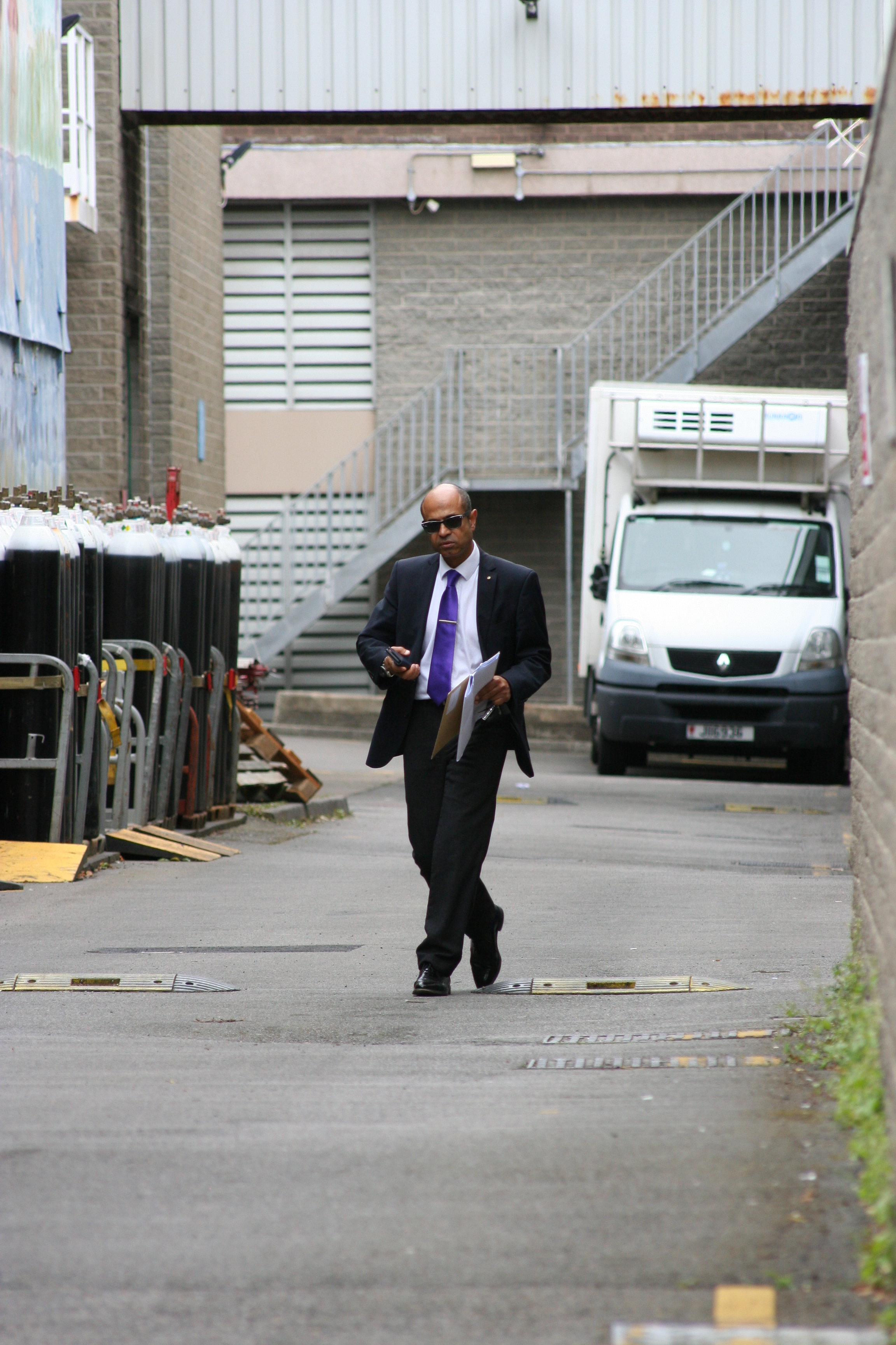
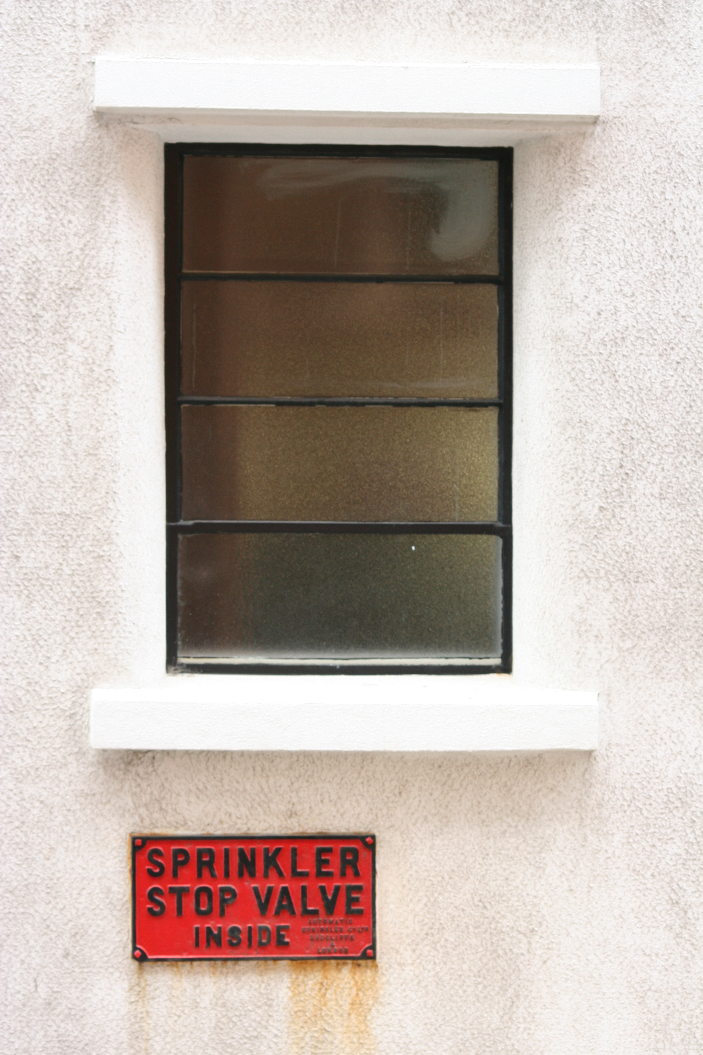
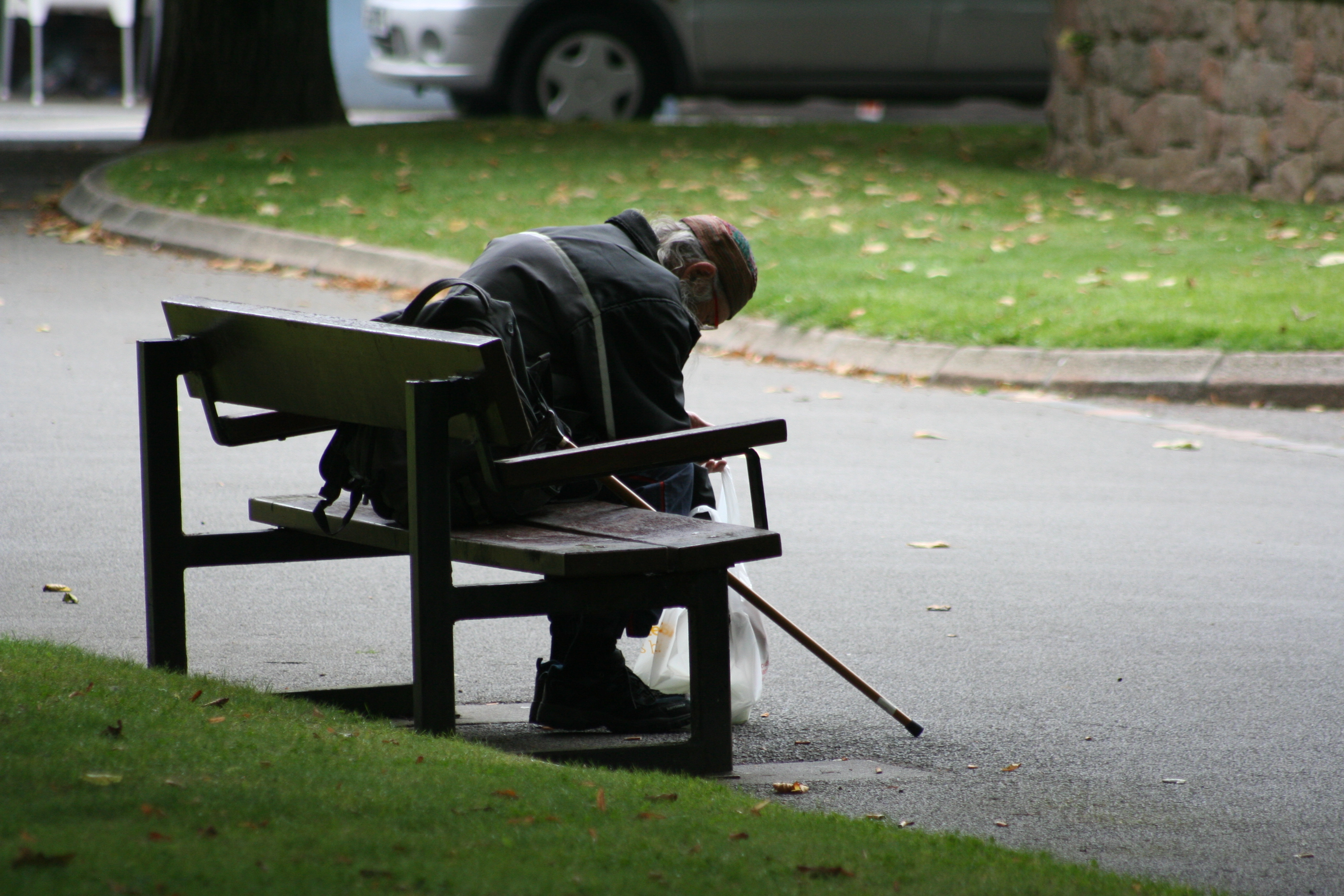
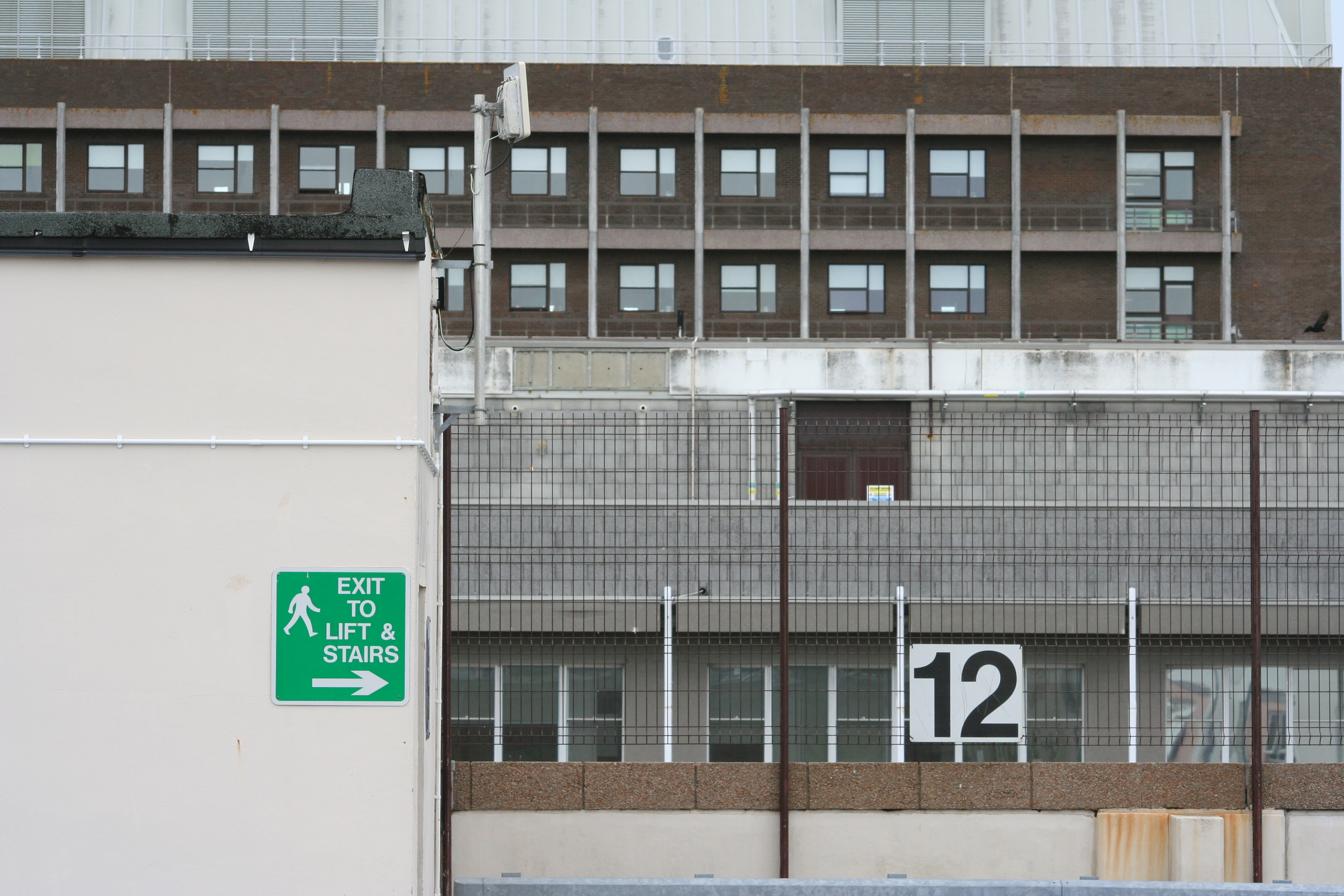
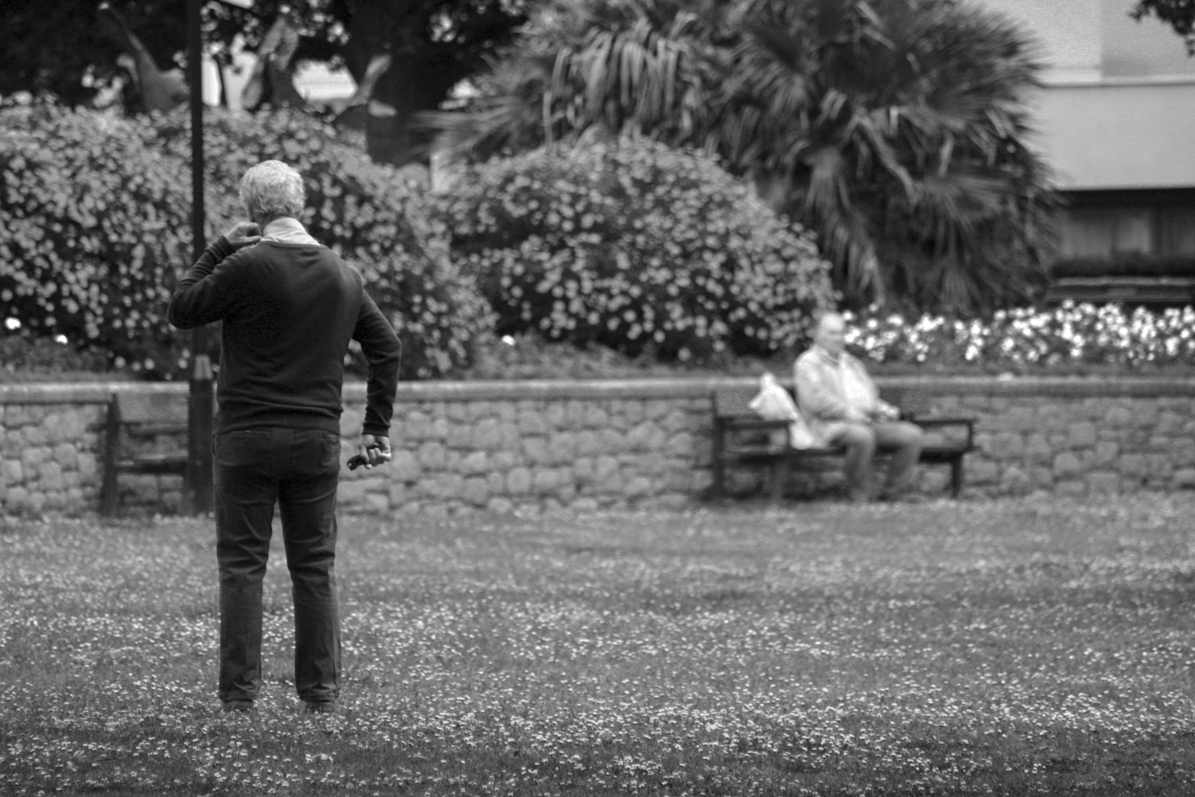
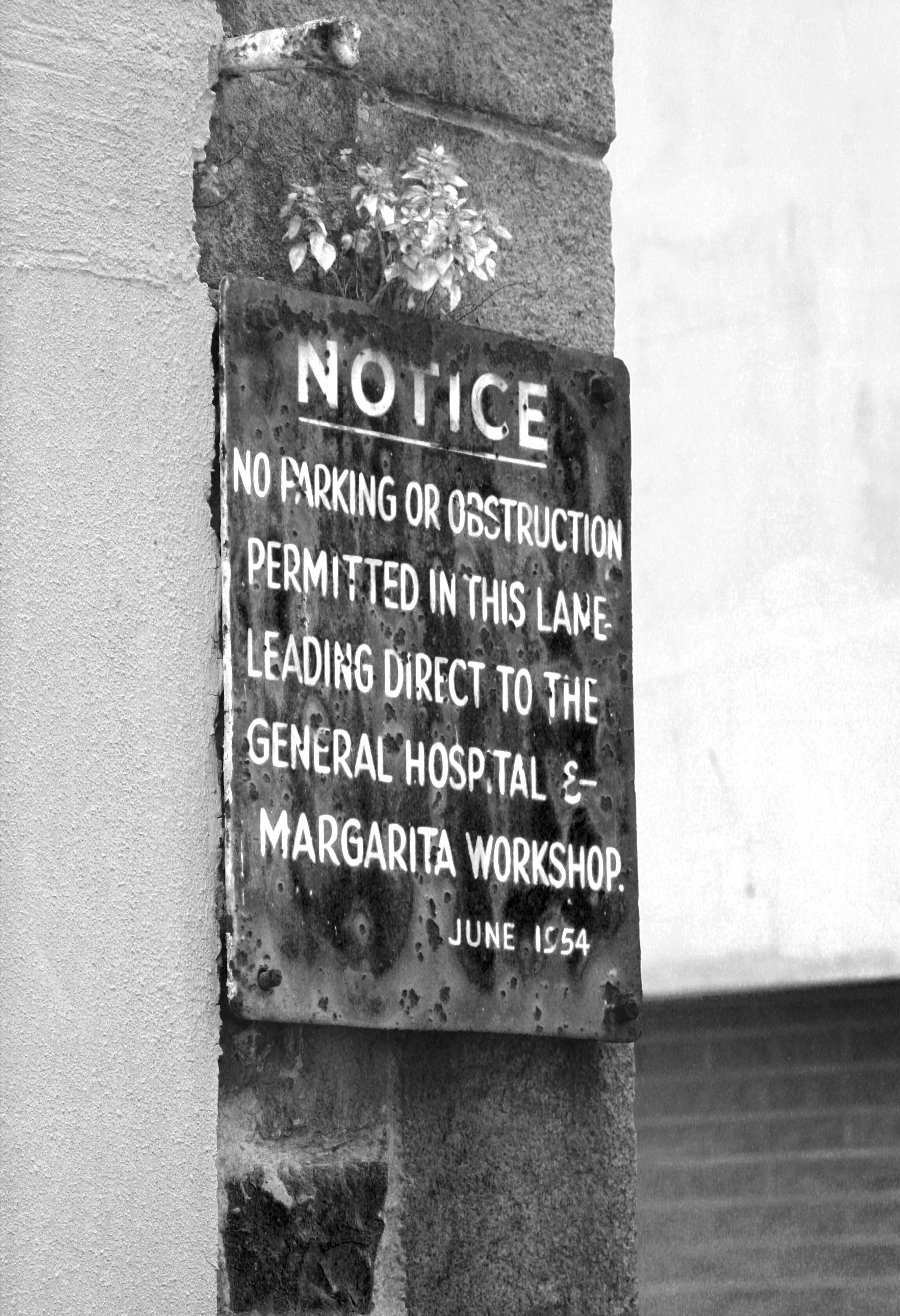
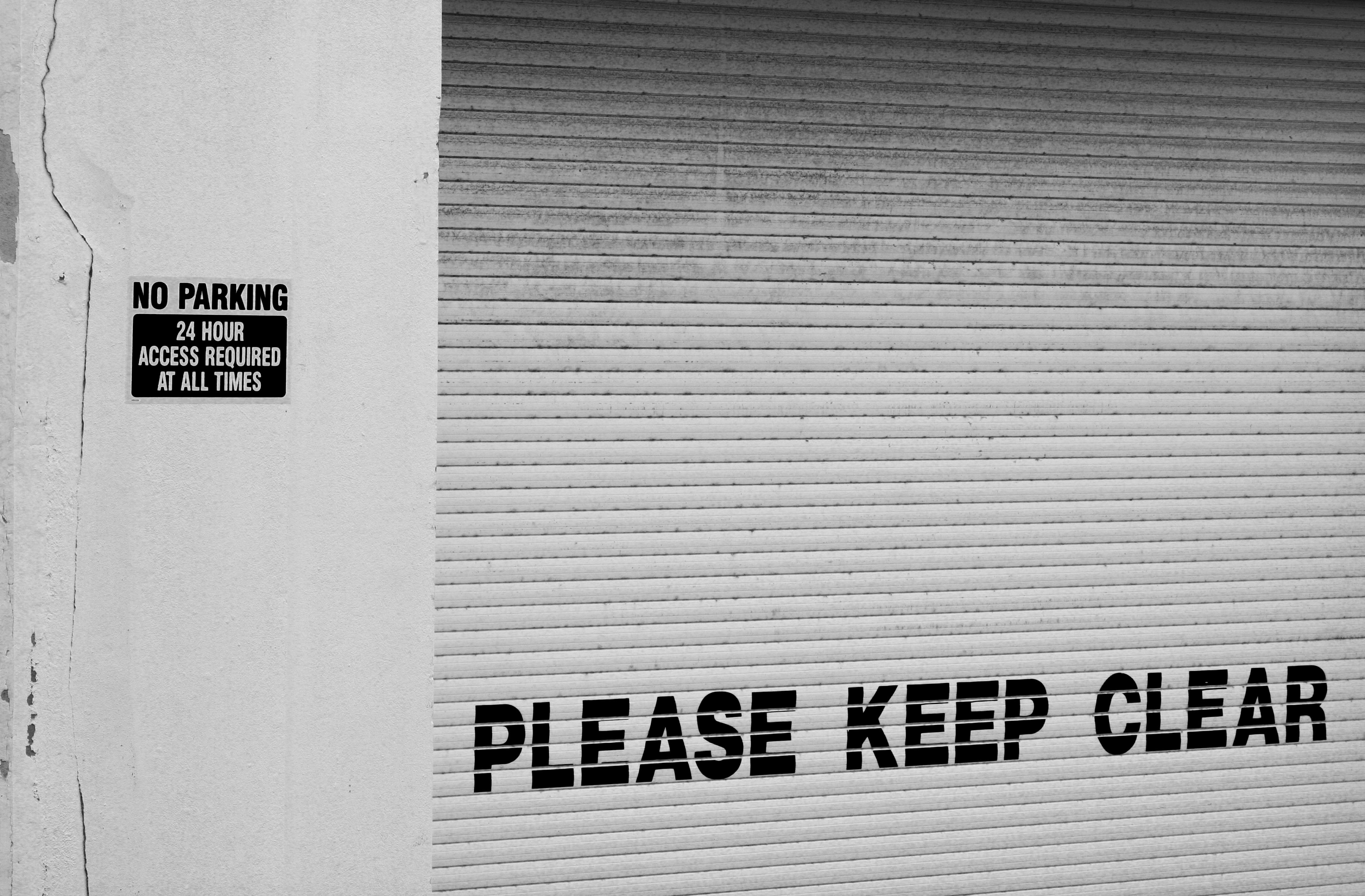
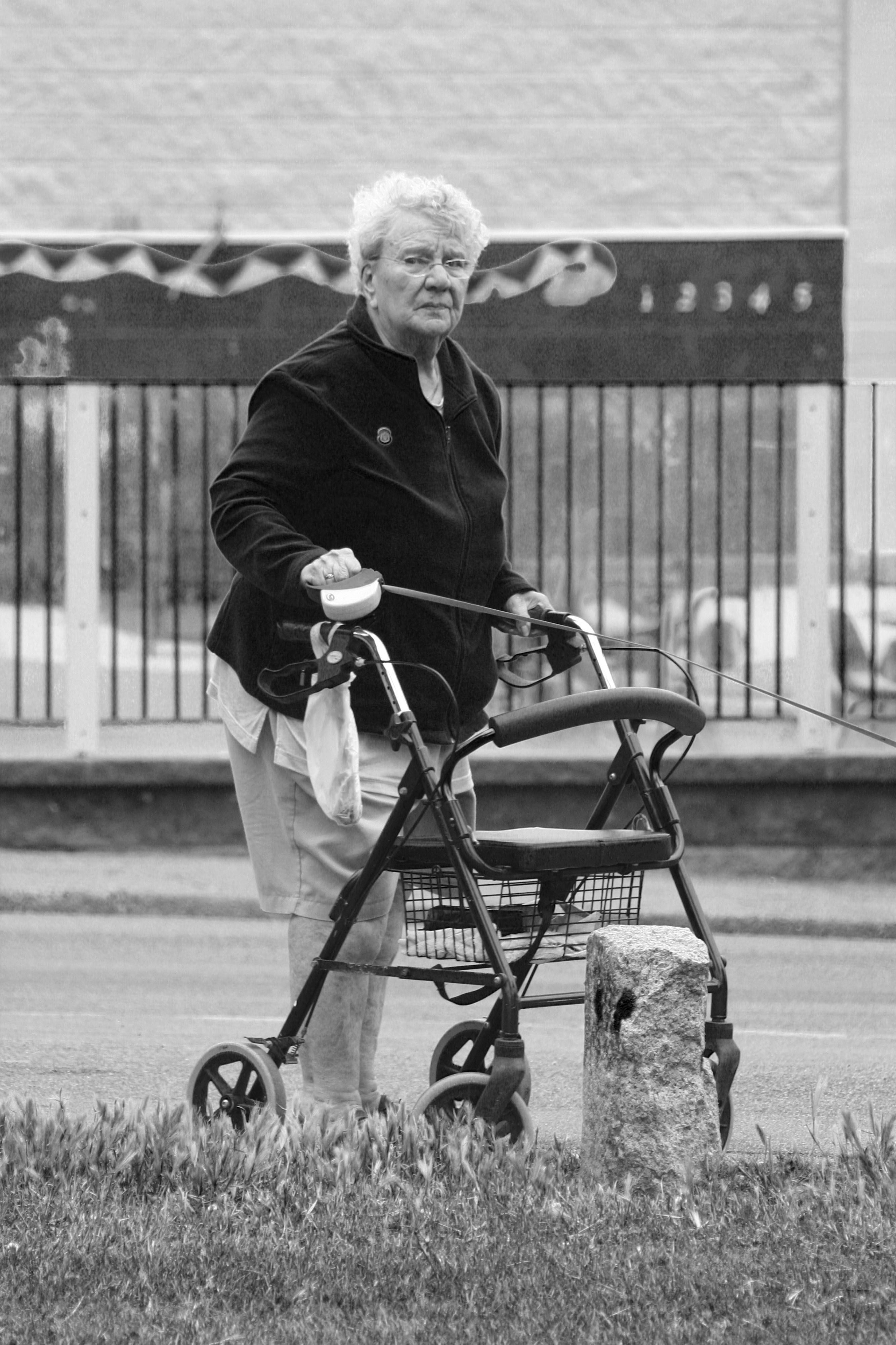
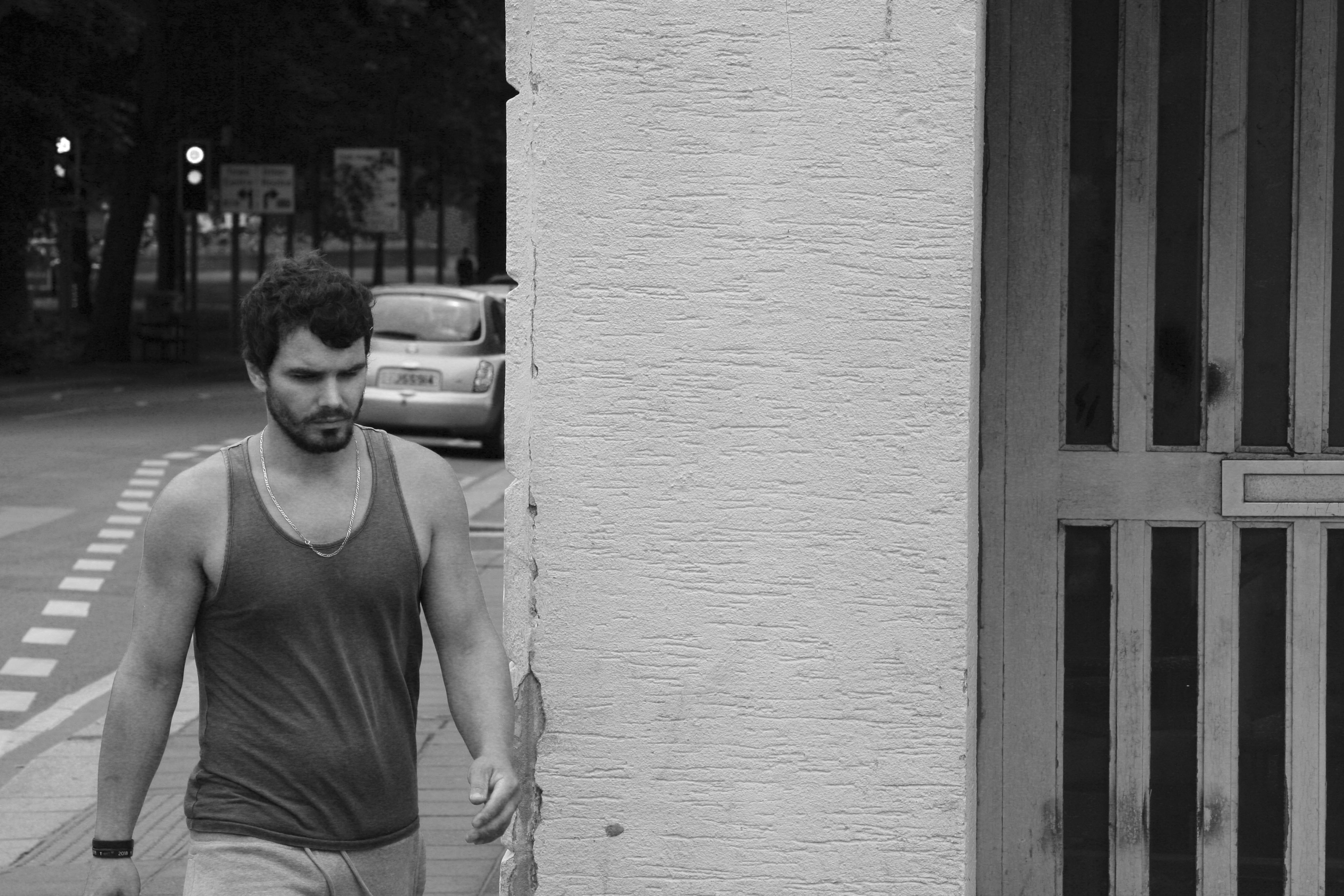
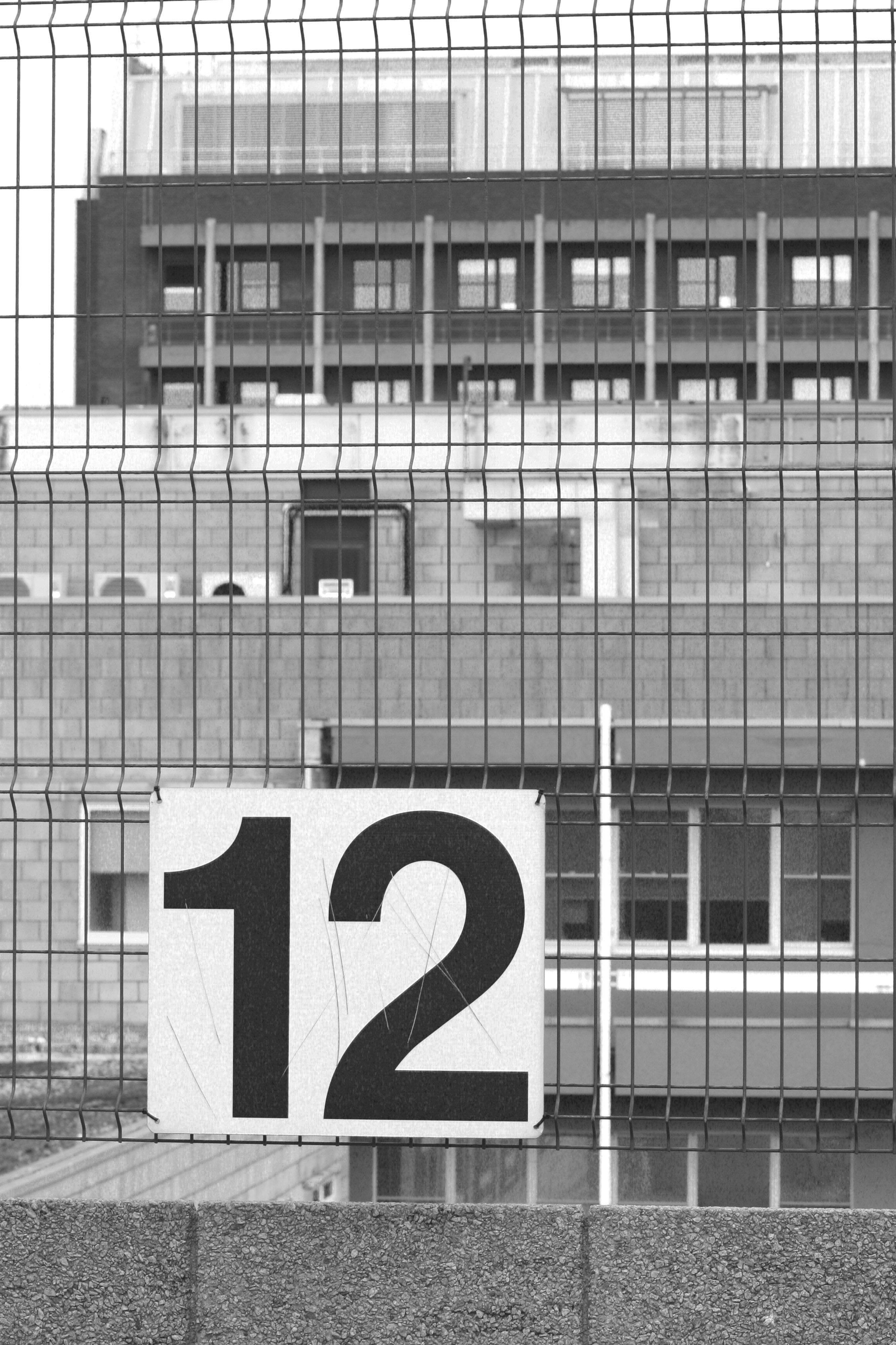
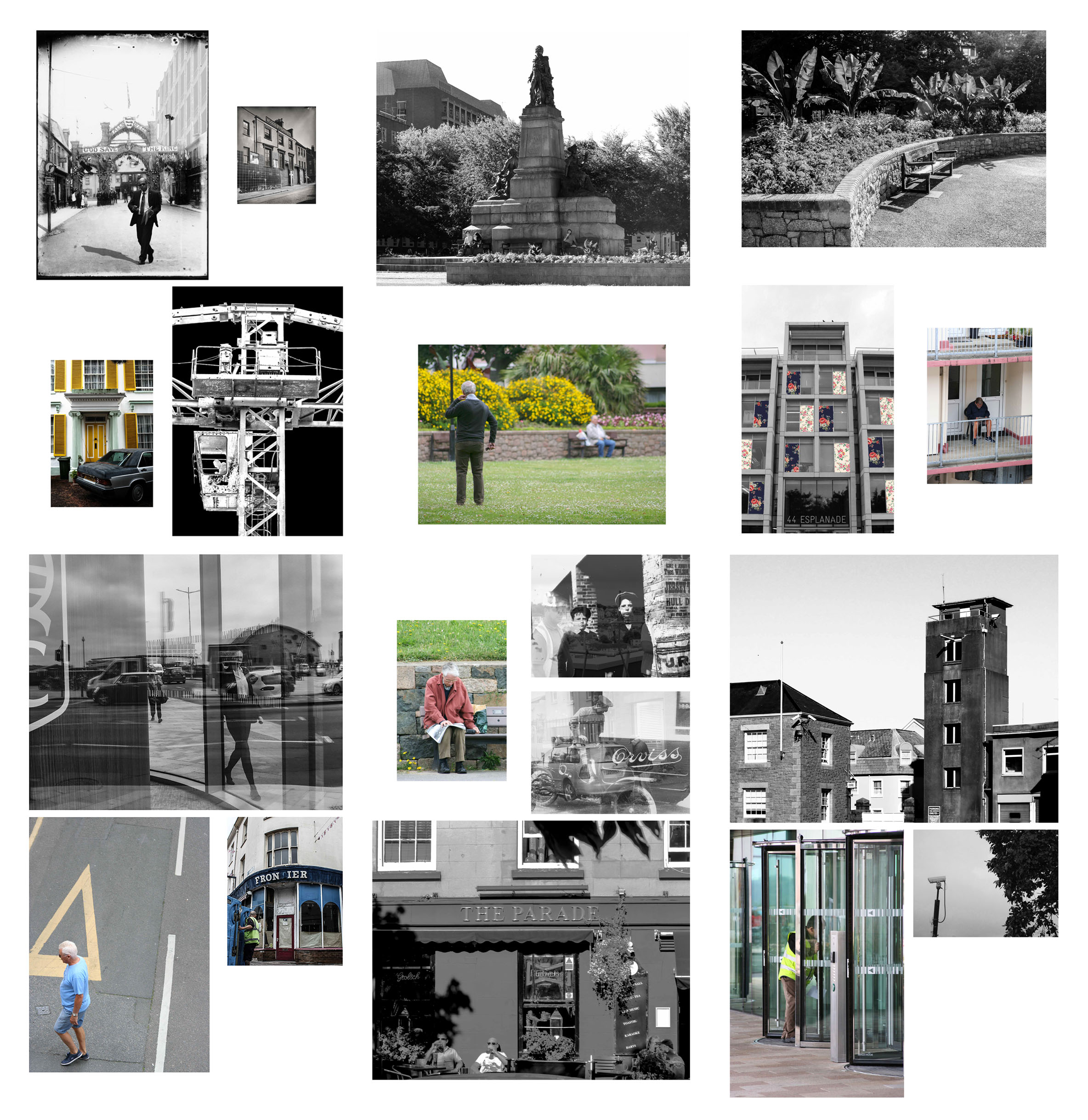
6 of my photos were included in the Future Of St Helier hoarding installation at the IFC in St Helier

Hoarding Installation

The unveiling of the Future of St Helier Hoarding at the International Finance Centre on the Esplanade in St Helier took place on Thursday 13 Dec 2018.

First published as a 52 page newspaper supplement in September by the Jersey Evening Post the work produced by A-Level Photography students at Hautlieu School have been transformed into a 34m outdoor installation as part of Masterplan Community Arts and Education Project

We were challenged with responding to specific areas, streets and neighbourhoods divided up along the urban vingtaines of St Helier and to explore through research, archives and photography the built-environment, urban living, diverse communities, town planning, land use and re-generation projects.

We thank all sponsors and collaborators for making this a successful contribution to the island’s cultural records and historic archives Jersey Development Company, Camerons Ltd, MJP ArchitectsArchisleLewis BushPhoto-Archive Societe-Jersiaise, Kevin Pilley, States of Jersey and Connétable of St Helier, Simon Crowcroft
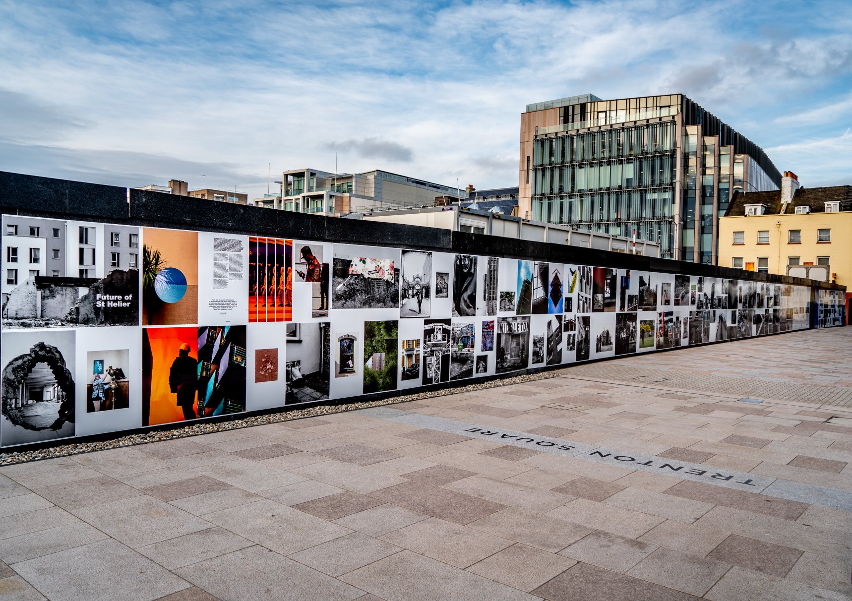
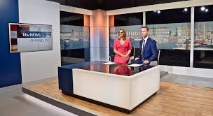
Earlier today we unveiled the Masterplan Future of St Helier hoarding display at the International Finance Centre. Lots of local media interest from Jersey Evening PostITV Channel TV and BBC Jersey who broadcasted live on radio talking to photography students at Hautlieu School, Constable of St Helier, Simon Crowcroft and sponsors Jersey Development Company, Camerons Ltd, MJP Architects about the future of the island and its capital. An excellent example of how a community arts and education project can generate a debate that affects all those who either live, work or visit St Helier.

If you are interested in our views of young people tune into BBC Radio here (listen from 3:18:30 onwards or watch the six o’clock news tonight on ITV.

https://www.bbc.co.uk/sounds/play/p06rlpdw

If you missed the news last night at ITV Channel TV you can catch up here with Hautlieu students talking (15m.12s) about their images on display at the Masterplan Future of St Helier hoarding on the International Finance Centre.

See link here
The outdoor installation on the hoarding around the construction site is a great way to engage the public in art and debates concerning the future of the island’s capital but, what we need in Jersey is a new contemporary art space that will provide a new venue to showcase art produced in the island, but equally also bring international art to Jersey for the public enjoyment of its residents and visitors alike.

The recent Culture, Arts and Heritage Strategic Review, commissioned by the Government of Jersey makes 20 new recommendations that will revitalise the island’s cultural infrastructure and achieve a wide range of social and economic objectives from tourism, to health and well being to external relations, to planning and environmental developments – in the hope that in partnership with Government it will enrich and enhance Jersey’s quality of life.

Let’s hope those in power who can make real changes to St Helier’s build environment will include such a new art space in the revised Masterplan of the Waterfront. All we need is political will and re-prioritising public funding for the arts. States of Jersey

Future of St Helier Newspaper

The outcome of students work was first published on Tuesday 18 September 2018 as a 52 page newspaper supplement, Future of St Helier that was printed in 14,000 copies and inserted into a daily edition of the Jersey Evening Post and distributed island wide.
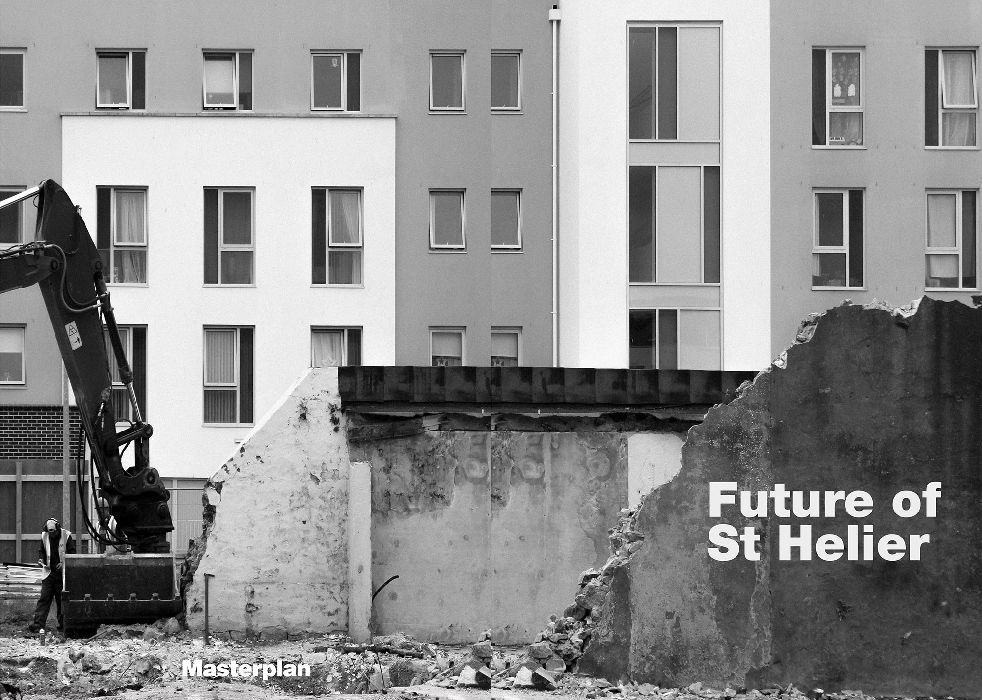
Here is a video browser of our Future of St Helier supplement printed and distributed in today’s edition of the Jersey Evening Post. Hautlieu photography students were challenged with responding to specific areas, streets and neighbourhoods divided up along the urban vingtaines of St Helier and to explore through research, archives and photography the built-environment, urban living, diverse communities, town planning, land use and re-generation projects. Each student designed a page spread which was then split in half producing a fragmented image reflecting on the nature of experience and diversity of St Helier.

Final Newspaper Page

This image (below) which I have decided to use as my page spread in the student collaborative ‘Future of st Helier’ newspaper article is a combination of a photograph from the Societe Jersaise photo-archive and some of the images from my first photo shoot. The idea behind this piece was to show how the aesthetics of the modern town are considerably less visually pleasing that those of the old urban landscape, and when imposed upon the archive photograph take away the charm from the photo. I believe that this image would work well in the newspaper due to its rustic and dated aesthetic mixed with the modern corporate elements that are included within it. Also as a full page in a newspaper, I believe that the boarder around the edge will frame the image itself in an eye catching way, and will look very effective in a newspaper.

Without actually knowing exactly when the original photograph was take, the ‘God Save The King’ banner in the foreground of the image shows the age of the archive photograph, as the image would’ve had to be taken before 6 February 1952 as that was the latest date of a reigning male British monarch. The clothing of the office worker, the street signs, the modern building and modern lamppost that have been added into the original photograph are the give away signs that the image has been manipulated as I have tried to make this obvious when editing, but also having in mind that I want the first glance of a viewer to just think that it is just a dated photograph.

Here are the information references from the archive of the original photo taken by photographer Francis Foot.


Draft Zine Layout

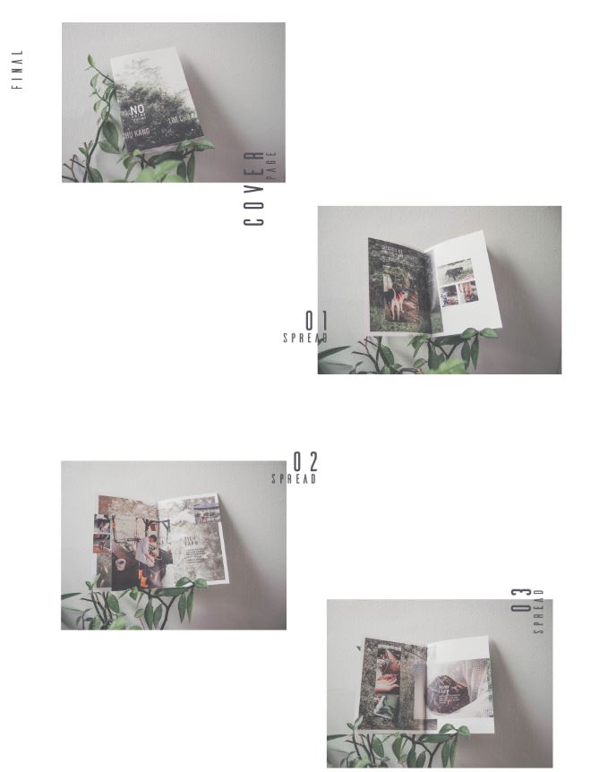
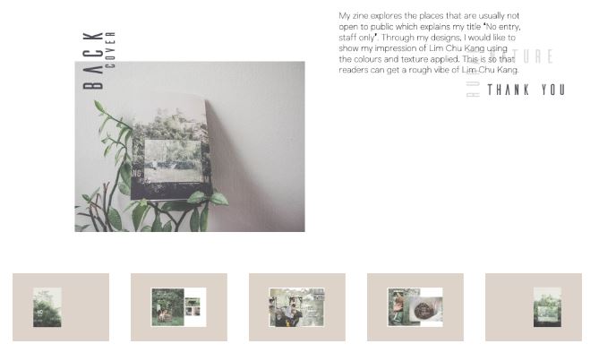
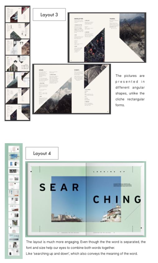
Here is my first draft layout of my zine design. I believe my choice and sequencing of photographs and my use of basic text is very effective and clean. I have tried to keep things as minimal as I can as i didn’t want to draw any attention away from the photographic content itself. However something that I am not too sure on at this point is the layout in terms of alternation and sizing of the images, I think if I was to experiment with alternative layouts using full bleed spreads and maybe overlapping images this could make for a more visually interesting sequence of images. So this is something which i will try when coming up with my final design for my zine. I may also experiment with the placement of the text used in the zine because at this point it is all very central rather than alternating or randomly placed etc.

Research On Creating A Zine

ZINE IDEAS / RESEARCH / INSPIRATION

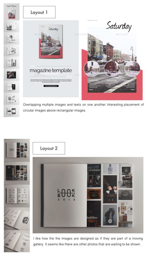
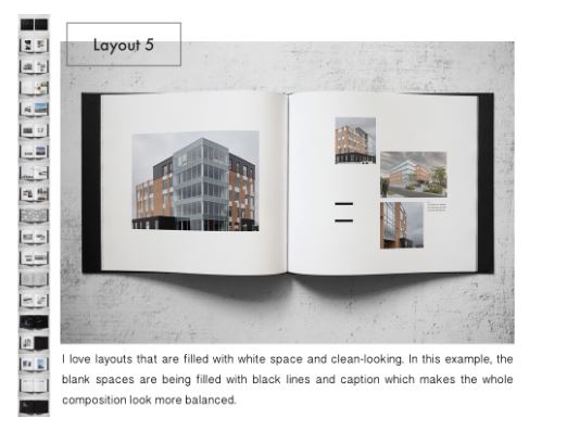
Here is the creative process of an existing zine called Ooi Qui Min which I was fond of, it shows a range of different presentation techniques and compositions which I think makes it a good zine to explore in order to get layout ideas for my own zine.

Here are some images of the creative process of the Ooi Qui Min zine…

 I believe that this zine is a very successful outcome as it covers various different compositions and layouts of images whilst remaining minimalistic. I also like the basic fonts used in the zine as they do not distract of draw attention away from the images themselves, this is something which I hope to do in my own zine.

Here are some alternative simple layout ideas for a zine, which look at different compositions, use of text, framing, colour and sequencing. I believe that it is good to look at many different examples of what it is that you are creating, as it will give you as much creative inspiration as you may need.

Physical Photo Manipulation / Collage

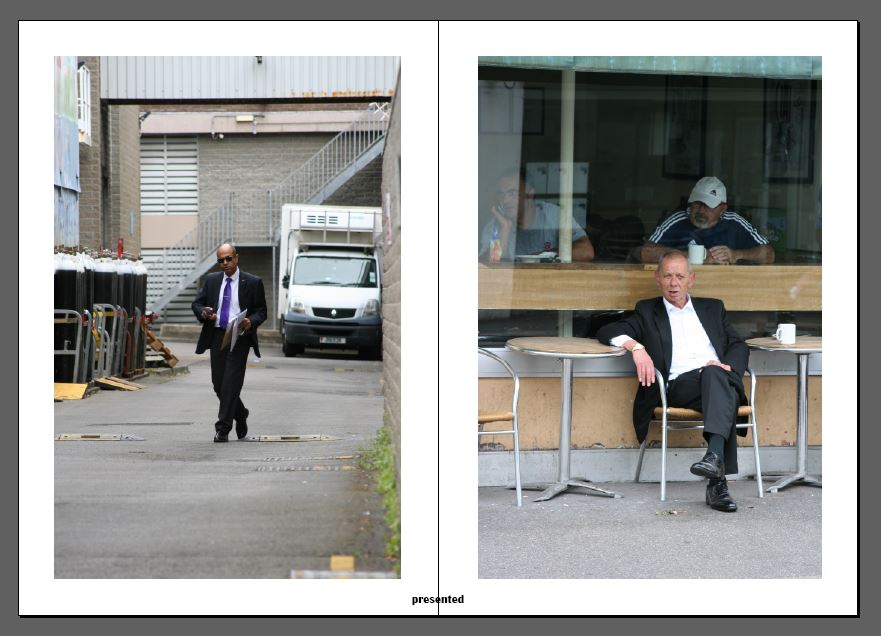
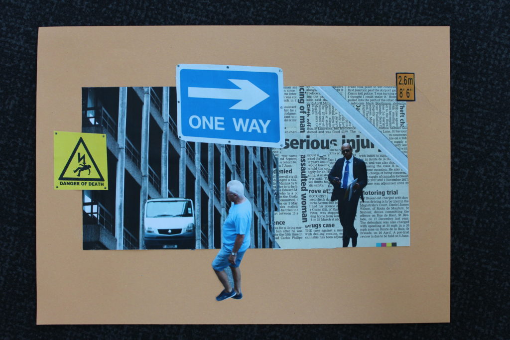
Using some of my photographs from my first and second shoot and a newspaper article about heath and safety issues such as injury, death, drugs and assault. The point of this collage was just to explore ideas about the concerns of the new hospital that is being planned for in the near future. The two street portraits of two diverse subjects in the collage are meant to signify the fact that people of any class, race, religion etc. will all be in need of health-care at some point in their lives. The photograph of the back of the current hospital is simply meant to show how dated and in need of renovation the current building is. The photographs of signs that have been included in the collage are all supposed to be a symbol of danger or warning which is commonly something that leads to injury and therefore peoples’ need for healthcare.

Here is a photograph of the physical collage before then being digitally manipulated…

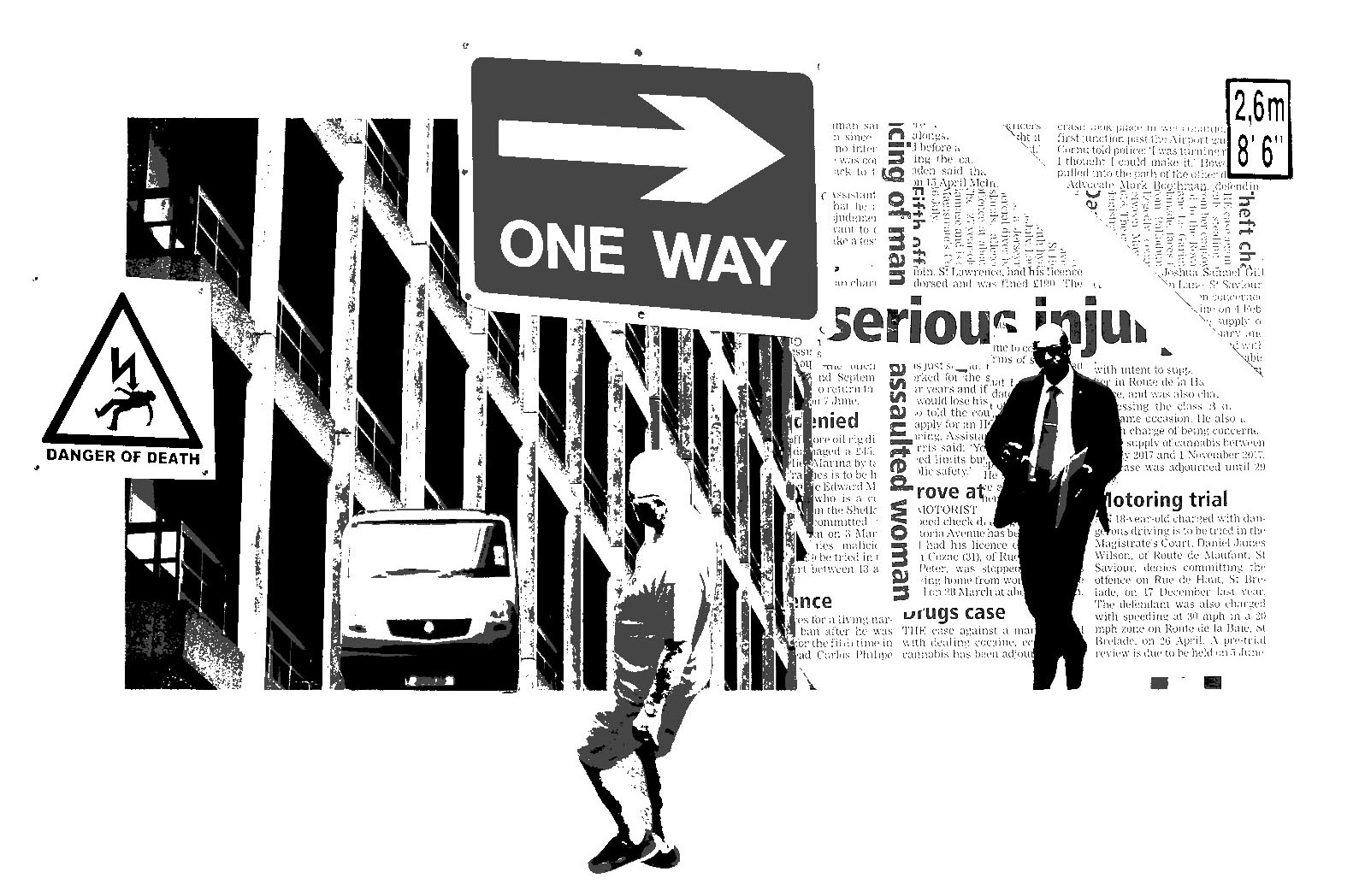
I then went on to use Photoshop in order to make the collage digitally versatile. I did this by cropping down the original and then increasing the exposure of the image. I then made the image black and white and adjusted the monochrome tones until I was satisfied with how it looked.

Here is the outcome of this…


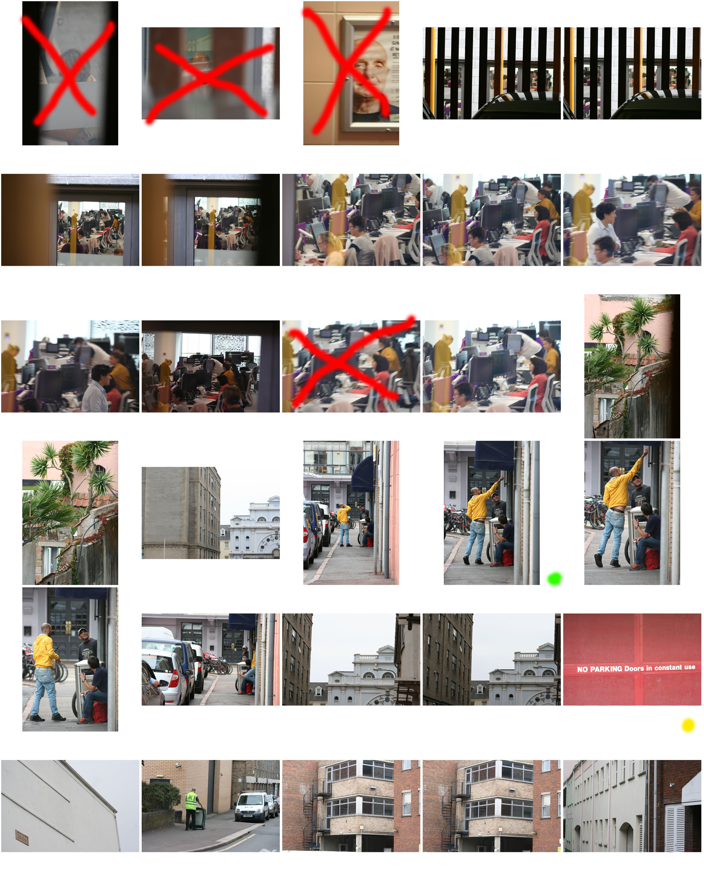
Critical Selection (Lightroom)

Critical Selection

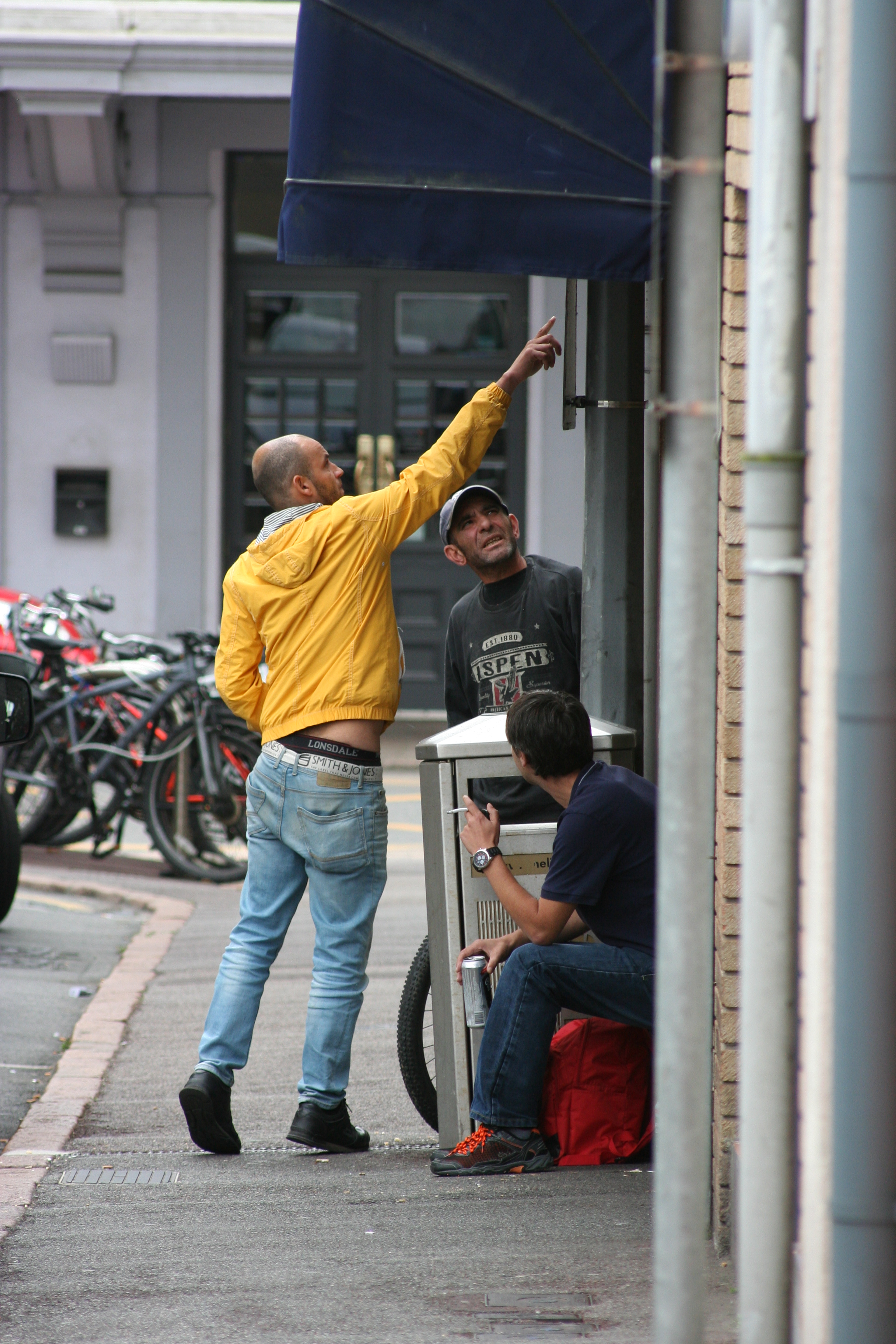
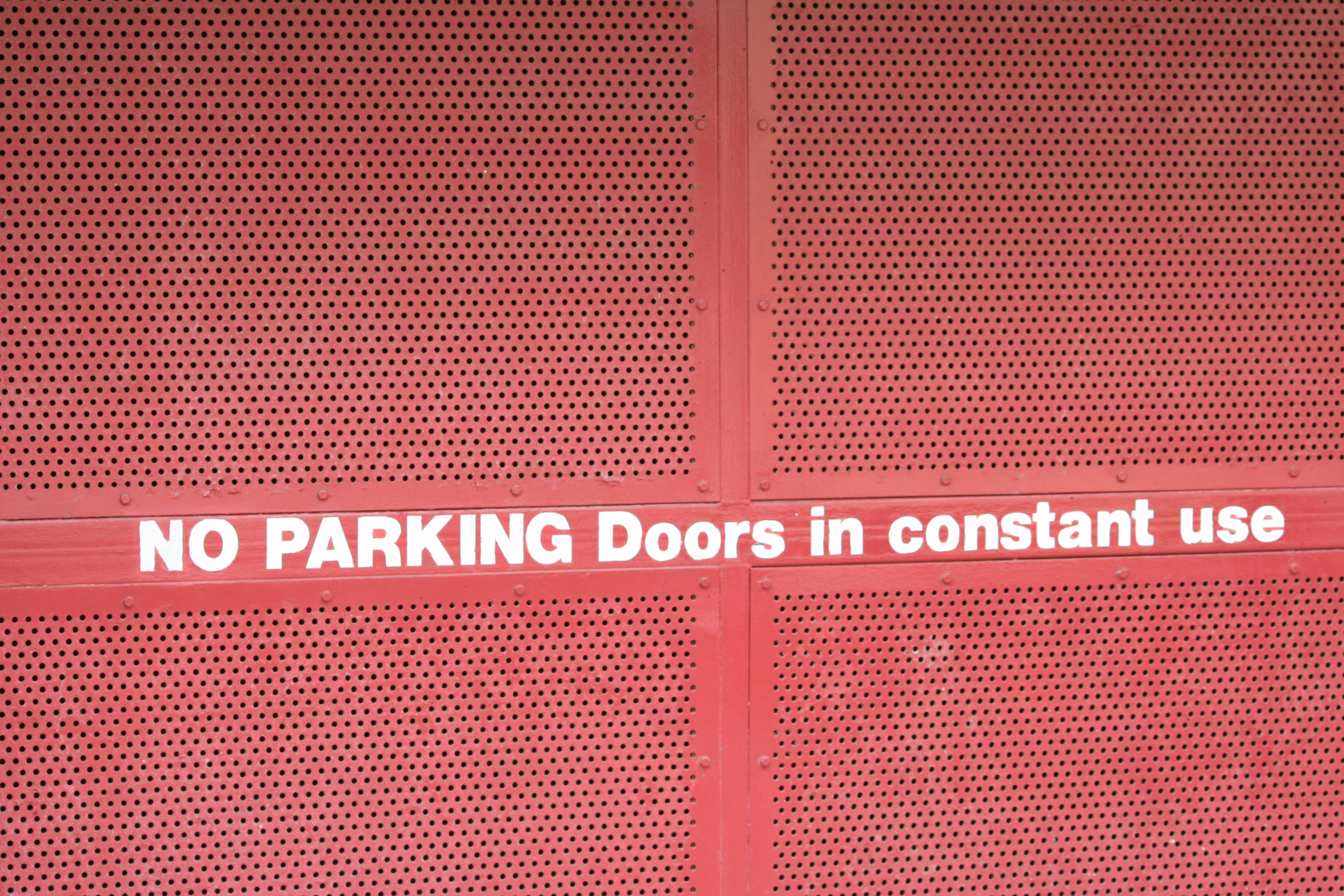
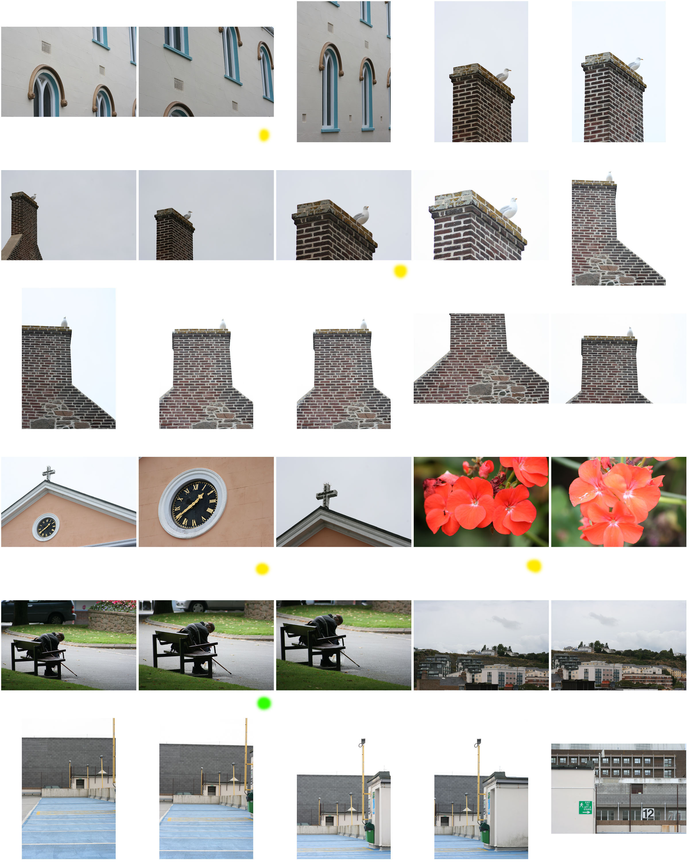
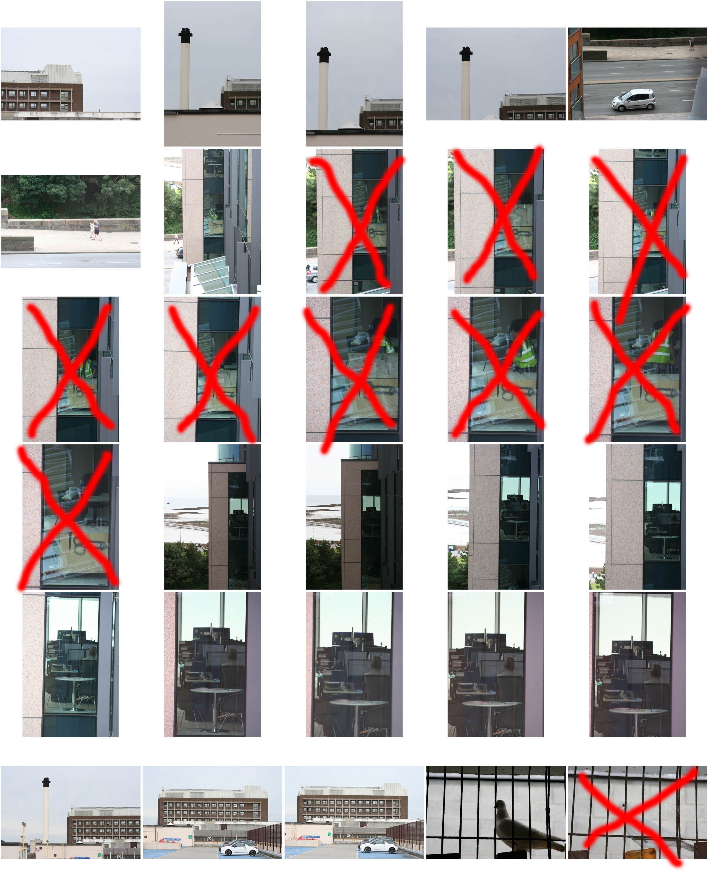
This blog post covers my critical selection of images which I have made using Adobe Light room from all 3 of my photo shoots which I  took in my allocated area of St Helier. These are the raw images before any editing and I have chosen them based on various aesthetic aspects such as the simplicity, colours, textures, and with the portraits based on the physical content of the images such as the expressions of the subjects of their surroundings. The images which I believe need to be slightly altered or manipulated I will caption with those needed changes, most of these slight alterations needing to be an increase in contrast, but i personally don’t believe that any of my favorite images which I have chosen need major changes to be made.

Shoot 1 Favorite images :

Could be slightly increased in contrast

Possible black and white, definitely increase contrast

Increase brightness and contrast to enhance the white

Black and white, possible increase in contrast

Enhance and darken blue tones

Experiment with saturation and hue of tones

Increase in contrast and slight decrease in brightness

Slight increase in contrast

Shoot 2 Favorite images :

Slight increase in contrast, maybe alter hue of red tones

Shoot 3 Favorite images :

Cropping, Increase contrast, possibly black and white

Cropping, slight increase in saturation

Slight decrease in brightness, maybe alter the hue

Experimental Editing

This blog post shows some of the experimental Photoshop edits which I have done on some of my favourite photographs from my first shoot…

This first image is a combination of a photograph from the Societe Jersaise photo-archive and some of the images from my first photoshoot. The idea behind this piece was to show how the aesthetics of the modern town are considerably less visually pleasing that those of the old urban landscape, and when imposed upon the old photograph take away the charm from the photo.

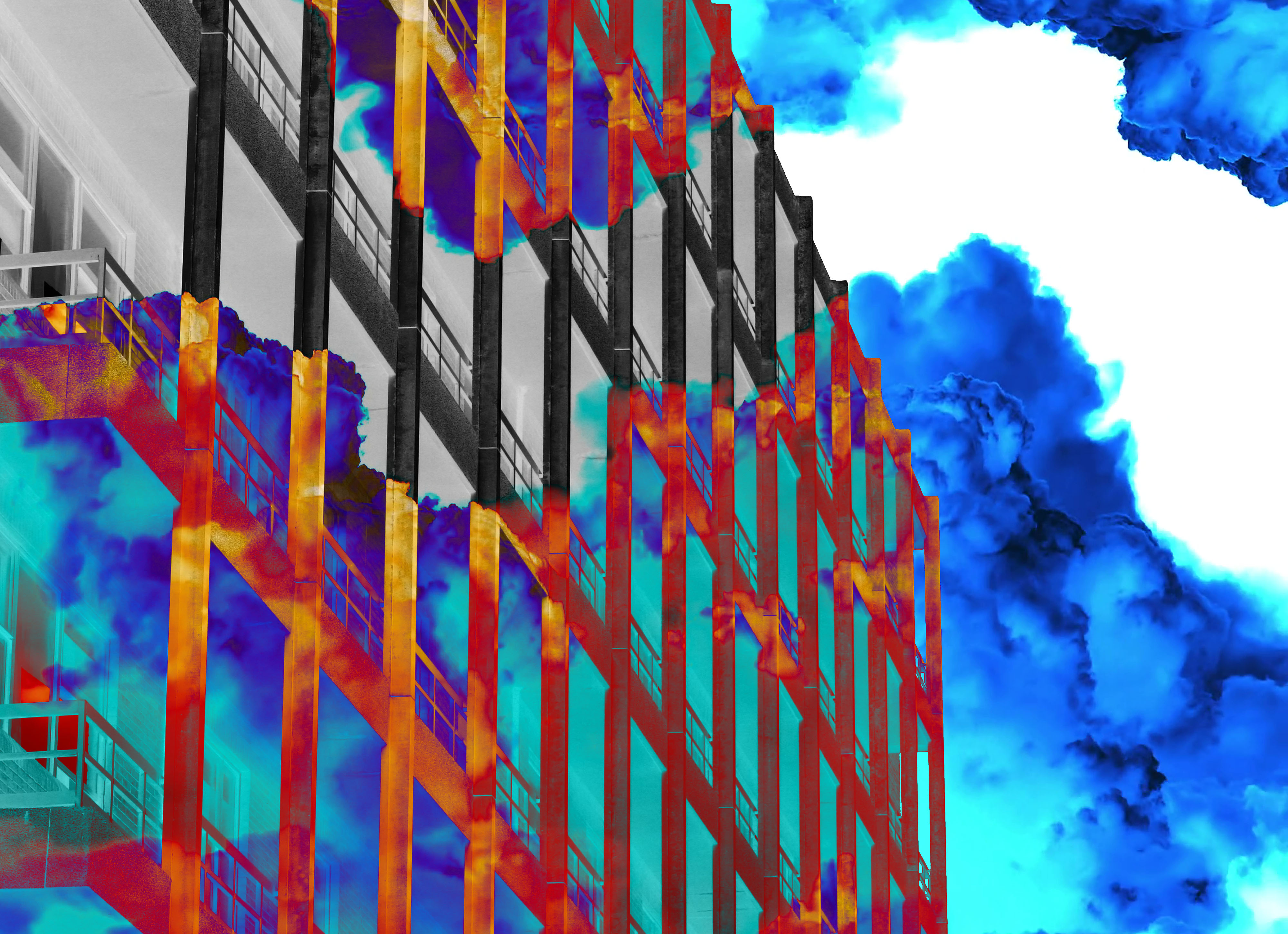
The idea for the second edit, which I produced on top of an image of the current hospital building, was looking at the indecisiveness involving the situation with the construction of the new hospital. The coloured mist represents the covering up of the important details in the situation and behind that the image/situation is in black and white, showing that once the details are exposed it can be dealt with in a much more basic manner.

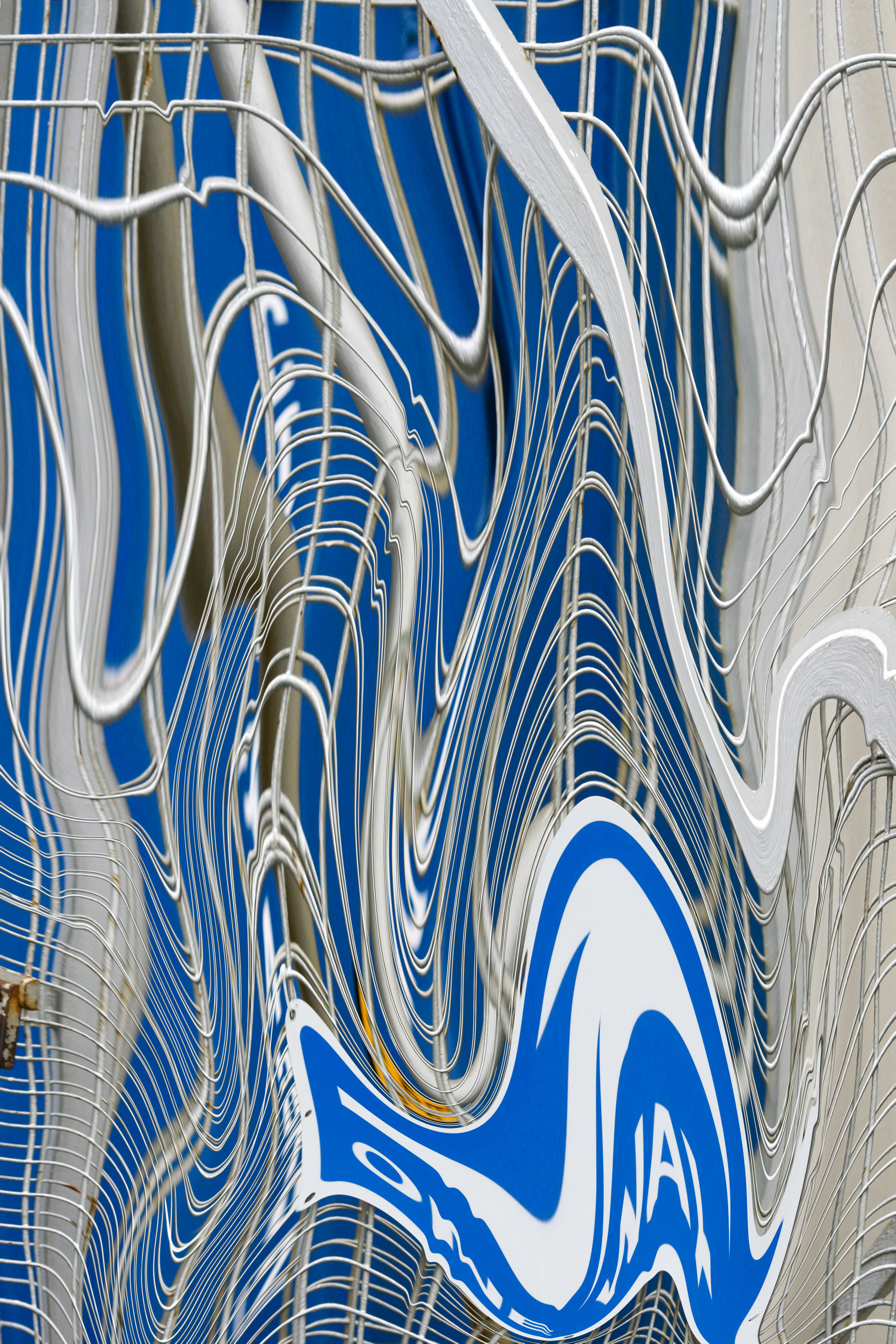
The next two following edits were experiments using the liquefy tool in Photoshop, I thought that the textures and text elements of these photos would work really well with this effect, as once the photo is liquefied these parts of the images will become distorted and stretched.
Black And White Editing Experimentation

Black & White Experimentation

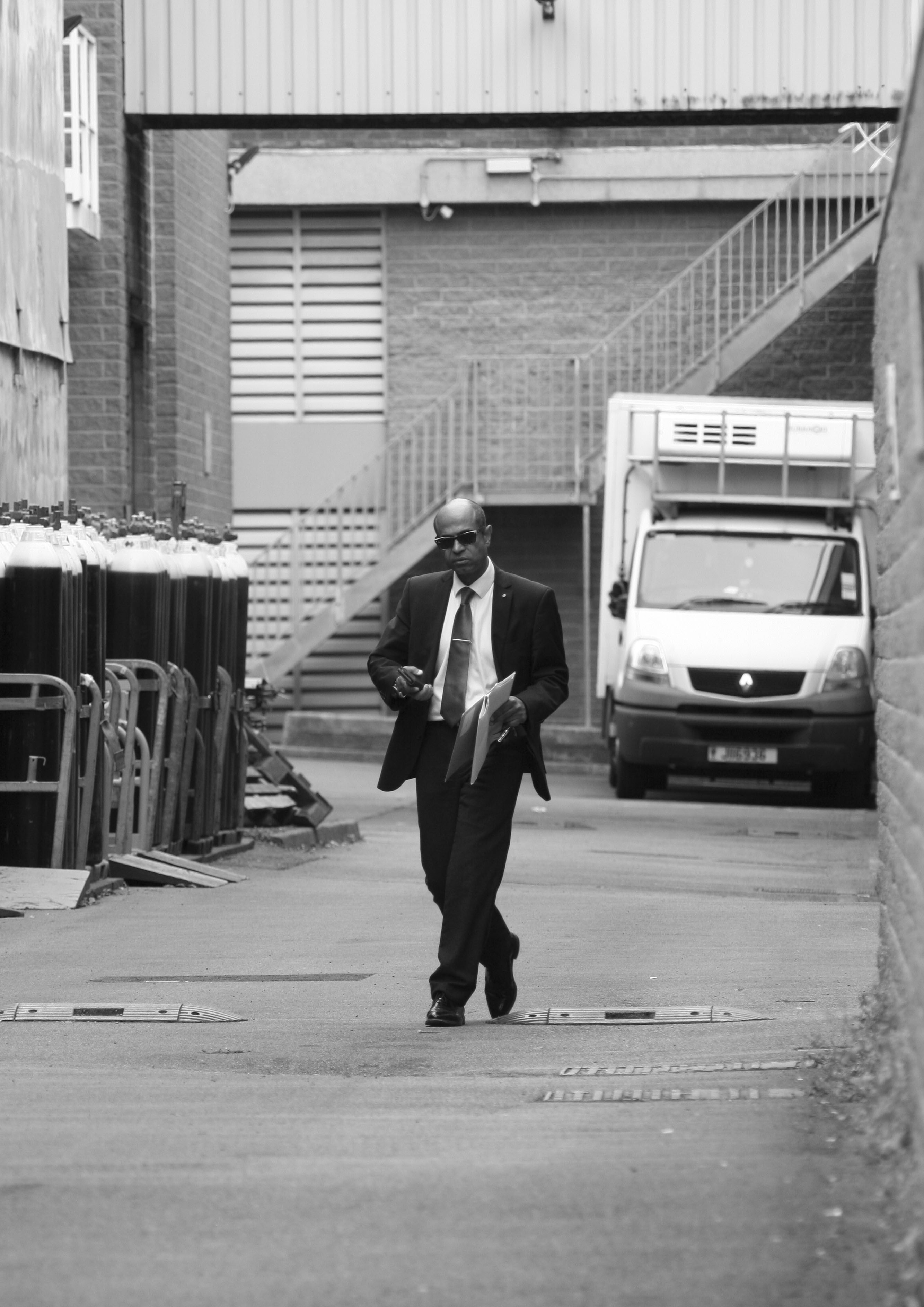
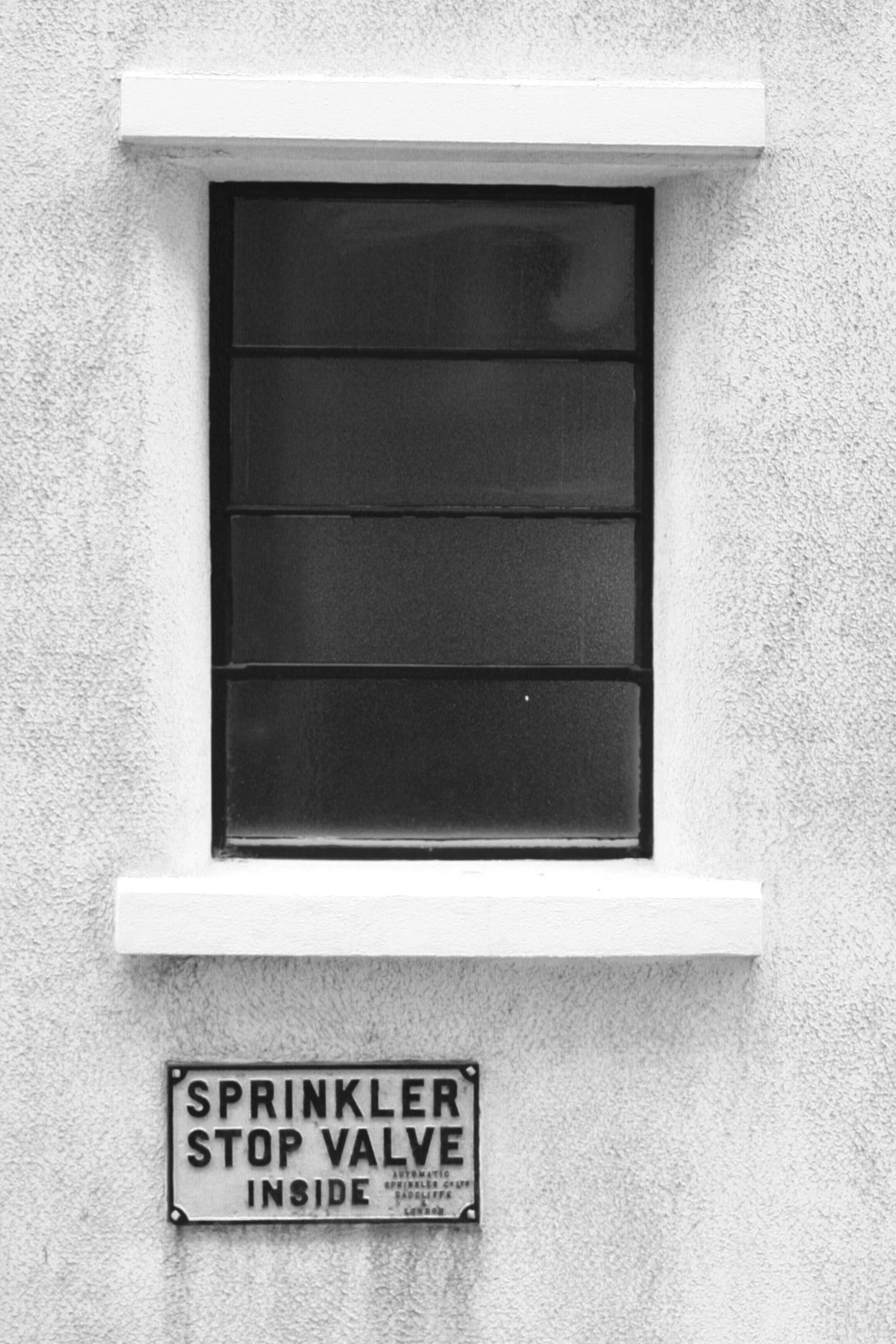
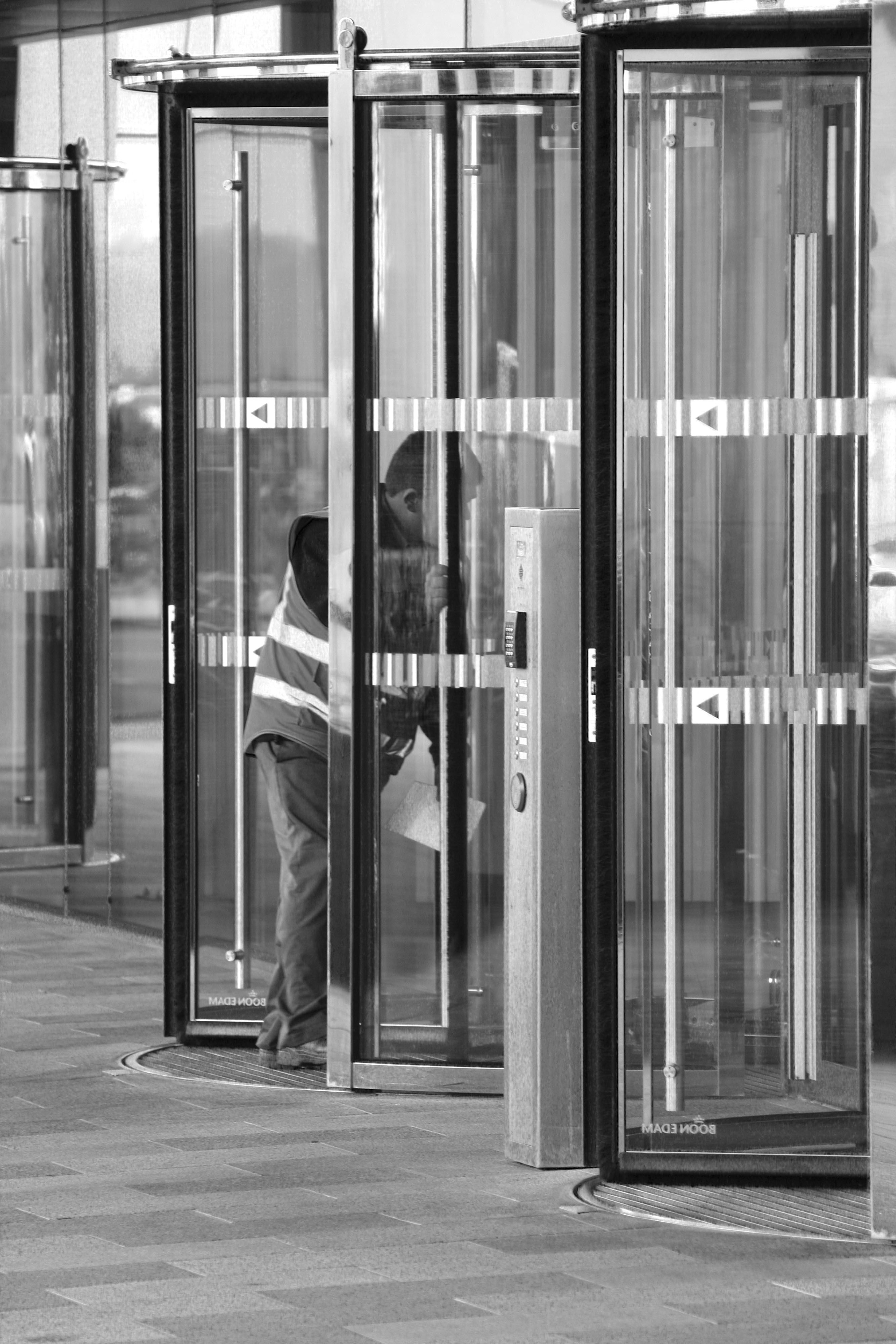
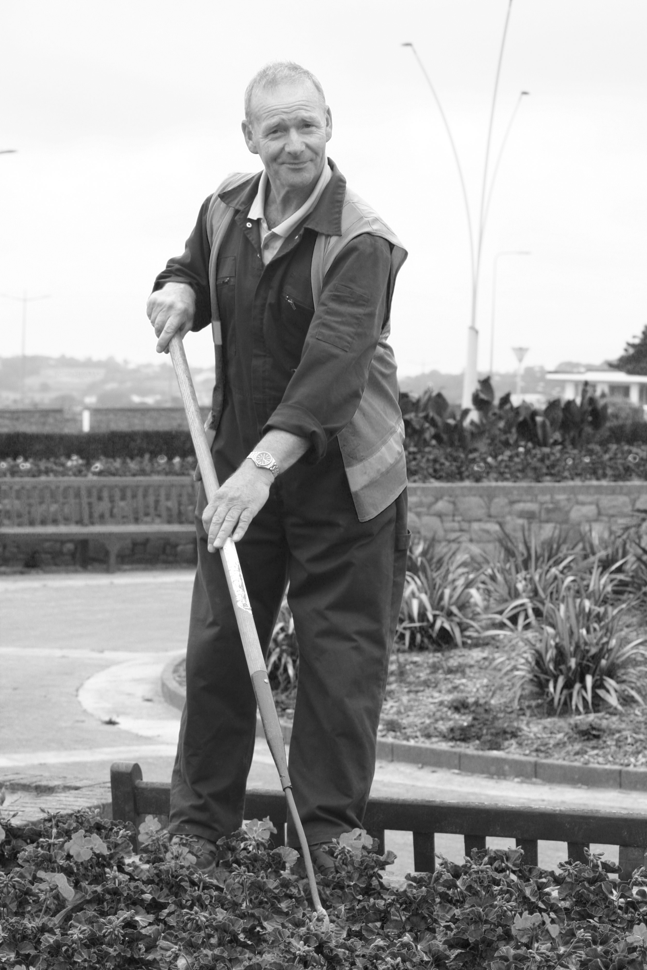
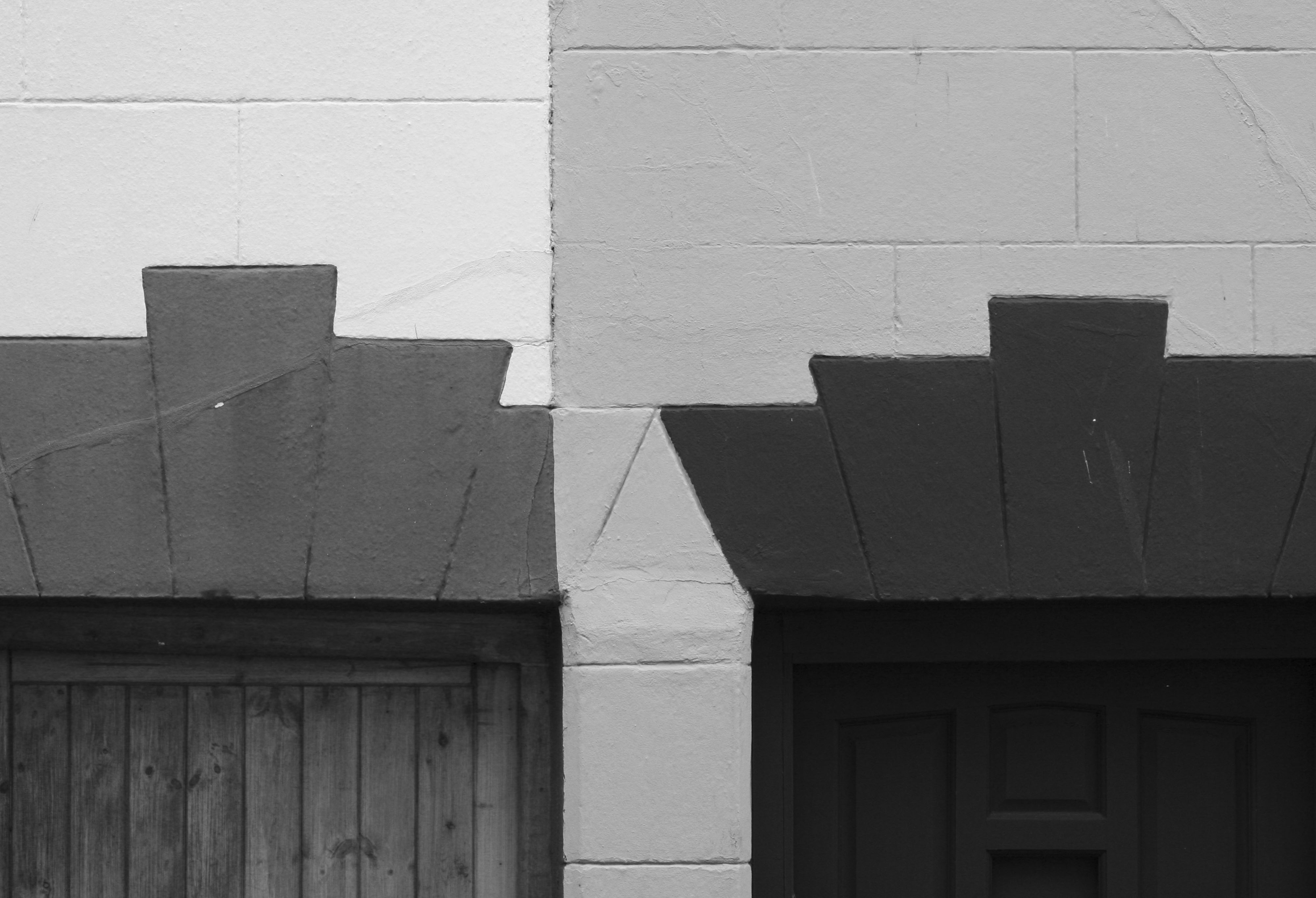
This post displays some of my favorite images from my first and second shoots that I have manipulated in black and white on Lightroom. I believe that the absence of colour in these edited images is successful as it gets rid of any visual distractions that may prevent the viewer from looking at the whole image and missing important elements of the photographs which add to their meaning and context.
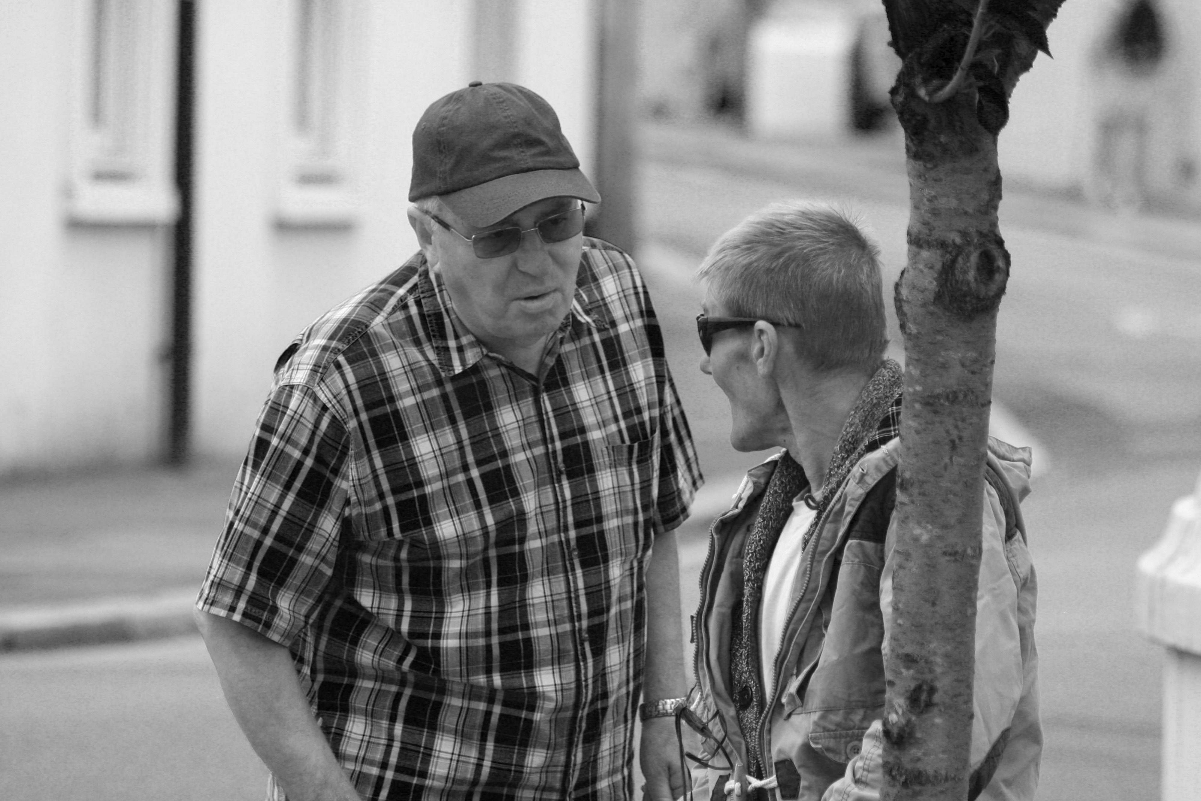
From these outcomes I personally believe that images 1,3,5,11,16 and 17 are the most successful of these edits as I believe in monochrome the images are an improvement upon their originals.

1
2
3
4
5
6
7
8
9
10
11
12
13
14
15
16
17