Photographer Research 1
Photographer Research 2
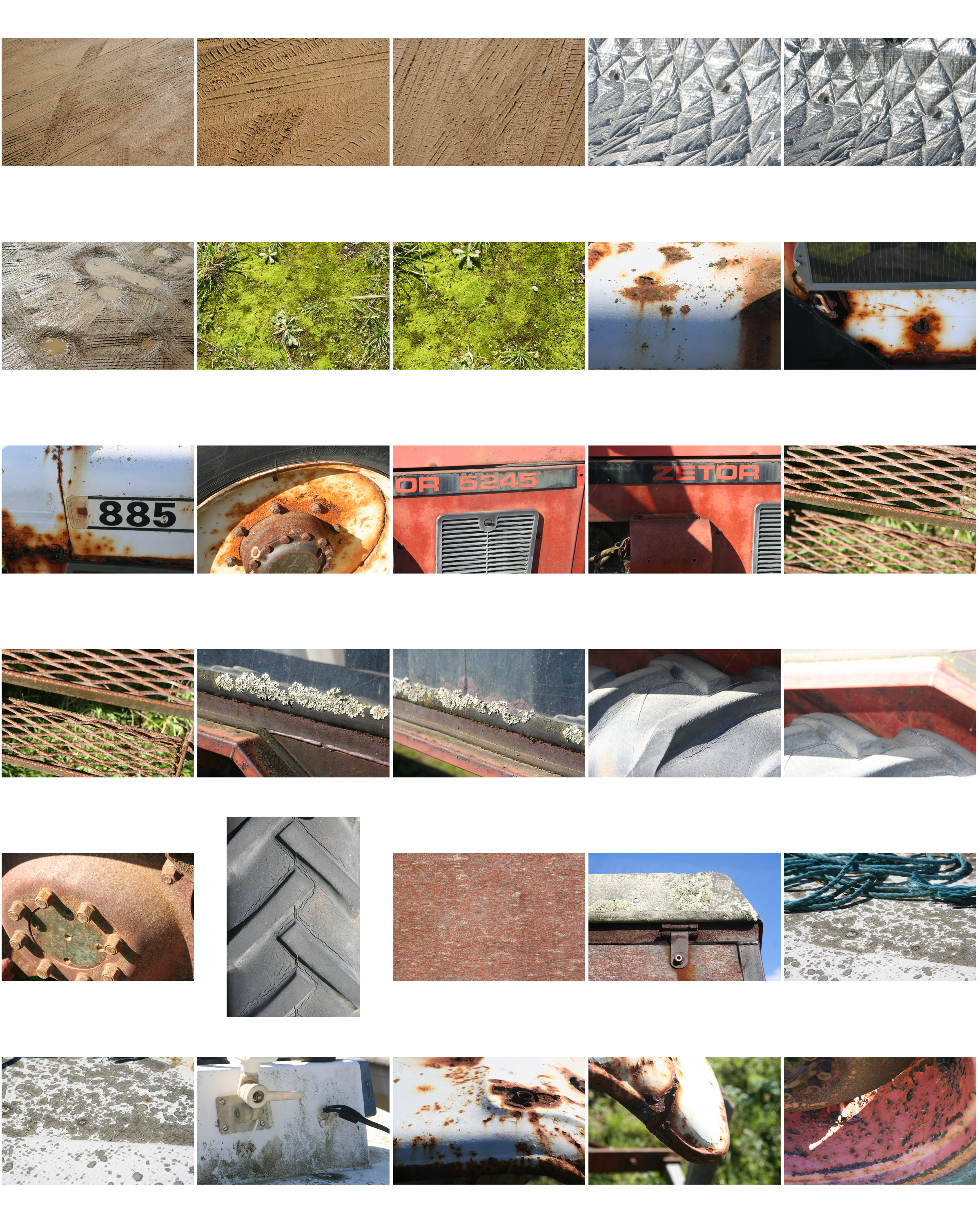
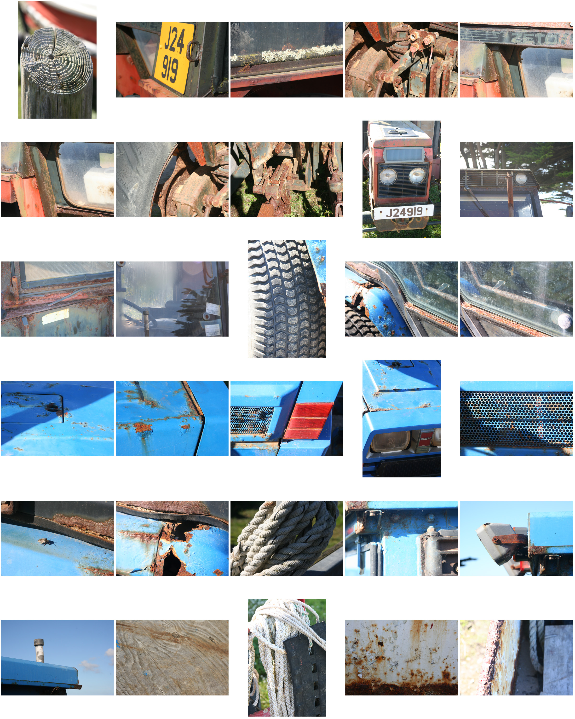
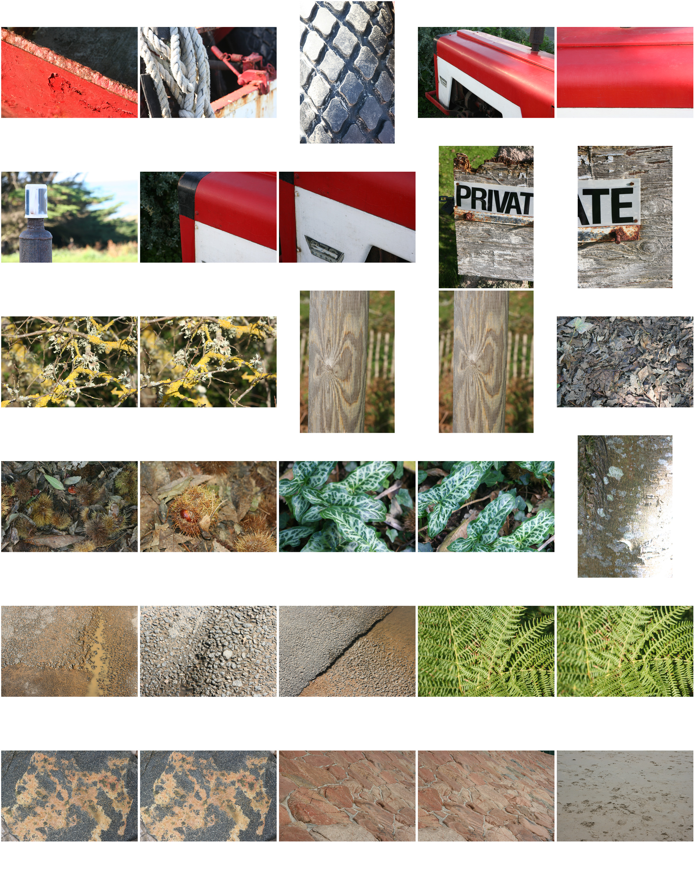
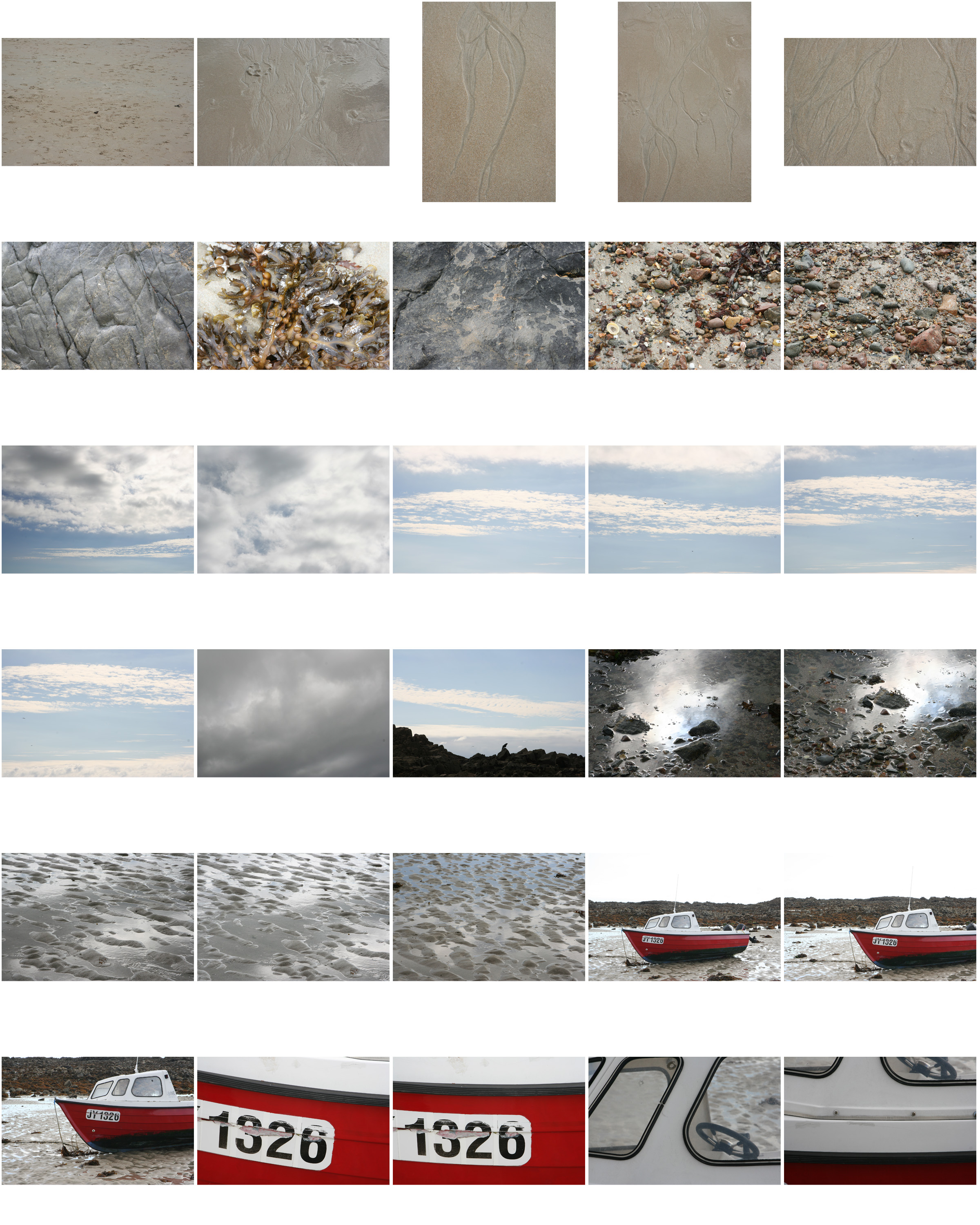
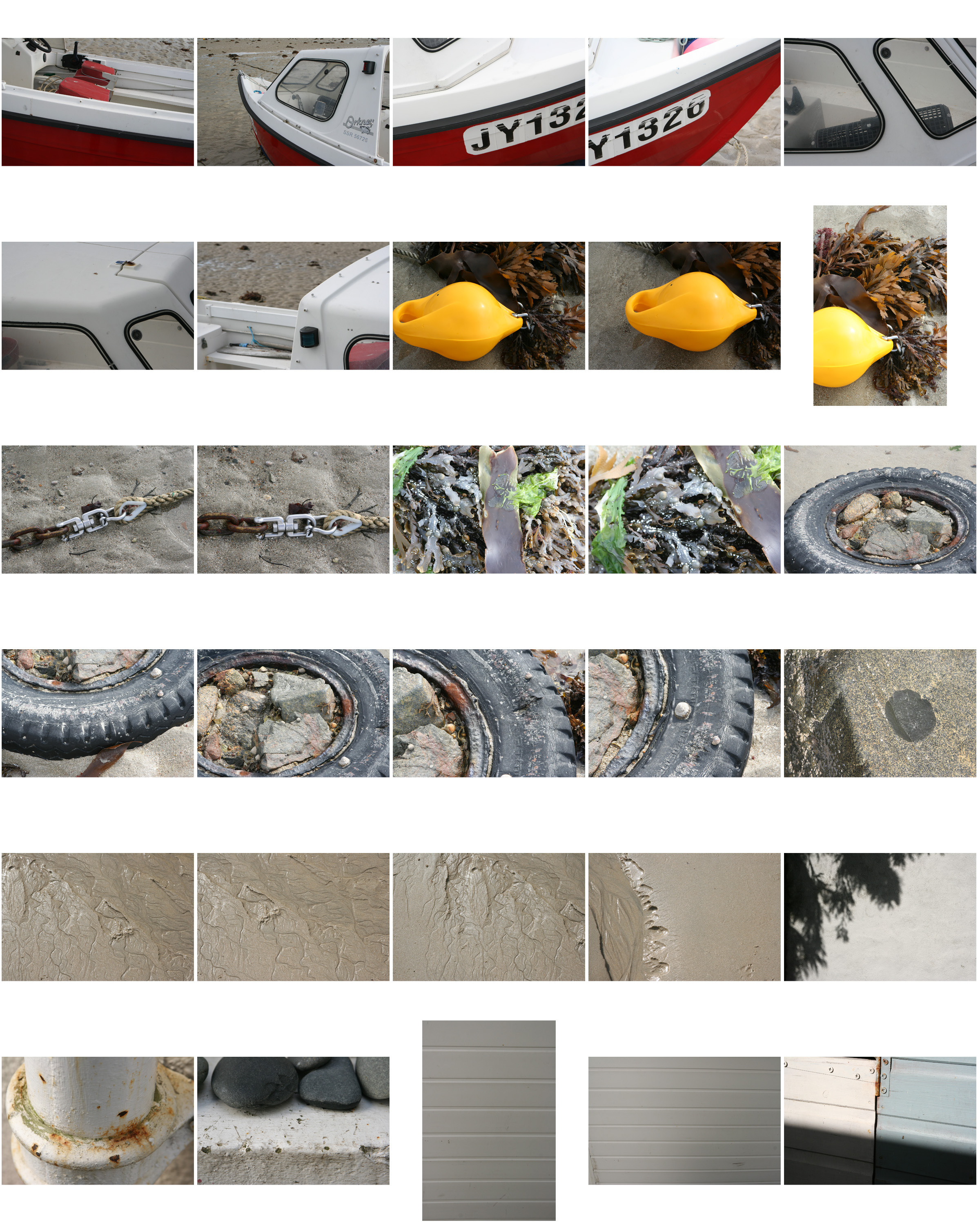
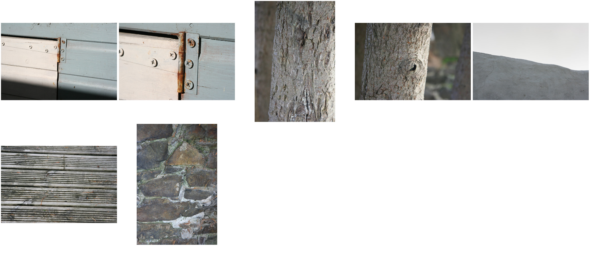
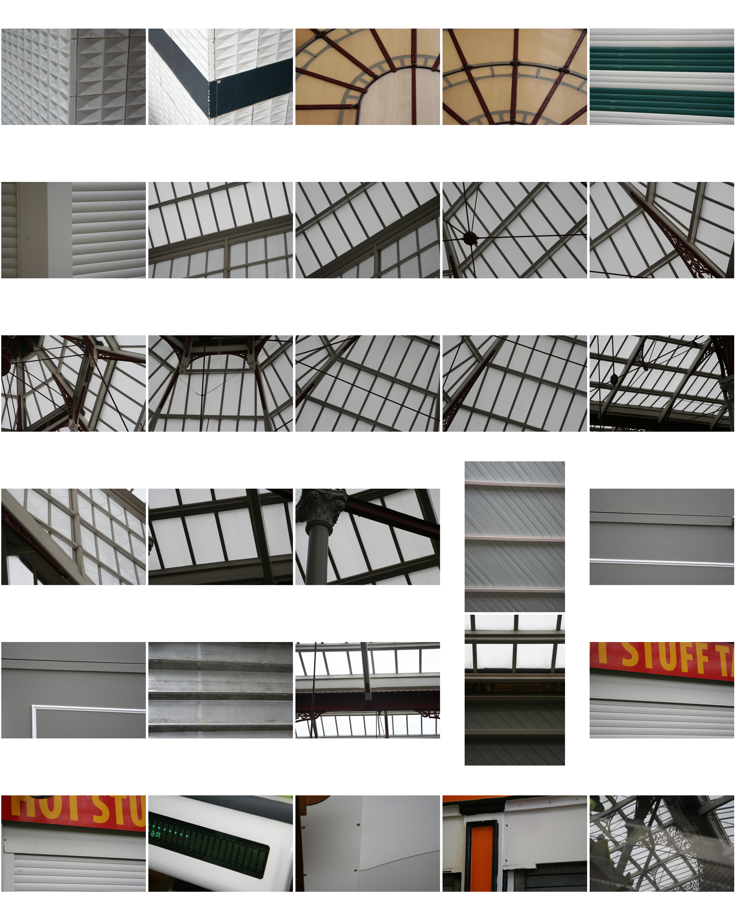
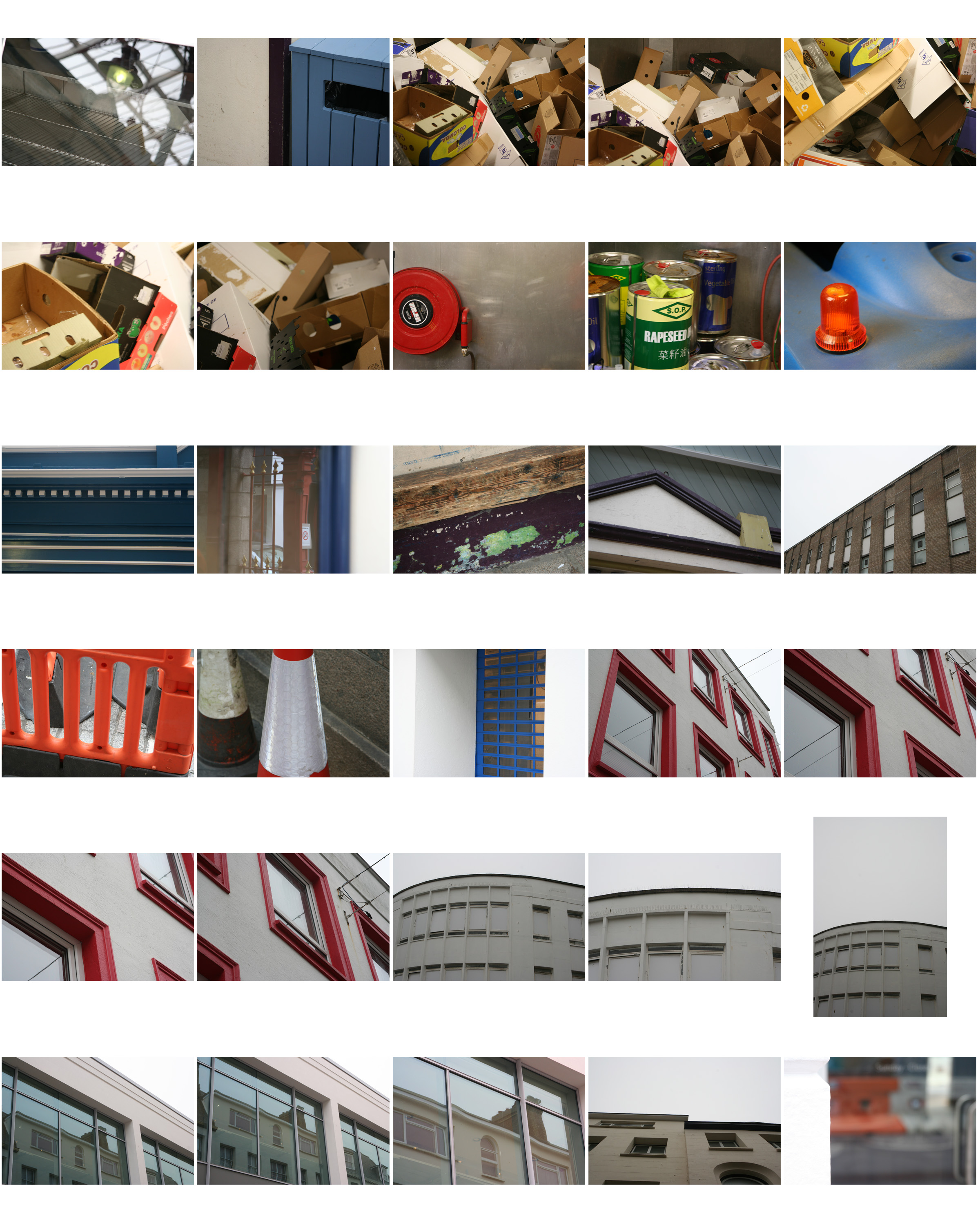
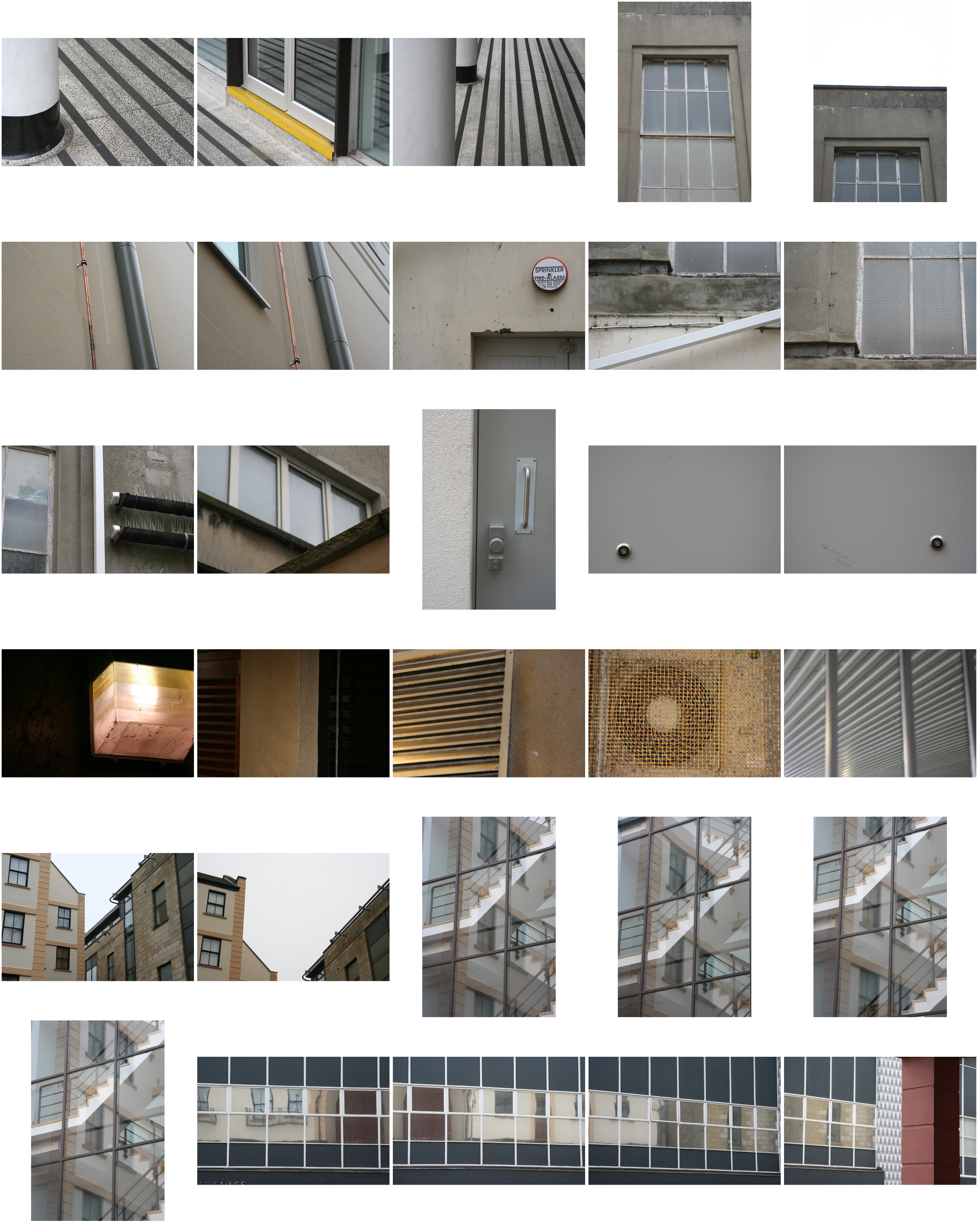
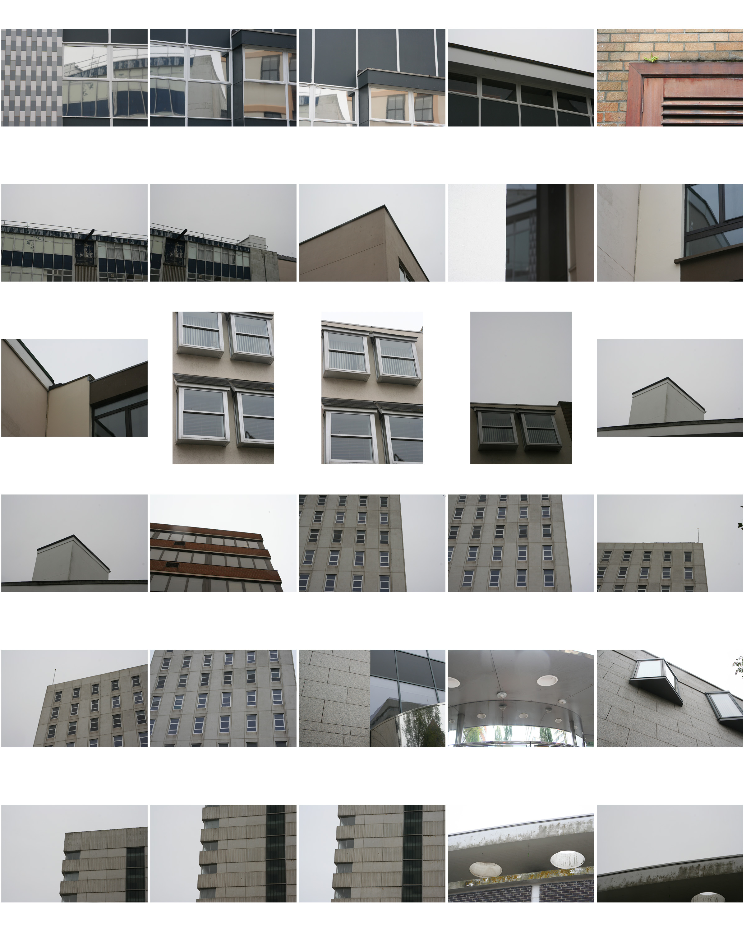
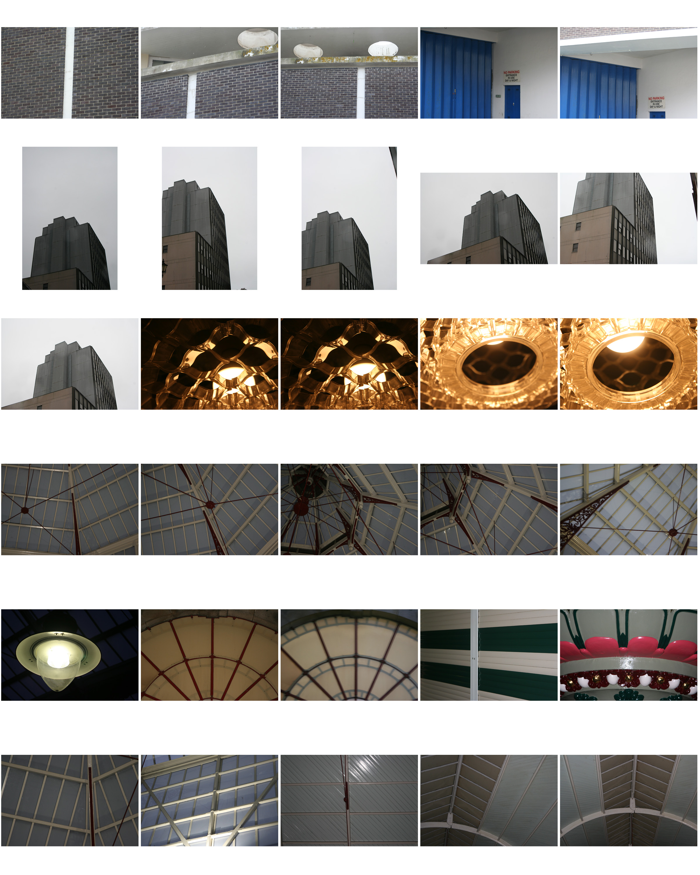
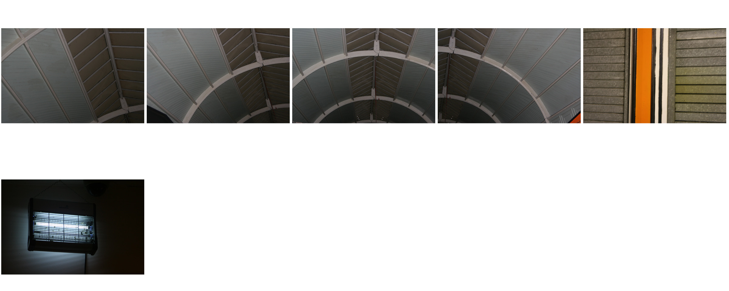
Texture Photo Shoot (My Response)


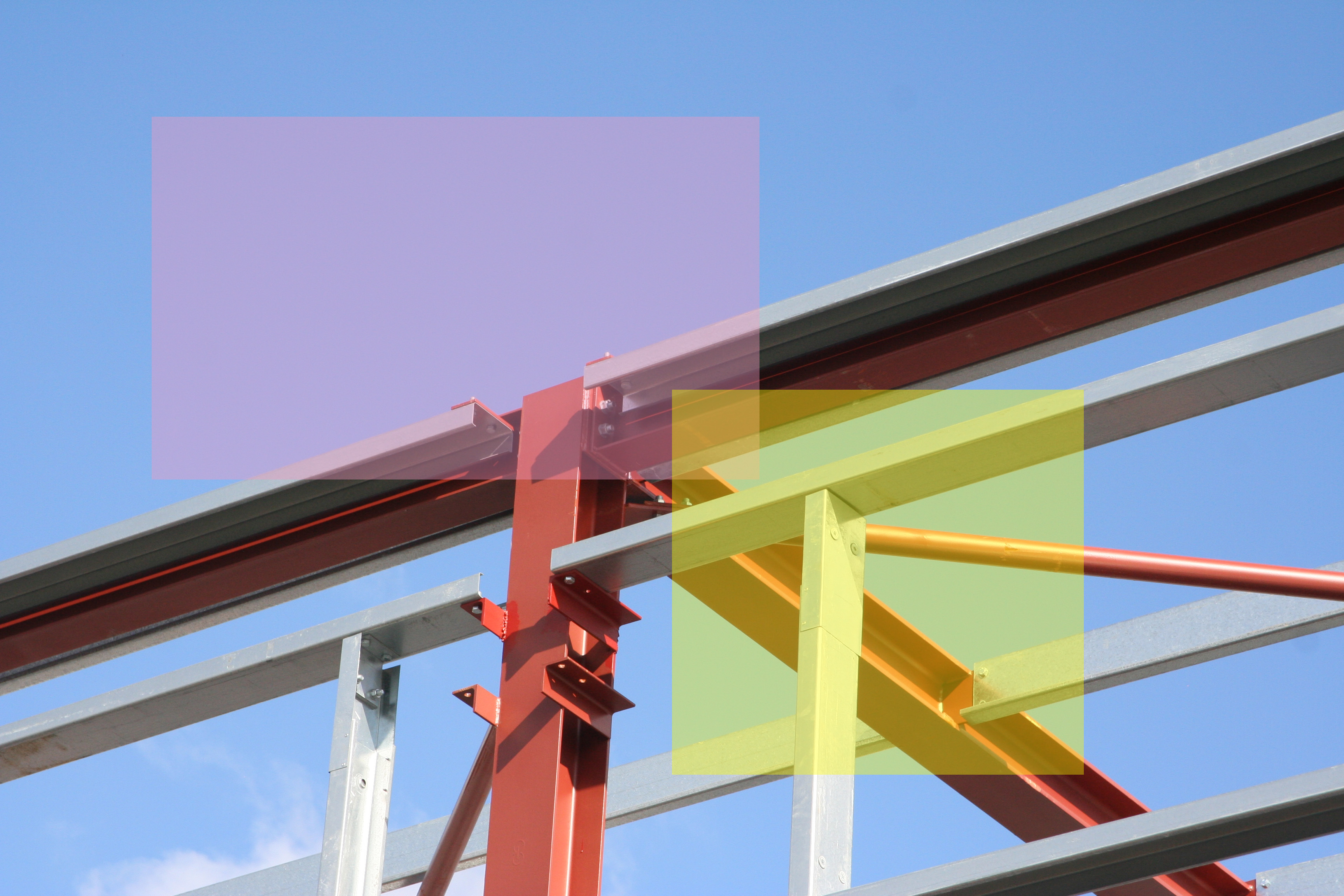
Colour overlays are a block of colour with an opacity lower that 100% that are placed over an image in order to bring the viewers eye to a specific section of the image.
Here are my colour overlay experimentations that were done on Photoshop using the shape tool and then adjusting the opacity of the coloured shapes.

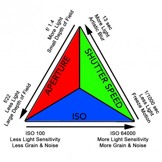
The exposure of an image is dependent on 3 variables/elements…
Shutter Speed
Aperture
ISO
These 3 variables must be set depending on the environment in which the photograph is being taken.
Shutter Speed – A faster shutter-speed lets in less light but takes a still freeze motion image of the subject. And a higher shutter speed lets in more light and gives the image a blur if motion is present.
Aperture – A lower aperture lets in more light and creates a smaller depth of field within an image and a higher aperture lets less light in and gives the image a larger depth of field.
ISO – A low ISO has less light sensitivity and causes the image to have a less grainy aesthetic, and a higher ISO has more slight sensitivity and gives an image a more grainy aesthetic.
Depth of field is the distance between the nearest and the furthest objects within a focused image. And how focused separate elements of the image are.

In these images the depth of field is alternative as in the first image the main focus (the branch) is in crisp focus however the further objects in the image are unfocused/blurred. But in the second the depth of field is slightly more balanced as the background although not in full focus is more visible.
The depth of field of an image can be altered through the use of the camera’s aperture (approx f/1.4 to f/22)

As you can see in this diagram a lower aperture (eg. f/1.4) causes the background of the image to be unfocused with the close/main subject remaining in focus. However a higher aperture (eg. f/22) the whole image is focused.

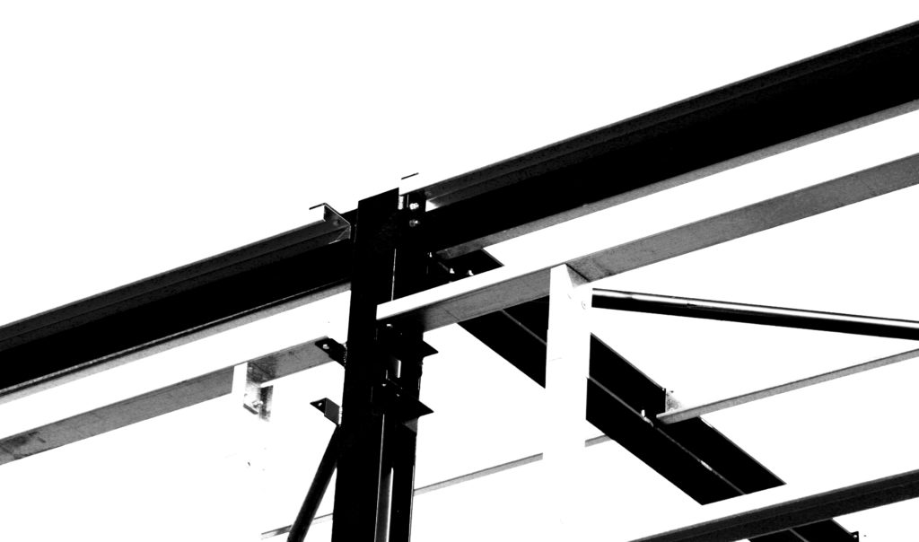
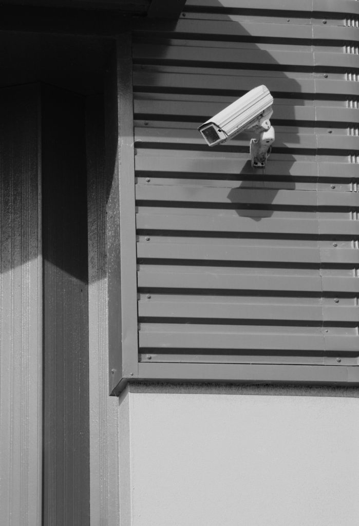
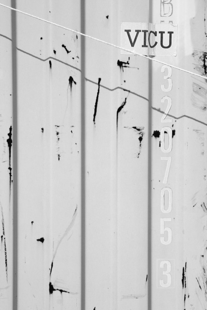
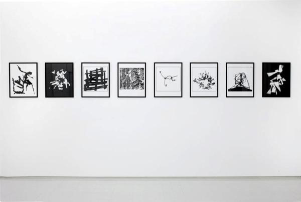
Helmer-Peterson produced large bodies of work in which he presented his images as the black and white extremities of the tones of his subject. This gave his work a bold and considerably minimalist style. Many of his subjects were based around a theme of industrialisation and architecture. The lack of any tones between black and white mean that the viewer is able to quickly interpret what the image is putting forwards without any unnecessary distraction.
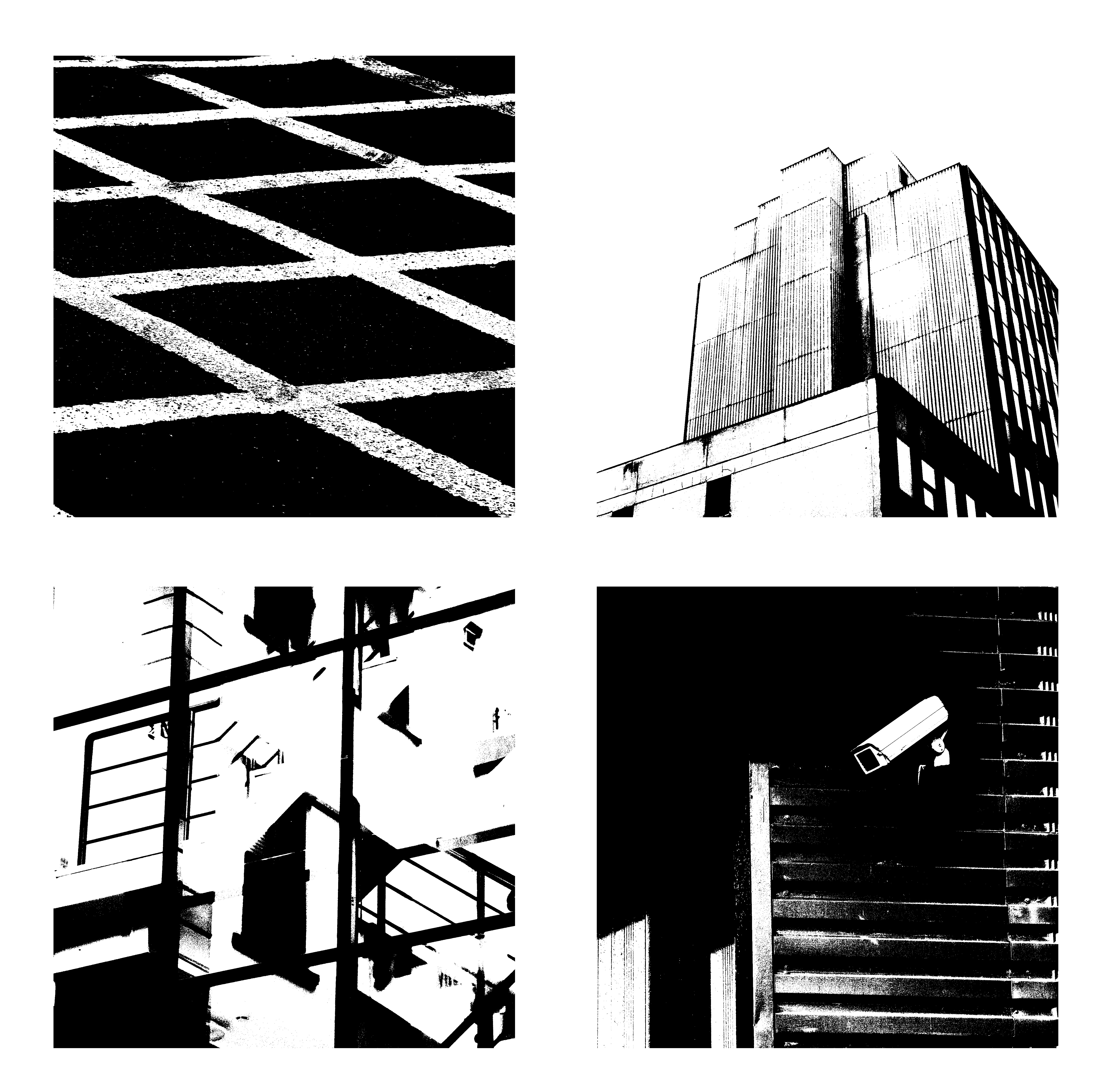
I produced this response simply in Photoshop using the threshold tool and adjusting it to a point where i believed it looked as aesthetically pleasing as possible. Then compiling the 4 edited images into 1 document in which the compliment one another.

The analysis of photographs consist of 4 elements these are:
-Visual
-Technical
-Conceptual
– Contextual
Visual: This photograph consists of various visual aspects. One of these aspects is the tone of the image due to the time it was taken. The monochrome tones allow the viewer to focus more on what the photograph is trying to capture rather than it’s details, and also shows a contrast between the races in the photograph. The photo consists of various natural frames, these natural frames surround the different goings-on within the photo allowing the viewer to look at each part separately without the distraction of another. The window frames of the train represent a separation between different classes and races, showing the hierarchy of power at the time, from the left to right. The rule of thirds is present in the image as it is split up into 3 sections from top to bottom, which gives the image extra focusses other than the main one in the centre. Although the image does mainly consist of foreground (the train) There is still an even depth of field as Robert Frank still keeps the background of the image clear.
Technical: The image has been taken using a natural light source, this could be a contrast between the nature and the unnatural social and racial issues of the time. There is a low aperture that is used to capture the background of the image sharply and to ensure that the entire image is focussed. The image would have probably been taken with a considerably fast shutter speed in order to capture the movement of the train sharply rather than the motion being evident. The image overall has a large tonal range, with the top of the image containing mainly light tones the centre containing a balance of tones and the bottom containing mainly dark tones, which could also represent the racial hierarchy of the era with white people believing they were above people of other race.
Conceptual: The white man is separated from the other passengers on the train as he is covered by the transparent window, this represents how he would’ve been protected by society at the time. The order of power at the time is shown from left to right which links in with the contextual side of things. The white bars between the separate frames/windows represent the power of white at the time, and how it was them who were separating themselves from black people during that era.
Contextual: This photograph was taken in the 1950’s. At this time the US was suffering from massive racial issues of segregation. This is due to the fact that equal rights hadn’t been introduced and racism was heavily influenced by the general public through political and governmental actions. This caused a segregated system on public transport, which is why in this image the African-American people are situated at the back of the train and the White-Americans are situated more forward. There was also issues with gender equality, as at the time of this photograph the US was a patriarchal society, that is why the males are situated in front of the females within each gender. So overall the image shows the massive social changes in society since the 1950’s.


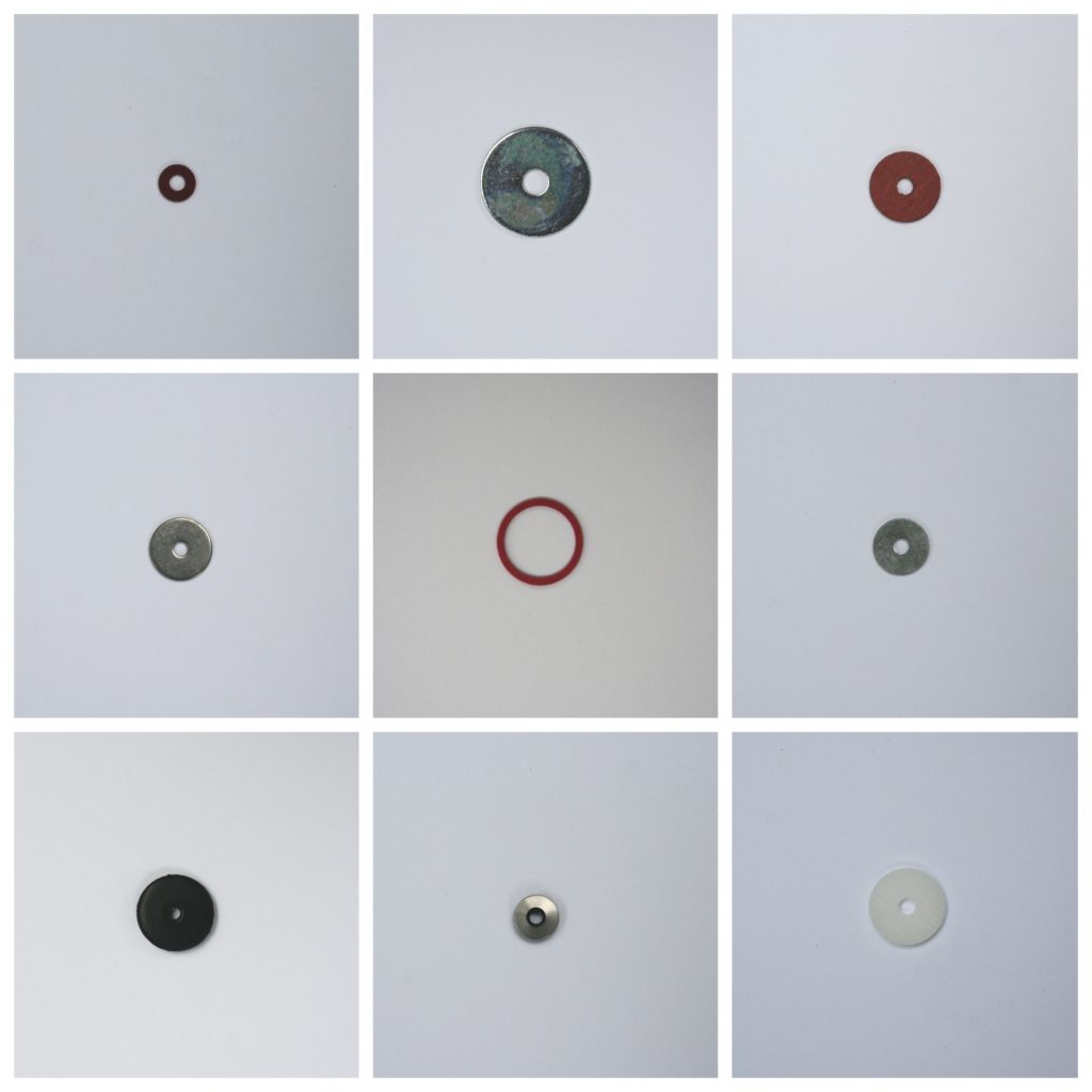


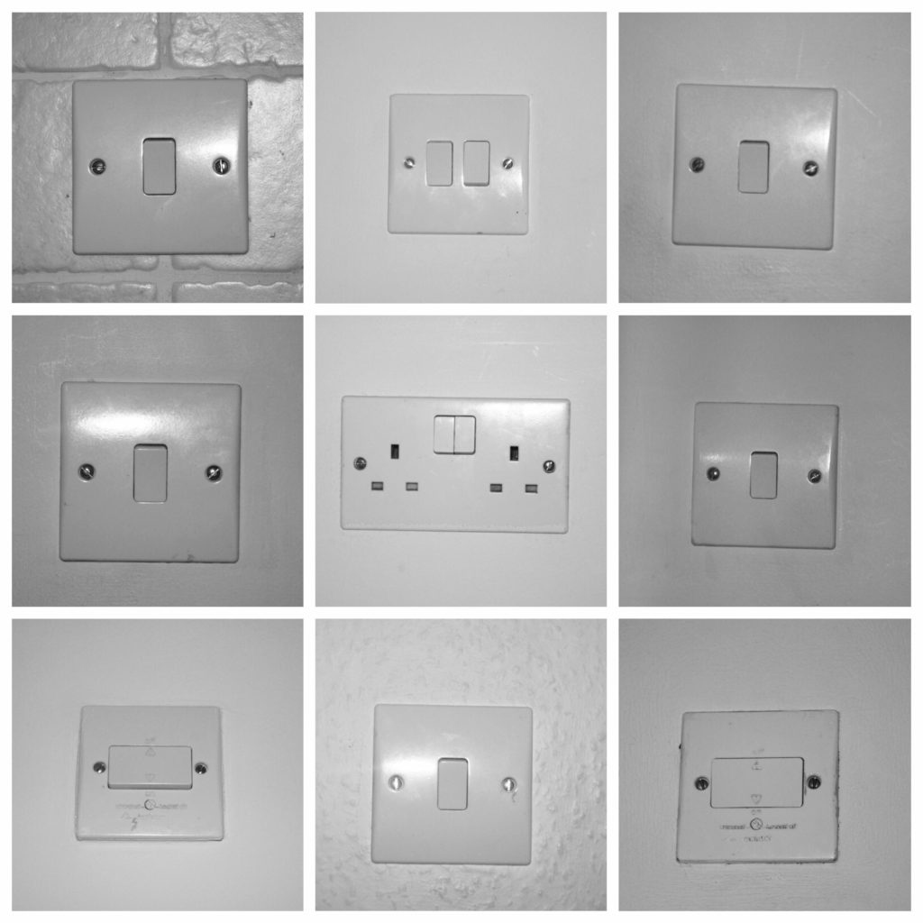

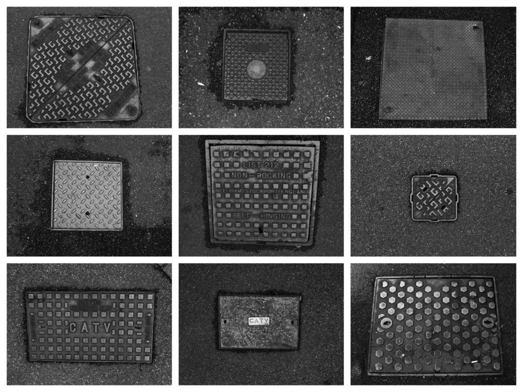
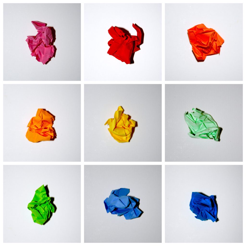
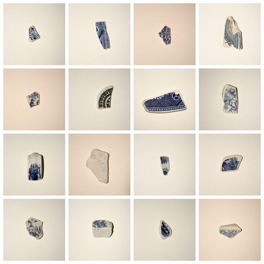

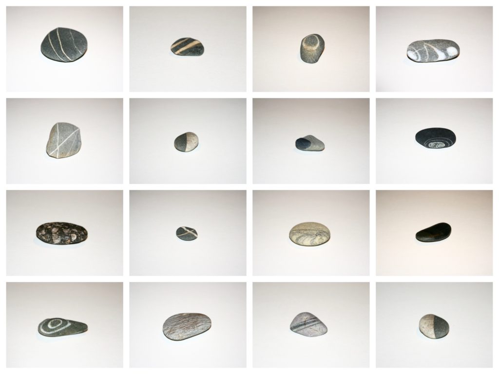

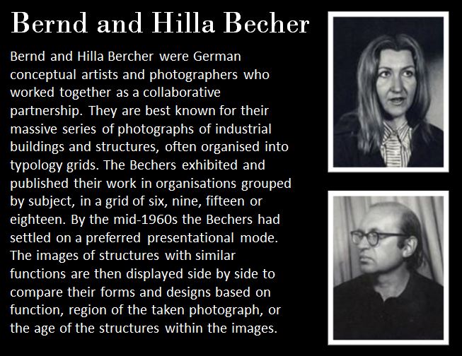
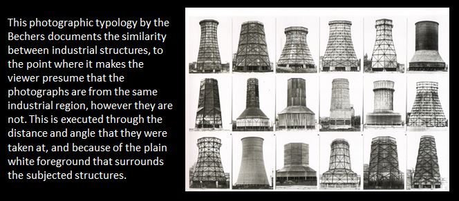
 Photographer Research Two (Bernd & Hilla Becher)
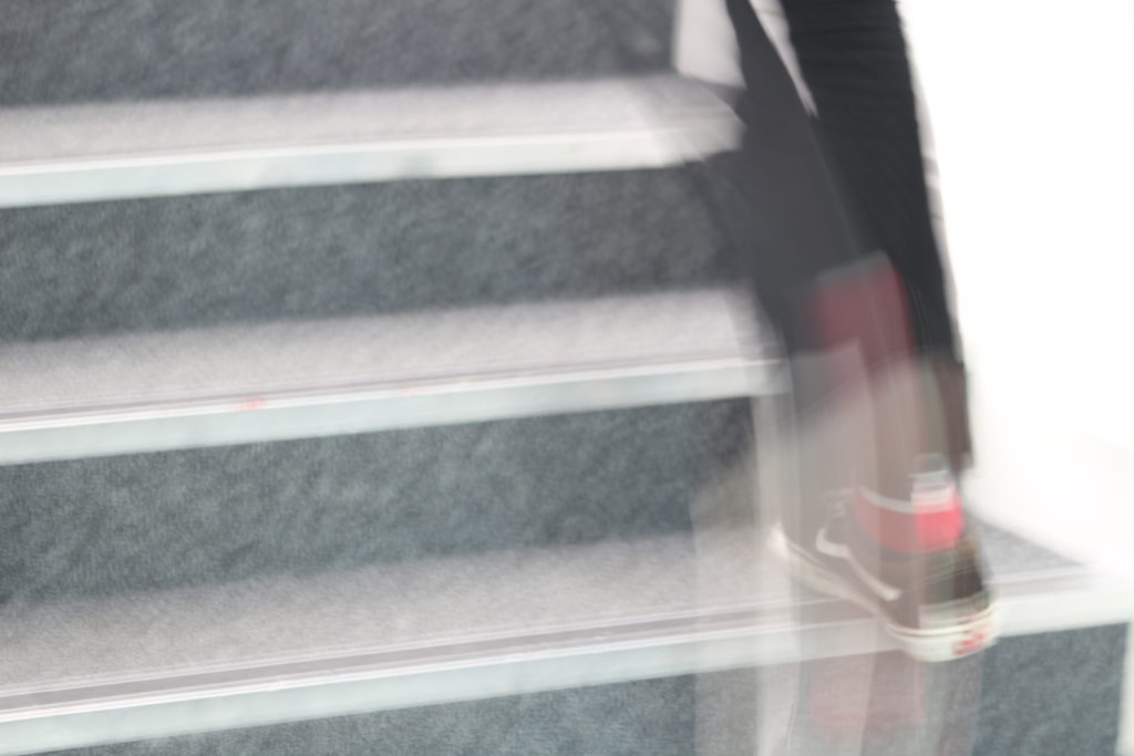
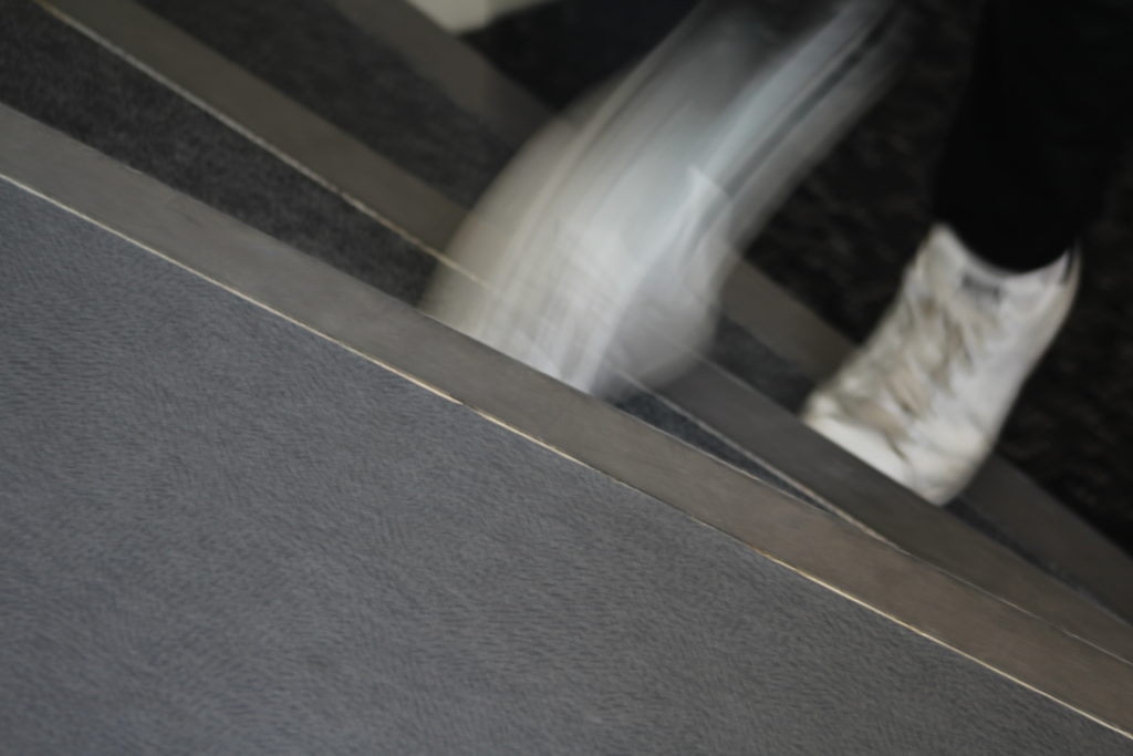
Faster camera shutter speeds are used in order to capture fast moving objects/elements of an image such as Athletes or the motion of water. However slow shutter speeds are used for capturing detail especially in dark environments as it allows a lot of light to enter the camera. But slow shutter speeds can be used to create visual blurred effects on single elements of an image while allowing the rest of the image to remain still.
Most cameras range from a 30 sec shutter speed 1/4000 sec.
Here is an example of how the use shutter speed can be executed…

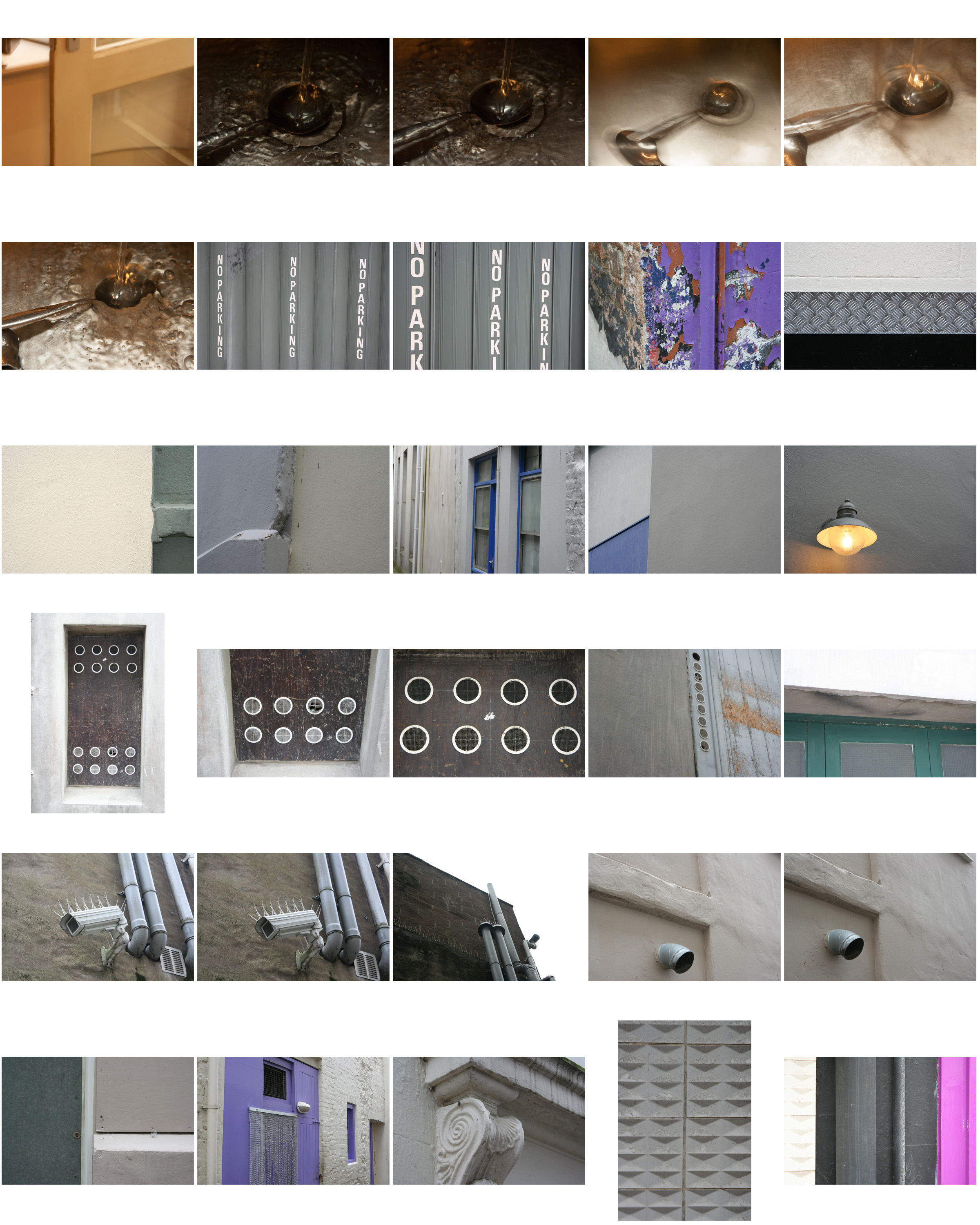
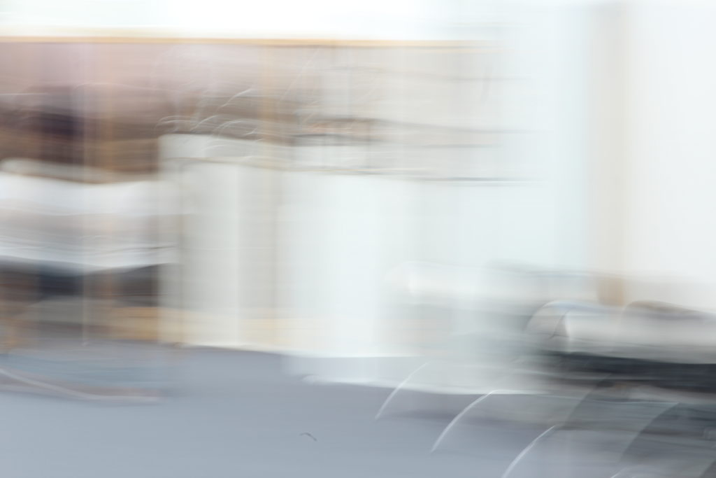
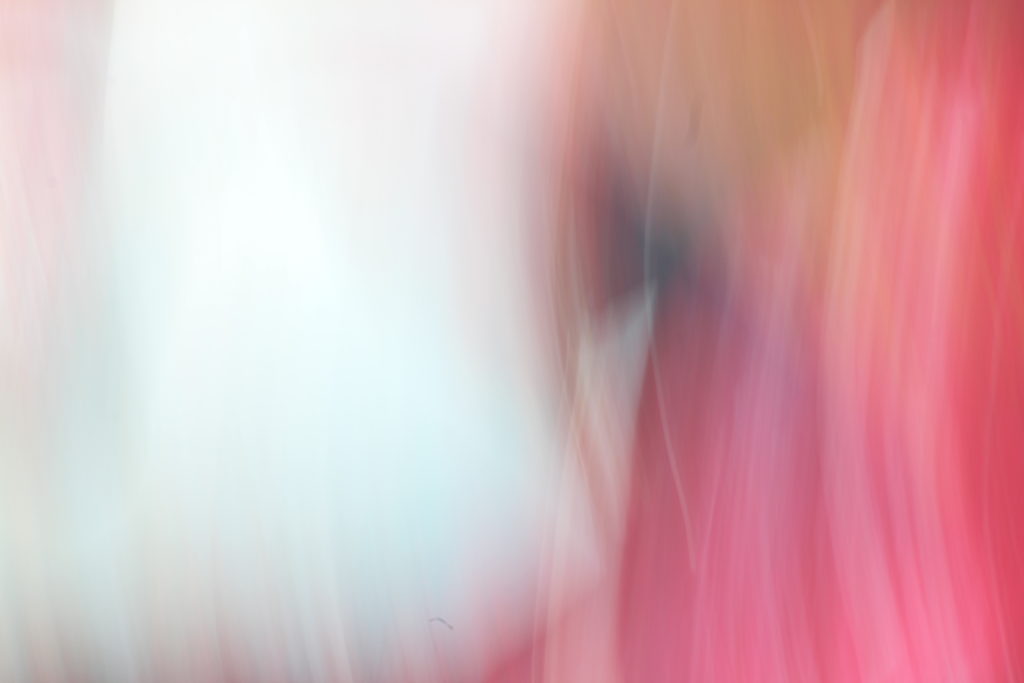
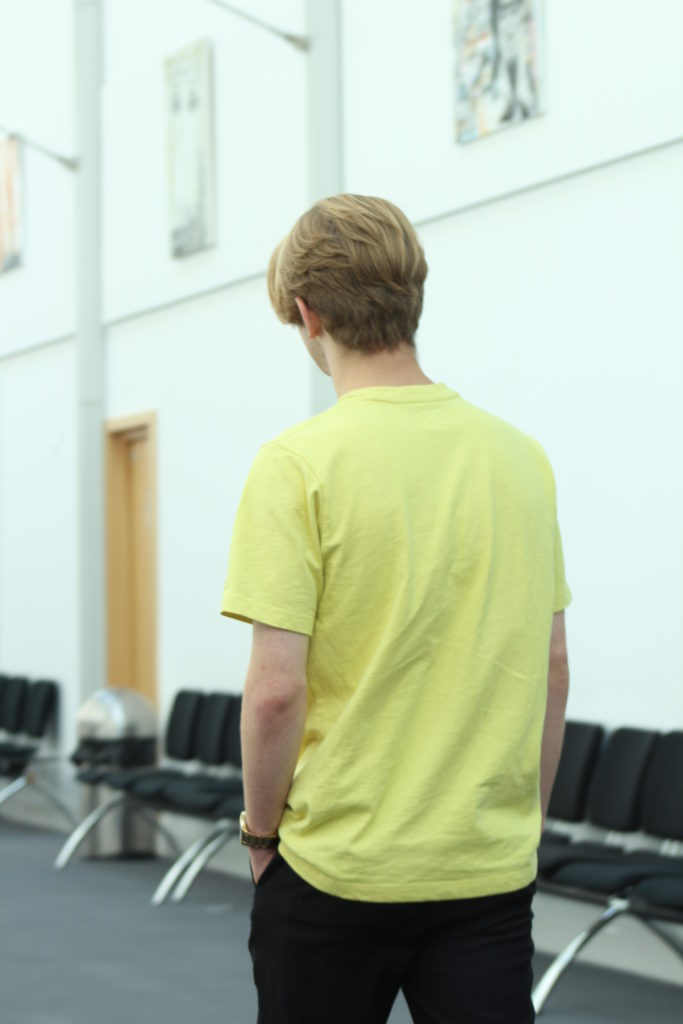
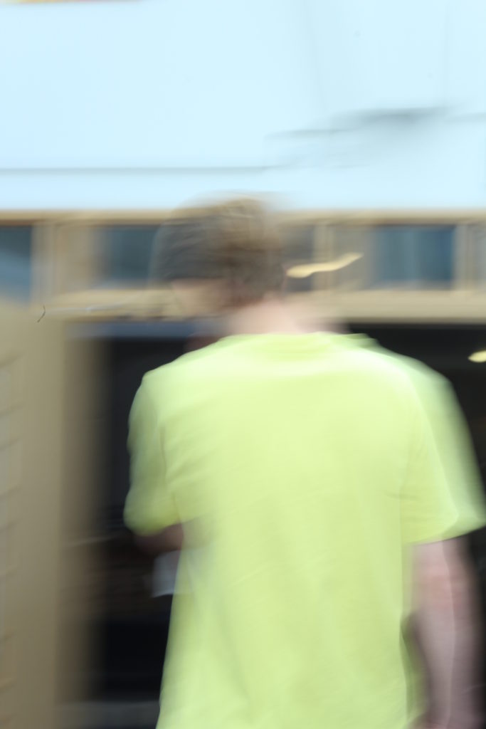
Myself and Jonny Phillips went out into the Hautlieu Street In order to experiment with different camera shutter-speeds. The majority of the photos that we took used movement of the camera itself, meaning that the whole image was blurred. In future using a tripod or a still surface to support the camera would be useful as it would mean that moving elements of the image will appear blurred however fixed/stationary elements would remain appearing still.
The Zone System, was a system of distinguishing between various black to white tones within an image. It provides photographers with a systematic method of precisely defining the relationship between the way they visualize the photographic subject and the final results.
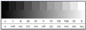
Here are some photographs I have edited in Adobe Photoshop with the Ansel Adams Zone tonal system in mind. 
