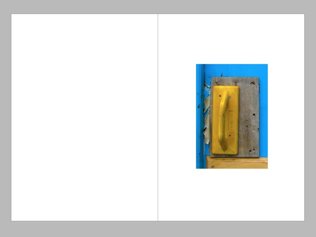
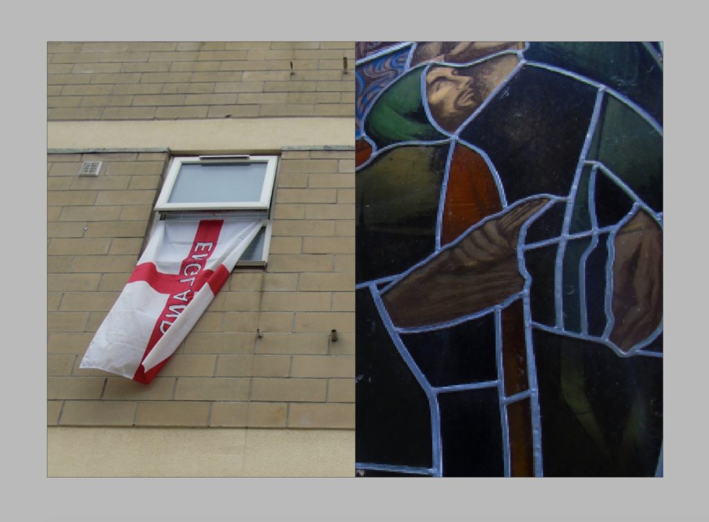
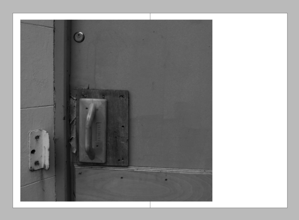
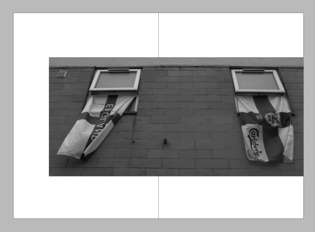
I used InDesign to create a variation of draft page spreads, my intention was to experiment with some different placement and layout ideas and also to experiment with having either all colour photos in my layout or all black and white. In the end I decided that although I did like the colour concept i found that having all the images in black and white helps the layout to link together better and creates a better narrative. Although I decided to go with the black and white layouts I still like the placement of the images on the other coloured pages, I felt that having a variety of page layouts is what would look best for my images as some images looked better by themselves or full bleed on the page or some smaller, I also experimented with having the single photos spread onto a second page slightly to create a break from symmetry, for example I decided to place the bottom right picture on the left of the page because the door handle is on the left of the door, but I still wanted to have something on the right page as when you are looking through a book you tend to look at the right page first so I placed the image slightly off from the left so that it would go over onto the right page.