Once I had finished with the design of the book I then proceeded to go onto framing some of the photos I had previous taken in a few shoots. Before I got onto the actual framing I wanted to decide on a layout that I could present them in before I actually did it. Here is a mood-board of some of the various compositions that I might consider when framing up the images:

I then proceeded to choose the images I wanted to frame, I selected the photos that I thought best reflected the topic and looked the best visually, technically and conceptually. These are the six images I chose for my framing outcomes:
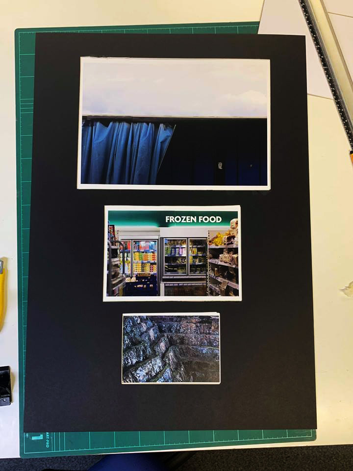
After I had completed selecting the photos I then went onto choosing the way I wanted them framed, the composition I chose presents the photos in descending size order (A3, A4, A5). By doing this it would allow me to create two separate frames where each size would represent a different area to consumerism and its process being creating, selling and ridding. However I thought that doing it would be too plain by itself so decided to create frames where the image sinks into the paper. To create this I would have to map out the composition on paper to then cut it out and stick the images on the other side of the sheet, giving the impression of a sunken photo. These were my results:
Overall I was really happy with the outcome of the composition as I thought by arranging the photos in an order where the biggest issue is presented as the biggest photo really highlights the issue of consumerism and the process it goes through all the while effect out environment. I also really like how the image size descended as I found that it really produced an aesthetic feel where the issue is represented by the size of the photos (waste being the most harmful).


