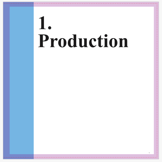
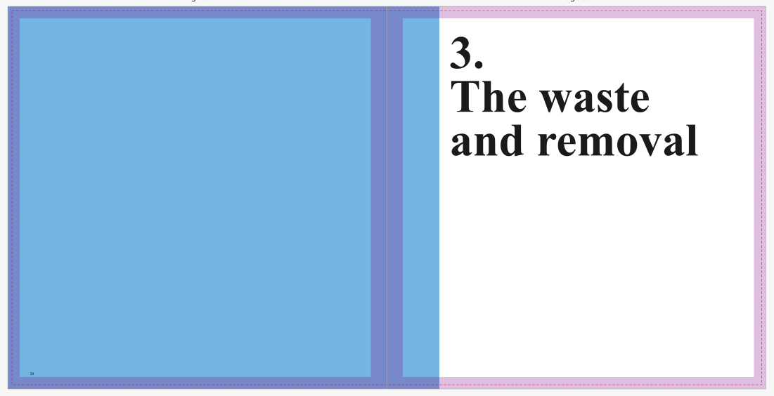
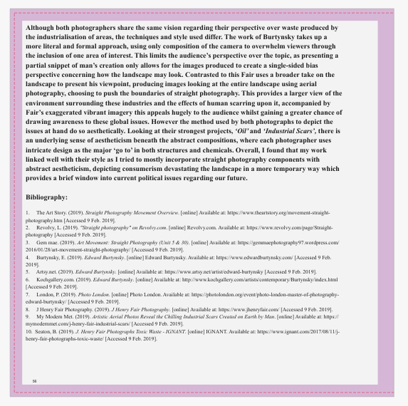
Once I had completed my initial draft for the composition, I then decided where to place my essay and various text throughout to add to the narration. To do this I wanted to include a few title pages which highlighted the topic themes as you progressed, whilst putting the essay towards the end of the book so that the audience could interpret the message behind the pictures before actually knowing what the book is about. I wanted to use a clean layout that properly that includes bright colours and a clear intention. These were my results from the experimentation’s:
Front And Back Cover
 For the cover I decided to use a rustic effect taken from one of the corroding metal sheets, choosing to use a white New Times Roman font as the main go to for text fonts. I made sure to place this in an area of the page that would make it clear enough to make out and read for the viewer, so by placing it against a blue backdrop seemed to be the logical choice. I selected the title ‘Preserved Consumption’ because of its referencing to how out activities that scar the landscape preserve man actions towards the environment. Along the spine I placed the title and my name in the same font and colour to add the effect of consistency before actually opening the book.
Topic Title Pages: 

 I then proceeded to implement title pages for each of the three topics which would separate the sections of the book out to create a narrative. Once again I used the font New Times Roman to create the impression of consistency, using numbers to represent the intended topic. When laying it out I made sure to include the text underneath the number so that it would fill more space whilst providing the book with an aesthetic result, which by complimenting it with a sky blue really brought out the result. For each of the titles I made sure they had a relevance to the topic they were before, allowing a certain expectation of what will be in it to arise before going through any of the pages.
Essay:


 Finally for the essay I made sure to include it at the end of the book, by doing this it would allow for the viewer to interpret the message of the book throughout, with only at the end there being any real answer to what I wanted to explore. Like the rest of the book I made sure to use the font New Times Roman, using varying font sizes throughout the essay on things such as bibliography, title, text and references so that some degree of aestheticism could be put across. Accompanied across the pages of the text I included the photos that the book referenced to and the photographers I studied when making my results, this compliments the essay nicely as the reader can switch between the pages to gain a broader insight into what I wanted to achieve. Composition wise I made sure that the images were placed in an visually appeasing area that did not draw any attention away from the text across the page. When positioning the text for the essay I made sure it started on the left hand side of the page and ended on the right, by doing this it gave the opposite pages more breathing space between them, preventing anything from becoming too eye sore.
