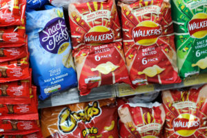
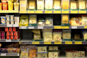
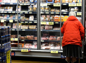
8One of my final ideas regarding consumerism was the concept of the product and result of consumerism. To do this I wanted to go to various shops in Jersey and photograph the aisles of food and the occasional customer buying, this would help in telling the story of societies consumerist habits. Here I wanted to capture vibrant and colourful items which would contrast the previous shoots that focused on dull landscapes scarred by industrialisation. For the shoot itself I wanted to reference back to Andrea Gursky, a photographer who had inspired a previous shoot.
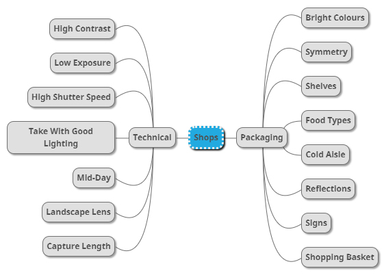
When going ahead with the shoot I decided that I should make a mood-board, by doing this it would allow me to explore ideas that I wished to produce when commencing with the shoot itself. The most important thing I wanted to portray in the image are the colours of the shop and its organisation compared to that of the source and outcome of consumerism. Here are examples of what I’m aiming towards in the shoot: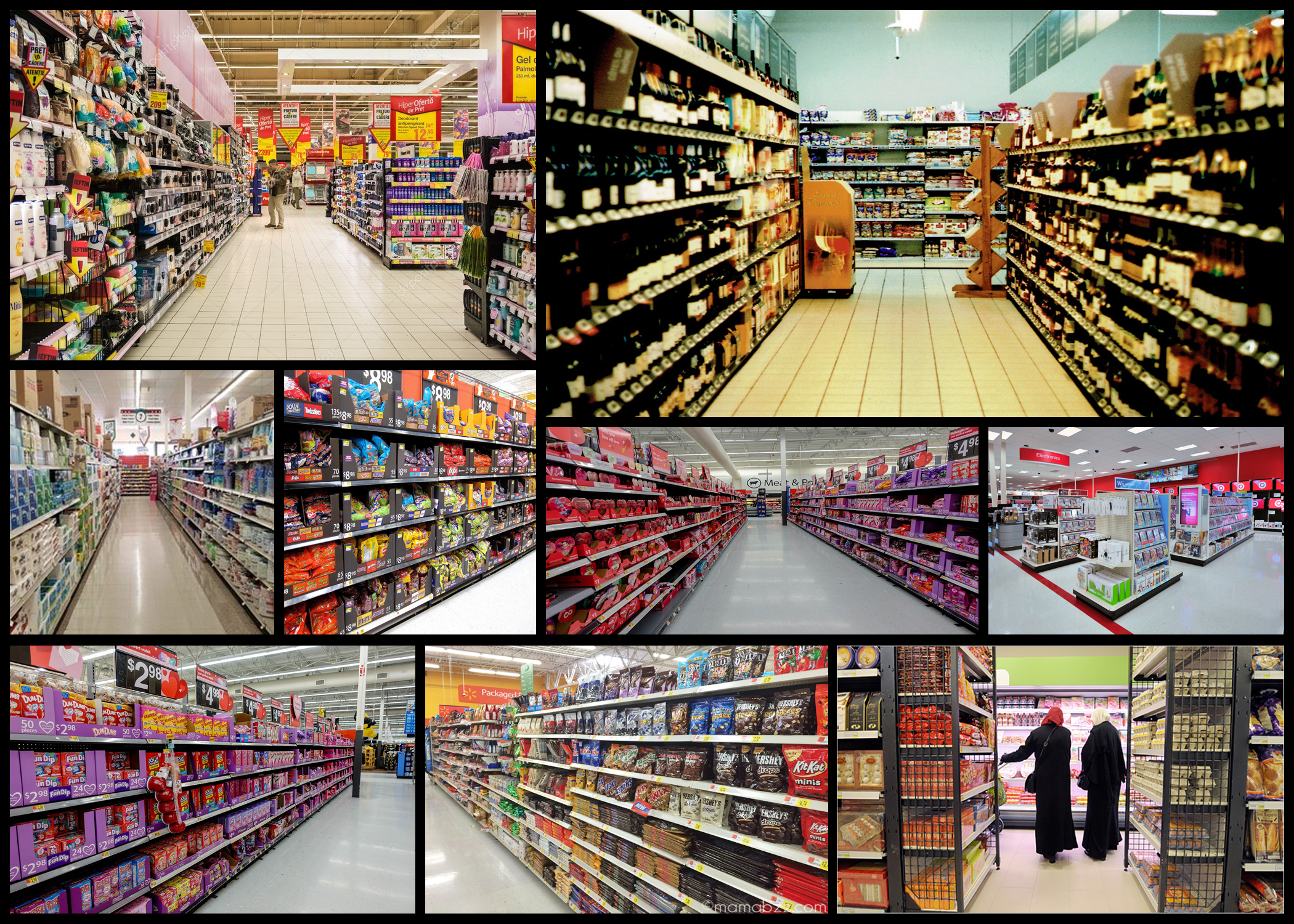 After I had finished producing the mood-board, I then decided to create a mind-map. This would allow me to physically write down my ideas and approach the shoot with clear intentions for what I wish to achieve. My ideas can be seen below:
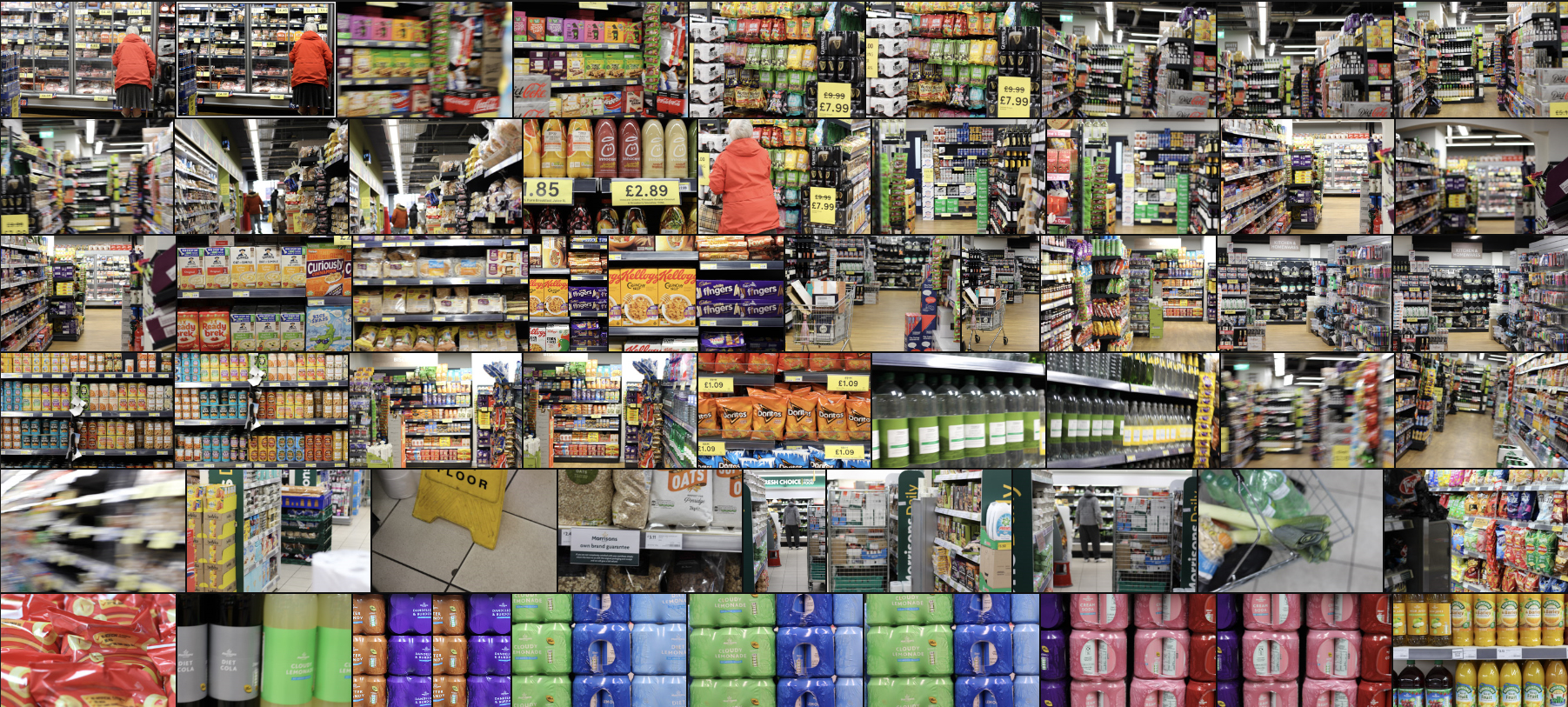
 Once I was happy with the ideas for the shoot I then proceeded to go out and photograph the chosen area. I had asked certain shops to photograph their aisles in the local area to capture the aestheticism of the rows. Here are my responses:
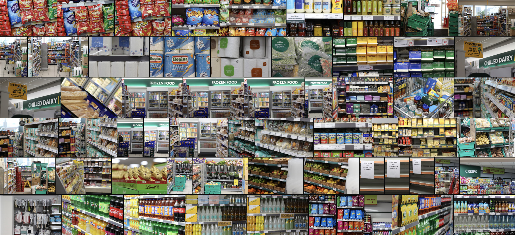
 After I had finished the shoot I went on to pick ten images that I thought best reflected the entire shoot, looking at how the related to the topic of consumerism and their overall look. By doing this it would make it easier to pick out the best image of the shoot whilst ridding me of any images that I thought were not up to scratch. These are my choices for the top ten image of the shoot:
Once I had chosen my selected ten image I then proceeded to change whittle down again into only five, by doing this I could analyse the photos to more detail, looking at how their technical, visual and conceptual aspects that defined them from the rest of the batch. Here are my selected five image of the shoot: 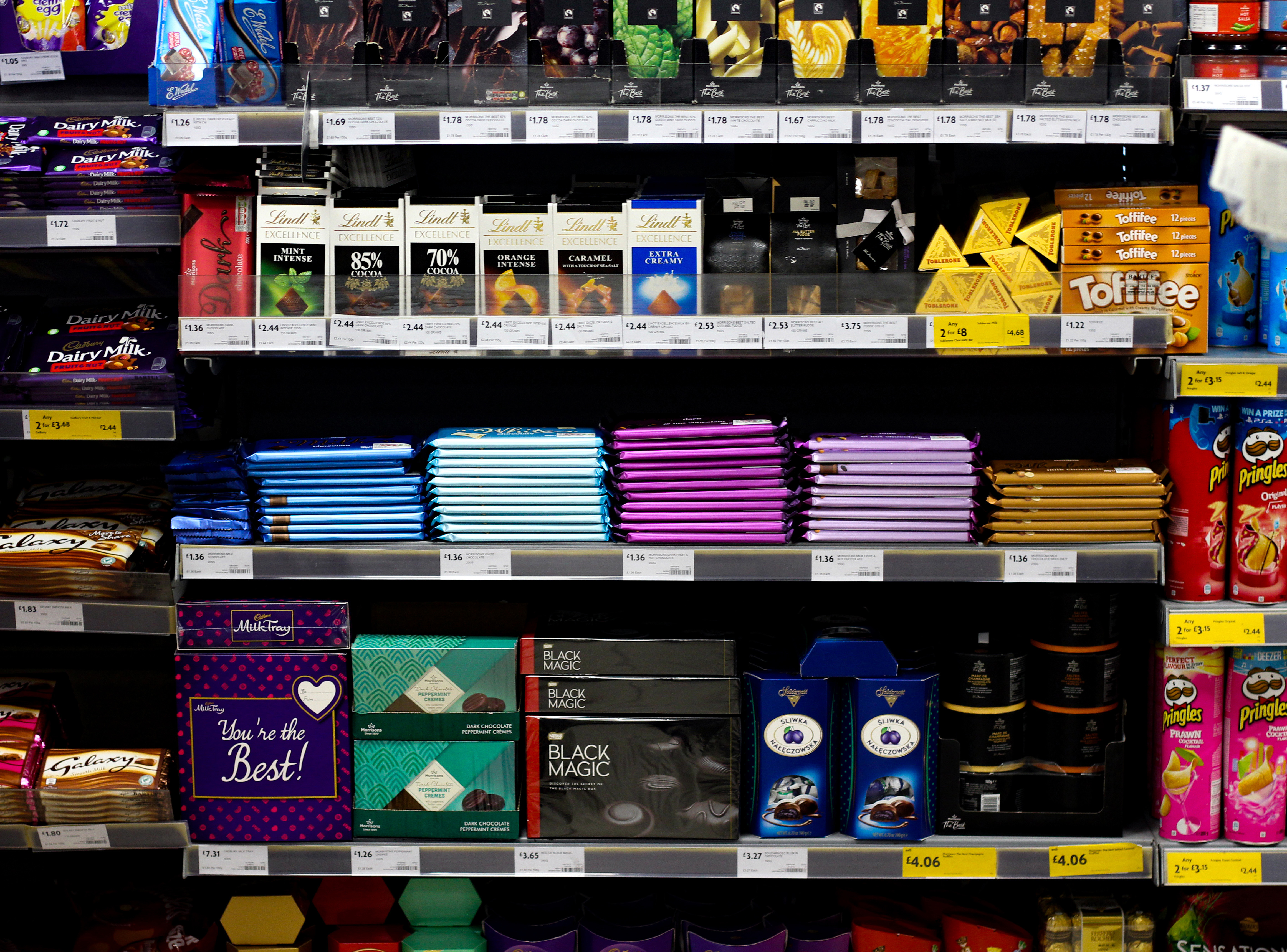 I selected this image because of the bright colours brought in by the chocolate wrappers. I found that this contrasted against the black backdrop made by decreasing the brightness making the shelves become more aesthetic as a result. I really like how the composition of the shelves shifting from different heights, this to me added differentiation into the piece through its depth. The neatness of the chocolate bars in the centre of the image provided a sense of organisation compared to the rest of the image which seemed to be more messy due to the placement of the items. Finally I thought that this image best reflected one of the most consumed items world-wide, the sugar industry, and especially with the news regarding the destruction of landscapes to produce chocolate products I found that the implicit meaning behind the photo really complimented the topic.
 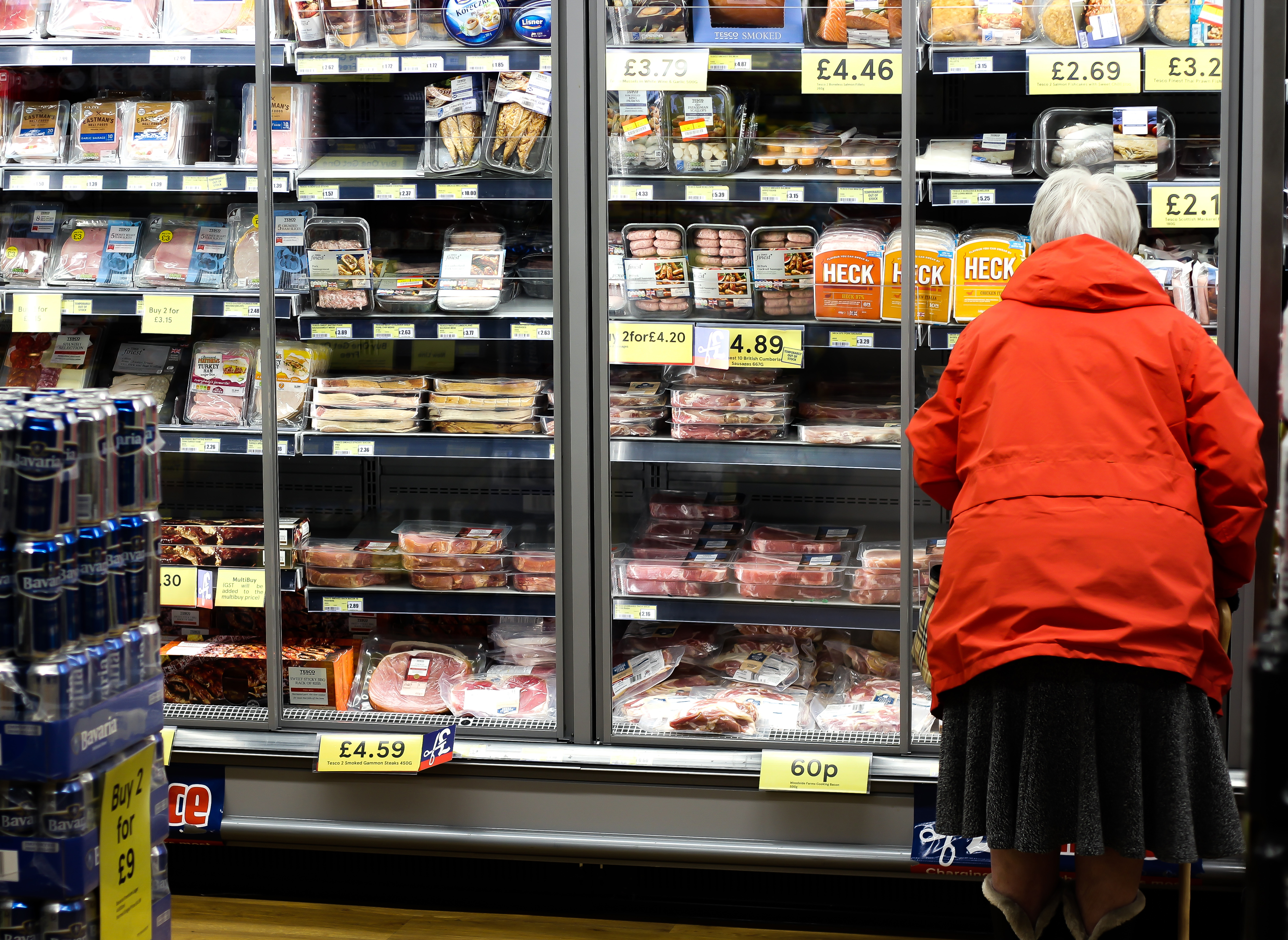 I chose this image because of how I thought the contrast between the meats and the lady in the red jacket really brought the image together. What can be seen as a predominantly dull piece is brought to life through the implementation of red, giving life to what would typically be seen as a cold section of the shop. This is really complimented through her composition and placement in the bottom right corner, as it adds room to view the rest of the aisle presenting a comparison within. I made sure to add the beers on the left to add a sense of depth into the piece and provide a broader sense of the shop as if you were there. Overall I found this image to be effective through its representation of someone buying the products, showing a mid-point between producing and the waste.
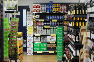
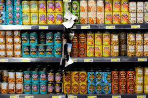
  What made me choose this image was the assortment of colours present through the stacked cans on the shelf. This variation every can or two for me added a huge sense of aestheticism to the photo, with the occasional tin missing adding a much-needed bit of depth into the photo. By including the tags dangling off the edges and the sides of the shelf it breaks up the otherwise symmetrical piece, preventing it from becoming too eye sore for the viewer and instead separates the focus of the audience. Overall I found this piece really represented the intended topic of consumerism as it provided a sense of order, something that I made sure not to make present in any other of the shoots.
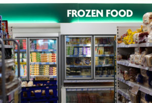
 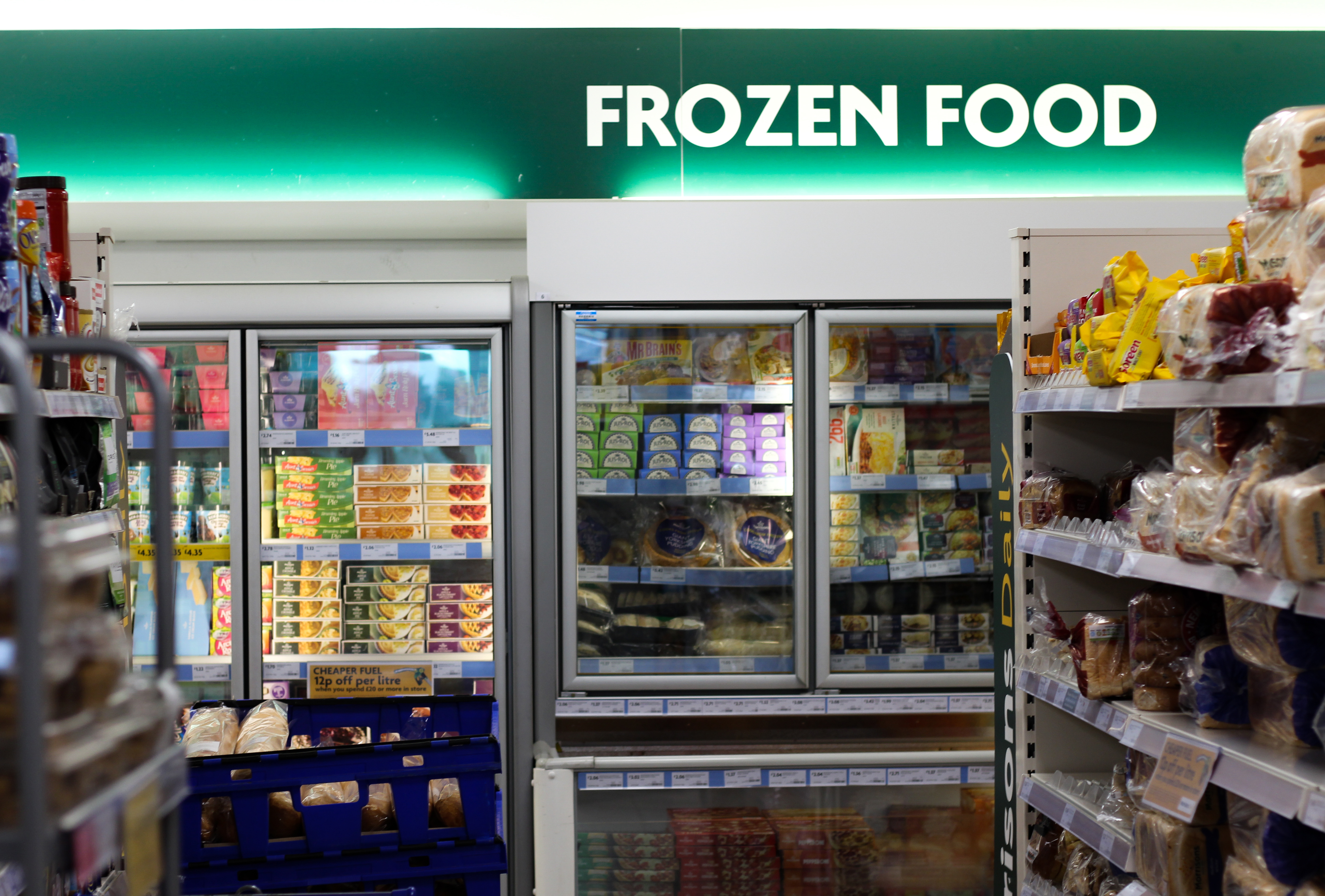 The reason I chose this image was because of the sign illuminating over the food aisles. This for brought much-needed colour into the photo, whilst providing order and categorisation for the food which can be seen as stacked in a rushed manner, providing order amongst the maze of food. For me the signed added an insight into the typical sight in a local shop, where everything is labelled and easily found, compared to that of the dump where everything is thrown in together, with items becoming lost forever. To me this image worked because it was the style of photography I wanted to achieve within the store, being straight photography, where I would only photograph what I witnessed using no manipulation to adjust the image whatsoever.
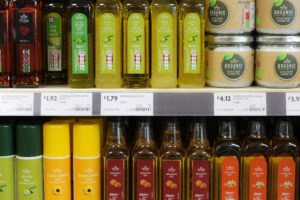
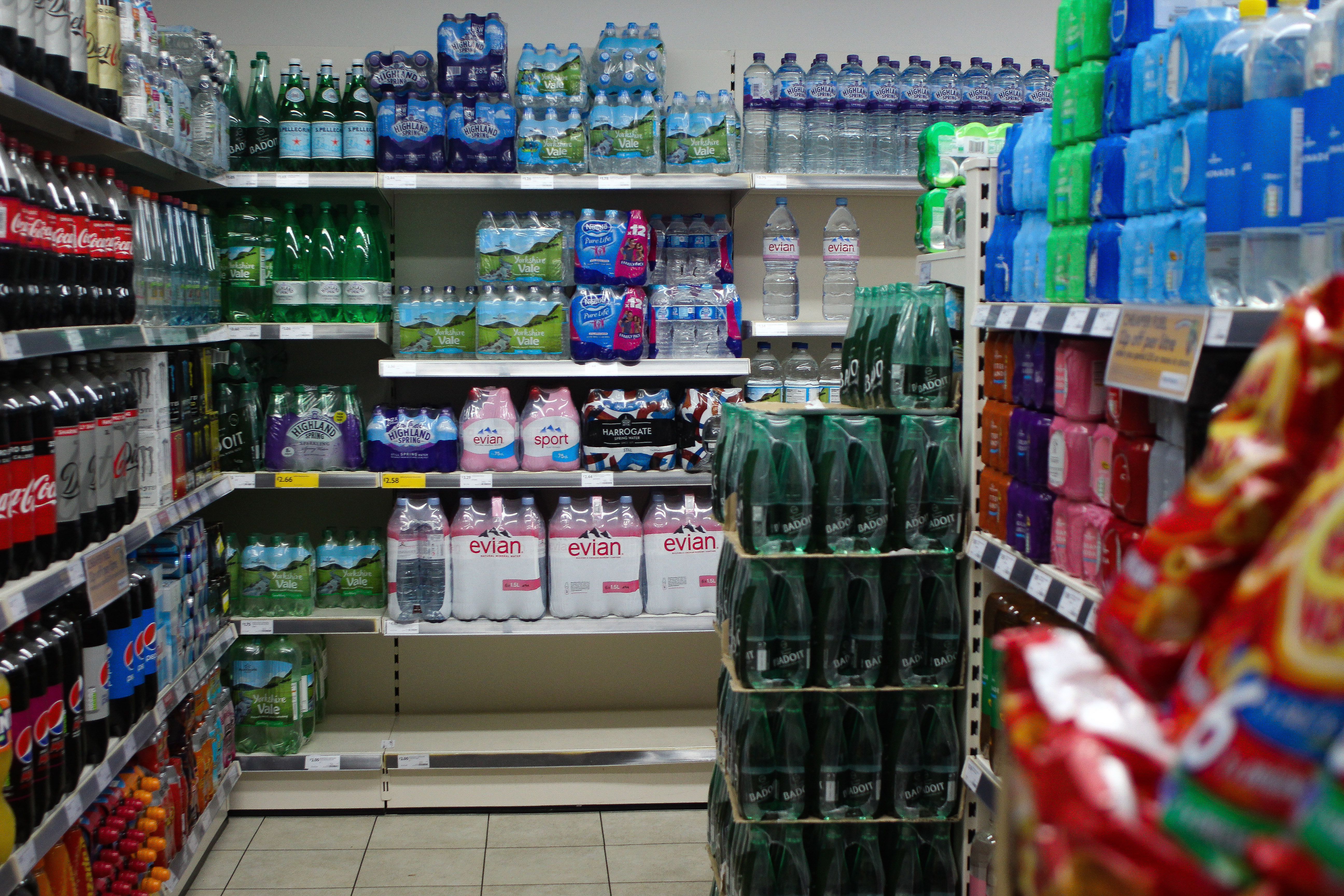 Finally I selected this image because I found it to be the best representation of straight photography out of the entire shoot, bringing through bleak colours and an ultimately dull image. For me this image was a great representation of how a typical local store would be laid out, with a look of organisation on the shelves and empty spaces. I really liked how the right side of the photo emerges from a crisp packet which for me adds depth to the piece as if you were walking down the aisle and this what you would see.
Once I had analysed all five images I thought I had enough evidence to select the best image out of the shoot. I would be taking into consideration its overall relevance in the shoot and topic of consumerism, with it needing to be a representation of the half-way point between producing and waste:
Final Image:  The reason I selected this image as my final piece is because of its relevance to the topic of consumerism, done through an aesthetic and appealing way. The capturing of a red jacket against a backdrop of dull coloured meats really sold this piece for me, producing a quite conceptual result that hid the face of the buyer. By only seeing a slither of the floor and section of various other shelves added a sense of you really being there witnessing the customer buying something, with the blurred beer cans adding depth into the photo. This image would be a great implementation into the presentation of the mid-section of consumerism, the product, showing someone buying food which will later be thrown away into the dump.


