Who is he?
Andreas Gursky was born January 15th, 1955, Leipzig, East Germany. The son of a commercial photographer, Gursky grew up around photography, starting to photograph things with a black and white Leica camera. He soon started to go against the trend and began working with coloured imagery and tripods. Gursky started to focus more and more on detail in the composition of his photos, the style he is now most celebrated for. By 1980 Gursky was producing photographs so large that they could only be printed on commercial boards, leading him to print of the largest photo paper ever, which he then combined single sheets with to make even larger. From here he became best known for his monumental digitally manipulated photos that examined consumer culture and the busyness of contemporary life, using his unique composition strategies to result in dramatic images that walk the line between representation and abstraction.
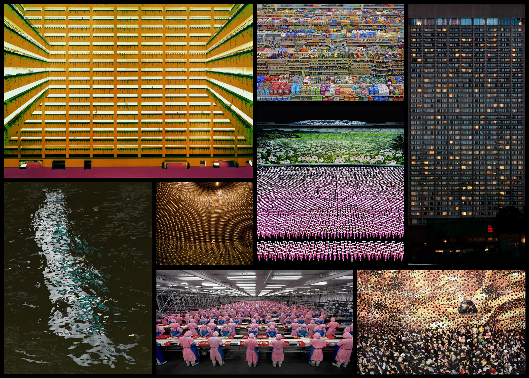
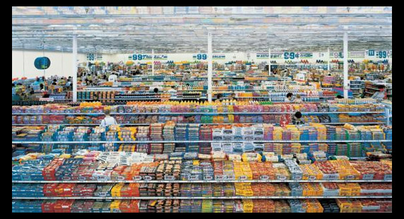
Gursky soon became fundamental in redefining photography for a new generation of photographers. Using digital image manipulation forcing into debate a new version of truth within photography, becoming apparent that the truth manipulating abilities of the camera could distort reality and erode the viewer’s trust. This pushed people to consider the question of truth, with this new digital photography becoming more and more relevant. Some of his work can be seen below: Once I had reviewed a few of his works I decided to go on and analyse one of his photos, by doing this it would allow me to understand what made his photography so effective. Whilst giving me an insight into the techniques and focuses of the style of photography he uses, and the thought process behind it. The image I have chosen is called ‘99 Cent’, taken 1999 of a local convenience store:
  Visual: Visually this image is extremely aesthetic, with the broad variety of colours present in the shop providing a sea of rainbows to be looked upon by the viewer. This is stopped from being too consistent and overpowering through the use of obvious shelves which stops the packaging from merging with the next, the white poles which pop up occasionally also add to this through their symmetrical layout across the shop, providing clear coordination in the piece and an unseen structure in the shops structure. I love how the packaging of the food is countered by the texture of the ceiling, which seems to almost reflect the colours of the below, fading into the distance as if its never ending.
Technical: When looking over the photo, I notice that the image itself uses a relatively higher exposure than usual due to shadows and black areas not being to noticeable and through the faded effect of the variety of colours such as red and blue. However a low saturation could have been used, reducing the colour of the products, stopping them from being too overpowering and instead becoming aesthetic. Gursky has purposely angled the camera so that he picks up the symmetry of the entire shop, with the poles and heads being reference to how he has done so. Finally the inclusion of the wall on the left breaks up the shop from becoming purely focused on products, presenting consumer life in the picture as well.
Conceptual: The image itself is meant to be a spectacle of consumerism appearing as organised, rigorous and formal. However the photo actual is hyper real, where yes its rooted in reality, however there is no physical space like it. By portraying such heightened constructions of our existence from dollar stores to football fields and sprawling cities, Gursky’s photography acts as a symbol of contemporary life. Seen through the mirrored food flattened and the iconic work, over exaggerating the environment of the surrounding environment.
