Photo book generally have a narrative or story line, this is more than just the sequencing of images and the aesthetics is how each image links and follows on. A stand alone image speaks for itself, we often will notice more details in these our eyes are not distracted my anything else. However multiple images is not always a distraction they can work together and create a more advanced understanding for the audience.
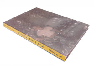
I have chosen to look into ‘Where Mimosa Bloom’ by Rita Puig-Serra Costa in more detail and analyse all aspects of it. The subject matter of the book is Rita and her mum and family memories all link with use of the yellow mimosa tree. The style of the book is very personal and aesthetically soft, with a faded pastel colour pallet. She has approached her photobook with a very unique structure, a mix of archival images, portraits, still life, landscapes and documents have all worked together to create a broad overview of her family and memories.
Firstly the design of the cover is distorted and not completely clear, this is an archival image from the photographers family achieve showing the subject of the book as a child. The faded effect and pixelation shows the vintage feel, we could link this to how photographs capture and preserve distant memories but also shows hoe nothing is permanent. The back cover is again distorted in the same way as the front and shows a landscape image with trees which could link to the title of the book. The spine of the book is in a bright yellow colour which stands out from the brown toned images, the text is debossed and printed in black. The same yellow colour has been used for the inside lining of the cover, and after researching the title this colour links to the flowers (bloom) or the mimosa tree.
The first few pages of the book progressively show and reveal a family tree, presumably which shows the link between the photographer and the subject of the book. As you turn each page a new image is revealed through frames cute into the paper.

