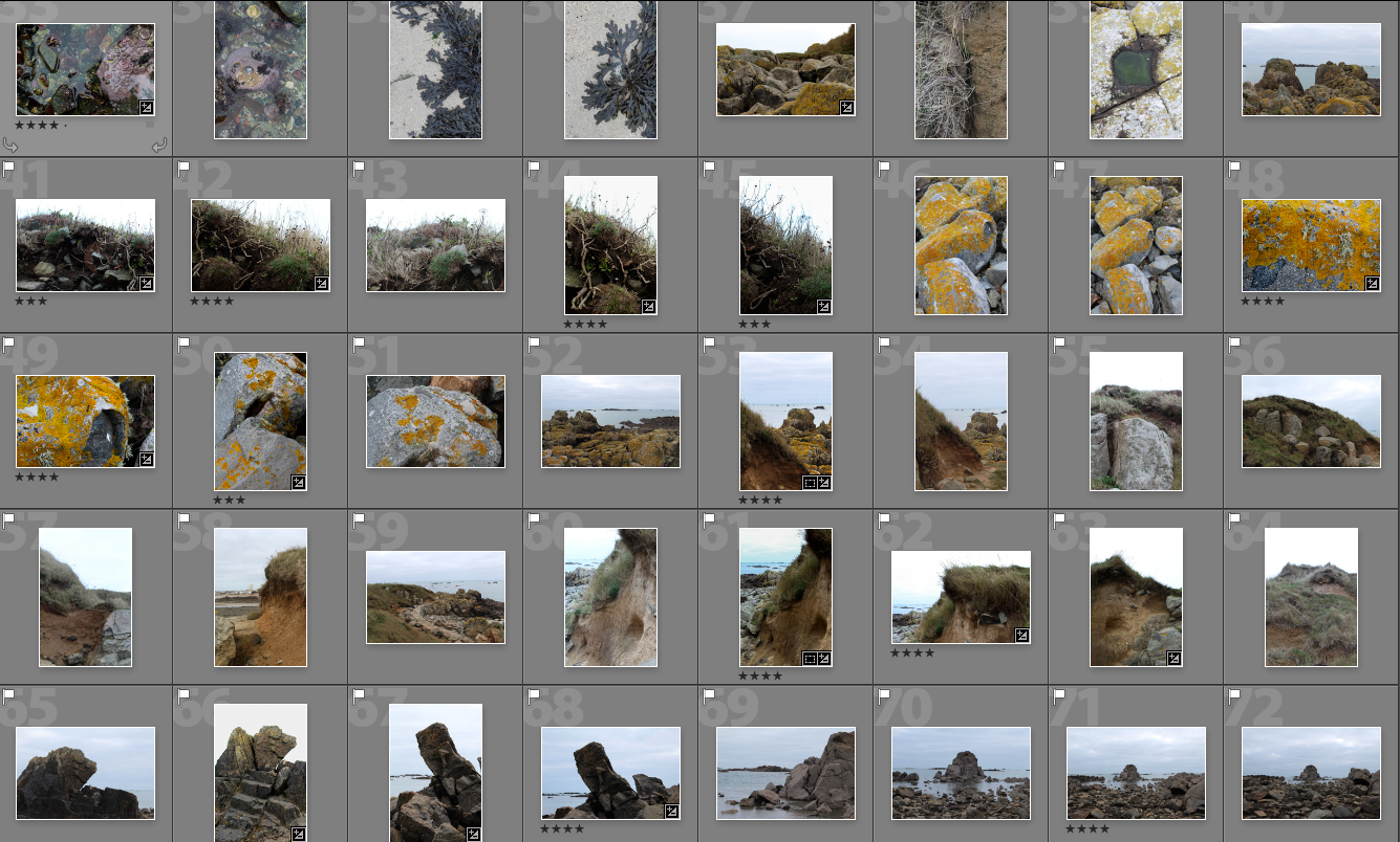
From this photo shoot I picked the best images from the 350 I took and narrowed them down to 40 and displayed them below. In the photo shoot i tried to focus on taking landscape images, but ended up liking more of the closer up images I took that looked at form and texture.
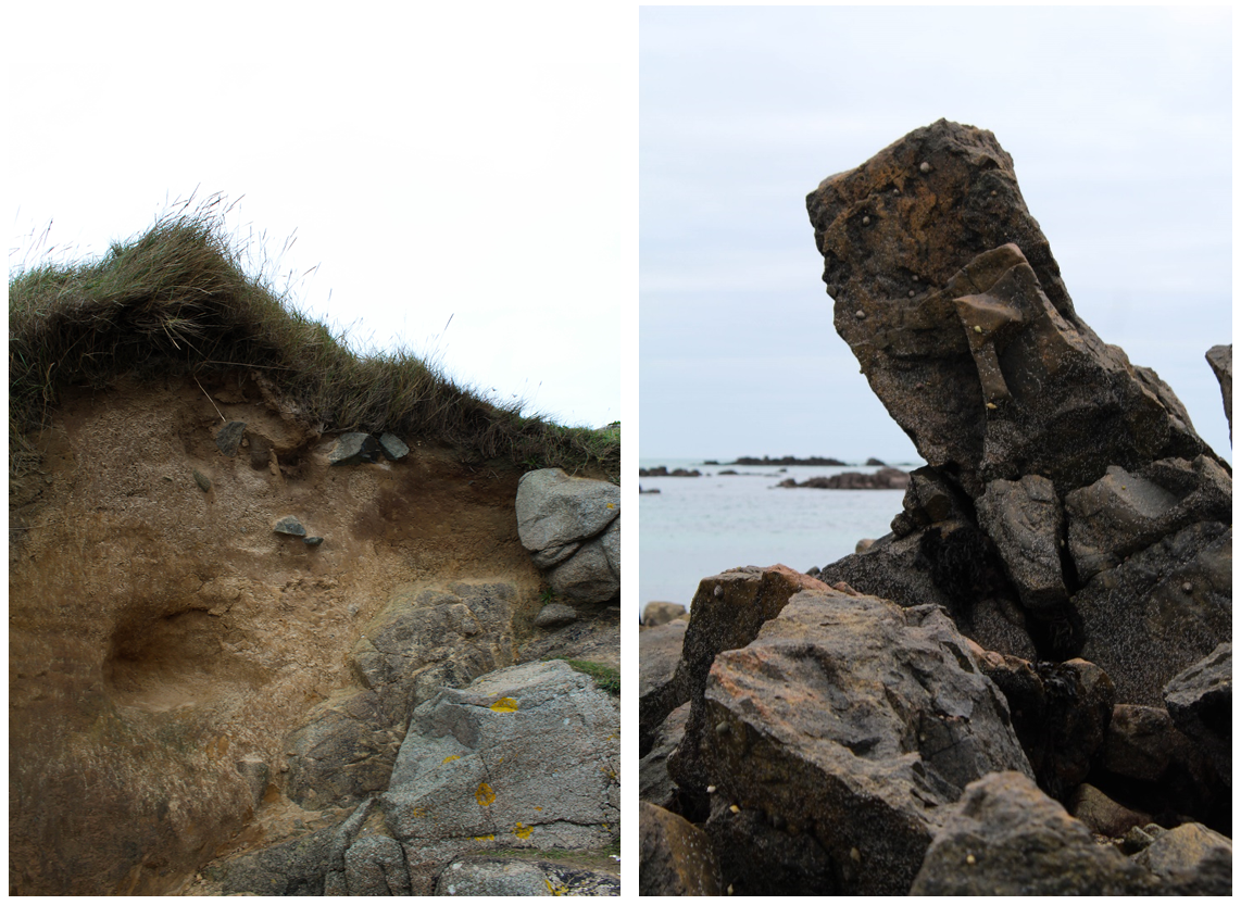
When on this photoshoot I found I was emphasising the shape and structure of the surrounding area. For example, the images above show natural objects (rocks and earth) contrasted against a bright background to make their shape stand out. The image on the left focuses on more rounded shapes wheres the right image looks at straight lines and more geometrical shapes. I was particularly interested in this rock as the shape was unusual and not like the other rocks on the beach. The angle it is positioned in a diagonal and sticks out above anything surrounding it. I like how in this image there’s close up rocks in the foreground which link to the rocks in the background along the horizon creating depth within the photo. The seaweed creates darkness to contrast with the lighter tones of the rock making a more interesting form. These two images link together but are also juxtaposed. In the left image the grey rocks on the bottom right of the image link with the right image and its shapes. The rest of the image is juxtaposed focusing on earth tones and more rounded shapes. I like this image because of the different textures shown in the earth and also because the image is divided into sections creating an interesting composition.
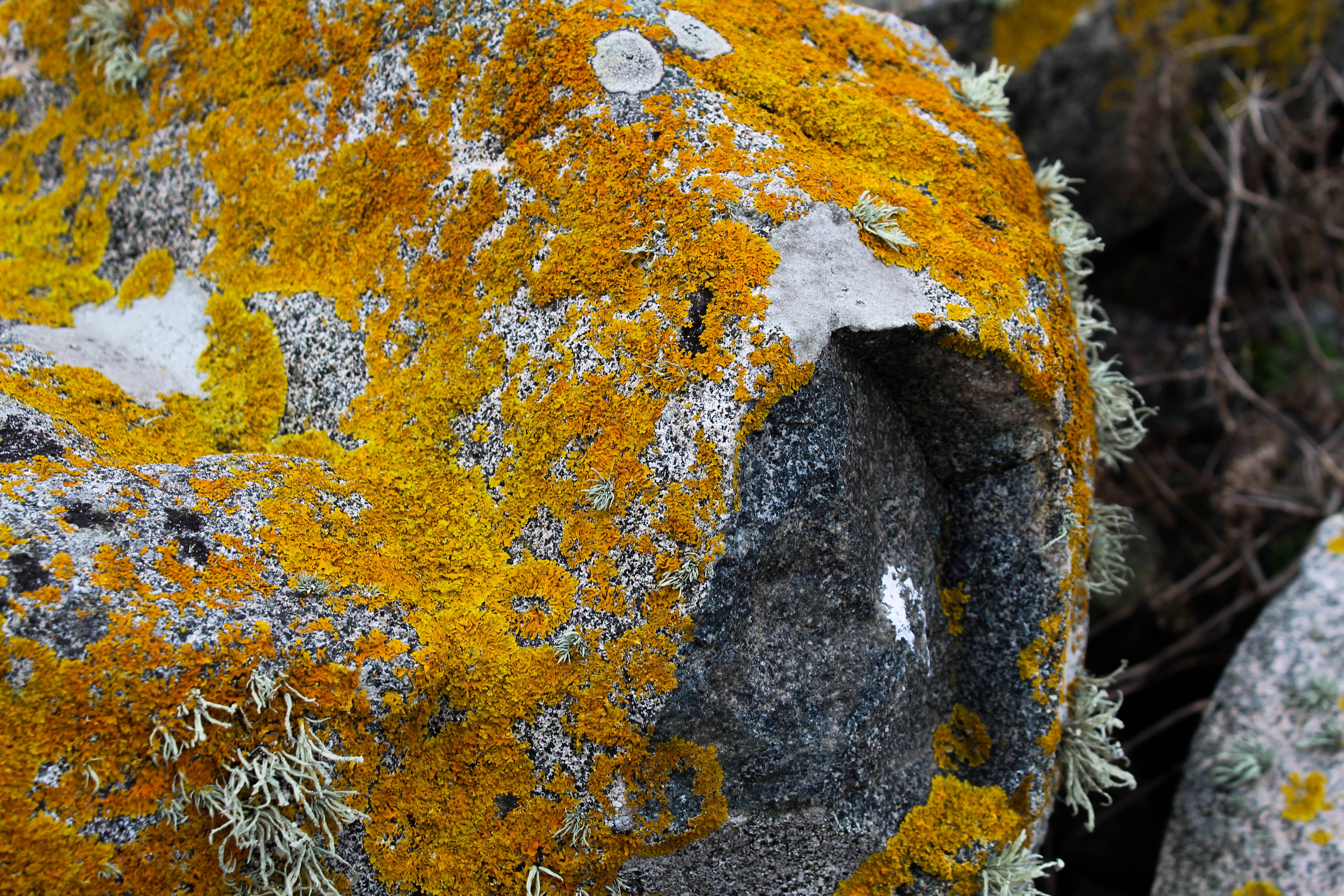 I chose this image because i like the many different textures and colours within it. The yellow/orange colour contrasts with all the other images I took in this shoot but still follows with the theme of earth tones that the others have. The different textures emphasise the rounded shape of the rock and make the image more interesting because there’s more details. I also like the angle this image was taken at as it emphasises the part of the rocks thats indented and isn’t orange which further highlights its 3d form. This part of the image also creates darker tones in the image to contrast against the bright colours. One aspect I could improve on is the composition of this image as on the right side of the image is part of another rock going out of the frame which doesn’t ruin the image but takes the emphasis off the other rock in the image. I think the other part of the background which shows brown parts of a plant complements the rest of the image and links to the arm colours on the rock.
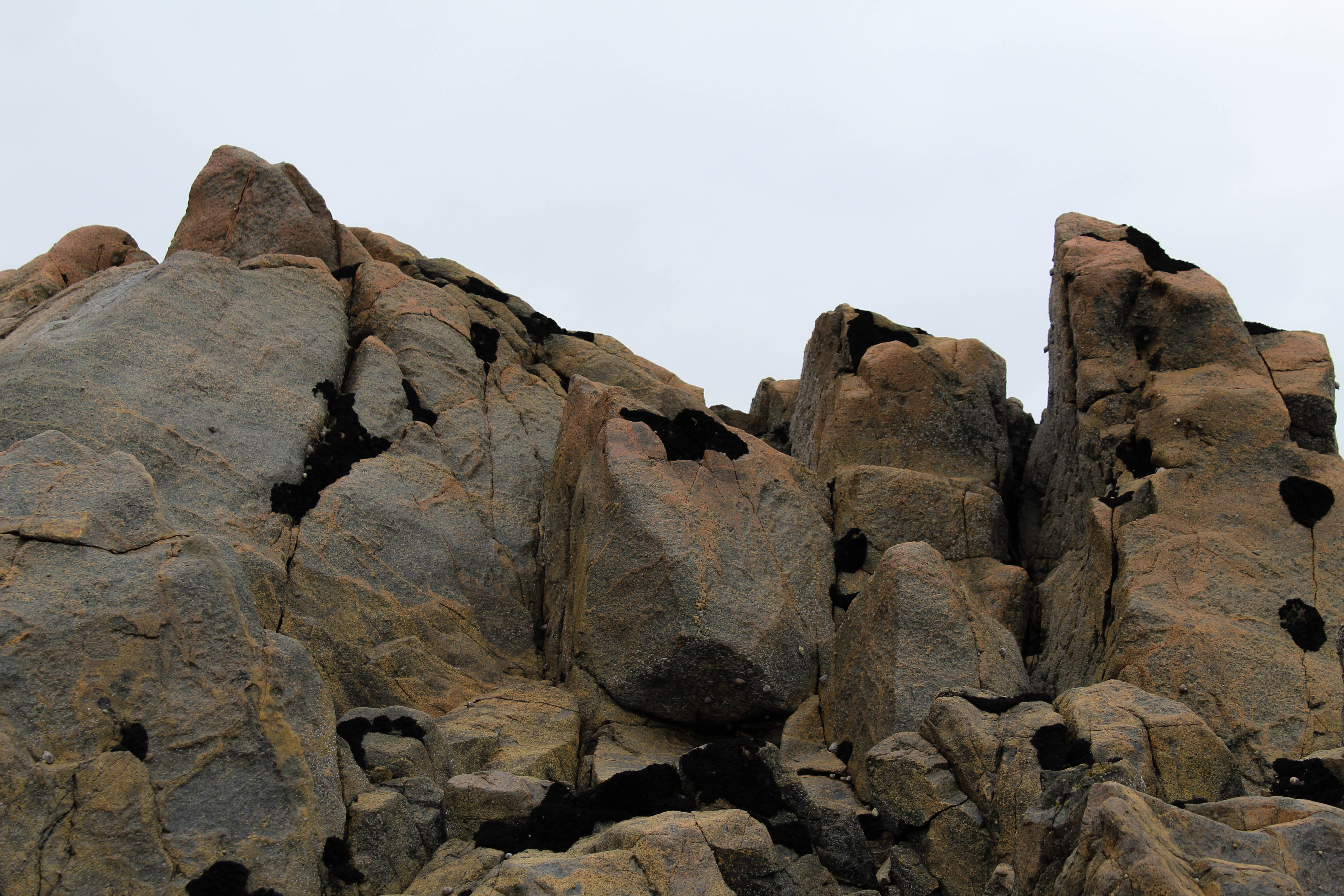
I chose this photo as one of my final images for this shoot as i think it complements my other final images well and follows the same emphasis on form and structure. The bright background emphasises the light and dark brown tones of the rock and highlights it’s interesting shape. I like this image as unlike some of my other images it doesn’t show anything in the background of the image and only show what’s in the foreground. Also its shape has rounded and sharp points which I like as it’s creates juxtaposition within the photo and further highlights it’s form. The seaweed which is on some parts of the rock creates an interesting pattern and adds to the different textures. In my photo book I plan to contrast these images that focus on form with archival images showing what the rocks and earth was like over 90 years ago. I will not find the exact spot where that images was taken but will show the contrast between the area over that period of time. In these image i aimed to capture was the atmosphere in the area is and I think i did that through the earthy tones.
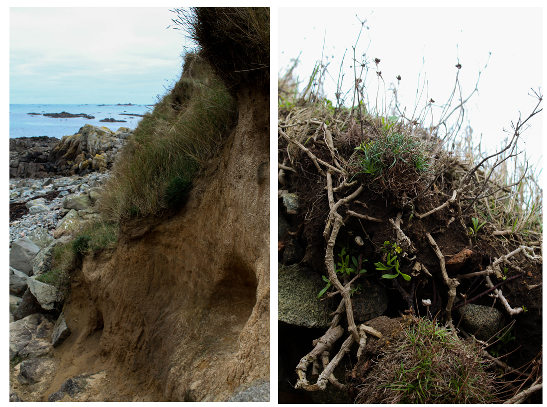
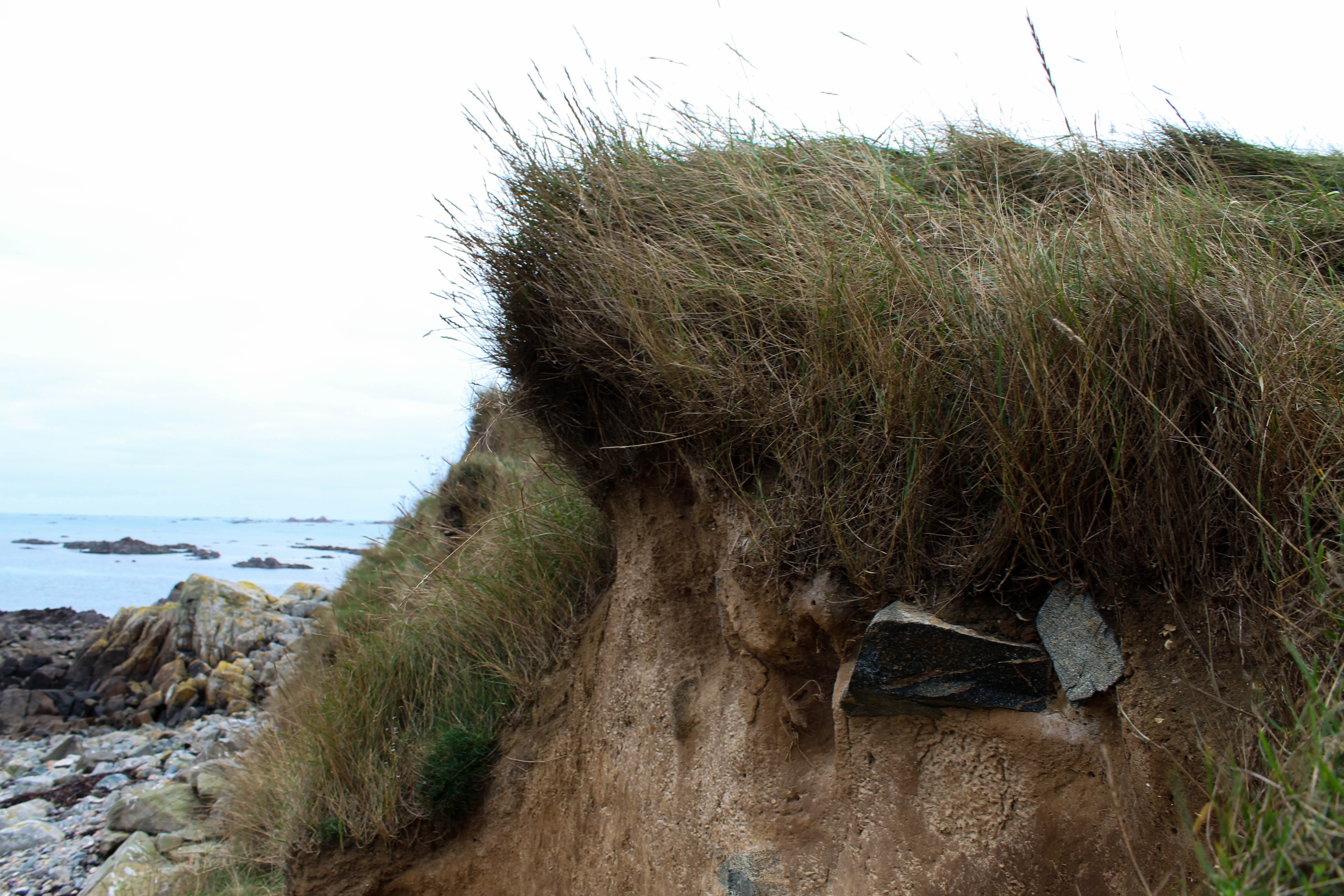
I chose these two image to display as I think they have many different elements to them which make them interesting. The image on the right focuses on the shape of the small branches coming out of the earth at the edge of green island. I tried to emphasise the light brown tones by using a bright white/grey background. I like the patterns the sticks make by growing in different directions and angles. The plants growing downwards in the foreground of the image contrast with the ones in the background growing upwards. These plants then contrast with the sections of earth that have grass growing on them bringing green tones to the image and making the textures more noticeable. I liked this image in particular as it shows new plants growing through through the bright green tones, but then also shows plants and grass that is brown probably caused from being near the sea and it being the winter. I chose the image on the left as as I like the depth of the image, showing different things in the foreground, middle ground and background. The foreground shows the earth of green island and it rounded form. This sections focuses on the earthy tones brown and green and its interesting shapes that formed from the sea. The middle ground shows the rocks on the beach next the island,the brown tones linking the foreground. The background shows the blue sea which contests the colours of the rest of the image. I like this image as all aspects of it are natural and it doesn’t show anything man made which i think portrays the atmosphere of the island.
