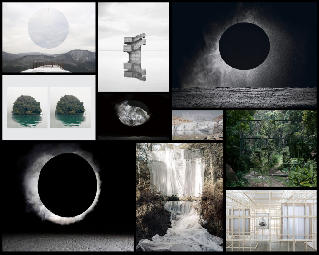
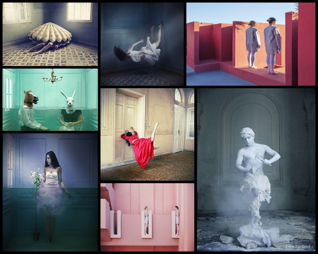
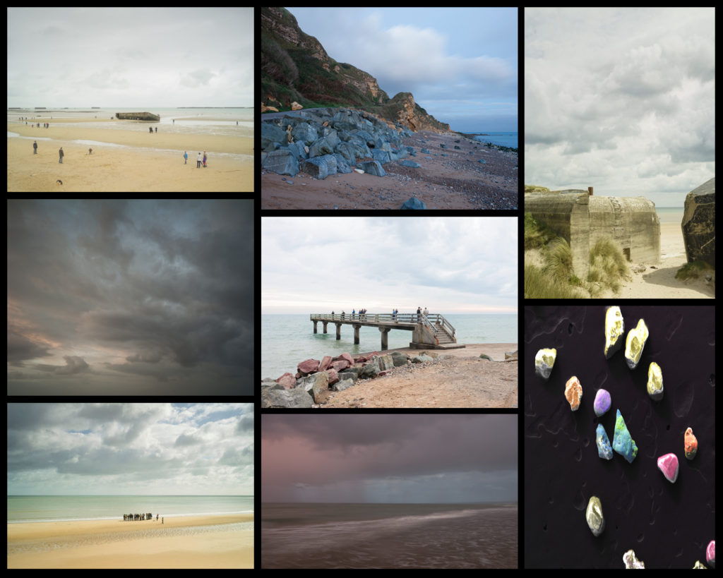
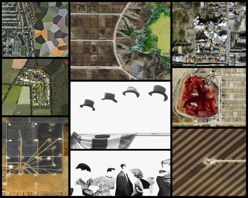
After researching rules and conventions of photography I finally thought that I was able to proceed onto the actual topic of political landscapes and how I could go about exploring the idea behind it. I really like the idea of surrealism and the use of conventions that I had previously used in various shoots and so thought it would be interesting to relate it to people, landmarks and landscapes. The artists I found to be of particular influence towards my interests are Edward Burtynsky and Donald Weber. By using these photographers as my primary influences for my political landscape shoot it would allow me to process the outcomes through different software such as Adobe Photoshop and Lightroom, creating differing outcomes due to the new range of possibilities that the apps presented.
For the shoot itself I wanted to look at the topic of consumerism, looking at things like: waste, shops, farmland and people. I thought by researching this topic it would perfectly define how the process of consumerism leads to its impacts regarding all aspects of society and how we live in Jersey. What I will be looking at in this shoot are how the use of consumerism changes and warps the outcome of the landscape around us. To get some ideas here is a mood-board to reflect various perspectives regarding the subject: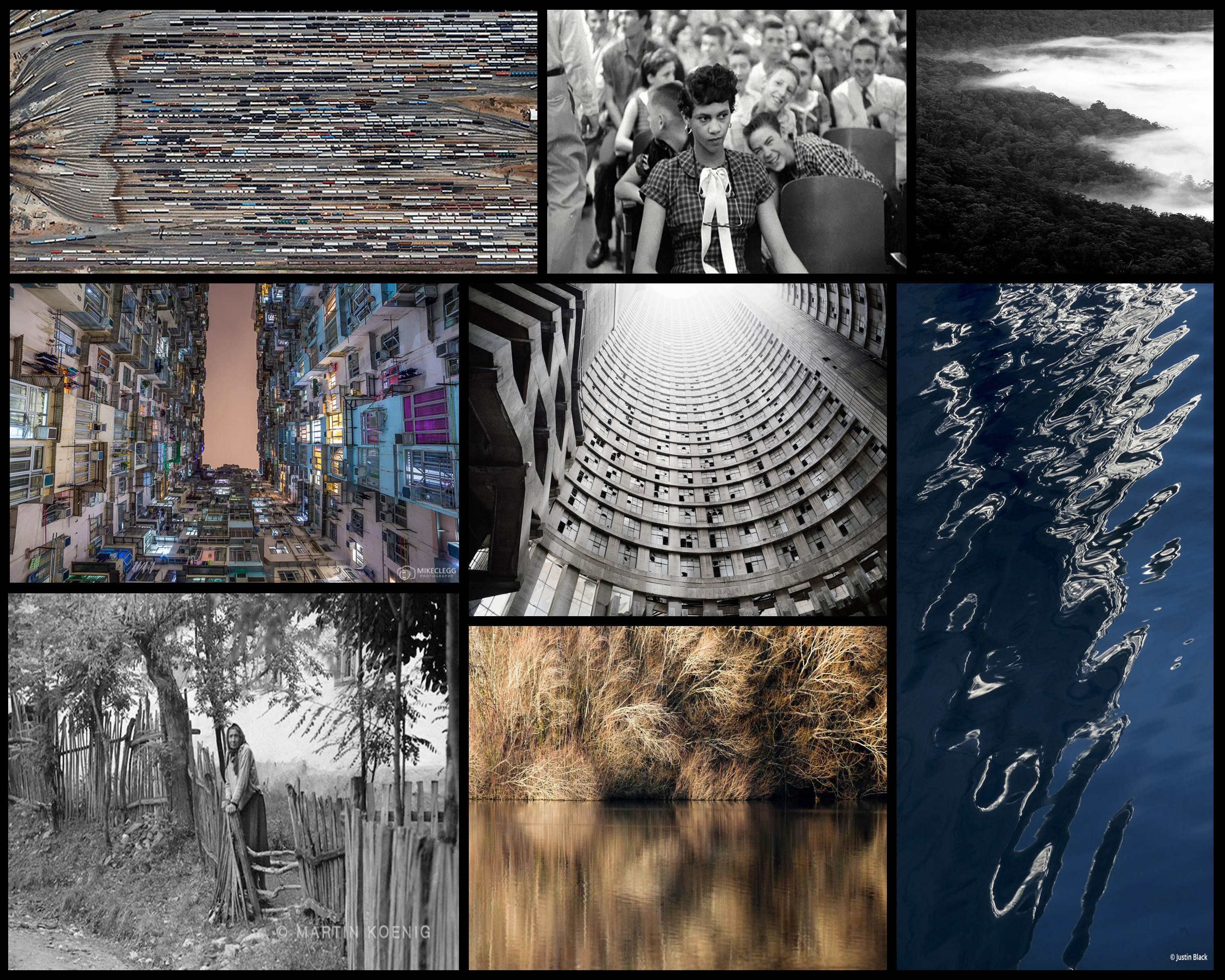 Leading examples of the certain photographers shown above interest me by looking at the subject of political landscapes in a more both a documentary and abstract approach than I would usually do. By doing this I could present my views and perspectives in a more implicit way rather than explicit, here are some mood-boards I have previously used in certain posts presenting the various photographers work:
Before actually proceeding with the shoot itself I thought it would make sense to create a mind-map with the topics and points of interest that I wished to explore when walking around looking to take photos. By doing this it would enable me to quickly focus and identify what to look for, whilst also prevent time from being wasted during the shoot itself by not knowing what to do. Here are my ideas regarding the topic: After I had created the mind-map I finally decided I was ready to go onto the actual shoot. Using the ideas above as a basis for my shoot I chose to focus on political aspects of the outcome of consumerism and how they shaped the landscapes around us. Here are the results from the shoot that I took on the topic of political landscapes:
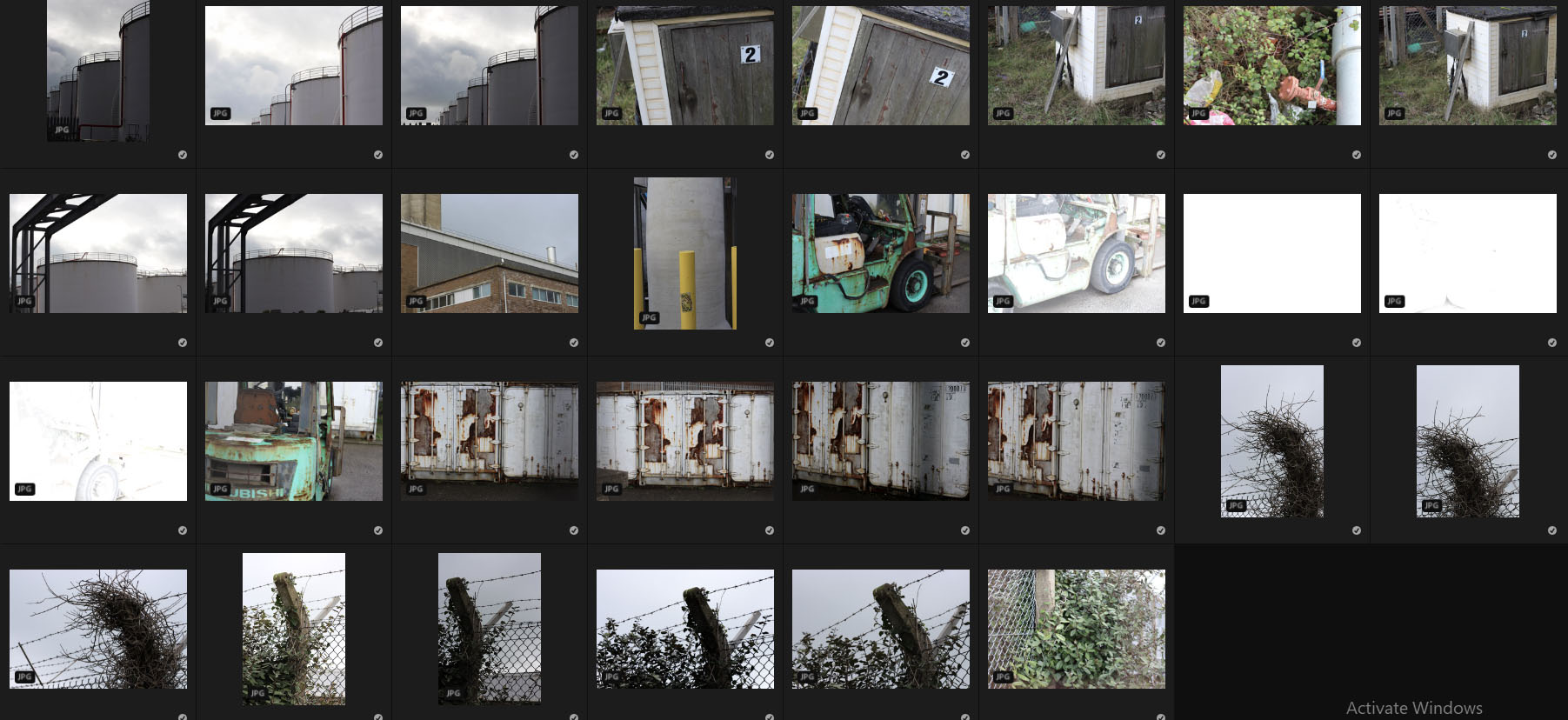
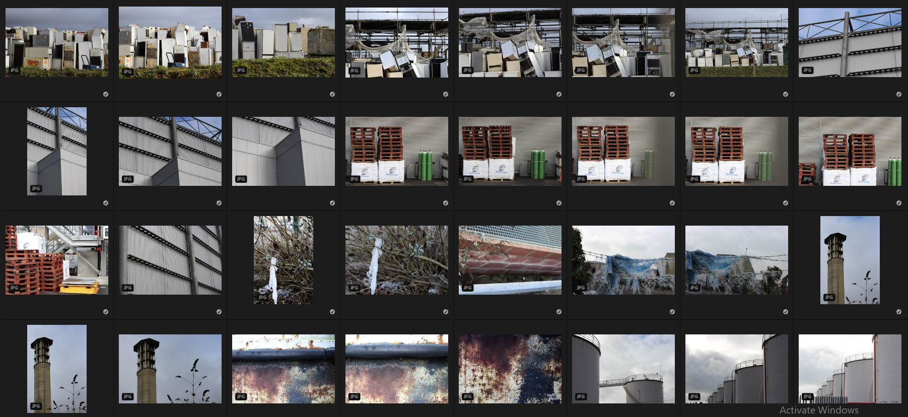
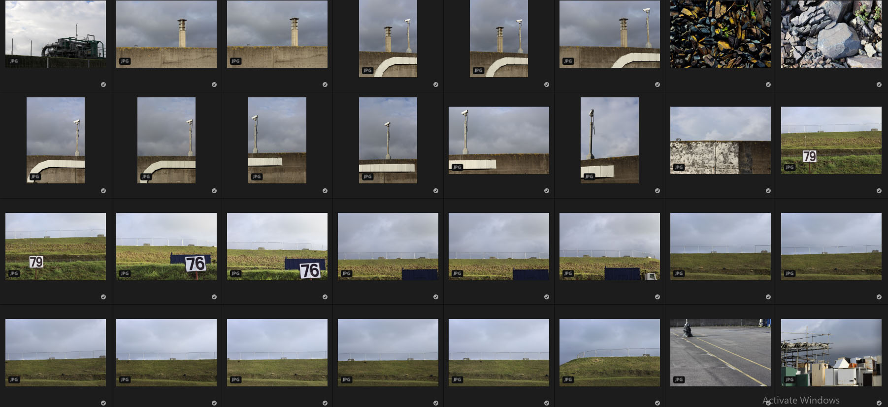
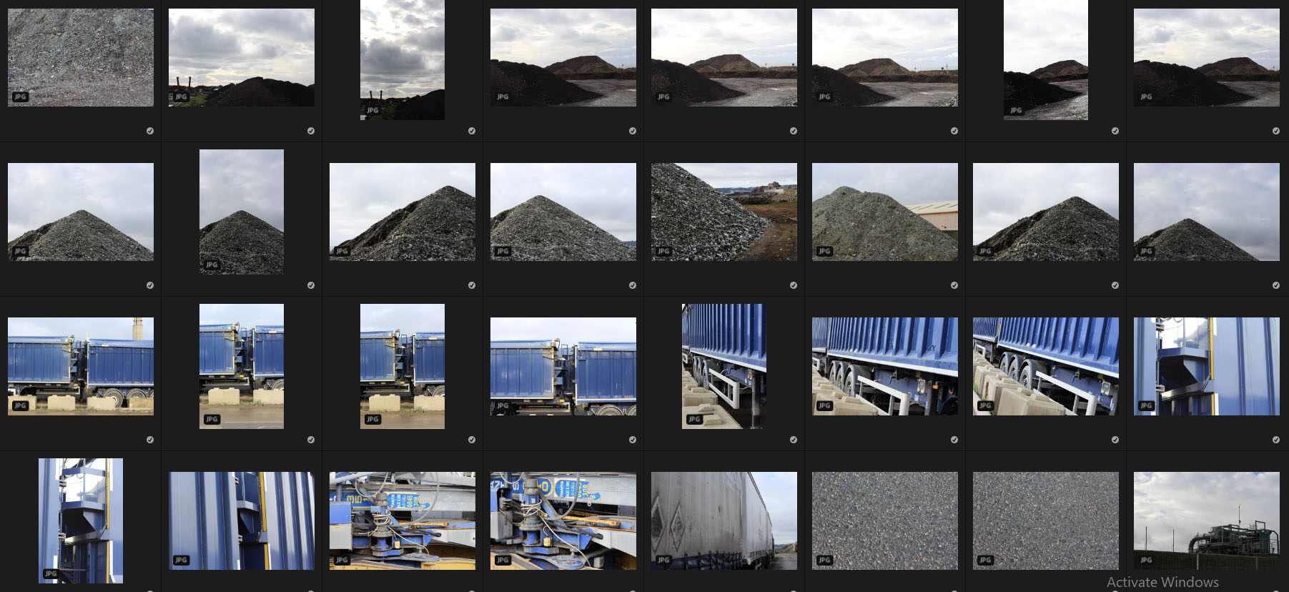
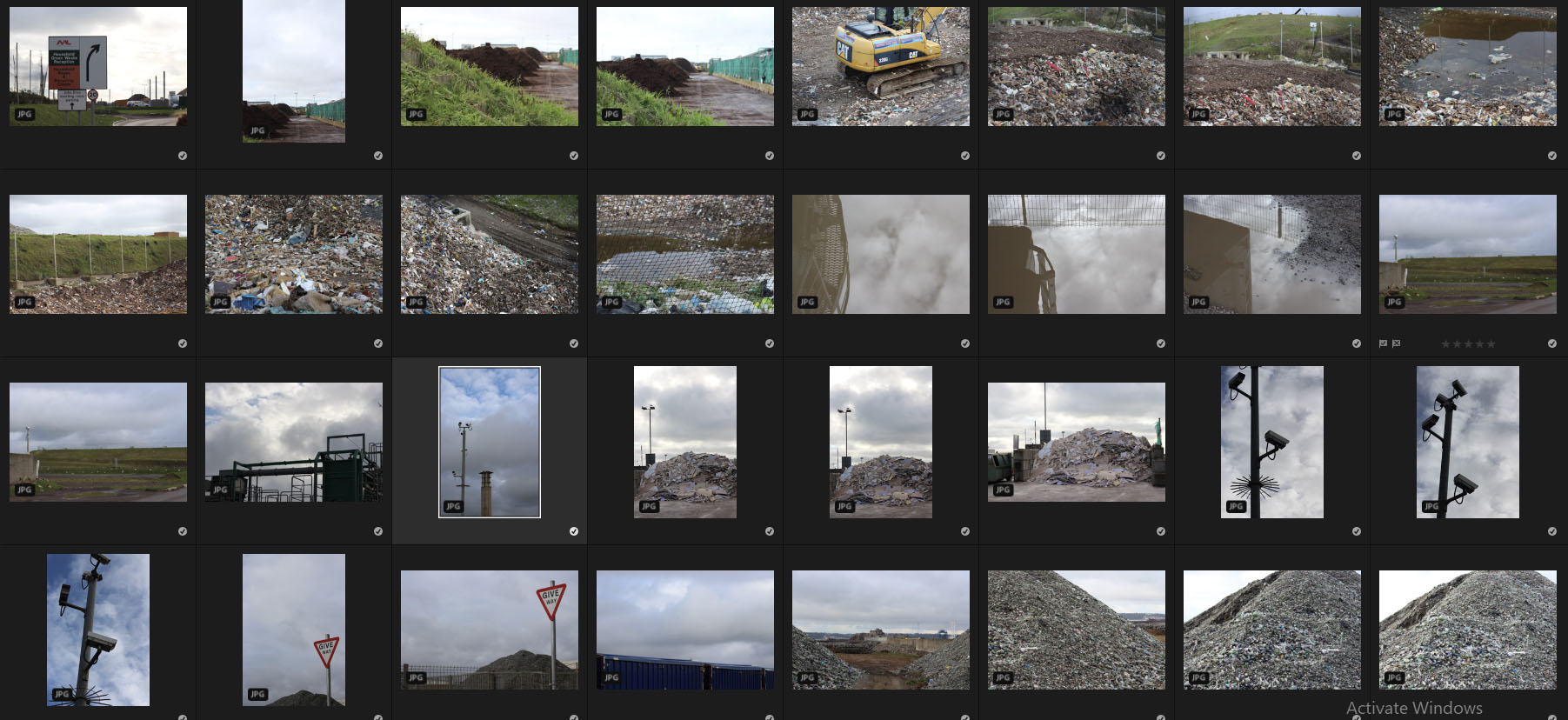
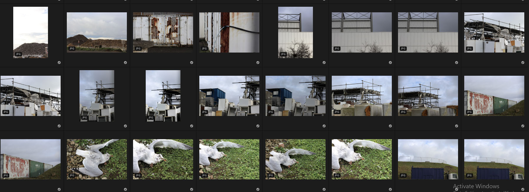 Once I had finished with the shoot I decided it was time to select ten images that I thought best reflected and represented the photos overall, and how they related to my chosen topic. By doing this it would allow me later on to select an overall best image using the method of deduction. Here are my favorite images from the contacts sheets:
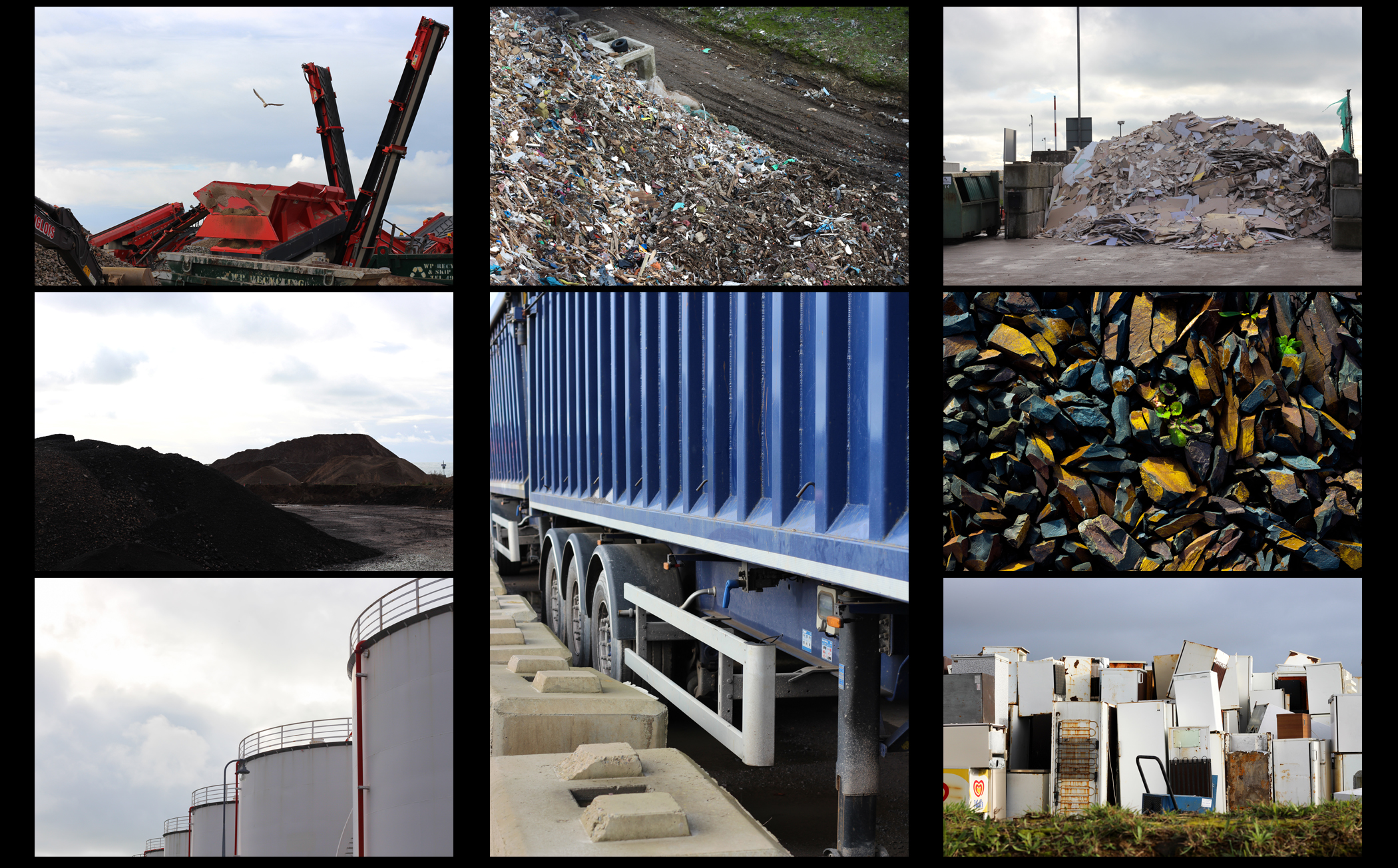 From here I then chose five of my best images out of the selection of ten, by doing this it would then allow me to analyze and study each image to greater detail, looking at the aspects that made me choose each picture. Here are my best five images from the shoot that I believe to reflect my intentions the best:
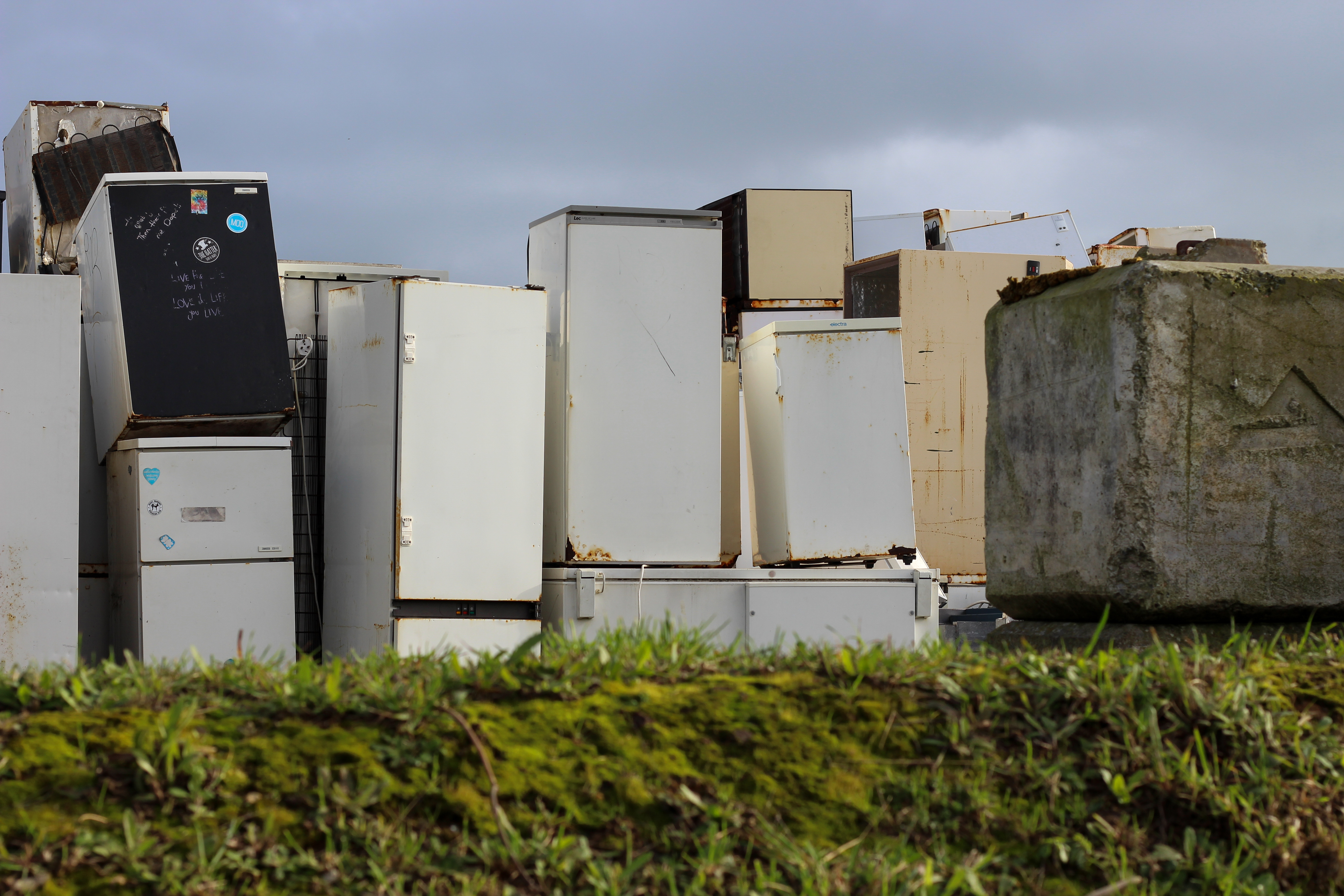 I selected this image because of the clear contrast between the green grass and the now disposed of fridges. I found that this contrast really produced an insight into how the landscape had been changed due to the process of consumerism, and how careless we have become in the outcome of out waste. I particularly liked how the concrete block broke up the generic pattern created by the sky, fridges and grass, adding a new perspective into the landscape rubbish is dumped into. This is complimented through the use of the darkened sky which casts an overlying grim tone across the entire image, preventing any chance of vivid colours coming through.
 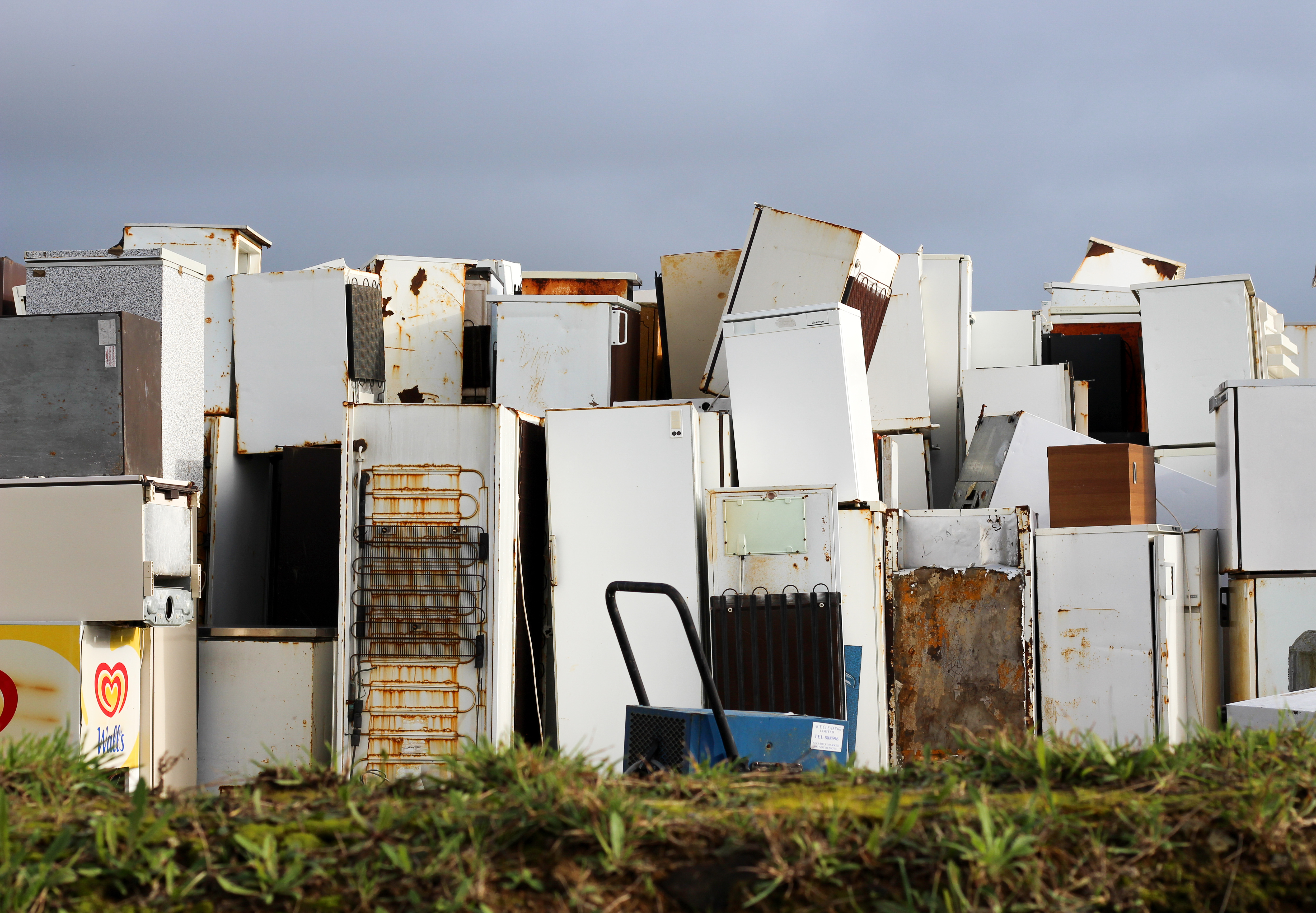 My list the first image I found that the pattern created by the sky, fridges and grass made not just an aesthetic result but also produced insights into our islands waste industry. What made me select this photo was how the blue cooler in the center of the image really broke up the symmetry and became the initial focus when skimming over the piece. I found that the wall of fridges really appealed to me as not only was it unusual but how it also reflect the sheer mass of items that have become unwanted to us.
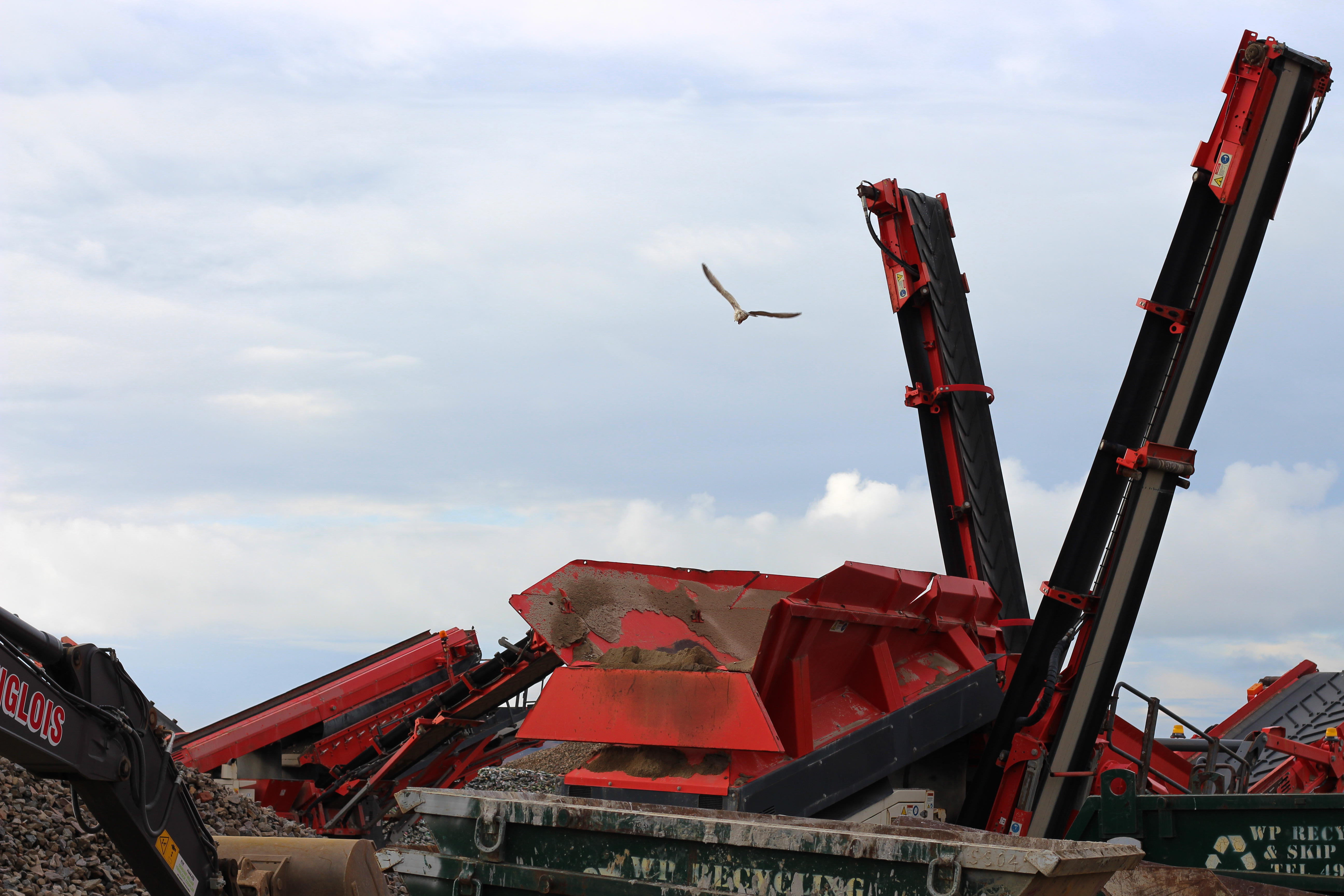 This image to me produced an impact through how the knowledge of what they are used for. The machines here are in the process of digging new landfills to dump rubbish in, in which the surrounding area is covered in seagulls living off the excess waste produced from of consumerism. The rest present in the image appealed to me through how it looked menacing and large compared to the rest of the landscape, but also how the wildlife such as the gulls centered their lives around the actions of how these machines operated.
 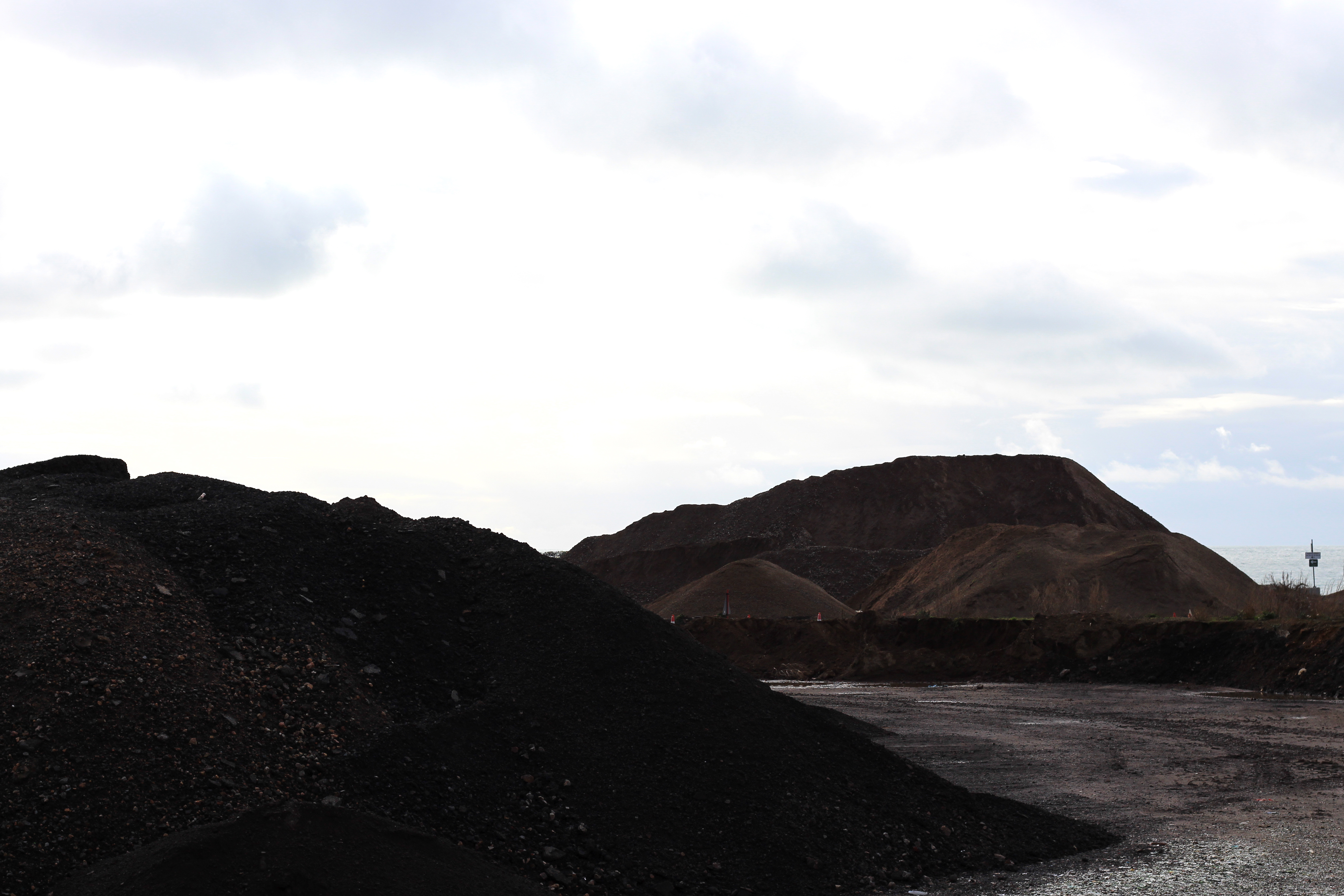 I selected this image because it shows the outcome of the machinery used above, where dirt has become mixed in with rubbish, completely changing the landscape through the piling of rubble carelessly thrown around abandoned areas. I really like the contrast between the dark colours of the dirt mounds and the clear sky, this is because of how it presents how out-of-place and unnatural the placement of the piles are, essentially scarring the landscape in the process.
 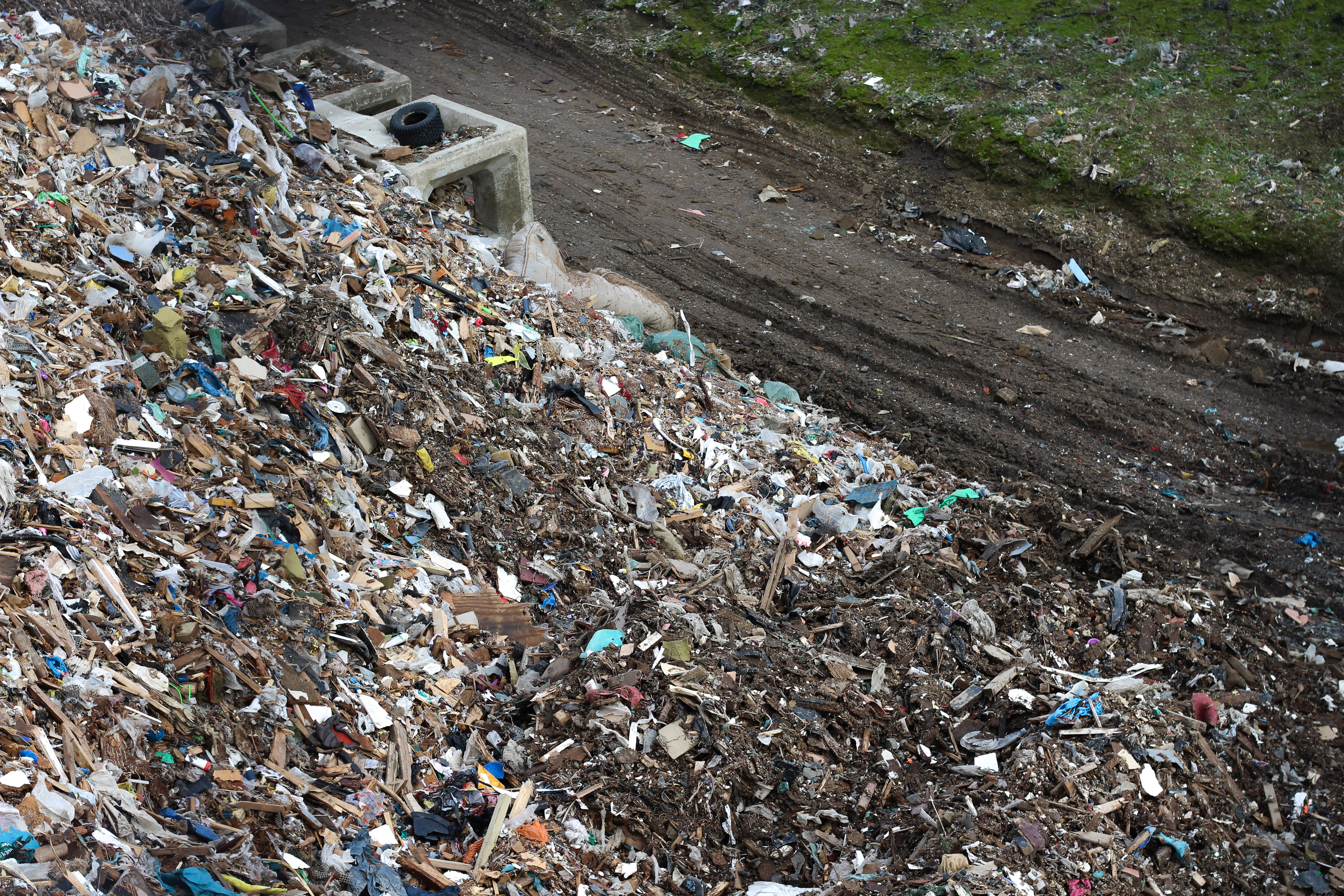 Finally I chose this image because it had the clearest contrast between man-made structures and nature in the entire shoot. This is represented through how the overwhelming pile of rubbish is overflowing across the road and only the green common, where a strip of dirt is seen as the only boundary holding back the tide of waste from flowing elsewhere. I especially like how the piece had been composed, as the majority of the picture is taken up by rubbish and the smallest section is filled with green grass, providing an insight into how we have treated out environment.
Best Image  The reason I selected this image as my favorite photo from the entire shoot was because of its composition and symmetry, whilst explicitly putting across my view of how we are treating certain areas of Jersey. What drew me in was how careless the fridges were thrown on top of each other, however at the same time creates a pattern that suggests each fridge was placed with purpose to produce this wall of white. I also really like how certain objects in the wall broke up the white pattern such as the cooler, rust and holes which pop up from time to time between the fridges.

