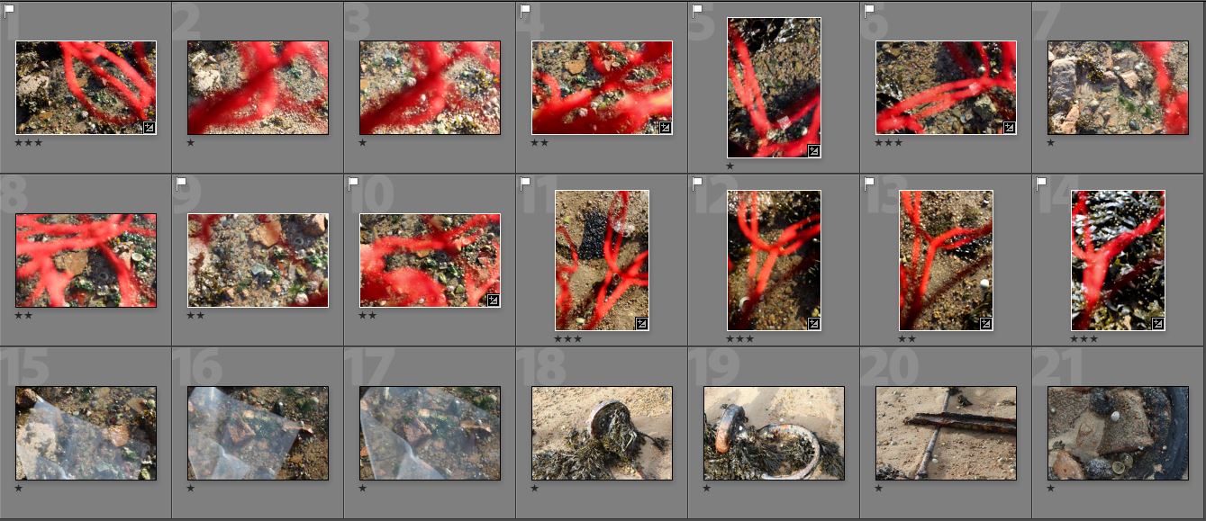
To interpret Stephen Gills style of work I visited Le Hocq beach and found an area that was surrounded by rocks and sea and focused on close up on certain sections with interesting patterns. I used pieces of red string in front of the lens to break the rule of manipulation by physically manipulating the lens so what the image is portraying is not what’s there in real life. I purposefully made some photos out of focus to create a blurry effect that some of Stephen Gills work has where he dipped his lens into the pond water he was documenting. I think this was effective in some images like the images where I experimented with string, but not others where I used plastic in front of the lens which is why I haven’t displayed them down below or edited any.
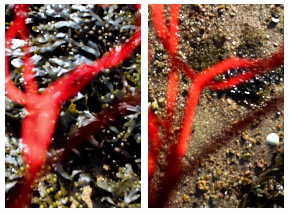
I displayed these two images together as the string is a similar shape in both, but the different backgrounds make them contrast one another. The photo on the left has a darker background making the red in the foreground stand out more than the right image. Both of the backgrounds of the images are slightly out of focus which i did to try and interpret the blurriness in some of Stephen Gills work. In my next photoshoot i will experiment by focusing the camera to see if the images are more effective. I chose these two backgrounds to photograph the string against as i like the different detailed patterns. The right image has yellow/brown tone grains of sand and rocks out of focus which is contrasted to the left image with the darker brown tones of seaweed that represent the flow of movement. The movement of the seaweed is similar to the string creating similar shapes and lines making a more interesting image. In the right image the shape of the string is contrasted to the background creating a more juxtaposed image.
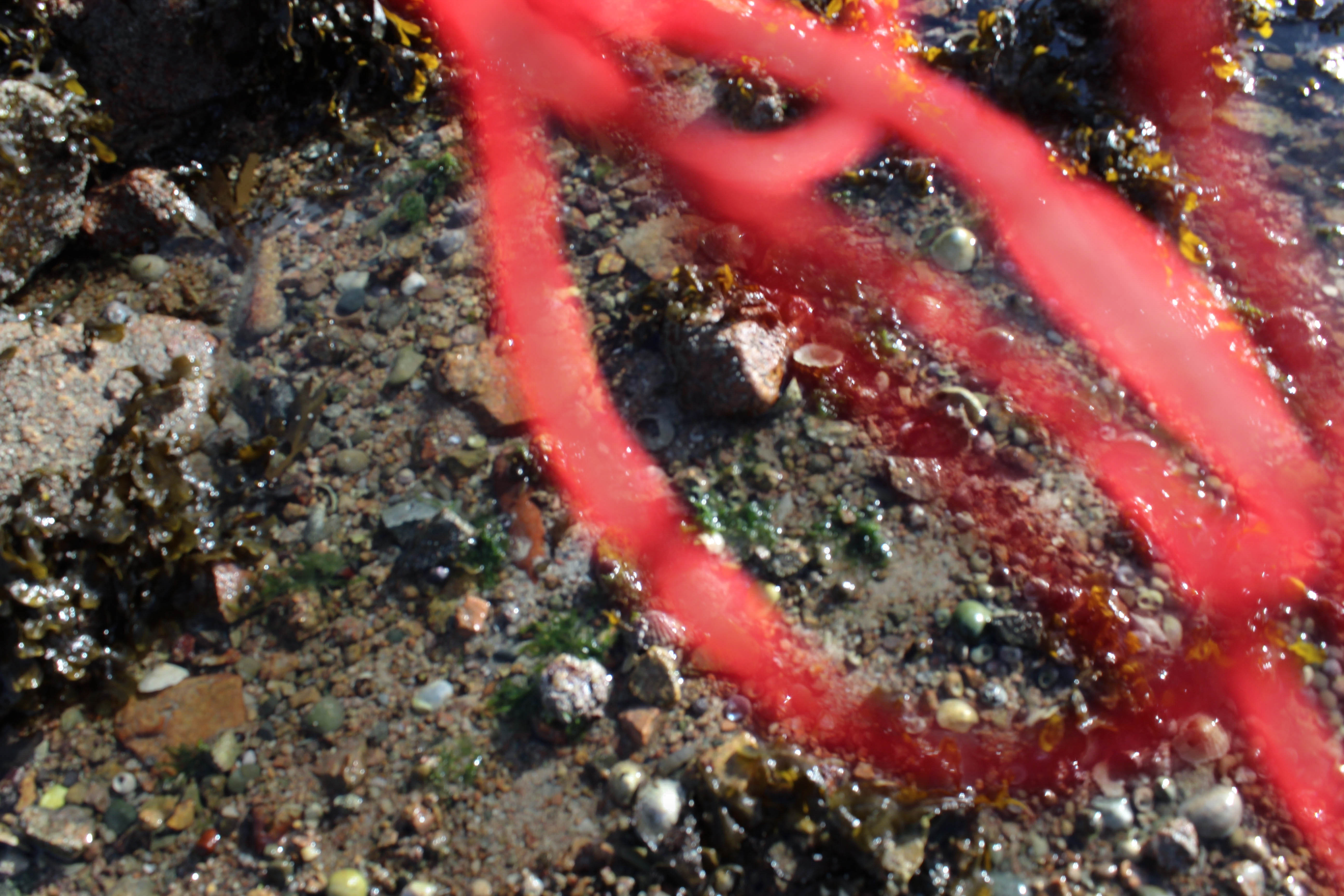
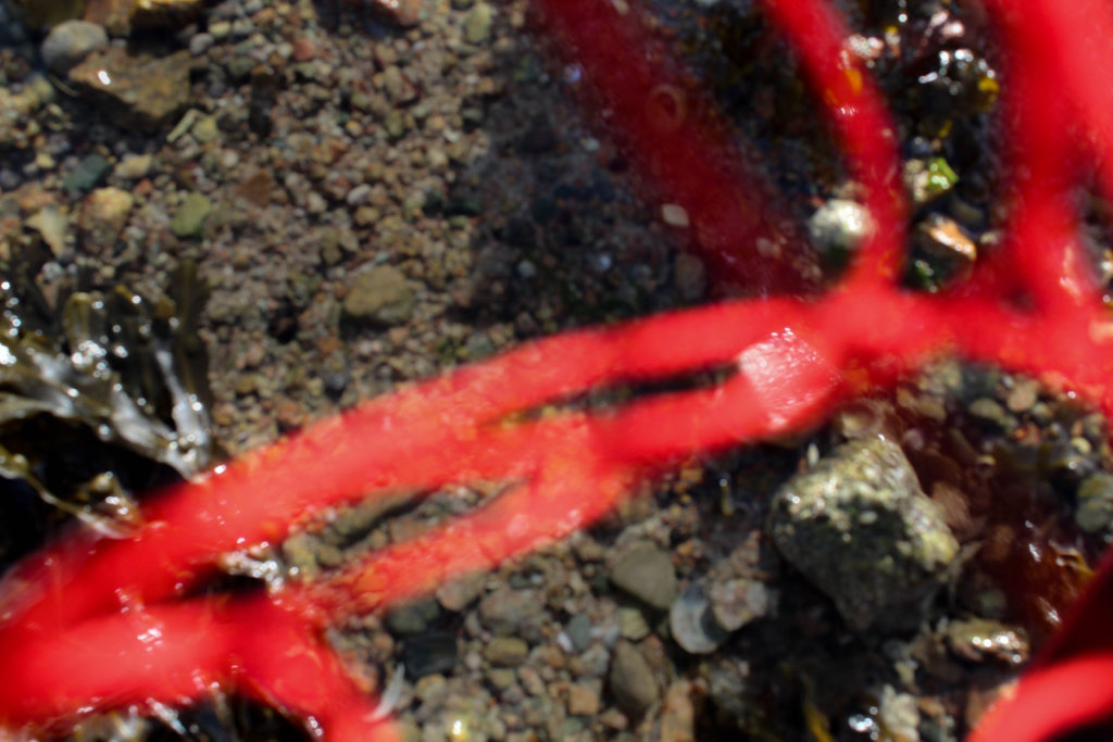
Experiment
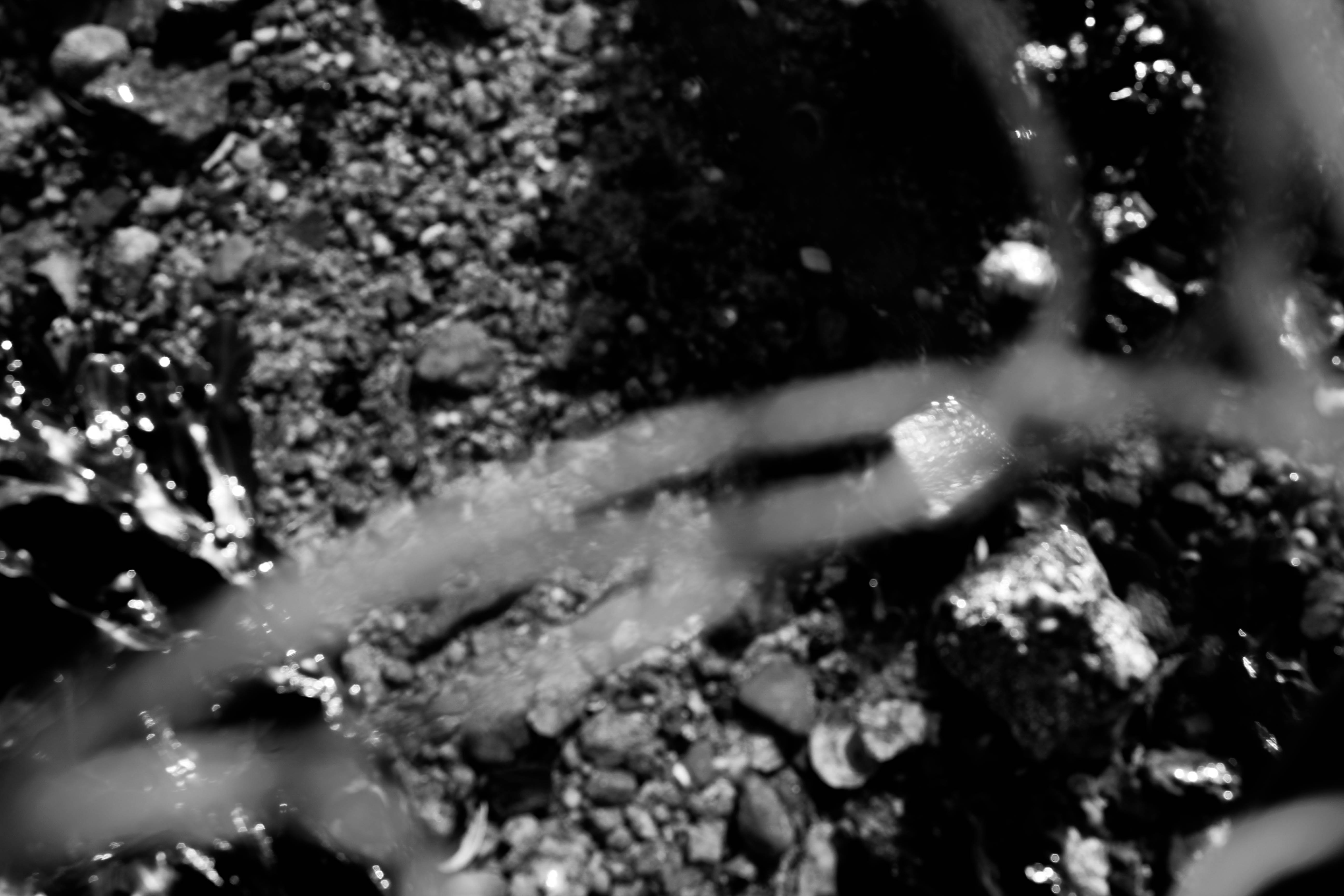
When first experimenting I edited some images in black and white to see if they were more effective. This emphasises the darker and lighter tones in the image and eliminates the mismatch of colours in the background.
Stephen Gills images:
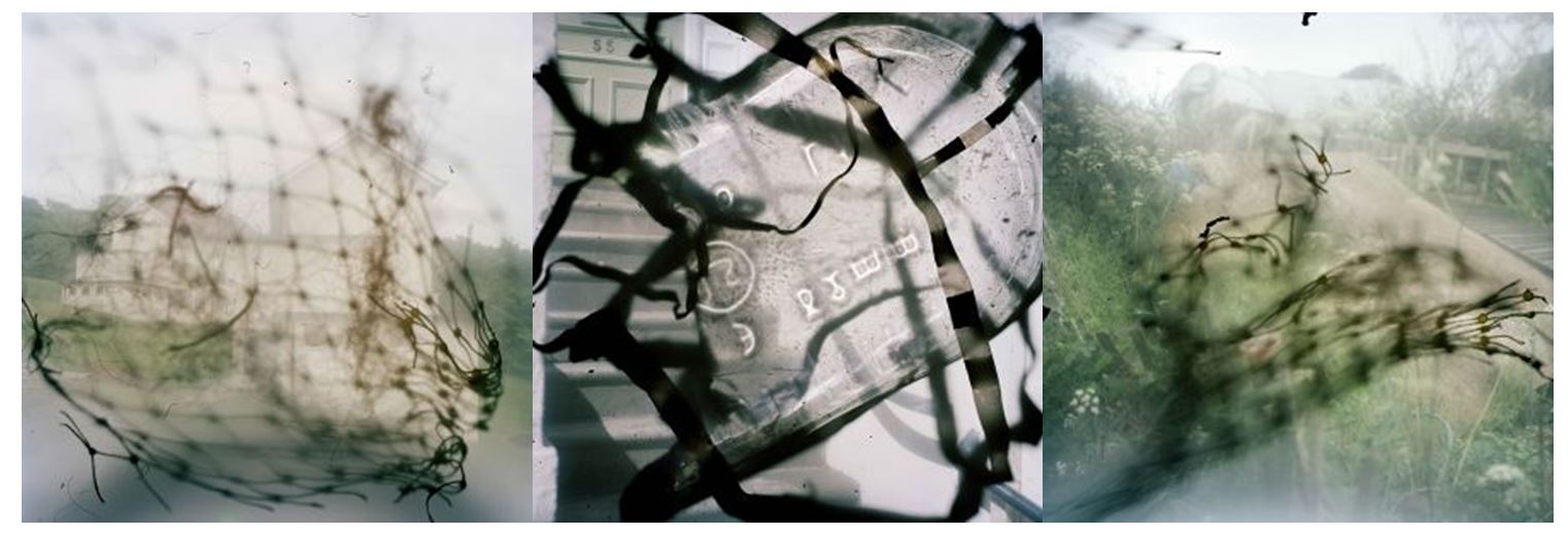
I think this is a good interpretation of Stephen Gills work, especially to the images displayed above, as it has a similar flow of movement with similar lines and curves. Although Stephen Gills photography may have more details in the layering of the different materials and the way the materials fit in with the background, I think I captured his style of work and made it my own.
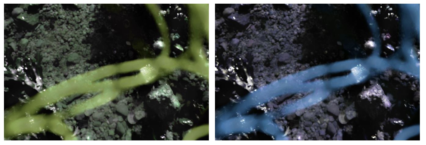
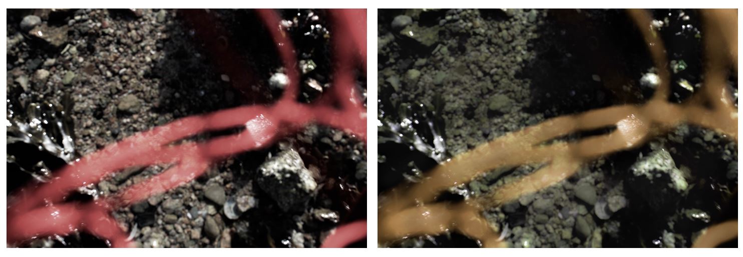
I also experimented by changing the main colours of the string to see if another colour was more effective. I chose to change red to yellow as in Stephen Gills images above there are many yellow and green tones. On the right image i edited the background even more out of focus as in some of Stephen Gills images he uses a blurred effect. I still kept some of the rocks on the edge of the image in focus so only the water blurred so there is contrasting patterns.
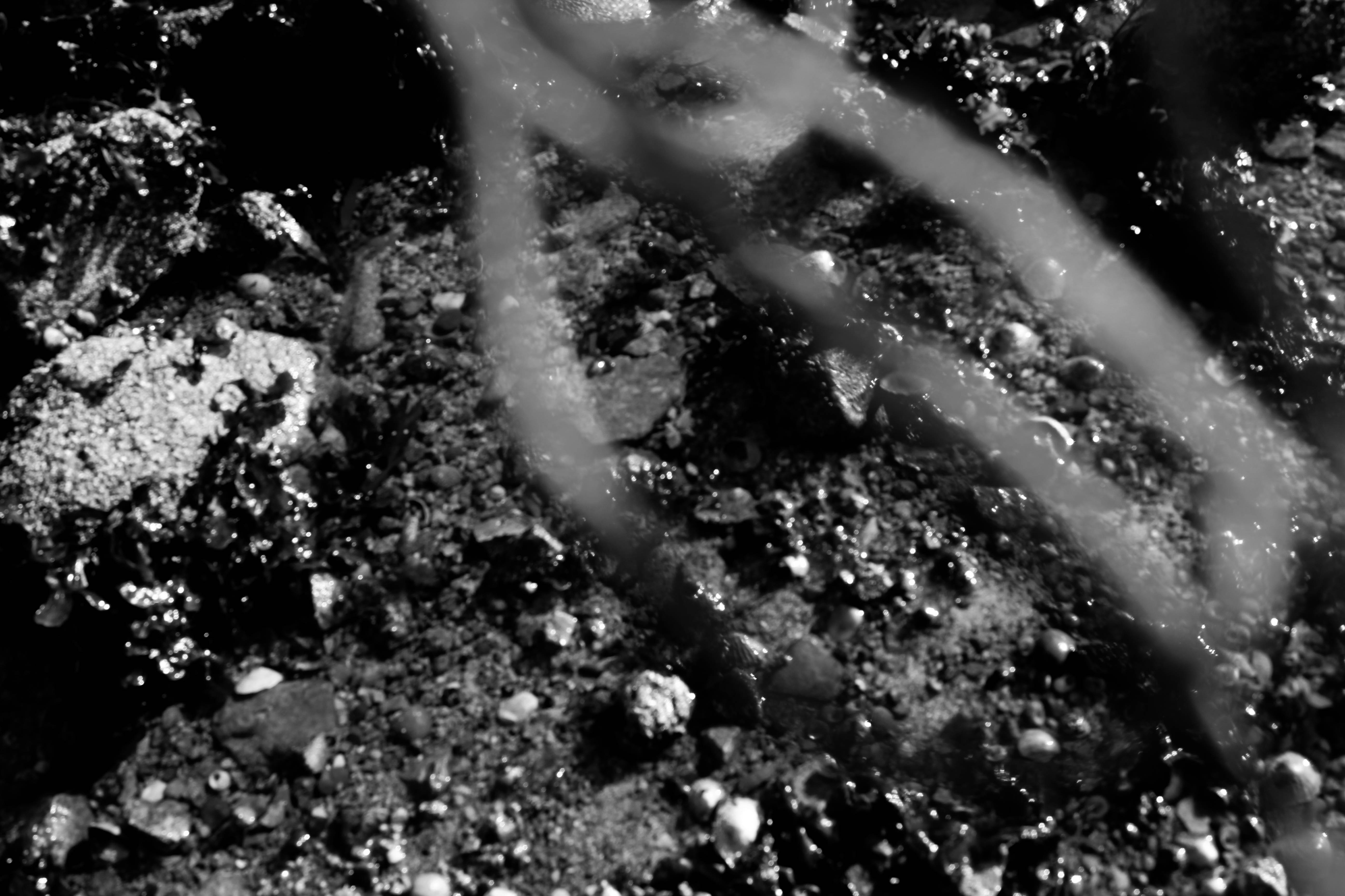
I think this image is more effective edited in black and white as the red colour of the string isn’t as overpowering and it fits in more with the background making a more aesthetically pleasing image.
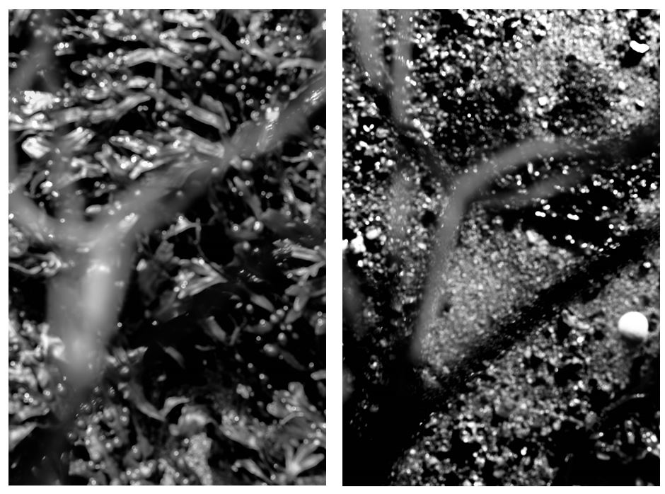
I edited these images in black and white to create a more formal appearance. This makes it harder to tell what the photos are portraying and emphases the combination of detailed patterns.I displayed these two images together as the shape the string is making in both are very similar, but the different patterns in he background makes them juxtapose one another. In this edit, the darker point in the seaweed in the left image are darken and creates a bigger contrast to the string in the foreground, making the lighter points stand out more.
Evaluation:
I will revisit this area again for my second photoshoot and try different way of experimenting like adding different colours of string in front of the lens and maybe placing materials into the landscape making the image in focus to try a different approach. I will work on making the images where plastic is placed in front of the image better as well. I also want to look at my personal archive and interpret some of Stephen gills portrait work from the series ‘Coexistence’ where he dipped the lens in the pond water before taking the portrait creating a blurred effect.
I also want to further manipulate the images in my next shoot by printing them out and adding objects on top to create a collage like image that has aspects that weren’t there when the image was taken.
