Using the same techniques as James Moreton, I will experiment more simplistically by using 1 or 2 images on each page that express a narrative together.
Experiment 1


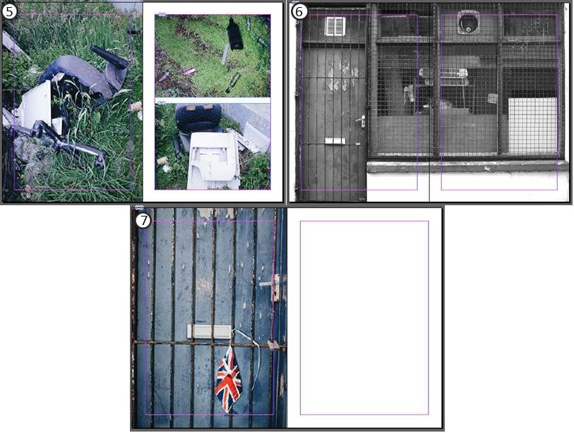
Firstly, I took a balanced approach in my layout by using a proportionate amount of large images to small images. This is a safe option as it is more aesthetically pleasing when looking at as a whole.
I decided that I did not like when one image crossed across both pages but was not full size (e.g. page spread 4) as the large abundance of negative space in one corner did not appeal to me visually.
Experiment 2


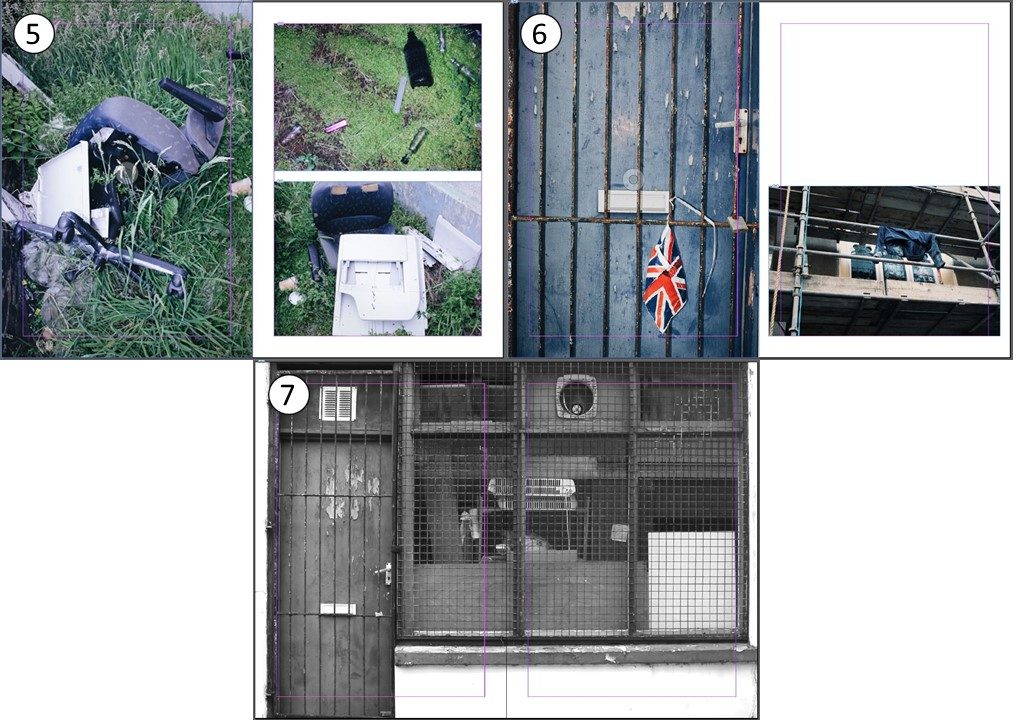
I removed the empty pages in this version in favour of using more images to tell my narrative. I resized images on page spreads 3 and 5 as their colour scheme shared similarities with images on the opposing page. I also resized images on page spreads 2 and 6 to demonstrate the different perspectives between the images. For example taking a voyeuristic view in comparison to a personal one, or being up close to a subject in comparison to viewing from afar and seeing the subject as a whole.
Combining features from both of these versions, I created a final third version.
Final Version


It was not until the end that I attempted to create my front and back cover. I chose this image as it lead into the first page spread as they were both taken in the same location. I flipped the image in reverse for the back cover as the image was not landscape and I believed the colours would look weird if I was to use a different image.
Additionally, I placed another image from the same location on the first page spread to become apart of the narrative of things we leave behind.
The final version still uses the same simplicity that James Moreton shows in his zines, however I provided my own inspired style on such page spreads as 1 and 5 in order to place more images that shared similarities with what was already there.
