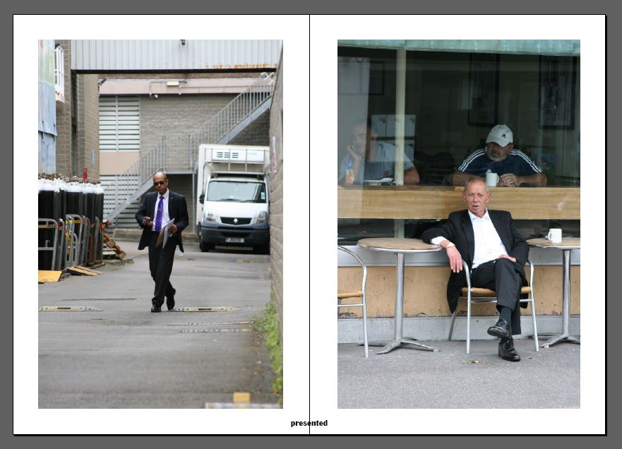
Here is my first draft layout of my zine design. I believe my choice and sequencing of photographs and my use of basic text is very effective and clean. I have tried to keep things as minimal as I can as i didn’t want to draw any attention away from the photographic content itself. However something that I am not too sure on at this point is the layout in terms of alternation and sizing of the images, I think if I was to experiment with alternative layouts using full bleed spreads and maybe overlapping images this could make for a more visually interesting sequence of images. So this is something which i will try when coming up with my final design for my zine. I may also experiment with the placement of the text used in the zine because at this point it is all very central rather than alternating or randomly placed etc.


