Evaluation + Analysis
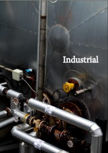
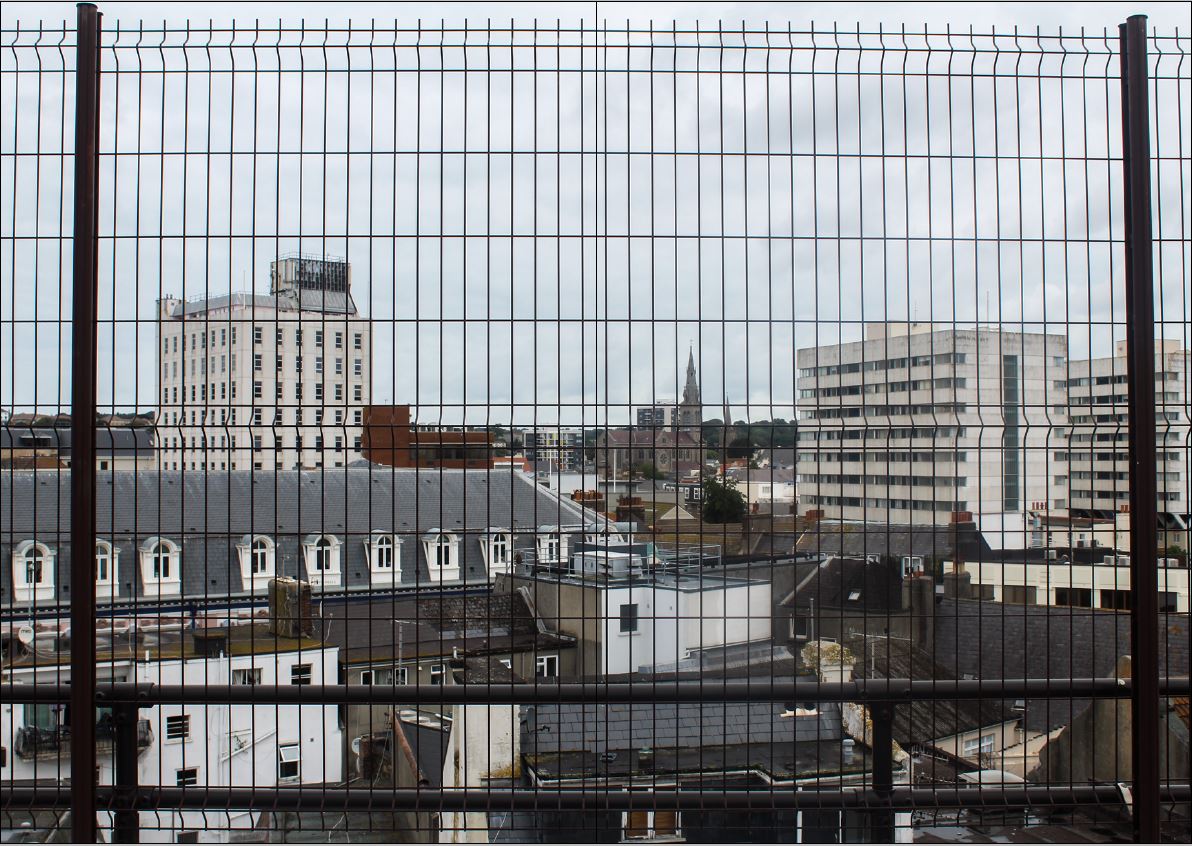
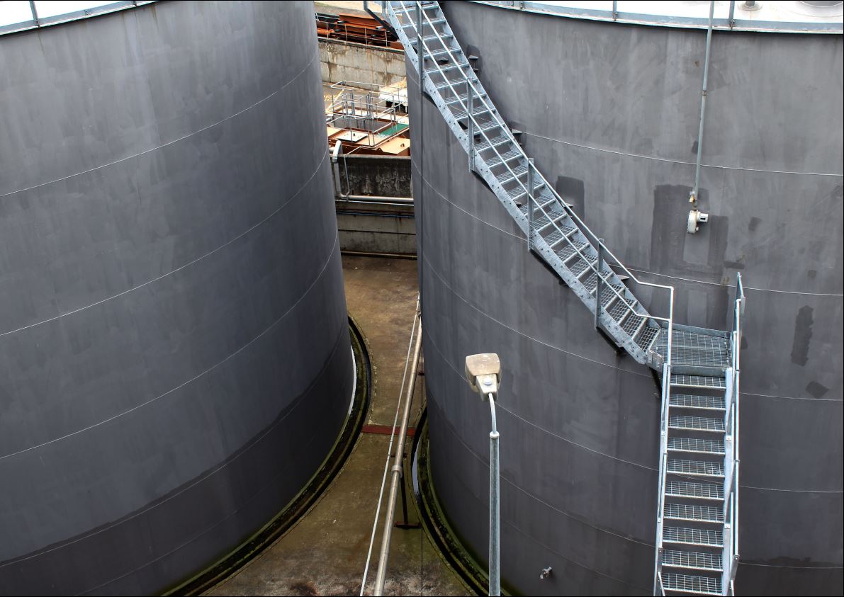
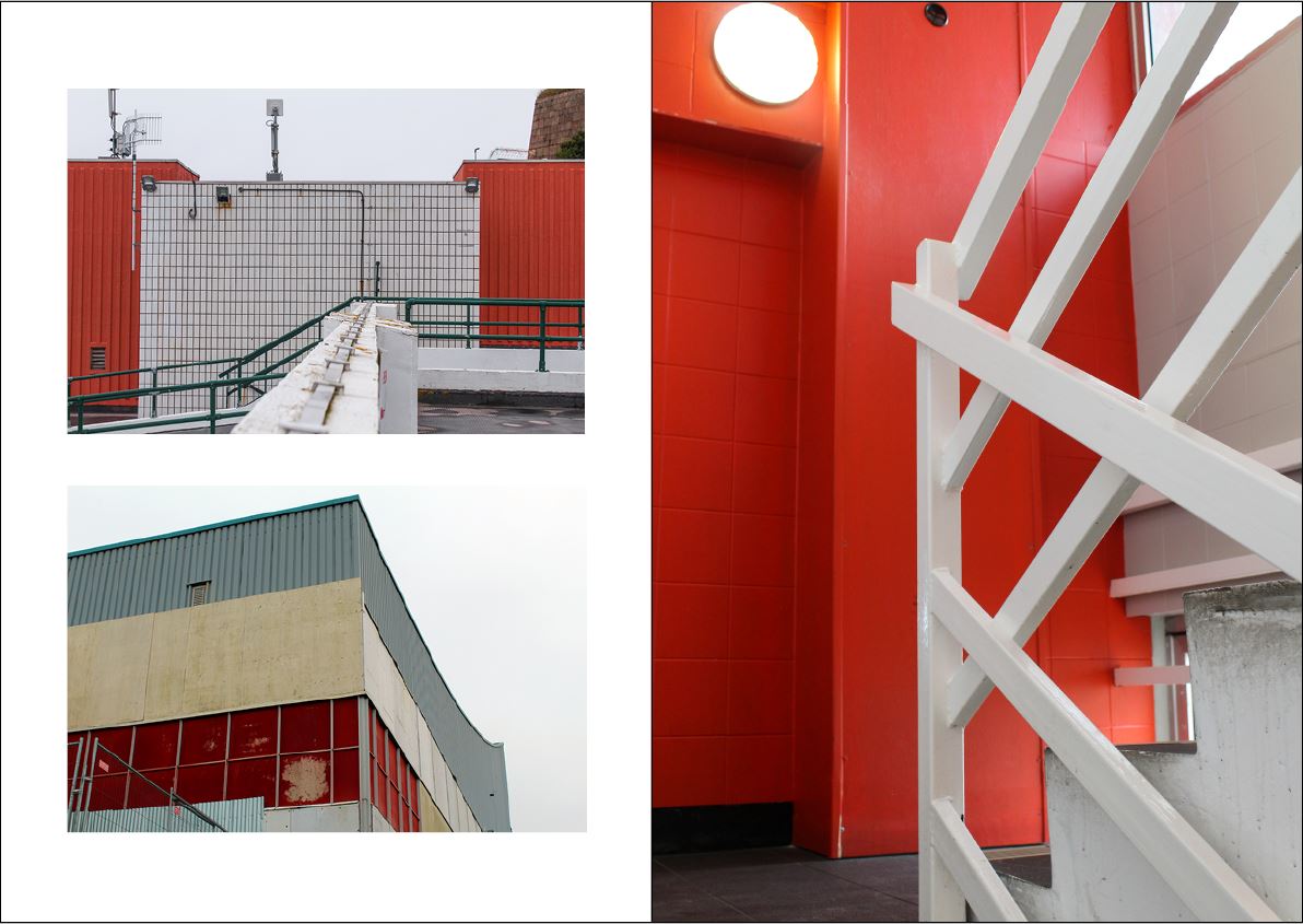
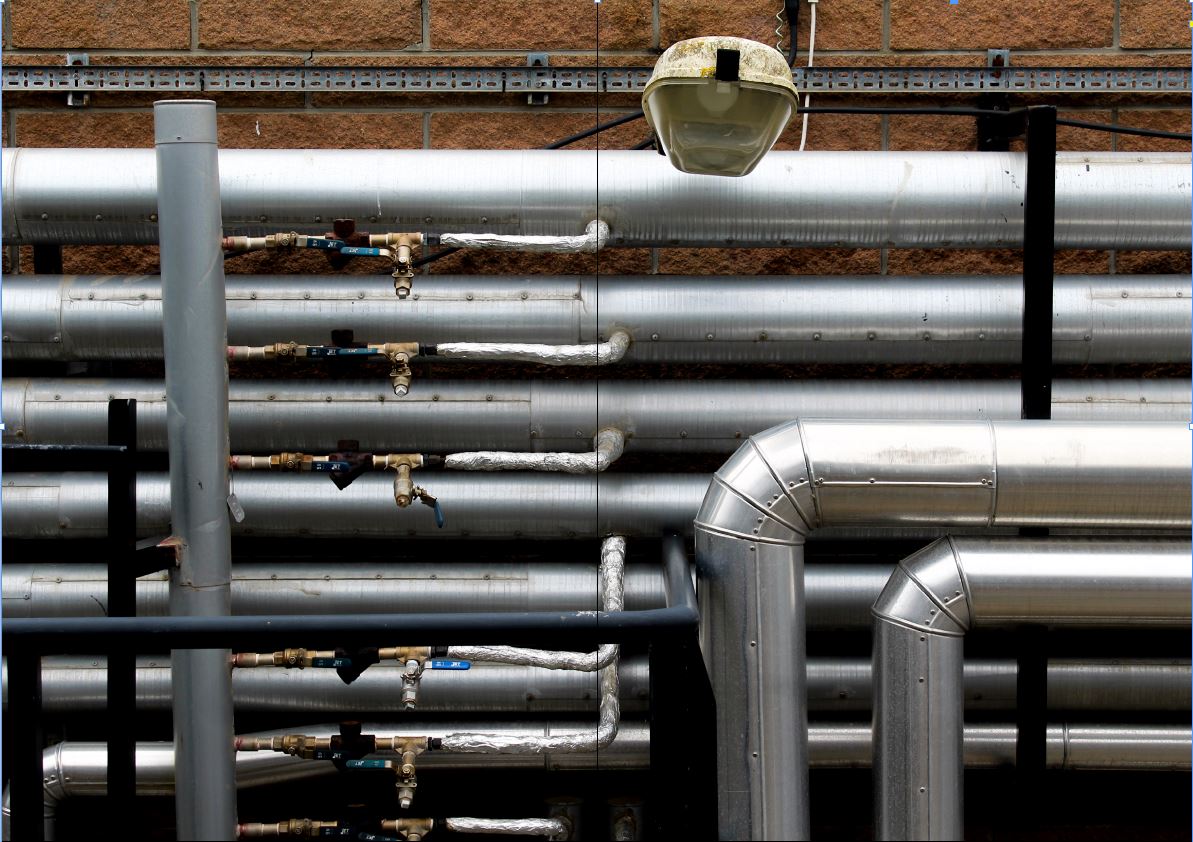
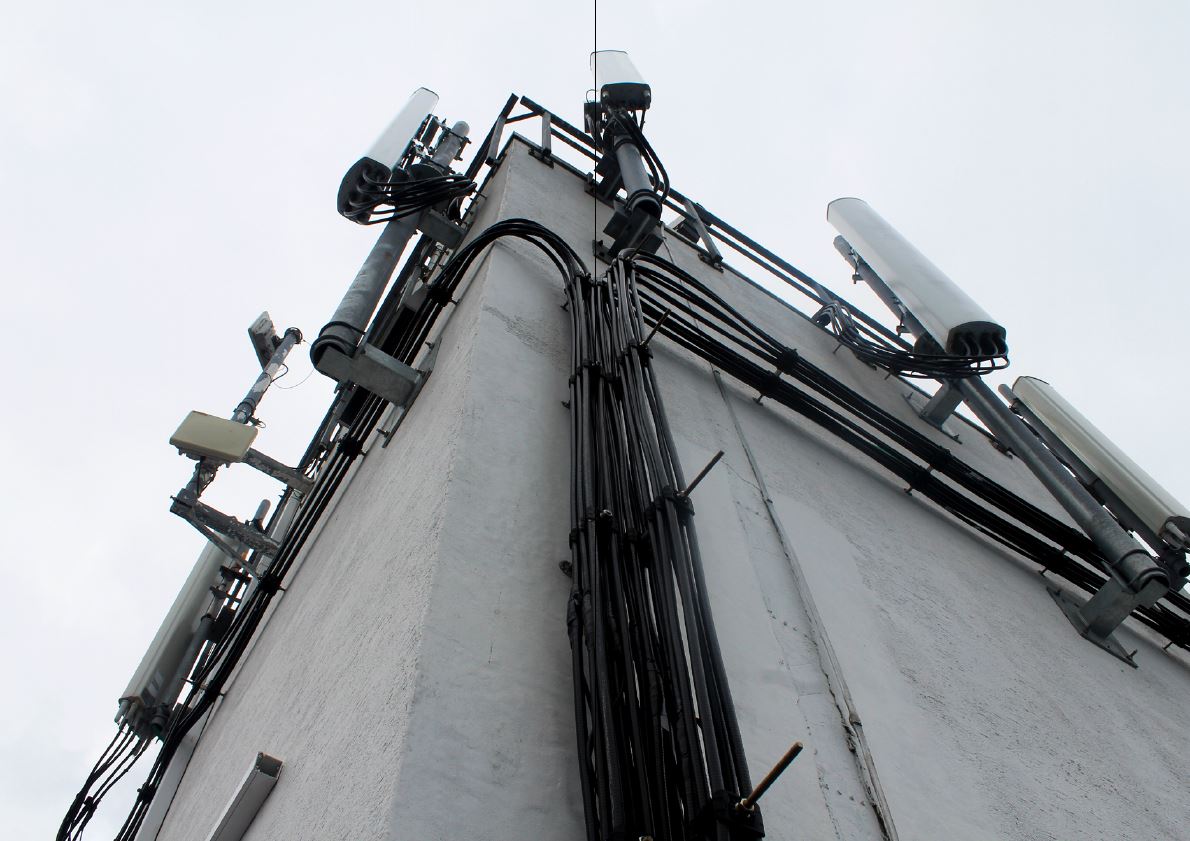
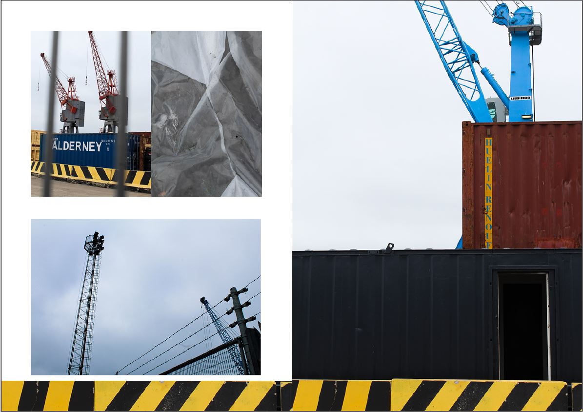
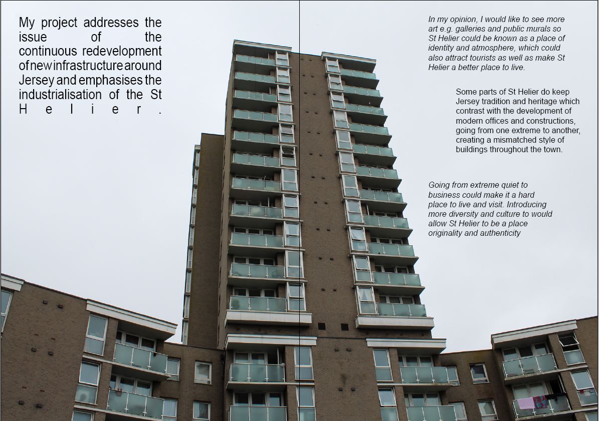
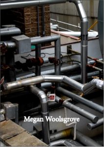
Overall, I think this zine is a good representation of the work i produced for this project and gives insight into the industrialisation of Jersey. It emphasises the mechanical shapes and structures from a different perspective that people might not see in their everyday lives. Some of the images I displayed across a double page spread as i thought they were most effective as they didn’t need other images to back them up to get the concept across. The front and back cover of the zine is one landscape image of piping and metal structures, indicating to the audience the concept of the images they will find in the zine without opening it. I thought this image worked best as the front and back as the right side of the image (front) had piping on the bottem half of the image and metal on the top giving room for the title of the zine ‘Industrial’. The left side of the image (back) is more chaotic and unstructured with the piping going in every direction, perhaps representing the disordered buildings and structures in Jersey. The font I used for the front and back cover was *** in white so you could clearly see it against the metal piping. I tried to display the images inside the zine so that the more detailed double page images were separated with multiple or less detailed images. The first two double page spreads are detailed images, the first being a over view of an area in St Helier trapped within repetitive black fencing. This is then followed by the second image of two metal structures, linking to the first image through the cooler tones and the dull, desolate appearance of the two images. I like the composition of the second image which is why it works well in a double spread spread as the metal staircase on the right frames that side of the image and contrasts the simplistic left side. These images are followed by multiple images on the third double spread. The left side displays two images of structured buildings which is contrasted with the full page portrait image on the right. I displayed all these image together all they all link with each other through the red sections. I thought I put this double page here as it’s a huge contrast from the cooler tones on the first two pages and breaks up full page images. The fourth double page in a full landscpae image of metal piping linking to the front and back cover of the image which is why I placed it in the middle pages of the zine. I gave this image a full page as it’s very detailed and contains many different tones where a smaller display wouldn’t give it justice. This is followed by the fifth double page image of a grey building with black electrical wires going up the side linking to the piping on the page before and the grey tones. I like this image as it shows a different perspective of industrial structure that people may not normally see through the upwards angle and emphasises the dullness through the grey undertones juxtaposed with the bright white background. The next double page shows multiple image I photographed around a building site representing the continuous redevelopment of new infrastructure around Jersey. This page breaks up the more detailed images and is contrasted form the page before with the brighter colours like blue and yellow. I included my interpretation of Luke Fowler’s two-frame photography showing an up close, detailed image. These images all link together through the portrayal of cranes on the building sites and fencing, each image giving a different perspective. The final double page image of my zine of one of a tower block of flat . The composition of this image gave me room the add text to the negative space about my project and why I chose this concept. I chose this as my final photo as it’s a stand out image and different to the rest of the images in the zine. The others are all linked through the use of cooler grey tones or though an aspect shown in the image, whereas the final image stands out through the composition and the brown tones contrasted with the white sky.
