Zine 1
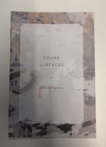
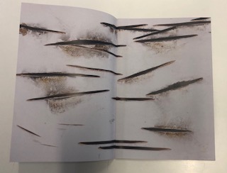
I chose to look at this zine because the dark and contrasting full-bleed photographs appealed to me as I am using full-bleed photographs in my design. The design of this zine is very dark and simple which fits in with the dark theme very well. The full-bleed photographs help to convey the bold theme as it almost makes the photographs more invasive and in your face.
Zine 2
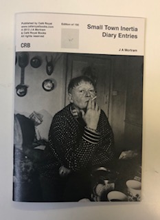
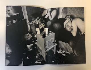
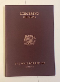
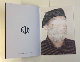
I found this zine very interesting as it has a strong theme as well as a message. Each double page consists of a symbol with a quote from the subject on the left side and then a portrait photograph of the subject with the face scratched out. This theme of identity carries on throughout the zine and is further pushed by the similarities between the cover and a passport. This simplistic design allows the message to be carried further and looks very aesthetically pleasing.
Zine 3
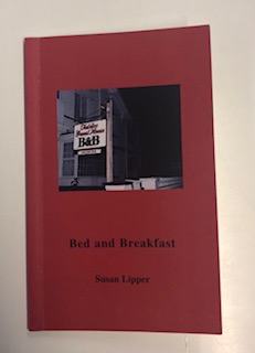
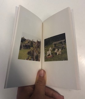
I chose to look at this zine as it has a more professional design to the booklet. It has a spine and is done through binding whereas the other zines are just stapled together. The design and placement of the photographs are very simplistic and minimalistic, there is one photograph per page with a wide border in order to allow the viewer to focus on that one photograph, which I think is very effective.
Zine 4
