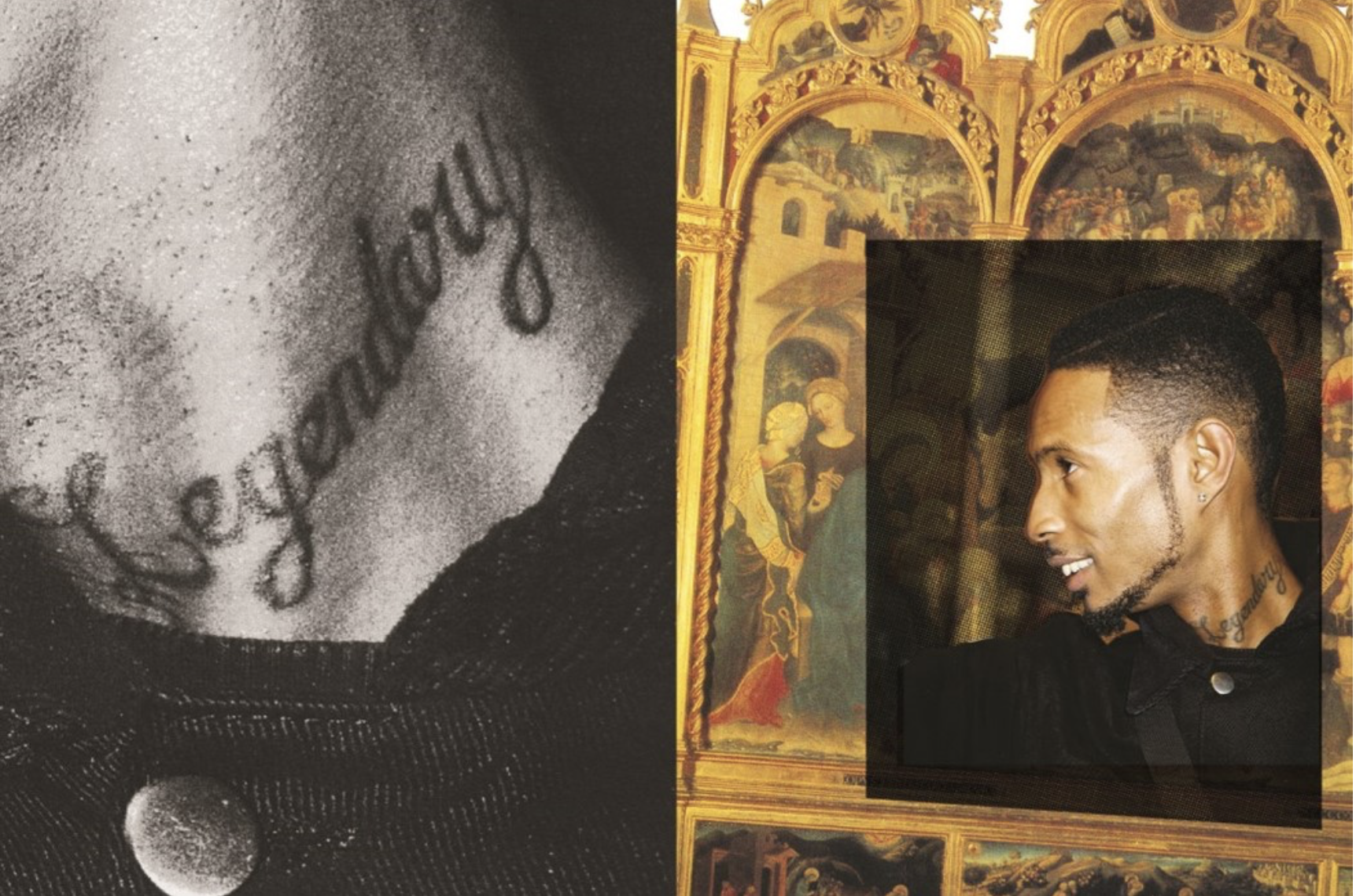
Joseph Patterson created a zine in order represent underground music as a creative renaissance of generations.The grime and hip hop scene was flourishing and he wanted to develop emerging themes and allow them to flourish within his work. The mainstream coverage of this work is typically poor and actively neglecting the scene and portraying a harmful approach to the music by the conservative media. His work shows a space that was ‘actually invested in underground music in youth centre’ they described as wanting their images less formal so a zine would be a unique format to enhance their work.

His images are a mix between a shoot on location and rarely people on stage as they do not want a featured person to be perceived a certain way in which they would not deem themselves. They use a mixture of overlapping imagery within their displays and writing quotes on some pages, usually the images have a strong contrast of time periods and the colours connecting them are overlapped between vibrant and black and whites.

This particular artist and group are typically based online which is why they launched this zine issue as it features a Longform and creates something in which you can look back at in years to come. lots of their work was inspired by DIY culture and stripping back and keeping the core elements of a photo and celebrating a passion and making your work personal by the intricate way In which you put it together and the people you surrounded yourself with. They want to highlight the importance of interconnectivity between the worlds of online creativity and physical when coming to photography.

Analysis;
I think this zine has conceptually a really interesting subject matter and narrative,although their is no chronological order or a method to which the story is being told but a representation of a current state of living for people within the underground crime music industry.It demonstrates a subjectivity of community within passions of people and the importance and influence music can have upon young people. The images itself develops the narrative construct of time and the comparison of having two highly different timeframes being presented as one (renascence and modern day) the images have an interesting composition of overlapping images to be placed upon older original works of art, these allow the placements to look more abstract and be Random in their framing but close up allow a intertwined structure to the narrative. The colours while are light do not reflect any vibrancy and come across as dim, this is to symbolise a similarity when forming to the older more dim and reserved older images. Overall I think this zine is highly effective with its message and is highly unique in comparison to many other zines.
