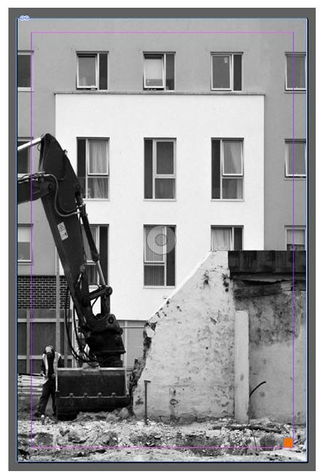
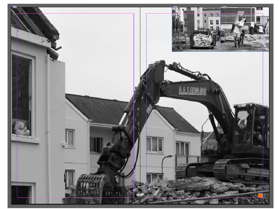
In this design layout I have looked at doing full bleed spreads along with images overlapping onto the full bleed spread. I think this composition is very effective as it makes the photograph more imposing and bold. The overlapping photographs are subtle but create an alternative look to the composition. I think that this composition emphasises the destruction within the photographs whilst showing the rebuilding going on in the background quite subtly. The constant black and white tone throughout the composition reflects the idea that St. Helier is just caught in a constant loop of construction and rebuilding in order to support the financial sector rather than supporting the tourism in the island that was so successful at a time.
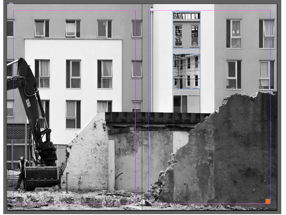
The below design is my alternative design for my single page. It sticks to the full page bleed to emphasise the photograph but crops one of the photographs from the double page spread in half to suit the design.