
Who is he?
Ernst Haas (1921-1986) is one of the most influential photographers of the 20th century considered one of the pioneers of color photography. Born in Vienna 1921 he took up photography after the war leading his early works to be on returning Austrian prisoners of war shown in LIFE magazine, Haas later joined Magnum in 1949 developing close relations with Capa, Henri Cartier-Bresson and Werner Bishof.
Haas moved to the United States in 1951 after experimenting with Kodachrome colour film becoming the premier colour photographer of the 1950s. In 1953 LIFE magazine published a 24 page large colour photo feature in New York City making it the first time such a large colour photo feature was published in LIFE. By 1962 the first coloured photography exhibition was held at New York’s Museum of Modern Art.
Haas traveled hugely, photographing for LIFE, Vogue and Look, being the creator of many influential publications. Four books he made in his lifetime were: The Creation (1971), In America (1975), In Germany (1976), and Himalayan Pilgrimage (1978)
Ernst Haas received the Hasselblad award in 1986 the same year as his death. Haas continued from there to be the center of attention for museum exhibitions and publications in examples such as Ernst Haas, Colour Photography (1989), Ernst Haas in Black and White (1992), and Colour Correction (2011).
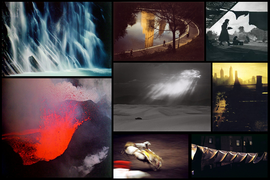
Some examples of his work can be seen below:
 After looking over some of the images from Haas I decided to analyze what made the aspects inside each one so effective, to do this I chose one of his most impressive images; Motion Horses:
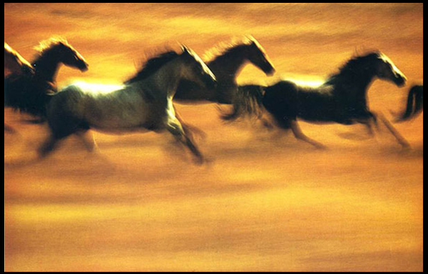 Technical: The image itself uses a vivid long shutter speed to capture the motion of the horses in action. By doing this it creates a sense of realism into how the photo would have looked to the photographer, making an aesthetically pleasing result from how the horses are contrasted sharply against the yellow backdrop of the piece. The picture seems to use a higher saturation to bring out the colours of the field and emphasize the darkness of the horses to create an almost abstract and surreal result.
Visual: Visually the piece it pleasing to the eye, with our focus drawing straight into the symmetrical line of the dark contrasted horses, this reduces any eye-sore for viewers as it creates a perfect balance of blacks and yellows. Composition wise the piece has been straightened so that the line of horses gracefully cross the field, not taking up too much or too little space within the area, and with more focus and detail being on the horses it draws our eyes away from the floor the first time we look at it.
Conceptual: The image is meant to capture the movement and fluidity of the horses whilst running in the wild. The lack of focus on any part of the picture is used to represent the vision of what it could become like moving at that speed, distorting certain features of the creatures to blurs which melt through into the surrounding landscape.