
Colour Edits:
For the colour experimentation of this shoot i wanted to emphasise the colour green as that was the area of St Helier I was given to explore. First I selected the image that contained green in them and highlighted that, then I found images that I liked and edited green into them so that they could still be included.
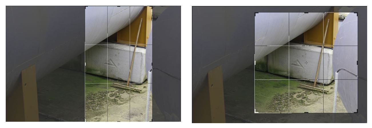
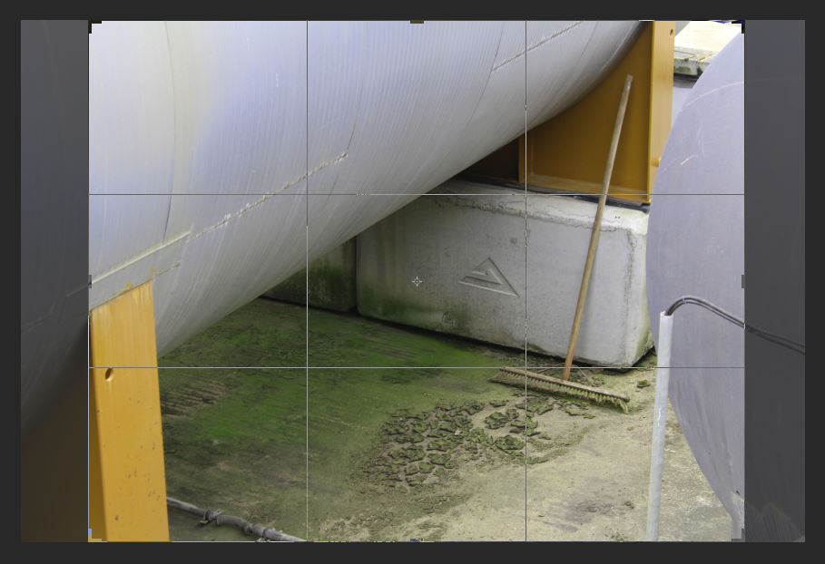
I chose this image to edit as i wanted to highlight the green and I liked the combination of colours i could edit in if I increased the hue of the green, changing the orange colour from the structure to yellow, creating a complementary combination of colours (yellow, green and white/silver). I like this image as the subject of the broom stick, which doesn’t look like its been used in a while from the mould around it, isn’t something that people passing by would notice. I interpret this image as the broomstick being the only signal of life in the image which is surrounded by industrial structures. Similar to how St Helier is being redeveloped into an a more industrial place with new office and buildings being built and abandoning its heritage, similar to how the broomstick has been abandoned and forgotten about. I also like the composition of this image with the industrial structures surrounding all the edges except for the bottom one and the contrast from the round silver structures to the vertical solid yellow blocks creating a juxtaposition in in the shapes and lines. These shapes emphasise the texture of the mould and dirt at the bottom as the other parts of the image don’t have much texture, so the audiences eyes are automatically drawn the the detailed texture in the center of the image.
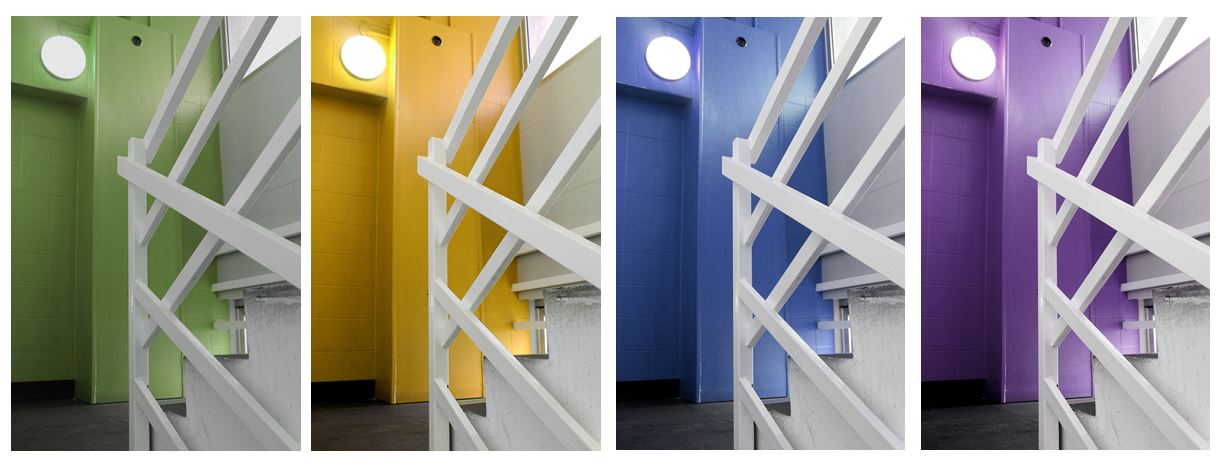
I particularly liked this image where I changed the hue of the red wall behind the stair case to green so I decided I would experiment with different colours others than green in this image to see which one worked the best.
Black and White edits:
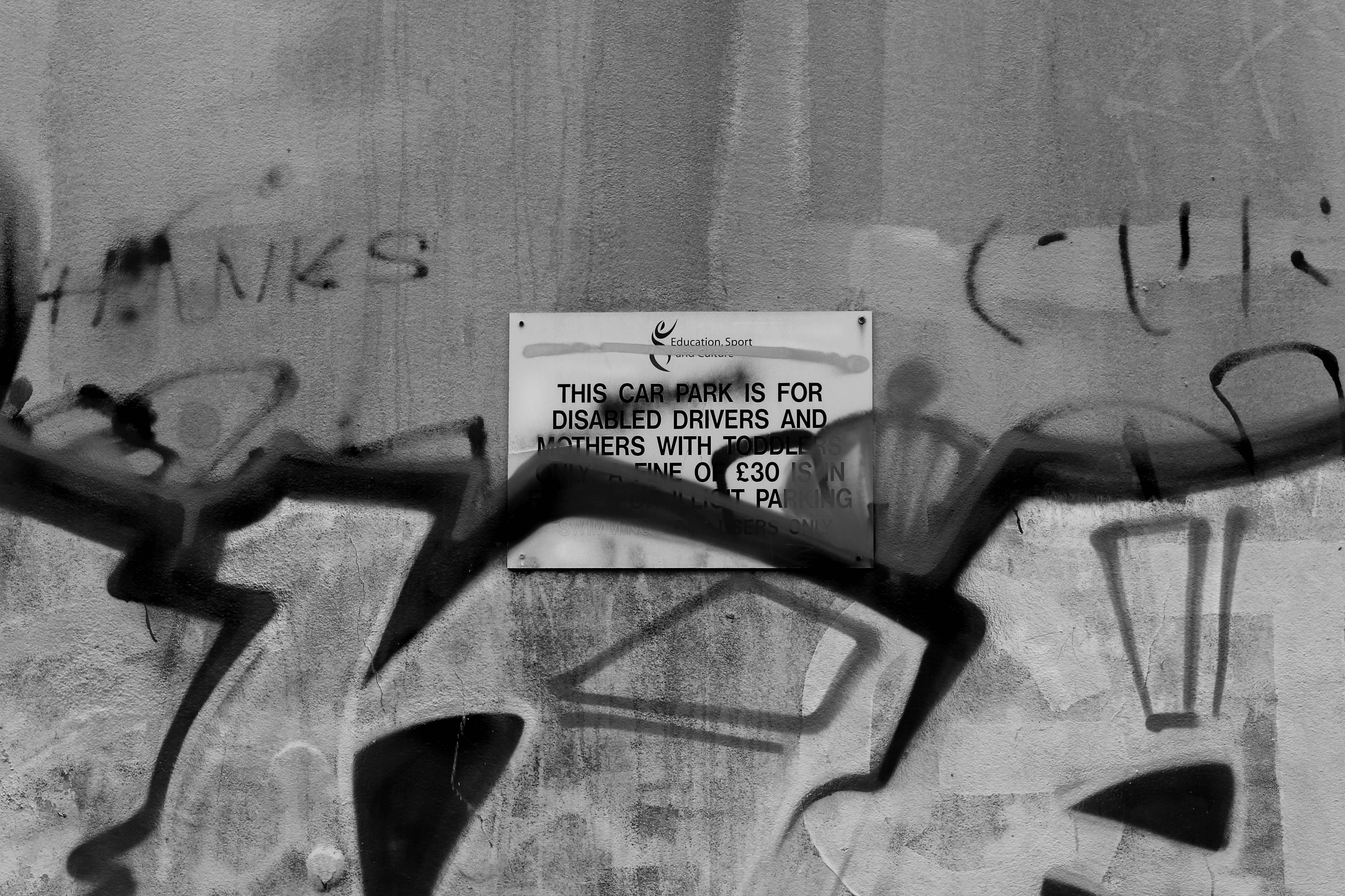
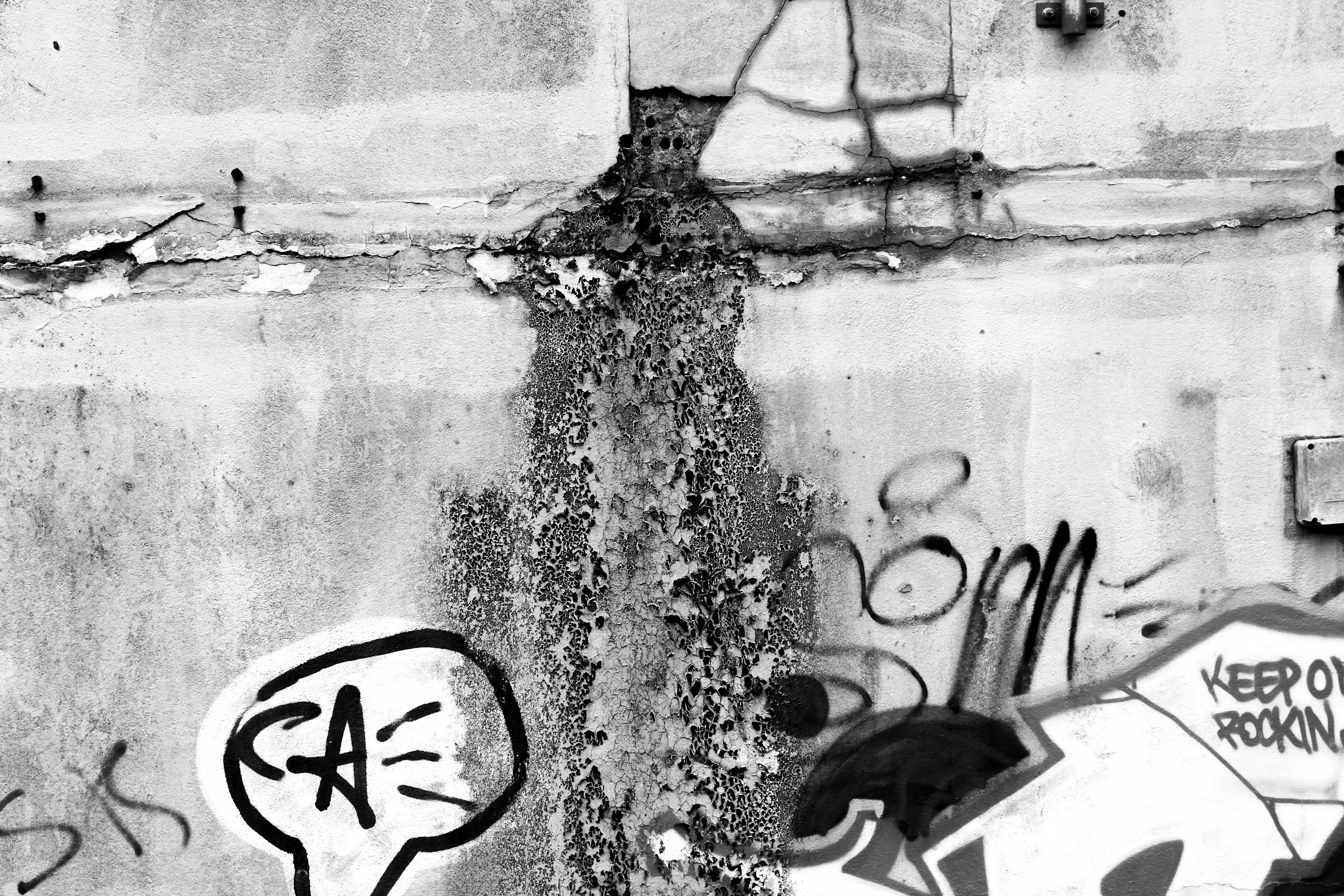
I thought these images would be more effective if i edited them black and white as i wanted to emphasise the dereliction and decay. By turning the image black and white i wanted to darken the shadows where the texture is and emphasise the decomposing of the wall. I like the bottom image as the mould shown looks like its pouring out of the cracks in the wall and the graffiti adds to the derelict look. The top image is also effective as it shows a sign officially put on the wall informing people about parking, and someone has spray painted over it, possibly reflecting how young people care about art and expressing their opinions about the future of St Helier.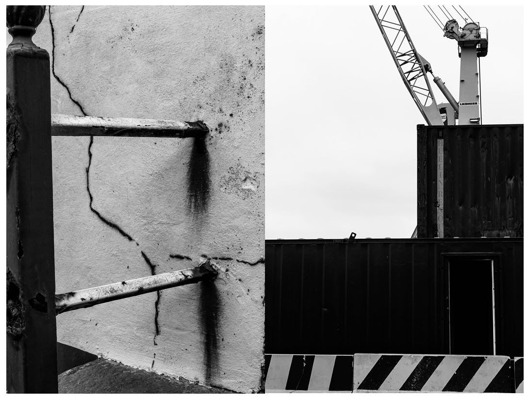
I also like these two images in black and white as they both show structural shapes, the left image portraying more dereliction on the side of a building, shown through the rusting and cracks in the wall, the right image showing objects and machines that are still being used, both images creating a juxtaposition. The image on the left is more effective in black and white as it further emphases the rusting from the metal bars when contrasted the the wall behind and the cracks in the walls are also highlighted. The bold vertical bar along the left of the image creates a division, adding to the differing of lines and angles in the photo. I like the image on the right as it shows two creates stacked onto of one another with a crane behind it, creating a shape that looks like they’ve been conjoined. The striped wall along the bottom of the image is effective as it shows a contrasting pattern compared to the other objects in the image and the colour links together with the crane creating a more balanced and aesthetically pleasing image. I particularly like the composition of this photo as everything is based on the right side on the image with the negative with space on the left.
I next experimented with the threshold in the images making them more bold and structural with only white and black being used in the photos.
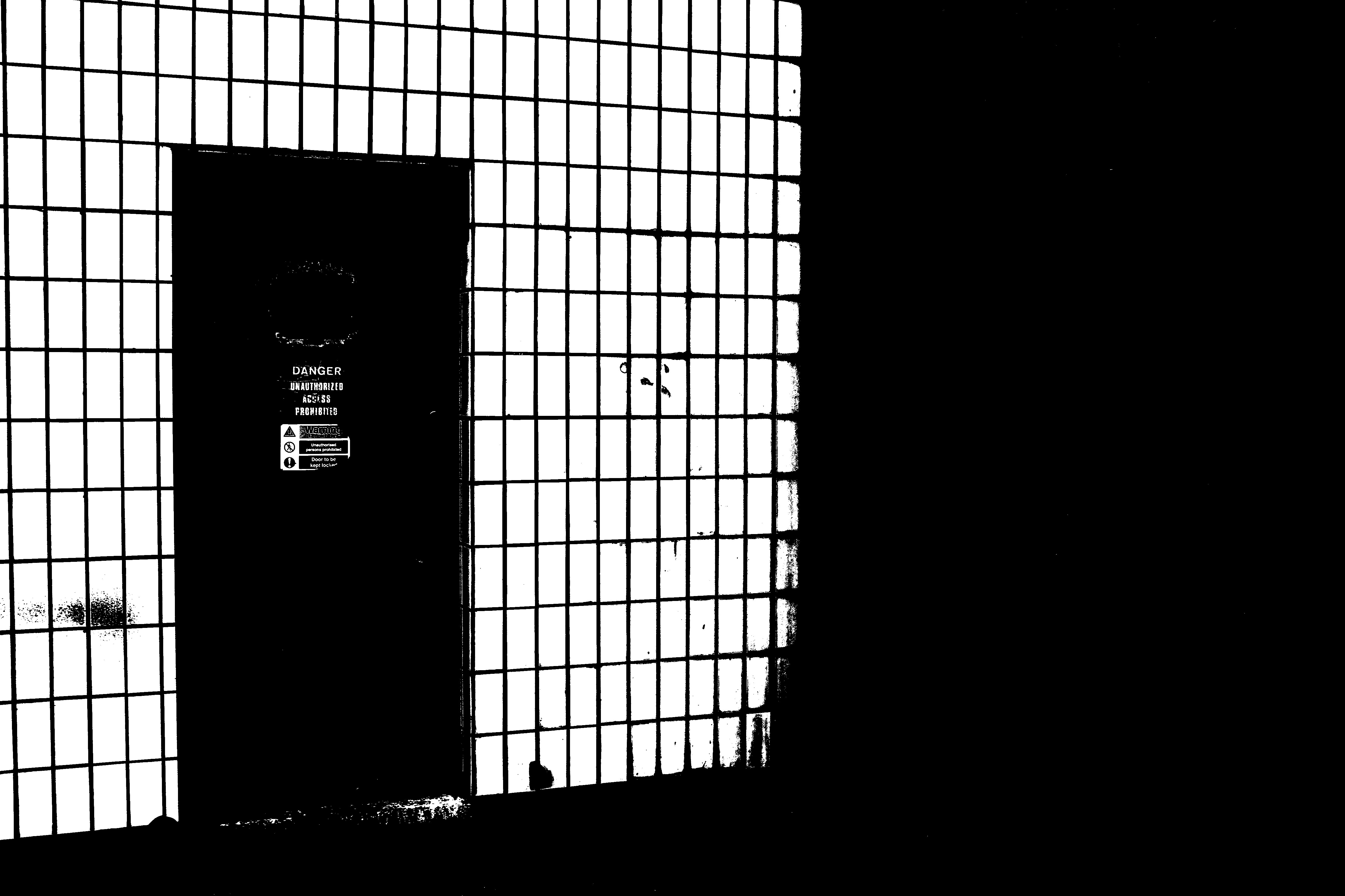
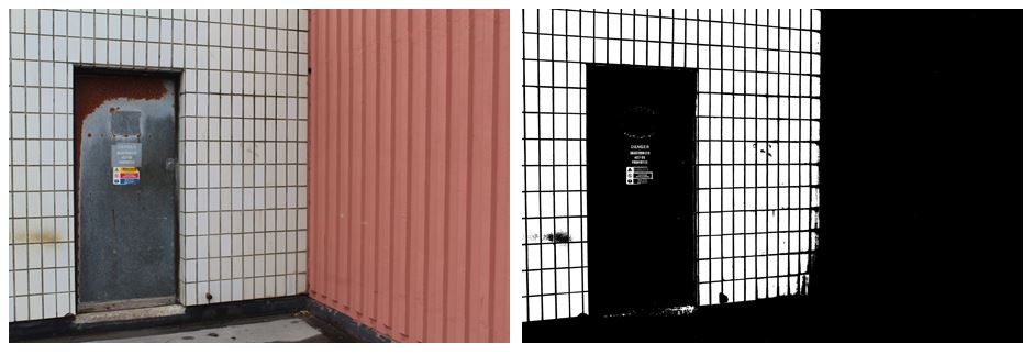
I think that the edited image where i changed the threshold is much more effective than the original image as it emphasises the industrial theme that i want my project to follow. The contrasting black and white lines are a lot more noticeable on the right image as the black in darken and the white it brightened. On the left image there are a lot more neutral tones in colour like the pink wall on the right and the brown rust on the silver door which is completely invisible on the right image, giving it more of a minimalistic but impactful look. The right hand side of the image is completely black out, making nearly half of the image one solid colour, directly the audiences attention the the left. I prefer the right image as the edit gives it a more…. feel, the signs on the door still being visible and the white wall on the left looking more like a fence and the door leading out to nothing.
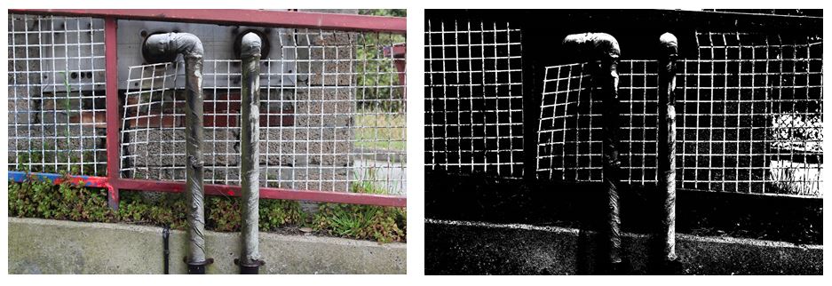
Changing the threshold in these images makes harder to figure out what the image is portraying and makes the lighter points in the image standout more than in the colour image, creating more of an overall impact . With the bottom to images i prefer the colour edit as it makes the images more interesting to look at with the bold red/pink lines and contrasting white bars creating a checkered effect. Also the two pipes in the center of the image are much more noticeable as they don’t blend into the black background, which is why only having 2 colours (black and white) in the right image isn’t as effective. The image on the right also shows more texture in the green leaves on the plants and the rusting on the silver pipes, compared to the left image where not much of this is seen. Although in the left image the bold, structural lines are emphasised more. The horizontal slope that the fencing is on is emphasised more by the solid black shapes ( where the plants are) which is then contrasted more with the vertical piping.