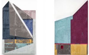

 I want the presentation of these images to keep focus on the images themselves because of the context. The style of these images are very minimalistic and I want the presentation to reflect that. I think the white and black boarders draw the eye away too much because of the contrasting shades and the bright colours.

Below is an example of Krista Svalbonas' presentation. She keeps the images she produces very raw and minimal, almost like the erratic shapes of her images defines itself. With my images, I think that the coloured backgrounds frames the pictures and there is no need for me to mount my pictures on a black board.


