
When selecting photos and planning for my final presentation I have been looking at how Miyako Ishiuchi (my original artist reference) displayed her work. The photos in the Frida series were taken for a catalog which we can see bellow.
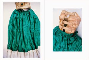
I like how minimal the layout is with no writing or patterns taking away from the impact of the image. The background surrounding the photo is white which brings out the rich colours in the silk. the background in the actual photograph is an off white colour and has shadowed areas, if the photo was displayed without a pure white boarder we might not notice these small details. These two images were selected to be placed together because they both display the different parts of the same item.
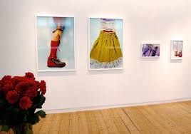
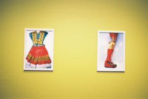
The photographs in the last two images have been displayed in white frames and hung on walls in different arrangements. Again they have been displayed in a very minimal way to keep a focus on the colour in the image. I love how the yellow background in the second display matches the colour in the image perfectly and brings the two frames together. I took inspiration from this for my own edits and used the eyedropper tool to sample the colours in the image onto the background.
Final Images:
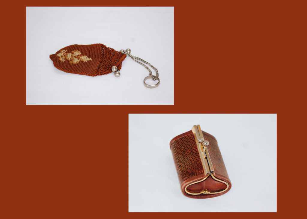
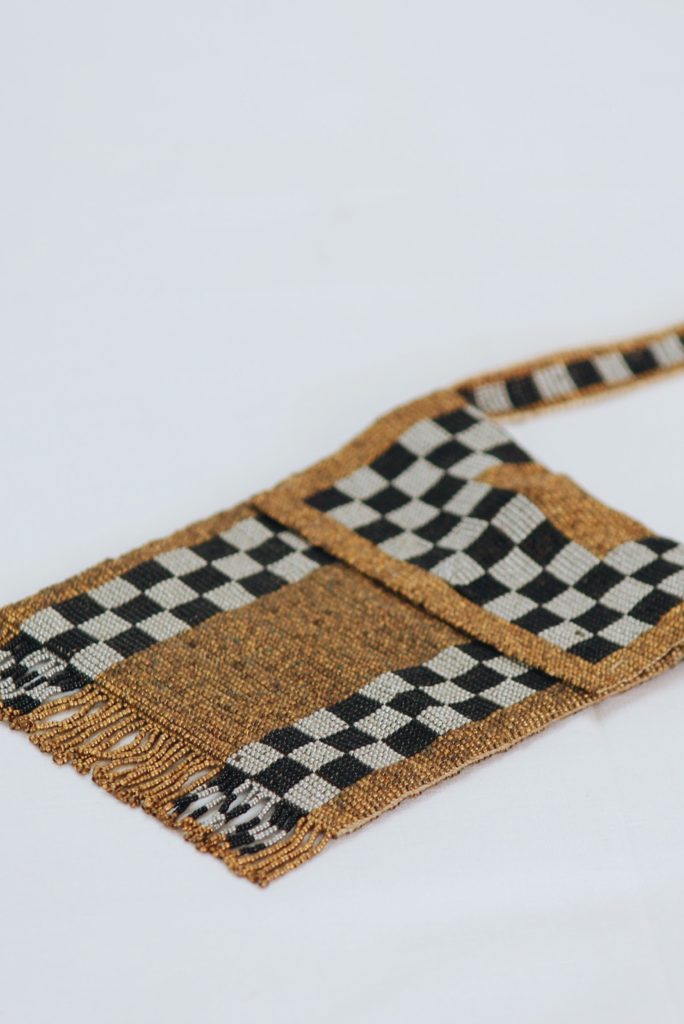
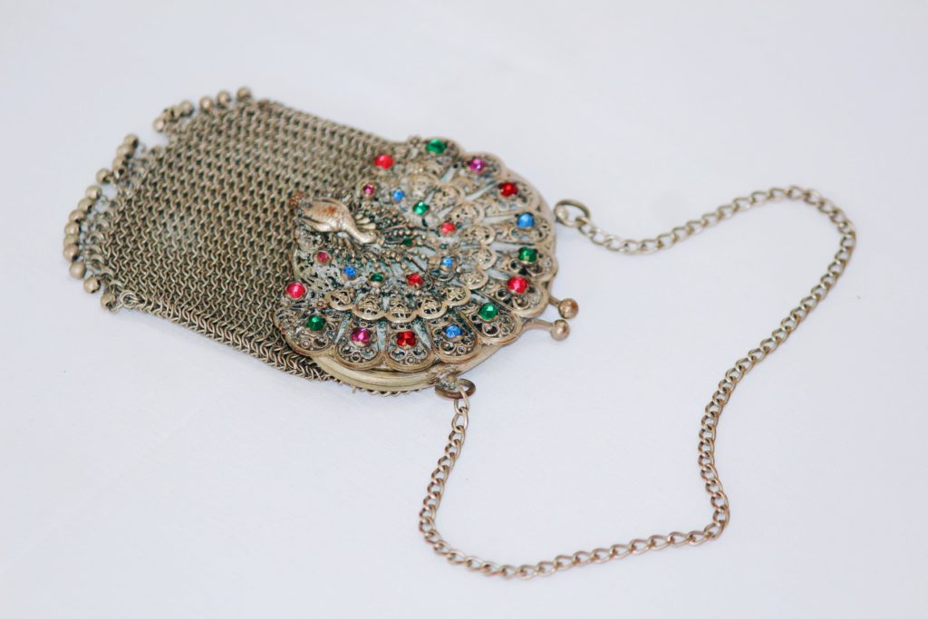
I took these two images of coin purses from the same shoot and chose to arrange them together as a set. Both the photos have a very similar colour schemes and I wanted to use this to link them together. I used the eye drop tool to select a red/ brown colour which matched both photos and made a new page, filling it with the selected colour. I then dragged the images onto the page and arranged them so that there was negative space in between filled with the colour.
I will cut out and glue these two photographs on to white foam board because I want the colours to stand out on their own, I also think this will give them the clean minimal look i was going for.
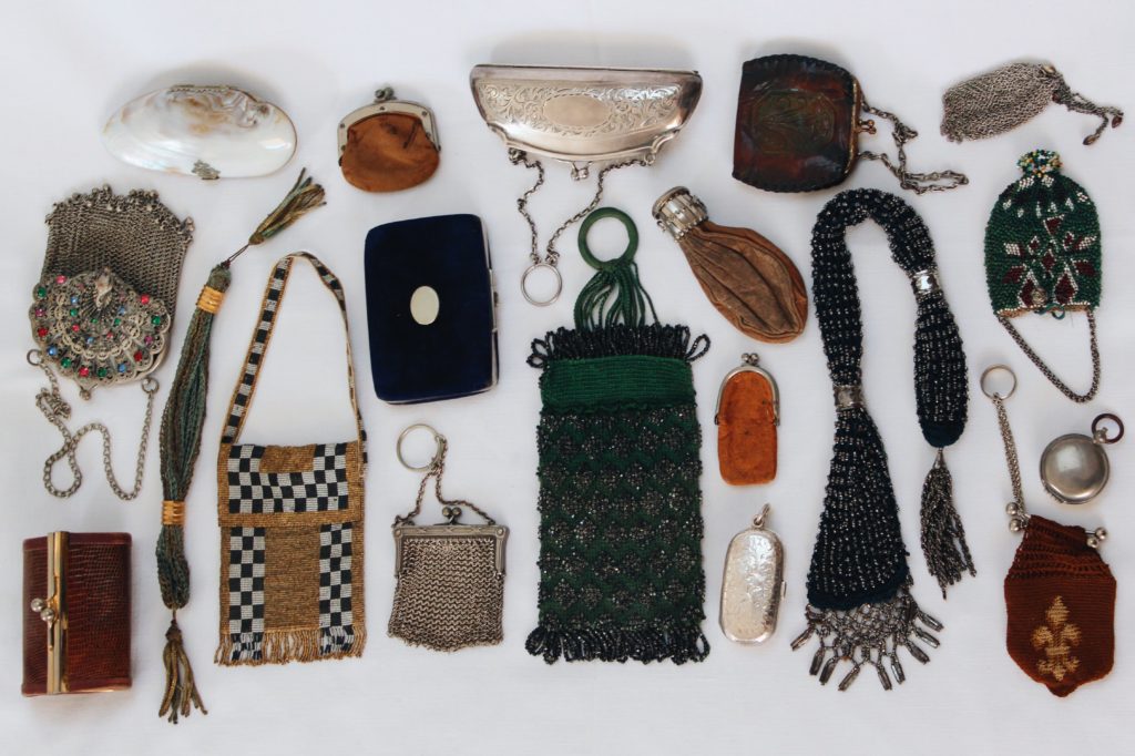
I chose these four photos of old coin purses for my final images because i think they show how how my ideas have developed through the project and display what i have learnt from studying my chosen photographers. The link to the theme of secrets, codes and conventions due to the museum style and unknown history in the items I have photographed. I wanted the photos to display what the antiques look like in real life and show their imperfections rather than re touching them to look perfect.
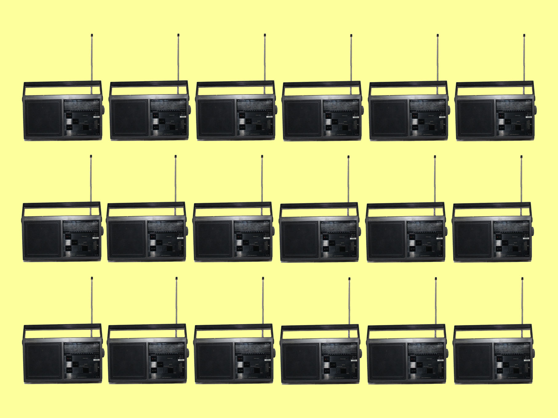
Another photo I have chosen to print is this one of a radio repeated multiple ties on a yellow background, again this shows an old item which has a story and a secret however also links to the theme of code in the way signals are transmitted to radios. I want to frame this image in a black window mount which will compliment the black parts of them image.