
Final Image selection

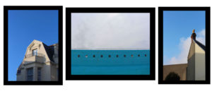
I have decided that for my that I will present all of my on the same level as i think that are all of the same stander and that the focus should be on all of the images equally.I have printed all of these images at the size of A4, i think that they are all complementary to each other and have a clear directive theme through out them
Final Layout Choice
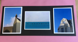
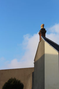
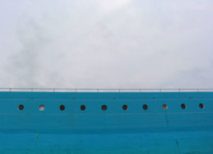
I decided to keep the final layout design very similar to what i had thought about previously , I did experiment with the overall layout choice through out the day,but i think that with more experimentation with different sizes of images the presentation would have been more interesting. But Icame to the decision that the most effective look was have images mounted on a a white foam board and then stuck onto a contrasting black colour card board. I took the two images on the outside in the shoot that i did of the area surrounding my house, whereas the middle images is from the shoot that i did down at Harve De Par. Overall I think that this small and clear presentation works well in the predestination and that the overall composition for the final sets works well to highlight the thinking themes of secrets,codes and conventions. Because i was focusing on minimalism for the inspiration of the project. By having this simplest design it helps to reinforce and highlight these areas in my work. One thing that I think would have improved the overall presentation of the composition, would have been if I had printed the landscape image to a bigger size as there is a lot of dead space around that area and it looks slightly out of place.