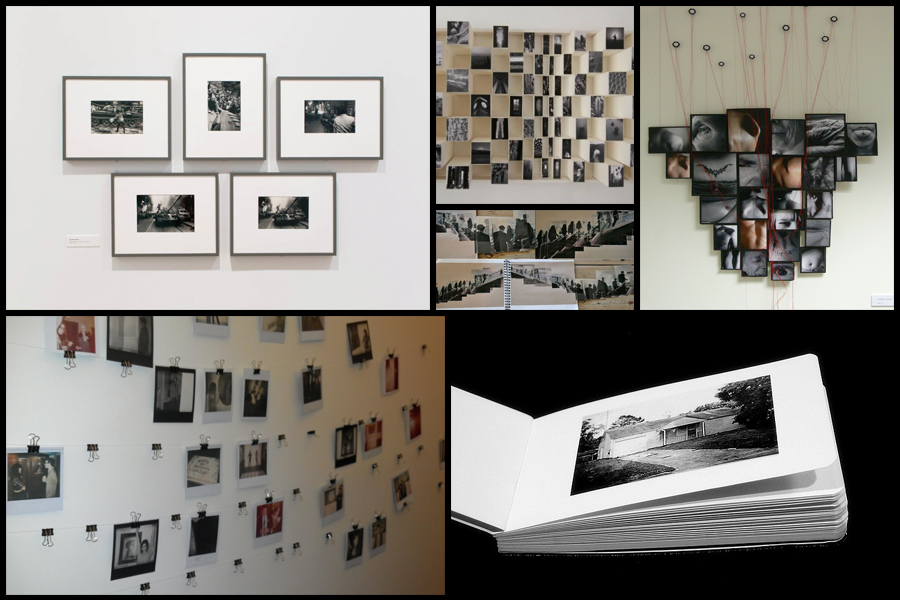
When presenting my final images once printed I decided to experiment with a variety of different ways in which I could do so. To do this I would use Photoshop to manipulate my images and develop them into the style of presentation I wanted before the actual thing, however when doing this I would need to come up with a mood board first to see if I could develop any ideas.
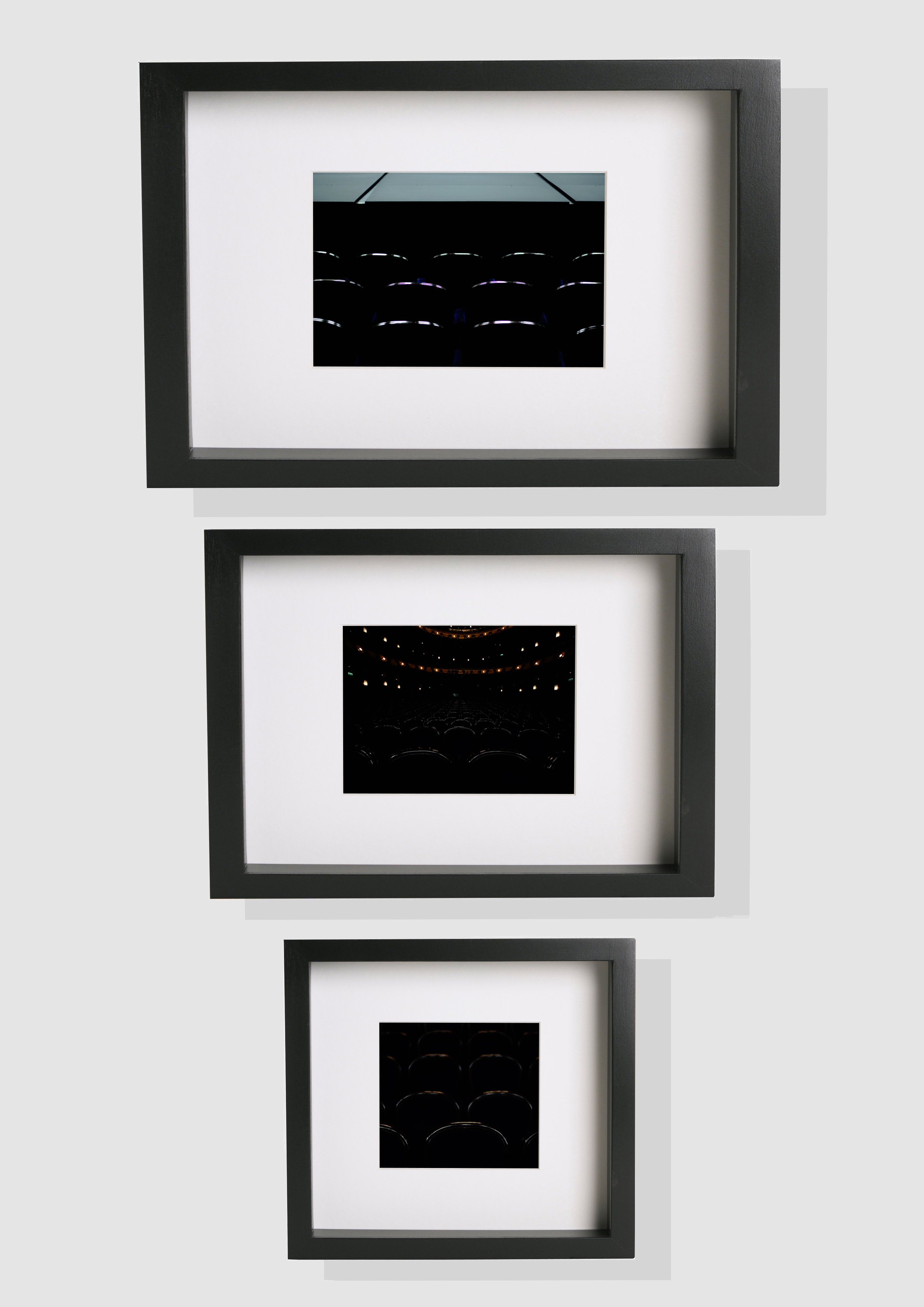
 After looking over these ideas, I decided on presenting all of my shoots in selections of three, each three images would be presented in descending size order on a black or white foam board. The biggest image would be the picture I thought was the most successful from that specific shoot, with the other two being close runners-up. If done on black card I would include a white border to add emphasis and bring out the piece to make it more aesthetically pleasing to the eye. To do this I would need to firstly use Photoshop to gather frames and edit them into this order, whilst imposing my pictures into each one. These are the outcomes:
 This is a diagram of the general layout of how I wish to stack the white and black card on top of each other to create a white border around the image as seen below, I am also going to experiment with a variety of different coloured backgrounds to see which presentation I liked overall:


 In the end I settled on using a white backdrop because I think it contrasted best with my mainly dark images, allow them to be more the center of focus. When stitching the images to the frames I found that keeping the images in descending order with the worst image as the smallest was the most effective method to use, this enabled the main focus point to be the best image and the worst the least. For the biggest image I will print that in A3 size, with the other two in A4 and A5, these sizes are the best for me to frame them in the desired style.
