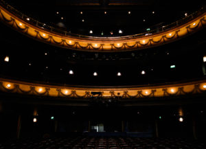
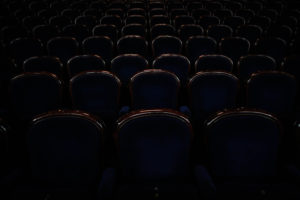
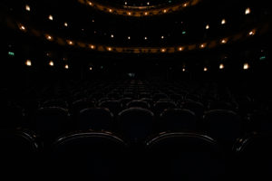
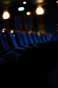
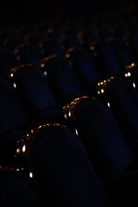
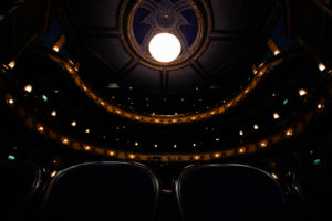
Within this shoot I will be particularly focusing on the idea of abandonment in areas such as opera houses which reveal the hidden beauty of the overall design. Inspired by Johnny Joo, I will be mainly focusing on composition to emphasize desertion through the use of symmetry and contrast which hopefully will produce dark seating but a high contrast of lighting, showing the lack of human activity usually seen in such areas and the uncomfortable feeling that is related to such imagery. Joo chooses particularly a technique of composition combined with an effective use of contrast especially on lighting to create dramatic photos centered around seating etc and areas people used.
Here are some example of Johnny Joo’s work: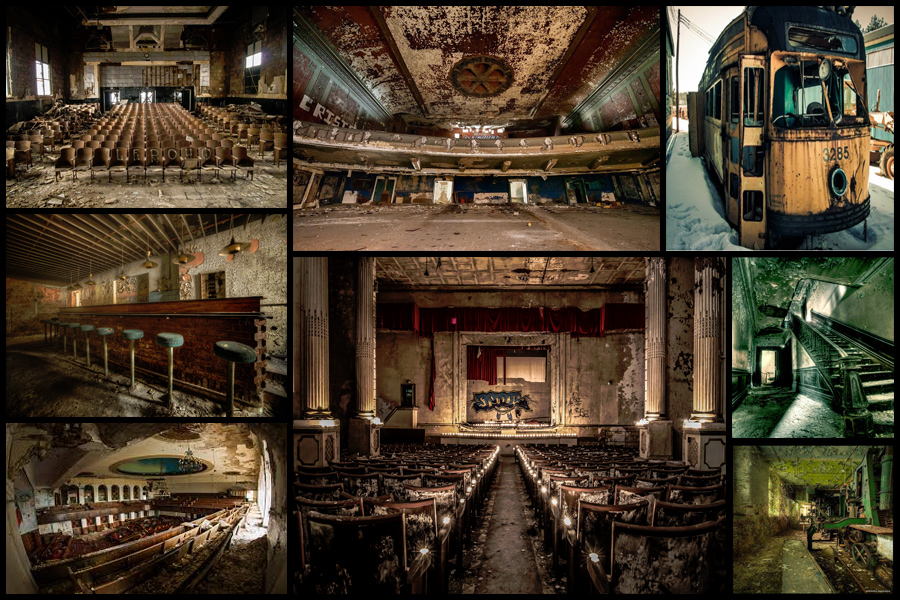 Once researching some of his work to draw inspiration from I decided I would make a mind-map from various ideas I had for the shoot, this would include things like angles, lighting and what to take. By doing this it would reduce the time needed on the shoot as I would know specifically what to do when there and how to take the images needed. Here are my drafted ideas for the shoot:
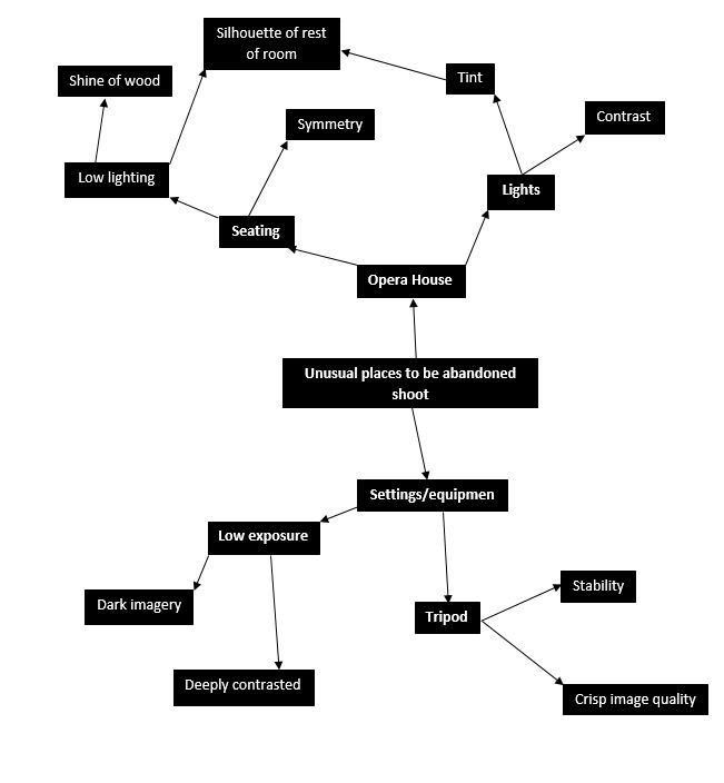 After I had completed my mind-map I thought it would appropriate to go ahead with the actual shoot itself whilst taking into consideration the ideas I had planned in advance. For the shoot I had gotten access to the abandoned opera house in town, these were my results:
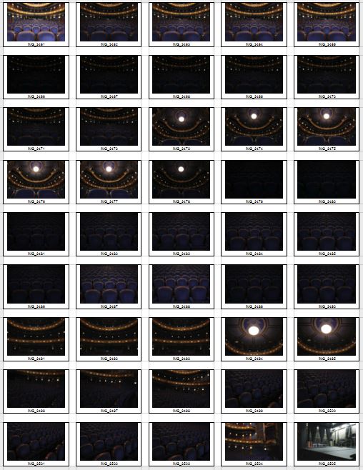

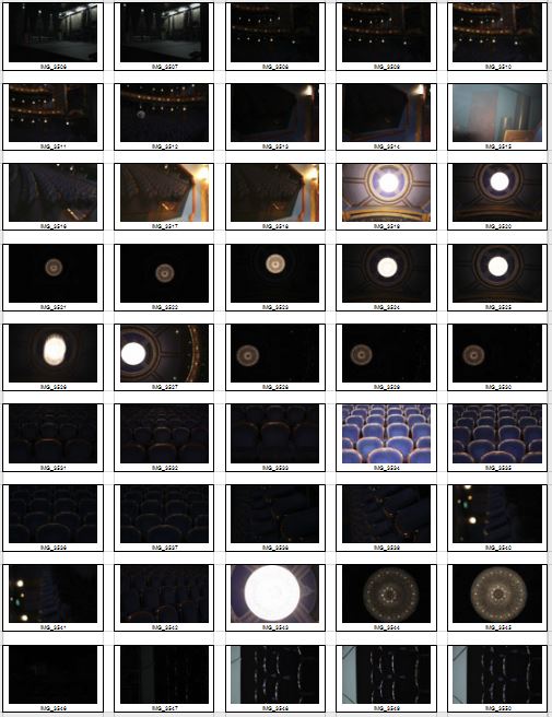 After this was done I started to whittle down the shoot to a top ten images, by doing this it would enable me to more easily find the overall best image of the shoot with in the process taking into consideration the aspects of each image that made it effective and how it could be related to the theme of secret, codes and conventions. These were my choices for my top ten best images of the shoot:
Once I had selected the top ten images I thought reflected the intention of the shoot and the were technically the best out of the rest I then wanted to drop that to only a top five. By doing this it would allow me to individually analyze each image to further know what photo would be the best result from the shoot. These were my results:
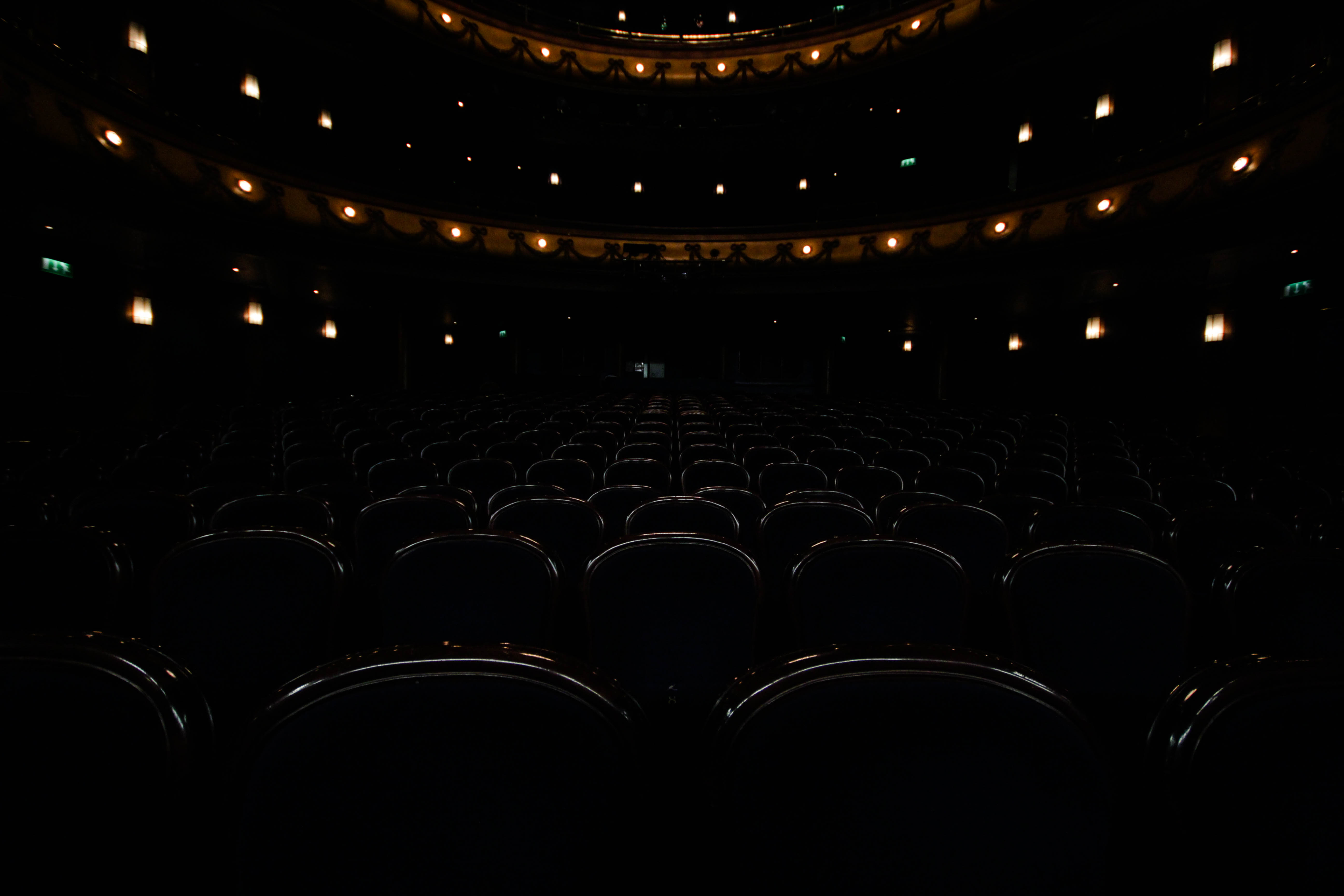 I chose this image because of how I really think it emphasized the ghostly effect created by the use empty seats. This is because of how the area it not usually seen without human interaction, and to see it devoid of anyone makes it feel unnaturally deserted, this is great for linking it to the topic of conventions as it’s not a place usually seen in this state. I found the composition great from the use of symmetry which I found particularly effective as it makes the picture aesthetically pleasing to view, with the seats having the lighting reflected and a depth of field used, it seems that the seats go on forever as if forgotten and unused. The orange lighting that surrounds the seats creates an even more ghostly effect from how it breaks the otherwise bland selection of colours present in the image.
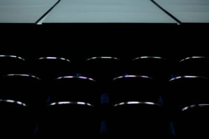
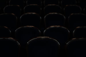
 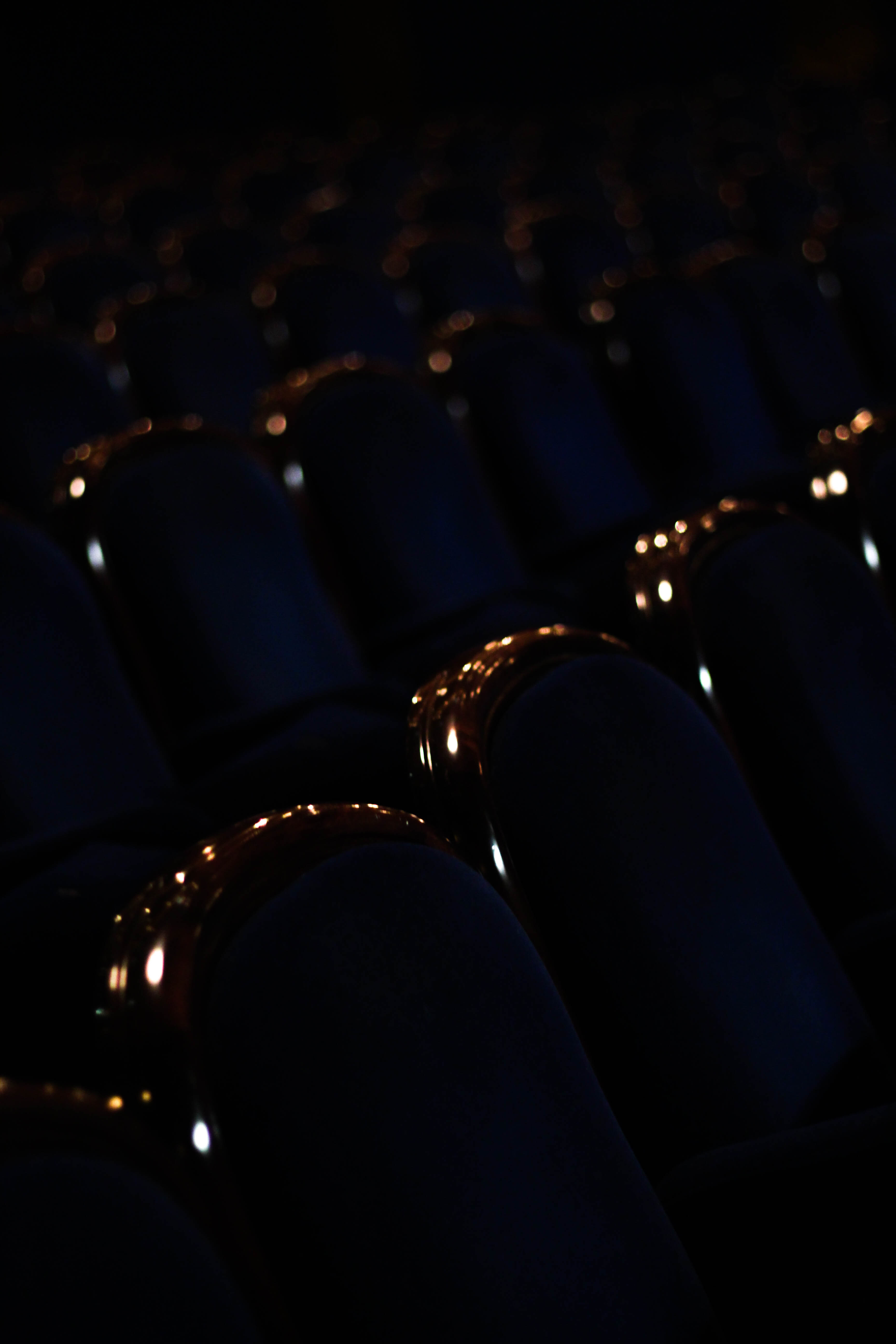 What I liked about this image was the use of a depth of field and the contrast of the shine on each seat. The use of a depth of field creates a sort of gradient that fades the lights away into the almost deserted distance, this is linked to conventions from how seats are usually linked to people sitting, and to see them abandoned in such a large-scale seems uncanny due to not usually perceived like this. The use of contrast between the lights of the shine on the chair and the darkness I found effective from how they provide enough light to define the objects but enough to make each chair into a silhouette.
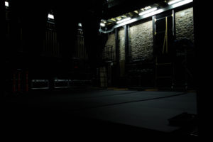
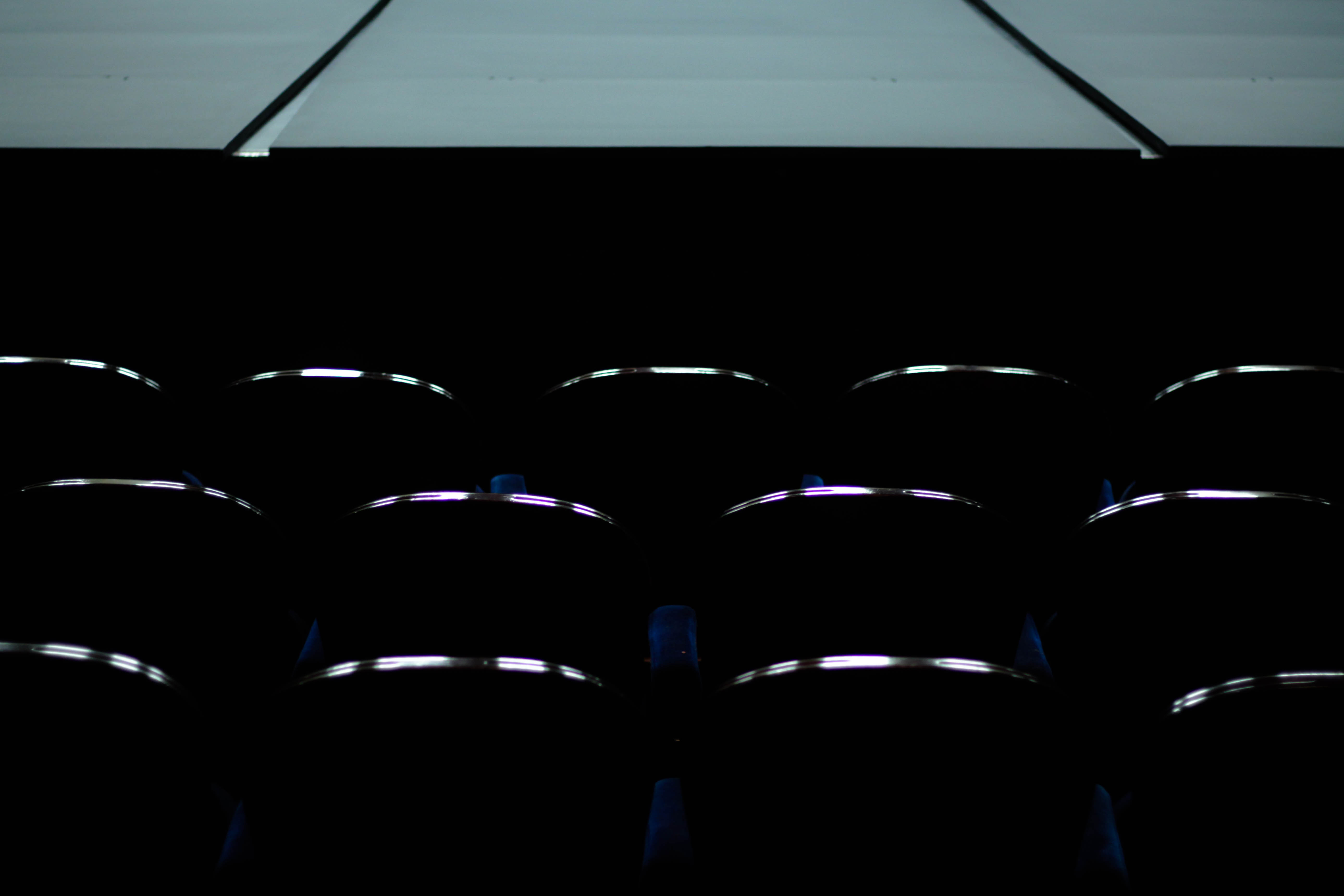 I loved how in this image there was a really clear contrast between the lightness of the stage and the darkness of the seats only defined by the shine on the wood. By doing this and through the use of symmetry I found it to be very aesthetically pleasing from how it the stage breaks the pattern that otherwise would only consist of dark chairs. The shine created from the chairs brings the image together from how it stops the stage from being too dominant in the picture and overpowering the rest of the image, this is helped by the black space between the stage and the chairs which stop the two different contrasts from colliding and ruining the symmetry and pattern. The image also reflects a ghost audience that is no longer there due everyone being long gone, thus creates an eerie effect of abandonment of the unusual.
 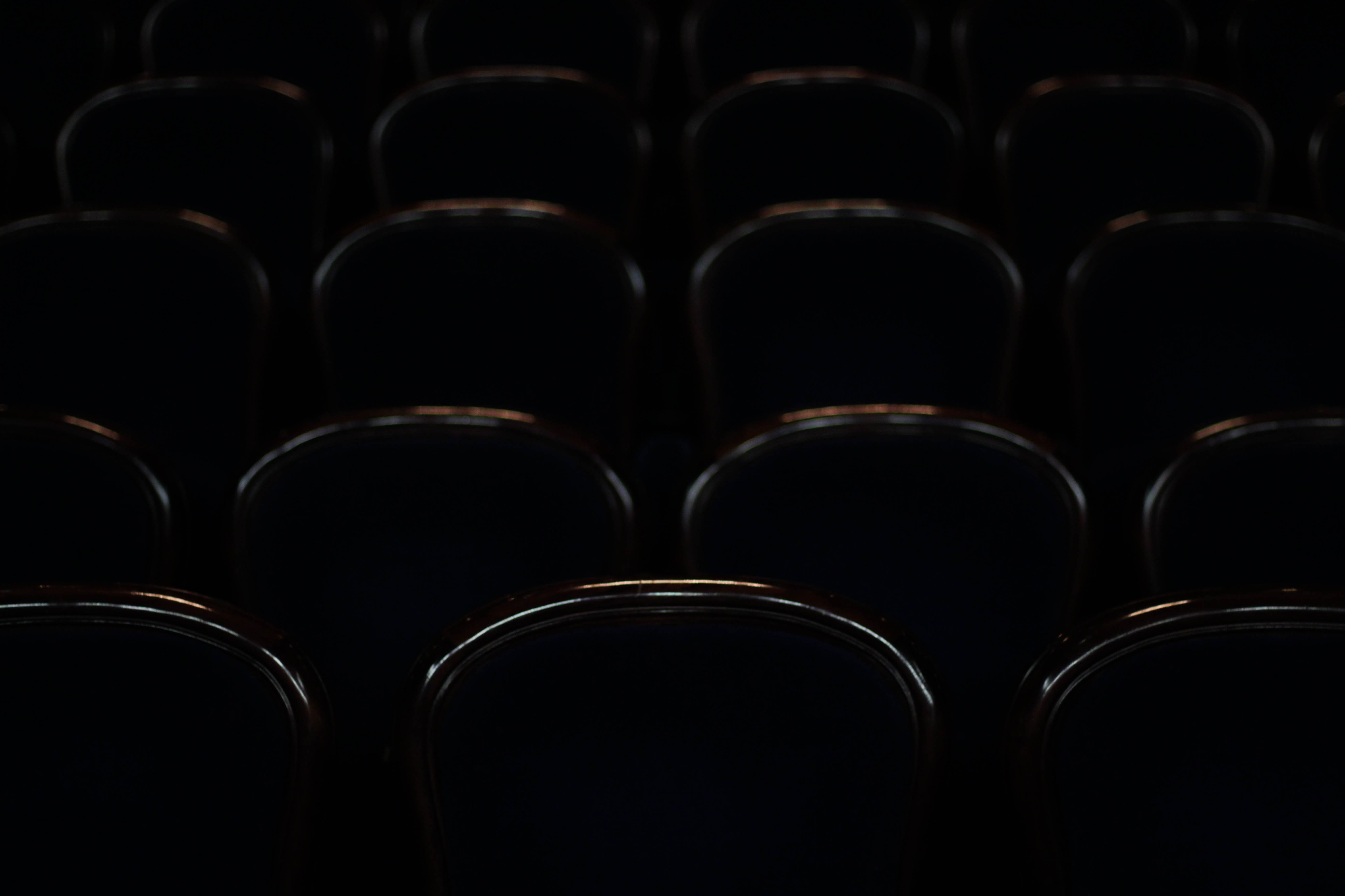 I chose this image purely because of the silhouettes and defined shine created by each of the chairs, this in my opinion combined with symmetry allows for an aesthetically pleasing result that is balances the darks with the top of each chair. This could be linked to conventions by how you could say each chair represents a former shell of what they use to be used for creating an atmosphere of desertion. The sheer darkness between each seat creates a symmetrical pattern with nothing displacing or ruining it to the eye making the piece as a result easy to look at.
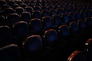
 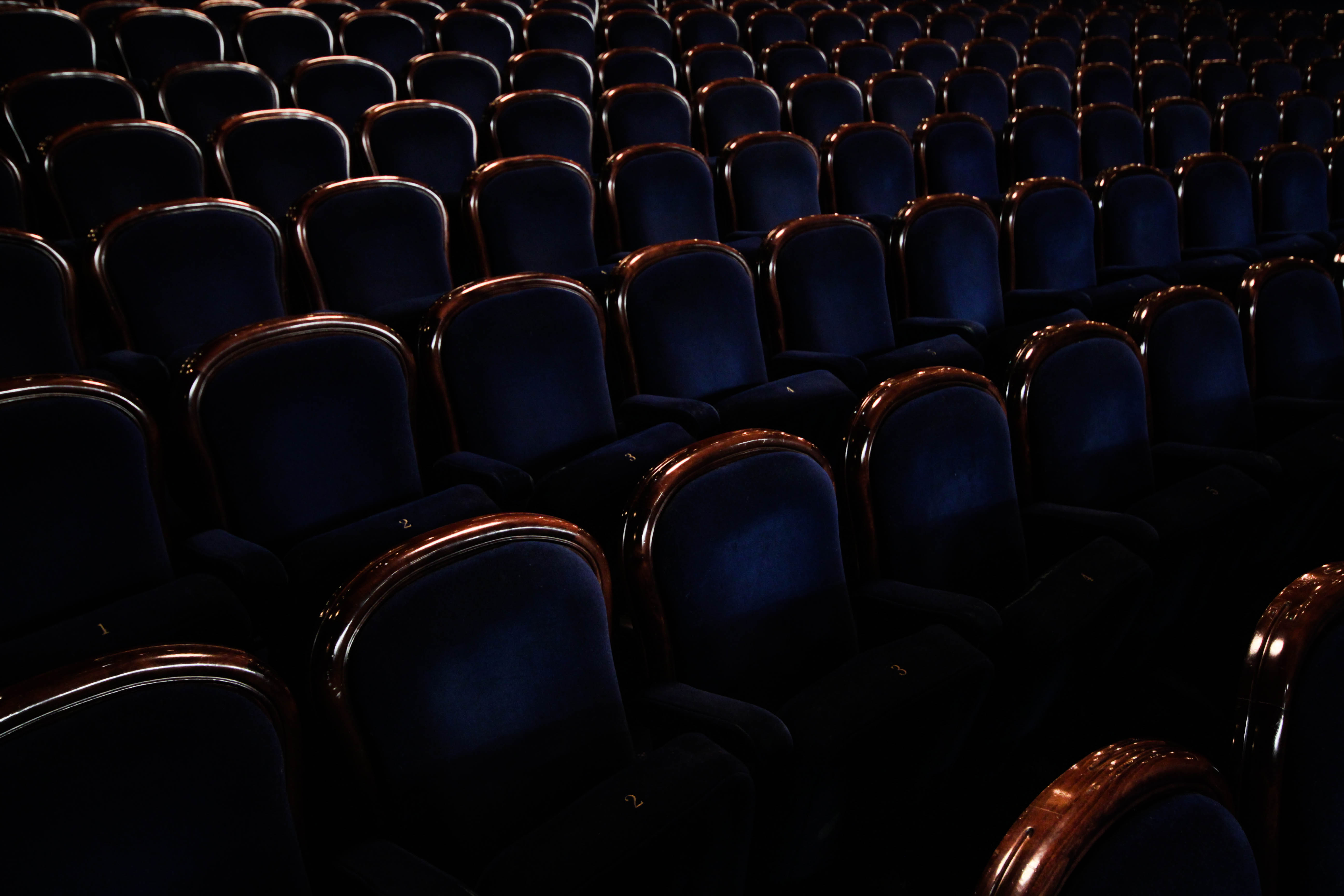 Finally the reason I chose this picture was because of angle and emphasis on abandonment from the amount of chairs present. I found that this image put particular emphasis on desertion from how the rows of chairs create an arc like formation throughout the image, with each one lacking people sitting in them. This conventionally is unusual, as seeing this amount of seats would usually indicate that people are present which is what the photo lacks. There is also a clear contrast present between the blues and browns of the seats which break up block colours to make the piece more visually appealing.
After analysing each image and how it related to the idea of conventions, whilst taking into account the technique each image used to create a visually pleasing result, I found it enabled me to decide the image I wanted to choose for my final and most successful image of the shoot. This was my decision:
Final Image:
 The reason I chose this image as my final and most successful image of the shoot was because of the clear contrast and pattern present within it. The use of the stage’s white against the darkness of the chairs I thought really made the image pop and draw the eye to it, with the indents of the stage stopping the white from being too consistent. However this is contrasted by the patterned symmetry made by the rows of seats present, with the definition of the shine creating a ghostly and empty feel to the image, completely opposite to that of the clean and plain stage. It also I thought related well to the topic of conventions as the empty seats and stage are usually seen full, especially in theatre, and to see them abandoned creates an eerie and unnaturally spacious feel to the overall photo.

