
Within this shoot I will be focusing on the use of dark areas to emphasise the idea of abandonment, to do this I will be visiting usually deserted landmarks such as car parks etc. This would allow me to create aesthetically pleasing results whilst creating the impression that human influence has passed by leaving it as a former shell of what it was originally used for. A photographer who inspired this shoot is Rut Blees, Blees focuses on abandoned areas and their urban aesthetics, used lighting to create contrast on specific areas.
Some of their artwork can be seen below on urban aesthetics: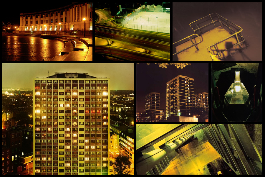 Once completed I decided it was time to move onto my ideas for the shoot, this consisted of creating a mind-map to allow me to focus on specific ideas I think would be most effective when taking imagery. This would make the shoot more efficient to do as I would know exactly what to do. Here are my ideas:
 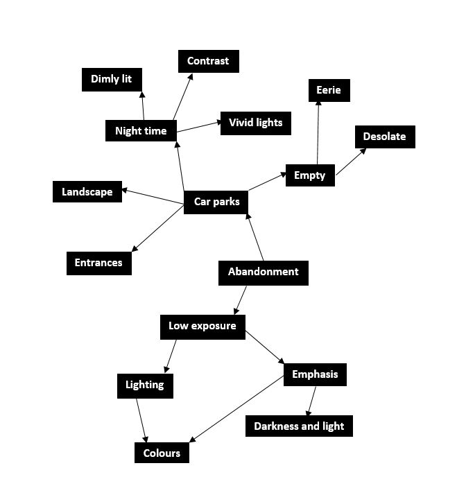 After I finished developing my ideas I decided it was time to focus on the shoot itself now, to do this I drove around Jersey visiting various car parks during the night to capture the images desired. Using a low exposure to produce the outcomes I found that it proved to emphasise the areas of choice like intended. These were my results:
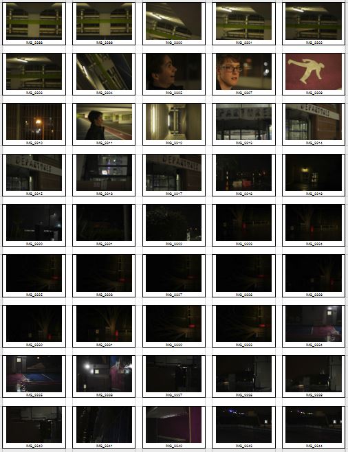
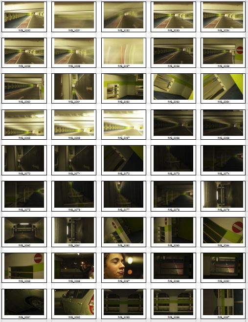
 After I had compiled the images into contact sheets I was able to whittle them down into a top ten images that I thought stood out from the rest of the pictures. This would make it easier to choose the final and most successful image out of the entire shoot. Here are my ten final choices:

Once completing this, I edited them down once again down to five images which I would analyze, this would make it much more easier to decide from which photos I thought were most effective as a development off the inspiration of Rut Blees. Here are my choices:
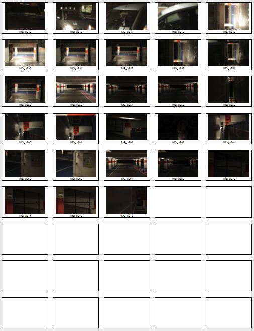
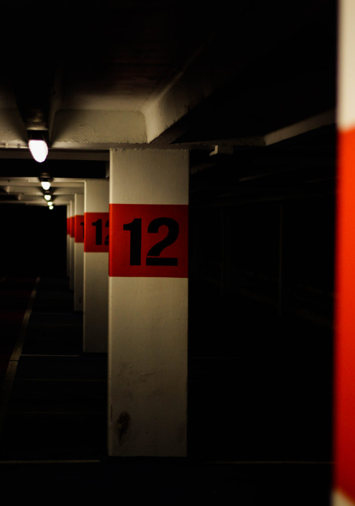
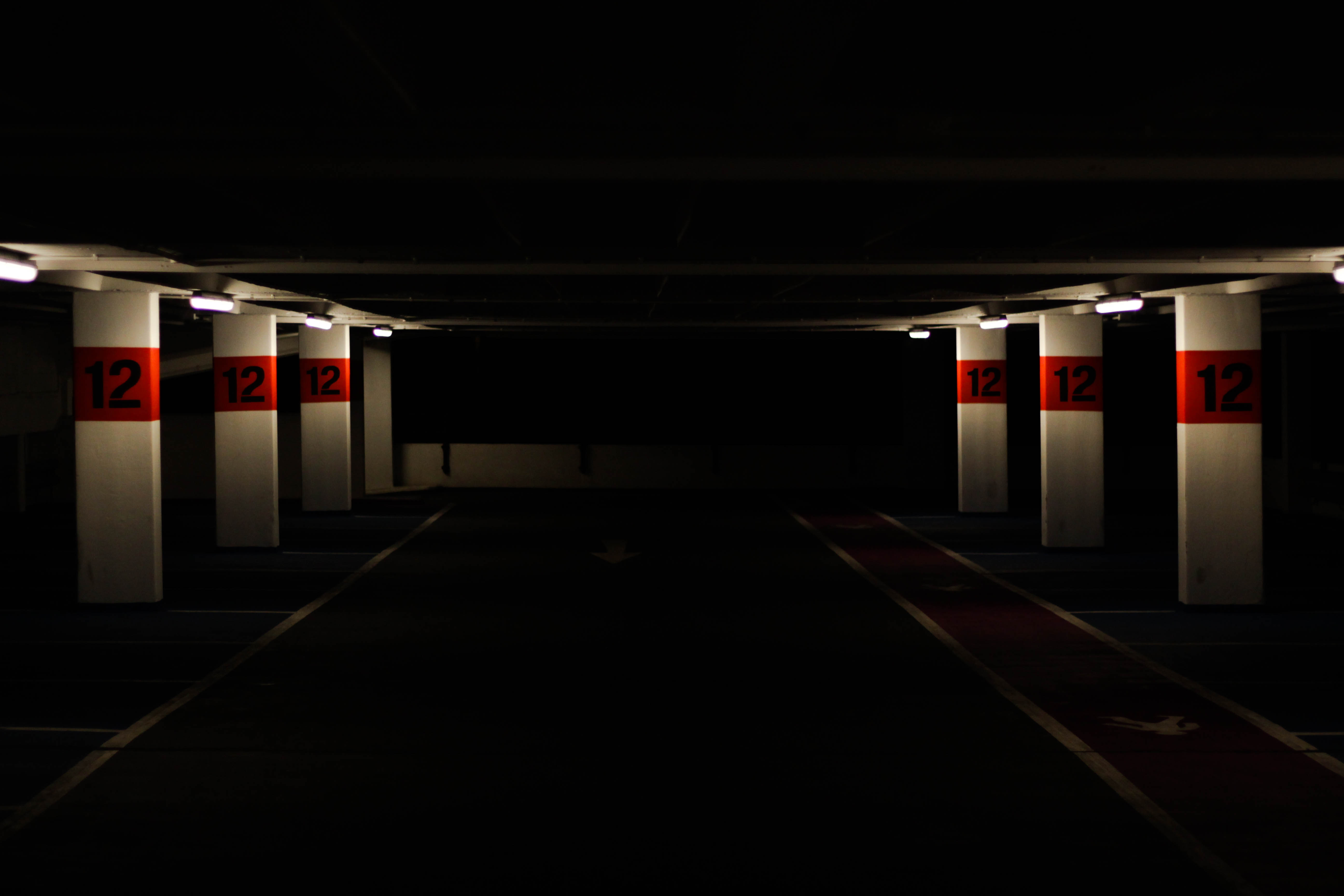 I chose this image as one of my selection of five because I found it contained an effective use of contrast between light and dark, combined with a use of depth of field I thought it gave across an eerie impression of a deserted atmosphere. The red use around the number I found to really balance the image from how the only light sources illuminated those areas whilst emphasizing the depth and darkness of the car park. I found the symmetry used within the image proved effective from how it created a sense of aestheticism with a border made from the use of the slanting ceiling.
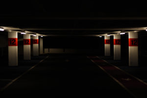
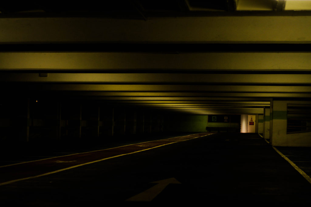
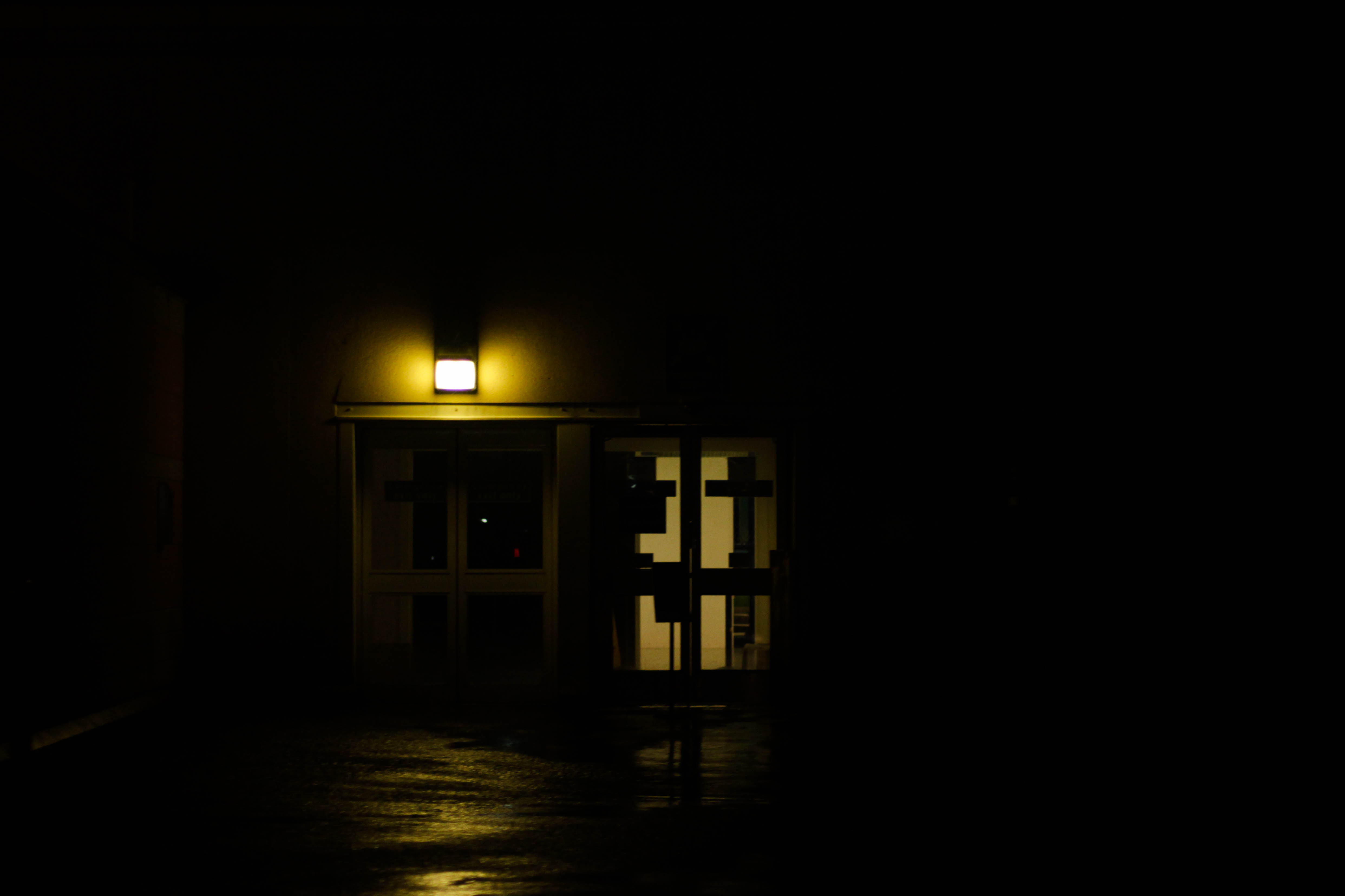 What I particularly liked about this image was the use of a dim yellow light illuminating a small radius around two doors, I found that this combined with the puddles reflecting and emphasizing the colours really gave the impression of an area deserted by human activity. This also produced a contrast between the doors and the rest of the image from how the darkness around it defines it even more the dimly lit imagery exit of the airport. The use of a singular light source present creates a creepy feel from how it creates silhouettes of objects around it allowing your mind to perceive what it wants of it.
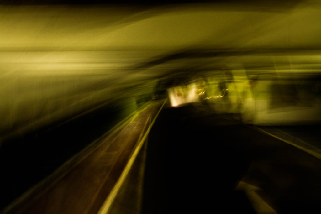
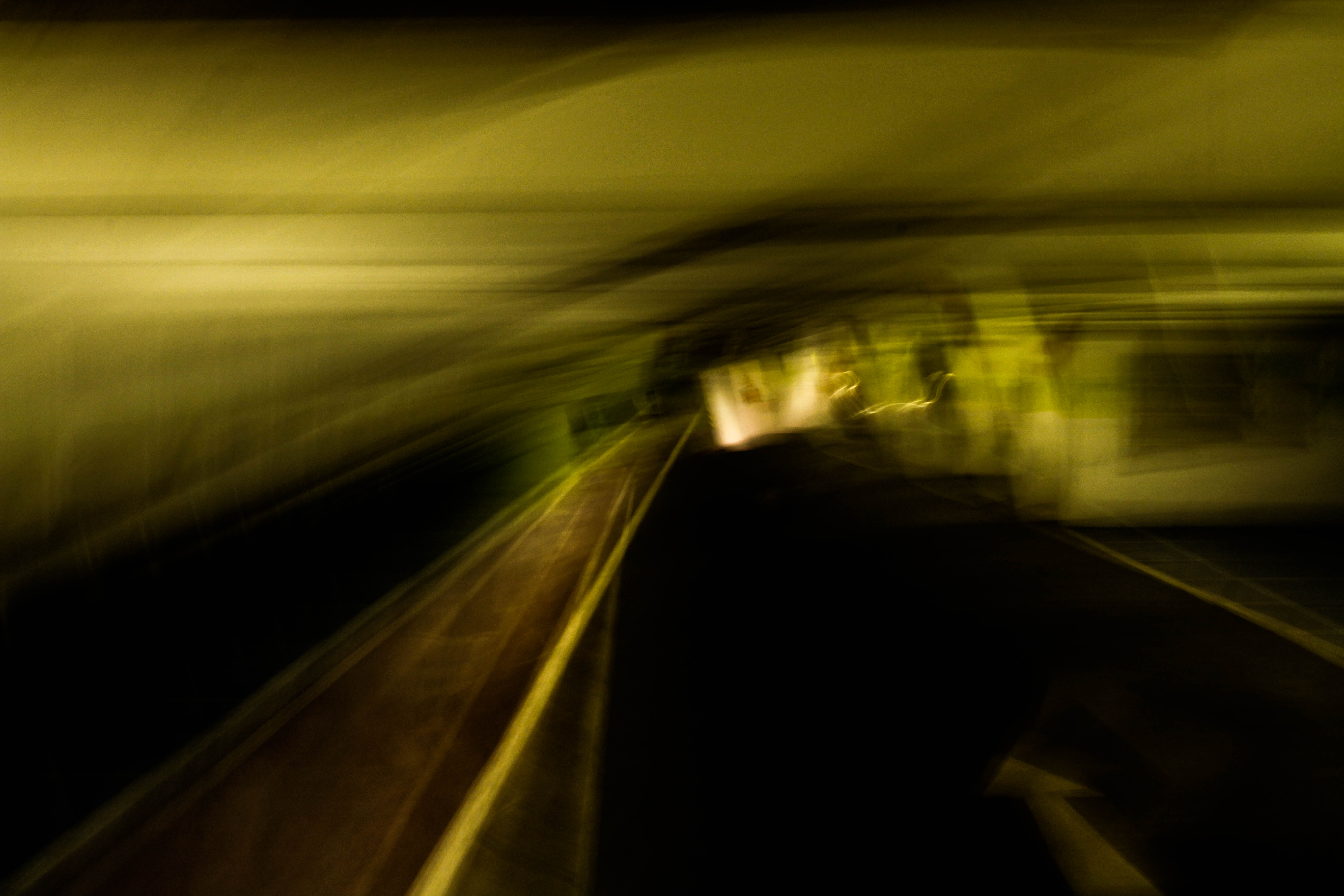 What I loved about this piece was how the blur created by the low shutter speed creates an abstract and almost dreamy landscape of the car park leaving your mind to interpret what it would look like. The combination of yellow and green compliment each other combined with the dark floor allows for and aesthetically pleasing result, however I found that the un-blurred road balances the image as it adds normality to the rest which is essentially is unbalanced.
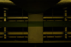
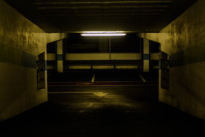
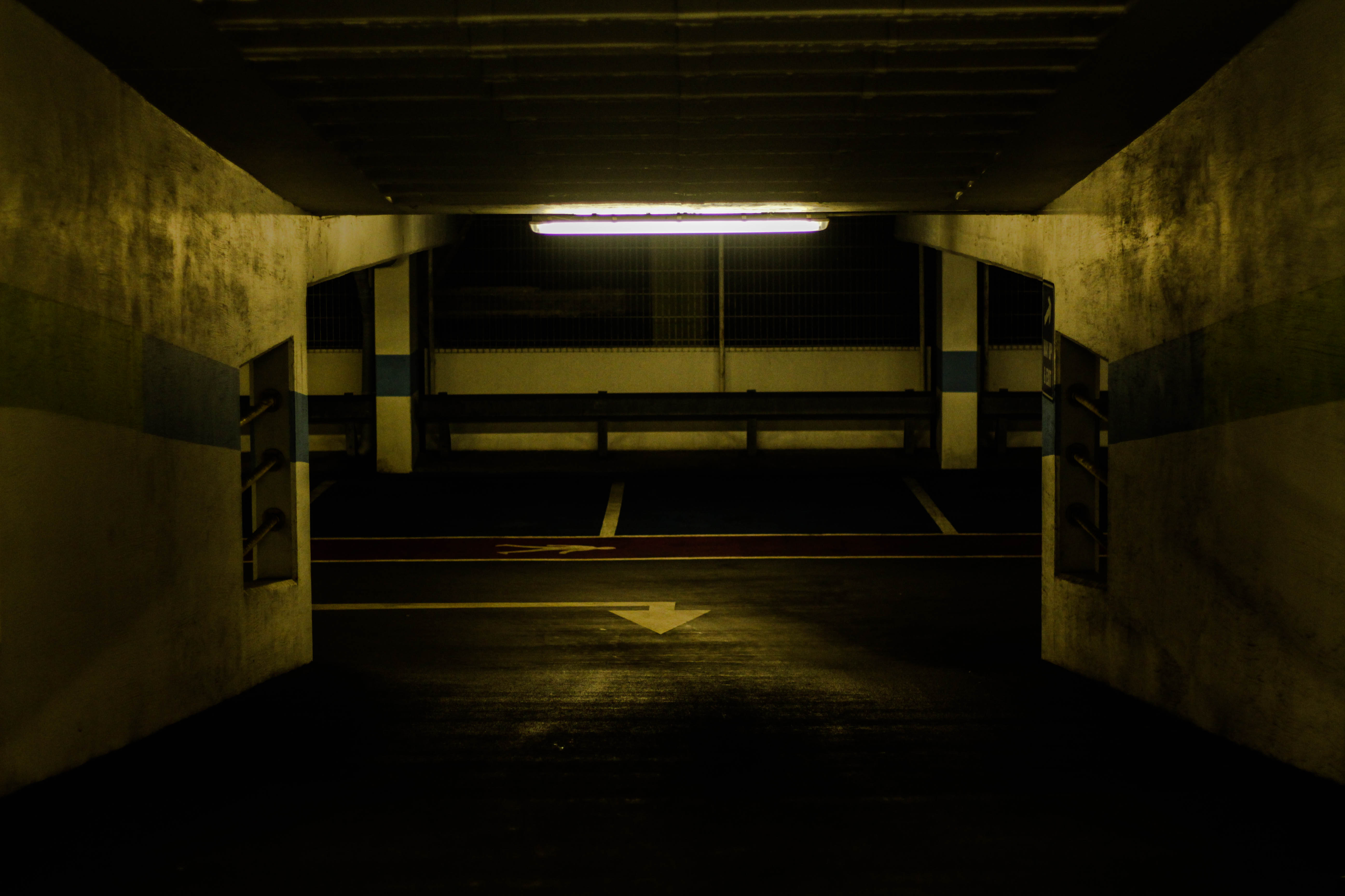 Within this photo I loved the use of a single light source illuminating the dirty walls with yellow lighting, I found that the impression imprinted by this allows a look of derelict and abandonment to the area from how the colours are dimmed with light sources emphasized. I found that the composition was particularly effective from how it was symmetrical throughout allowing for an aesthetically pleasing outcome with the light being the center of the image and the main focus point. The use of depth of field on the far end of the car park wall adds balance to the piece from how the detail is removed from it allowing the viewer to mainly focus on the walls and ceiling without much distraction.
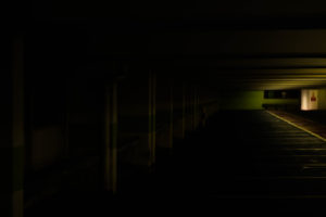
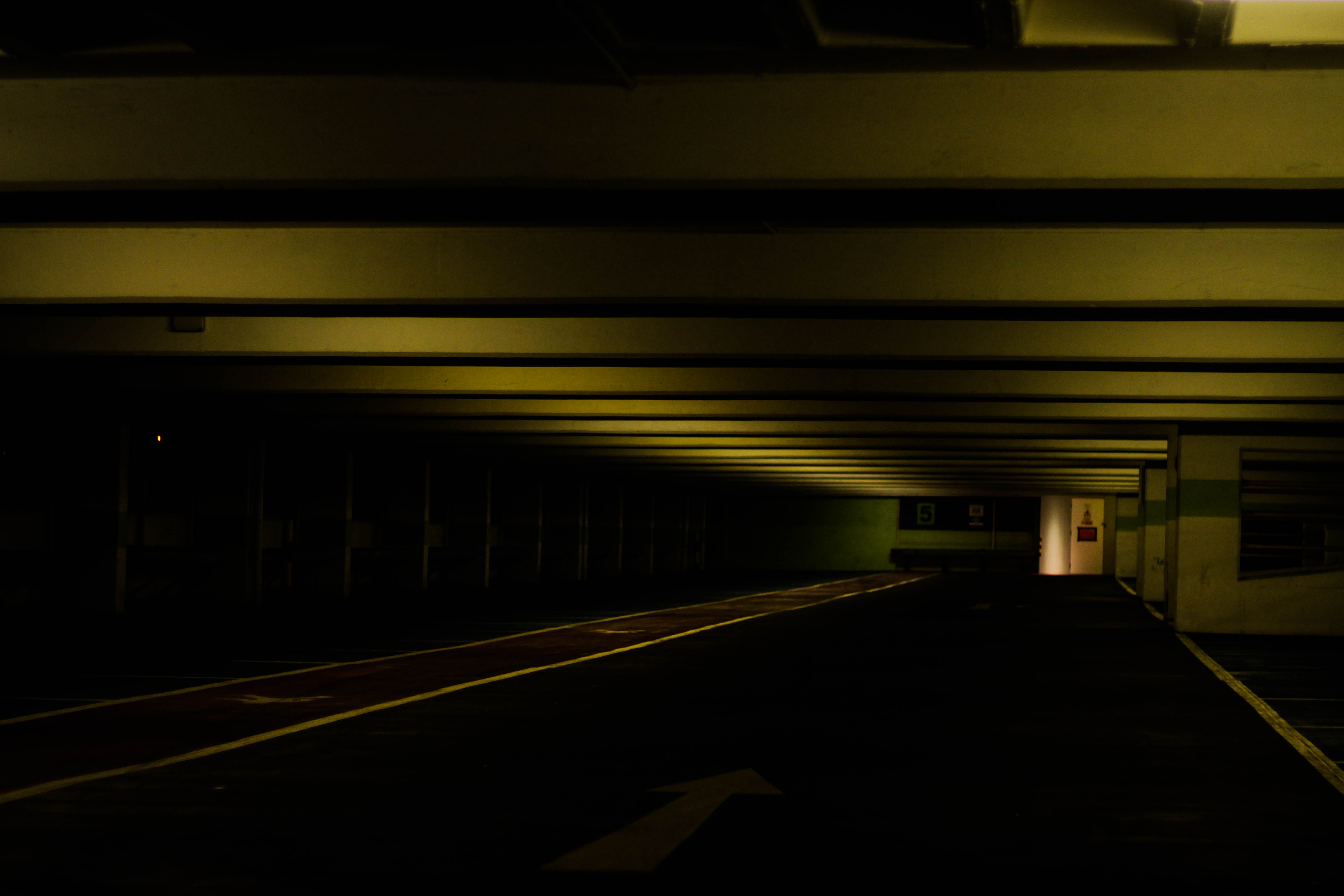 Finally I chose this piece because of how the use of a depth of field and the yellow tinted lights compliment due to how the ceiling is slanted off to the right in the distance. On top of this there is a significant contrast between the floor and ceiling presenting it as a sort of unknown area where the side cannot be seen only the ceiling and exit, with the remaining parts a mystery to what is there. The composition is slanted like most of them, but the patterned ceiling adds interesting features to the piece rather than being head on, presenting it as a large corridor like structure.
After analyzing the images I decided it was time to move onto picking the best image from the five. To do this I need to consider which image related to the idea of abandonment whilst implementing in eerie effect as well, and gives the impression of somewhere deserted by people. This was my end result:
Final Image:
I chose this image as my final picture that I believe is the best outcome from the shoot because of the lighting and composition. The lighting itself presented an eerie and hostile glow illuminating the walls surrounding it, revealing the dirt covering the walls that could suggest the place is hardly every used. The contrast between the light dark emphasizes the idea of abandonment and how nothing is there, this is also complimented by a depth of field which blurs out the parking spaces suggesting that nothing is every there and humans have forgotten it. This is accompanied by symmetry which creates aestheticism throughout the picture with the light being the central point of it and both walls boxing the photo in creating a cramped feel to it.