Editing process
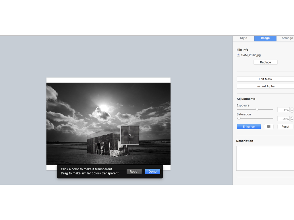
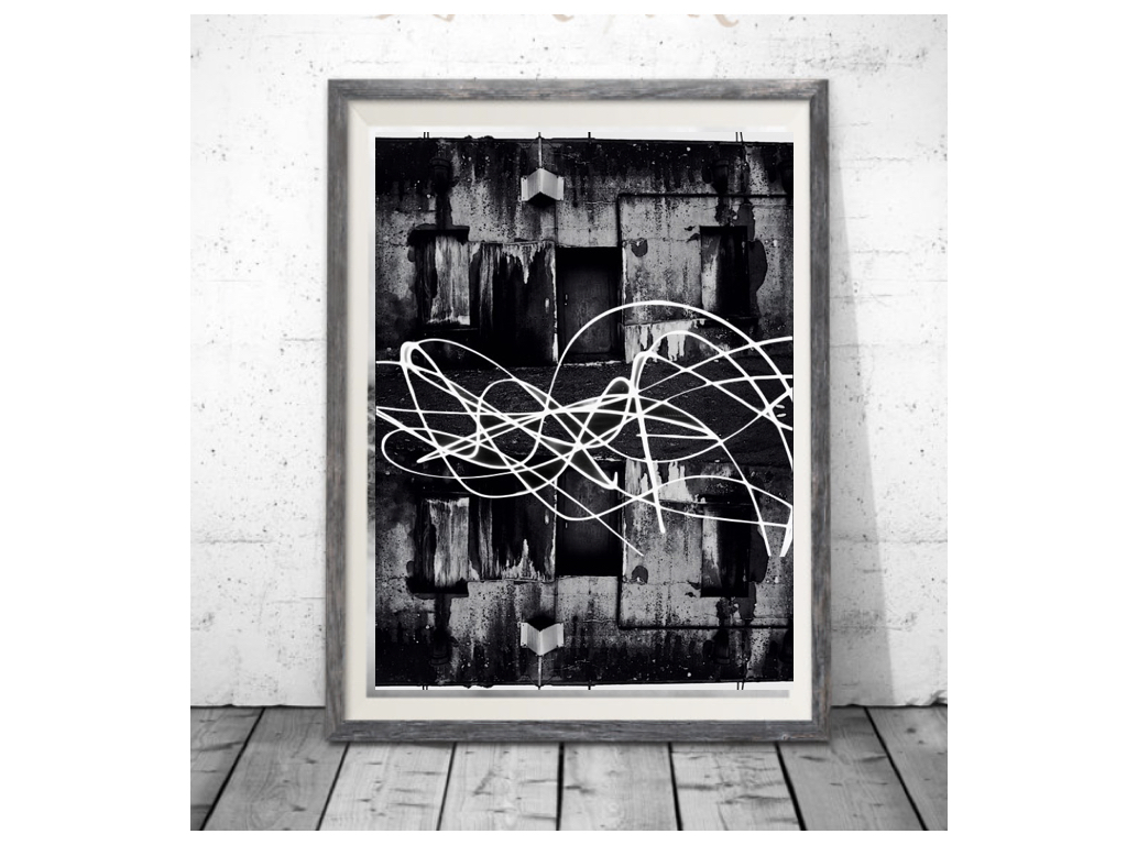
firstly when editing I went through all my shoots in order to find two images in which I think could make a successful overall composition,to do so I would line them up and think of a composition in which I could make.When I decided on the images I focused on the structural images and used an instant Alpha editing technique in order to remove the background and only use the part of the building that from a three dimensional shape and also has strong hold to its shape.I then layered the image in order to place the structure on top and arrange it in the composition middle so it looks effective on the light itself,Furthermore I edited the tonal qualities on both images lowering the saturation making the images both the same tones but creating a lighter exposure on the stature as it has a more realistic feel to the light shining on top of it.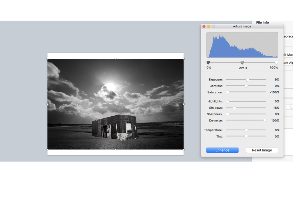
Here are the settings before I edited the images I found it important to find the same level of structure and the sea and lower half of the bulling so it looks realistic and also have surrealism within the image due to the believability.
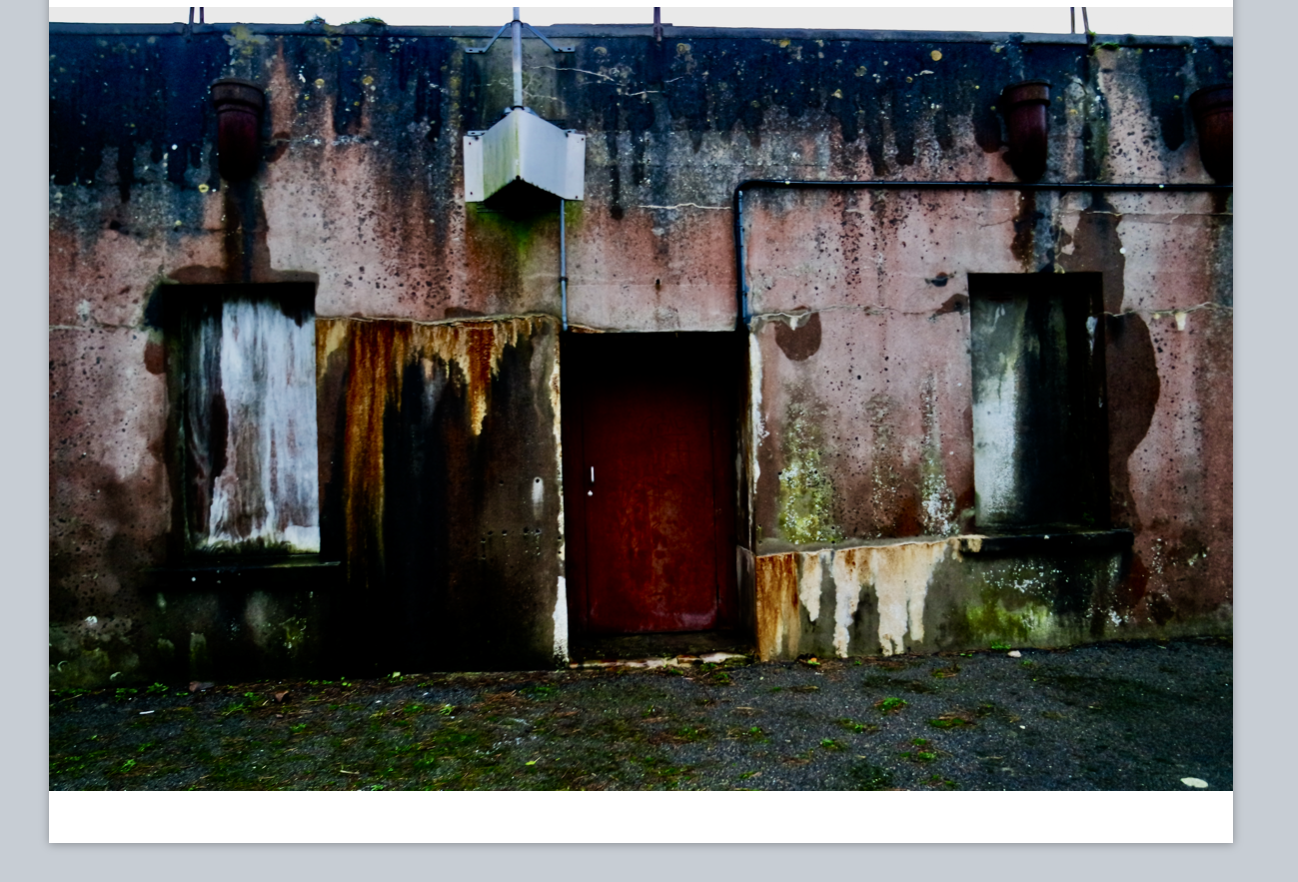
This was there original images of the houses I wanted to capture this due to all the lectures seen wihtin the building and an old sense of abandonment wihtin the image,furthermore I thought the shape and cut would work well when repeating the image due to the straight lines and form.
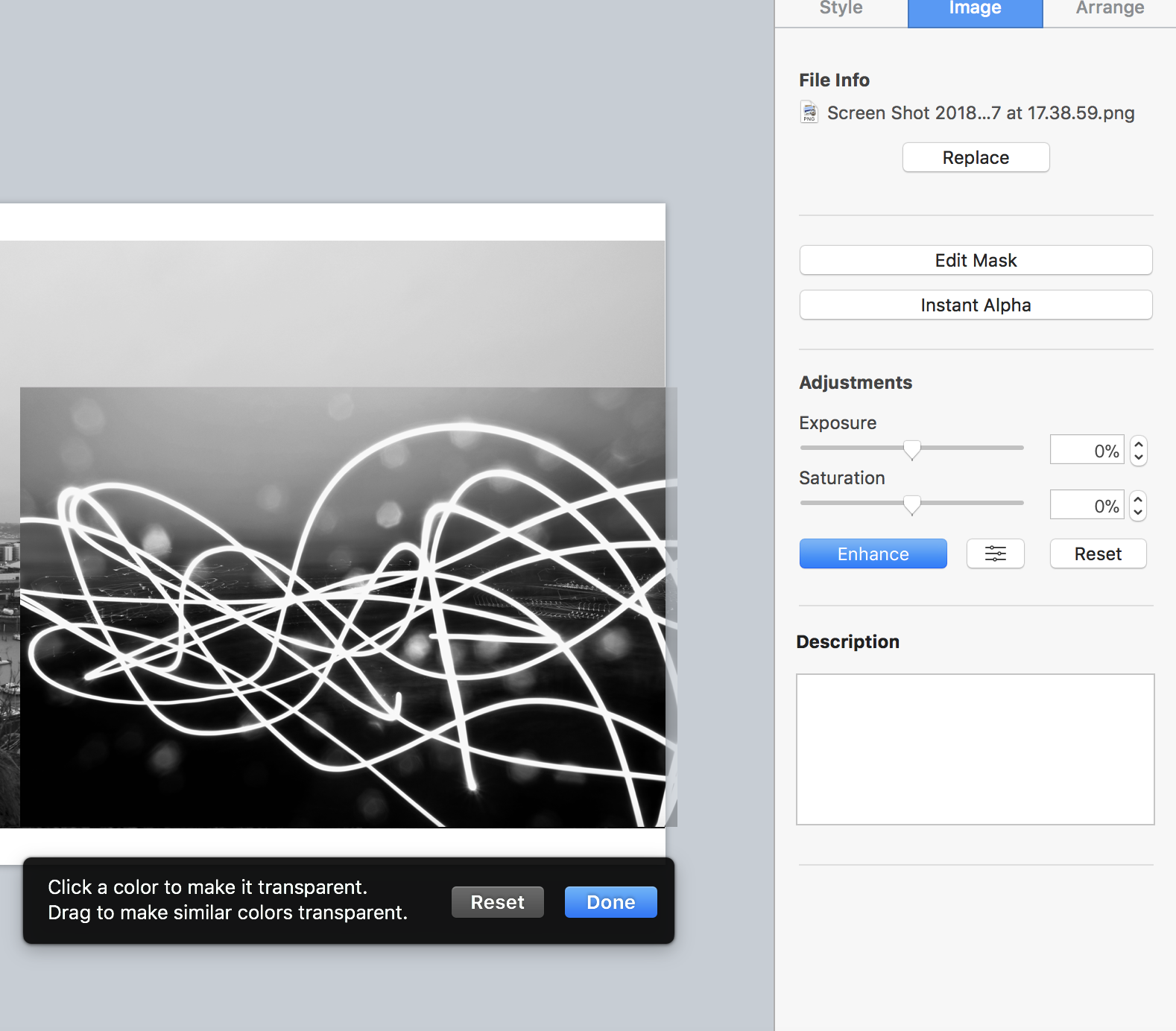 For this image I wasted to capture a slow shutter exposure on the light and show a movement over a city shaped thought it had strong abstract qualities but would look affective when layering an image.
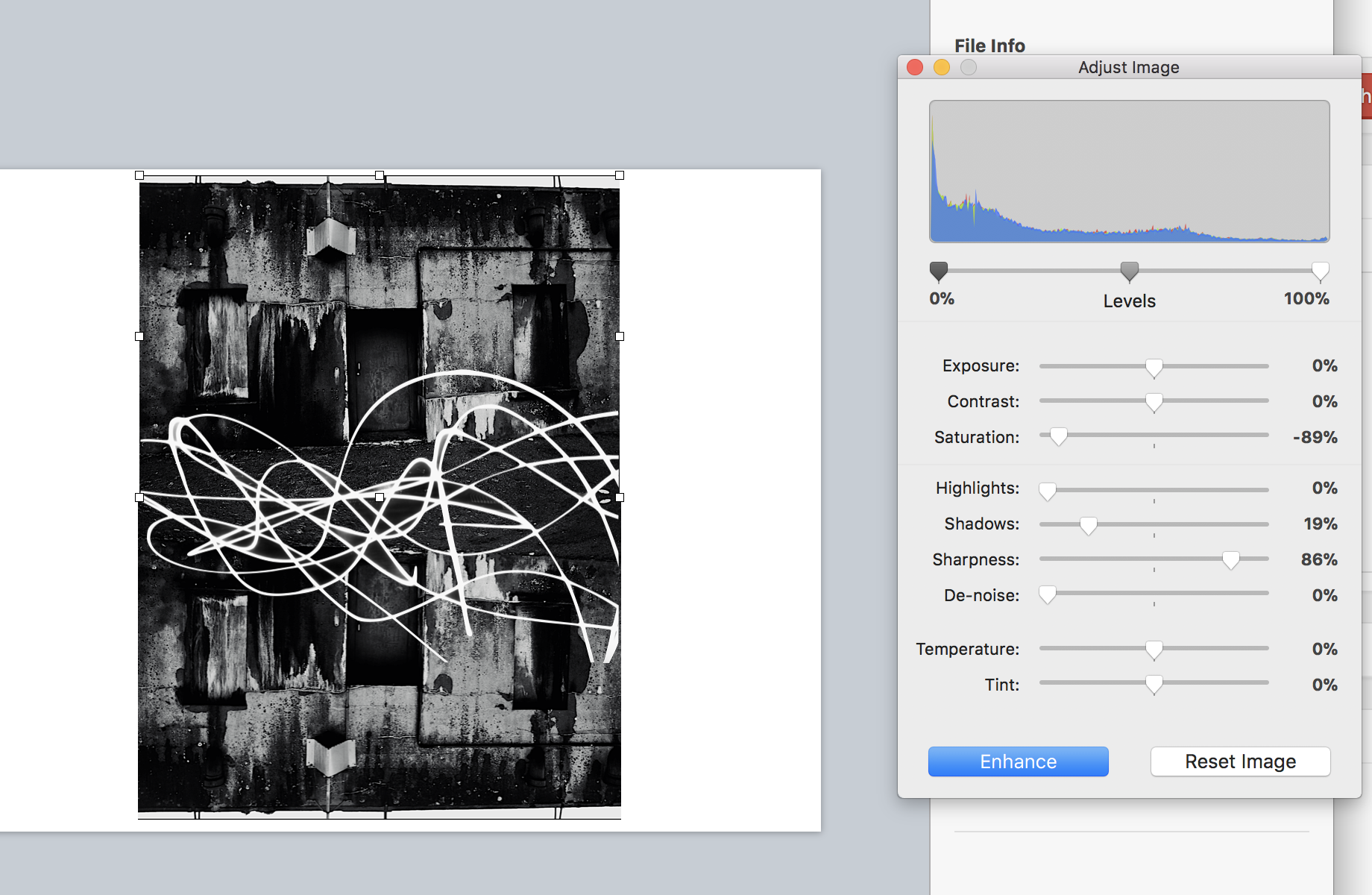
Finally I flipped and repeated the house images and adjusted the tones as above, I then used alpha once again to remove the black from surrounding the light exposure and then applied that to the image over the top structure in order to show an effective strand throughout the piece and an equal sizing.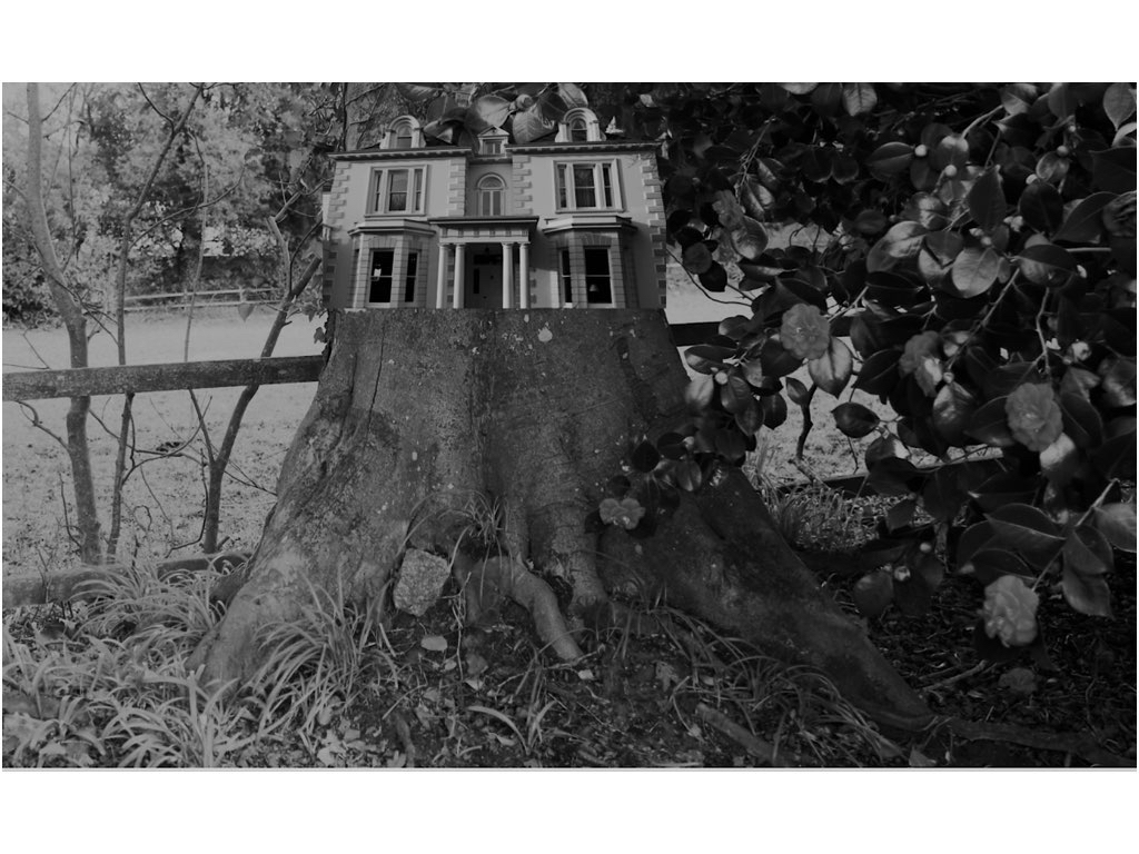
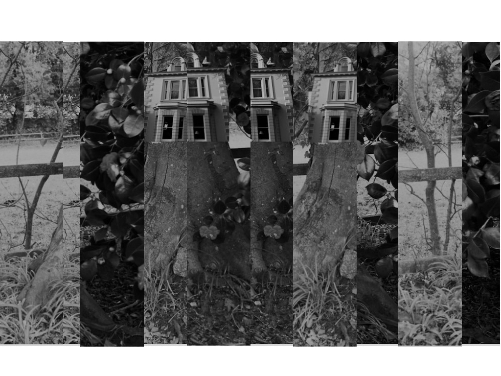
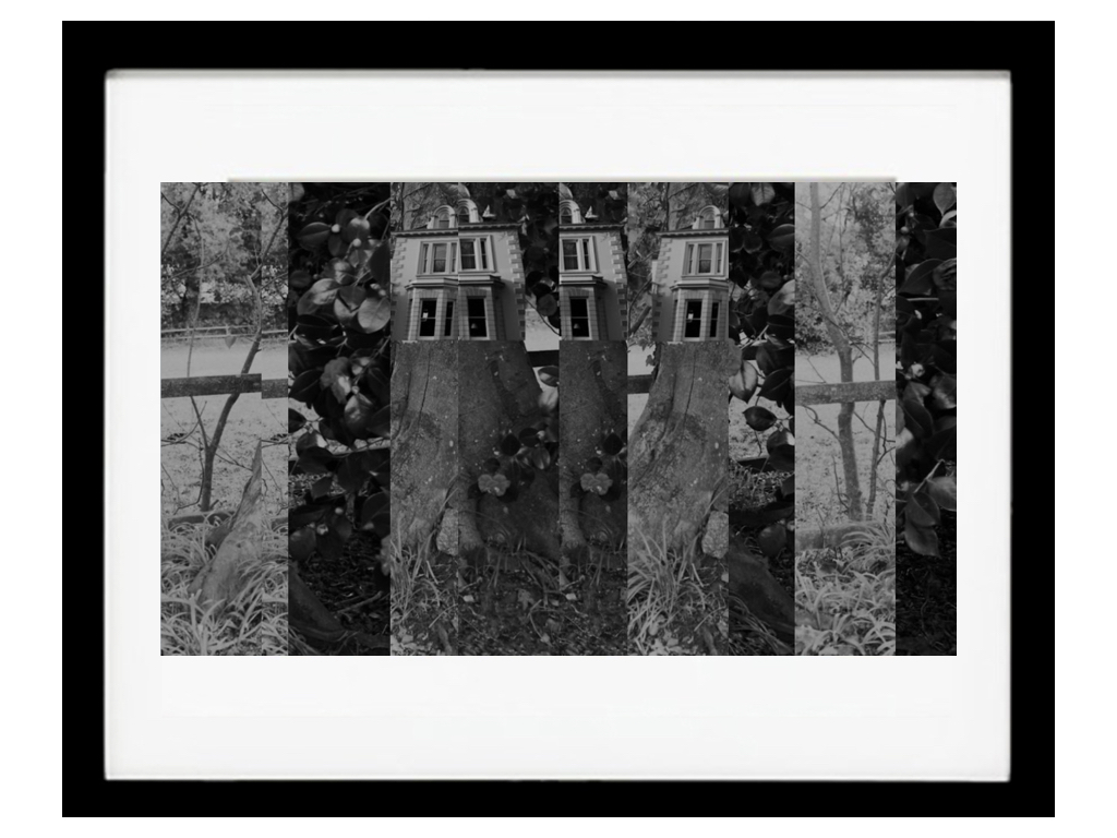
To edit this image once again I was separating the house for the surrounding background and using the dame tones to attach the images to each other,Although It was mostly important to capture the size and insure it was equal to the size of the tree itself.I wanted to additionally experiment within how I can change the lines and overall image by cutting and resizing with them into separate sections of the piece,this can be shown here:it shows different sections and different tones yet you are still Able to see the original piece itself.
Presentation ideas / printing solutions
For presentation I think I want separate ideas but for all of them to compliment the individuality of the image itself:for the first image due to its simplicity and power to speak for itself I think a black frame with a white boarder would be effective in a large print out ,when doing this I thought due to the dark tones to all the images they would all look best in black frames wihtin different cuts and sizes of frame and inside displays.
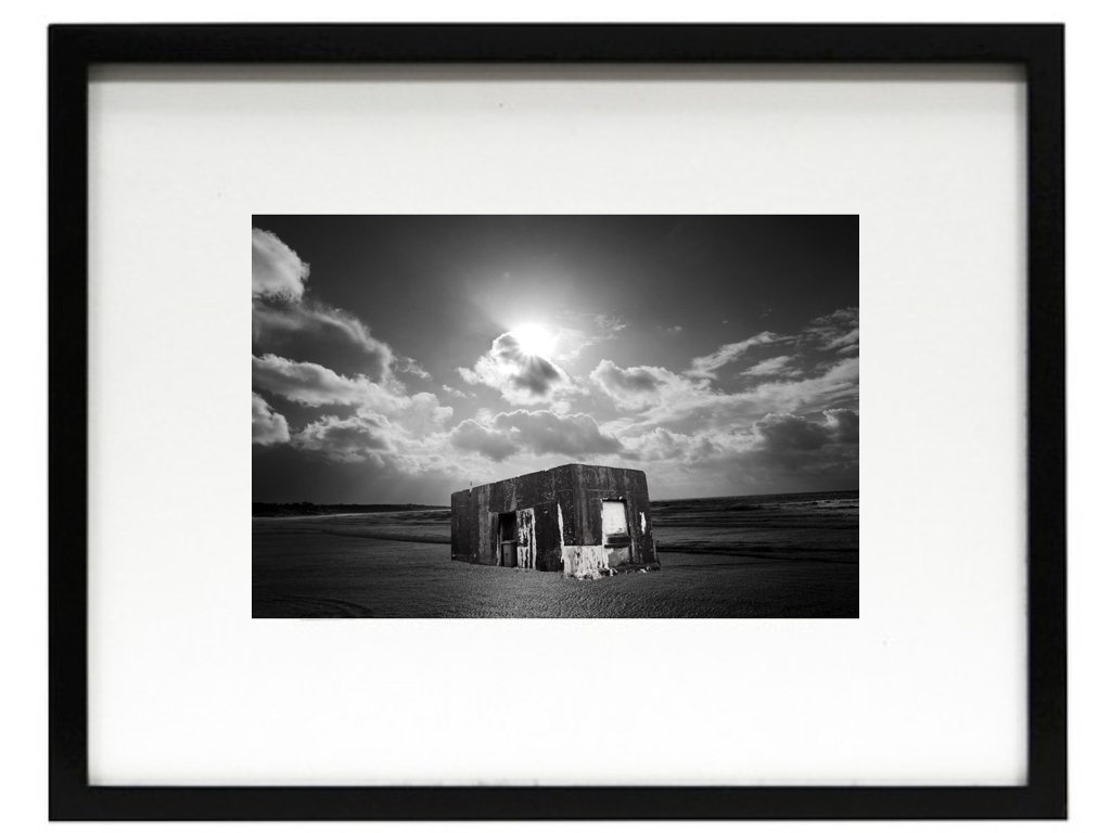
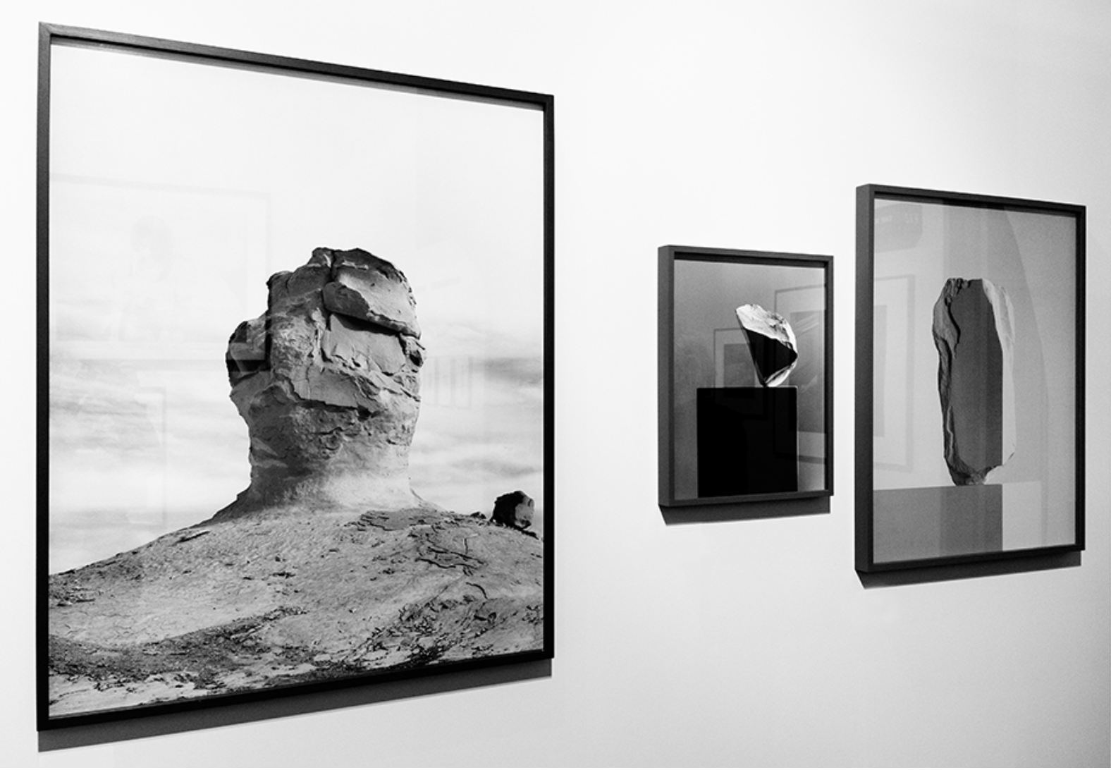
My idea was somewhat based off of this, using different sized and thickness of frames to enhance the I ages themselves but I would also include a white inner boarder to the images, as I think this looks effective.
Compare and contrast to your chosen photographer
Noemie Goudal
Her work has a clear connection to my response of hers, showing structures being on water and showing themes of surrealism and mirroring techniques such as she does in water,I was too able to show a opposition of their natural equal, wether that be sea and a man made mould or a manner and a tree, and or be a city scape conflicting with an urban building,I used her sense of dimensions throughout my pieces and my final also using many different angles of interest.I think I have successful shown a sense of her ideas and format of nature though my work and through a comparison you will be able to see the same theme continuing through.
