My second shoot idea would be a close up face shoot focusing on editing and tones:
aim;To be inspired my tonal beauty and a relationship within the vulnerability of facial insecurity and a lack of vision,also an unknowing of reflection and being.
editing techniques:
1)A substance to cover the eyes
2)Dissolving the image itself
3)Bluring the image over the face and also to create a sense of movement.
4)Poke holes within the image to create a source of light and lack of being.
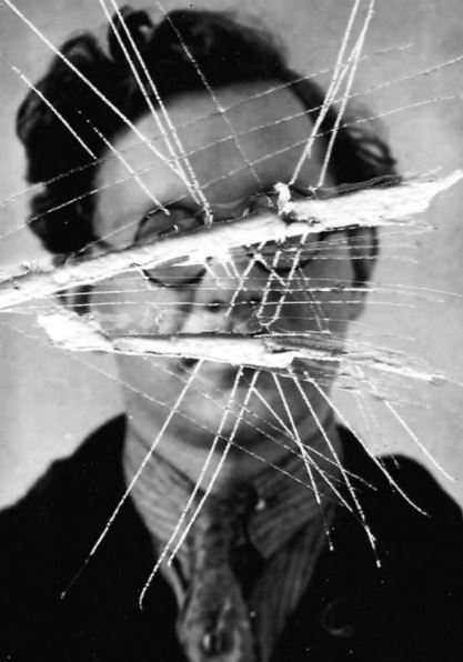
For this piece I was inspired by the abstract and more hardship and lines within the piece itself, it shows a harsh lines and brutal ship in order to symbolize a removal of ability to see who they are and express and talk about who they are and emphasis that lack of identity.there is also a harsh contrast within the beauty and close up of the face and the visor and abstract destruction of the rest of the shoots. there is also a theme of negatives and how the images have and as if they are an outcast.
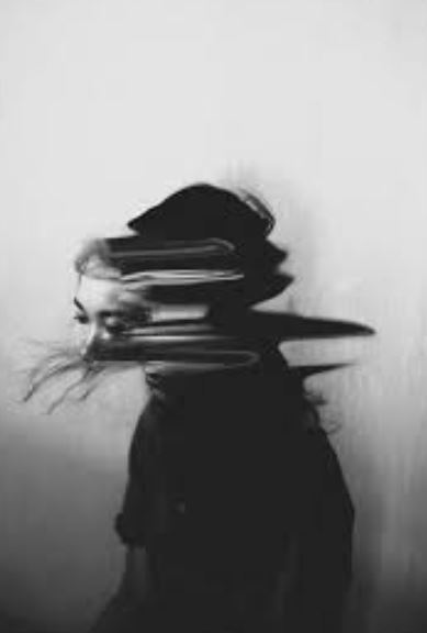
For this I was inspired by the lack of face and the movement of the nudge altogether,it shows a development of their personality and overall.I also want to show an interposing composition within this work so possibly using hands over the face to show an interesting miss direction of the piece itself. I like the way in which the face is still completely in connect and it is only the neck that is a somewhat diffusion of the body.It is very abstract but still clear demonstration of lack of identity within a sense of confusion.
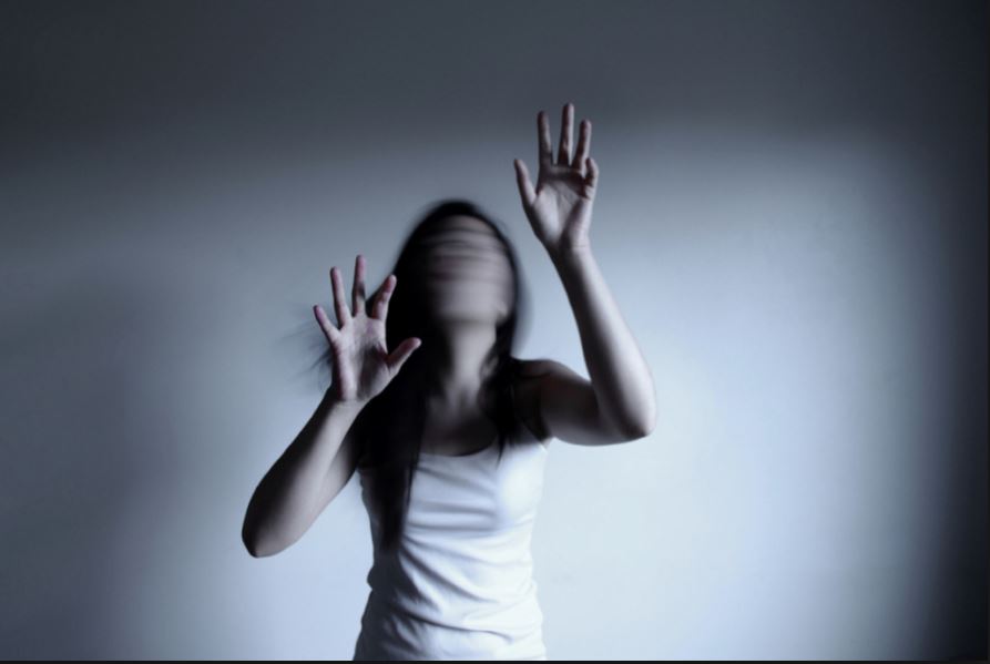
The overall composition of this piece is interetsing as it shows a grasp and focus only upon the body.The blur this time is focused more upon the face and a stillness of struggle upon the body itself, I like how the hair blends in within the movement of the face.The hands show an effort to grasp,perhaps in order to indicate a sense of release of wanting to hold onto something,perhaps a past memory or trying to grasp themselves.
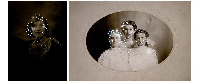
I chose this concept due to the way in which light can be used to enhance the people and show an interesting form of almost censorship, the light shows a gapping within the images, the light does not come through their face but only surrounded themselves indicating the main centered interest and also a sense of their spirit and not surrounding on what they look like themselves.
Artist I was influenced by is:Taylor Chan
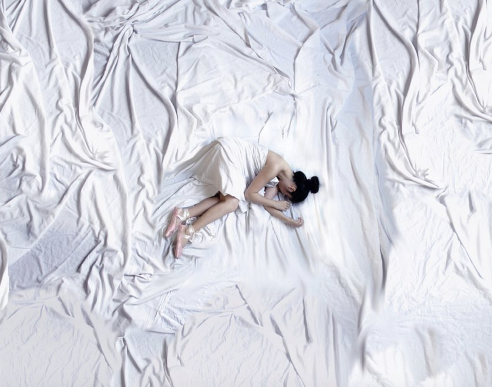
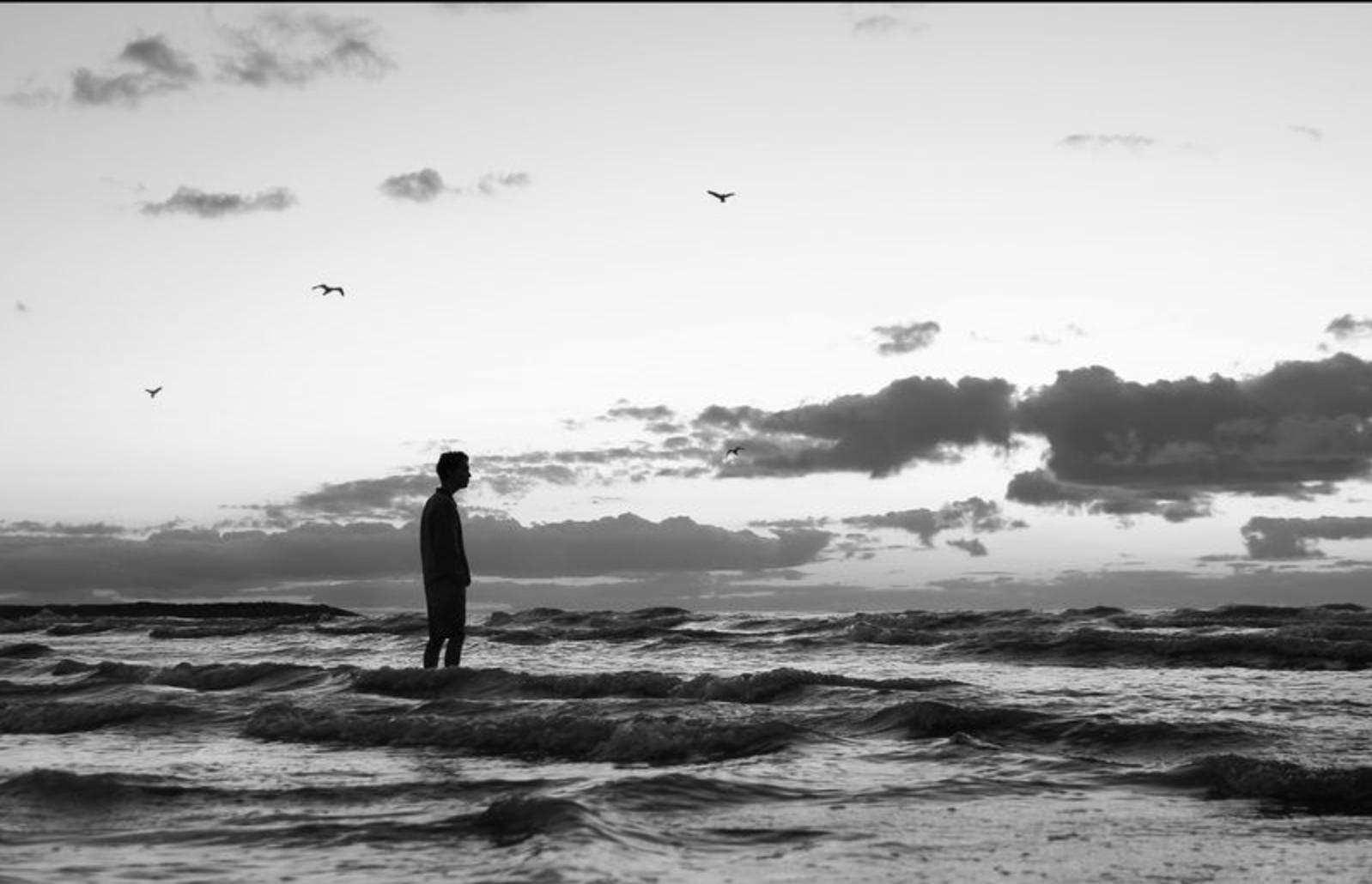
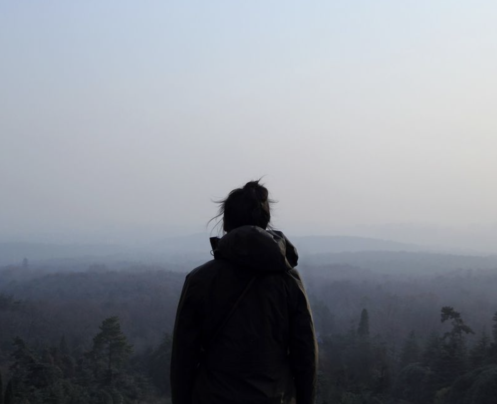
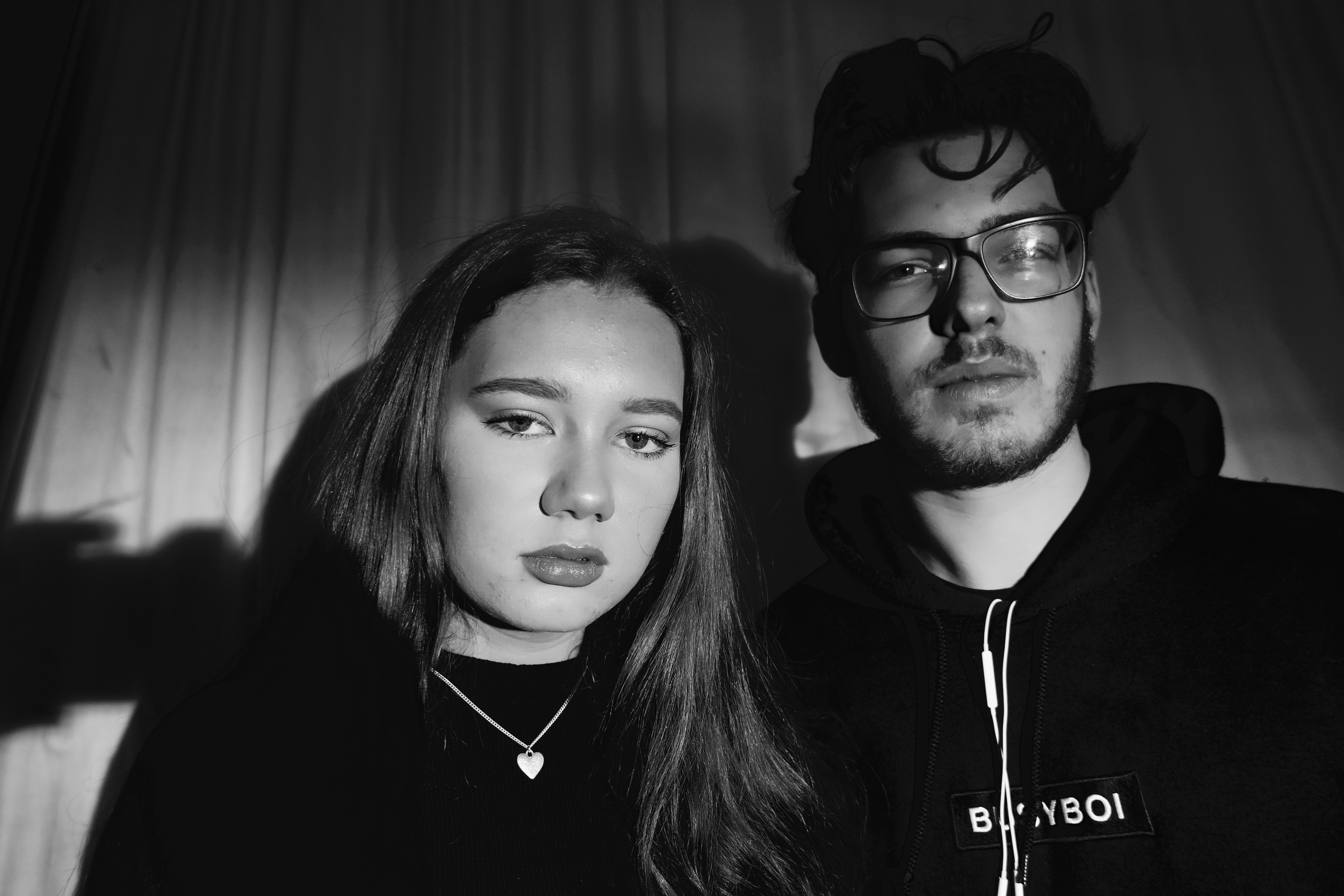
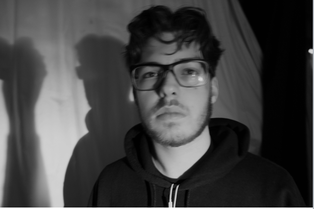
Here you can see my original images I wanted to show a simple composition in order to create effective centered editing.I also cropped many of my images in order to remove any unwanted shadows from the image itself.
best edited images:
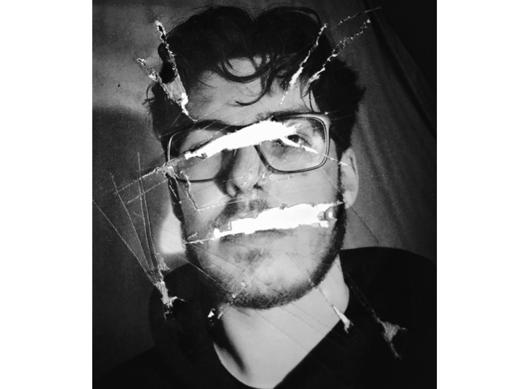
For this first image I was inspired by the first image shown above, it shows a removal of every feature that creates an impact of purpose, there is a sense of aggression swell that I wanted to show through the raggedness of the marks within the paper itself.
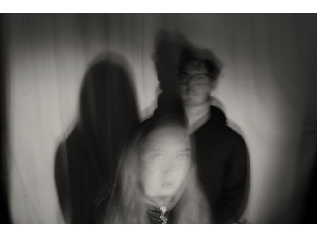 Within this image I wanted to show a blur and repletion of the face throughout my images and how their shadows and positions are the same and there is only a movement within their face, this was inspired by the second images want to further edit this though in such a way that it clearly shows a forward movement and blurring of the face but in a. more dynamic method.
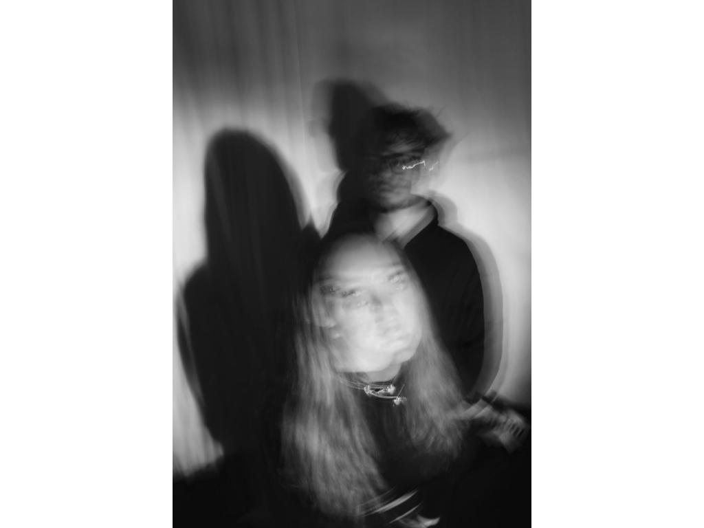
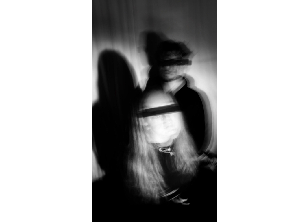
Here I used the image above in order to show a lack of identity again showing a removal of the eyes but in a way of covering them which is not as quite sinister as the previous. it shows a sense of blinding them of covering them fro the truth in a way. And much like below this is the same effect of raggedly removing of covering up who they are. 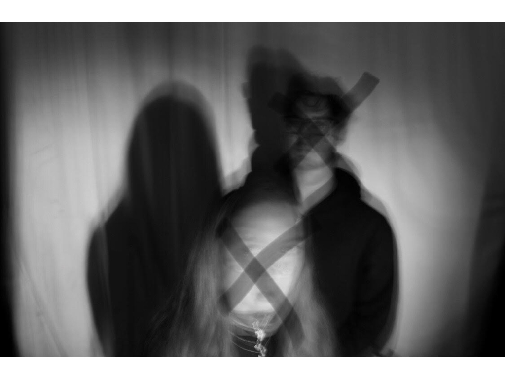
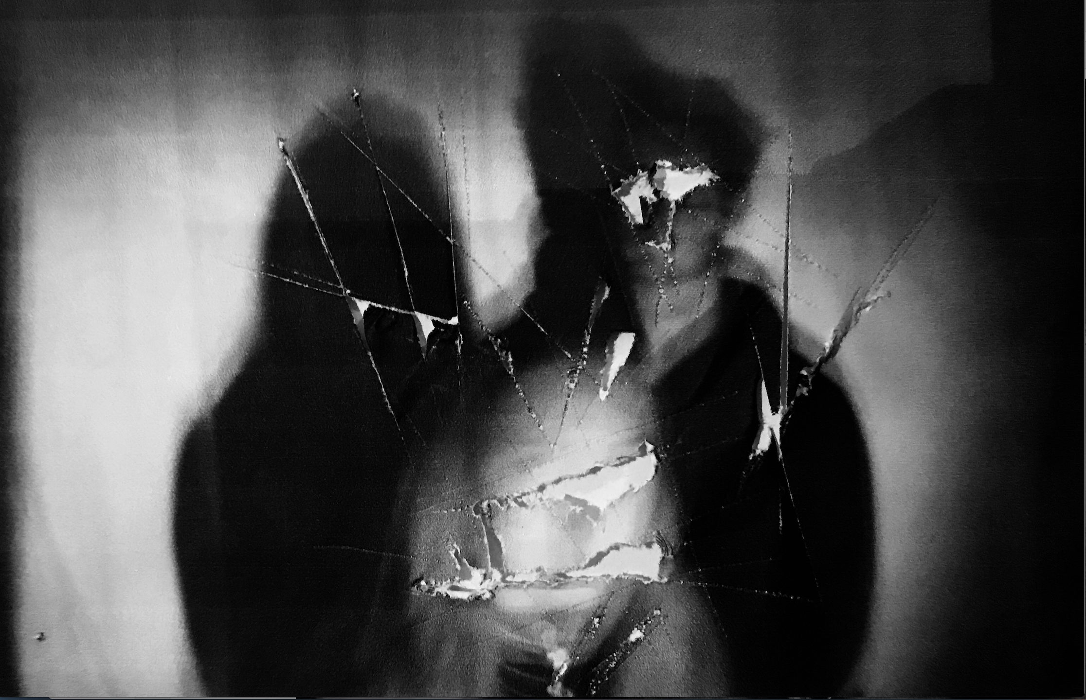
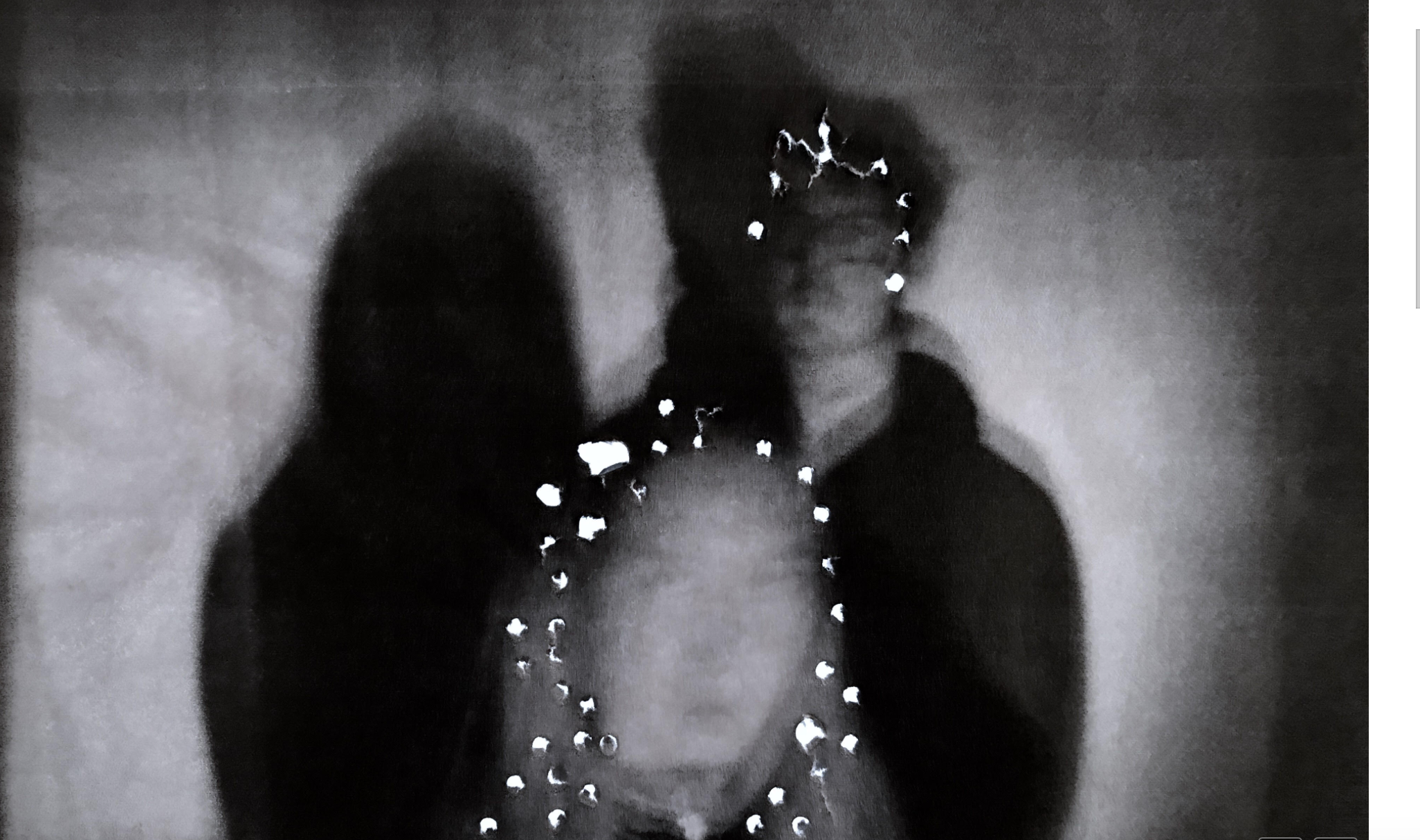
within these two I additionally wanted to show previous editing techniques of cutting out and getting a light from underneath in order to highlight the holes and ragged sensation from within the image.The random marks allow a presentation of harm and unwanted areas that symbolize within the loss of identity itself. It is also enhanced within the slow shutter speed of the piece additionally.

This edit was unsuccessful,I wanted to connote a movement of the face and a sense of blurring but overall it looks more liquefied and not the aspect of loss and movement that I was trying to portray.
evaluation:Overall this shoot was effective by using the original editing ideas and transferring those onto my own personal work,however i do not feel as though these images are the strongest out of this project even though they do show a sense of loss of identity throughout.
