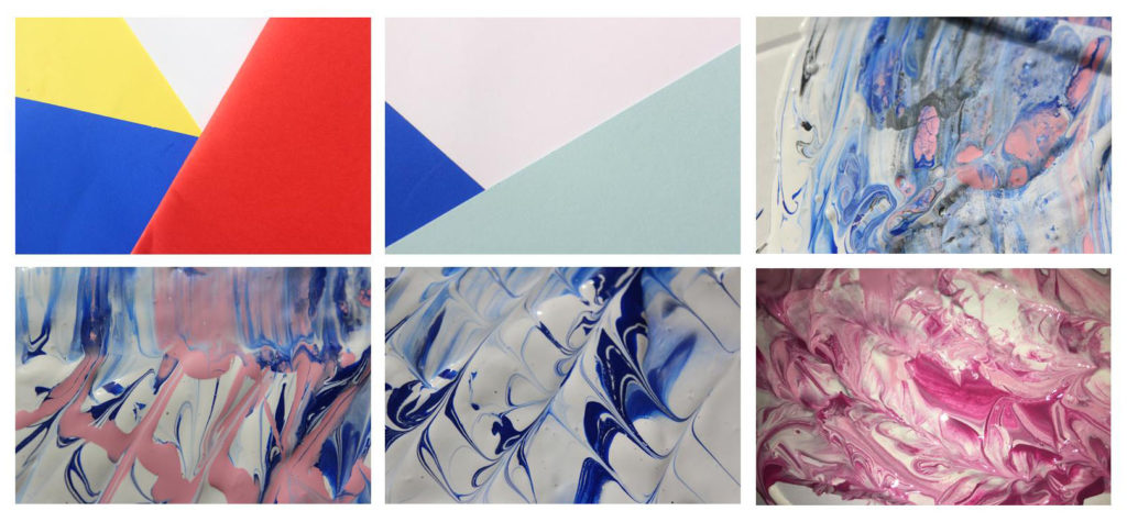
I chose these six photos for my final selections from my colour harmonies and contrasts shoot because I thought they showed a range of styles, patterns and colours. I took these photos in the style of two famous abstract photographers however for my final image I would like to edit them using skills I have acquired during this project.
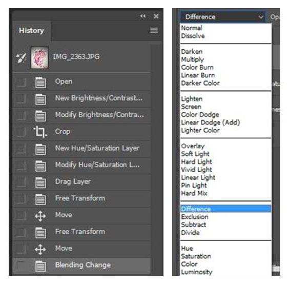
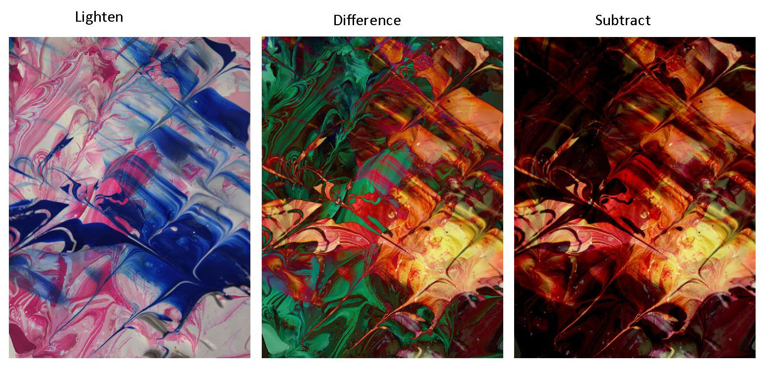
Using these two images from my last shoot I re sized and rotated them so they were the same dimensions. I then added the blue photo as a separate layer over the pink one and experimented with blend tool.
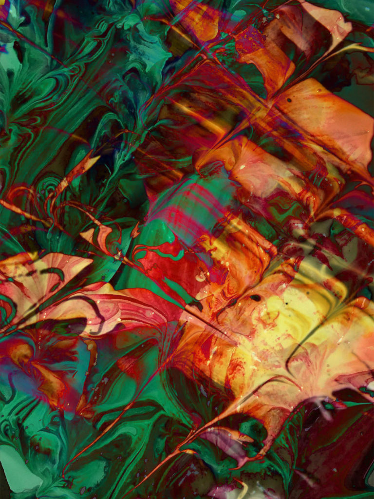
For the first edit i used the blend setting lighten, this removed all the white areas from the blue image so that the pink showed through. This photo did fit the abstract theme however the colours made the photo a bit disjointed and you could still see the original image. For my final image I wanted something more traditionally abstract that showed a mixture of all the techniques I have learned through this project such as shape and pattern, colour and texture. The second image for me showed this the best.
Alternative Final Piece …

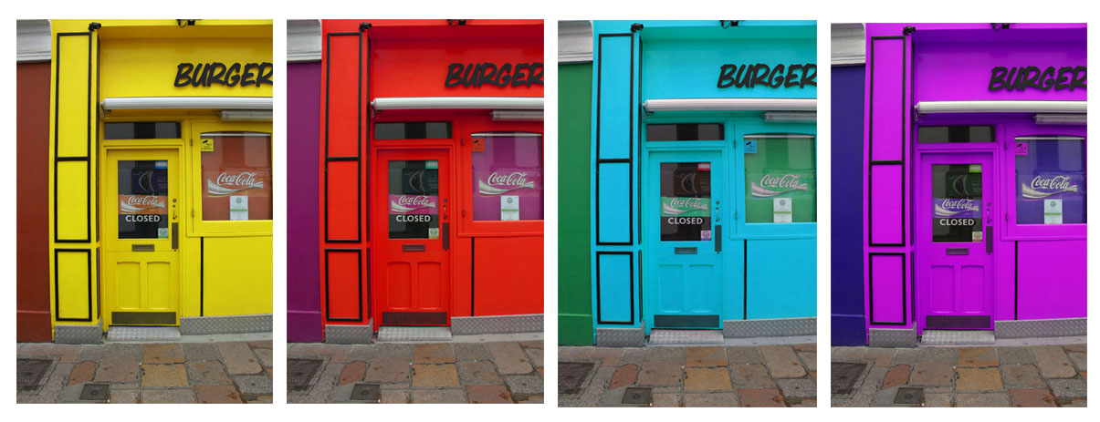
Excellent unit. You have a diverse range of images inspired by the h/w tasks and your own sense of creativity and ability to seek / find. Well done!
However…I think you should Re-select your final images (choose from a wider range of h/w tasks) in readiness for the print process later in the year.
For example : texture images (develop into double exposures on Photoshop)…see me if unsure!