Franco Fontana
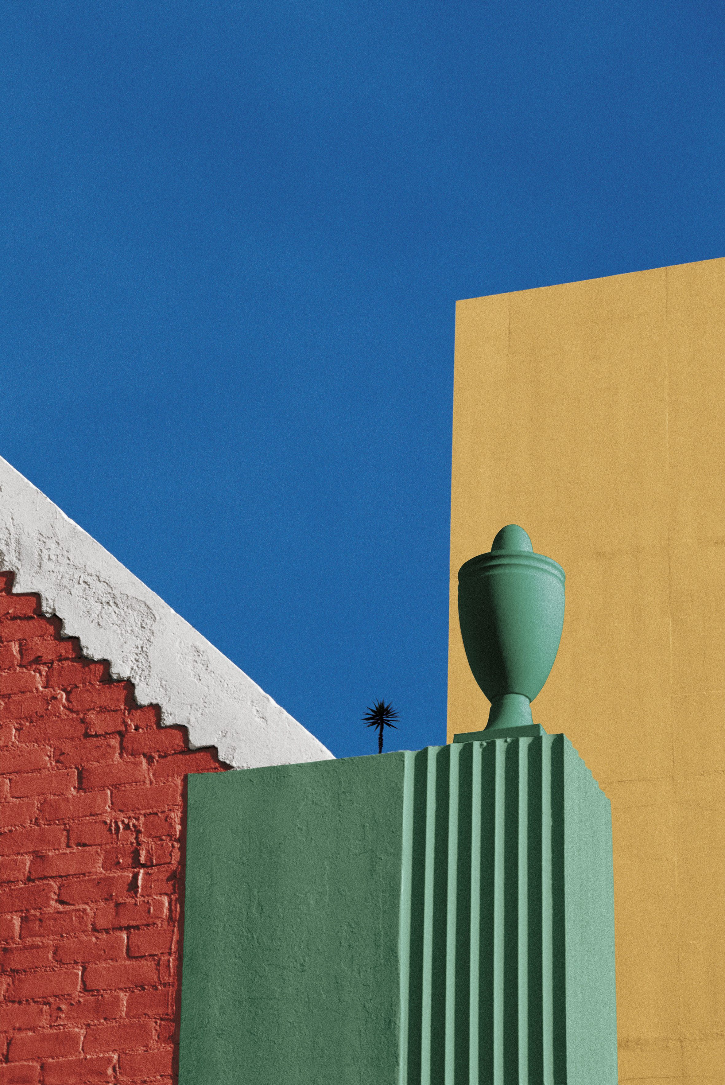
- Franco Fontana is an Italian photographer born in Modena, on December, 9th, 1933. He is best known for his abstract colour landscapes. He is known as the inventor of the photographic line referred to as concept of line.
- Franco Fontana is interested in the interplay of colours and he had based his own vibrant and original language on that. He explored different subjects: urban landscape, portraiture, fashion, still-life and the nude.
- He worked with 35 mm cameras, mostly on location claiming that his studio was the world.
- He began working as an amateur photographer in 1961. His first personal exhibitions took place in 1963 in Vienna, in 1965 in Turin and in 1968 in Modena. Since then he has participated in more than 400 exhibitions – collective and personal – and his work is in approximately 60 museum collections all over the world.
- Fontana doesn’t restrict himself to just the image, he transforms it to something else, probably curious about other people’s life.
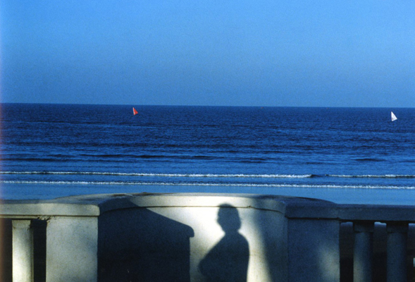
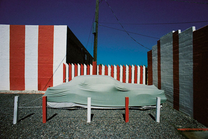
I liked Fontana’s use of vibrant colours on normal objects to emphasize their abstraction. The colours bring out the detail and textures in a subject.
Tamara Lorenz
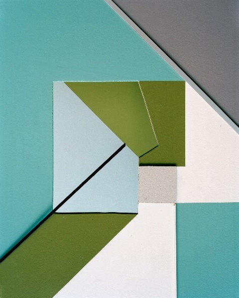
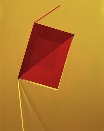
- German artist Tamara Lorenz creates various constructions which she then photographs to exploit their abstract properties. The addition of strong planes of colour provide another source of contrast in addition to those of line, shape, tone and texture.
- Rather than photographs of things, each image seems to create its own reality. Consequently, the viewer is unable to recognise a conventional subject and is occupied with the business of looking.
- Perspective, distances and proportions and weight — the layouts convey a merging of different layers with unclear allusions that is not verifiable in reality. The photograph generates its own media-based reality analogous to the paradox of objectivity.
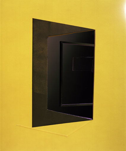
Tamara’s use of simple objects to bring out dimensions based on perspective inspired me to consider the same techniques when taking my photographs.
Image Analysis
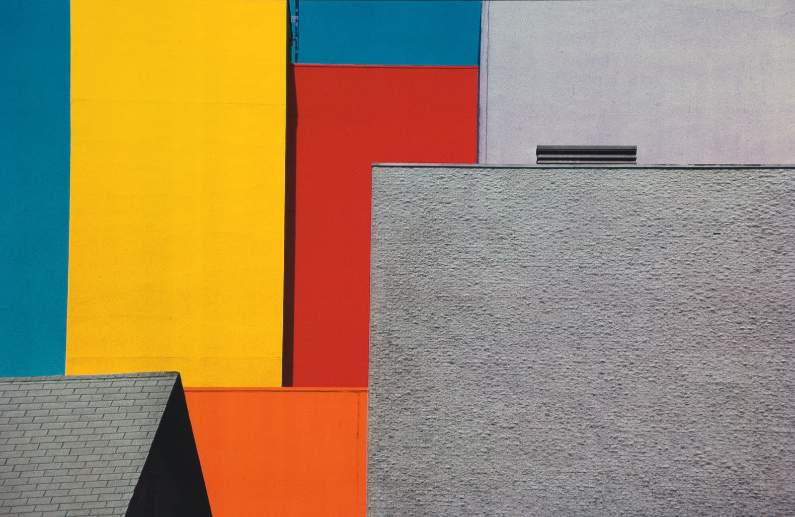
Fontana uses natural lighting in this image to show off the vibrance of the warm colours in the walls and the cold colours in the sky.
Franco Fontana uses a hyperfocal distance which allows for everything to be in focus, this makes the buildings and the sky become part of the same layer so that everything feels 2D and flat. It allows for him to present the textures in the grey buildings and the rooftop in the bottom left corner.
The image does not fit into a rule of thirds which increases the feel of the images abstraction because the vibrant and colourful shapes are in random locations.
Fontana had long found as much inspiration in the city as in the countryside. He saw in our built worlds more than buildings, surfaces, objects and colors. Through his camera he captured the moments when shadow and light appeared as solid as stone.
My Work
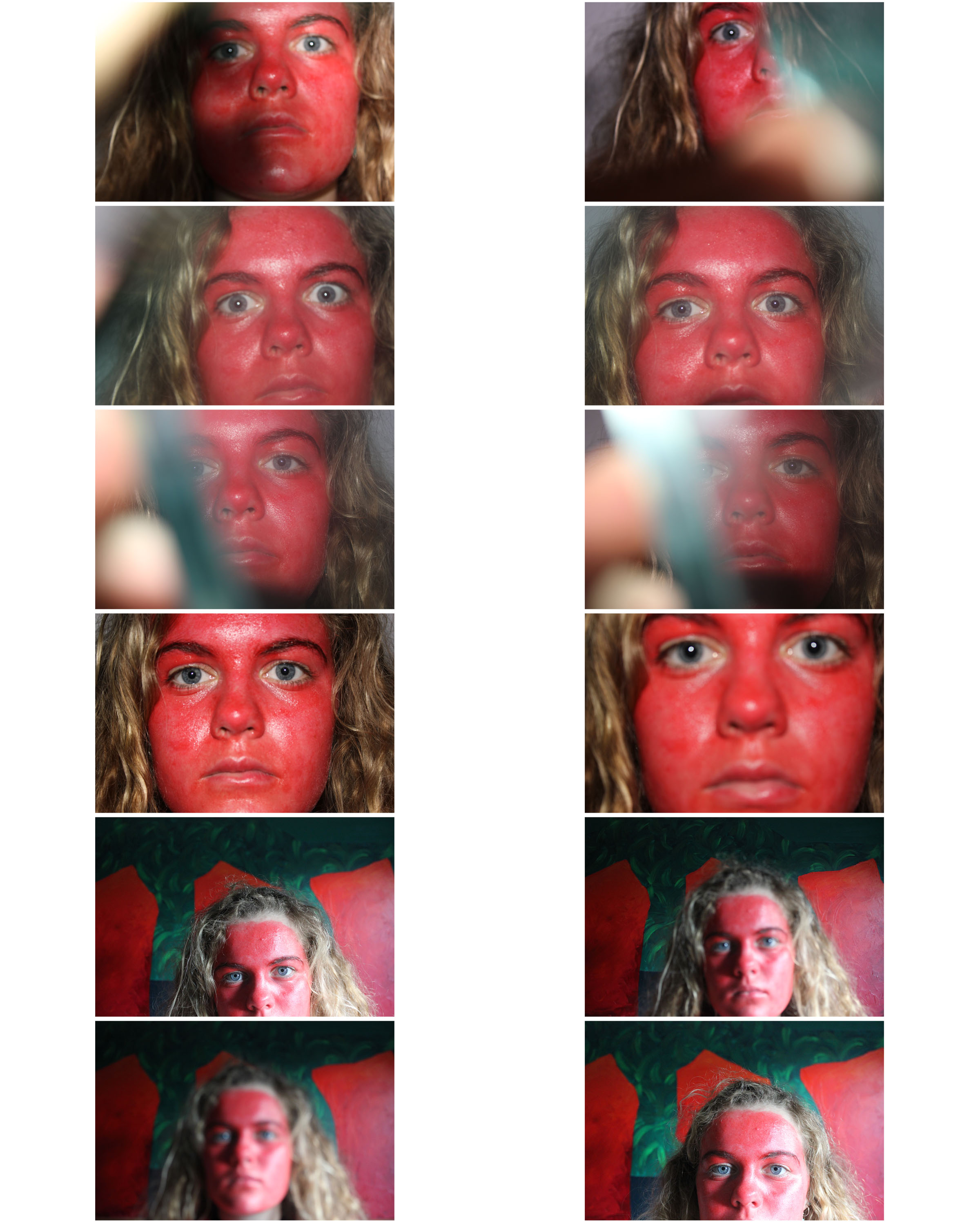
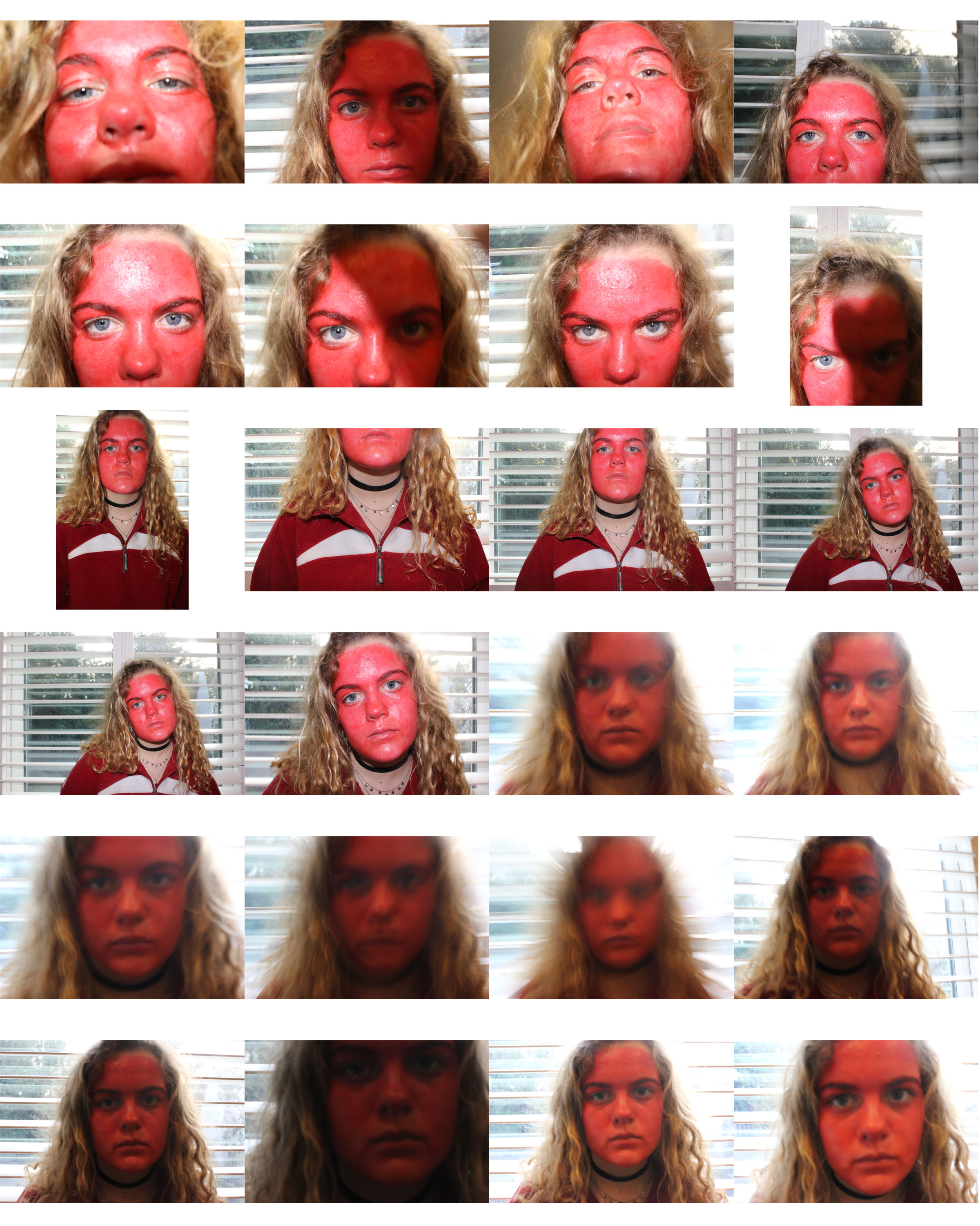
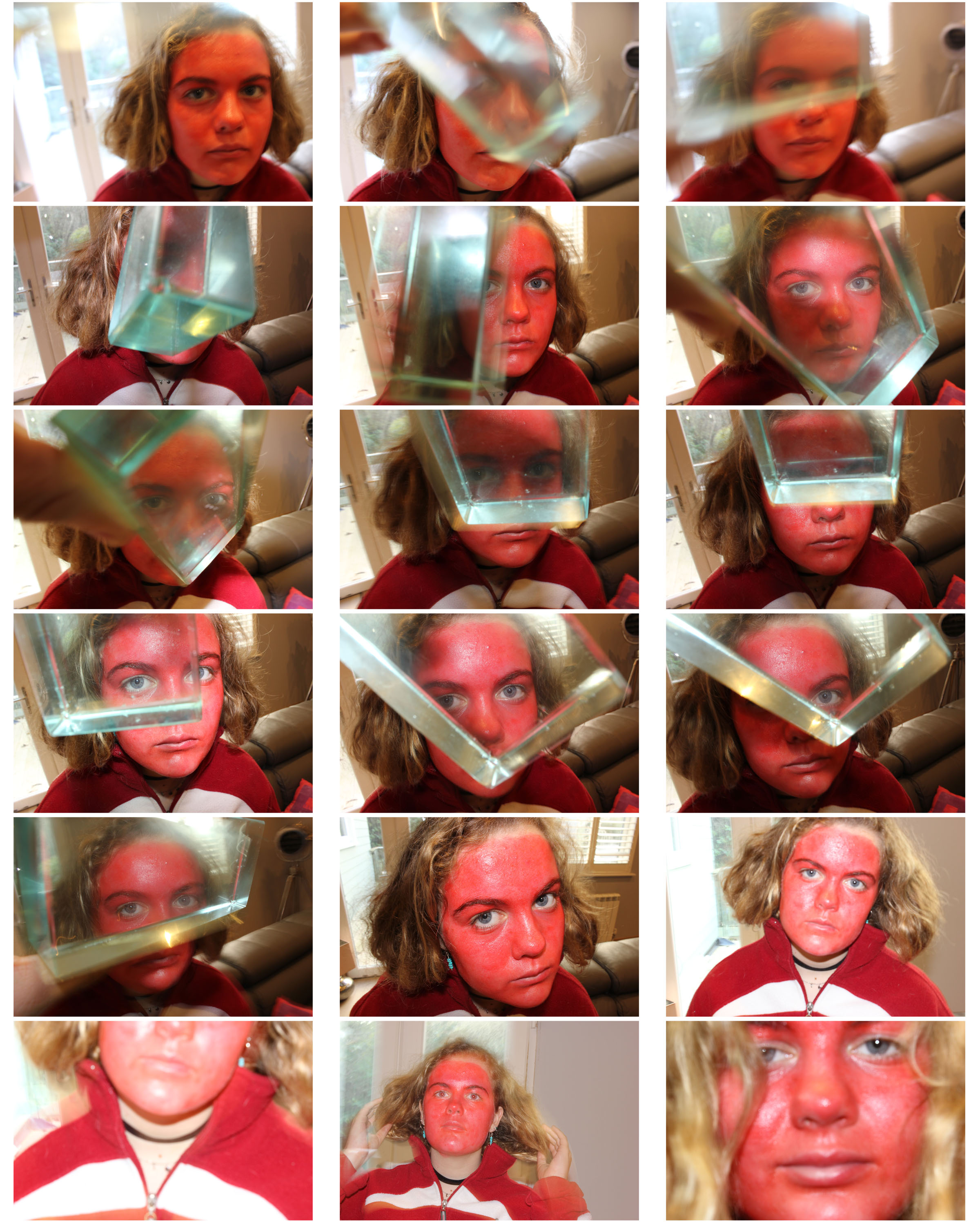
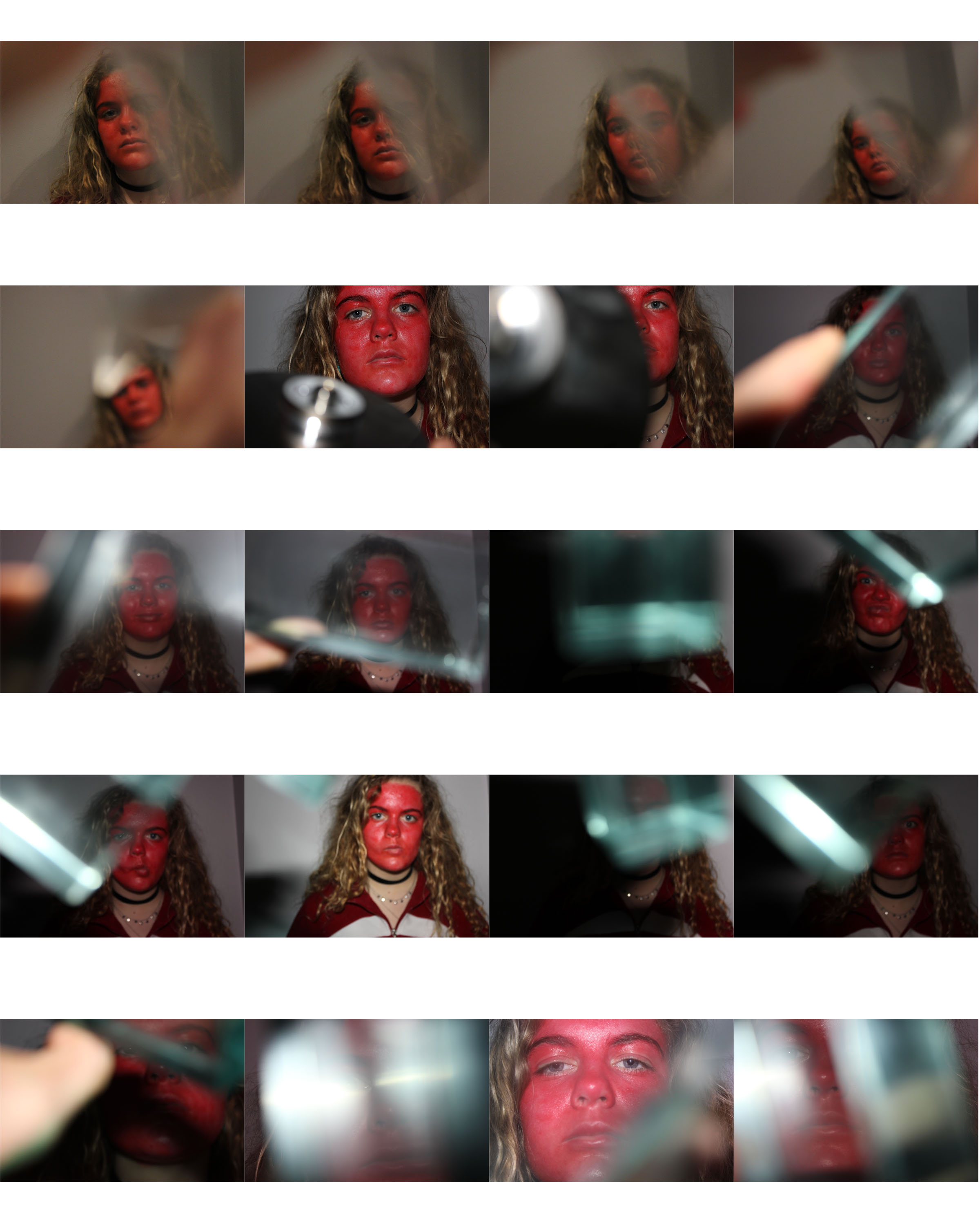
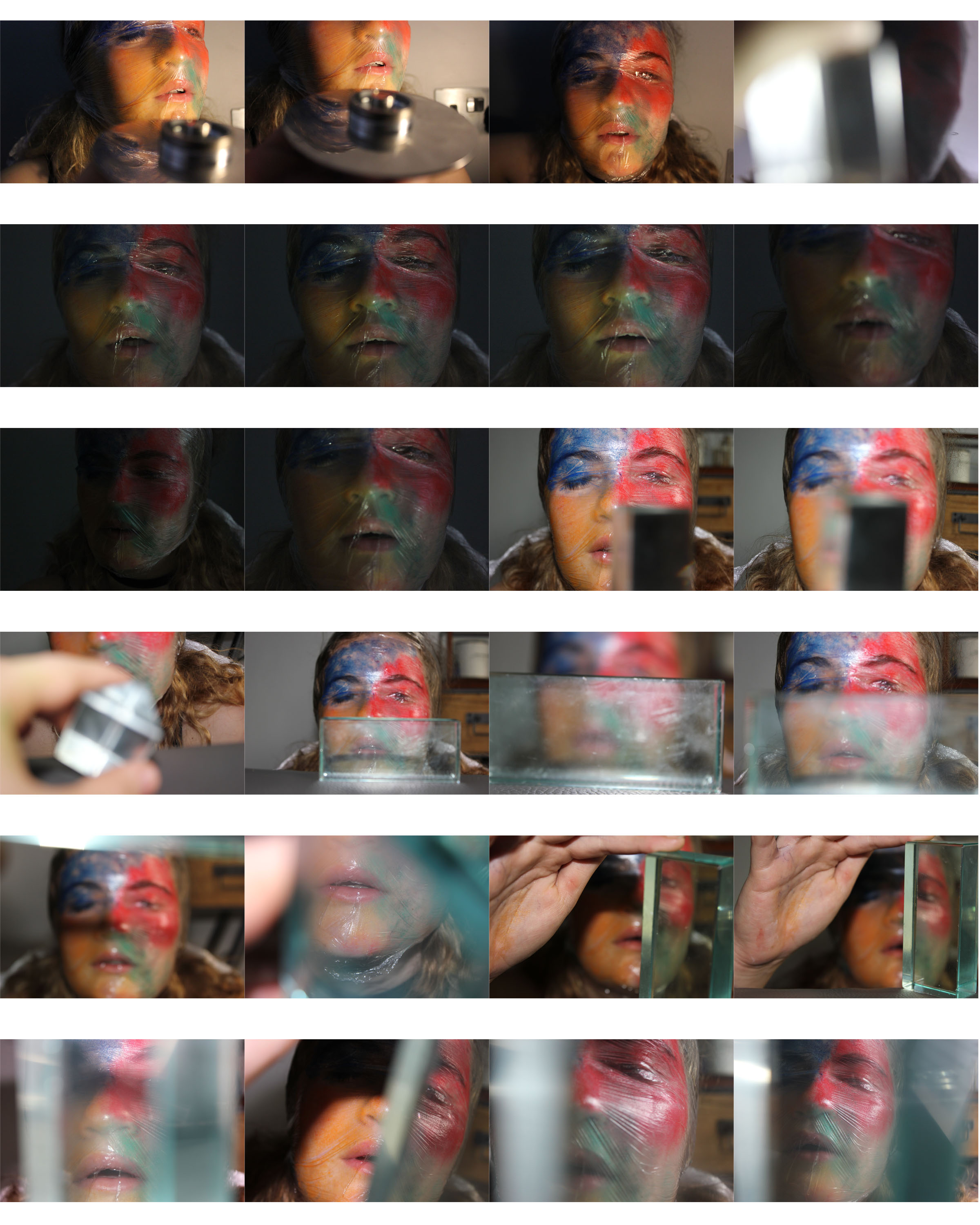
When taking the portraits, I painted face in different warm and cold colours to emphasize the details and textures. I placed glass blocks and prisms in front of the lens to sometimes distort the image so that it became more abstract.
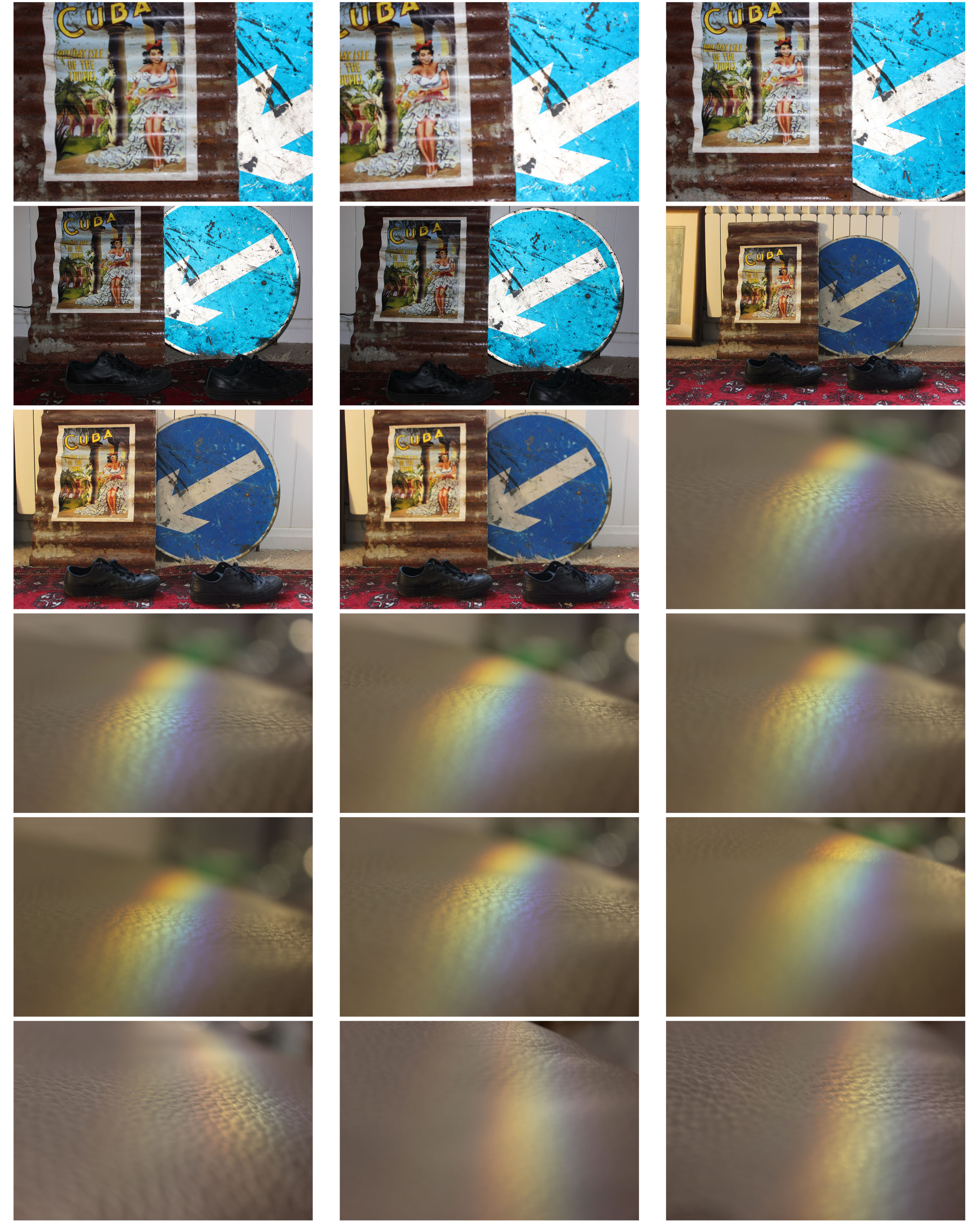
I placed the prism next to a light beam so that it would split into the different colours.
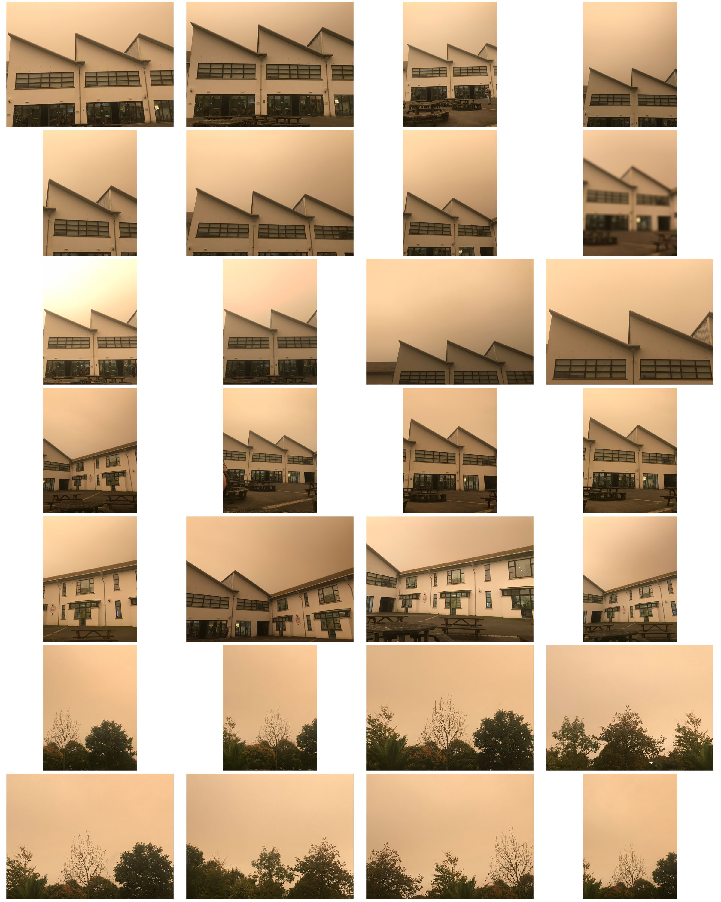
I took these photos from my phone of the outside of the school building. I liked the shapes and repetition of the different roofs. On the day, the sky was a yellow colour due to abnormal weather so I felt it would be perfect to take photos of and see what it looked like after editing.
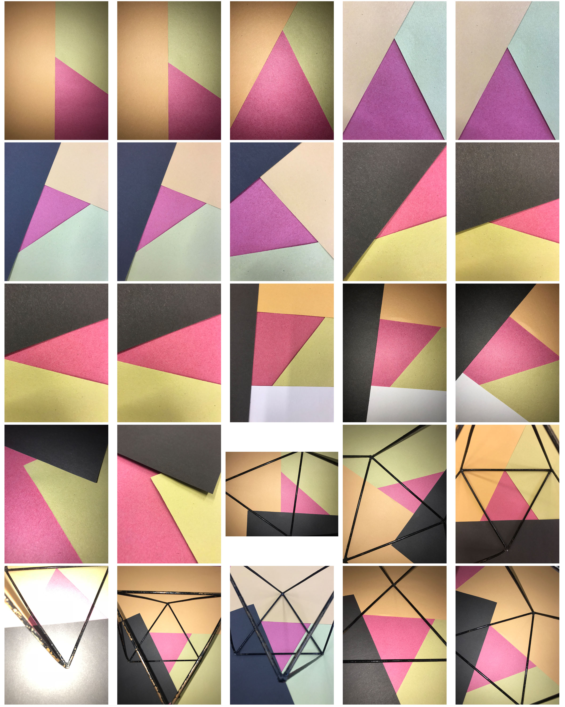
For these final images, I simply took photographs of different coloured paper layered over one another for dimension. I found a 3D metal shape next to it so I added this into the picture for abstraction.
My Edits
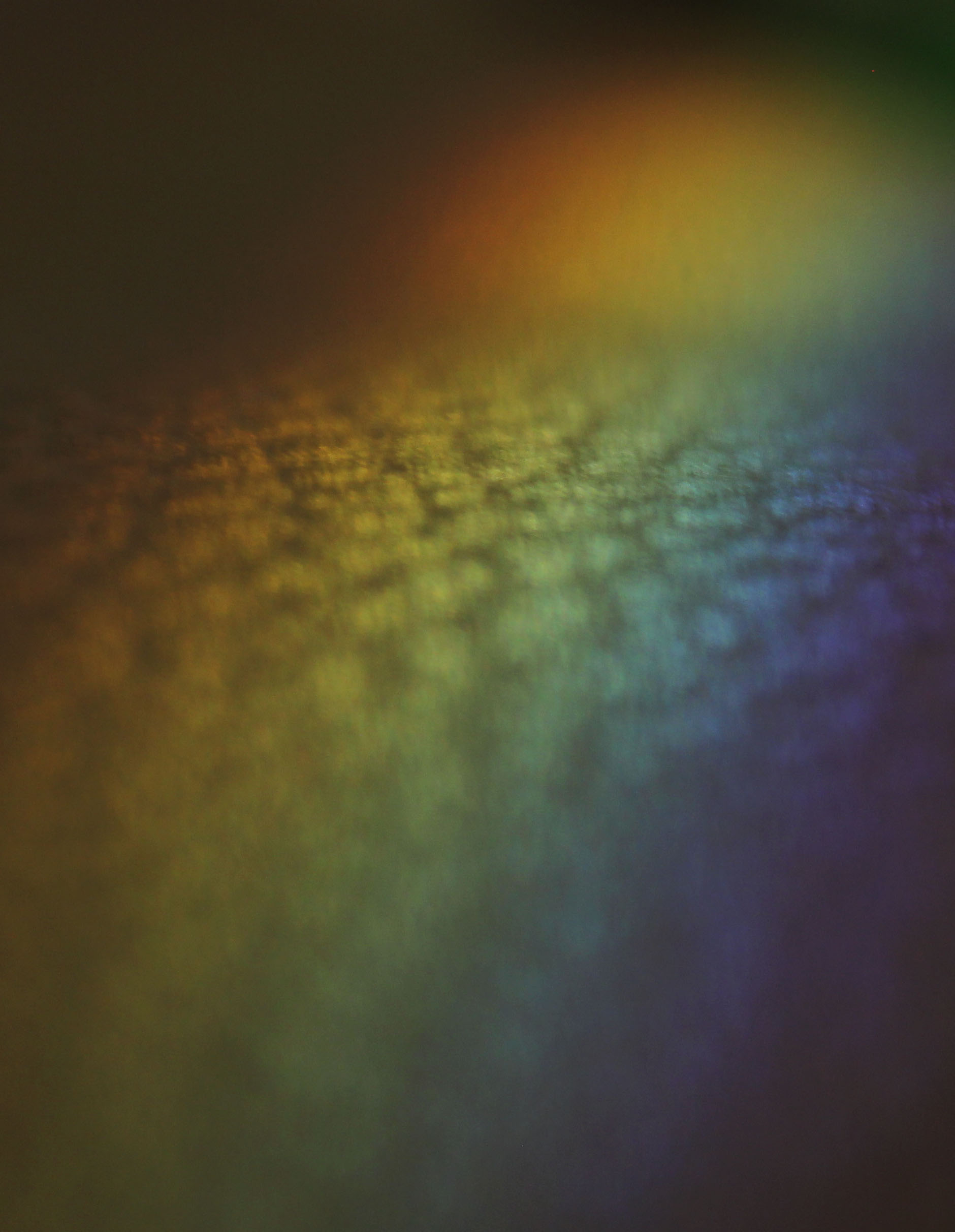
I adjusted the levels of dark to light in this image to show of the spectrum of vibrant colours in the middle. I also increased the contrast to emphasize this. When taking the image, I used a narrow depth of field to put the focus on the colour in the fore and midground so the image had dimension.
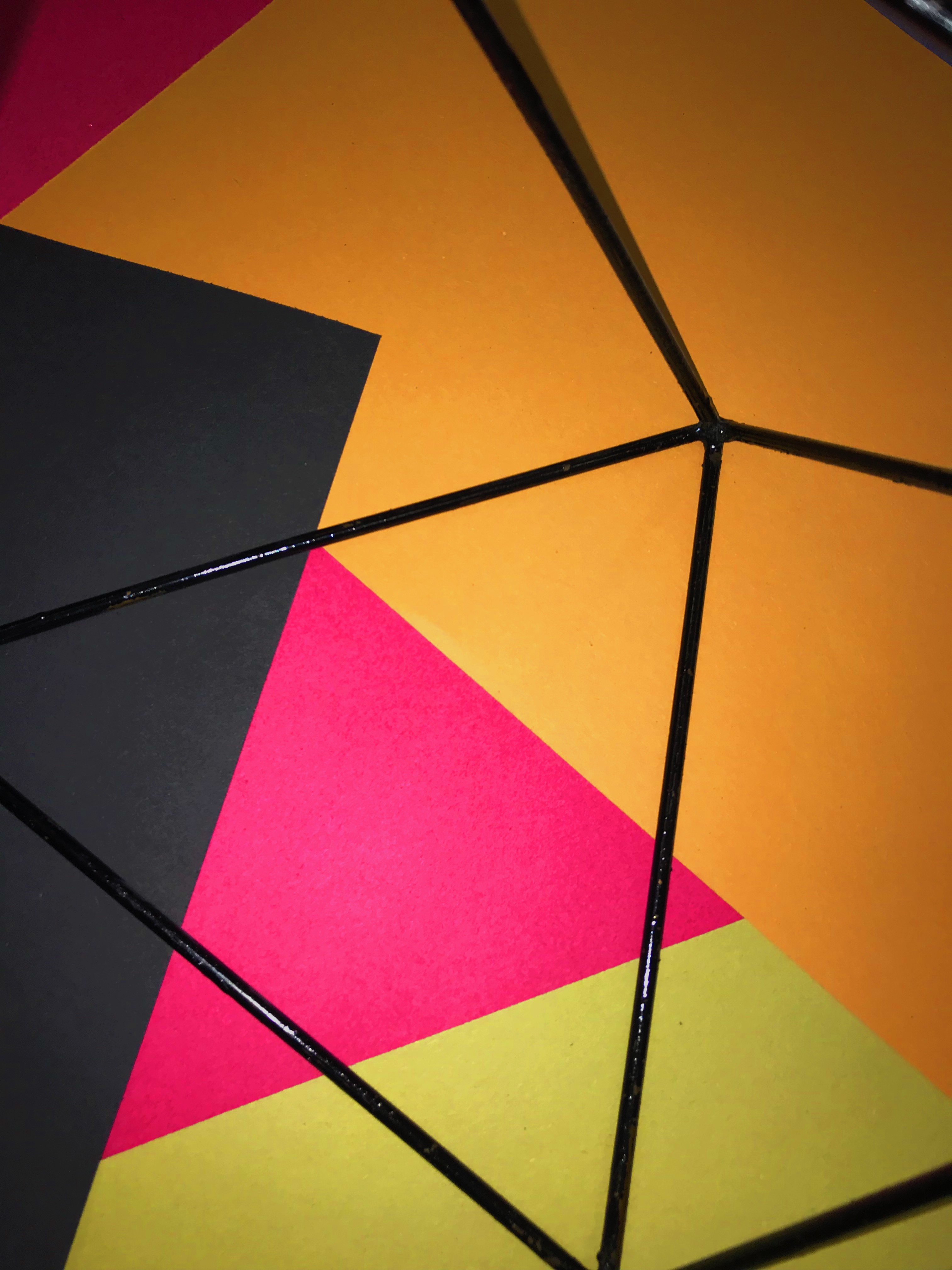
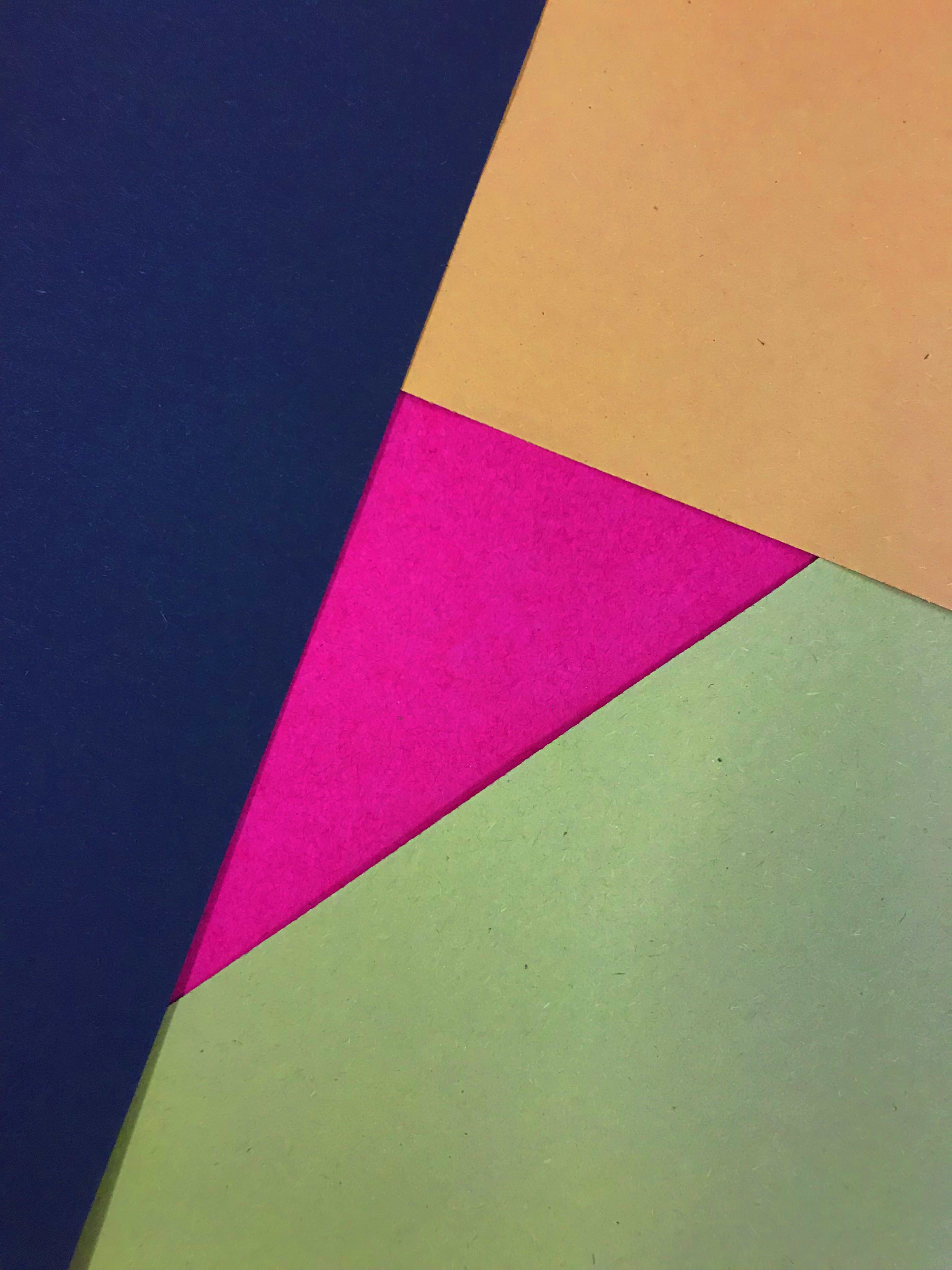
For the above images, I increased the saturation to make the paper’s colour more vibrant.
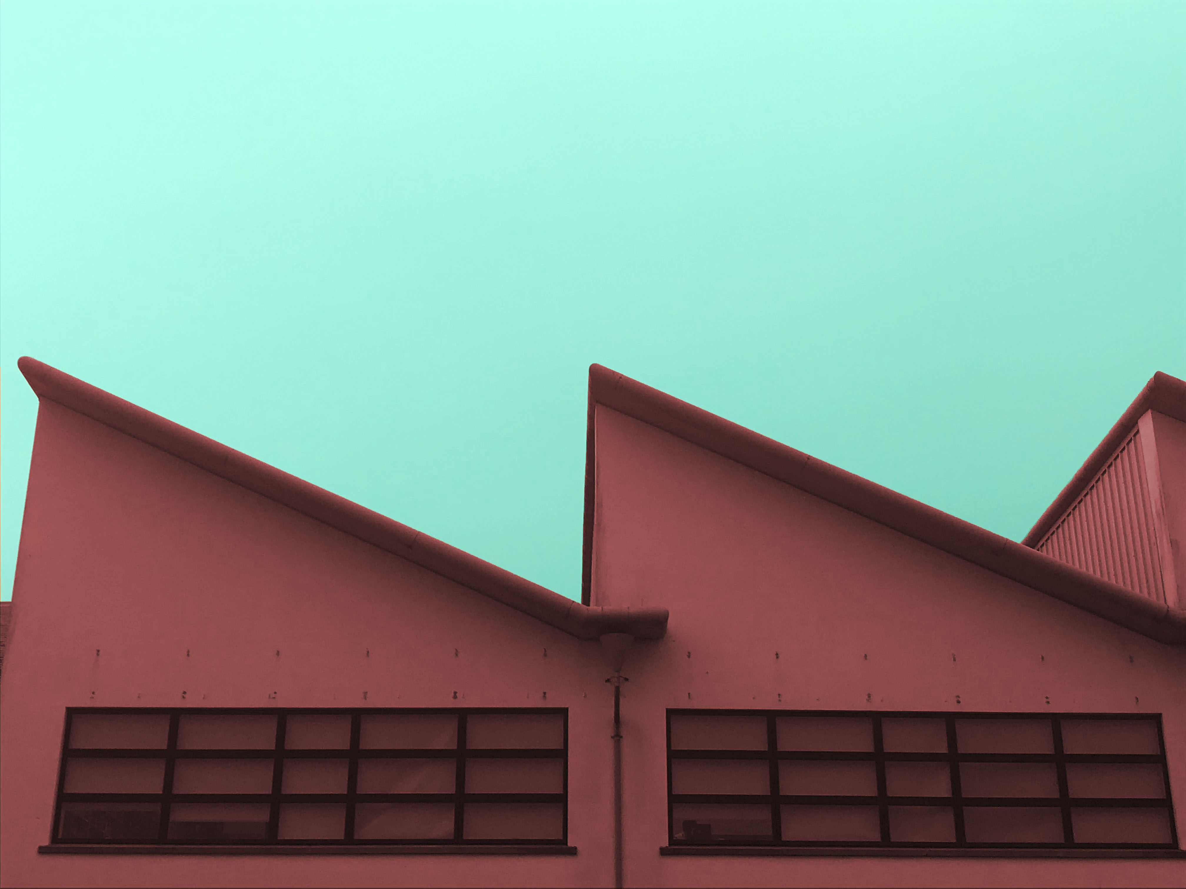
I used the quick selection tool to select the sky and I changed the hue colour to a light teal colour. I did the quick selection tool again to choose the building, this time making it a redish colour to stand out. I then increased the contrast of the whole image.
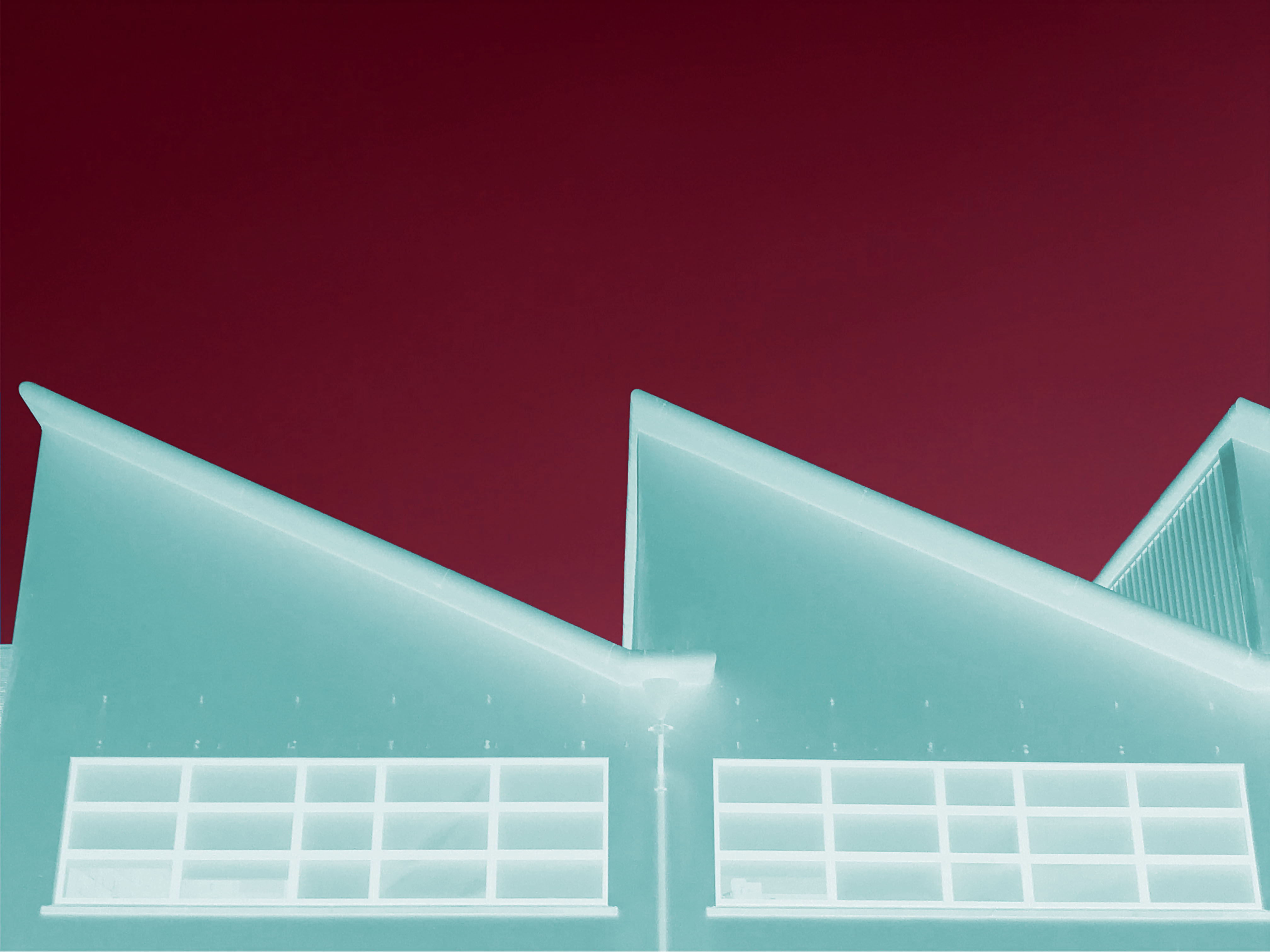
I wanted to see what the image would look like if I inverted the colours.
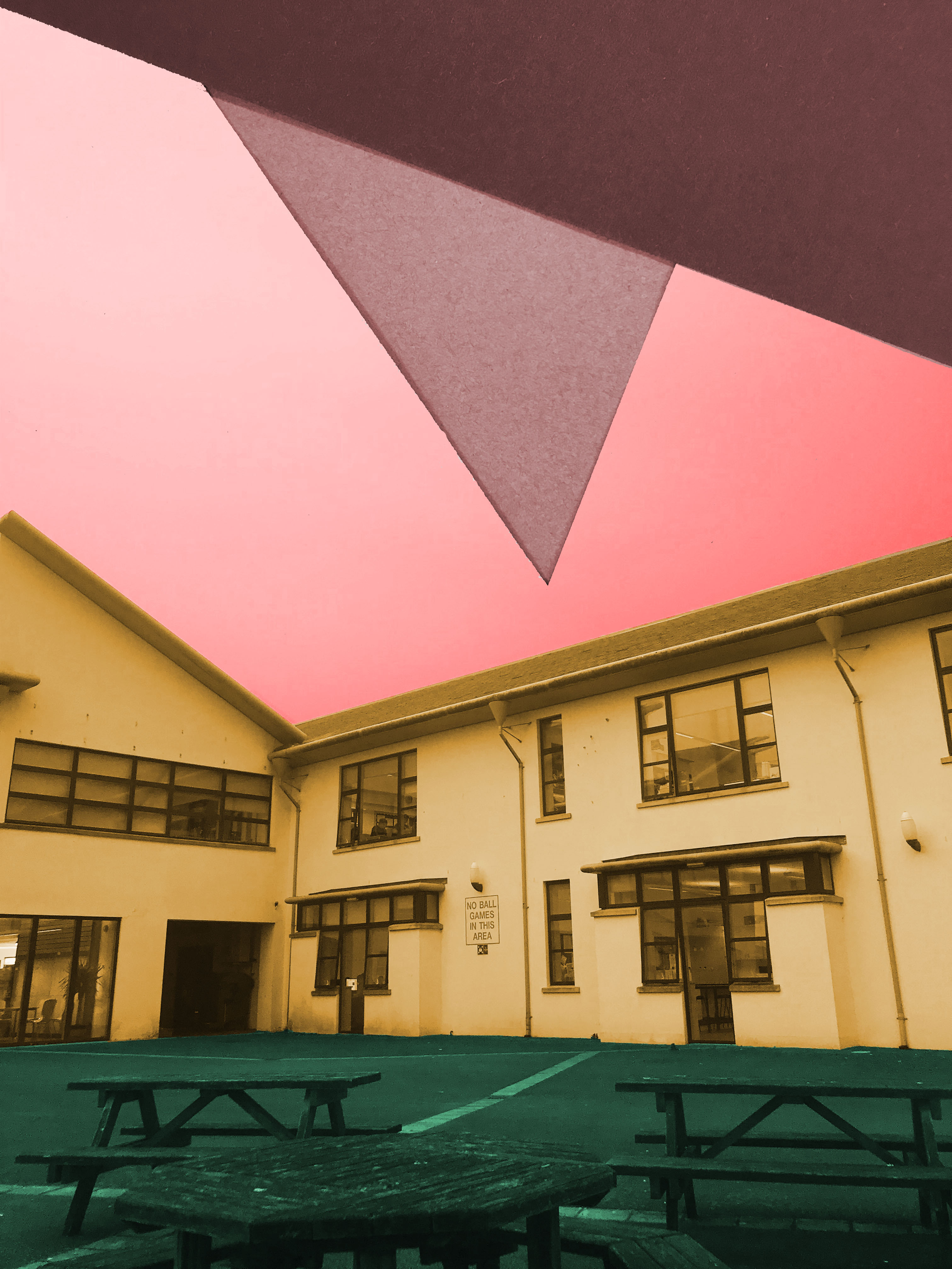
First I took one of my paper images and used it as an overlay for the sky in this image. I liked it as it added texture and tone. I quick selected the 3 different sections of this image ; the sky, building and the ground and made them each a different colour that stood out against one another.
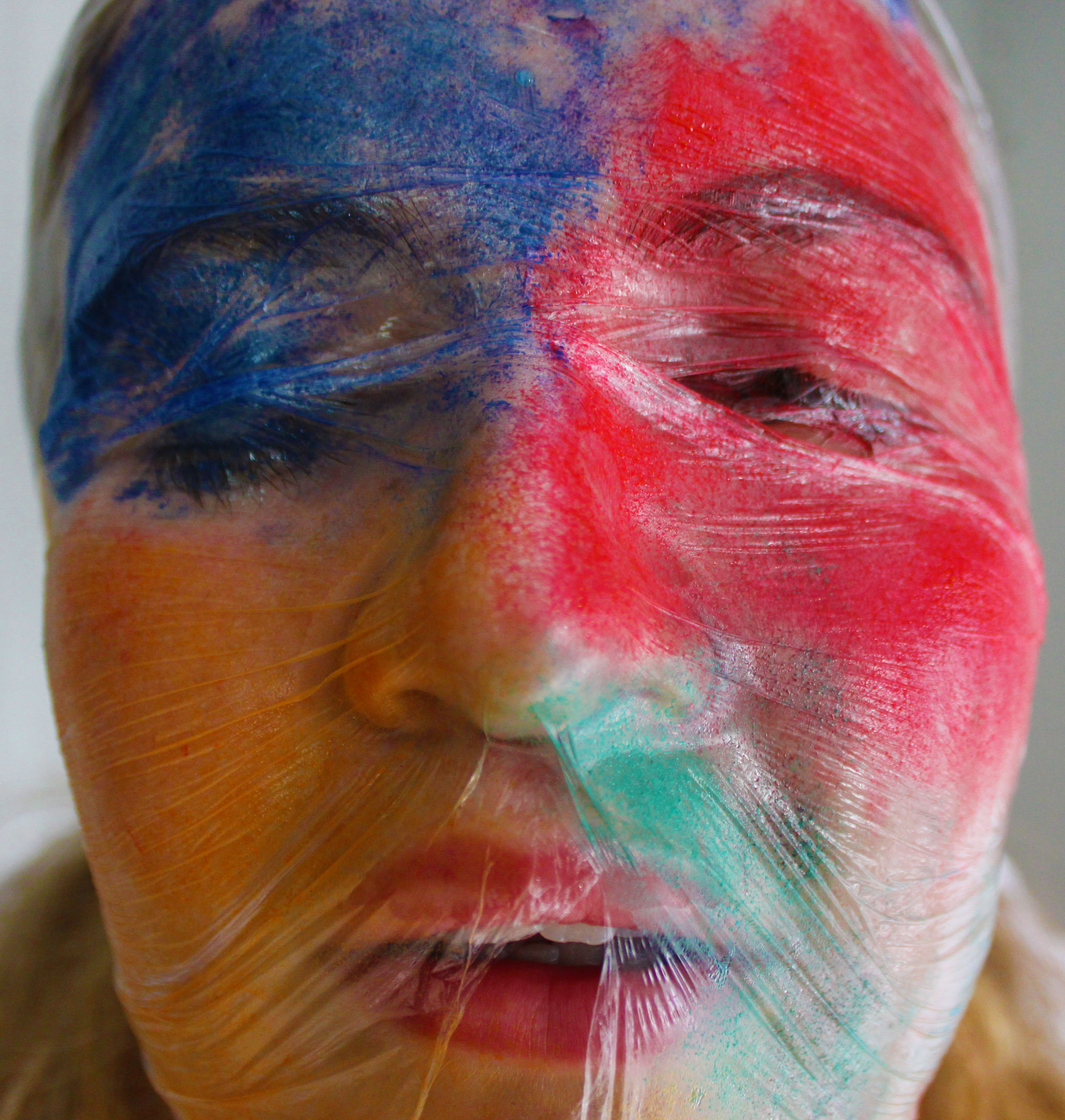
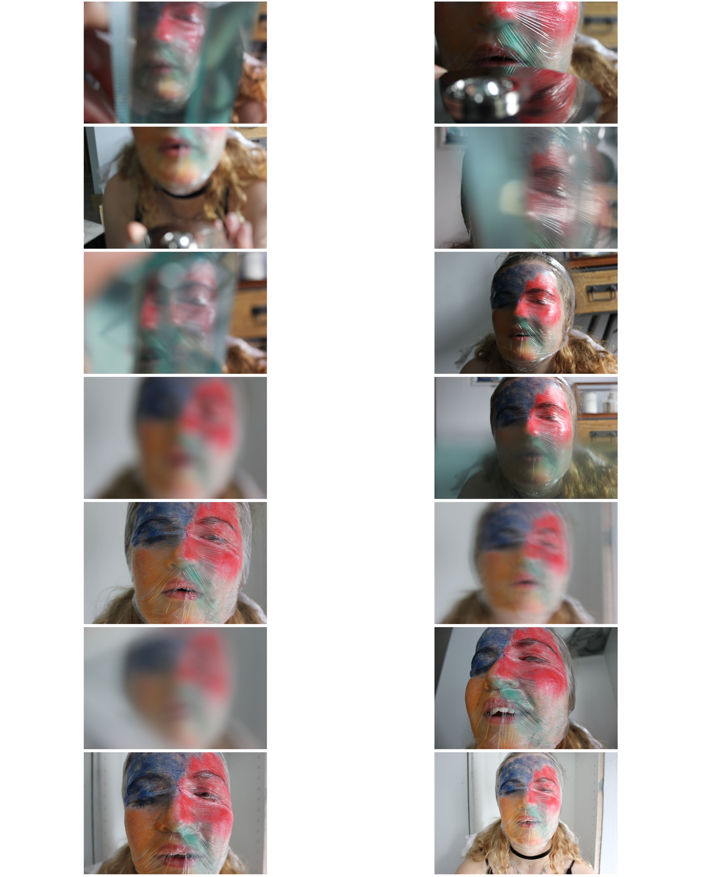
I took this close-up image and cropped it so that the face was the main focus. The natural lighting on the right of the image gives the cling film wrap (that I put on the face) shine and texture. By having each section of the face a different colour, I feel it shows the abstraction that I wanted.
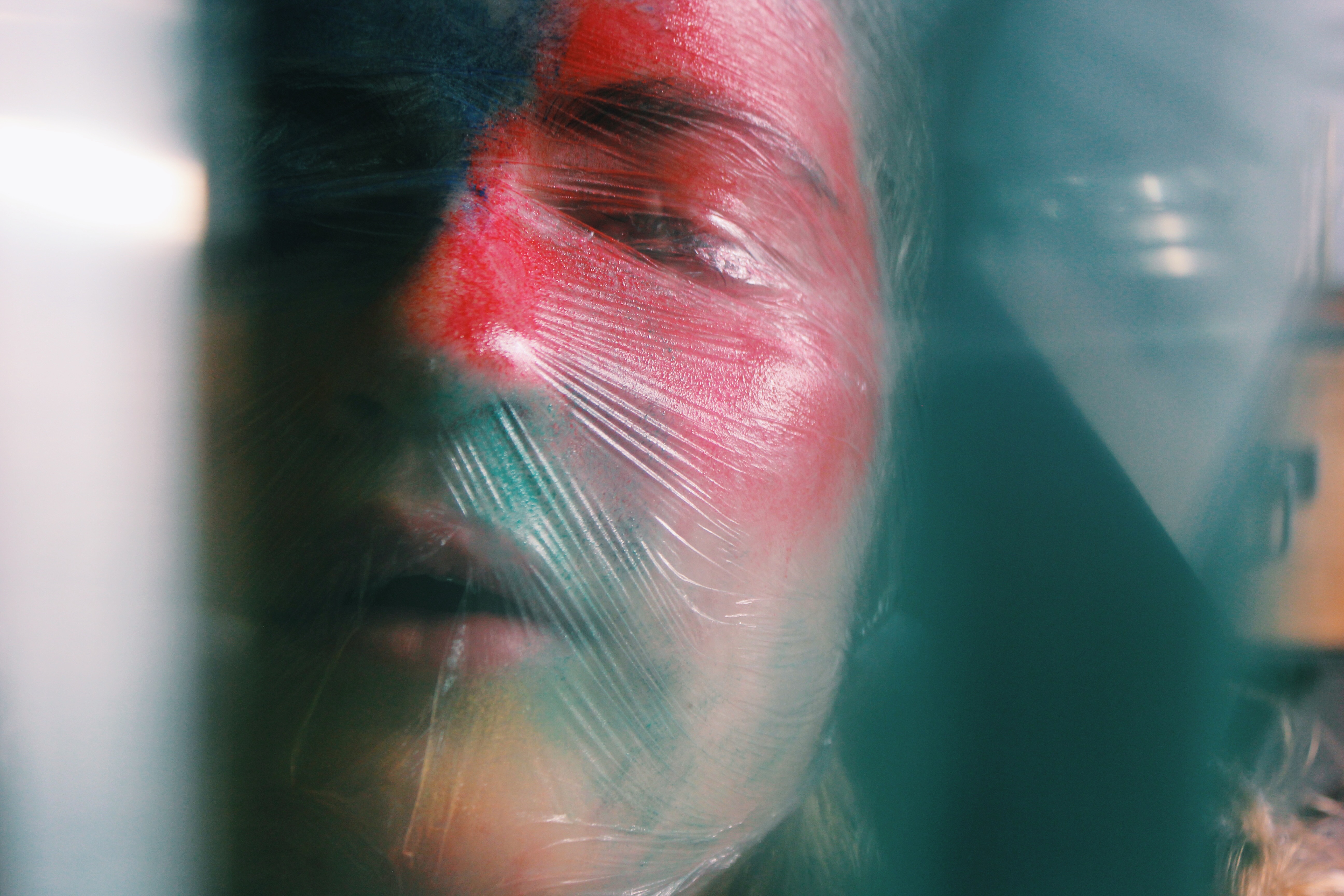
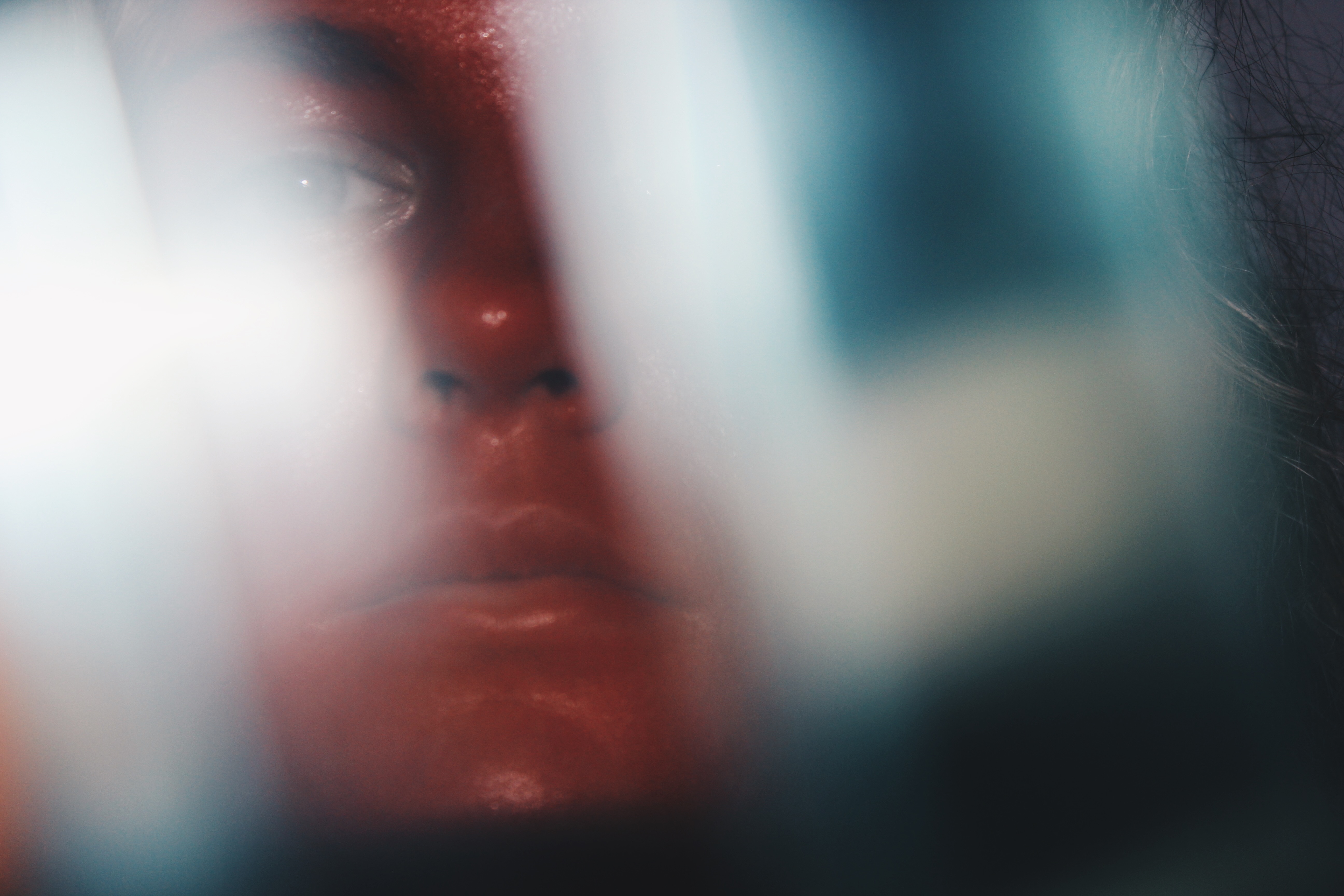
I used filters from ‘VSCO’ for these images to bring out the colours in the prisms and glass blocks. The brightly coloured faces stand out through the glass but with a subtle flare over them giving it its abstraction.
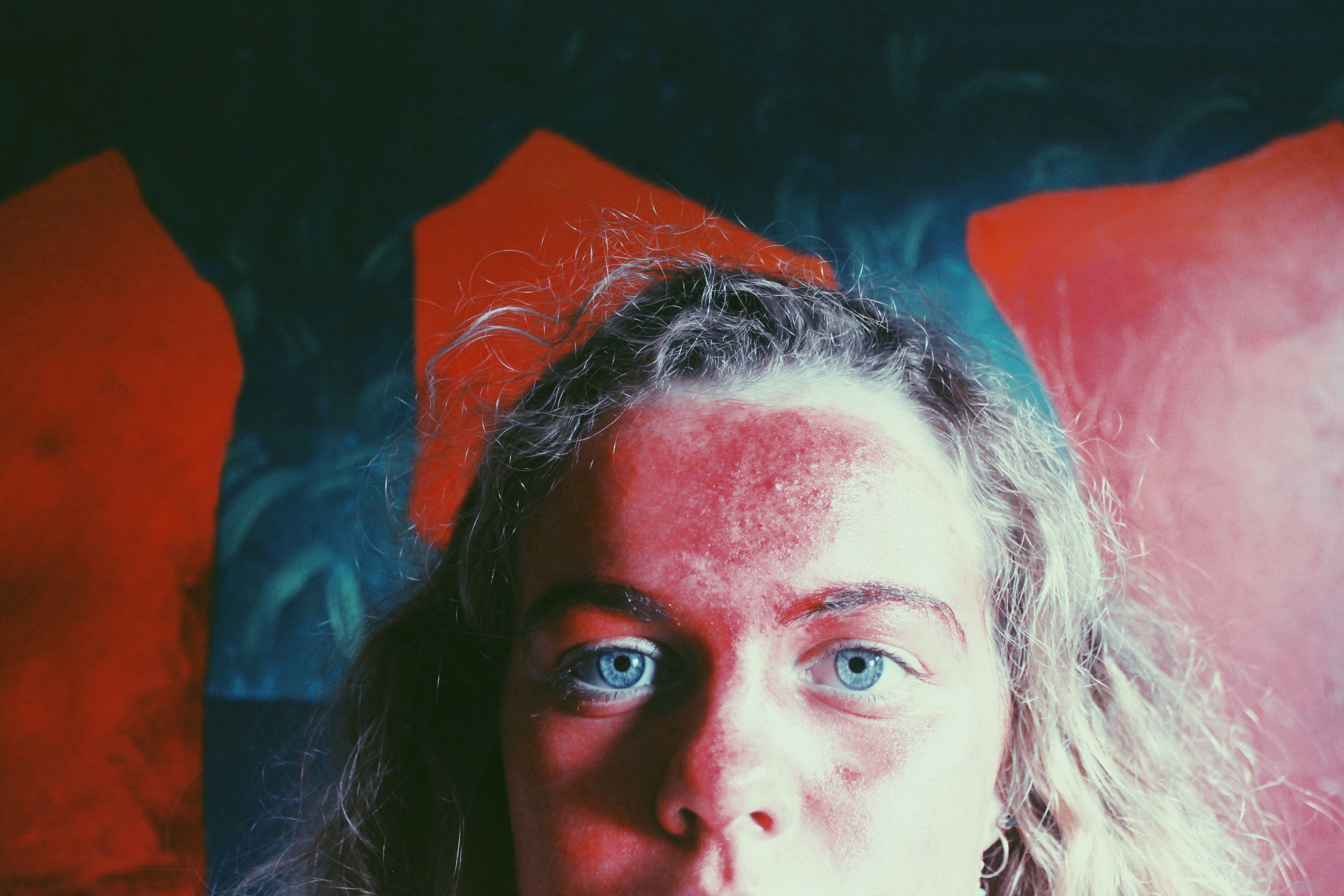
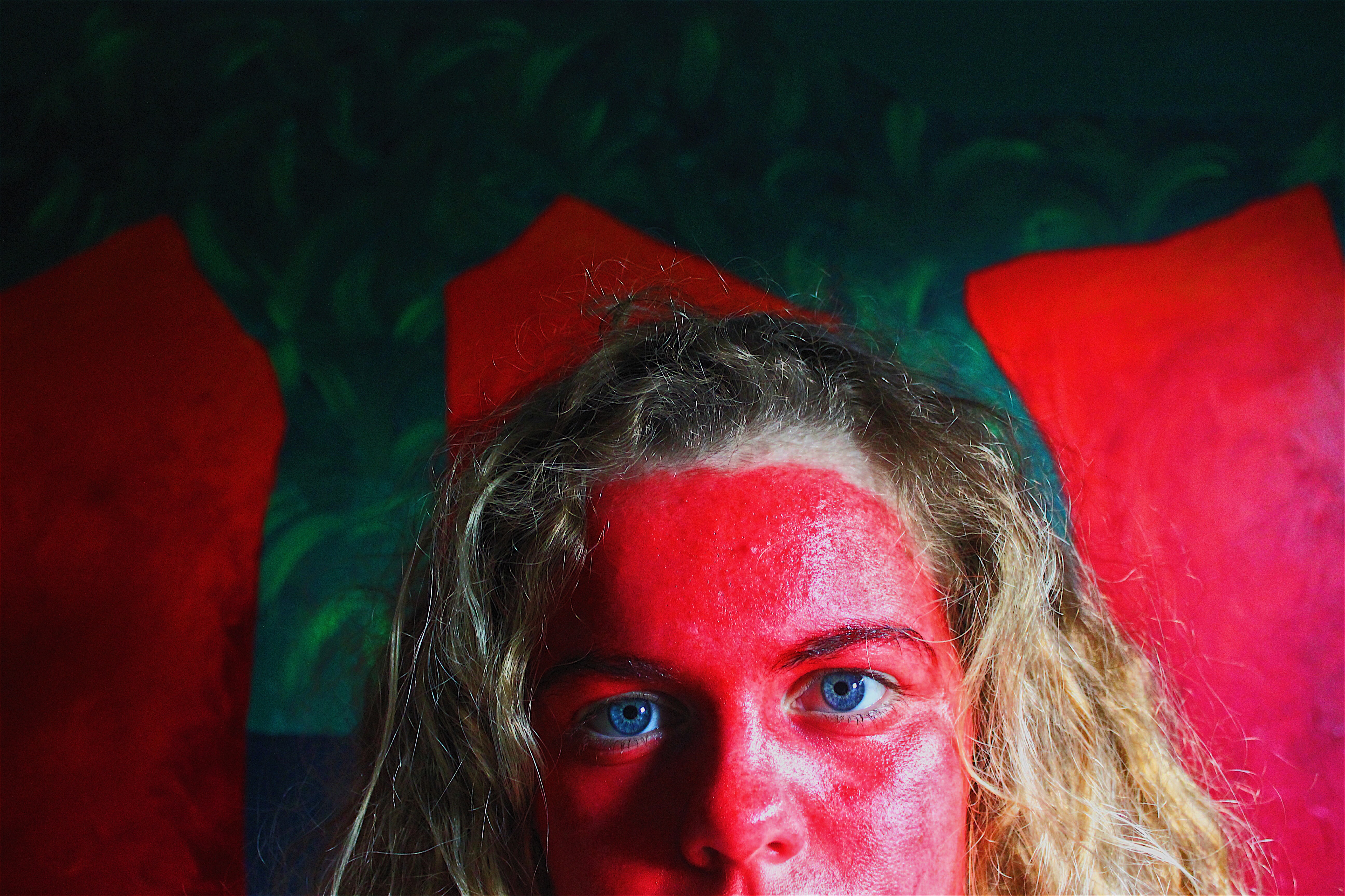
I took these two images and in one I applied a filter, the other I increased the saturation and highlights to make the colours pop out. This also makes smaller details like the blue eye colour more noticeable.
