
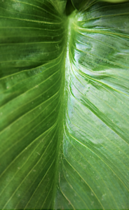
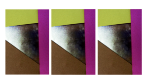
This was my image originally,I chose this image because it has a lines of symmetry throughout the middle and due to the colour being vibrant. I also thought that all the lines of detail would compliment the composition of the piece when experimenting with the layout .
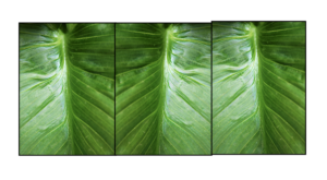
For my first edited I simply repeated these images in lines exactly the same as before,with the the lines throughout it is more obvious and appealing to see and it also portrays the highlights throughout very well.
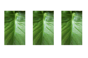
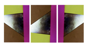
next I flipped these images to all be different,this creates a more abstract feel and a less fuller sense as to what the leaf really is and also shows the tones in different interesting experimental methods.
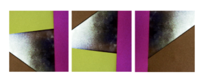
I then proceeded to put my images into a squared again continued these are different angles within th images and again have flipped images within the squares.
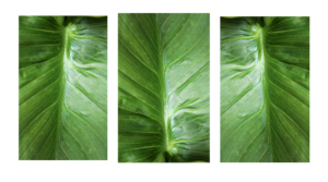
The next image is interesting because I wanted to shows a somewhat continuation of the lines through the second image which is also at a different angle so creates a center point and allows the image to become more dynamic and interesting. 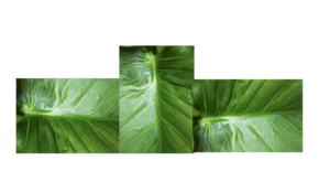
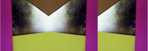
For This image I was again inspired by my previous experiment of the layout of the piece itself is making it so every center point is facing out of the middle. I still have point from the two opposite leaves.
within this last image I want to form a mirror limes and. a sense os symmetry to the pieces also added a boarder so aswell as forming the piece it also breaks the form into specific piece of the text.This piece is also divided into darks and lights within the division.
For these next images I wanted to focus more on the actual development of colour, this was in order to again experiment with form and how I can develop the different angles of the paper too.
These images are both slightly different angles of the colour itself. but I want to further this image to more of circular and line patterns .
Here I wanted to show a repeated pattern of the lines within the image but still showing the fragments of colour at the same time. I also exaggerated the colour in order to further exaggerate the vibrancy if the piece.
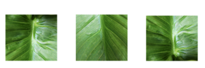
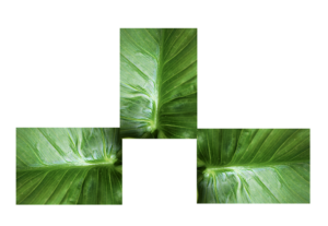
Within the two outside images are facing out in order to show a clear cohesion within the piece and symmetry too.But the middle image is the direct line as it is different to all the other images.
Here I also furthered the image into a squares and again flipped the image itself around too.
And lastly within this range you can see my lines of symmetry but a continuation of the line too.