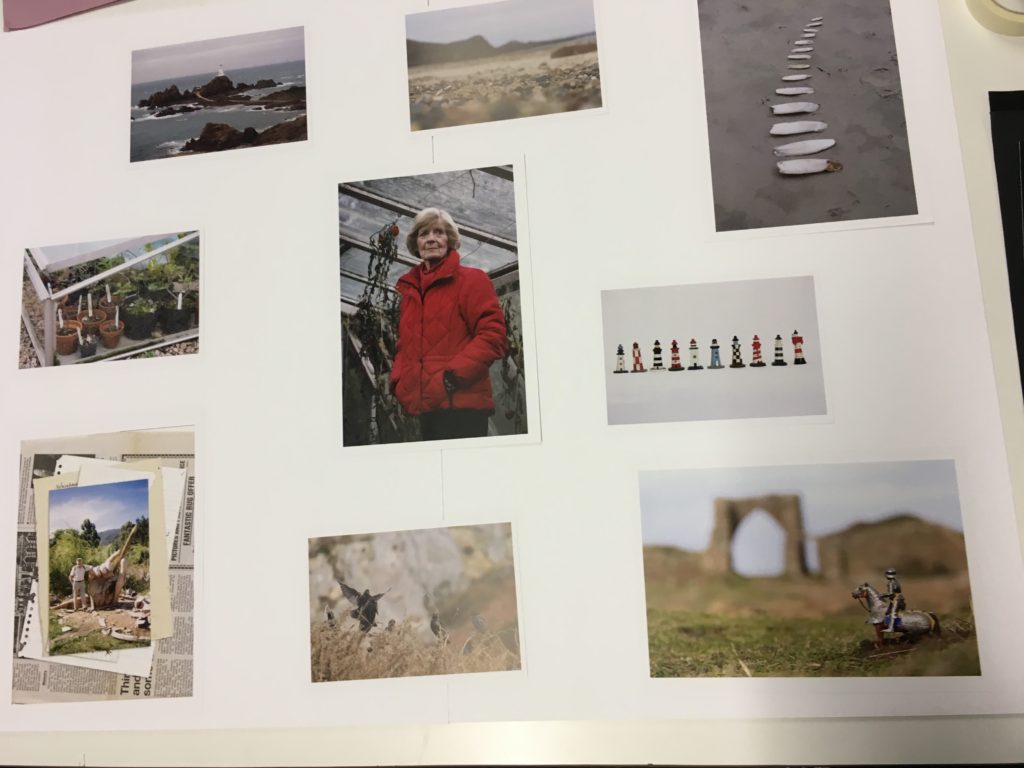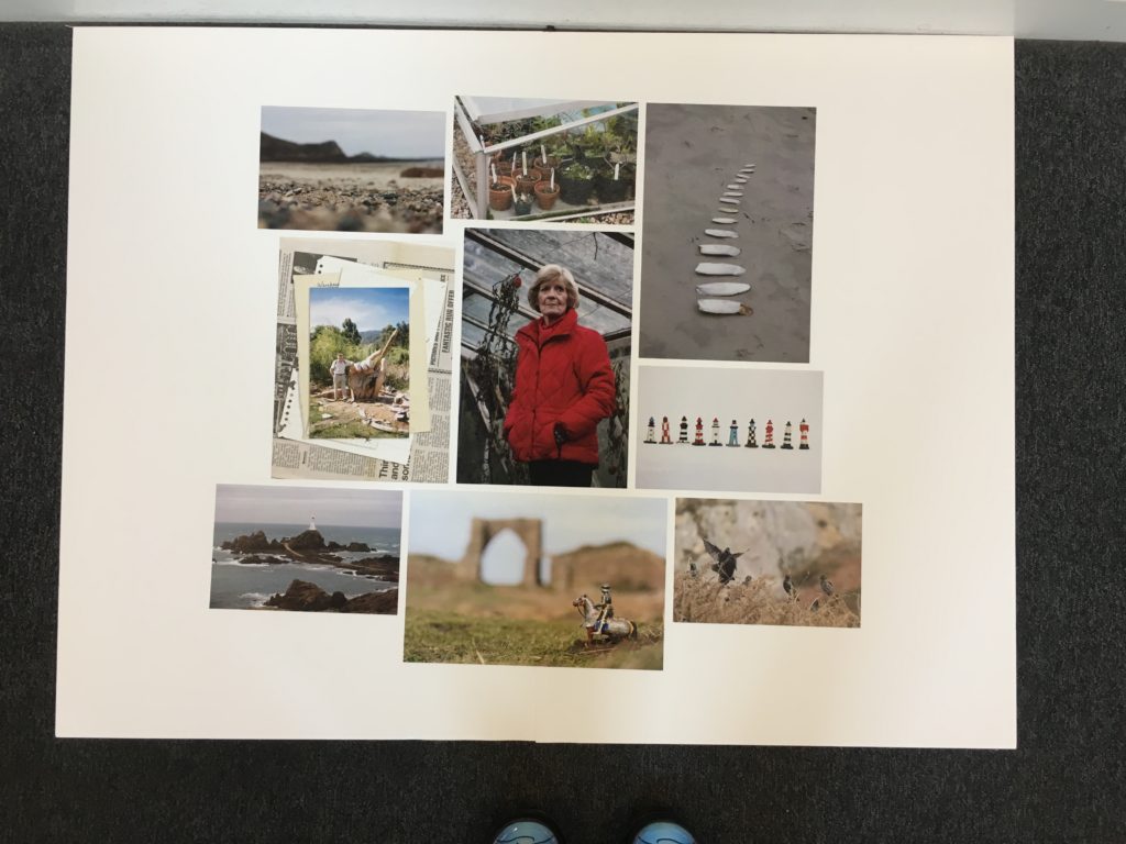
For my final presentation of the images I wanted to display them all on a white background in a collage format. I got my photos printed in a range of portrait and landscapes in size A4 and A5. I stuck two sheets of A2 foam board together to make a big canvas and background. I knew I wanted the key portrait of my Grandma in the centre because it is the boldest of all the images and draws your eyes in. I played around with different layout trying to spread them out evenly and make them all fit together without any big gaps.

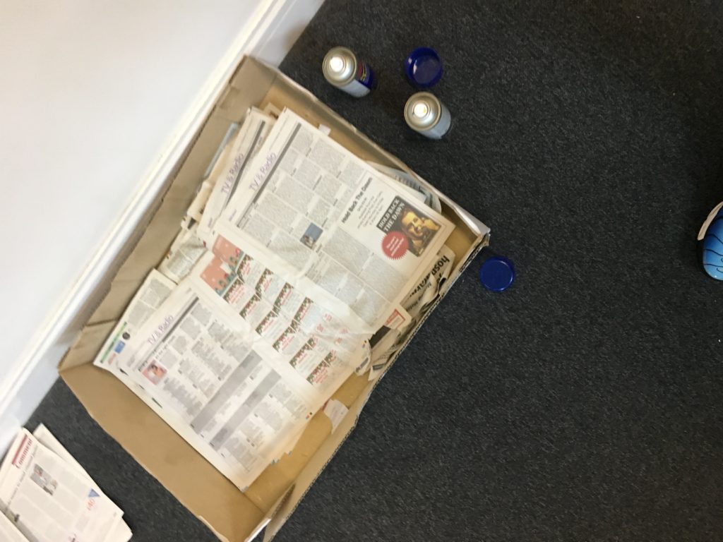
When I had decided on the placing of the images I spray mounted them and stuck them in place. First measuring the centre image and the aligning the rest up with it to make sure they were all straight. The image layout had a rough edge and were not all perfectly lined up, this was intentional to create a more natural look and to give it more interest.

