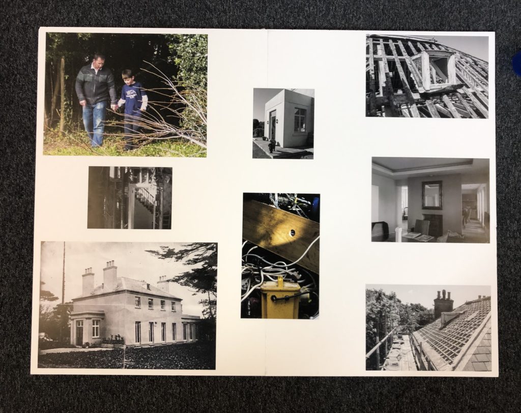
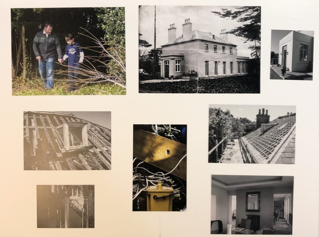
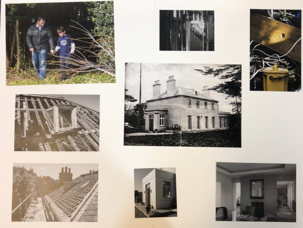
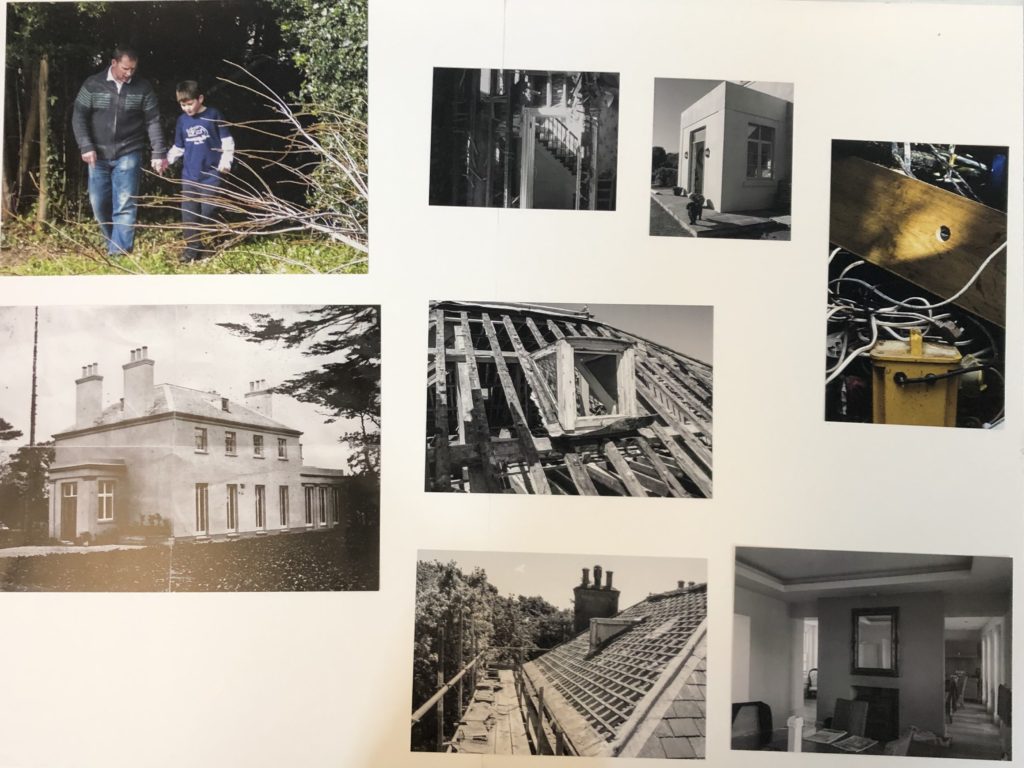
Below I have shown the different layouts that I experimented with when attempting to find the most aesthetically pleasing way to present prints from my Political Landscape project. I first decided that I would be mounting the photographs on white mount board as the white of the board would contrast very well with the black and white photographs to create a clean and neat outcome. I then explored different ways of grouping the collection of photographs, such as the larger photographs together or grouping the archival photographs together and then the modern photographs together. Through this experimentation I came to the conclusion that the best way to present the photographs was in three columns in order to keep the presentation need and clear so that the photographs did not look crammed together or out of place. I believe that the way in which I have chosen to present the photographs makes use of the space available to place the photographs on the board whilst allowing enough space between the photographs for it to look good and for the viewer to be able to look at each photograph individually due to an organised structure.
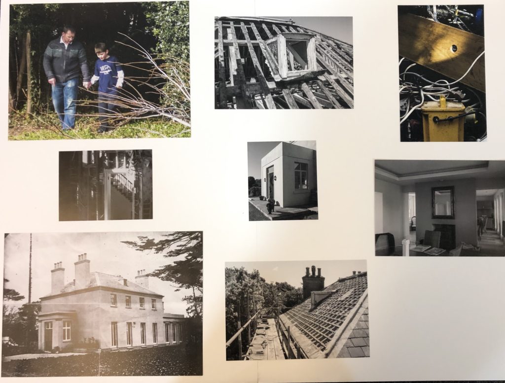
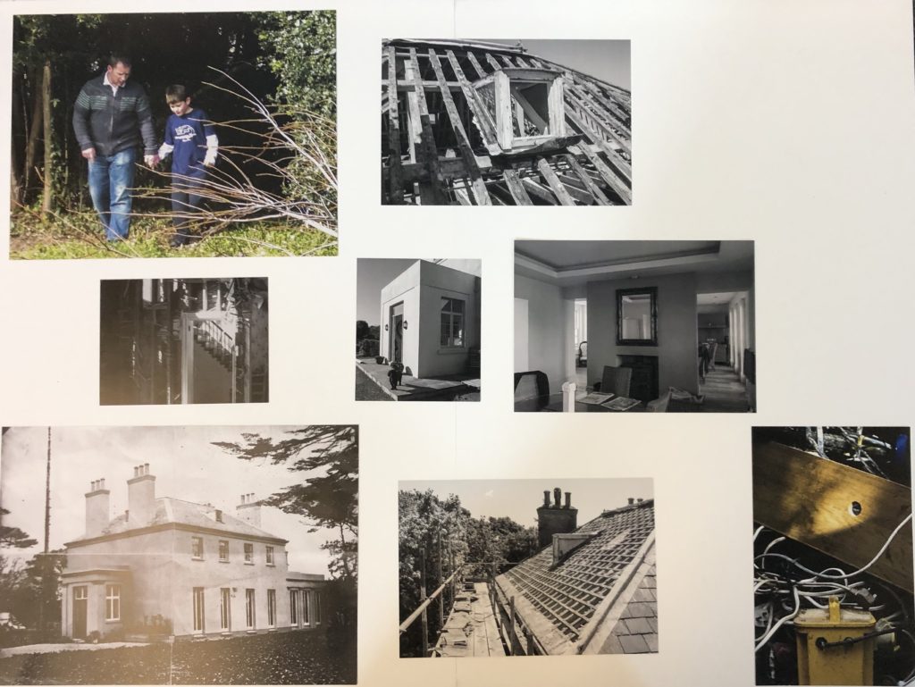
Final Outcome
