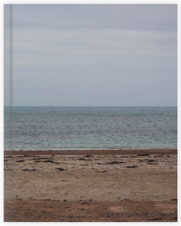
Here is a link to my Photobook “Little Changes”
Below I have shown the different layouts that I experimented with when attempting to find the most aesthetically pleasing way to present prints from my Political Landscape project. I first decided that I would be mounting the photographs on white mount board as the white of the board would contrast very well with the black and white photographs to create a clean and neat outcome. I then explored different ways of grouping the collection of photographs, such as the larger photographs together or grouping the archival photographs together and then the modern photographs together. Through this experimentation I came to the conclusion that the best way to present the photographs was in three columns in order to keep the presentation need and clear so that the photographs did not look crammed together or out of place. I believe that the way in which I have chosen to present the photographs makes use of the space available to place the photographs on the board whilst allowing enough space between the photographs for it to look good and for the viewer to be able to look at each photograph individually due to an organised structure.
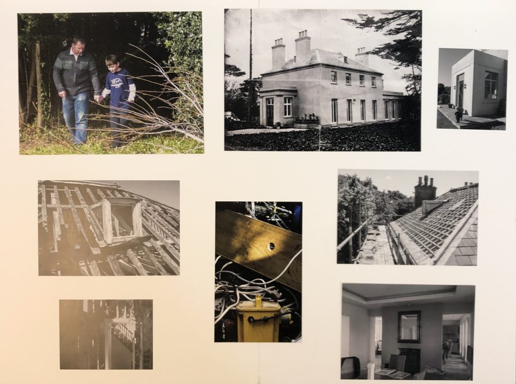
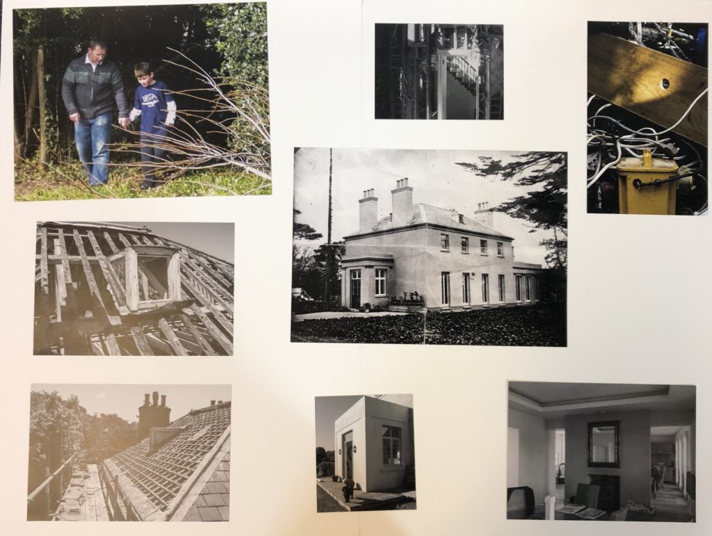
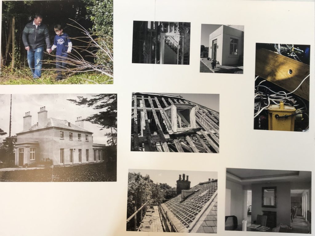
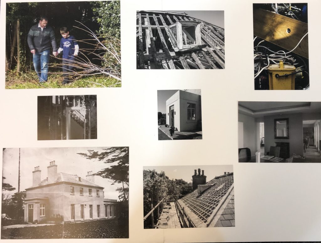
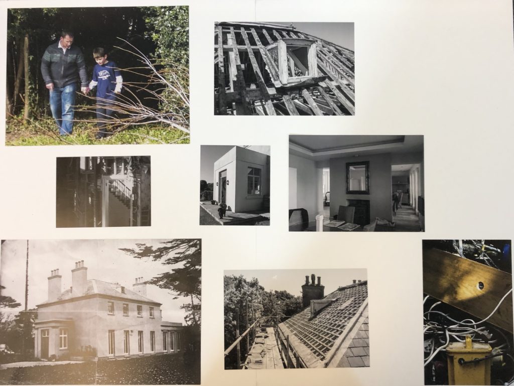
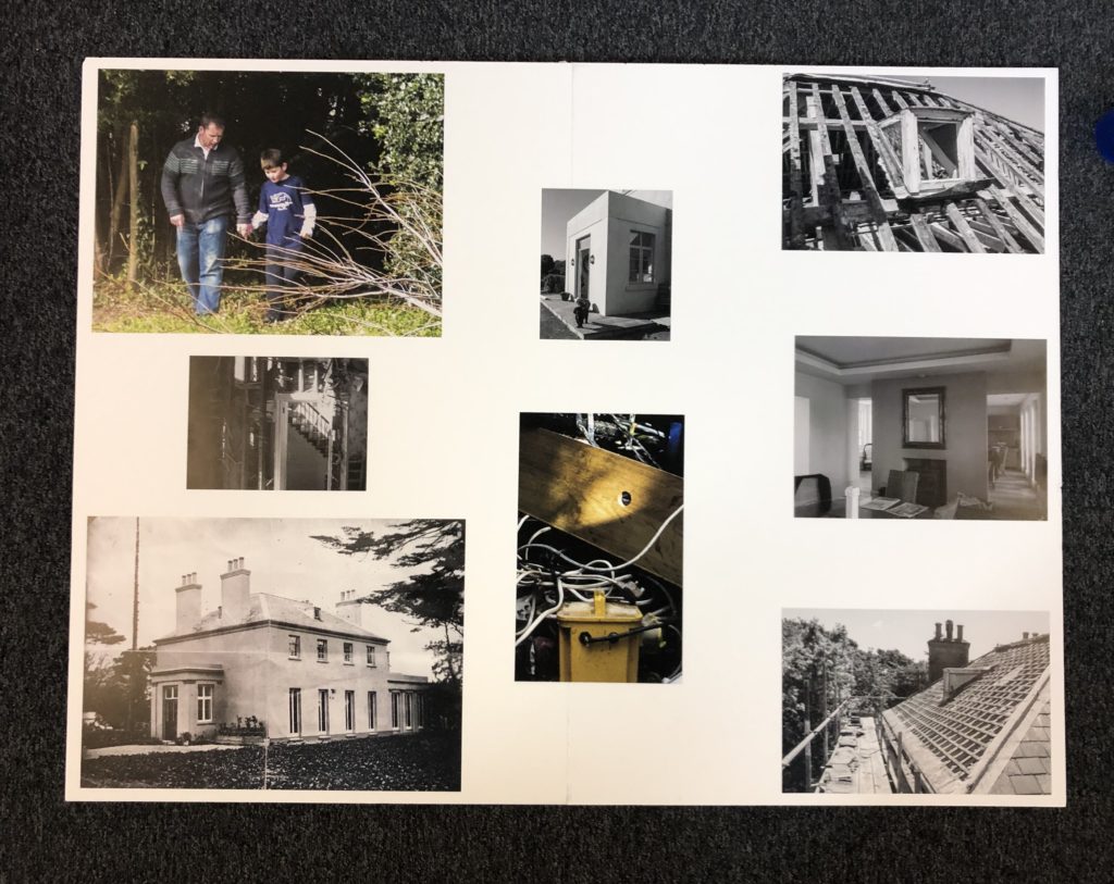
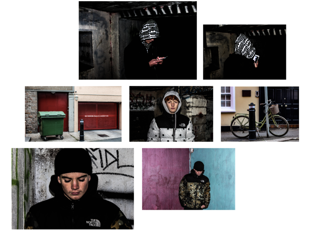
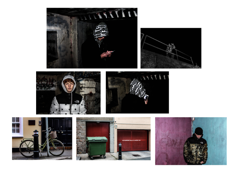
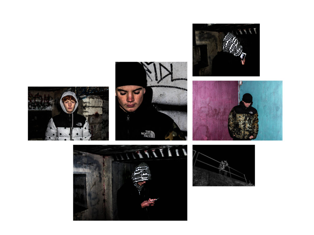
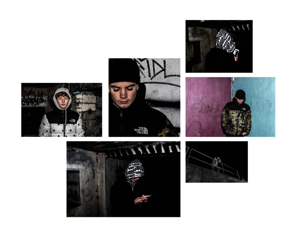
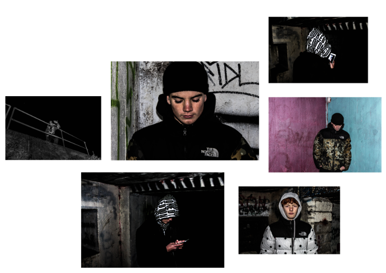
My final layout
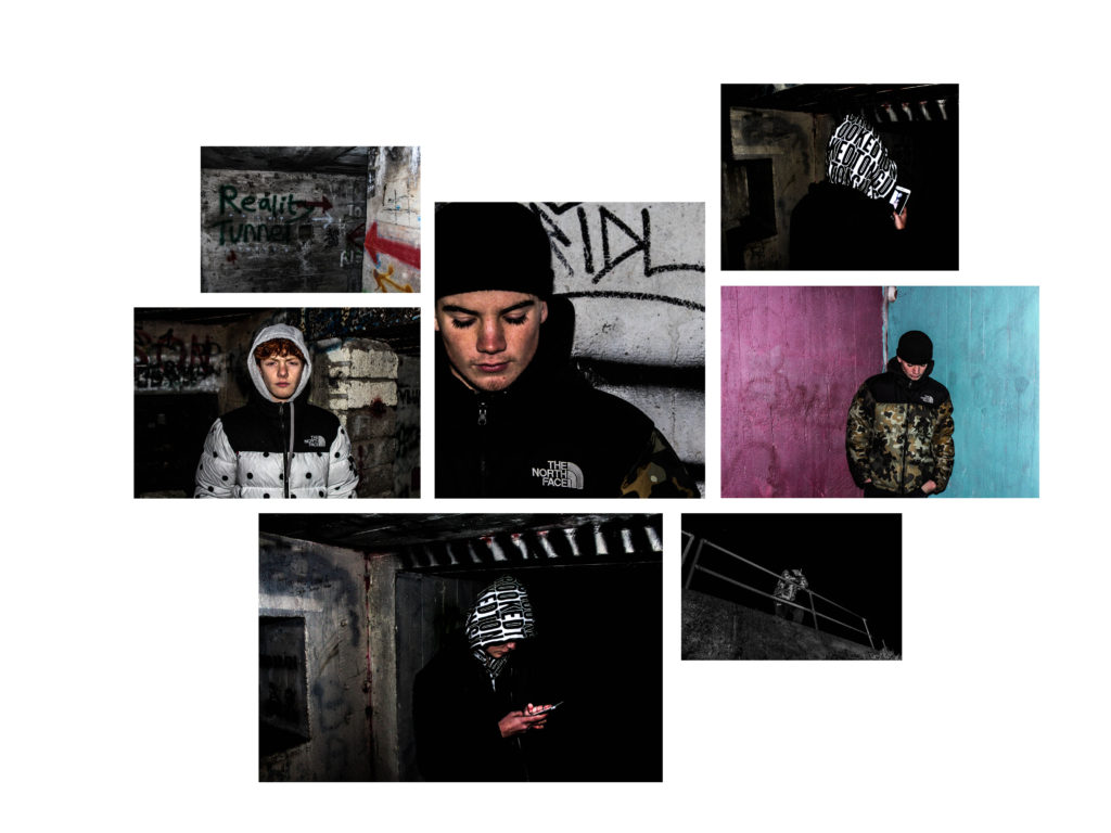
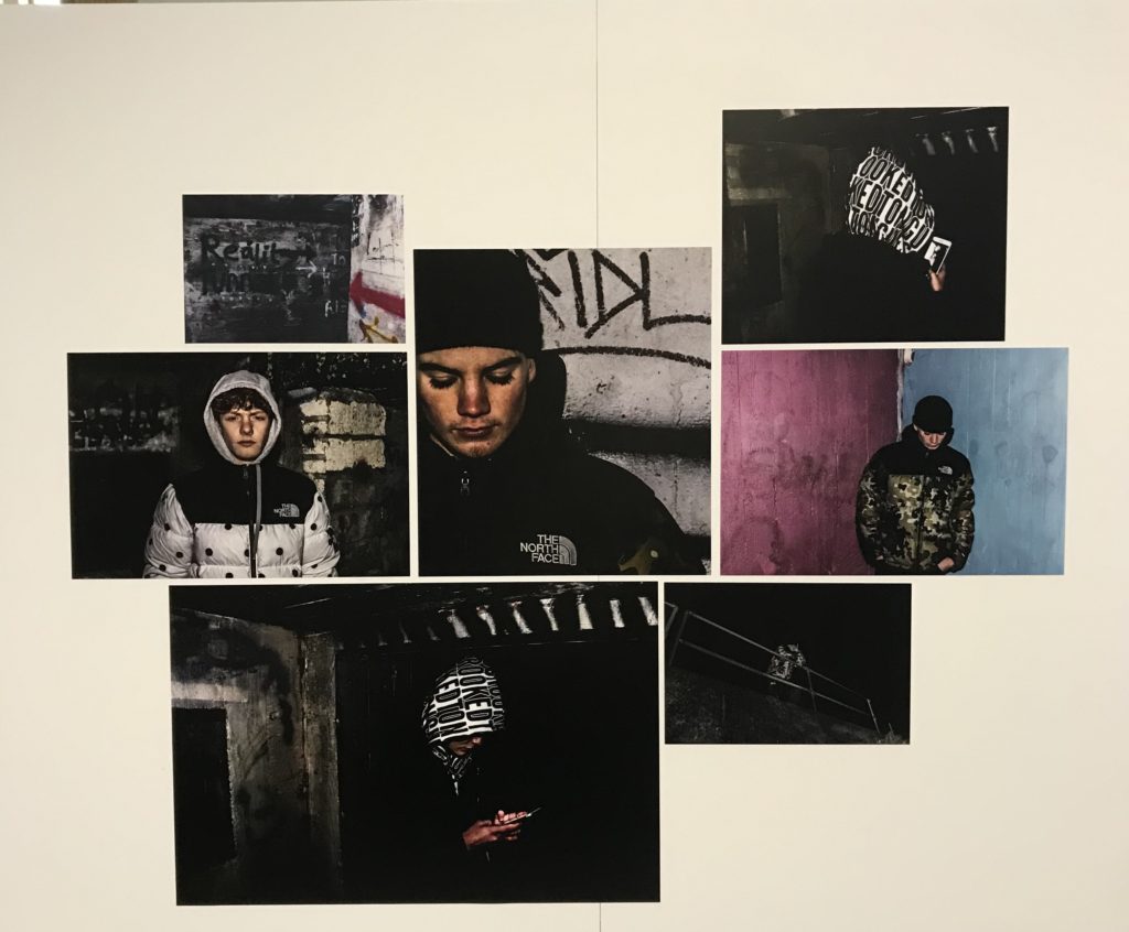
I have chosen the following images, as I have previously spoken about their quality that they hold and the amount of narrative which is found within the pieces. I wanted to create a final presentation that both showed element of landscape, portraiture, surrealism which all fits into my end title of my political landscape model was named ‘How do people react, control and effect the environment by creating man-made structures that cause a sense of isolation?’. I wanted to experiment within the orientation of my piece and more interesting ways which they could be positioned, as I think this would only further develop the narrative of my work altogether. Furthermore, I wanted to experiment with size also as I feel a variation of sizes allows for a more interesting layout. I tried to choose images which have a similar colour theme throughout.I wanted to included all my images but found it looked too crowded when all al the board which resulted in me removing two images. Due to some images having bold colours and also having dark images it created strong contrast and also variation. I do not feel a black background would be the best background have, as it might remove some of the tones, and create a background which you cannot properly see and won’t be as affective. I believe this project overall has really allowed for me to expand on the ways in which I am capable to take images and develop them further and create a true theme to my progression of work.
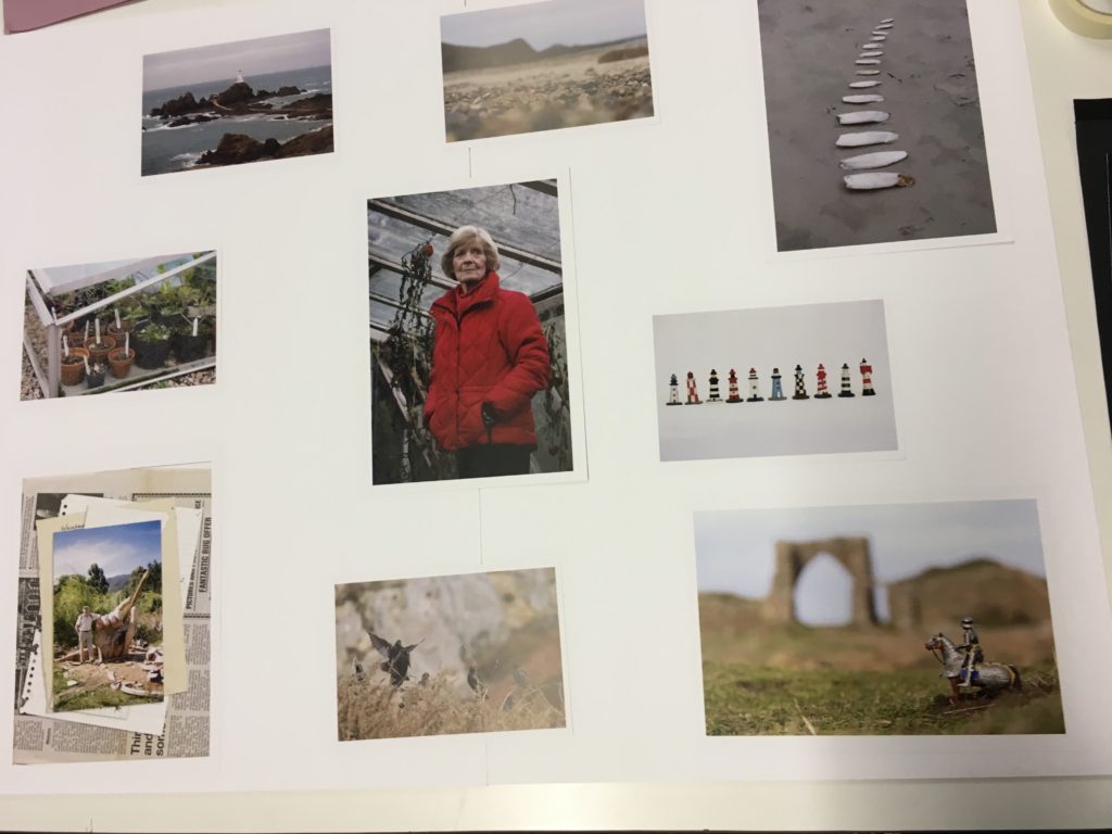
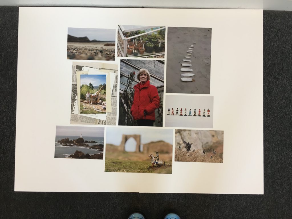
For my final presentation of the images I wanted to display them all on a white background in a collage format. I got my photos printed in a range of portrait and landscapes in size A4 and A5. I stuck two sheets of A2 foam board together to make a big canvas and background. I knew I wanted the key portrait of my Grandma in the centre because it is the boldest of all the images and draws your eyes in. I played around with different layout trying to spread them out evenly and make them all fit together without any big gaps.
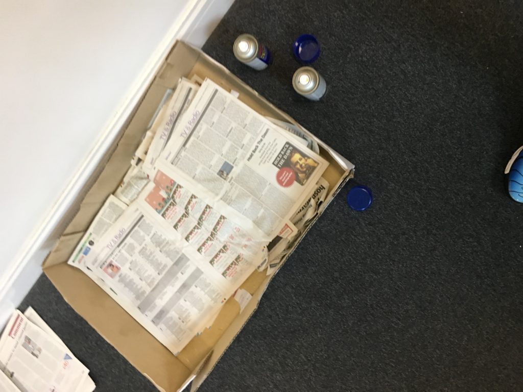
When I had decided on the placing of the images I spray mounted them and stuck them in place. First measuring the centre image and the aligning the rest up with it to make sure they were all straight. The image layout had a rough edge and were not all perfectly lined up, this was intentional to create a more natural look and to give it more interest.
